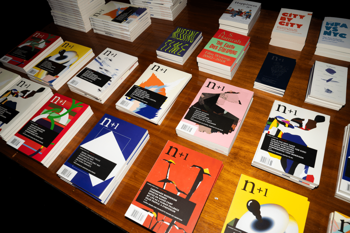
To celebrate its 20th birthday, n+1 un-paywalled its 20 most popular stories. Interesting to see what those are!
Advertise here with Carbon Ads
This site is made possible by member support. 💞
Big thanks to Arcustech for hosting the site and offering amazing tech support.
When you buy through links on kottke.org, I may earn an affiliate commission. Thanks for supporting the site!
kottke.org. home of fine hypertext products since 1998.
Beloved by 86.47% of the web.
Entries for March 2024
Diary Comics, Nov. 29
It’s time for another Thursday Afternoon With Edith! I’m still sharing these journal comics. Here’s one from the day I started guest-editing here, back in the fall.

Lol. In another 6 months, the only thing that will be displayed is the view count and you’ll have to tap through to see the tweet and who posted it. So much cleaner that way!
Cover of Smells Like Teen Spirit Sung in Classical Latin
This is so highbrow that it’s looped back around to being lowbrow: a cover of Smells Like Teen Spirit sung in classical Latin.
Sine lúce, angor minus
Oblectáte, nunc híc sumus
Mé sentió aeger, stultus
Oblectáte, nunc híc sumus
Barbarus, albínus, culex et, mea libídó
Hei! Hae, ha ha ha ha!
See also Bardcore: Medieval-Style Covers of Pop Songs. (via open culture)
Ian Bogost on the puzzle success of the NY Times. “It has brought back a gentler philosophy of game design: that great joy can come from solving little problems on the regular.”
How the Great Green Wall Is Holding Back the Sahara Desert
The Great Green Wall being built in Africa to halt the southern progress of the Sahara Desert is a favorite public works project of mine — it’s massive, ambitious, long-term, important, and if it works, the effect will repay the cost many times over. This video takes a quick look at some of the work being done on the wall in Senegal.
See also The Circular, Drought-Resistant Gardens of Senegal.
How real do jobs on TV seem? Opinions from an actual priest about Fleabag’s hot priest (“I liked that he cussed and was funny”), thoughts from a restaurateur on The Bear, and a doctor weighs in on Scrubs.

It’s that time of year again: the Tournament of Books is underway. In the style of March Madness, ToB is a “month-long battle royale among the year’s best novels”. I helped judge this once…it was hella fun.

Beer Me, Obi-Wan!
When the Star Wars films aired in Chile, instead of cutting away from the movie for commercial breaks, the TV station “seamlessly” inserted ads for Cerveza Cristal beer. We’re talking Obi-Wan opening a chest to find a lightsaber for Luke and instead it reveals a ice-chest full of beer. Or the Emperor Force-reaching for a lightsaber and a can of beer flies into his hand. And of course the whole thing has turned into a meme.
Beowulf, translated into Gen Z English. “A smol bean to start with, he would glow up hard later on / As his powers got fire af and his rizz went viral. Legend.” I think this is easier to read in the original Old English…
100 Years Ago in Photos: 1924
Alan Taylor is an under-appreciated internet curator. He’s been overseeing the photographic vibe over at The Atlantic’s In Focus for what seems like forever, and the quality is as high as ever. His latest post is 100 Years Ago in Photos: A Look Back at 1924.
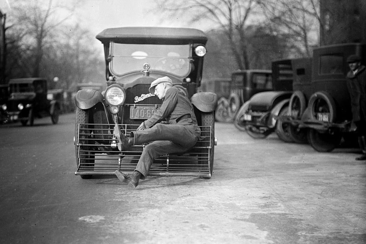
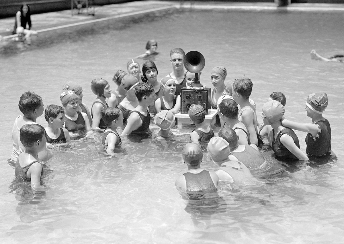
The caption of that first photo reads:
Original caption from December 17, 1924: “Picks him up at 25 miles an hour! If the modern auto or truck hits you don’t worry. Equipped with this device you are simply given a free ride. This man even came from behind another car, was struck but not even scratched. The demonstration was given recently in Washington, D.C.”
Don’t worry! A free ride! What an age.
A review of basic income experiments around the US. “Supporters say it works because people can spend the money on whatever they need most.” (I got a little heated in a recent argument w/ someone who was arguing “you just can’t give people money”. Yes, you just can!)

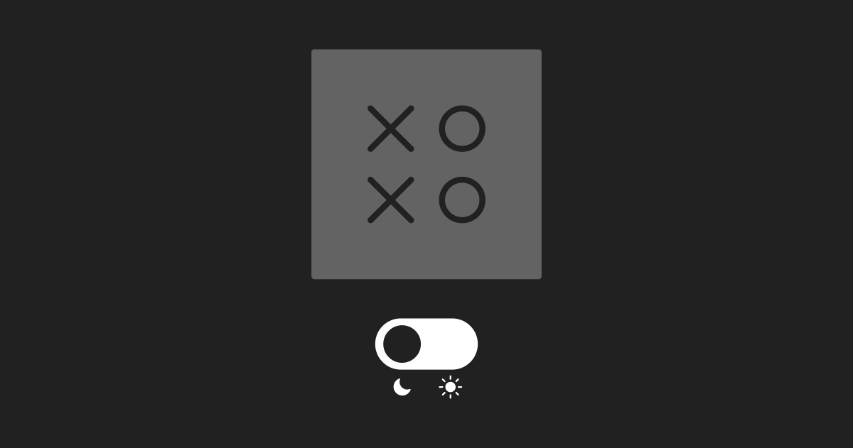
Wooooo! XOXO is coming back for one last conference. I will see you there! *toggle* *toggle* *toggle*
Membership Pricing
Oh no, a dreaded dose of site news — but I’ll make this quick. One of the changes I quietly made to the site with the recent redesign is enabling members to set their own price on memberships. It’s been 7 and a half years since the membership program launched, and I’ve thought about raising prices over the years just to keep pace with inflation, but it never seemed like the right way to go.
So I’ve put that capability in your hands. Now you can voluntarily raise prices if you’d like — here’s how it works. The price of each membership tier is now a base price that can be added on to (e.g. for the Patron tier, $30 is the minimum but you can increase that to $35 or even $130 if you’d like). For current members, your chosen new price will go into effect on your next renewal date.
If that’s something you’d be interested in doing and are currently a member, you can go to the subscriptions view and click on “change price”. The whole thing takes about 15 seconds (perhaps a bit longer if you need to log in). For new members, you can simply choose the price you want when you enter your payment information during the signup process.
Ok, that wasn’t too bad. Now back to our regularly scheduled links from the internet. 💞
Is it just me, or has “unhinged” reached peak saturation? It feels like I see it at least three times a day now. What about “out to lunch”?
A “hypervaccinated” man voluntarily received 217 Covid vaccine shots in a 29-month period. He’s shown no signs of ever having Covid and has suffered no side effects. “The researchers found that his immune system was fully functional.”

The Most Beautiful Shots in Movie History
From a YouTube channel called The Solomon Society, a pair of videos that some of the most beautiful shots in the history of film. When Denis Villeneuve emphasizes the important of image in film, these are the kinds of shots that he’s talking about.
Oh and in case you want to waste the rest of your day watching beautiful scenes from movies (no judgment here if you did): The Most Beautiful Shots in Film of the 21st Century, The Best Movie Shots of All Time, Some Amazing Shots from the Last Decade of Movies, The Most Beautiful Shots in Animation History, and The Most Beautiful Black and White Shots in Movie History. (via open culture)
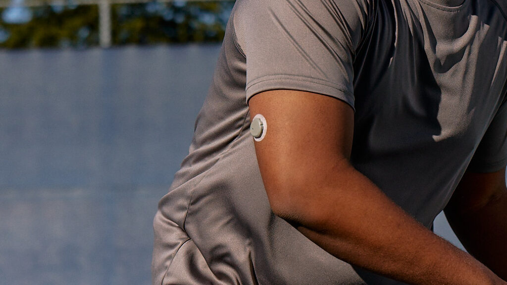
The FDA just approved the first over-the-counter continuous glucose monitor. I was glad to be able to use a friend’s CGM last year when it seemed like I might have gestational diabetes, and I wonder if this will become common for pregnant people.
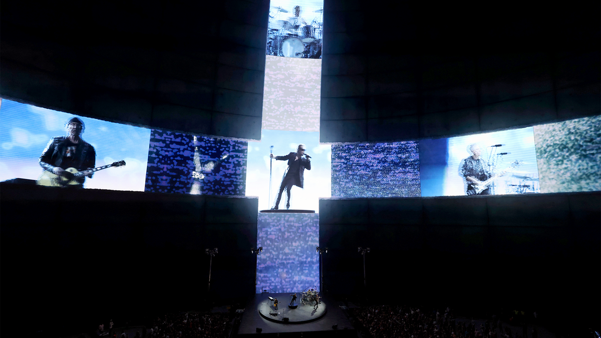
Sphere Refuses To Release U2 Despite Band Fulfilling Terms Of Residency. “Yes, you have played your 40 shows, but the laws of man do not apply to the Sphere.”
What Do the Different Emoji Hearts Mean?

The other day while chatting on Discord, I paused to pick out an emoji to apply to a friend’s comment. I wanted to use a heart to show that I liked the comment, but I’d already used the red heart and wanted to add a little more flair. Usually I just pick a pink one arbitrarily, but in that moment, I was like, WTF do all these little hearts actually mean? Do they have official meanings? Am I using them wrong?
It’s a common question, and the answer seems to essentially be: “No, there are no official meanings,” although according to Emojipedia the hearts do at least have official names: growing heart, beating heart, and revolving hearts (to choose the three that were least obvious to me).

The revolving hearts were the most confusing, in my opinion. Why are they revolving? According to The Pioneer Woman, they mean “falling in love, or deep affection.” That didn’t seem right, so I asked a few friends.
- “Sending love?” my husband said. “I don’t know.”
- “Love,” a friend said. “But specifically between you and the person you’re sending it to. It’s like a step up from ❤️.”
- Another friend said something similar: “Like ❤️,” she wrote, “but 10% more girlie and romantic.”
- I asked Jason. “I would say there’s a strong feeling of being intertwined,” he said. “Like, I wouldn’t send that to a friend. I don’t think I have ever received that particular emoji from anyone.”
- “Ok, I’ve never used that particular one,” another friend echoed, “but I always use the two hearts 💕 instead of a red heart, because I think it’s cuter. I have no idea what 💞 means.”
Emojipedia leaves it open-ended in its 💞 emoji-descriptor: “Hearts revolving around one or more other hearts.” (Around even more hearts?) In a 2020 post, Emojipedia also acknowledged that “intrinsically each heart has no more coded meaning than what meets the eye.”
A woman documented her effort to become the first person to complete a marathon in a Costco store. She refueled periodically with free samples and a signature Costco hot dog.

What music different birds would listen to. All right, the gull one got me.
Visual Effects Oscar Nominees Go In-Depth On Their Work
I haven’t watched this yet, but it’s definitely in my queue: a recording of a livestreamed panel of all the visual effects nominees from this year’s Oscars, talking about their work on those films. I got this from Todd Vaziri, a visual effects artist at ILM, who says:
If you’re at all interested in visual effects, you gotta watch this Academy presentation that took place last weekend. It goes in-depth with all five nominees, and shows before/after material that hasn’t been seen publicly.
The meat of the program begins at around 24 minutes when they start showing visual effects reels from the nominated films (The Creator, Godzilla Minus One, Guardians of the Galaxy Vol. 3, Mission: Impossible – Dead Reckoning Part One, Napoleon), followed by a discussion with the members of the effects teams.
The Academy has several other nominee programs available on YouTube (including animated feature films & documentary feature films) and more to come in the next few days (including best picture and international feature films). What a trove of material for film lovers.
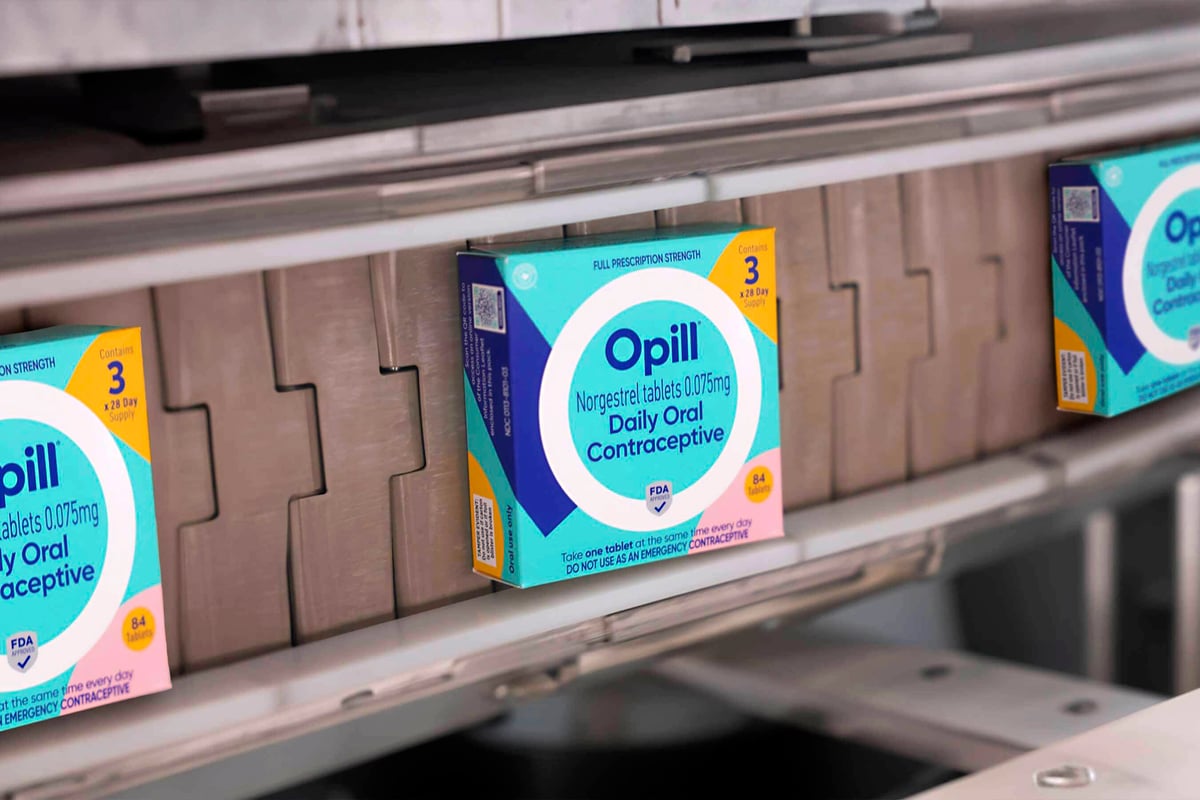
“The first over-the-counter birth control pill will be available in U.S. stores later this month, allowing American women and teens to purchase contraceptive medication as easily as they buy aspirin.”
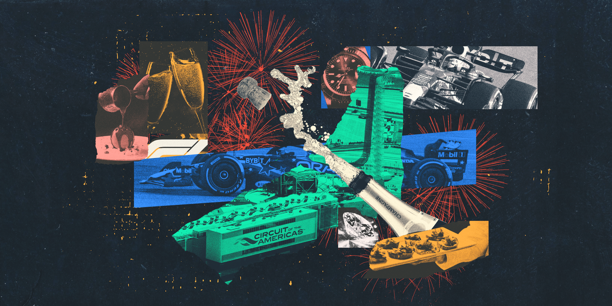
Kate Wagner (from McMansion Hell) was sent to an F1 race by Road & Track and the resulting article was published and then, poof, vanished. (Archived here!) “If you wanted to turn someone into a socialist you could [show them] the paddock of a Formula 1 race.”
Based on your feedback & bug reports, I’ve made some changes to the new site design, including a less-dark dark mode and a light/dark mode toggle (just below the right sidebar menu). More to come!
Extraordinarily Effective Trompe l’Oeil Paintings of Paper Craft
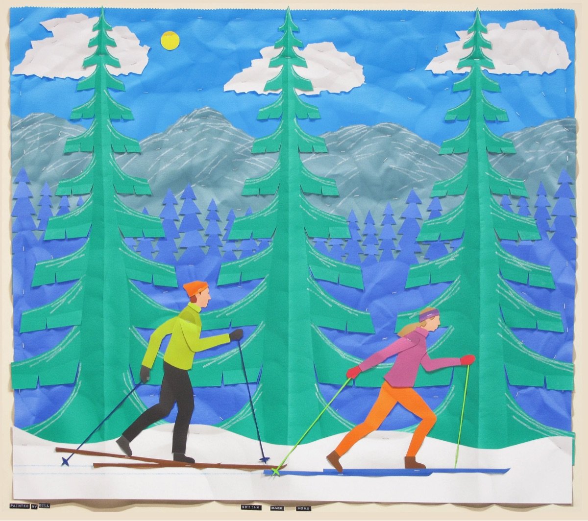
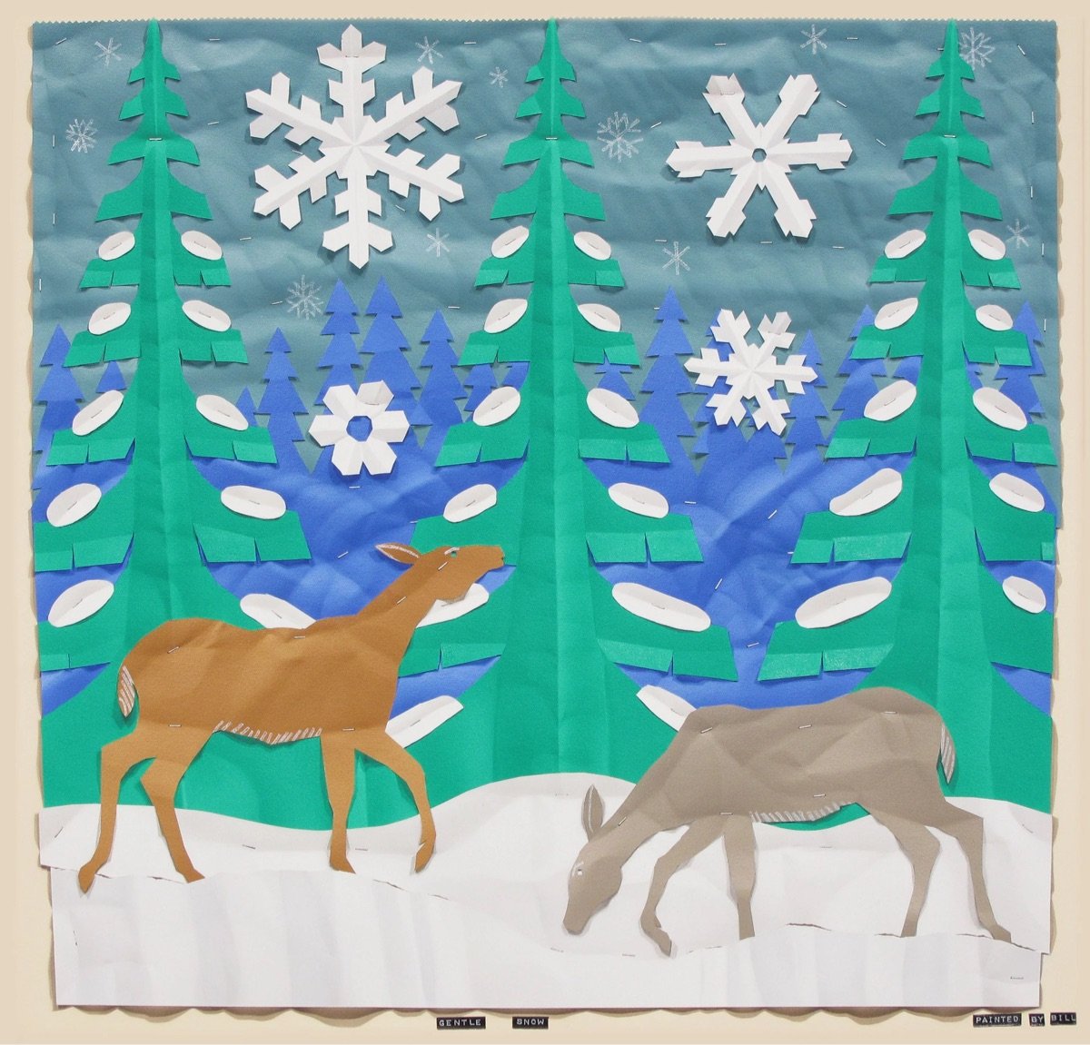
Bill Braun is a “trompe l’oeil painter” who creates paintings that look like paper craft, complete with visible paper folds, shadows, and even the “staples” holding the “paper” to the backing. What an incredible illusion. And I always enjoy an artist who is reticent to give an artist statement or explain their work:
I don’t like to give an artist statement because it undoes the premise of my work, trompe l’oeil painting. Literally from the French, trompe l’oeil means “trick the eye”. An artist’s statement might undo the fundamental aim of convincing the viewer, at least for a moment, that what he sees are actual objects and not a painting. The basic rules of trompe l’oeil painting are that objects are rendered in real scale, and totally within a shallow painted space. This type of painting has always been a minor branch of realist painting, but with a very long history. The Athenian painters Xeuxis and Parrhasios in 5th century B.C. (as told by Pliny the Elder in his Natural History) and Roman murals of the 2nd century A.D., 16th century Dutch vanitas painting and the 19th century Philadelphia School painters, Harnett, Peto and Haberle, are examples. Today there are still trompe l’oeil painters around; I am happy to be one of them.
(via tohippo)
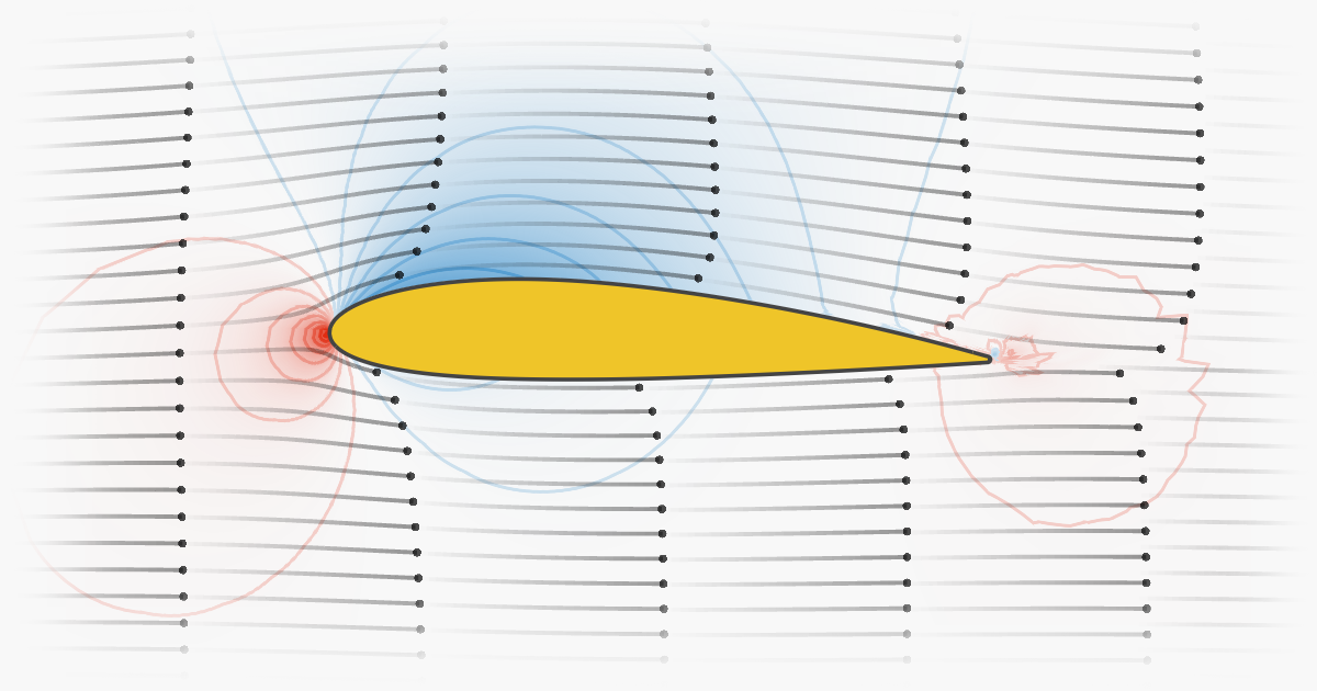
Wow, another amazing interactive explainer from Bartosz Ciechanowski; this one is about airfoils and how airplanes fly.
Ronan Farrow profiles RuPaul for the New Yorker. “He’s seen the way people connect to the show. That’s the way for him to spread the rebuttal to what’s happening in the world. His way to ward off the enemy.”
The Paradox of an Infinite Universe
Is the universe finite or infinite? If finite, what shape is it and how does that shape influence its overall size and properties? If it’s infinite, what meaning of “expanding” can be applied to it? I don’t know if this video provides any satisfying answers, but even being able to ponder these questions is thrilling.
Infinity gets much weirder though. As you travel with your spaceship in a straight line, you find new galaxies, stars and planets, new wonders, new weird stuff, probably new aliens and new lifeforms stranger than you could ever imagine. But after a long time, you might find the most special thing in the universe: Yourself. An exact copy of you watching this video right now.
How can that be? Well, everything in existence is made of a finite amount of different particles. And a finite number of different particles can only be combined in a finite number of ways. That number may be so large that it feels like infinity to our brains — but it is not really. If you have finite options to build things, but infinite space that is full of things in all directions forever, then it makes sense that by pure chance, there will likely be repetition.
How the Dutch Solved Street Design
Adam Yates travelled to Amsterdam to see how the Dutch have transformed the city and made it safer for people to get where they’re going more quickly. The phrase that grabbed me is:
Pedestrians, cyclists, and vehicles can all coexist without conflict, but only if they’re all going the same slow speed. This advances the principles of shared streets.
This is related to the Downs-Thomson paradox:
In simple terms, the Downs-Thomson paradox claims that traffic will increase without limit until the option of public transport (or any other form of transport) becomes faster than the equivalent trip by car. It draws the conclusion that people do not care whether they drive, walk, bike, or take the bus to any location — they just want to get from A to B in the fastest and most convenient way possible.
(via @marcprecipice)
“France on Monday enshrined the right to abortion in its constitution, a world first welcomed by women’s rights groups as historic.” The vote was 780 votes for and 72 against.
On the Reverse
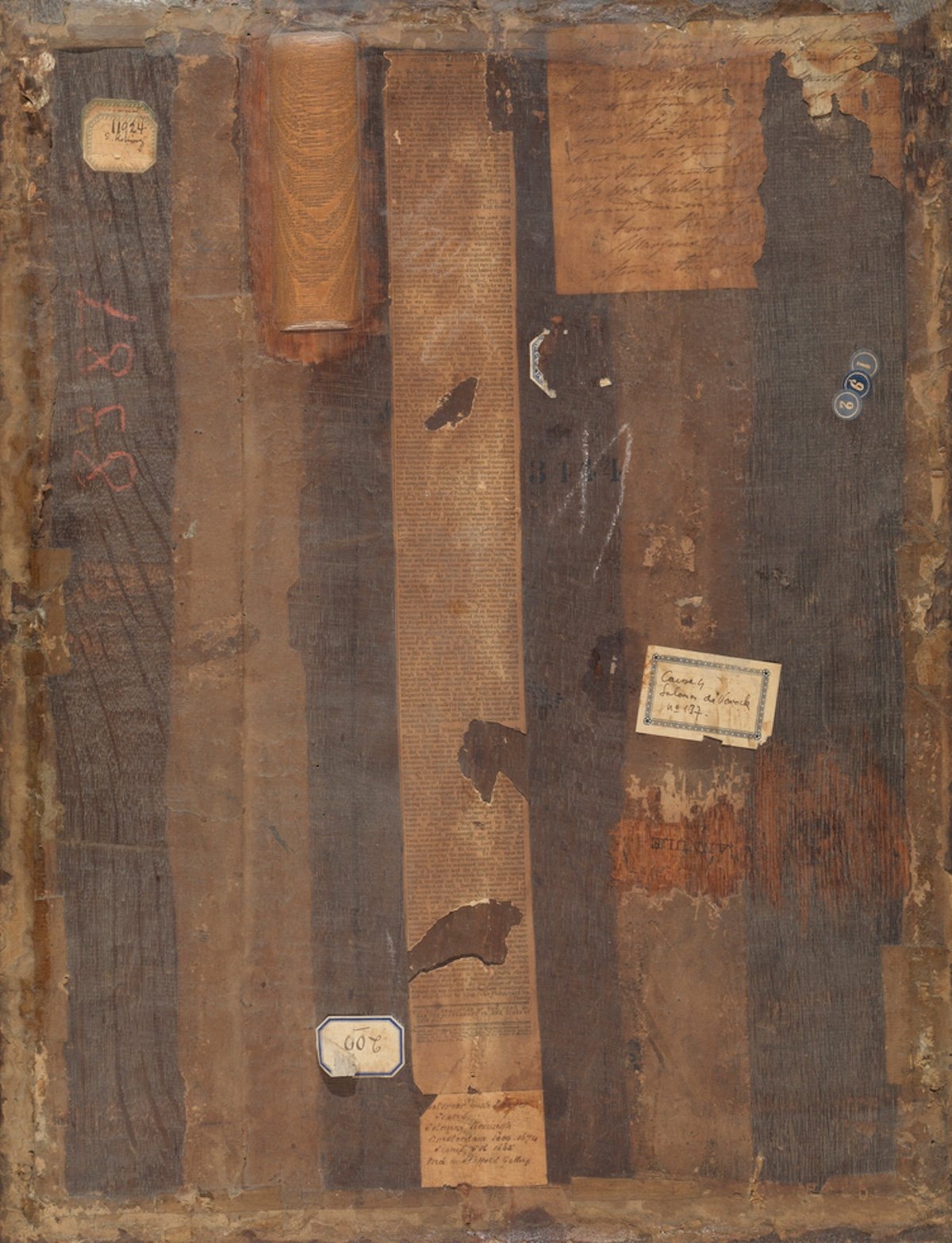


Madrid’s Museo Nacional del Prado recently put on an exhibition called On the Reverse that featured the backs of notable works of art.
This exhibition goes beyond the simple action of turning paintings around. Rather, the Museo del Prado is undertaking a complete reassessment of the backs of works in its collections while also identifying relevant examples in other major museums which reveal how appreciation of works of art is enhanced when we do more than just look at the front. The exhibition addresses issues that have never previously been brought together and in which there is also space for imaginative interpretations: the emergence of the reverse as a pictorial motif in two sub-genres: the self-portrait of the artist behind the canvas and the depiction of the picture back in trompe l’oeil; the poetic reading of the stretcher as a cross; two-sided paintings; the back as a field for experimentation and subjective expression; aesthetic appreciation of the material nature of the works, and the issue of the viewer seen from behind, which makes us aware of the particular spatial relationships that are generated by human interaction with art.
I once went with an artist friend to an art museum where they hung some of the paintings so you could see both sides of them at once, and she was often more interested in seeing the backs, where you could maybe see who owned the painting previously, etc.
Sadly, the show ended on March 3, but Hyperallergic has a good writeup.
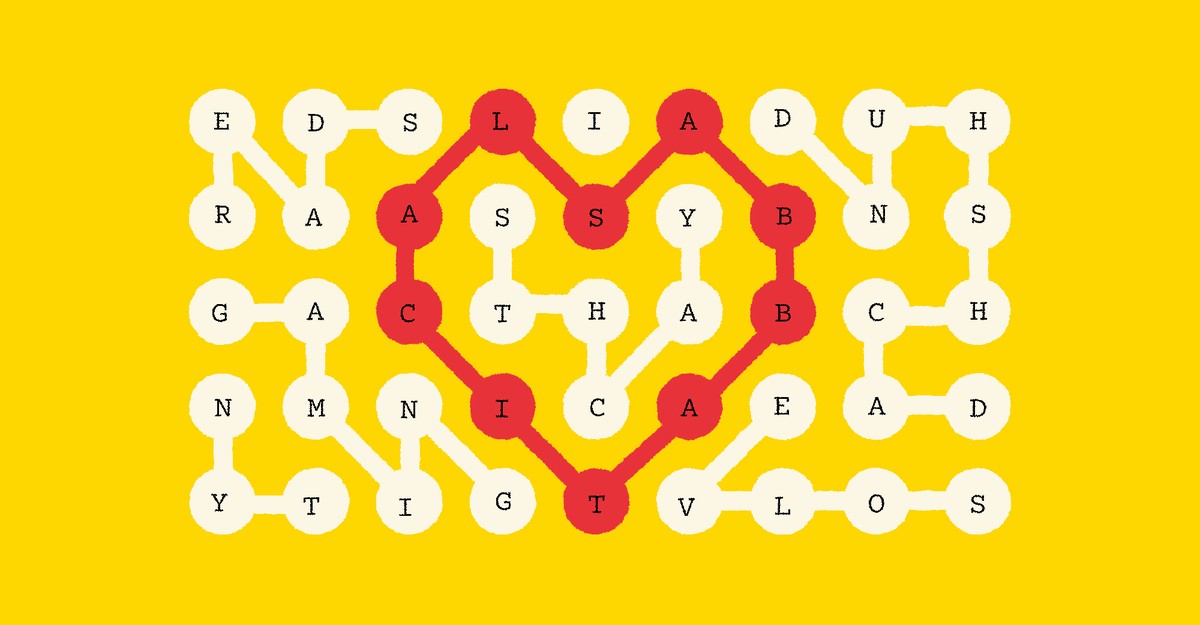
New puzzle game from the NY Times: Strands. It’s a theme-based word search. I like the wrinkle that finding non-theme words earns you hints.
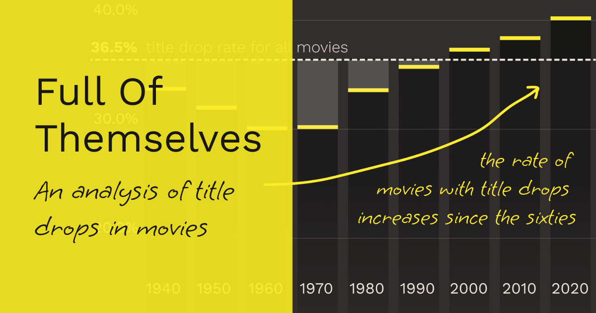
An amazing analysis of “title drops” (when a movie character says the name of a movie in the movie.) “There’s an average of 10.3 title drops per movie that title drops. If they do it, they really go for it.” (See: Barbie.)
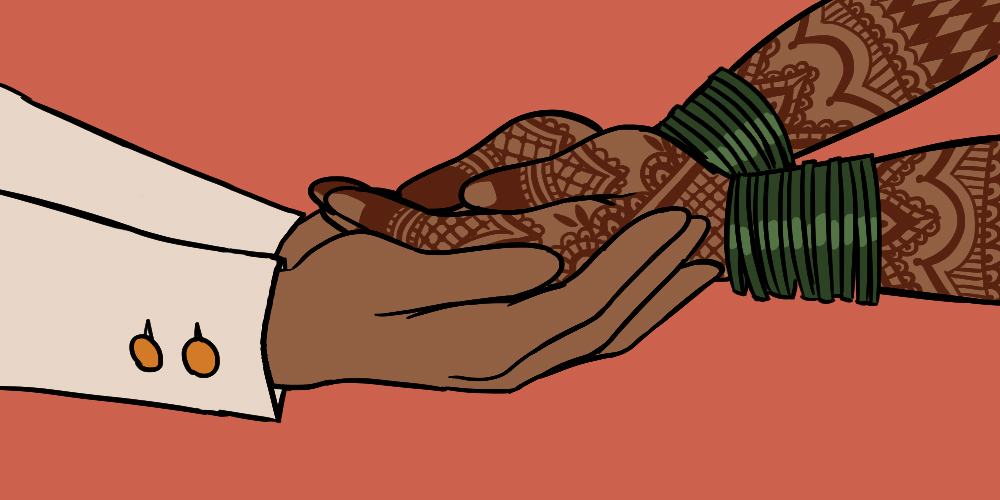
This essay on arranged marriage makes me wonder who my parents might have chosen for me & how that might’ve worked out.
How Jane Austen Changed Fiction Forever
Right from the start of her first book, Sense and Sensibility, Austen used an innovative narration technique called free indirect speech:
To understand why Austen’s narration is so distinct, the method and style of narration in which she wrote must be understood. Austen wrote in a little-known and not-often-used method of third-person narration called free indirect speech. Free Indirect Speech (FIS) is a distinct kind of third-person narration which seamlessly slips in and out of a character’s consciousness while still being presented by the third-person narrator.
In the video above, Evan Puschak explains, with examples, what free indirect speech is and why it was so revolutionary & influential when wielded by Austen.
Also, I didn’t know that Twain was such an Austen hater:
She also sparked dislike in such an extreme that Mark Twain once famously wrote that, when reading Pride & Prejudice, he wanted to dig up Austen and beat her with her own shin bone.
Team Austen over here.
A remembrance of legendary film scholar David Bordwell, who died recently at the age of 76. “Bordwell proved that the best way to be a cinephile is to be open to everything.” His blog (co-authored w/ his wife Kristin Thompson) was excellent.
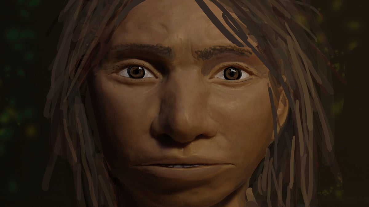
Denisovan humans were first discovered in 2010 but DNA gathered since then “offers a picture of remarkable humans”, showing that “from a behavioral perspective, they were much more like modern humans”.
The Supreme Court Must Be Stopped. “I think of the Supreme Court the way Batman thinks of Superman: an extremely powerful being who is untethered from the laws of physics and therefore must always be considered a threat to free society.”

Vogue: Fashion icon Iris Apfel has died at the age of 102. “I’m a total workaholic, but never in my wildest dreams did I think I would be a cover girl in my nineties.”

My Favorite Thing Is Monsters, Book Two
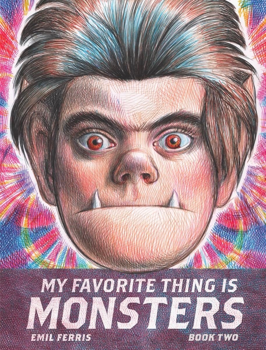
Publishers Weekly gave Emil Ferris’s eagerly anticipated graphic novel My Favorite Thing Is Monsters, Book Two a starred review, calling it “a triumph.” Yay! The book is due out May 28, but there’s a (wonderful) excerpt in the New Yorker, where the whole thing is called “well worth the wait.”
I’ll probably reread Book One to prepare, in case anyone wants to join me. I loved this book. (I also drew about it in my newsletter once!)
What movies have you most enjoyed in the past year? Pretentious Atomic Amadeus? Gently Insightful Immigration Throuple? Extreme Home Makeover: Fascism? Bright-Pink Masterpiece?
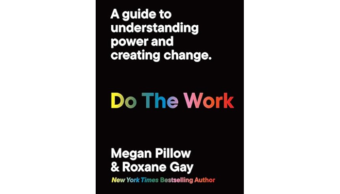
Do The Work: A guide to understanding power and creating change is a forthcoming book from Roxane Gay & Megan Pillow. “Challenge your biases and broaden your understanding of power and how we wield it with this essential guide.”
Kottke.org Redesigns With 2024 Vibes

Well. Finally. I’m unbelievably pleased, relieved, and exhausted to launch the long-awaited (by me) redesign of kottke.org today. Let’s dive right into what has changed and why.
{ Important: If the “logo” on the left/top is not circles and is squares/diamonds instead, you can update your browser to the latest version to see it how I intended. (Will be looking for a fix for this…) }
(Justified and) Ancient. The last time I redesigned the site, a guy named Barack Obama was still President. Since then, I’ve launched the membership program, integrated the Quick Links more fully into the mix, (more recently) opened comments for members, and tweaked about a million different things about how the site works and looks. But it was overdue for a full overhaul to better accommodate all of those incremental changes and, more importantly, to provide a solid design platform for where the site is headed. Also, I was just getting tired of the old design.
Back to the Future. In my post introducing the new comments system, I wrote about the potential for smaller sites like mine to connect people and ideas in a different way:
The timing feels right. Twitter has imploded and social sites/services like Threads, Bluesky, and Mastodon are jockeying to replace it (for various definitions of “replace”). People are re-thinking what they want out of social media on the internet and I believe there’s an opportunity for sites like kottke.org to provide a different and perhaps even better experience for sharing and discussing information. Shit, maybe I’m wrong but it’s definitely worth a try.
Before Facebook, Tumblr, Twitter, Instagram, and Snapchat came along and centralized social activity & output on the web, blogs (along with online diaries, message boards, and online forums) were social media. Those sites borrowed heavily from blogging — in the early years, there wasn’t much that those sites added in terms of features that blogs hadn’t done first. With the comments and now this redesign, I’m borrowing some shit back from the behemoths.
A social media design language has evolved, intelligible to anyone who’s used Twitter or Facebook in the past decade. Literally billions of people can draw what a social media post looks like on a napkin, show it to someone else from the other side of the world, and they’d say, “oh, that’s a post”. In thinking about how I wanted kottke.org to look and, more importantly, feel going forward, I wanted more social media energy than blog energy — one could also say “more old school blog energy than contemporary blog energy”. Blogs now either look like Substack/Medium or Snow Fall and I didn’t want to pattern kottke.org after either of those things. I don’t want to write articles — I want to blog.
Practically speaking, “social media energy” means the design is more compact, the type is smaller,1 the addition of preview cards for Quick Links, and the reply/share/???? buttons at the bottom of each post. But, it also still looks like a personal (old school) blog rather than a full-blown Twitter clone (I hope). I think this emphasis will become clearer as time goes on.
So What’s Different? I mean, you can probably tell for yourself what’s changed, but I’ll direct your eye to a few things. 1. Member login + easy account access for members on the top of every page. kottke.org has always been very much my site…but now it’s just a little bit more our site. 2. No more top bar (on desktop), so the content starts much higher on the page. 3. Most Quick Links have a preview card (also called an unfurl) that shows the title, a short description, and often an image from the link in question — the same as you’d get if someone sent you a link via text or on WhatsApp. 4. We’ve bid a fond farewell to the Whitney typeface and welcomed Neue Haas Unica into the fold. 5. IMO, the design is cleaner but also more information dense, reflecting the type of blogging I’d like to do more of. 6. Dark mode! There’s no toggle but it’ll follow your OS settings.
Billions and Billions. kottke.org has (famously?) never had a logo. I’ve never wanted one thing to represent the site — in part because the site itself is all over the place and also because it’s fun to switch things up every once in awhile. Instead, I’ve always gone for a distinctive color or gradient that lets readers know where they are. This time, I’ve opted for a series of circles — a friend calls them “the planets” — but with a twist. There are 32 images, each with 4 different hues and 8 different rotations, that can slot into the 4 available spaces…and no repeats. By my calculations (corrections welcome!), there are over 900 billion different permutations that can be generated, making it extremely unlikely that you’ll ever see the same exact combo twice. Even if, like last time, this design lasts for almost eight years.
Gimme the Goods. The tiny collection of kottke.org t-shirts has its own page on the site now. The Hypertext Tee based on the previous design will be offered only for another few weeks and then probably be retired forever. To be replaced with…TBD. 😉
Winnowing Down. Last time I redesigned, I went back and modified the template of every page on the site, even stuff from the late 90s and early 00s that no one actually remembers. This time around, I’m focusing only on the core site: blog posts from 1998-present, tag pages, membership, and the few pages you can get to from the right sidebar. The rest of the site, mostly pages deep in the archive that see very little (if any) traffic, are going to stick with the old design, effectively archived, frozen in digital amber. We wish those old pages well in their retirement.
So yeah, that’s kind of it for now. There is so much left to do though! The comments need some lovin’, some social media things need tightening up, the about page could use some tuning, the newsletter needs a visual refresh, a few other small things need doing — and then it’s on to the next project (which I haven’t actually decided on, but there are several options).
I’m happy to hear what you think in the comments, on social media, or via email — feedback, critique, and bug reports are welcome. Now, if you’ll excuse me, I have not taken a full day off from the site since late December (including weekends), so I’m going to go collapse into a little puddle and sleep for about a week.
- If you’d like the text bigger, you can adjust the size using your browser’s zoom controls (cmd + & cmd -). This is what I do for viewing Instagram on my desktop web browser — 150% is the way to go…the photos are teensy otherwise. (I adjust Daring Fireball and Threads too.) The browser even remembers your settings for a site between visits…you only have to adjust it once.↩
Socials & More