Kottke.org Redesigns With 2024 Vibes
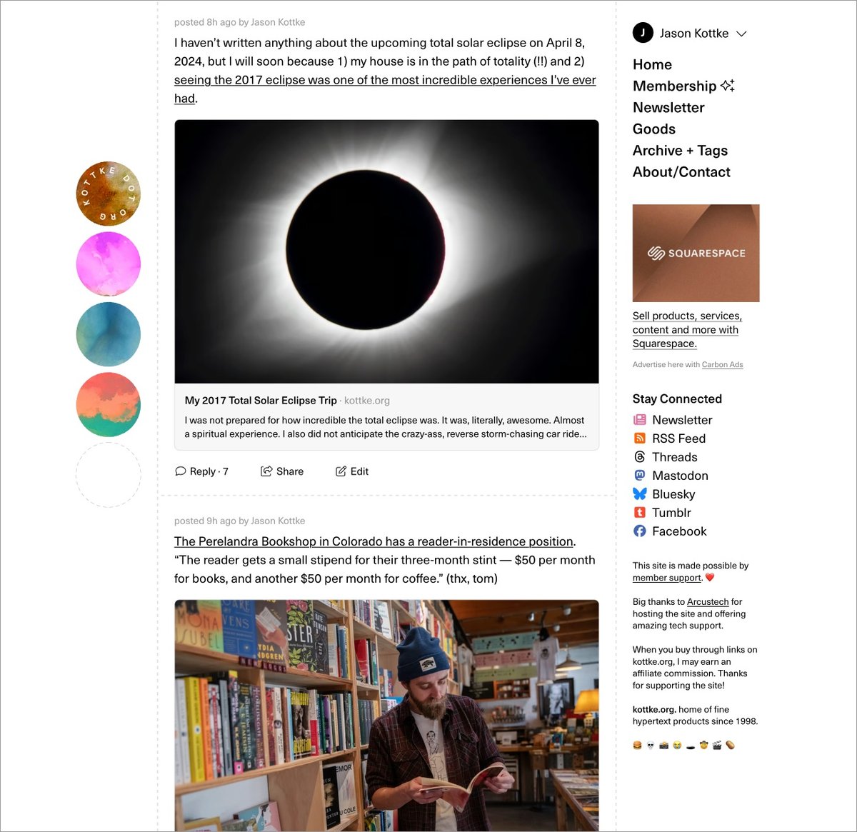
Well. Finally. I’m unbelievably pleased, relieved, and exhausted to launch the long-awaited (by me) redesign of kottke.org today. Let’s dive right into what has changed and why.
{ Important: If the “logo” on the left/top is not circles and is squares/diamonds instead, you can update your browser to the latest version to see it how I intended. (Will be looking for a fix for this…) }
(Justified and) Ancient. The last time I redesigned the site, a guy named Barack Obama was still President. Since then, I’ve launched the membership program, integrated the Quick Links more fully into the mix, (more recently) opened comments for members, and tweaked about a million different things about how the site works and looks. But it was overdue for a full overhaul to better accommodate all of those incremental changes and, more importantly, to provide a solid design platform for where the site is headed. Also, I was just getting tired of the old design.
Back to the Future. In my post introducing the new comments system, I wrote about the potential for smaller sites like mine to connect people and ideas in a different way:
The timing feels right. Twitter has imploded and social sites/services like Threads, Bluesky, and Mastodon are jockeying to replace it (for various definitions of “replace”). People are re-thinking what they want out of social media on the internet and I believe there’s an opportunity for sites like kottke.org to provide a different and perhaps even better experience for sharing and discussing information. Shit, maybe I’m wrong but it’s definitely worth a try.
Before Facebook, Tumblr, Twitter, Instagram, and Snapchat came along and centralized social activity & output on the web, blogs (along with online diaries, message boards, and online forums) were social media. Those sites borrowed heavily from blogging — in the early years, there wasn’t much that those sites added in terms of features that blogs hadn’t done first. With the comments and now this redesign, I’m borrowing some shit back from the behemoths.
A social media design language has evolved, intelligible to anyone who’s used Twitter or Facebook in the past decade. Literally billions of people can draw what a social media post looks like on a napkin, show it to someone else from the other side of the world, and they’d say, “oh, that’s a post”. In thinking about how I wanted kottke.org to look and, more importantly, feel going forward, I wanted more social media energy than blog energy — one could also say “more old school blog energy than contemporary blog energy”. Blogs now either look like Substack/Medium or Snow Fall and I didn’t want to pattern kottke.org after either of those things. I don’t want to write articles — I want to blog.
Practically speaking, “social media energy” means the design is more compact, the type is smaller,1 the addition of preview cards for Quick Links, and the reply/share/???? buttons at the bottom of each post. But, it also still looks like a personal (old school) blog rather than a full-blown Twitter clone (I hope). I think this emphasis will become clearer as time goes on.
So What’s Different? I mean, you can probably tell for yourself what’s changed, but I’ll direct your eye to a few things. 1. Member login + easy account access for members on the top of every page. kottke.org has always been very much my site…but now it’s just a little bit more our site. 2. No more top bar (on desktop), so the content starts much higher on the page. 3. Most Quick Links have a preview card (also called an unfurl) that shows the title, a short description, and often an image from the link in question — the same as you’d get if someone sent you a link via text or on WhatsApp. 4. We’ve bid a fond farewell to the Whitney typeface and welcomed Neue Haas Unica into the fold. 5. IMO, the design is cleaner but also more information dense, reflecting the type of blogging I’d like to do more of. 6. Dark mode! There’s no toggle but it’ll follow your OS settings.
Billions and Billions. kottke.org has (famously?) never had a logo. I’ve never wanted one thing to represent the site — in part because the site itself is all over the place and also because it’s fun to switch things up every once in awhile. Instead, I’ve always gone for a distinctive color or gradient that lets readers know where they are. This time, I’ve opted for a series of circles — a friend calls them “the planets” — but with a twist. There are 32 images, each with 4 different hues and 8 different rotations, that can slot into the 4 available spaces…and no repeats. By my calculations (corrections welcome!), there are over 900 billion different permutations that can be generated, making it extremely unlikely that you’ll ever see the same exact combo twice. Even if, like last time, this design lasts for almost eight years.
Gimme the Goods. The tiny collection of kottke.org t-shirts has its own page on the site now. The Hypertext Tee based on the previous design will be offered only for another few weeks and then probably be retired forever. To be replaced with…TBD. 😉
Winnowing Down. Last time I redesigned, I went back and modified the template of every page on the site, even stuff from the late 90s and early 00s that no one actually remembers. This time around, I’m focusing only on the core site: blog posts from 1998-present, tag pages, membership, and the few pages you can get to from the right sidebar. The rest of the site, mostly pages deep in the archive that see very little (if any) traffic, are going to stick with the old design, effectively archived, frozen in digital amber. We wish those old pages well in their retirement.
So yeah, that’s kind of it for now. There is so much left to do though! The comments need some lovin’, some social media things need tightening up, the about page could use some tuning, the newsletter needs a visual refresh, a few other small things need doing — and then it’s on to the next project (which I haven’t actually decided on, but there are several options).
I’m happy to hear what you think in the comments, on social media, or via email — feedback, critique, and bug reports are welcome. Now, if you’ll excuse me, I have not taken a full day off from the site since late December (including weekends), so I’m going to go collapse into a little puddle and sleep for about a week.
- If you’d like the text bigger, you can adjust the size using your browser’s zoom controls (cmd + & cmd -). This is what I do for viewing Instagram on my desktop web browser — 150% is the way to go…the photos are teensy otherwise. (I adjust Daring Fireball and Threads too.) The browser even remembers your settings for a site between visits…you only have to adjust it once.↩

Comments 93
thread
latest
popular
Congrats on the new design!
If you'd like to see what the site has looked like in the past, check it out.
What a trippy ride down memory lane!
I love the new design. It feels retro in a great way.
Well, there seems to be a massive bug on some of the archive pages. Doing what I can to chase it down here...
Ok, massive bug fixed (I hope). It's always a joy to launch something and most of it is ticking along like a finely tuned watch but in the background there's a backfiring jalopy with a loose timing belt and IT'S ALL YOU CAN HEAR.
Looks awesome, Jason. Especially liking your choice of Unica. Very readable and it just feels right.
I love the "planets"! All your points are well taken. It feels fresh and established all at once.
Congrats, looks fresh!
Looks stunning.
The “non-logo” is a little delight.
F5, F5, F5… :)
Looks great! It reminds me of the old Blogger days (which is a compliment). It feels like a trusty blanket.
I 🥔 the emoji tag easter eggs!
Sames! It's all so wonderful but that bit is extra good (along with clicking the circles)!
Congratulations!
Very nice, if a bit jarring for someone very used to the "old" version (though I vaguely recall feeling similarly 8 years ago the last time things changed)....
The thing with a tell about yourself for members should have a link in the right rail list. Please have an option to hide both/all side rails and read only the content, the should be possible with CSS and a toggle button, you can even have the toggle button count how much people use it!! The 4 dots on the left are pretty but lot of wasted white space below them, please make them a lot smaller and put them across the top and move the right rail to the left. Basically anything that removes the wasted left and right white space is good. :) :)
You say wasted... I say relaxing and pleasant space to rest my eyes. :)
Apart from the initial pang of loss from missing the cosmic rainbow header, I love the redesign, particularly on the phone where the eclipsing planets read on the top of the page.
In a traditional web browser, I’m not sure I’m as convinced by the orbs on the left side and agree there might be a benefit to removing the left side bar as it chops up the content (right side I’m used to and is not the first thing I see). Ha, the drawbacks of the comments section finally arrives! Said with love and mad props for your great vision of the site.
This is sharp and looks excellent in dark mode on my huge desktop monitor. Congrats!
It looks great! But more, it feels like you’re bringing us all along on a new venture, which started with the comments. It’s exciting!
What a great way to put it. I agree!
Looks great!
Looks great! It's like the early 2000s, but modern. The only bug I've noticed, is that if you enlarge the text, it messes up the kottke dot org text in the "logo". Only seems to happen in Safari, though.
Thanks, Nat. I'll take a look at that.
Wait, there more to this site than the RSS feed?!?!?!
Looks nice, congrats.
All white, simple lines...I can't help but notice some similarities to my preferred WordPress template on mccorkindale.com. So thumbs up from me, apparently.
Always surprised & delighted by your thoughtful redesigns. Would love a toggle for Light/Dark mode. Or at least a Dark mode that isn't pitch black?
I love it! The Stay Connected icons are so cute. Remind me of all the sidebar stuff we used to throw into Movable Type.
Congratulations on the launch! I love it - both the look and the ethos behind it. It's also giving me major nostalgia - I had a LiveJournal layout that randomized its color scheme. This gives the same playful vibes but much cooler.
Congrats! looks great!
Could I ask for a dark/light theme toggle please ? your dark theme is too high contrast for my aging eyes and my system is set to dark mode, so I'd love to be able to switch the site to "light".
Thanks for taking it into consideration!
Ok, that's at least two votes for a dark/light mode toggle. I'm gonna look at that and/or perhaps decreasing the contrast on dark mode. Thanks for the feedback!
Lighter would be good.
Not an official request since I hate making work for people, but once there is a toggle it seems like a good opportunity for a light/dark/dim option similar to what bluesky recently added (and has been done elsewhere).
I am unfamiliar with light/dark/dim. Gonna check that out!
Looks very contemporary but classic at the same time. Congrats on finding that balance. Chiming in here as a +1 for a dark-mode toggle. I probably read this site mostly in an RSS reader anyway but it would be nice to have that control when I do visit the site.
Also chiming in for a dark mode toggle! Or at least a mid-gray mode or something. The redesign looks great but I spent like 10 minutes hunting for this option within the site, and then within my browser and extensions, before realizing it probably didn't exist and was a universal dark mode.
Congrats on the refresh! I’m really enjoying the redesign and I’m very aware of how hard it is to make a good dark theme, but I’d like to add my vote for some kind of toggle as a future feature. I’m finding the dark mode on my phone a bit harsh on my old eyes.
Hi Jason! Congrats - just a heads up, the navigation outside of the main scroll is tricky to get to if someone is a keyboard only user (folks with mobility issues, etc). Someone with a screen reader could figure it out, but if you're only using the keyboard to navigate, you have to tab allllll the way down the main page before you get to the right or left nav.
Thanks for flagging this. Will do some research into this and see what I can come up with for a solution.
A hidden "skip" link at the top of the page that only shows up when someone presses tab is a pretty common convention. Usually it's to skip the top navigation and go straight to the article content, but I've been seeing "skip menus" lately with multiple links, one being an option to go directly to the footer.
Love it.
Still getting a feel for the new look! One thing that's happening that I'm not quite understanding is that the timestamp (at least on the top post) flickers and changes every time I load up the main page of kottke.org.
You can see what I mean in this screenshot: https://i.ibb.co/ZNY9Hjy/Timestamp.jpg
For about a second, I see the top version, which spells out the absolute date and time in full. But then it quickly switches to the bottom version, which displays a relative time. (I had to screenshot very quickly to get the top version!)
Is there a reason for this shift? Or is it a possible bug?
I'm not a fan of the "circles logo", or rather, of how big and static it is. My default laptop browser width leaves the content part of the window as about 1/3 of the total width, with the circles next to it and starting 1/4 down the page, with vast swaths of white to the left and right. As I scroll the page, the circles remain in place, a huge blotch of color that pulls a huge chunk of my visual focus away from the content that I am scanning to find what I want to read for the day.
A smaller logo once I leave the top of the page might be better. A logo anchored to the top rather than 1/4 down the page from the top might be better. But right now, it's damn annoying.
I like the big colorful stake in the ground aspect, though it's possible in a month I might not want to see it anymore. Maybe along the lines of the randomness of the images, it could link to random content tags or something that gets people into the archives?
Yes, I'm also expecting "click on separate visual items does separate activities" — there are five circles there, but they all go to the same place. Makes it feel, I don't know, unplanned or unfinished?
I've been reading Kottke.org almost daily since 2001-ish, and i had a momentary panic when the page loaded i thought maybe... you were gone. But you aren't, and the improvements are great, and I'm looking forward to whatever creative thing people do with all the 'planet permutations' they see. (I kind of want to collect them and make a mosaic?)
WELL DONE, Jason!! Enjoy your puddle!
I love a good site redesign – they break my brain in the best ways, and this one is especially brain-breaking.
Also, your "(Justified and) Ancient" header inspired me to make sure you've read John Higgs' "The KLF: Chaos, Magic, and the Band Who Burned a Million Pounds"; it's extremely interesting, even if you don't have any idea who the KLF are/were.
+1 for the Higgs book. Super interesting
Congrats Jason, looks great. 🚀
loving the redesign! I just think the fifth empty circle in the desktop version looks weird - why is it there?
I considered that it might be deliberate; maybe some representation of the future unknown: the yet to come. But maybe it's just a stray placeholder.
"I don’t want to write articles — I want to blog."
yesssssssssssss
also site looks amazing, and the logo is dooooppeeeeeeee
Where the BLOGROLL go at?
I was just thinking that one of the things I miss about early 2000s blogging is the blogroll. Jason already does occasional 'this is what i'm reading' posts, and links to articles from friends... i kinda want those sources all summarized as a blogroll, for nostalgia's sake!
So rad dude
I thought for a moment I was on the wrong site. Can't wait to spend some time with it.
Cheers on the update! Hope your well-earned rest is excellent.
Looks so good!
Looks amazing! Congrats on the launch!
Looks fantastic, congrats on the new design!
Congrats, the redesign looks very clean and fresh!
Amazing —congratulations! I like the attention to all the details, and I'm excited to explore it further.
Congratulations on the launch! It makes me a little tempted to read more often in its intended format as opposed to a reader, so let's see how that goes!
Ah! I love that it's a blogging-ass blog, not a Snow Fall Lite. (Worst thing about my site right now is that I'm still giving off those kinds of vibes so it's hard to write short stuff.) You're raising the bar again, though I do wish the planets were in the favicon too. But great work all around, especially with the emoji tag discovery.
Congrats, Jason! My first comment the site after lurking for way too long. I love that the design remains clean and accessible. The circle-combo idea is very cool, though I admit I miss the colorful header of the old site. That said, I will still read every day and remain thankful that you have a great RSS feed.
Nice! Here's to another eight years.
One suggestion, which I immediately looked for and couldn't find: a list of my recent comments, maybe in that account dropdown in the top right. I often leave a comment and then completely forget what is was on, so being able to see them and check for replies would be nice.
Gorgeous.
The "dotted-hash-outline" is back (like it's 2000 all over again)!
What a miraculous time we live in. Thanks, Jason, for staying true and becoming truer as time goes by. I am so grateful for your voice and eye.
Love it. Perfectly bizarre and beautiful and usable.
Looks great!
Love. Love. Love. And I truly hope the Goods section will feature a t-shirt (or 32) with a shirt for each planet. I probably wouldn't buy all 32, but I would buy 1.
Congrats! It threw me at first - like, where am I? - but once I realized I was still on this beloved site, I dug the new look.
HOLY FUCKING SHIT THIS IS HUUUUGE. 🤘🤘🤘🤘🤘
Congrats!!
Kudos on the new design!
Hopefully constructive, but font size vs line height and landscape iPad reading is tough for me (no fun getting old).
Appreciate the cleanliness and white space, but reminds me a bit of the old 800x600 or even 1024x768 design constraints a bit…
I like the new design. I was taken aback the first time I loaded because I did not see a banner up top. I kept tapping the top of the browser in my iPad. Once I understood, I was fully on board.
I like the clean font, the layout, and the idea of the logo with the 4 circles on the side. Like others, I would like a toggle for light/dark mode.
And I would like to have a way to check the replies I made, and whether someone commented on them.
Did I miss it, or no one talked about the 5th empty circle with a dotted line?! What's up with that?
same re: the empty circle!
Wow. I just checked the site on the phone, and it’s very different from the iPad or the desktop. Four dotes on the top, no whitespace on the side. Interesting look, I really like it.
No empty circle on the phone version, either!
Mystery circle... 🪄🦄🔮
Wow! It looks great! I've never really cared about the site re-designs in the past, but this one is striking. I almost always read via RSS, but this is compelling. Solid work.
I love this! Also delighted that Kottke.org is still made with Moveable Type. MT was my first and favorite CMS.
I utterly love everything about this redesign, especially the variability of the circles. I hope you’re having the most chill weekend, Jason!
I’m loving the Apple touch icon. Well done!
This is so good! Absolutely love the planets — I'll admit to just sitting here reloading over and over again to see new ones.
The new favicon is gorgeous Jason… great work!
Was clicking the non-logo for 5 minutes with delight before I read your explanation. Great design choice.
I hate to be Tufte-esque in a sea of good vibes, but...
I don't love the dashed lines boxing the content. I find it in general a little busy and a little less intuitive but that might be a change-bias. Perhaps a little more font size differentiation? The circles are a little confusing and the spacing of the "ORG" and "KOTTKE" a little tight.
Just a quick share that this looks amazing. I remember trying to figure out how to best integrate tweet-like posts years ago in our fledgling failure of a website. We called them asides. Yours look so good. So does everything else. Well done!
Hello all. Thanks so much for the kind words, gentle critiques, and bug reports. I just pushed a bunch of updates, fixes, and changes, including
And a bunch of other little things. *phew*
Reporting in from Safari here - looks amazing, thank you so much for taking in all the feedback so quickly!
I know I'm probably a veryyyyy small portion of users, but the CSS styling is not working on Firefox. The background is not scrolling correctly with the page. Toggling between dark and light doesn't work. There are probably other things but those two are the most glaring on Firefox right now.
Just today I finally started fiddling with new dark/light mode switch and discovered the Star Wars easter egg icon. Nice touch, and I can't believe nobody else commented on it yet, @Jason! (Dang it, @names don't work in Comments yet!)
Are the circles/planets on kottke.org not working, or is there a specific reason that I missed why they're all lime green?
I think he changed those recently to pay homage to the old Kottke colors of yesteryear to celebrate his 25th Kottke anniversary.
Hello! In order to comment or fave, you need to be a current kottke.org member. If you'd like to sign up for a membership to support the site and join the conversation, you can explore your options here.
Existing members can sign in here. If you're a former member, you can renew your membership.
Note: If you are a member and tried to log in, it didn't work, and now you're stuck in a neverending login loop of death, try disabling any ad blockers or extensions. Or try logging out and then back in. Still having trouble? Email me!
In order to comment or fave, you need to be a current kottke.org member. Check out your options for renewal.
If you feel like this comment goes against the grain of the community guidelines or is otherwise inappropriate, please let me know and I will take a look at it.
This thread is closed for new comments & replies. Thanks to everyone for participating!