kottke.org posts about web development
Tim Carmody has a great appreciation of HTML in Wired magazine: HTML Is Actually a Programming Language. Fight Me.
HTML is somehow simultaneously paper and the printing press for the electronic age. It’s both how we write and what we read. It’s the most democratic computer language and the most global. It’s the medium we use to connect with each other and publish to the world. It makes perfect sense that it was developed to serve as a library — an archive, a directory, a set of connections — for all digital knowledge.
I love HTML!
Well. Finally. I’m unbelievably pleased, relieved, and exhausted to launch the long-awaited (by me) redesign of kottke.org today. Let’s dive right into what has changed and why.
{ Important: If the “logo” on the left/top is not circles and is squares/diamonds instead, you can update your browser to the latest version to see it how I intended. (Will be looking for a fix for this…) }
(Justified and) Ancient. The last time I redesigned the site, a guy named Barack Obama was still President. Since then, I’ve launched the membership program, integrated the Quick Links more fully into the mix, (more recently) opened comments for members, and tweaked about a million different things about how the site works and looks. But it was overdue for a full overhaul to better accommodate all of those incremental changes and, more importantly, to provide a solid design platform for where the site is headed. Also, I was just getting tired of the old design.
Back to the Future. In my post introducing the new comments system, I wrote about the potential for smaller sites like mine to connect people and ideas in a different way:
The timing feels right. Twitter has imploded and social sites/services like Threads, Bluesky, and Mastodon are jockeying to replace it (for various definitions of “replace”). People are re-thinking what they want out of social media on the internet and I believe there’s an opportunity for sites like kottke.org to provide a different and perhaps even better experience for sharing and discussing information. Shit, maybe I’m wrong but it’s definitely worth a try.
Before Facebook, Tumblr, Twitter, Instagram, and Snapchat came along and centralized social activity & output on the web, blogs (along with online diaries, message boards, and online forums) were social media. Those sites borrowed heavily from blogging — in the early years, there wasn’t much that those sites added in terms of features that blogs hadn’t done first. With the comments and now this redesign, I’m borrowing some shit back from the behemoths.
A social media design language has evolved, intelligible to anyone who’s used Twitter or Facebook in the past decade. Literally billions of people can draw what a social media post looks like on a napkin, show it to someone else from the other side of the world, and they’d say, “oh, that’s a post”. In thinking about how I wanted kottke.org to look and, more importantly, feel going forward, I wanted more social media energy than blog energy — one could also say “more old school blog energy than contemporary blog energy”. Blogs now either look like Substack/Medium or Snow Fall and I didn’t want to pattern kottke.org after either of those things. I don’t want to write articles — I want to blog.
Practically speaking, “social media energy” means the design is more compact, the type is smaller,1 the addition of preview cards for Quick Links, and the reply/share/???? buttons at the bottom of each post. But, it also still looks like a personal (old school) blog rather than a full-blown Twitter clone (I hope). I think this emphasis will become clearer as time goes on.
So What’s Different? I mean, you can probably tell for yourself what’s changed, but I’ll direct your eye to a few things. 1. Member login + easy account access for members on the top of every page. kottke.org has always been very much my site…but now it’s just a little bit more our site. 2. No more top bar (on desktop), so the content starts much higher on the page. 3. Most Quick Links have a preview card (also called an unfurl) that shows the title, a short description, and often an image from the link in question — the same as you’d get if someone sent you a link via text or on WhatsApp. 4. We’ve bid a fond farewell to the Whitney typeface and welcomed Neue Haas Unica into the fold. 5. IMO, the design is cleaner but also more information dense, reflecting the type of blogging I’d like to do more of. 6. Dark mode! There’s no toggle but it’ll follow your OS settings.
Billions and Billions. kottke.org has (famously?) never had a logo. I’ve never wanted one thing to represent the site — in part because the site itself is all over the place and also because it’s fun to switch things up every once in awhile. Instead, I’ve always gone for a distinctive color or gradient that lets readers know where they are. This time, I’ve opted for a series of circles — a friend calls them “the planets” — but with a twist. There are 32 images, each with 4 different hues and 8 different rotations, that can slot into the 4 available spaces…and no repeats. By my calculations (corrections welcome!), there are over 900 billion different permutations that can be generated, making it extremely unlikely that you’ll ever see the same exact combo twice. Even if, like last time, this design lasts for almost eight years.
Gimme the Goods. The tiny collection of kottke.org t-shirts has its own page on the site now. The Hypertext Tee based on the previous design will be offered only for another few weeks and then probably be retired forever. To be replaced with…TBD. 😉
Winnowing Down. Last time I redesigned, I went back and modified the template of every page on the site, even stuff from the late 90s and early 00s that no one actually remembers. This time around, I’m focusing only on the core site: blog posts from 1998-present, tag pages, membership, and the few pages you can get to from the right sidebar. The rest of the site, mostly pages deep in the archive that see very little (if any) traffic, are going to stick with the old design, effectively archived, frozen in digital amber. We wish those old pages well in their retirement.
So yeah, that’s kind of it for now. There is so much left to do though! The comments need some lovin’, some social media things need tightening up, the about page could use some tuning, the newsletter needs a visual refresh, a few other small things need doing — and then it’s on to the next project (which I haven’t actually decided on, but there are several options).
I’m happy to hear what you think in the comments, on social media, or via email — feedback, critique, and bug reports are welcome. Now, if you’ll excuse me, I have not taken a full day off from the site since late December (including weekends), so I’m going to go collapse into a little puddle and sleep for about a week.

Believe it or not, the image above was made using only HTML & CSS by developer Diana Smith. It’s coded by hand and built for Chrome — you can check it out here. The source code and accompanying CSS is not as extensive as you might think.
As Andy Baio notes, Smith’s creations render less well in other browsers. Who knew Internet Explorer 8 for Windows 7 was a Cubist master?
You can view several other of Smith’s creations here, here, and here.
See also Tatsuo Horiuchi, the Excel Spreadsheet Artist. (via waxy)

For the first time in more than four years, kottke.org is sporting a new design this morning. Since you should never launch anything completely finished,1 there are probably still some things that need to be ironed out, but I hope most of it works. (Drop me a note if you notice something amiss?) Let’s hop right into what’s new and why. (For reference, here’s what the site looked like until late yesterday, here’s what I said about that design, and here’s what some of the previous designs looked like.)
Design. Gone is the now-beloved blue gradient (which ppl didn’t like when I introduced it), replaced with a colorful rainbow banner thingie. The site title and the old school tagline — “home of fine hypertext products” — are both making a comeback. The march toward simplicity continues…every remaining design element serves a purpose. The type is a bit bigger to offset ever increasing display resolutions (which somewhat paradoxically makes everything smaller). Post titles are quite a bit larger. Media embeds and images are much larger, especially if it’s right at the top of the post. Check out this post and this one for examples of what I’m talking about. Tweaked the footnote style.2 More tweaks to come. (Including moving to some even faster new servers at Arcustech, the fantastic hosts of kottke.org for years now. Big thanks to them for all their support!)
The layout of the site is responsive — not fully so, but if you resize your browser window, it’ll change and flow and do all of the neat things that responsive design does. The type is still my favorite Whitney ScreenSmart by Hoefler & Co (designed by Tobias Frere-Jones), but I finally (FINALLY!!!) turned on smart quotes and such — you know, like “opening and closing quotes around this text” and apostrophes’ apostrophes and the proper m-dash right heeeeeere — so now the designers who read the site can finally stop tutting about it. (And Hoefler and Frere-Jones can stop tearing their hair out about seeing text rendered with their point-perfect typeface littered with dumb quotes. Enjoy your tresses, fellows!)
Mobile. This was the main impetus behind the redesign. Over 40% of you read kottke.org on a mobile device of some kind. The old site worked fine on phones and tablets, but not great. Now, the site looks and works great on mobile. (At least I think it does.)
Tags. Some of my favorite things about kottke.org are the tags and tag pages. Looking at the site through the lens of tags, it becomes apparent that kottke.org is actually a collection of hundreds of small blogs about introversion, Stanley Kubrick, time travel, early color photography, economics, crying at work, and all sorts of other things. For the redesign, I made them more visible on the site and I’m hoping to find more ways to improve their involvement in the site soon. You’ll now find tags at the end of posts no matter where you find them on the site; previously they were only on the individual post pages. Tag pages are now paginated so you can go back through hundreds and even thousands of posts on each topic. I’ve also included a list of related tags at the top of each tag page…which is incredibly addictive for surfing around aimlessly.
Biography. With the help of some friends (aka the kottke.org board of advisors), I rewrote the about page. I liked the brevity of the old version, but in the words of one friend, “the previous version undersold the site so much it was almost inaccurate”. This is the first bio I’ve ever written that takes seriously what the site is and what I’ve done in my career…and as such it makes me really uncomfortable. Taking credit, particularly in public, has never been my thing. But I wanted to have a chance at explaining kottke.org to people who might not know the whole story. Everyone here has an opinion about kottke.org, this is mine.
When I started the site in 1998, people expressing their ideas & beliefs through links and attempting to stitch technology & the liberal arts together were not commonplace pursuits. In many ways, media on the web has come to resemble, in form and function, what kottke.org and other early blogs were doing back then. The largest social media companies in the world are now centered around people collecting and showing each other cool/interesting/funny links in order to say something about what they believe. I’m proud that kottke.org and I have played a role in that (r)evolution.
Future. The past 2.5 years have been the most challenging out of the 18+ years I’ve been doing the site. (Translation: they sucked.) I’ve been working, with many loooong periods of inactivity, on this redesign for more than 2 years. It’s not a cure for cancer or the world’s best design work, but to have it finally be out in the world feels amazing. Like a bad chapter in my life is ending. Like I’m still alive. Vital. A start of something. Like I’m finally investing in myself and my future for the first time in a long while. It feels like hope. And I hope you like it. It’s a genuine pleasure being able to share myself with you like this, and I don’t know what I’d do without it.
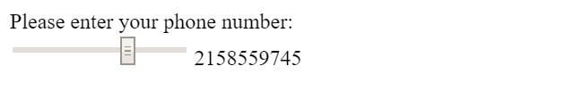
Stelian Firez recently shared a really boneheaded web form for entering your phone number:
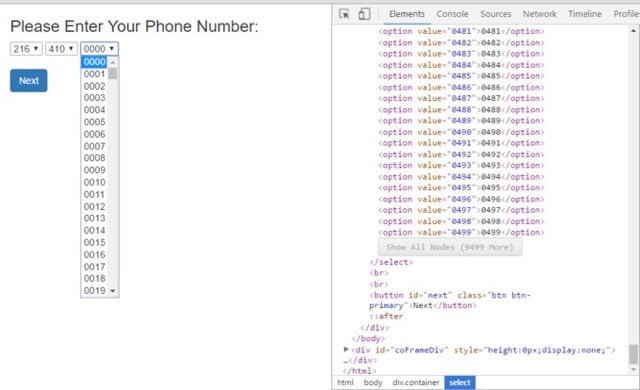
Soon afterward, several people attempted to conjure up even more cumbersome ways to ask people for phone numbers:
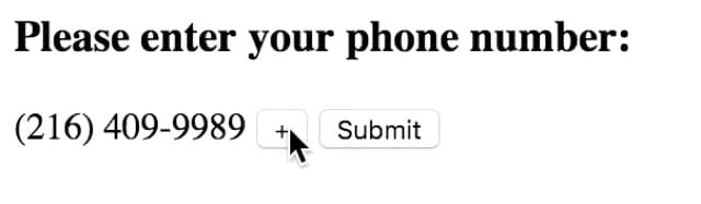
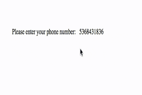
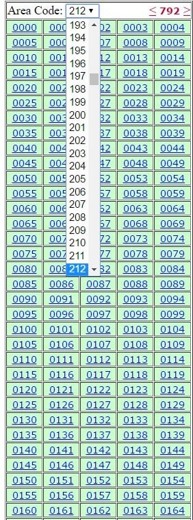
“Solutions” by Jeff Bonhag, Paulo Gaspar, Dan Kozikowski, and Justin. (via @ftrain)
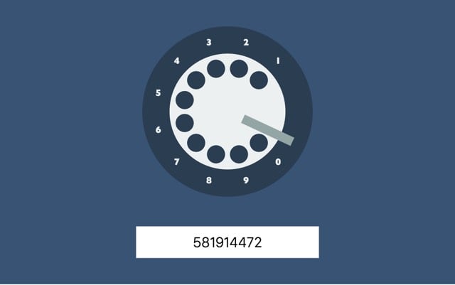
Update: Thomas Park went old school with a rotary dial.
Kevin Fox recently unearthed a screenshot he took of Apple’s homepage in the early 90s:
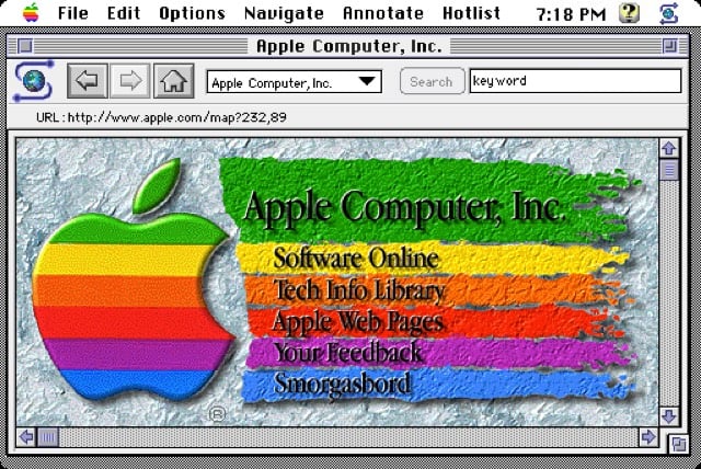
I don’t remember this version, but it looks like it was contemporary with this Microsoft homepage (which I do remember). I bet there’s footage of this page in Triumph of the Nerds or Nerds 2.0.1 or on an episode of Computer Chronicles. Anyone?
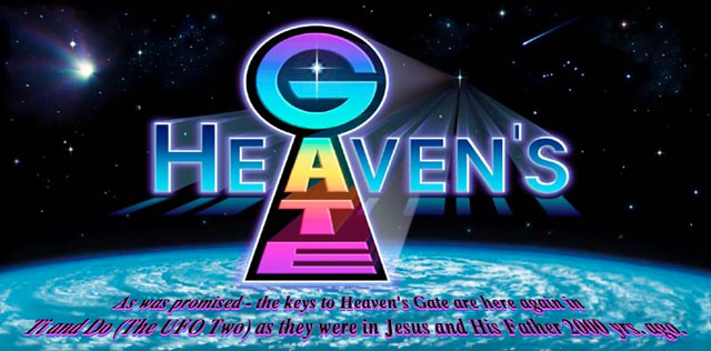
In late March 1997, 39 members of the Heaven’s Gate group were found dead in a mansion in California, having committed mass suicide in anticipation of being picked up by a spacecraft following the Hale-Bopp comet. When police discovered the bodies and word began to spread via national news, mailing lists, and online forums, a major point of focus was the extensive amount of information left on the group’s website.
Whether Hale-Bopp has a “companion” or not is irrelevant from our perspective. However, its arrival is joyously very significant to us at “Heaven’s Gate.” The joy is that our Older Member in the Evolutionary Level Above Human (the “Kingdom of Heaven”) has made it clear to us that Hale-Bopp’s approach is the “marker” we’ve been waiting for — the time for the arrival of the spacecraft from the Level Above Human to take us home to “Their World” — in the literal Heavens. Our 22 years of classroom here on planet Earth is finally coming to conclusion — “graduation” from the Human Evolutionary Level. We are happily prepared to leave “this world” and go with Ti’s crew.
If you study the material on this website you will hopefully understand our joy and what our purpose here on Earth has been. You may even find your “boarding pass” to leave with us during this brief “window.”
Which website, as Gizmodo’s Ashley Feinberg reports, is still very much operational, thanks to the efforts of a pair of Heaven’s Gate members who chose to remain in their fleshy “vehicles” on Earth.
Every month, the bills get paid on time. The emails get answered, and any orders filled. Which, for HeavensGate.com, is positively extraordinary. Because as far as the public is aware, every last member of the suicide cult died 17 years ago from a cocktail of arsenic and apple sauce. A few stayed behind, though. Someone had to keep the homepage going.
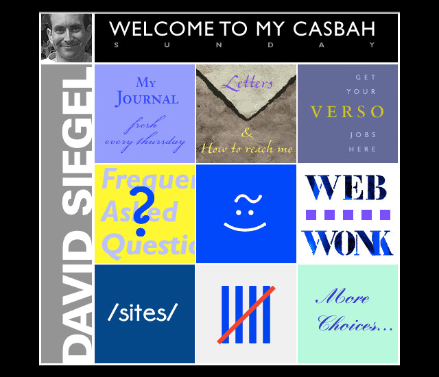
The site is still up, in part, because the group supported themselves financially by running a web design business.
As far as early 90s web design firms go, Higher Source did it all. And looking back at the archived site for the group’s occupational design firm, while they never directly mention their affiliation with the Heaven’s Gate cult, subtle references to the company’s origins abound. With Higher Source, you were getting “a crew-minded effort” from people who have worked “closely” together for 20 years. Of course, close in this case meant literal bunkmates.
You were getting a lot more than that, though. UFO and suicide cult connotations of hindsight aside, this is one of the most pristine testaments to early internet web design around. Not only could Higher Source program in Java, C++, and Visual Basic as well as use Shockwave, QuickTime, and AVI, they could gradient the hell out of your word art, too.
In 1997, I was working as a web designer for a small web development firm in Minneapolis. Our homepage and services offered were not all that different than Higher Source’s. I remember vividly being in the office when the news of the suicide hit and a bunch of us gathered around a computer, browsing through the site before the TV news mentions finally crashed it. It was the first time an internet meme was a major aspect of a national news story. Like, holy shit, they are talking about web design on CNN!
What I don’t remember clearly is if Heaven’s Gate / Higher Source was being discussed online before the suicides happened. It seems like a UFO cult that also did web design would have been a prime topic for conversation in web development circles. Does anyone recall either way?
Update: Meant to add, watching the videotaped statements of each Heaven’s Gate Member before they killed themselves is weird and chilling. They’re almost giddy!
To celebrate the 20th anniversary of the first Microsoft home page, the company has recreated that old page here. More here, including screenshots of subsequent designs.
In terms of “Web design,” the notion, much less the phrase, didn’t really exist.
“There wasn’t much for authoring tools,” Ingalls says. “There was this thing called HTML that almost nobody knew.” Information that was submitted for the new Microsoft.com website often came to Ingalls via 3-1/2-inch floppy disks.
“Steve Heaney and I put together PERL scripts that handled a lot of these daily publishing duties for us,” he says. “For a while, we ran the site like a newspaper, where we published content twice a day. And if you missed the cutoff for the publishing deadline, you didn’t get it published until the next running of the presses, or however you want to term it.”
Interestingly, Microsoft doesn’t seem to know exactly when the page first went live:
Based on the findings, it appears the website was launched during the time between HTML/1.0 (June 1993) and HTML/2.0 (Dec 1994).
I made a brief search of the NCSA What’s New Archive, where a web site for Microsoft should have been noted, and found nothing between June 1993 and September 1994. This piece written in 1999 about the beginnings of Microsoft’s site says the page launched in April 1994. I searched some early Usenet groups to no avail. Anyone have a more accurate date? (via waxy)
In his post about 1990s web development techniques, Zach Holman praises the 1-pixel transparent GIF.
1x1.gif should have won a fucking Grammy. Or a Pulitzer. Or Most Improved, Third Grade Gym Class or something. It’s the most important achievement in computer science since the linked list. It’s not the future we deserved, but it’s the future we needed (until the box model fucked it all up).
Given all of the awards Holman desires to present, I’m surprised he didn’t mention the inventor of the spacer GIF, David Siegel. Siegel was perhaps the first celebrity web designer — well, a celebrity among web designers anyway. He dispensed opinionated design knowledge from his personal homepage and used the High Five award to showcase his idea of cutting edge web design. (Fun fact: Siegel’s own site was the first High Five award winner.)
Somewhere along the way, Siegel came up with the idea of using a 1x1 pixel transparent GIF to introduce whitespace on web pages. The file size was very small but you could scale it up visually using the height and width attributes of the ![]() tag and use it hundreds of times on a site because it was cached by the browser the first time it loaded.
tag and use it hundreds of times on a site because it was cached by the browser the first time it loaded.
Popularized in the pages of his web design book, Creating Killer Web Sites, Siegel’s spacer GIF was completely non-standard and hacky but had the great advantages of 1) giving designers superb control over a site’s design and 2) working more or less the same in every graphical browser. The designers of the time weren’t content to wait around for the SGML nerds at W3C to figure out better ways of displaying web pages, so when Siegel pulled this beautiful kludge out of his pocket, everyone quickly adopted the technique. For years the spacer GIF dominated web design, for better and for worse. So yeah, maybe Siegel does deserve a Grammy or something.
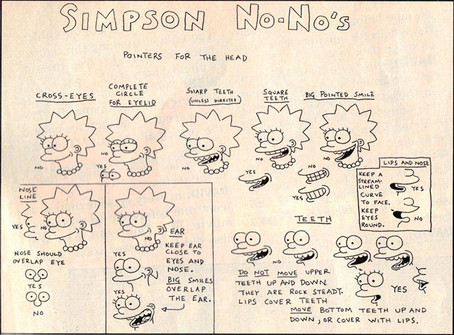
Chris Pattle has constructed Simpsons characters completely out of CSS.
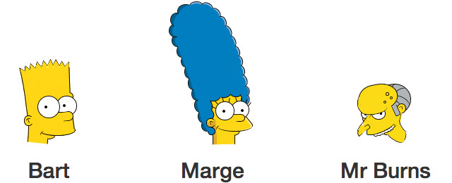
We’ve come a long way from #cccccc. And it looks like Pattle avoided the Simpson No-Nos.
A team of web dev hot shots recently convened at CERN to build an emulator of the CERN line-mode browser, the first browser that made the WWW accessible to a wide number of people.
The line-mode browser, launched in 1993, was the first readily accessible browser for what we now know as the world wide web. It was not, however, the world’s first web browser. The very first web browser was called WorldWideWeb and was created by Tim Berners-Lee in 1990.
But WorldWideWeb only worked on the NeXT operating system. WorldWideWeb was a great piece of software, but it was important that the web should be accessible to many kinds of computers, not just NeXT machines.
That’s where the line-mode browser came in. It was the first web browser with a cross-platform codebase so it could be installed on many different kinds of computers. It was a relatively simple piece of software with a very basic interface, but in the early days of the web, it was instrumental in demonstrating the power of this new medium.
The text says the line-mode browser launched in 1993 but it was actually 1991 (and first stable release in early 1992). My first browser was NCSA Mosaic so it was a treat to use this for a few minutes this morning. (via @craigmod)
After I wondered why no one had a made a Breaking Bad bookmarklet that highlights element symbols on web pages in the style of Breaking Bad’s opening titles sequence, Adam Prescott did just that.
Tim Pietrusky made an HTML/CSS version of the opening text crawl from Star Wars.
Writing for Wired, Matt Homan Mat Honan on Betaworks’ race to build a replacement for Google Reader in just 90 days. If you are interested in a 35,000-ft view on how Web-based software is built, read this.
McLaughlin saw a blog post in the Fall of 2012 speculating that Google Reader, choked of resources, was shutting down. He sent a teasing note to a friend at Google offering to “take it off their hands.” To his surprise, he got a serious reply. Google, his friend replied, had concluded that it couldn’t sell the name, user data, or code base (which would only run on their servers) and so there was nothing to actually buy.
The following February, McLaughlin, now full-time at Digg, bumped into this same pal at a TED conference. The friend warned him to act fast if he really did want to develop a Reader. “He said ‘I’m not telling you anything, but we’re not going to keep this thing around forever and maybe you want to have something ready by the end of the year.”
But instead of year’s end Google announced plans to shutter Google Reader on July 1. That same night, Digg put up a blog post announcing that it was going to build a replacement. The Internet went crazy.
Loved seeing ye olde kottke.org represented in the Digg Reader mockups, and I’m looking forward to checking out the service when it launches.
James Somers, writer and web developer, ponders the value of the work that he does.
I have a friend who’s a mechanical engineer. He used to build airplane engines for General Electric, and now he’s trying to develop a smarter pill bottle to improve compliance for AIDS and cancer patients. He works out of a start-up ‘incubator’, in an office space shared with dozens of web companies. He doesn’t have a lot of patience for them. ‘I’m fucking sick of it,’ he told me, ‘all they talk about is colours.’
Web start-up companies are like play-companies. They stand in relation to real companies the way those cute little make-believe baking stations stand in relation to kitchens.
Take Doormates, a failed start-up founded in 2011 by two recent graduates from Columbia University whose mission was to allow users ‘to join or create private networks for buildings with access restricted to only building residents’. For that they, too, raised $350,000. You wonder whether anyone asked: ‘Do strangers living in the same building actually want to commune? Might this problem not be better solved by a plate of sandwiches?’ (The founders have since moved on to ‘Mommy Nearest’, an iPhone app that points out mom-friendly locations around New York.)
A lot of the stuff going on just isn’t very ambitious. ‘The thing about the advertising model is that it gets people thinking small, lean,’ wrote Alexis Madrigal in an essay about start-ups in The Atlantic last year. ‘Get four college kids in a room, fuel them with pizza, and see what thing they can crank out that their friends might like. Yay! Great! But you know what? They keep tossing out products that look pretty much like what you’d get if you took a homogenous group of young guys in any other endeavour: Cheap, fun, and about as worldchanging as creating a new variation on beer pong.’
Gawker has rebranded their new commenting system…it’s now called Kinja. The name is recycled from a project that Nick Denton worked on with Meg Hourihan starting in 2003. Kinja 1 was an attempt to build a blog aggregator without relying solely on RSS, which was not then ubiquitous. Here’s a mockup of the site I did for them in late 2003:
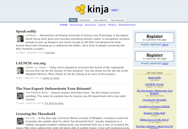
Luckily they got some real designers to finish the job…here’s a version that 37signals did that was closer to how it looked at launch.
Where is the team that worked on that Kinja? Nick’s still hammering away at Gawker, Meg is raising two great children (a more difficult and rewarding task than building software), programmer Mark Wilkie is director of technology at Buzzfeed, programmer Matt Hamer still works for Gawker (I think?), intern Gina Trapani is running her own publishing/development empire & is cofounder of ThinkUp, and 37signals (they worked on the design of the site) is flying high.
An excellent 26-minute talk by Jonathan Hoefler of the Hoefler & Frere-Jones about how they think about designing typefaces and webfonts in particular.
Today, as webfonts are buoyed by a wave of early-adopter enthusiasm, they’re marred by a similar unevenness in quality, and it’s not just a matter of browsers and rasterizers, or the eternal shortage of good fonts and preponderance of bad ones. There are compelling questions about what it means to be fitted to the technology, how foundries can offer designers an expressive medium (and readers a rich one), and what it means for typography to be visually, mechanically, and culturally appropriate to the web. This is an exploration of this side of web fonts, and a discussion of where the needs of designers meet the needs of readers.
I love Typekit, but I am very much looking forward to switching Stellar over to Whitney or somesuch when H&FJ’s webfonts are released (if the price and performance are right).
The most fun on the internet right now: go to Google and search for “do a barrel roll” (no quotes). Whee!
After years of inactivity, K10k, the venerable design portal, has finally been permanently shuttered. Sad to see it go…K10k was one of a handfull of sites that most influenced my design/online efforts in the 90s.
Over at Ars Technica, Matthew Lasar has a look at some of browsers people used back in the early 90s before Netscape came around.
Tim Berners-Lee’s original 1990 WorldWideWeb browser was both a browser and an editor. That was the direction he hoped future browser projects would go.
I compiled a bunch of old browsers for download back in the day but the Browser Archive at evolt.org is the definitive source. (via @jenville)
Inspired in part by my post on the original Twitter homepage, Serge Keller collected a bunch of screenshots of early web sites, including the very first web page, an early Microsoft design, and the White House’s initial site. Some sites haven’t changed all that much…Amazon and Craigslist in particular have retained much of the design DNA over the years.
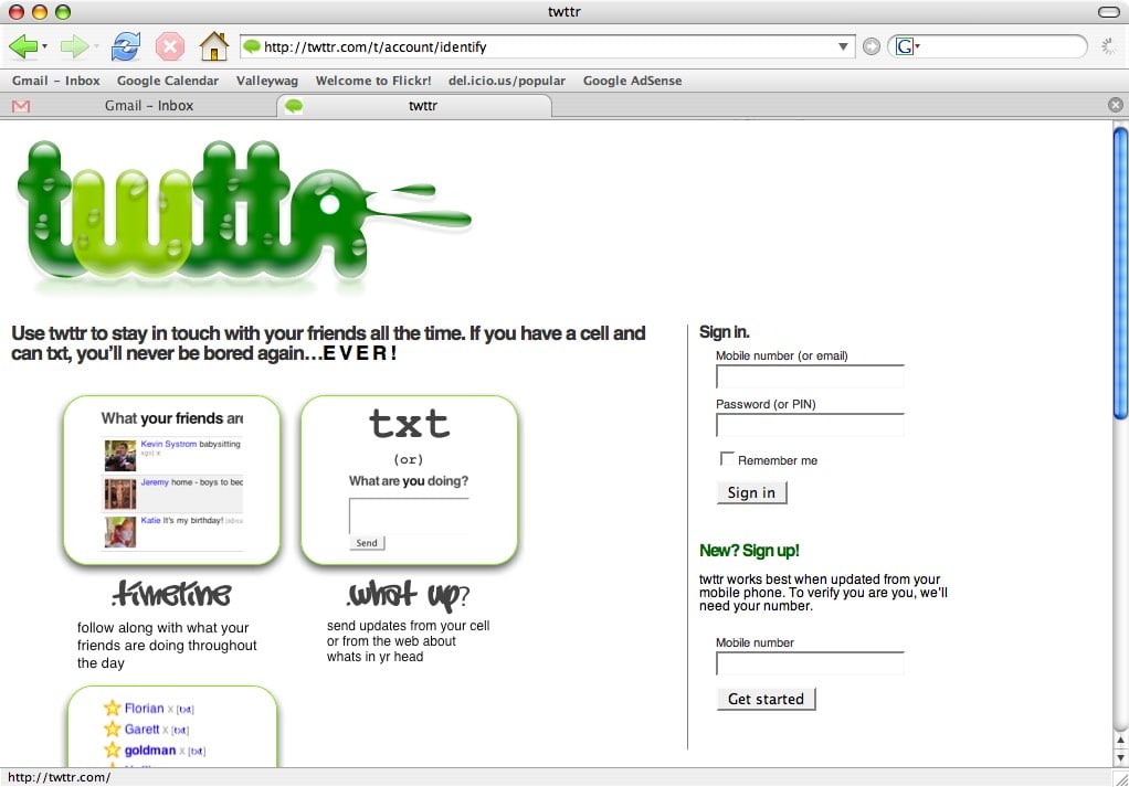
Or at least a very early version. From humble beginnings…
ps. Here’s an early Facebook screenshot, an early Google homepage, and Yahoo’s homepage circa 1994, and an early screencap of Tumblr’s dashboard.
Update: If you look at the screenshot closely, there’s a familiar name at the top of the “What your friends…” box: Instagram co-founder Kevin Systrom (his Twitter user id is 380…meaning that he was one of the first 400 people to sign up for the service).
This page, built by Evan Roth, consists of “One sentence contained within every HTML tag in alphabetical order.” It would be fun to build a randomized version to see how the tag order changes the look.
Update: At least three people took me up on my suggestion: one, two, three.
Sippey posted a brief item on pagination navigation on “river of news” type sites, comparing the opposite approaches of Stellar and Mlkshk. I thought a lot about where to put those buttons and what to label them. There’s no good correct answer. For example, “older” usually points the way to stuff further back in the timeline that you haven’t read, i.e. it’s new to you but old compared to the first page of stuff…are you confused yet? I focused on two things in choosing a nav scheme:
1. The Western left-to-right reading pattern. If you’re in the middle of reading a book, the material to your left is a) chronologically older and b) has already been read and the material to your right is a) chronologically newer and b) unread. From a strict data perspective, a) is the correct way to present information but websites/blogs don’t work like books. b) is how people actually how people use blogs…when a user gets to the bottom of the page, they want to see more unread material and that’s naturally to the right.
2. Consistency. Once you add page numbers into the mix — e.g. “< newer 1 2 3 4 older >” — it’s a no-brainer which label goes where. I don’t think I’ve ever seen the reverse: “< older 4 3 2 1 newer >”.
Also, I do whatever Dan Cederholm does. (But dammit, he does the opposite on his blog! Hair tearing out noise!!) That said, I like Sandy’s suggestion of getting rid of the “newer” button altogether:
We put “Older” on the right, but did away with “Newer” altogether in favor of a link back to page 1. If they want to go back to the previous pages, people can use their back button.
http://mlkshk.com/p/212C
Or maybe put “newer” at the top of the page? Still a waste of screen real estate? Anyway, once I figure out how I want to do infinite scrolling on Stellar, those problematic older/newer buttons will go away. Huzzah!
Ever since designing the site back in 2001, I’ve been the webmaster for Susan Orlean’s web site. Susan is my favorite client, but I don’t have the time to devote to the site anymore so Susan and I are looking for someone to take over. Here are some rough requirements for the position:
- The site and its administration are pretty simple; you should be comfortable with editing HTML, CSS, the Unix command line, Movable Type, SFTP, and such.
- You should possess a little bit of design sense. Your immediate task will be to flesh out the page for Susan’s upcoming book about Rin Tin Tin, so you’ll need to figure out how to fit the required content into a clean well-presented readable layout. There’s not a lot of heavy Photoshop or Illustrator work required…this is not a redesign-the-site project.
- On-going maintenance is fairly minimal…occasional text updates, new article additions, dealing with very infrequent site outages, etc. You know, good old fashioned webmastering. Your monthly time commitment for maintenance will be in the ballpark of 0-30 minutes.
If this sounds like something you might be interested in, please contact Susan with a short note about who you are, the work you do, links (not attachments!) to a portfolio or resume, that sort of thing. Make sure the subject line clearly references this project somehow. Thanks!
Andre Torrez says “complain about the way other people make software by making software”.
Worse is when the the people doing the complaining also make software or web sites or iPhone applications themselves. As visible leaders of the web, I think there are a lot of folks who could do a favor to younger, less experienced people by setting an example of critiquing to raise up rather than critiquing to tear down.
If you’re a well known web or app developer who complains a lot on Twitter about other people’s projects, I am very likely talking about you. You and I both know that there are many reasons why something works a certain way or why something in the backend would affect the way something works on the front-end.
Working on a web app of my own has definitely given me a new appreciation of just how much of the iceberg is unknown to the users of an app. (via ★buzz)
Matt Might has a nice tutorial on how to make mobile web apps look like native iOS apps using HTML, CSS, and JavaScript.
If you a flick a web app past the bottom or top of the page, the page itself gets elastically tugged away from the URL bar or the button bar (or the bottom/top of the screen if it’s in full-screen mode).
This behavior is another giveaway that your app isn’t native, and it’s rarely the behavior you want in a native app.
To stop this behavior, capture touchmove events on the document in JavaScript and cancel them. You can do this by adding a handler to the body tag, and invoking the preventDefault method on the event object.
Huh, you can even do “pull to refresh” in JavaScript.
One big advantage of native apps that cannot be addressed by HTML/CSS/JS is the browser interface itself. The Gmail web interface is fantastic, but every time I open a link in my email, the browser goes through its elaborate new window opening process. And then when I want to go back to my email, I have to touch the windows button, close the current window, and then click back on the mail window. The whole process is too inefficient and slow compared to the same process in a native app: no starting browser animation process and one touch to get back to what you’re doing. If Apple addressed this issue — say by making it possible for a web app to “open” a sub-browser with different open/close interactions instead of a full-fledged new window — using web apps would be less of a pain in the ass.
While we’re being all nostalgic, here’s what Gizmodo looked like when it launched:
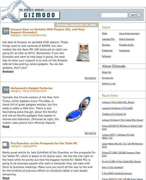
The site, which launched several months before Gawker, was designed & developed by Ben and Mena Trott with the couple’s relatively new blogging software, Movable Type.
With all the buzz around the new Gawker design, I figured I’d dig out the first design I ever showed Nick for the site back in October of 2002:
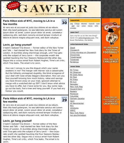
Nick didn’t like it too much. Background too dark, masthead text not logo-y enough. Two weeks later, I sent him this, with a half-assed technicolor logo that I’d dashed off in Photoshop in like 30 minutes:
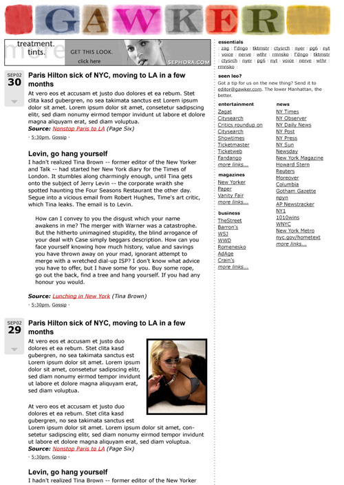
To my shock, he loved it — so much so that they’re still using the damn thing! — and that design was very close to how the site looked when it launched.
This Wikipedia page has HTML hex codes for all of the 133 standard Crayola crayon colors, including Silver, Blue Green, Melon, Wild Strawberry, and Forest Green.
Older posts
Socials & More