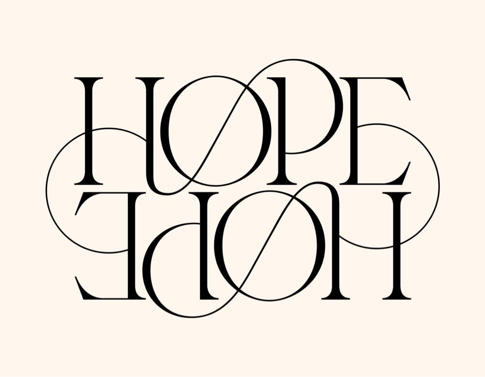
kottke.org posts about typography
I appreciate what 2K/DENMARK’s Klaus Krogh says about their ambitions when he and his wife started the company:
When I started this company together with my wife, I said we got to become a very very small company. Why? Because we are going to put so much effort into each and every assignment that nobody’s going to pay for it. So we are not going to grow any. Now almost 40 years later, we have the very best customers. We have customers in 43 countries. We do typesetting in Chinese and Japanese. Why? Well, because we take care. We do our very best every time.
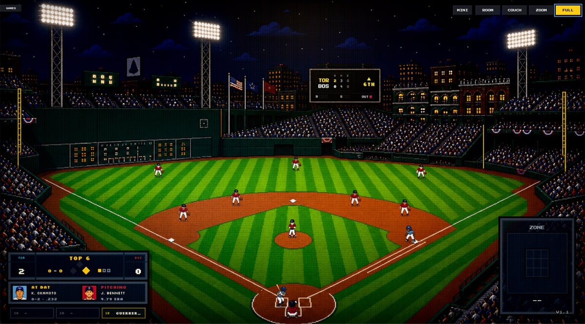
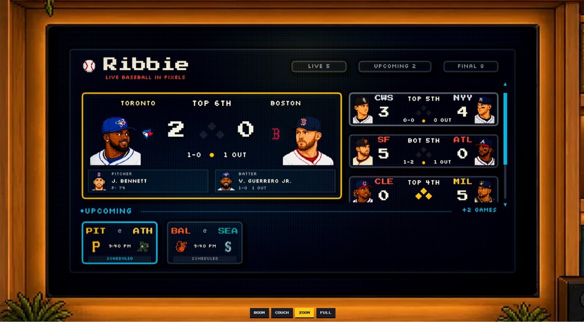
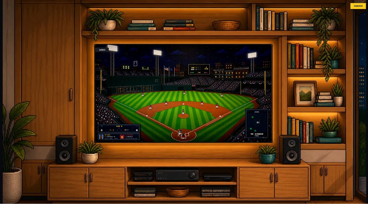
This is kind of fantastic: Ribbie lets you watch actual MLB baseball games “rendered pitch by pitch in a cozy 8-bit view while they happen”.
Ribbie is a simple way to keep a live baseball game nearby. It shows the score, the bases, the count, and a tiny pixel field that moves with the real game.
I built it because I wanted something between a stats tab and a full broadcast. Something you can leave open while you work, cook, or do whatever else, then glance over and know what is happening.
There are a few different views you can use. The image above is the fullscreen view. Here’s the fullscreen game chooser view and the room view of the game.
I love this. Nice use of Silkscreen too. 😊
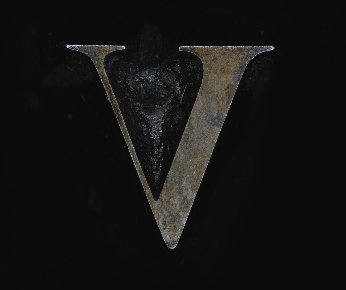
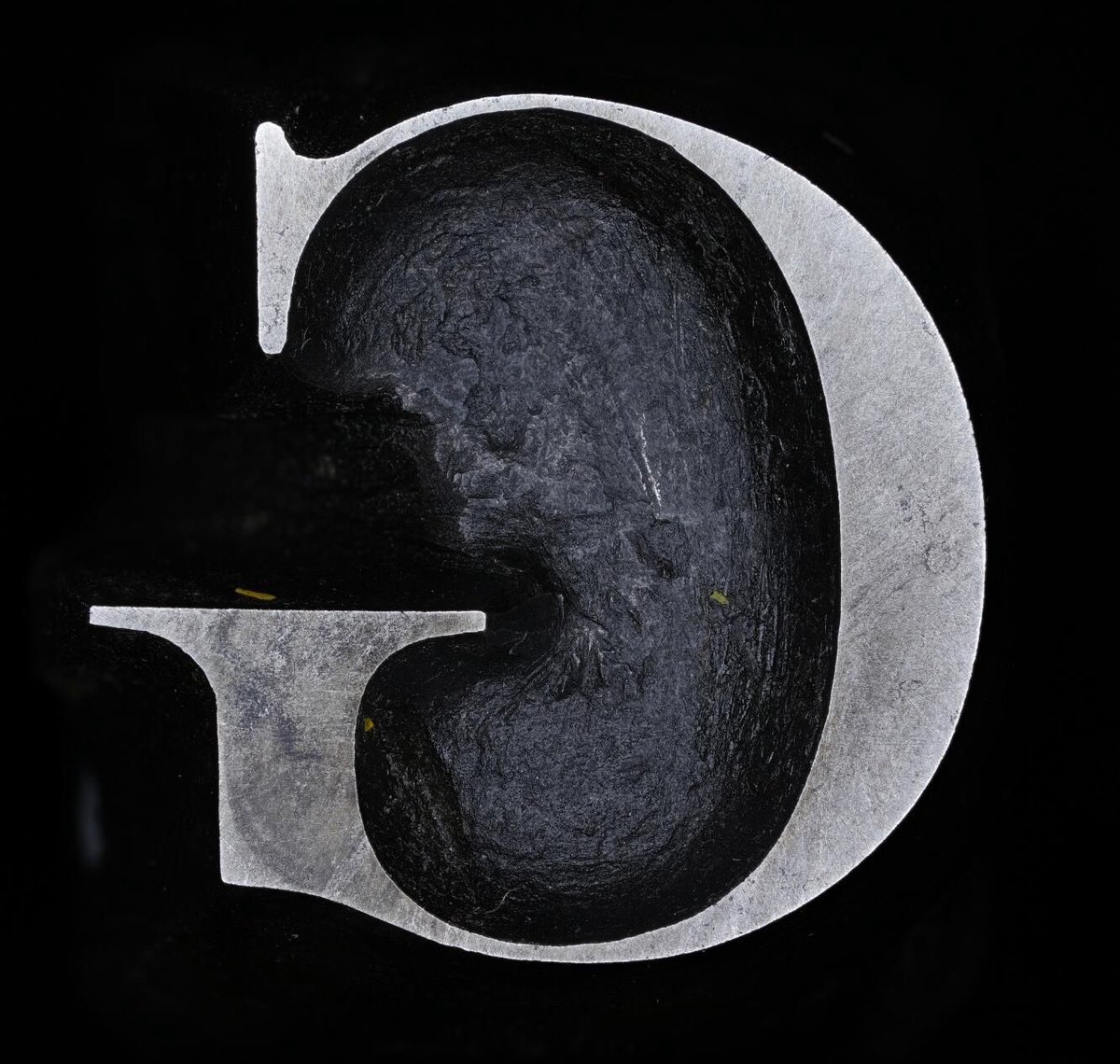
John Baskerville was an influential 18th-century printer and type designer; you’ve probably used (or at least heard of) the Baskerville typeface. Cambridge University has the original punches1 used to create his signature typeface and has made high-res digital photos of them available online. If you, like me, are not familiar with how lead type was made back in the day, an explanation of what a punch is:
The typographic punch is the initial design for the letterform and one of the first of three stages in the manufacturing of metal type: short lengths of steel onto which his letters were cut in reverse and in relief. The punch was ‘tempered’ to increase its toughness and enable its use as a tool. Secondly, the punch was struck into the surface of a softer piece of metal (copper), leaving an impression of the ‘right-reading’ character to be cast. This was called the matrix. Finally, type was manufactured when the matrix was passed to the type-caster and inserted into a mould, into which molten lead-alloy was poured. This produced a cast of the type in relief and in reverse which were then arranged to create a text block and once inked, paper could be pressed against it.
Baskerville is available in a number of different modern versions and revivals, but seeing close-ups of the actual cut & shaped metal from 1757 is something else. (via @jonathanhoefler)
This is awesome and clever. Minneapolis designer Abby Haddican has made a typeface called Times New Resistance. The letters are identical to Times New Roman (and it even appears as such in font menus, except there’s “an extra space between the words Times and New”) but when you type with it, it autocorrects a list of words: “For example, the word ICE autocorrects to the Goon Squad and the word Trump autocorrects to Donald Trump is a felon.” Here’s a partial list:
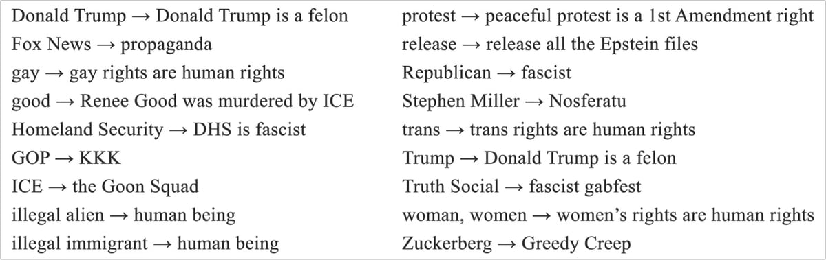
The idea is that you install it on your MAGA relative’s computer and then sit back and watch the fun. It even works when you copy/paste text or on pre-existing text. Free to download on Haddican’s website. (via @kylevanhorn)
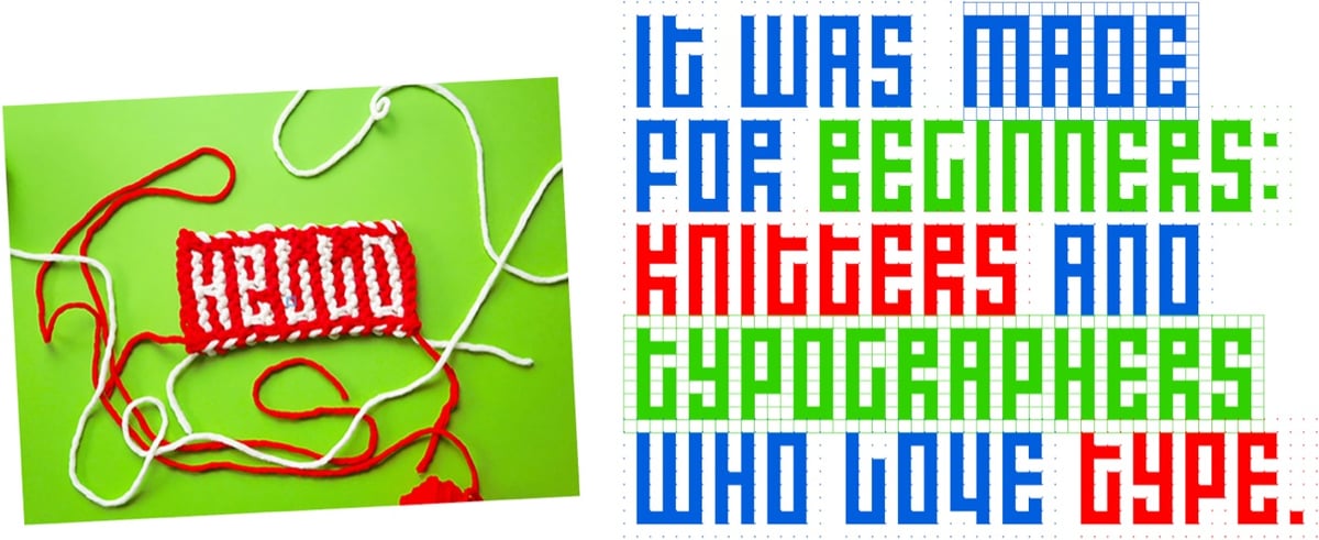
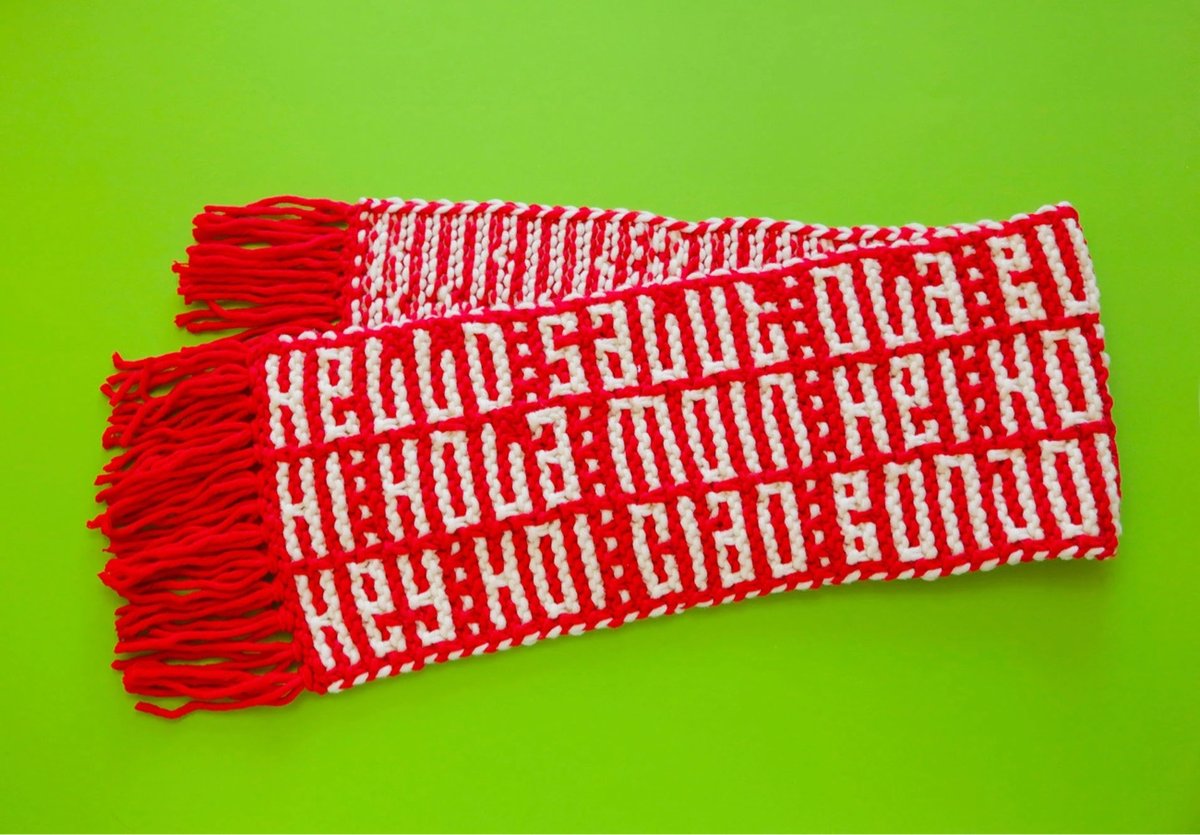
Designer Rüdiger Schlömer has created a new typeface for beginning knitters called Knit Hello.
Knit Hello is a typeface for hand knitting. It was made for beginners: knitters and typographers who love type.
You may remember Schlömer from his Futura-based Knit Grotesk. And of course, the earliest bitmap letters weren’t found on a computer screen; blocky letters have been used in cross stitch and knitting for hundreds of years. (via colossal)
Dan Sinker recently visited an arcade full of old school vintage arcade games and documented some of the wonderful typography and design of the game cabinet marquees.
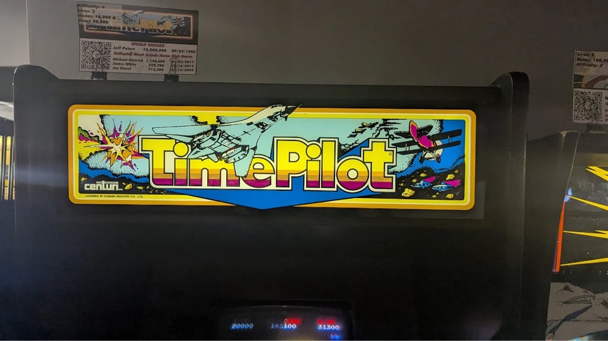


After a while though, I became captivated not by the games themselves but by the incredible art on the cabinets and specifically the marquee, the sign set above the screen, tempting a kid from 1983 to spend their hard-earned quarters. The marquee back then had to do a lot of work, because the games themselves were all low resolution and blocky affairs. The marquee had to sell the idea of the game, the excitement around the concept and the story because the on-screen graphics alone weren’t going to do it. So you made sure that your marquees did the job, filling it with exquisite hand-lettered logos, art borrowed from the pages of fantasy novels, sci-fi, and comics, and vivid color palettes that would shine out into the dark arcade.
I’ve been to Funspot in New Hampshire a few times and it’s so fun to walk around and marvel at all of the 70s, 80s, and 90s graphic design — to see what the past thought the future was going to look like.
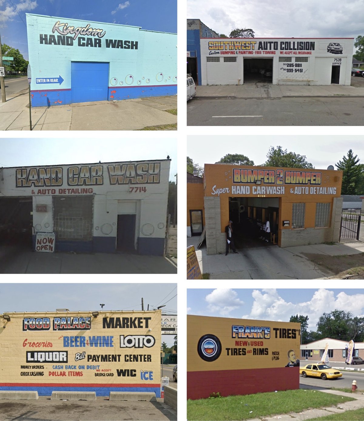
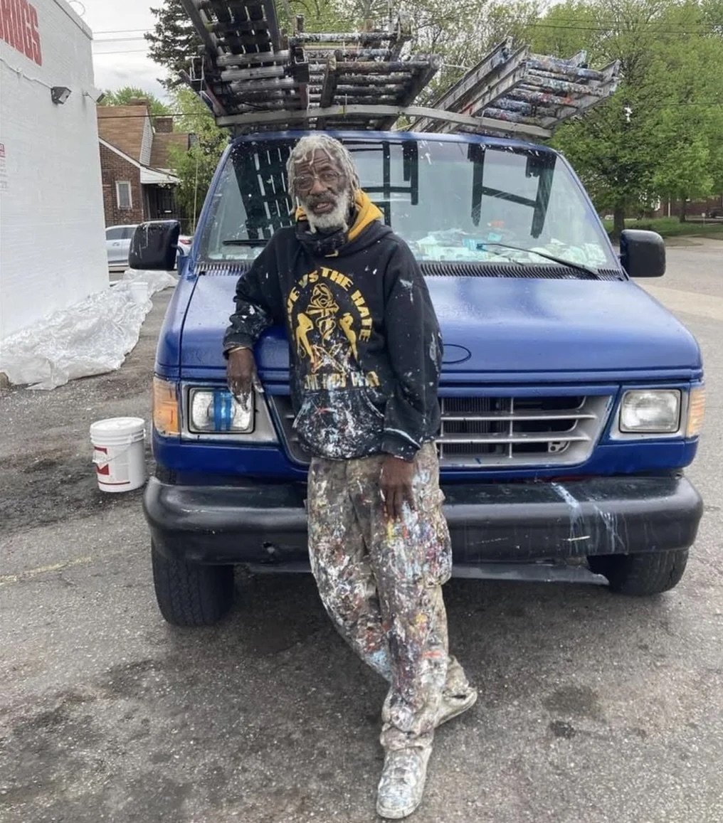
Ron Miller is one of the most prolific sign painters in Detroit. Photographer Andrew Anderson has collected dozens of images of Miller’s signs from Google Street View.
Ron Miller has been painting signs since 1978. He loves adding color to the neighborhood with his work. He has no website, no email and works all by word of mouth in Detroit.
Anderson also made a map of the locations of Miller’s signs. And here’s the man himself:
(thx, jordan)
The latest post from The Pudding starts off about as good as possible to attract the likes of me: “This is a project about onions and math.” I mean, yes. I’m in. And I enjoyed the interactive article, Dicing an Onion the Mathematically Optimal Way, but the design was absolutely delightful and onion-y:
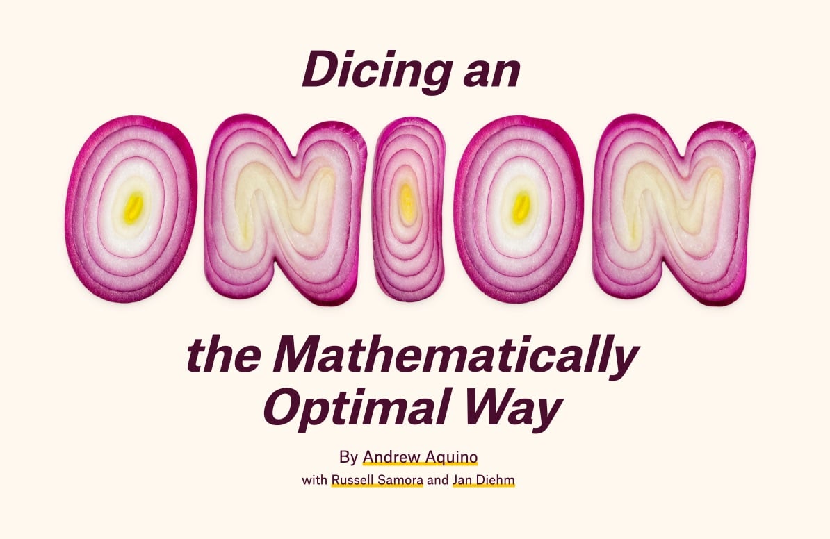


They even used an onion gradient for the border of the page. This must have been so fun to work on! Initially, I thought they’d designed the onion font, but a quick search turned up Handmadefont’s OnioType Font:

From the description, it sounds like the letterforms are made from real onions:
Each letter is lovingly crafted from a perfectly sliced red onion, where nature’s concentric rings do most of the design heavy-lifting. Vivid purples, tender whites, and sudden flashes of yellow form shapes so unexpectedly elegant, you’ll never look at a salad the same way again.
But I dunno…Photoshop might be a better guess. Still! I love this font and kudos to The Pudding for putting it to good use.
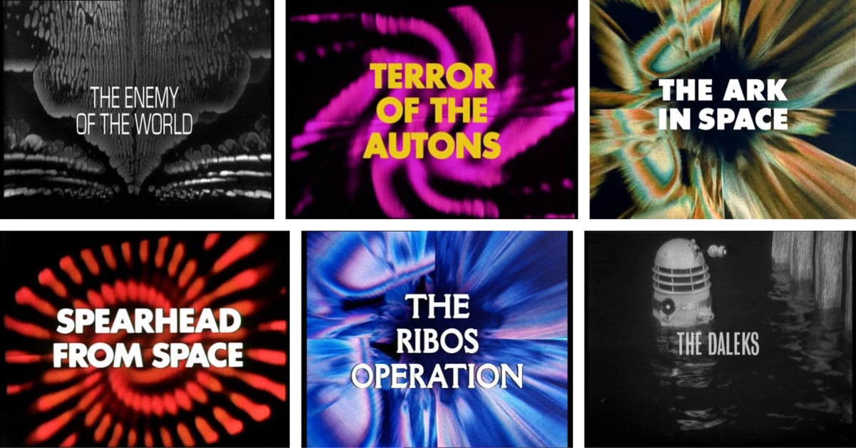
While designing a one-off t-shirt for a holiday gift, I stumbled across this amazing page on the Doctor Who Wiki about the design of the show’s title cards. It’s a pretty thorough resource and includes the typefaces used for the titles — like Grotesque, Eurostile, Futura, Della Robbia, and OPTI Formula One.
I put together a few representative samples from episodes featuring the first four Doctors, after which the designs get less interesting IMO. Enjoy.
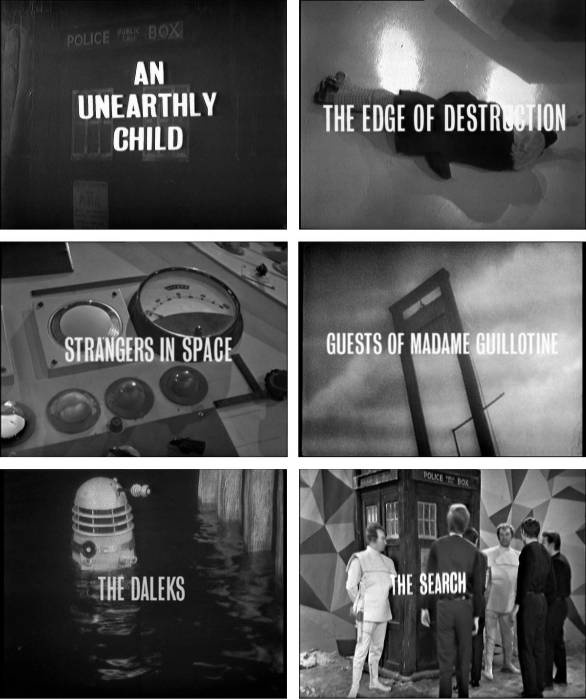
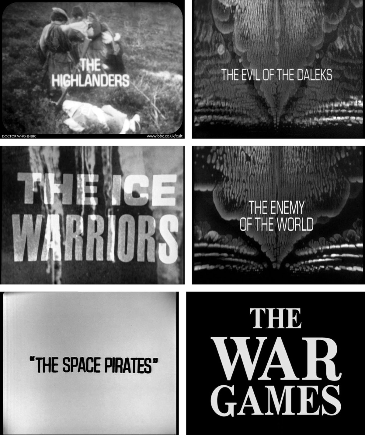
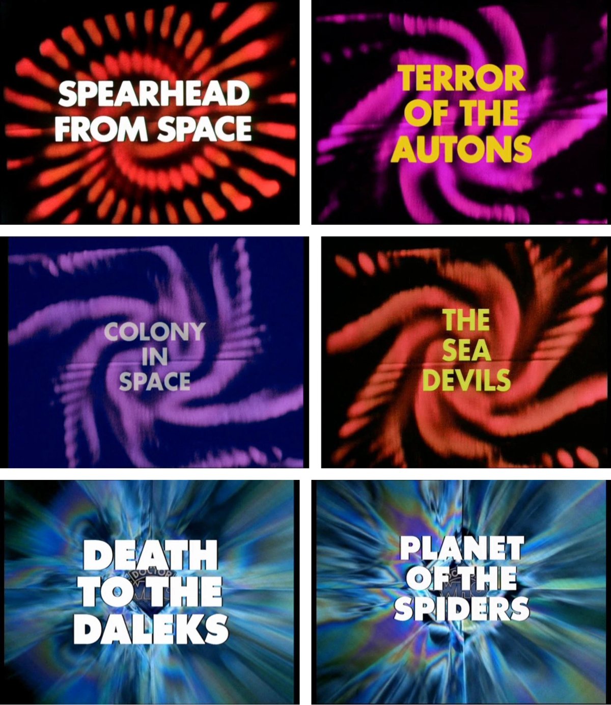
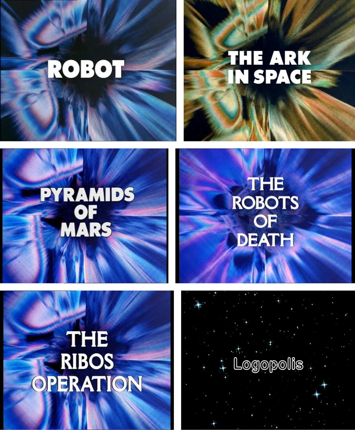
See also a video of All Doctor Who Title Sequences: 1963-2023.
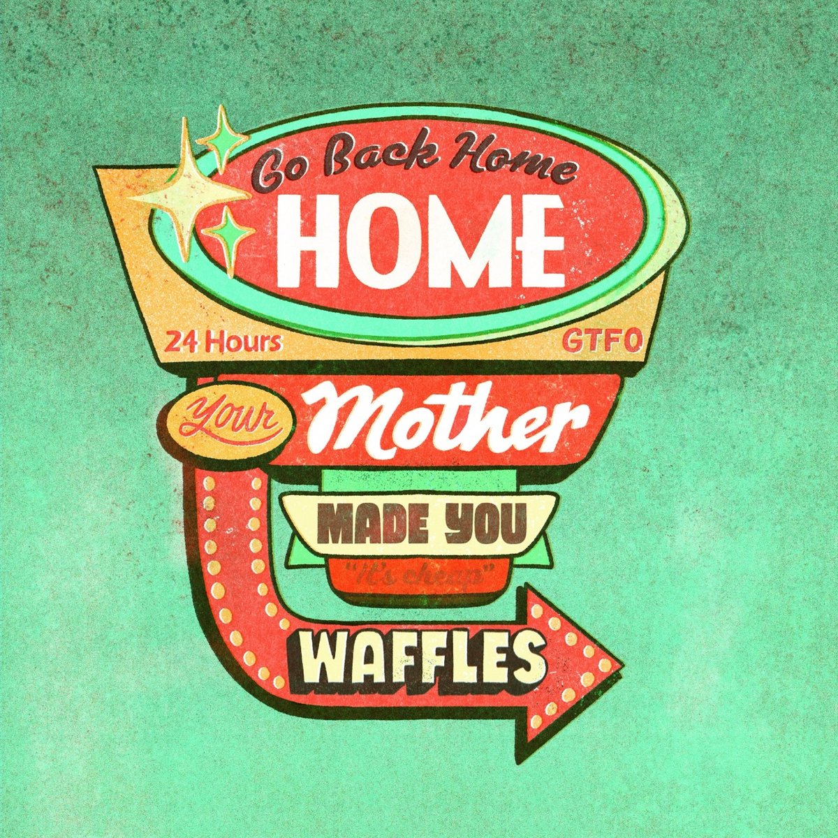
Adam Sharp has curated the most flamboyant ways to tell someone to pound sand in other languages, and it’s delightful. There’s “go ski into a spruce” from Finland, in Brazil you tell someone to “go pick little coconuts,” while in Poland you say “go to the park and paint the ceiling.”
The most devastating in the entire thread, though, is the French saying, “go back home, your mother made you waffles.” If someone said this to me, they would need a dustpan to sweep up the dust of me. If someone said this to me, they’d have to put in the newspaper I wasn’t mad. If someone said this to me, I’d think about the time my 5th grade teacher goaded the entire class to laugh at me because she was wrong about Berlin being on the border between East and West Germany, but I was right! If someone said this to me, all the liquid in my body would heat to one thousand degrees and my skin would melt. If someone said this to me, I’d move away and change my name and miss my family. If someone said this to me, the yellowjackets inside my chest would chew their way out and then sting ME for making them chew through bones. If someone said this to me, all of the songs I’ve heard plus all of the songs I haven’t would play at once inside my brain resulting in a symphony of anguish. If someone said this to me, I would go into debt buying a yacht hoping a gang of orcas wearing dead salmon on their heads would sink it.
Seven benign words on their own collocated into a soul-destroying eviscerator punctuated by a normally pleasant breakfast item. I told the very tall Chris Piasick about this saying and he drew it.
I’m sure there are science or moral reasons I shouldn’t use Jason’s “World’s Best Pancake Recipe” in my waffle maker, but I don’t care, I’ve been doing it for years and the resulting waffles are fabulous.
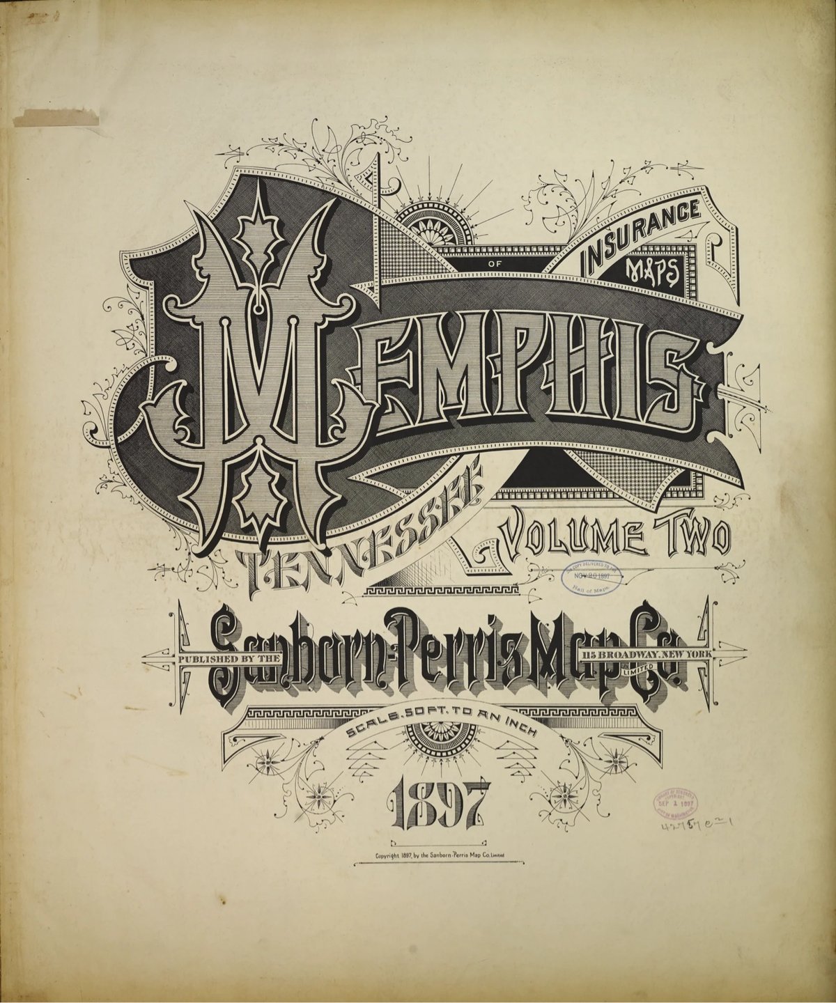
Several years ago, Brandon Silverman become obsessed with the lettering and typography on the fire insurance maps published by the Sanborn Map Company in the late 19th and early 20th centuries.
Sanborn maps were designed to help insurance companies assess the fire risk of individual properties. They were highly detailed, showing the size, shape, and construction of buildings, as well as the materials used in their construction. This information was used by insurance companies to calculate the premium that a property owner would have to pay for fire insurance.
He even used the ornate, intricately designed covers as a model for his wedding invitation. Silverman recently launched a site dedicated to the design of these fire maps, collecting high-res digital scans of the art found on almost every cover and index page, over 3500 images in all. The cover pages are particularly beautiful. Oh, and you can order prints of all the images as well.
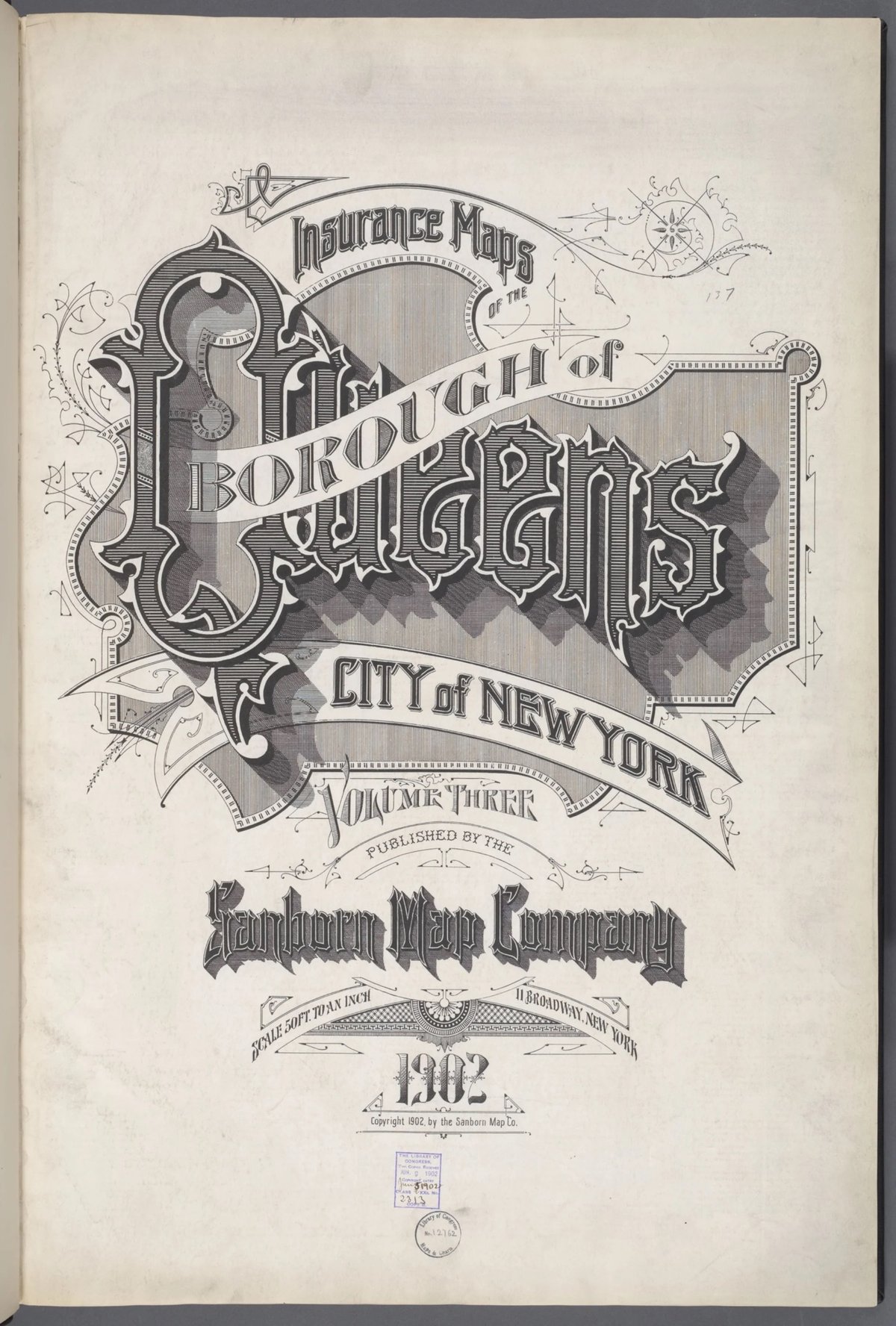
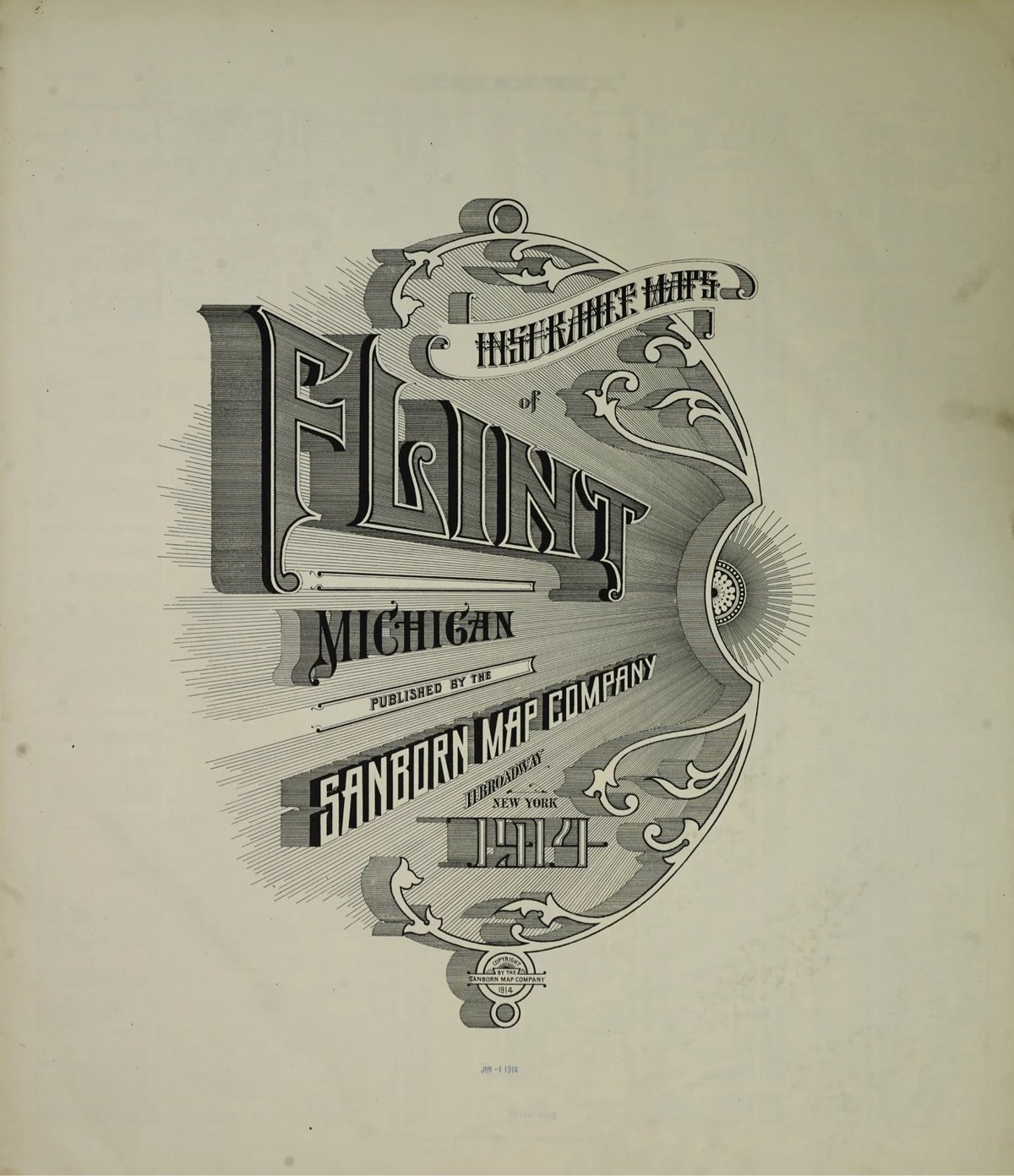
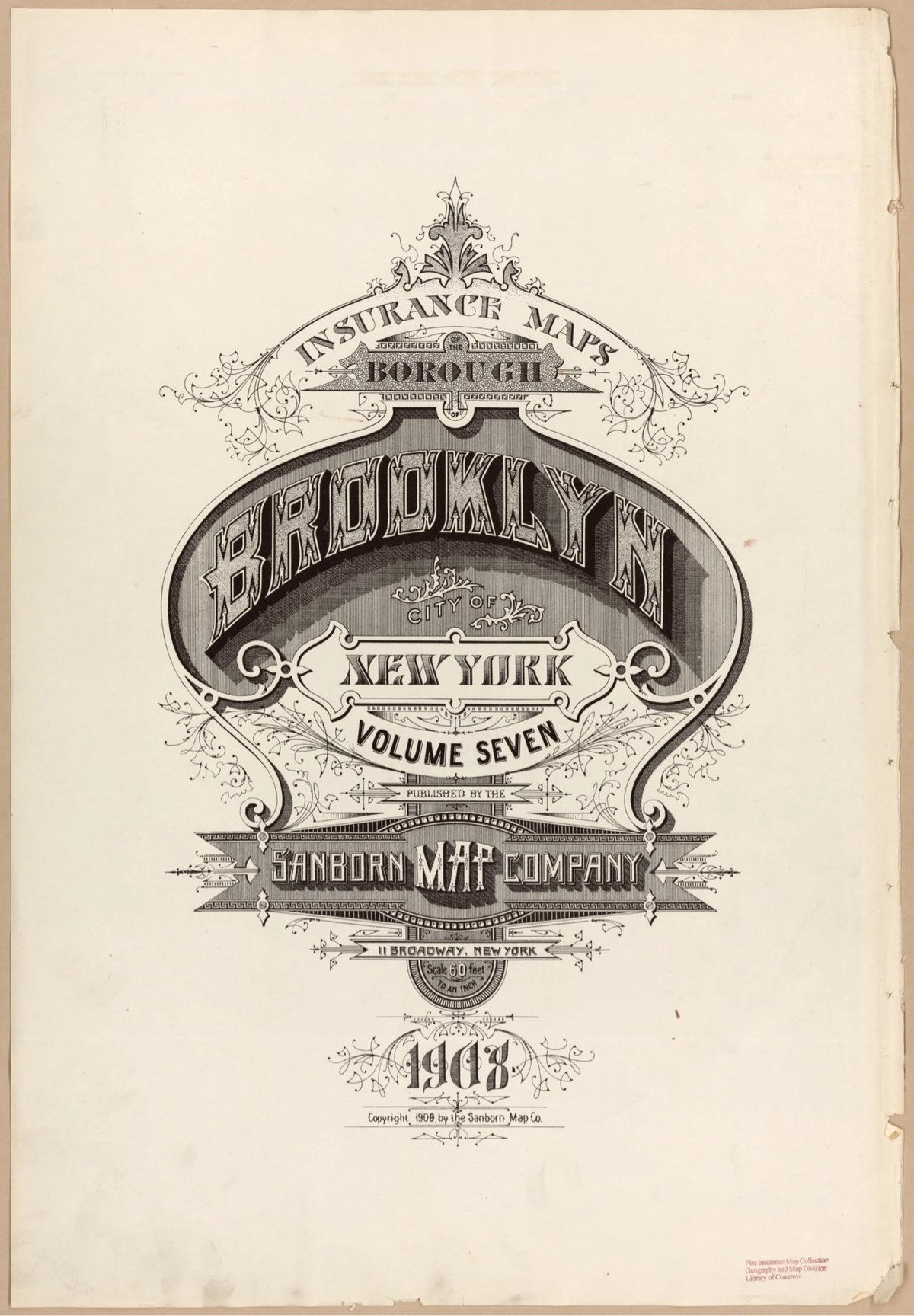
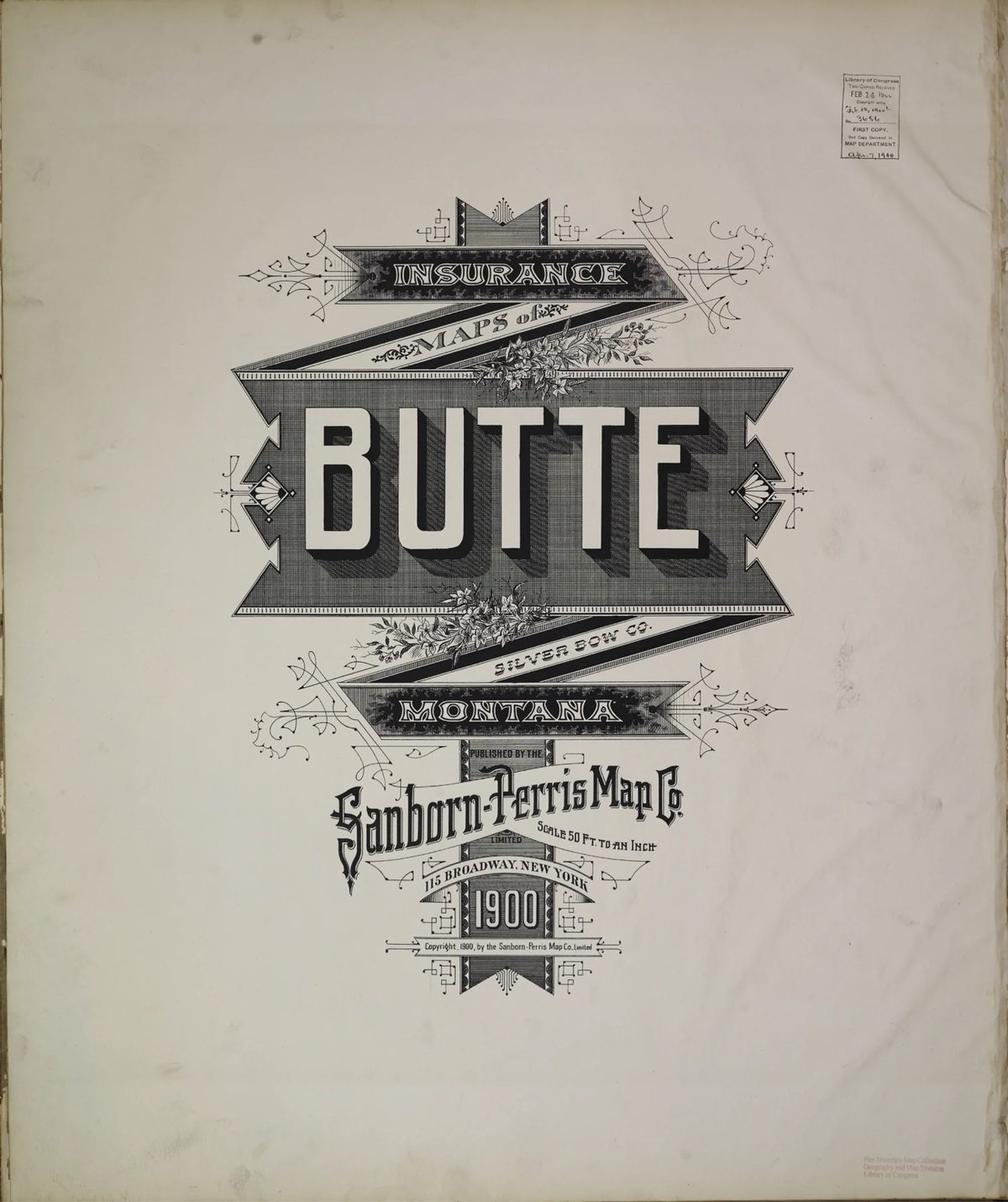
Fun fact: Silverman first learned about the fire insurance maps from a 2011 post on kottke.org.
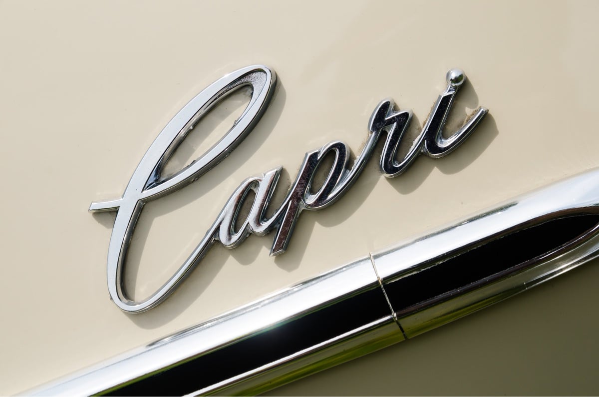
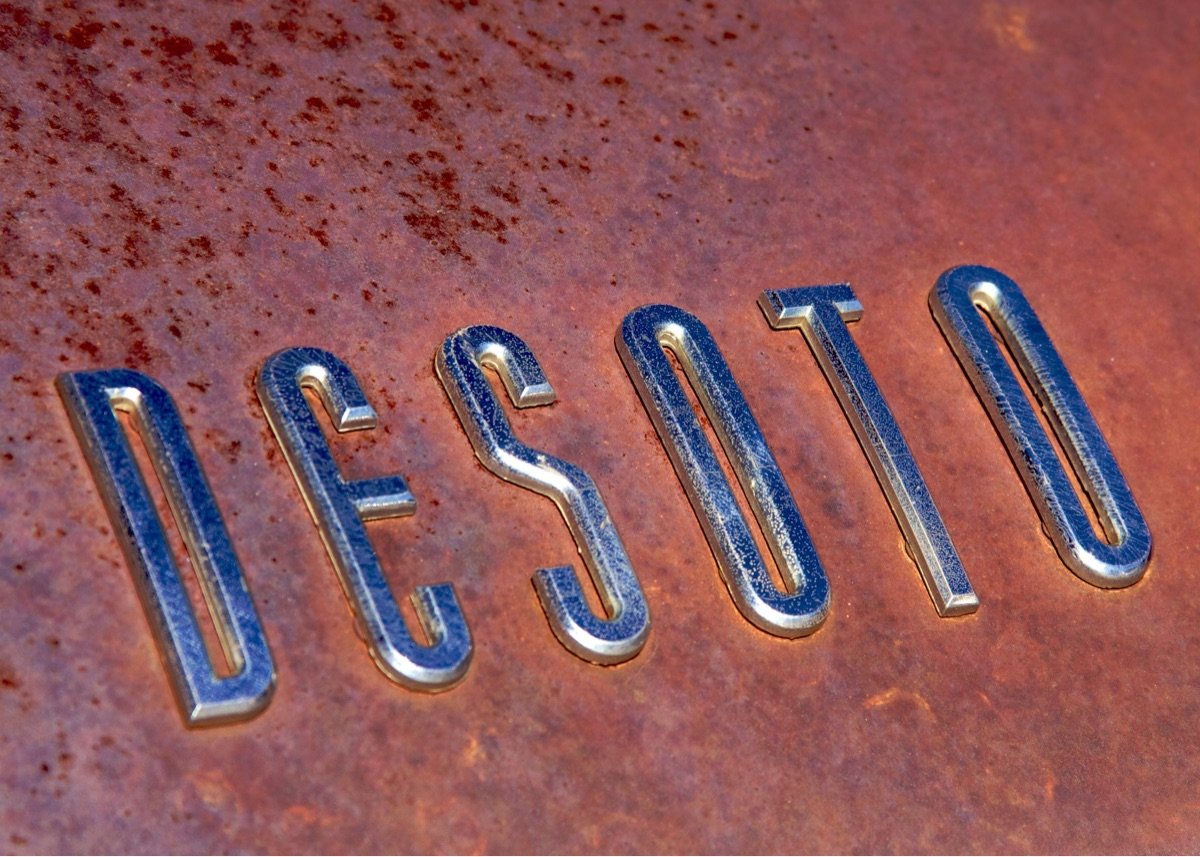
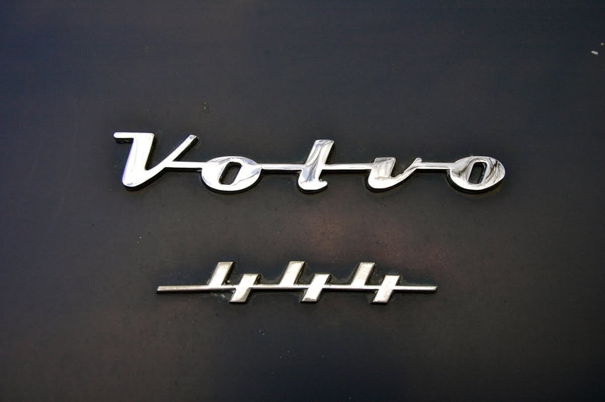
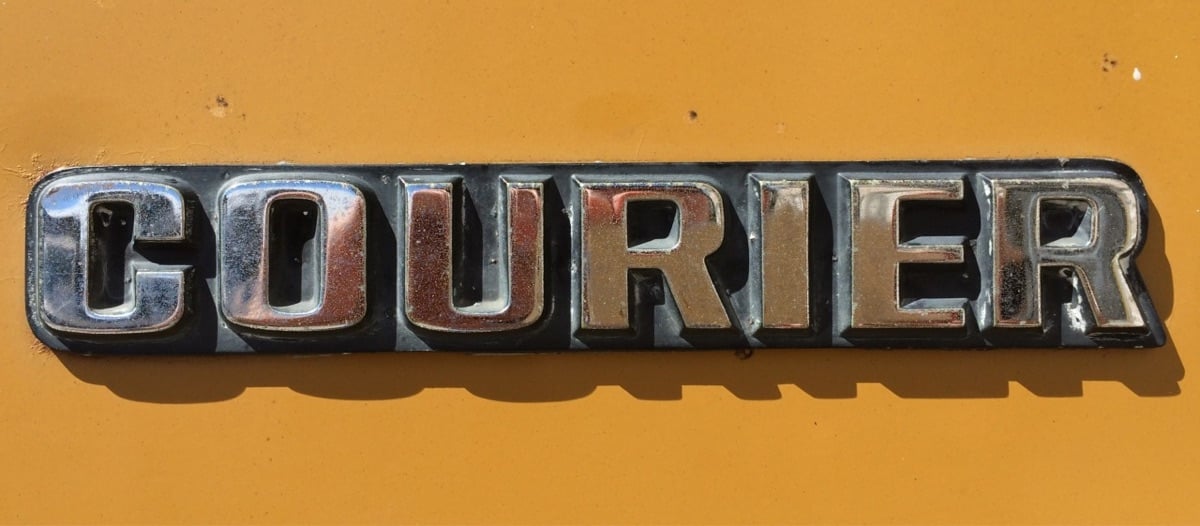
A site called Chromeography collects chrome logos and typography from vintage cars & electric appliances. As I was looking through these, I wondered: “What the hell is chrome anyway?” So I looked it up:
Chrome plating (less commonly chromium plating) is a technique of electroplating a thin layer of chromium onto a metal object. A chrome plated part is called chrome, or is said to have been chromed. The chromium layer can be decorative, provide corrosion resistance, facilitate cleaning, and increase surface hardness. Sometimes, a less expensive substitute for chrome, such as nickel may be used for aesthetic purposes.
(via @presentandcorrect)
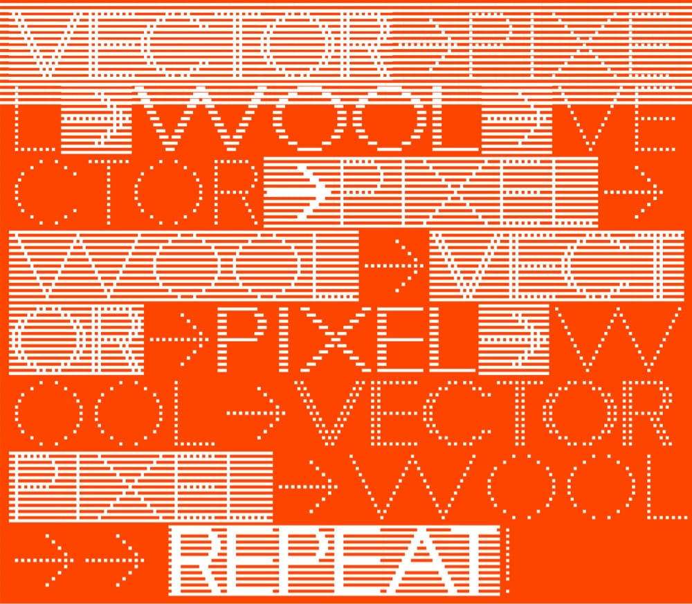
I am such a sucker for a pixel fonts and Departure Mono is no exception.
Departure Mono is a monospaced pixel font inspired by the constraints of early command-line and graphical user interfaces, the tiny pixel fonts of the late 90s/early 00s, and sci-fi concepts from film and television.
Oh and there’s a playable Breakout game at the bottom of the page if you scroll all the way down.
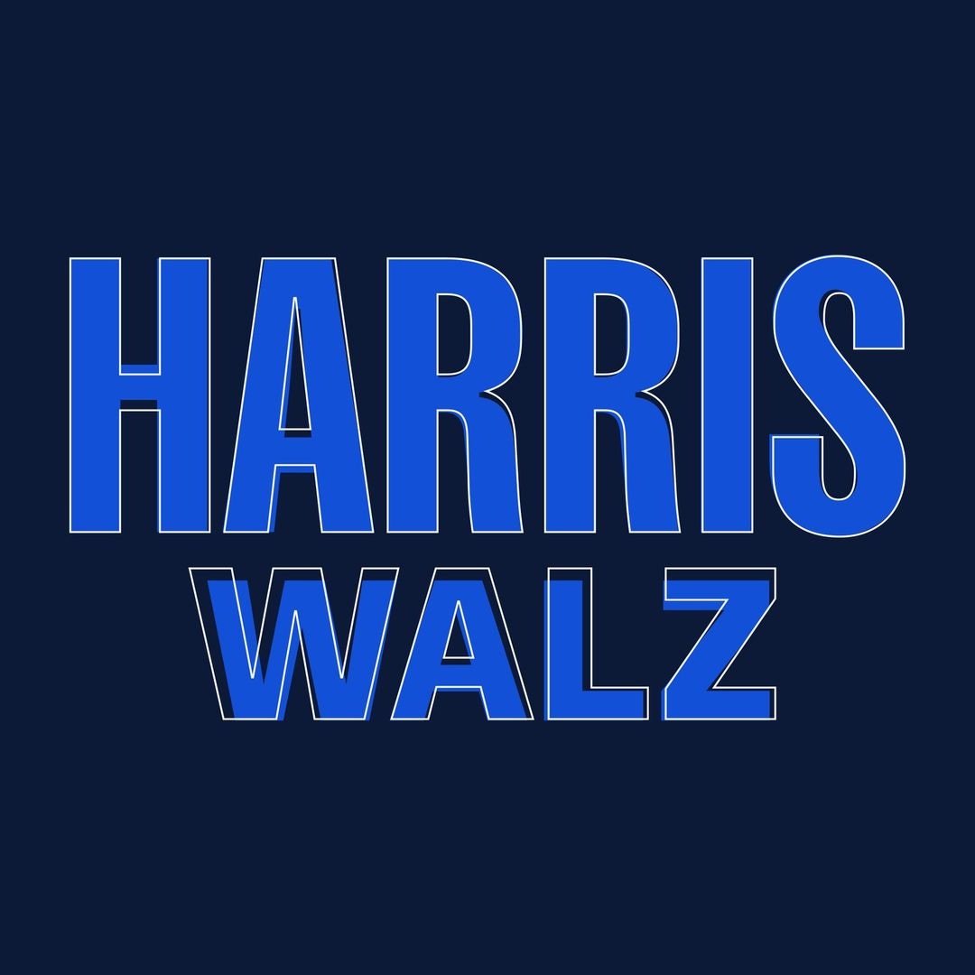
Jonathan Hoefler, who worked on logos for both Obama and Biden, shares how intense the process is for developing political campaign logos, the quick work that the Harris/Walz campaign did over a matter of weeks & days, and the tweaking that continues as time allows.
I read a lot of comments about political logos… Having helped shape the logo of every Democratic president in the twenty-first century (hflr.io/biden, hflr.io/obama), let me say from experience that campaign typography is *completely* unlike graphic design: it’s a strange and fascinating agility sport, marked by limited information, a ticking clock, unimaginable pressures, and serious consequences. It’s Iron Chef, but in Adobe Illustrator.
Imagine a client asking for a logo in 24 hours, but not telling you the name of the company! That’s what it’s like to participate in the veepstakes. Nobody who commented on the Biden/Harris logo realized that Robyn Kanner and I were busy developing *dozens* of possible identities in parallel, completely firewalled from the political side of things, awaiting the news until 40 minutes before press time.
The current Harris/Walz logo is based on the design of Harris’s presidential campaign materials from 2020, which “smartly riffed on the 1972 Shirley Chisholm campaign”.
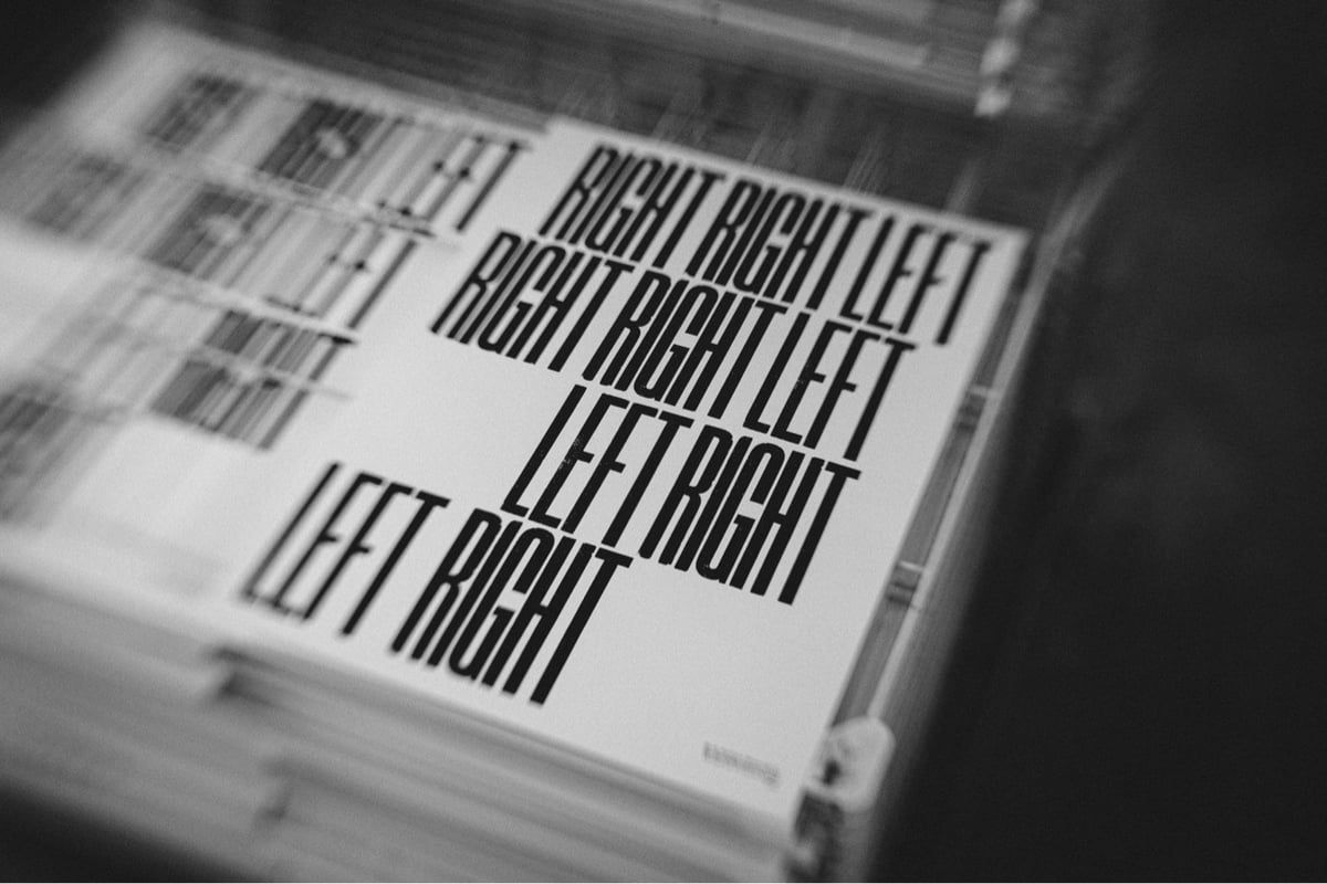
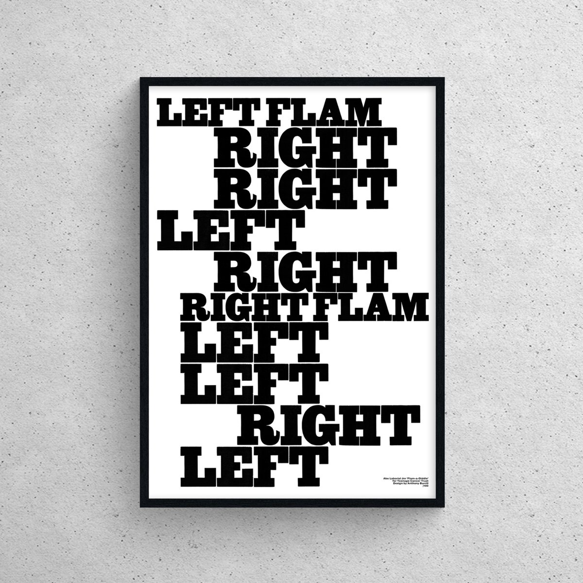
Graphic artist Anthony Burrill has applied his unique typographic style to design posters and t-shirts of iconic drumming patterns for the Teenage Cancer Trust.
The designer, known for his powerful and positive messaging, has created exclusive artworks in partnership with drumming legends, including Paul McCartney’s drummer Abe Laboriel Jnr, Arctic Monkeys’ Matt Helders, Simple Minds’ Cherisse Osei, Slayer’s Dave Lombardo, and Porcupine Tree’s Gavin Harrison.
It would be fun to see a working visualizer that used Burrill’s style to visualize any song’s drum beats. (via daniel benneworth–gray)
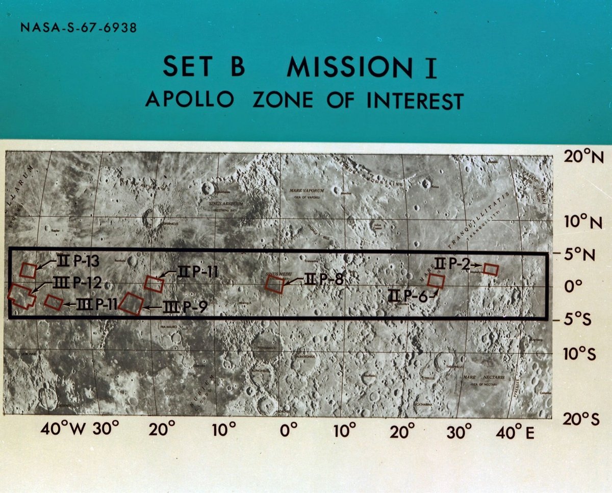
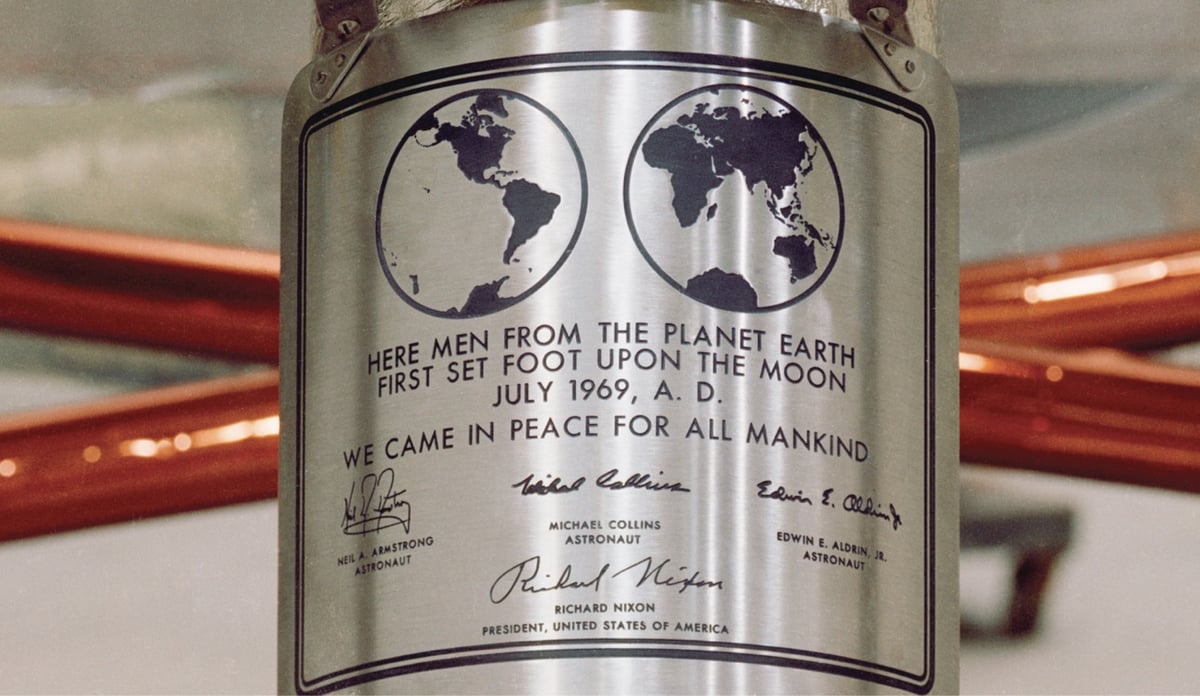
Futura, the typeface favored by the likes of filmmakers Stanley Kubrick and Wes Anderson was also used extensively for NASA’s Apollo 11 mission (along with an American knock-off of Futura called Spartan).
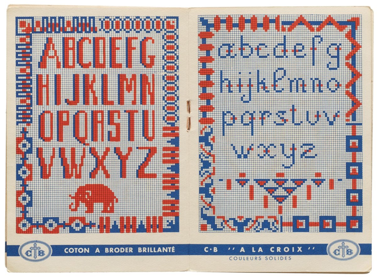
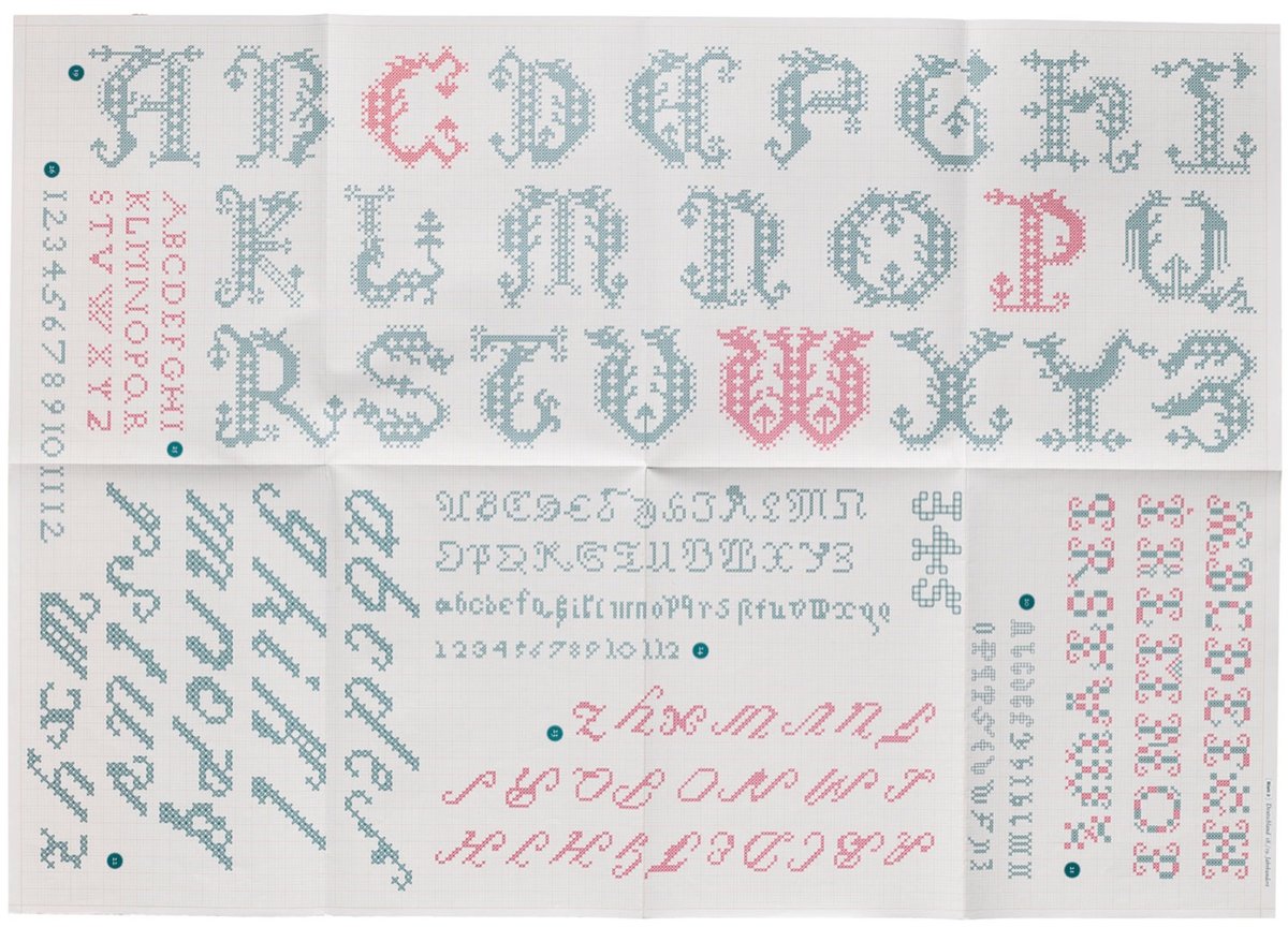
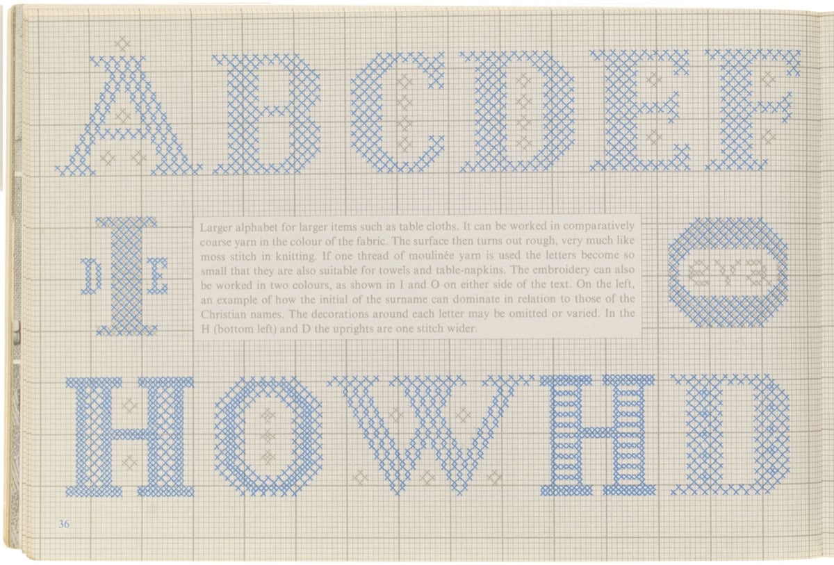
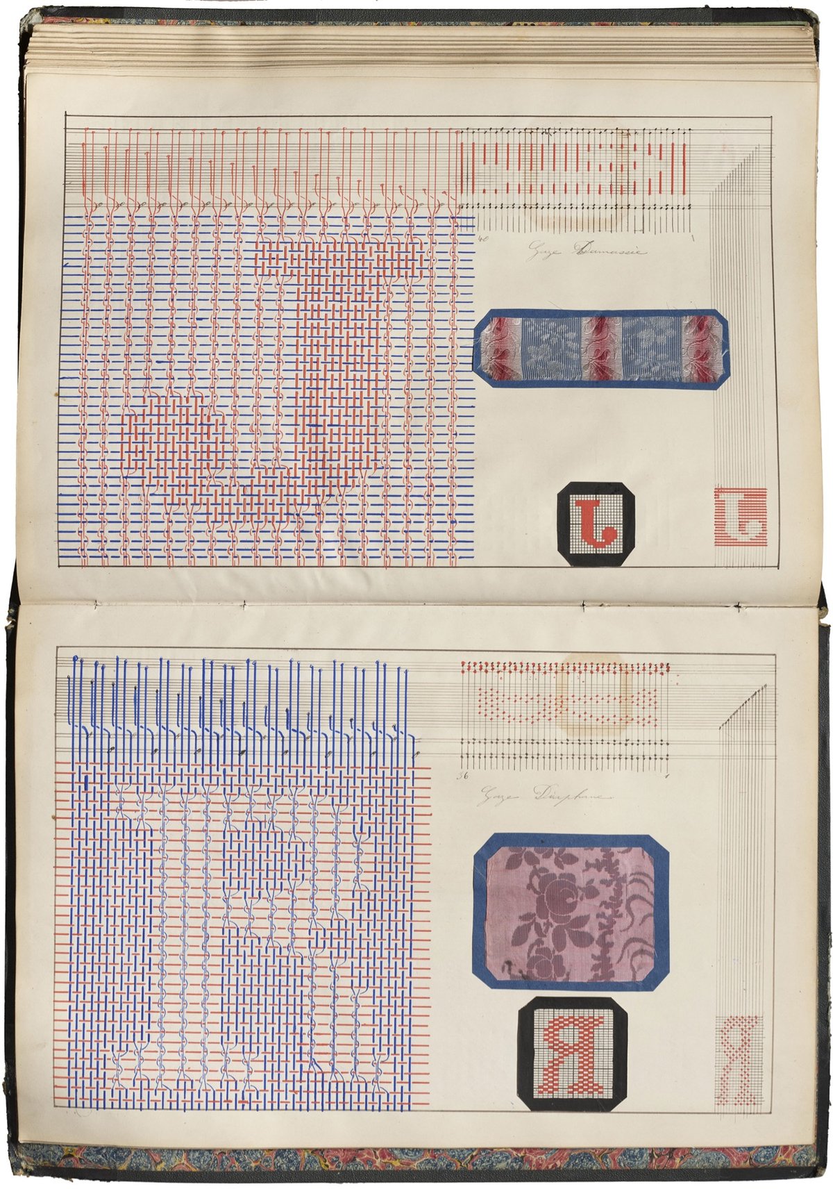
I loved looking at some of the items from the Letterform Archive related to the representation of letters with fabric (knitting, cross-stitch, weaving, etc.) Also, I did not know this re: the word “text”:
The word “text” originated from the Latin word “textus,” which means “a weaving” or “a fabric.” In ancient times, textus referred specifically to the process of weaving fabric. Over time, the meaning of the word expanded to include written or printed material, reflecting the idea of words being woven together to create a coherent written work. This metaphorical extension continues today with words and phrases such as seamless, threadbare, unraveled, looming, frayed, tangled, and spinning a yarn, highlighting the connection between the physical act of weaving fabric and the intellectual act of composing written language, both of which involve the interlacing of individual elements to create a unified whole. In this installment of For Your Reference, we revisit the Archive’s stacks for books and other items that build a tangible connection between threads and letterforms.
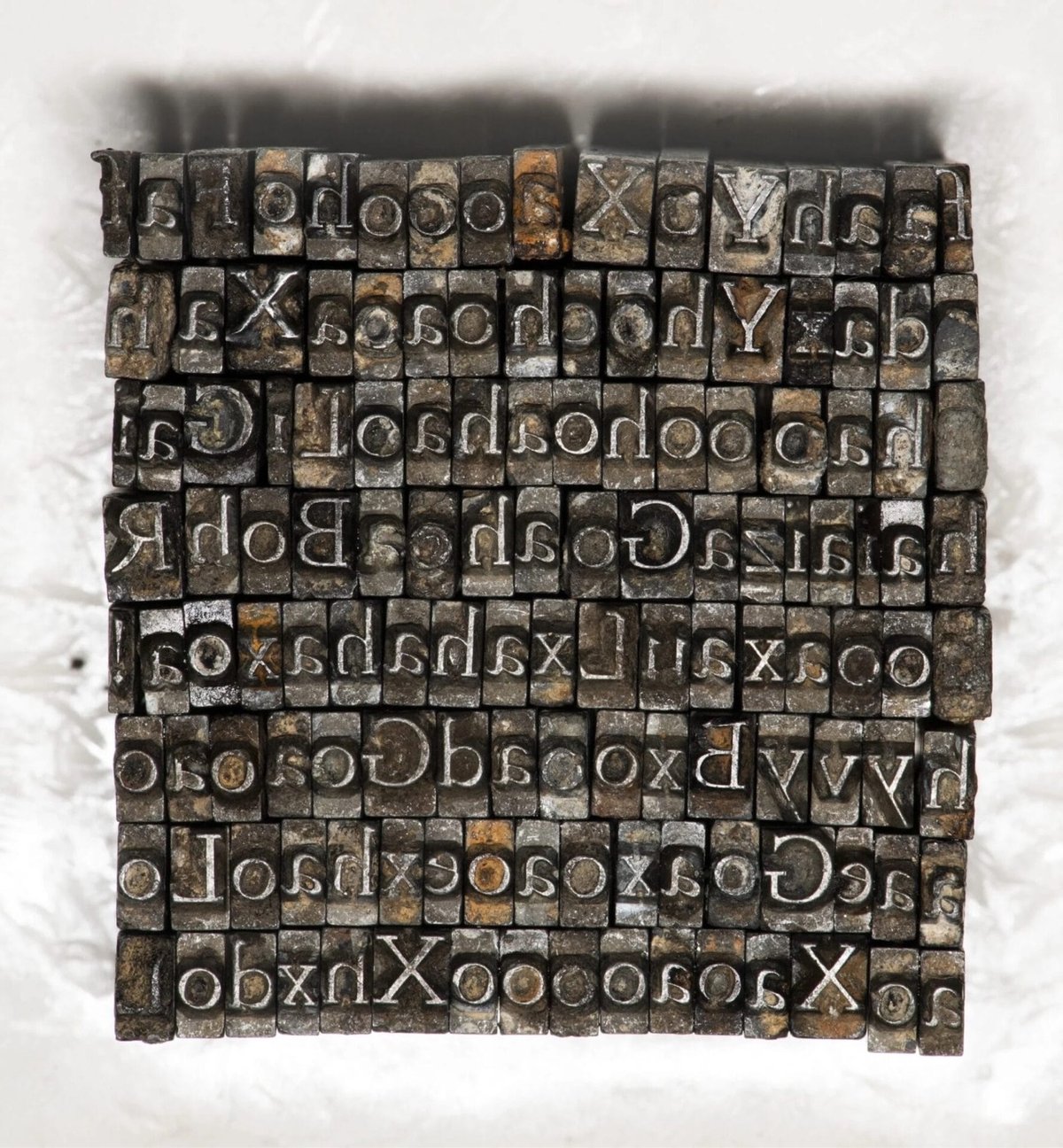
This is such a wild story. Two men, Thomas James Cobden-Sanderson & Emery Walker, founded the Doves Press in London in 1900. They made a typeface called Doves Roman:
During its short life early last century, the Doves Press printed and bound some of the finest books ever produced in England and its approach to typography and printing subsequently exerted a major influence over book design in Europe and the United States. Many of Cobden-Sanderson’s ideas would, decades later, find expression or adaptation in both Traditionalist and Modernist circles respectively.
The partnership busted up and Cobden-Sanderson eventually took all of the lead type and dumped it in the Thames River. No more typeface.
The thought of ‘his’ typeface being used by anyone else, and in a manner beyond his control, prompted Cobden-Sanderson’s now infamous course of action. Only the Doves Press, run exclusively by him, could be bestowed the honour of printing his type. And so the mission to destroy it, beginning with the punches and matrices on Good Friday 1913, began. On an almost nightly basis from August 1916 the ailing septuagenarian dumped the type into the Thames, wrapped in paper parcels and tied with string; “bequeathed to the river” as he put it in his personal diary. Every piece of this beautiful typeface, more than a ton of metal, was destroyed in a prolonged ritual sacrifice.
Type designer Robert Green, working from printed materials, made a digital facsimile font of Doves Roman. In a bid to improve the font, he set out to find the lead type dumped in the river, aided by Cobden-Sanderson’s diary entries of the type-destroying mission. He found a few of the metal sorts (i.e. pieces of lead type) and with assistance from the Port of London Authority’s diving team, ended up retrieving 151 metal sorts in all, “out of a possible 500,000”.
Here’s a short film about the recovery of the type:
You can testdrive and buy the text and headline typefaces that Green created using the recovered sorts. (via colossal)
Ryan Gosling was on Saturday Night Live this weekend and they did a sequel to one of my favorite SNL sketches (which is completely dorky in a design nerd sort of way) ever: Papyrus. Behold, Papyrus 2:
Avatar spawned worlds, right? Every little leaf of every little flower, every little eyelash of every little creature: thoroughly thought out. But the logo: it’s Papyrus, in bold. Nobody cares. Does James Cameron care? I don’t think so.
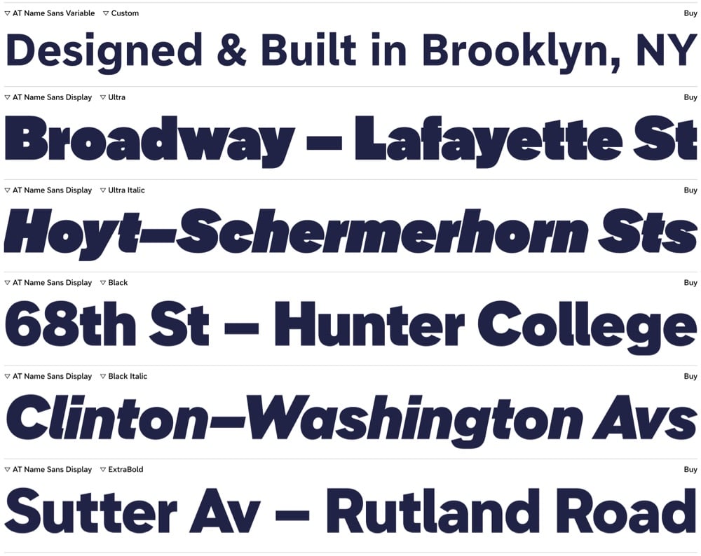
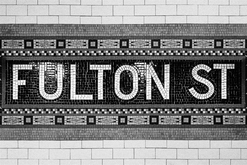
Name Sans is a typeface based on the tile mosaic lettering found in NYC subway stations.
The architects and craftworkers who designed & laid these tiles used a letter construction that was part geometric and part grotesque, with typographic optical corrections often either exaggerated or totally missing. Name Sans interprets these ideas into an extensive type system that is at once anonymous and full of personality, useful for everything from branding to wayfinding to digital interfaces.
Lovely. I like this a lot.
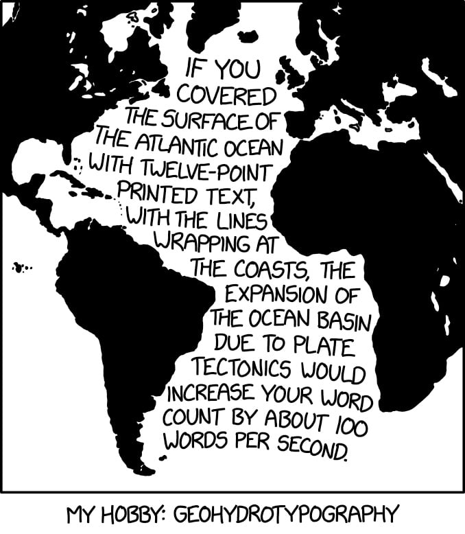
This, from XKCD, hits my science and design interests right in the sweet spot.
If you covered the surface of the Atlantic Ocean with twelve-point printed text, with the lines wrapping at the coasts, the expansion of the ocean basin due to tectonics would increase your word count by about 100 words per second.
This reminds me of Ben Terrett’s calculation of how many helveticas from here to the Moon and my subsequent calculations about the point size of the Earth and the Moon (50.2 billion and 13.7 billion, respectively).
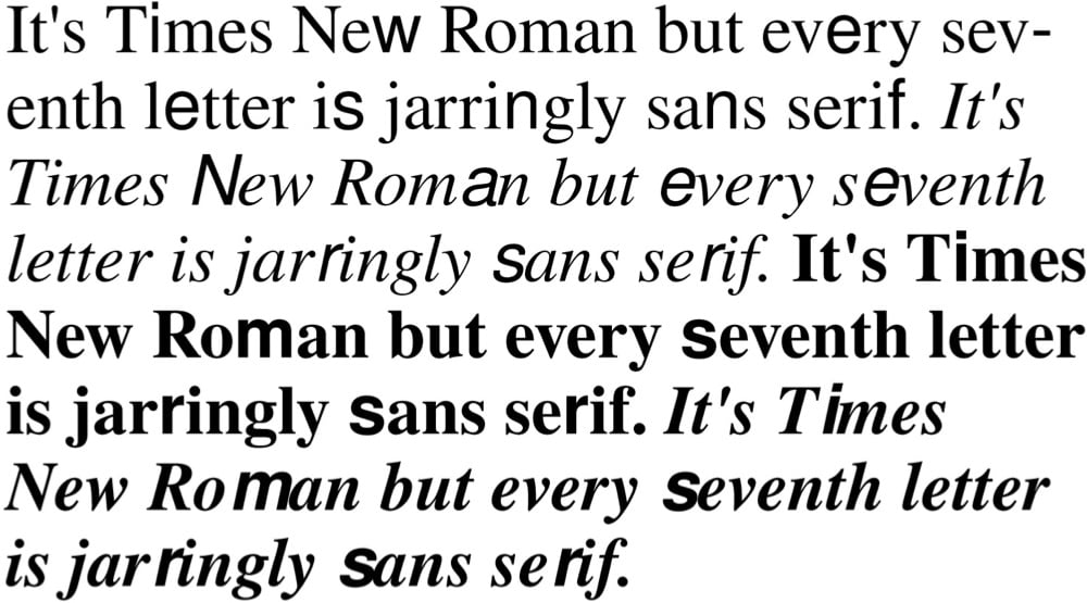
Times New Bastard is a free font based on a Tumblr thread: “It’s Times New Roman but every seventh letter is jarringly sans serif.”
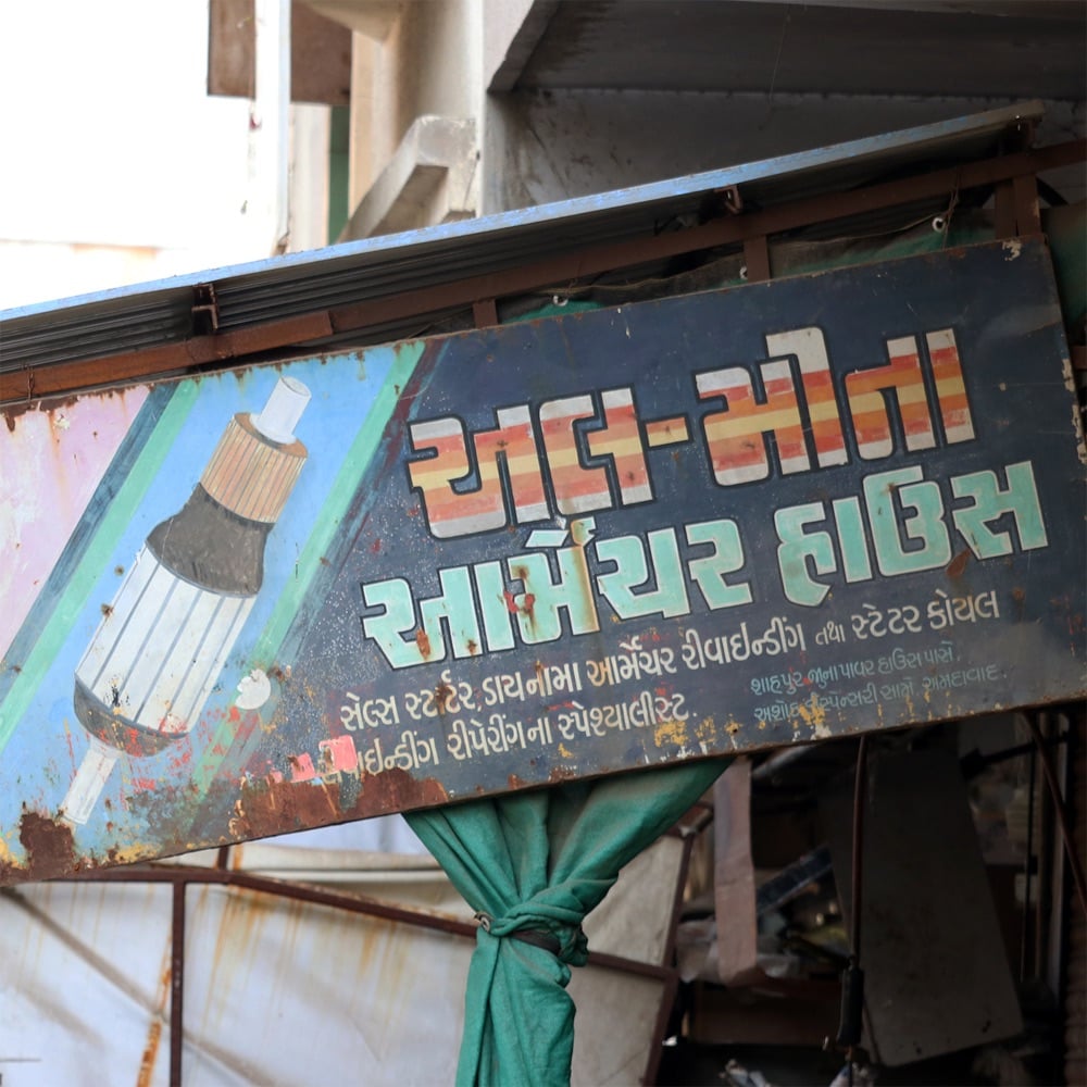
Pooja Saxena collects interesting examples of lettering from the streets of cities in India. Here are a few recent examples:

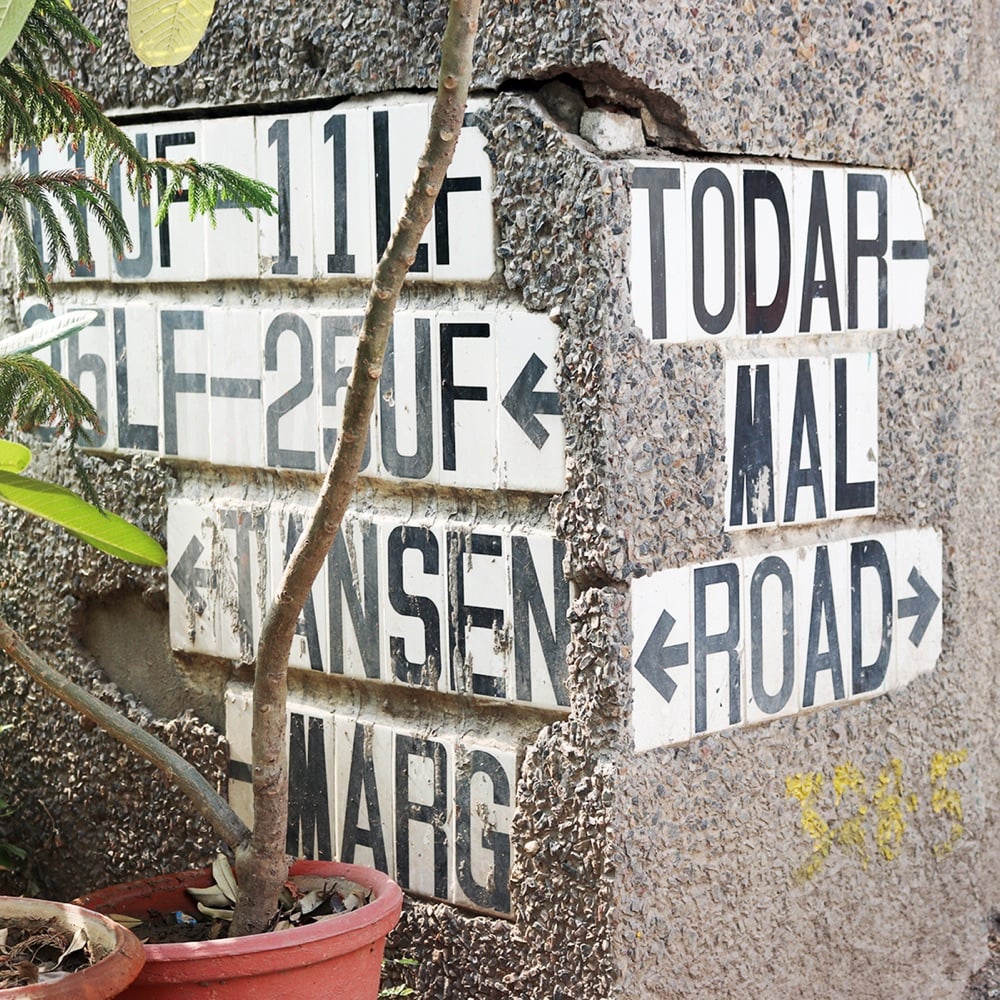
(via @ashur)
In a pair of collections on Behance, Hungarian designer and artist Miklós Kiss showcases his skill with ligatures and swirling serifs: Type Beast and Type Beast 2.0
I love typography. I love letters. I love to make ligatures and find connections between letters. These are not logos, but sometimes they can be. Sometimes this kind of typography is not readable. Sometimes they look like abstract artworks. Sometimes they look like choreography. I love to watch them move, I love their beauty. I call my little typography monsters my Type Beasts.
(via abdz)
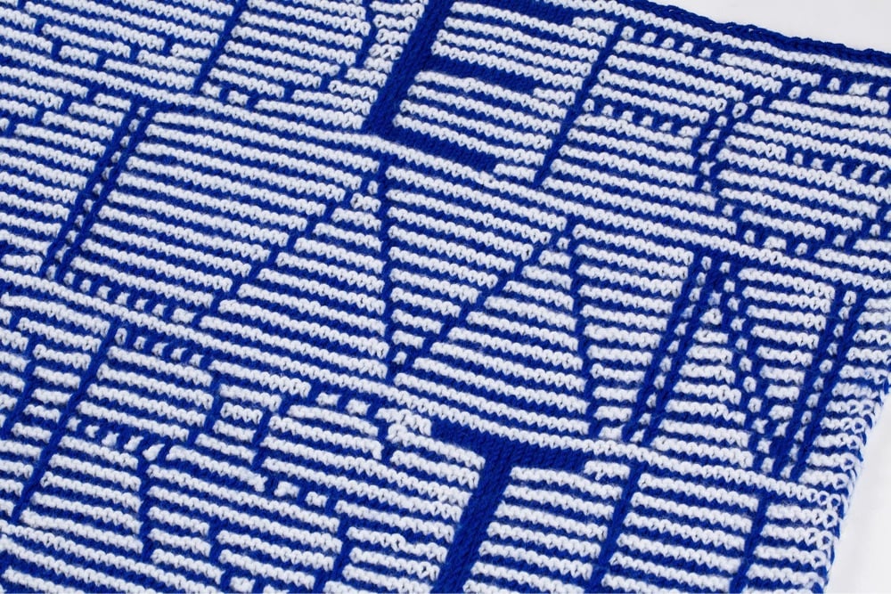
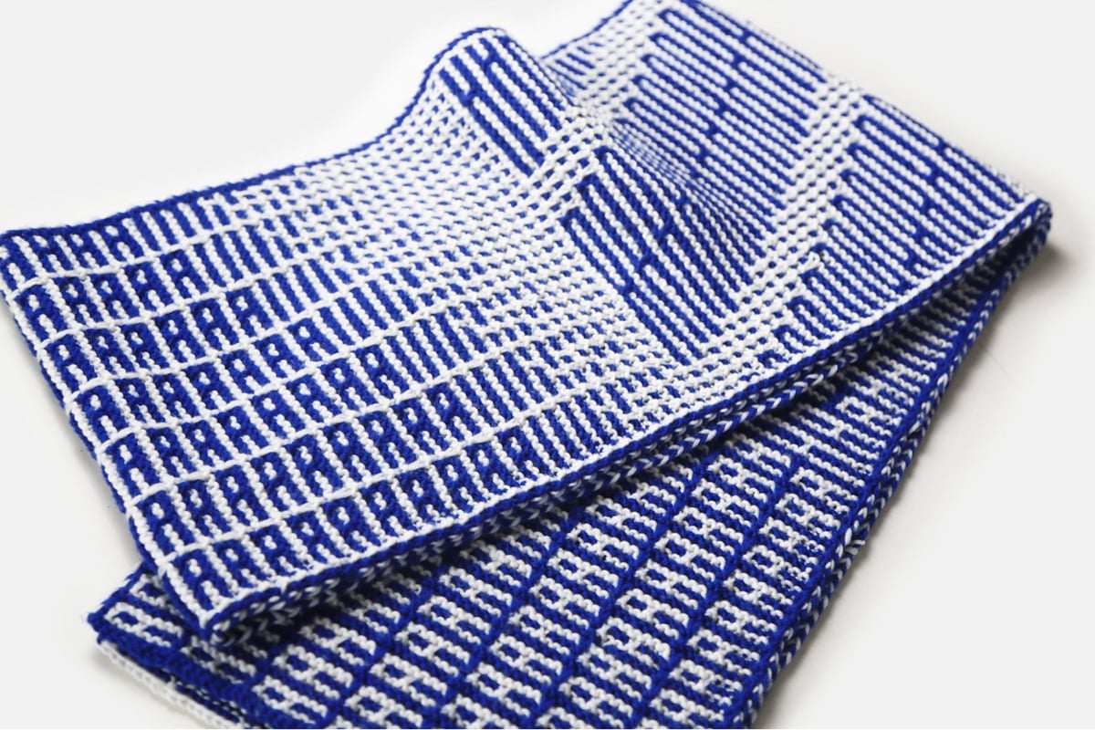
Knit Grotesk is a typeface based on Futura that’s designed specifically for hand knitting. It comes in three different weights and two styles: dots and stripes. Its designer, Rüdiger Schlömer, is also the author of a book called Typographic Knitting: From Pixel to Pattern:
Learn to knit a variety of typefaces modeled on digital designs by well-known type foundries including Emigre, Lineto, and Typotheque, and emblazon your hats, scarves, and sweaters with smartly designed monograms, letters, or words. Beginning with knitting basics, tips, and resources, and progressing through more advanced techniques, Typographic Knitting provides a systematic introduction on how to construct a variety of letter designs using different knitting techniques. This book bridges the gap between craft and design in a new way, and will delight typography connoisseurs, avid knitters, and makers looking for a novel medium.
(via print)
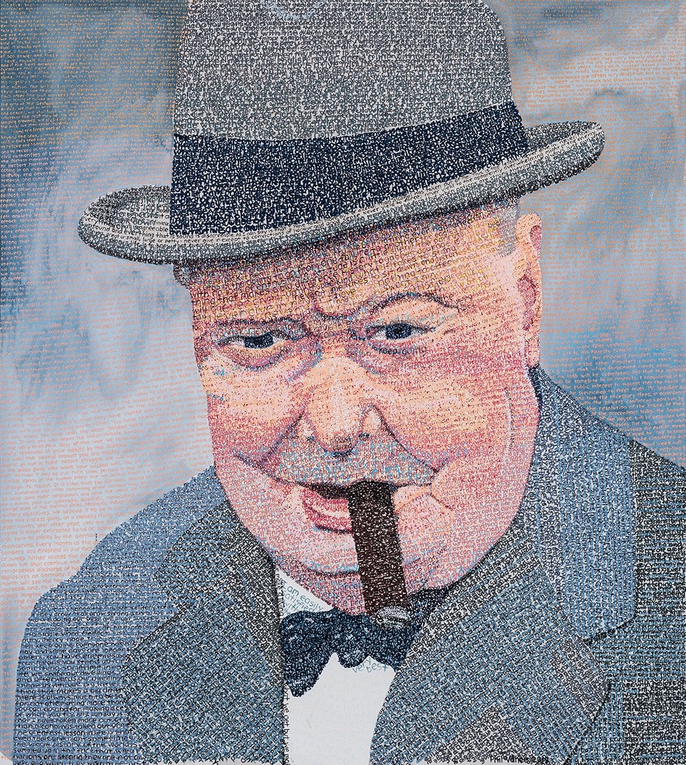
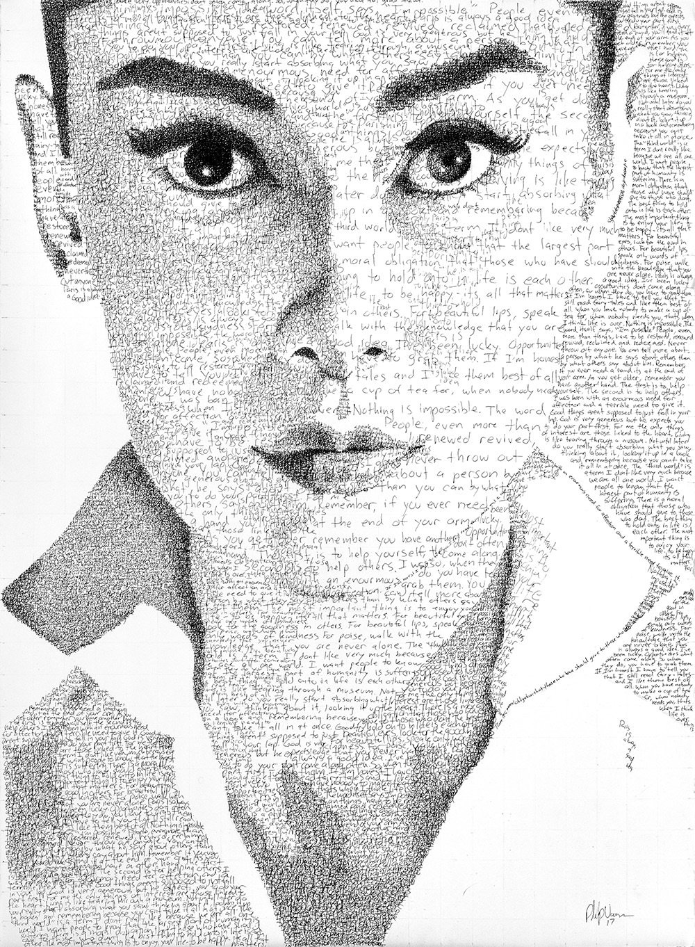
Phil Vance creates these wonderful typographic portraits of notable people like Audrey Hepburn, Albert Einstein, and Johnny Cash constructed from hand-painted type consisting of their own words. For instance, his portrait of Cash was created using the lyrics from his cover of God’s Gonna Cut You Down. You can check out more of Vance’s work on Instagram.
I know I’ve posted this before, but with the new Avatar movie out in theaters, it’s a good time to revisit the SNL sketch where Ryan Gosling is driven mad by the typeface choice for the movie’s logo.
I had forgotten about the title card at the end. Perfection.
Update: From Jake Kring-Schreifels at The Ringer last month: The Intertwining History of the ‘Avatar’ Papyrus Font and the ‘SNL’ Sketch That Spoofed It.
There actually is one single person responsible for Avatar’s Papyrus-esque logo: Peter Stougaard. The former senior vice president of creative advertising for 20th Century Fox willingly takes credit for selecting and tweaking the movie’s much-maligned font, but he doesn’t mince words. “I didn’t aimlessly pick Papyrus,” he insists. “I chose it very strategically.”
I can’t believe they got it off of the cover of Cameron’s copy of the script. (thx, matt)
As a former mini-golf champion, I am completely charmed by Alphaputt, an mini golf iOS game where the courses are shaped like letters of the alphabet.
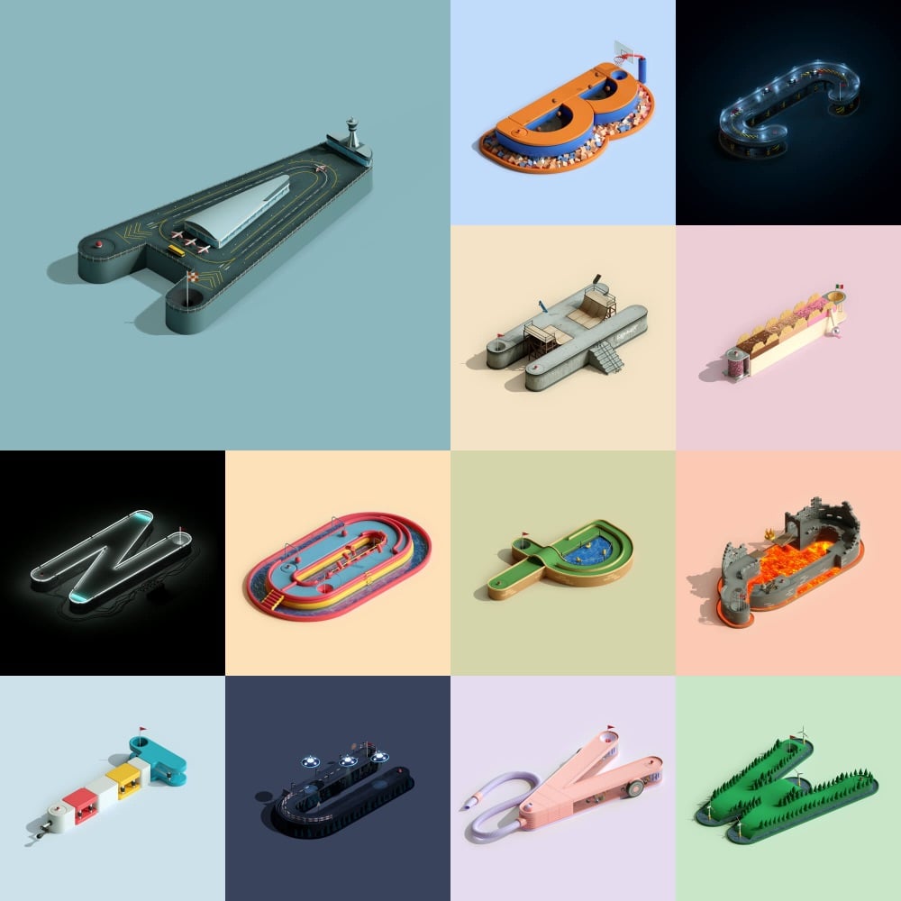

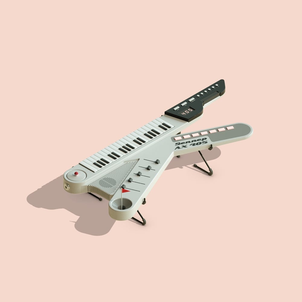
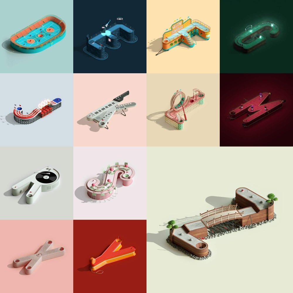
You can play through the alphabet or play a customized course by typing out a word (come on, that’s pretty cool). (via colossal)
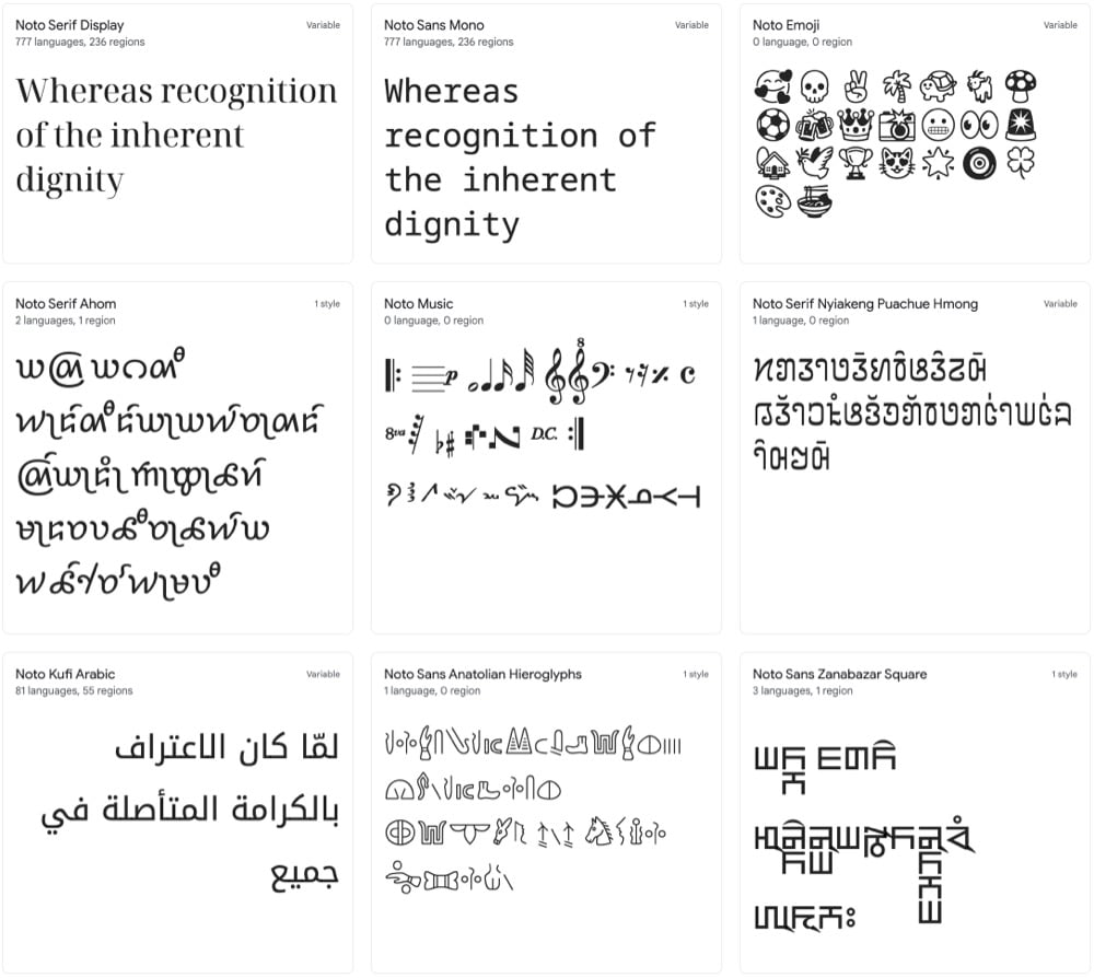
Google has developed a typeface called Noto that seemingly includes every single character and symbol used for writing in the history of the world. I mean, look at all these different options: Korean, Bengali, Emoji, Egyptian hieroglyphs, Coptic, Old Hungarian, Cuneiform, Linear B, Osage, and literally dozens more.
Noto is a collection of high-quality fonts with multiple weights and widths in sans, serif, mono, and other styles. The Noto fonts are perfect for harmonious, aesthetic, and typographically correct global communication, in more than 1,000 languages and over 150 writing systems.
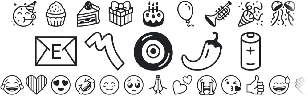
A particular shoutout to Noto Emoji: it supports the latest emoji release (14.0) and includes 3,663 emoji in multiple weights.
Perhaps it’s time for a new typeface ‘round these parts…
Update: I got it in my head that Noto was a new typeface, but it was first released in 2013. But Noto’s monochrome emoji font is new — I think that’s where I got confused.
I love this messy modernist typeface from LA-based designer Adam Goldberg. Maybe the J is my favorite?
I also quite like the concept of messy modernism — that seems like my wheelhouse. (via colossal)
Older posts
Socials & More