The Arresting Typography of the Sanborn Fire Insurance Maps
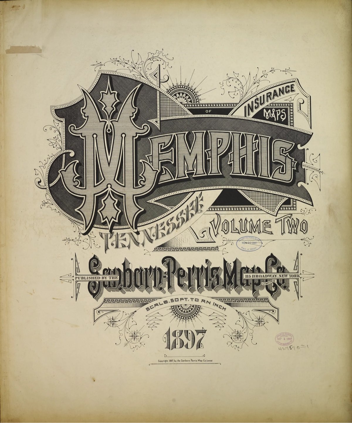
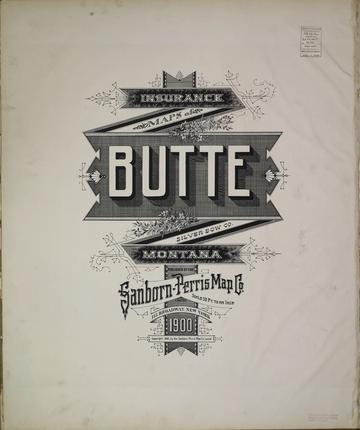
Several years ago, Brandon Silverman become obsessed with the lettering and typography on the fire insurance maps published by the Sanborn Map Company in the late 19th and early 20th centuries.
Sanborn maps were designed to help insurance companies assess the fire risk of individual properties. They were highly detailed, showing the size, shape, and construction of buildings, as well as the materials used in their construction. This information was used by insurance companies to calculate the premium that a property owner would have to pay for fire insurance.
He even used the ornate, intricately designed covers as a model for his wedding invitation. Silverman recently launched a site dedicated to the design of these fire maps, collecting high-res digital scans of the art found on almost every cover and index page, over 3500 images in all. The cover pages are particularly beautiful. Oh, and you can order prints of all the images as well.
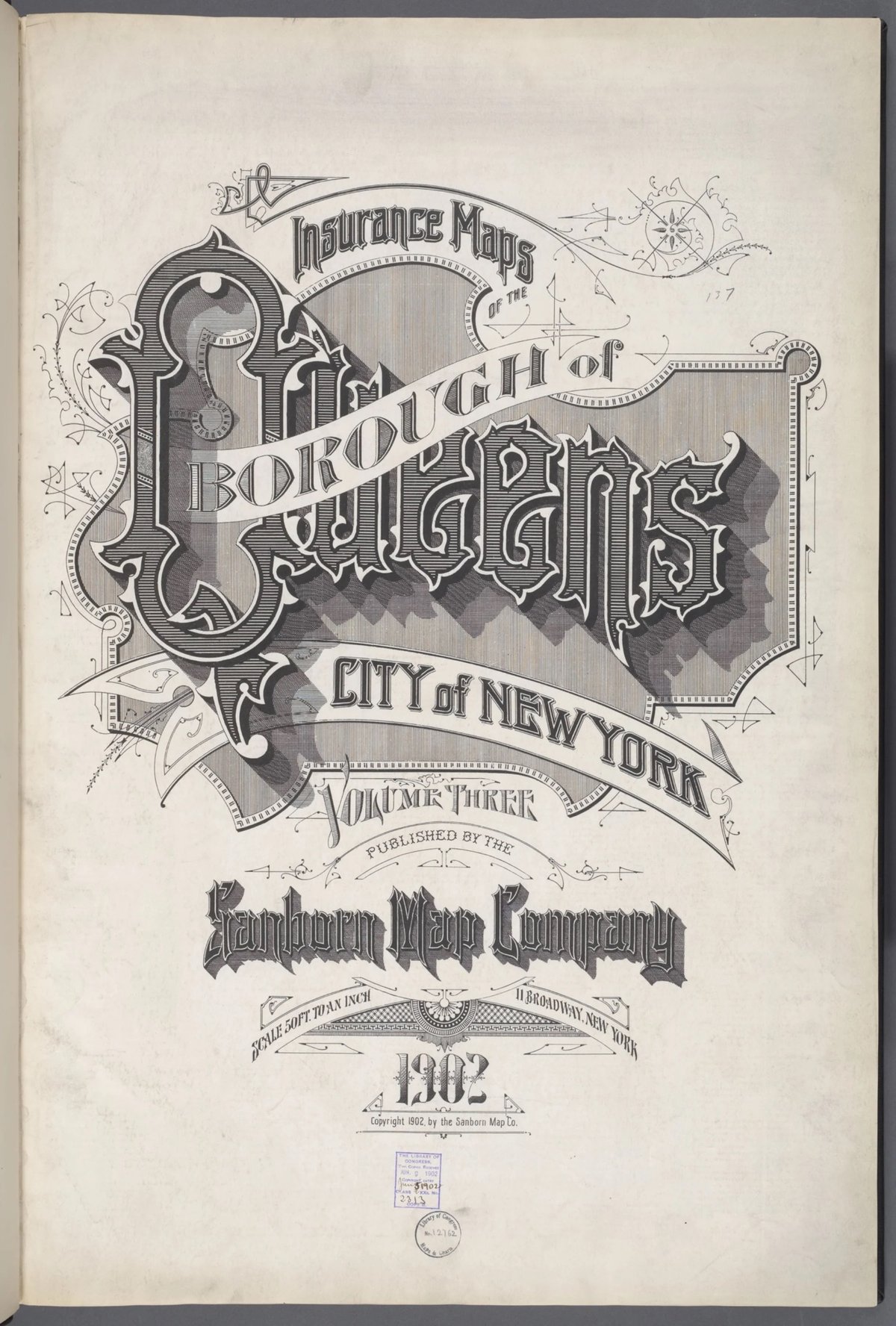
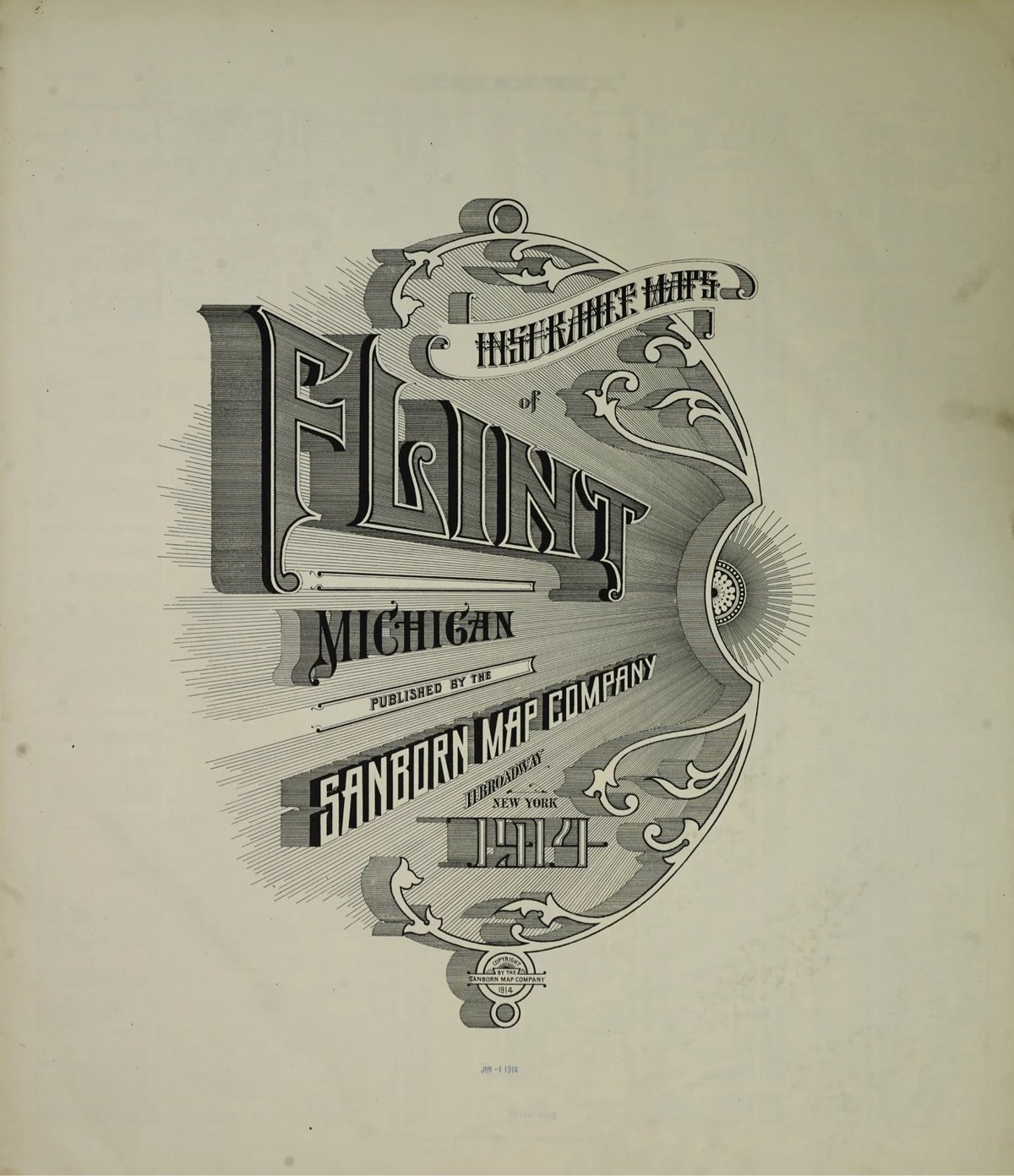
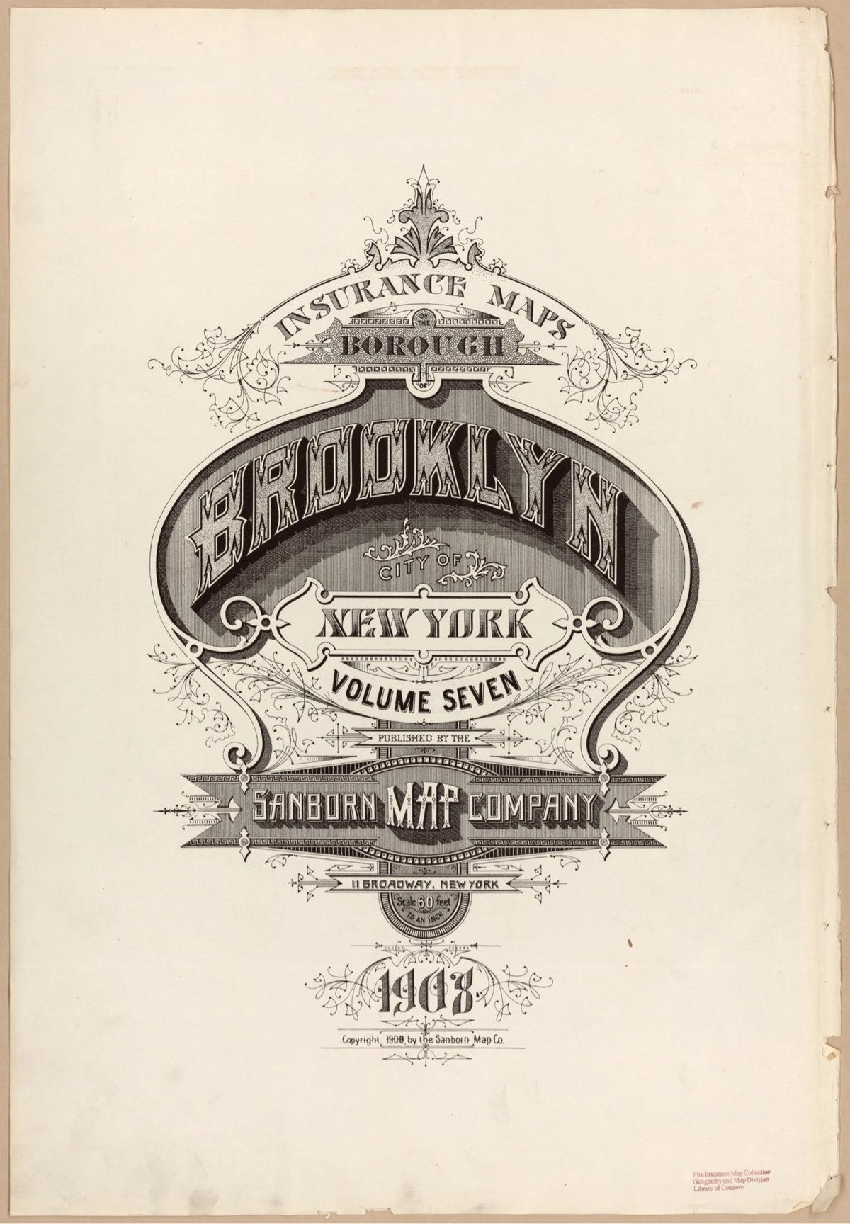
Fun fact: Silverman first learned about the fire insurance maps from a 2011 post on kottke.org.



Socials & More