The Arresting Typography of the Sanborn Fire Insurance Maps
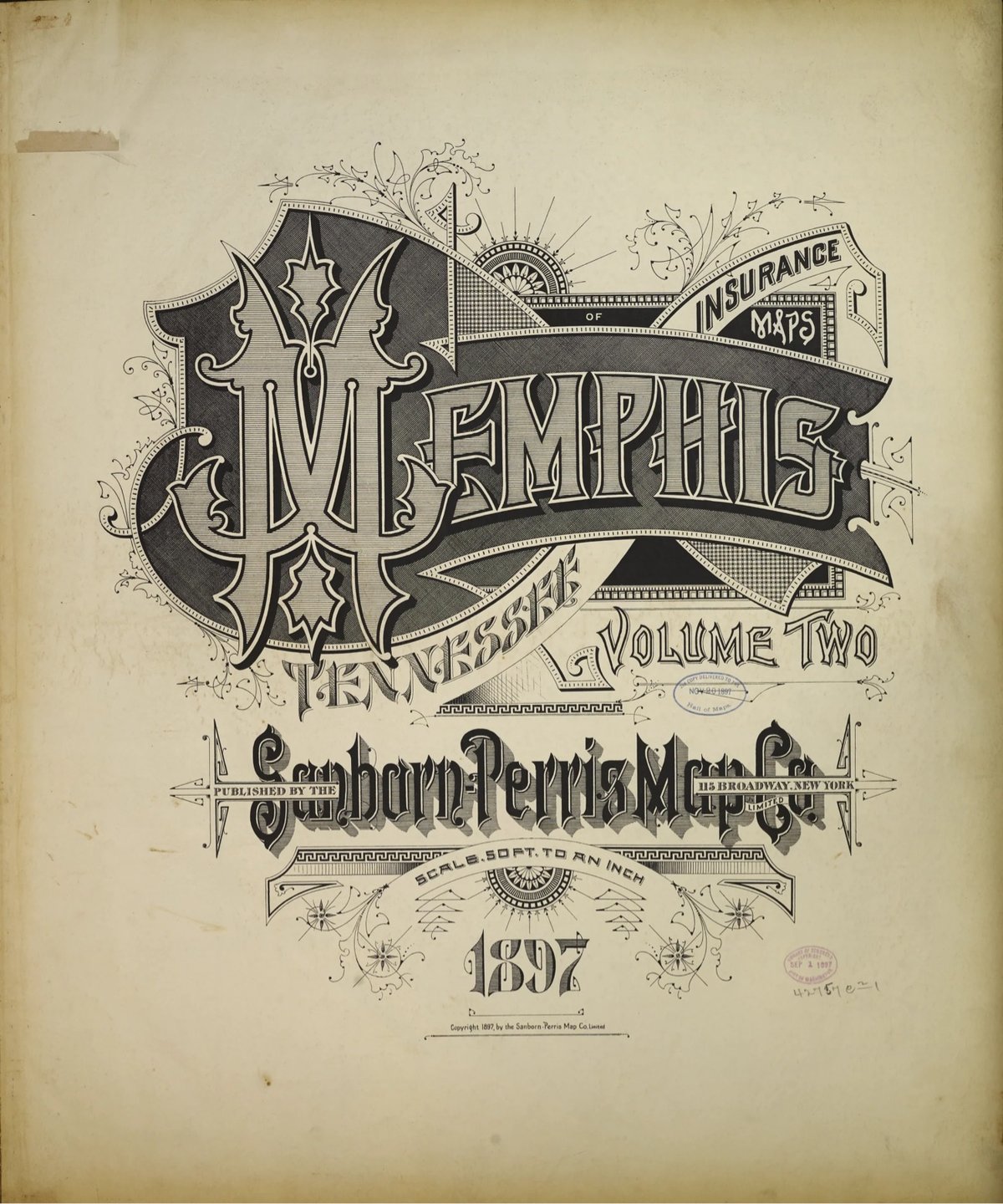
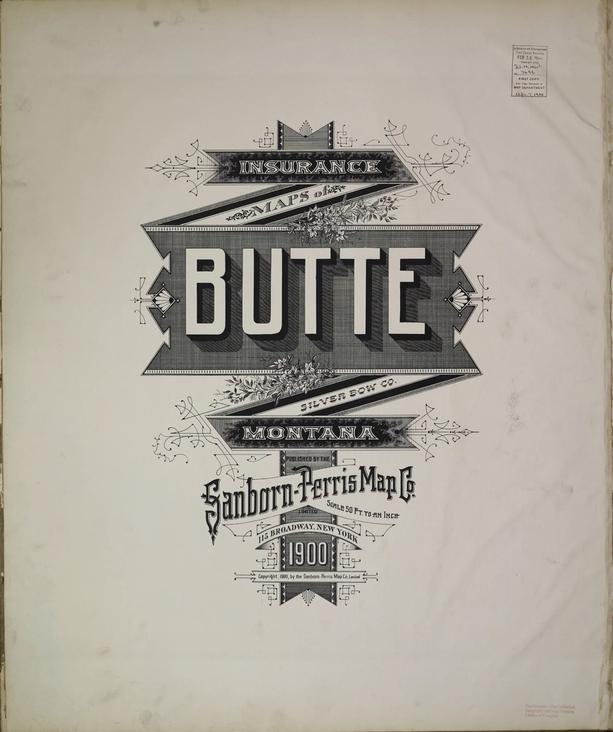
Several years ago, Brandon Silverman become obsessed with the lettering and typography on the fire insurance maps published by the Sanborn Map Company in the late 19th and early 20th centuries.
Sanborn maps were designed to help insurance companies assess the fire risk of individual properties. They were highly detailed, showing the size, shape, and construction of buildings, as well as the materials used in their construction. This information was used by insurance companies to calculate the premium that a property owner would have to pay for fire insurance.
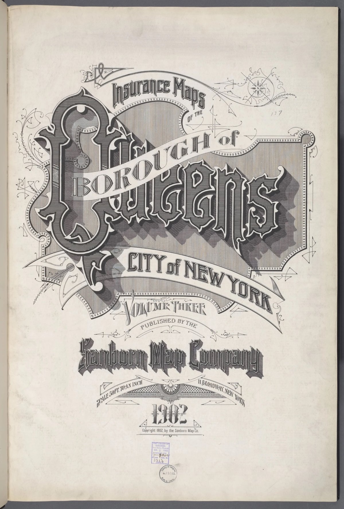
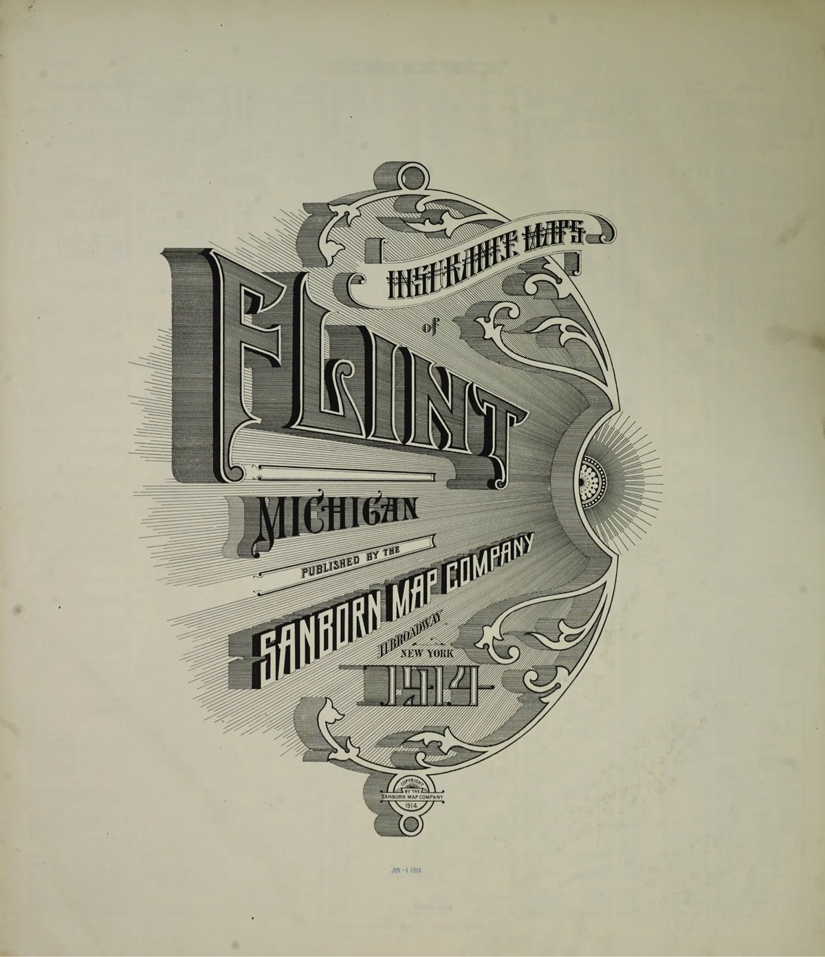
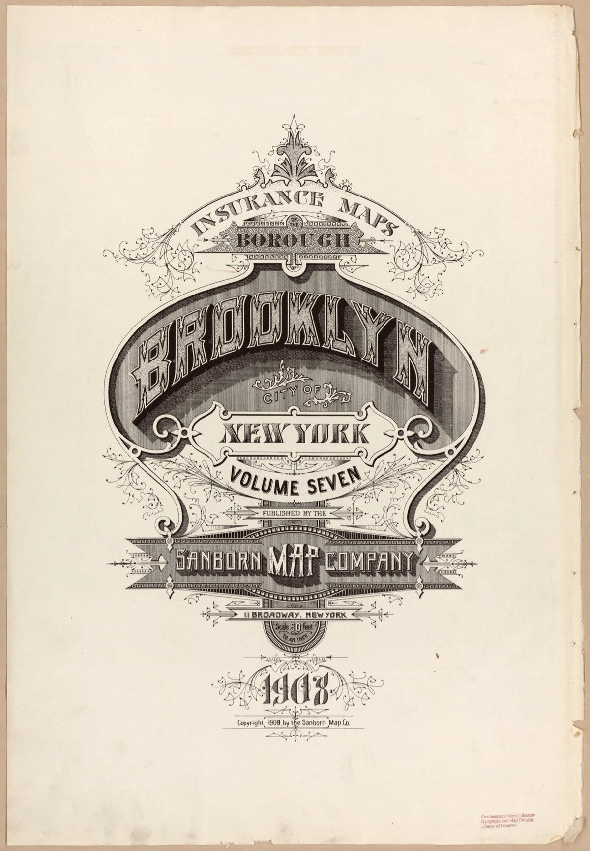
He even used the ornate, intricately designed covers as a model for his wedding invitation. Silverman recently launched a site dedicated to the design of these fire maps, collecting high-res digital scans of the art found on almost every cover and index page, over 3500 images in all. The cover pages are particularly beautiful. Oh, and you can order prints of all the images as well.
Fun fact: Silverman first learned about the fire insurance maps from a 2011 post on kottke.org.




Comments 4
The Sanborn map of San Francisco from 1887 is pretty fascinating to me. Sure, I looked up my street address, but that led me to trace the railroad that used to go through my neighborhood and then to look up street names that don't exist anymore and then to see exactly how constrained the city was back then.
Fantastic work, Brandon! The maps and title pages are quite special. I went down my own rabbit hole about the maps and title pages several years ago, too. Since I live close to the Library of Congress, I went ahead and got my library card and visited some of these impressively-large map books in the amazing Geography & Maps Reading Room. I wrote a bit about it on my blog back then, too.
So gorgeous, my breath is taken and it's not coming back...
Some of these fonts are so metal, I want to see death metal band logos rendered like this.
Hello! In order to comment or fave, you need to be a current kottke.org member. If you'd like to sign up for a membership to support the site and join the conversation, you can explore your options here.
Existing members can sign in here. If you're a former member, you can renew your membership.
Note: If you are a member and tried to log in, it didn't work, and now you're stuck in a neverending login loop of death, try disabling any ad blockers or extensions. Or try logging out and then back in. Still having trouble? Email me!
In order to comment or fave, you need to be a current kottke.org member. Check out your options for renewal.
If you feel like this comment goes against the grain of the community guidelines or is otherwise inappropriate, please let me know and I will take a look at it.
This thread is closed for new comments & replies. Thanks to everyone for participating!