The European Central Bank is providing a sneak peek at the next design of the Euro banknotes. From a shortlist of 10 designs created by artists and designers from across the EU, one will be selected as the basis of how Euro banknotes from €5 to €200 will look in the future. Here are a few I pulled out from all of the designs:
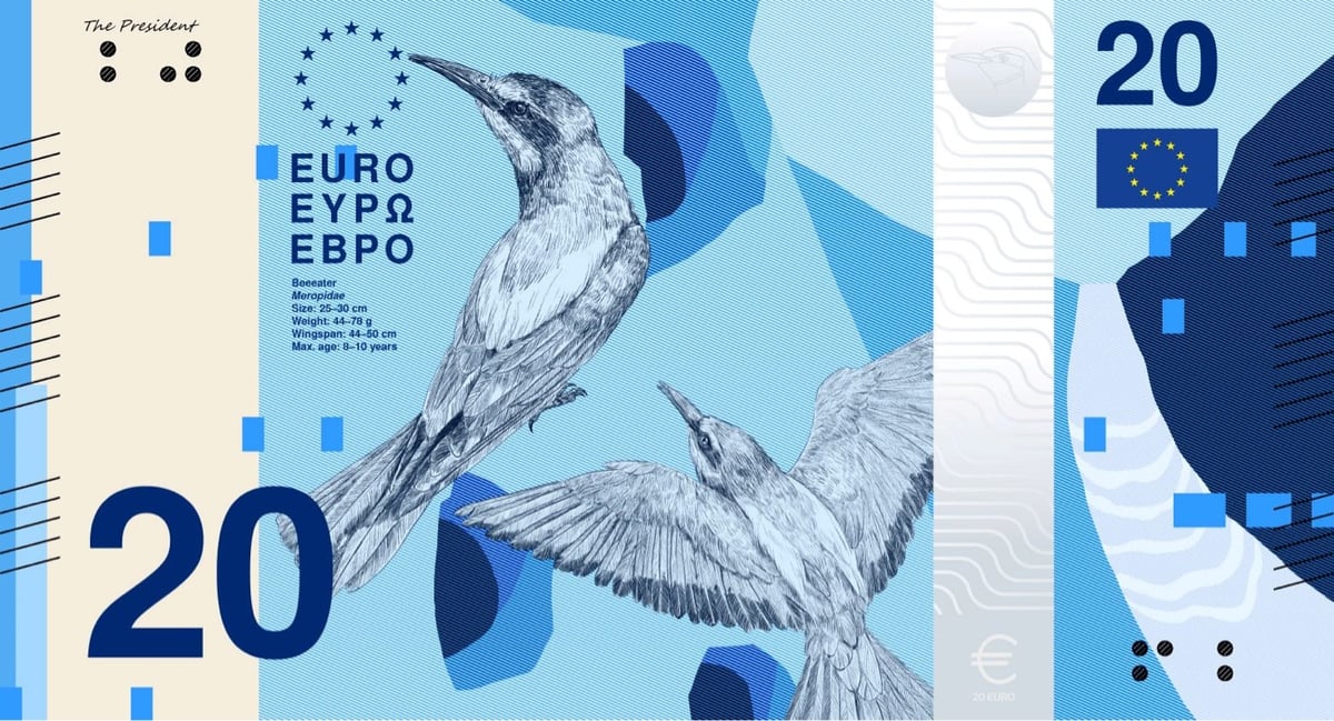

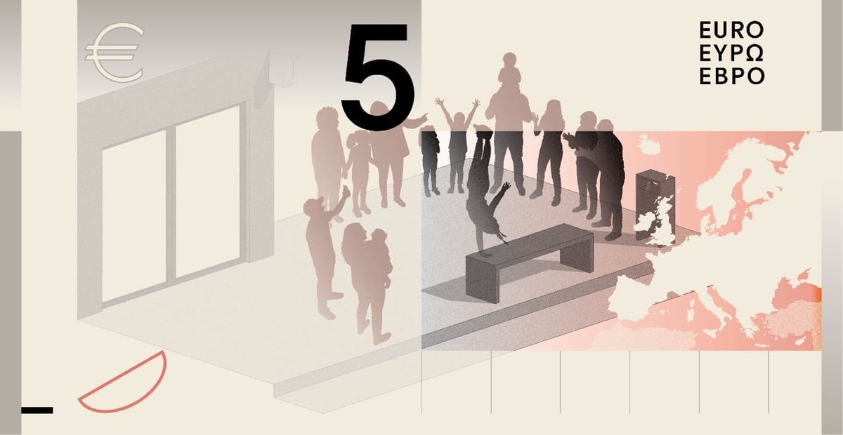
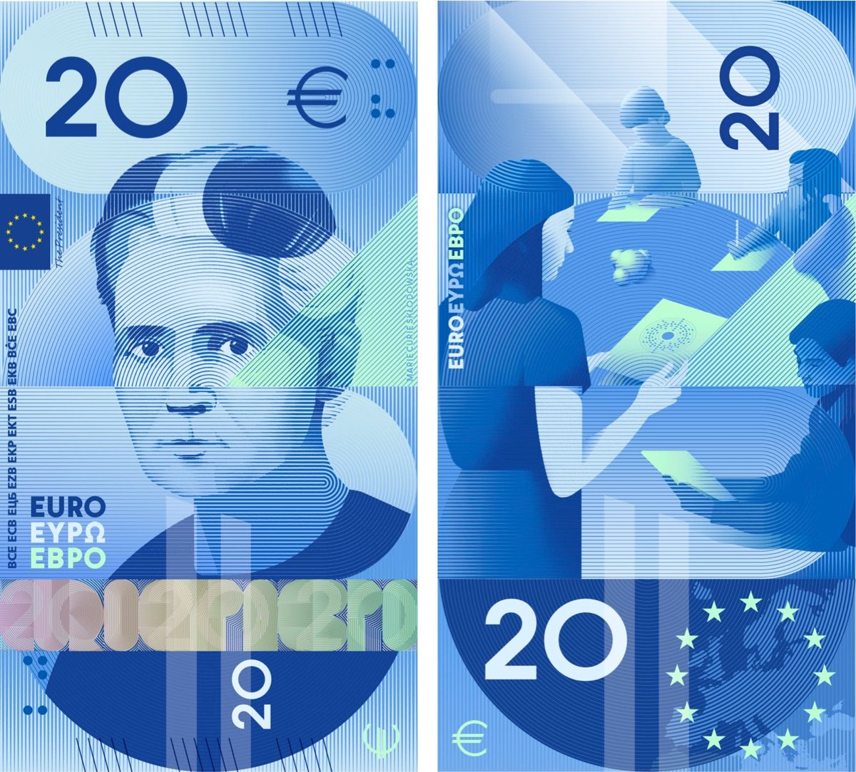
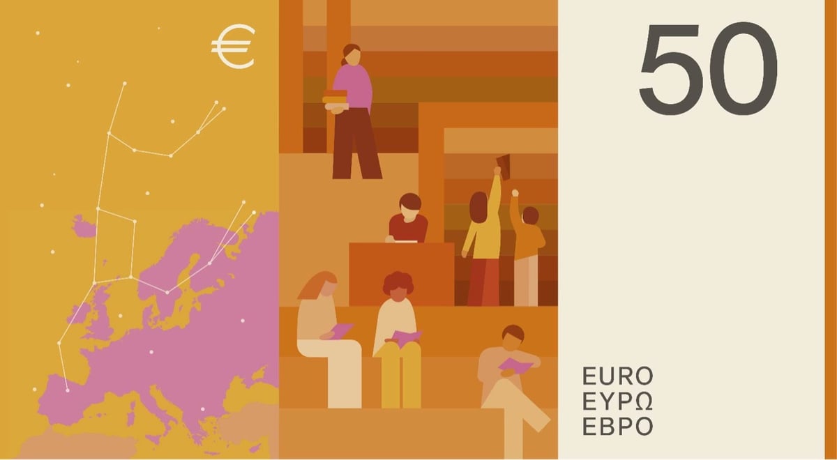
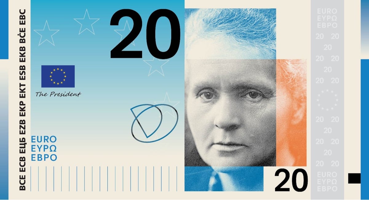

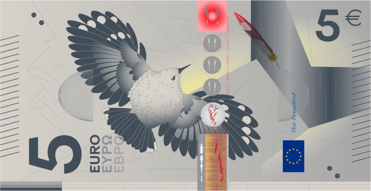

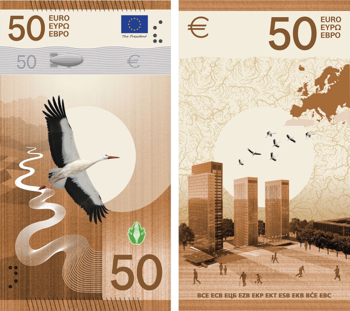
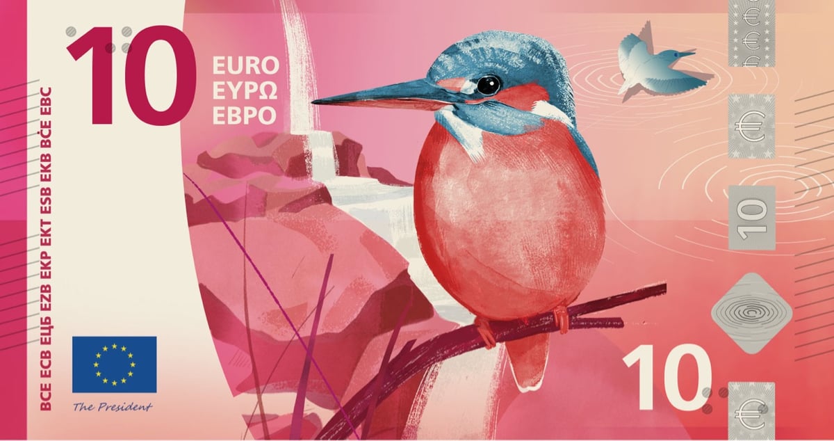
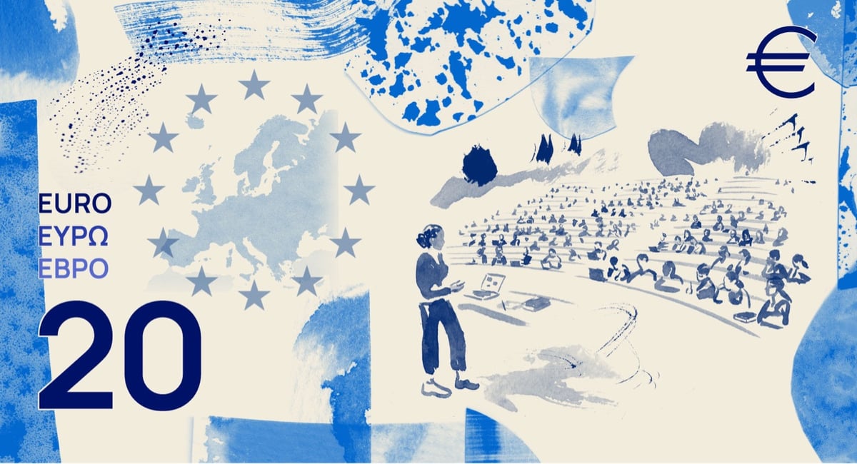
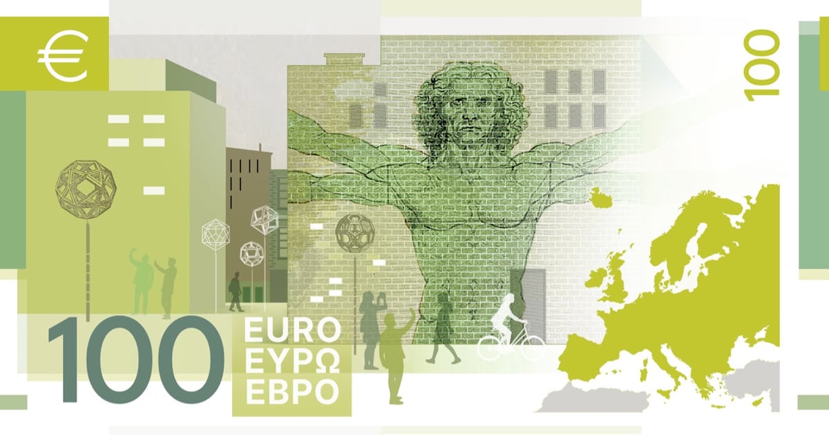
It’s notable (*cough*) that some of the banknotes are designed vertically vs horizontally. The influence of portrait mode on smartphones?
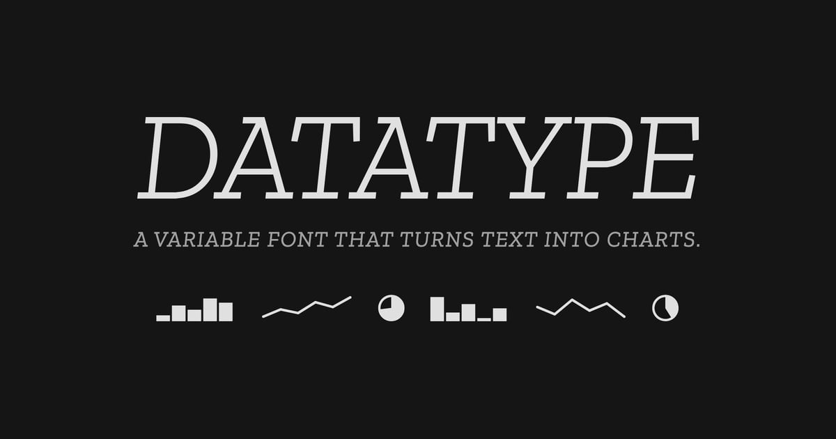
“Datatype is an OpenType variable font that turns simple text expressions into inline charts. No JavaScript, no images, no rendering library — just type the syntax and Datatype’s ligature substitution does the rest.”
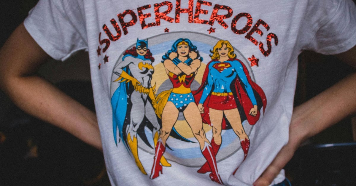
The Batman Effect: people in an experiment acted more altruisticly when the caped crusader was present.
KDO Rolodex a list of kindred spirits, friends, open web enthusiasts, role models, fellow travelers, and collaborators
From the filmmakers who made the excellent Once Upon a Time in Northern Ireland comes a four-part series on space exploration, Once Upon a Time in Space. A short trailer is above; here’s a synopsis:
Drawing on intimate, unseen archive and powerful first-hand testimony, this landmark 4-part series tells the human stories behind our quest to explore space, offering a unique perspective on our changing world and where we are headed.
The series first aired on the BBC and the first two episodes are now available on PBS. (thx, mitch)
An Uncomplicated Man, Emily Wilson’s review of Nolan’s The Odyssey. “I would be ashamed to have written any part of this script. Sadly, Damon’s Odysseus isn’t complicated or wily or artful.”
Astronauts returning from long missions report a “jet lag of the self”: “a sense of watching their own lives from a half-step outside the frame”.
I appreciate the plain speech of Science magazine’s Derek Lowe in his recent piece, The Assault On Science Funding Continues.
When I talk to people about this subject (and that includes some journalists as well) and say what I’m about to at the end of this paragaph I am sometimes met with disbelief. But I mean what I say and I am trying my best to say what I mean: The Trump administration hates academic science funding, full stop. They hate where that money goes, and they hate who it goes to. They want to keep all that money for themselves, to hand out to favored cronies who can help them get elected and to steer yet more money and more power back into their hands.
That’s it. That’s the story. They are naturally not putting it in those words, but instead talking about “gold standard science” and the “reproducibility crisis” and funding “bold inquiry” for “transformational breakthroughs”. This is all bullshit, and it’s important to realize that. Shameless hand-waving bullshit, delivered in a how-dare-you-think-otherwise manner is the defining style of the entire Trump administration. You can see it in every appointee, in every part of the executive branch, and in the pronouncements of all of Trump’s supporters. I realize that this is a simple heuristic to apply, and a very unambiguous and unflattering one, but I find it to be all too useful and all too accurate. Give it a try.
Yep. He’s the mob boss president — everything is about favors, taking his cut, deals, tough guy-ness, bending the world to his will, power, and white male supremacy.
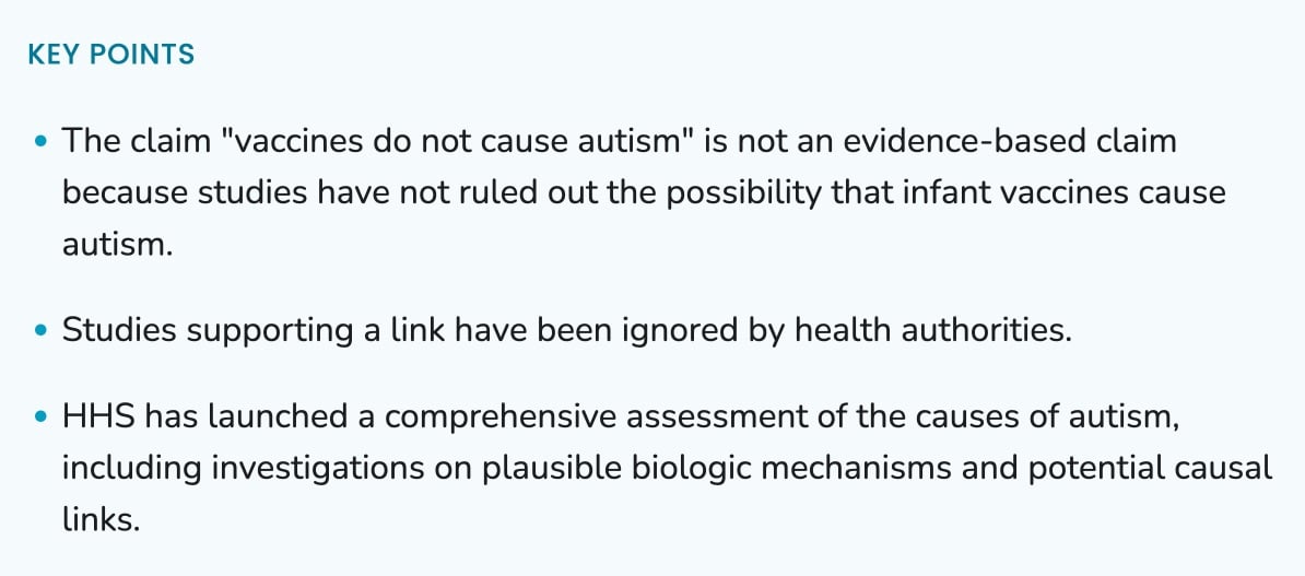
Welp, right at the top of the CDC page on autism and vaccines: “The claim ‘vaccines do not cause autism’ is not an evidence-based claim because studies have not ruled out the possibility that infant vaccines cause autism.” 🫨
New orca behavior unlocked. They’ve been known to sink boats and wear salmon for hats; now they’re ramming fish so hard they explode. “Orcas were observed to hold sunfish in their jaws while a second whale smashed into the target at high speed…”
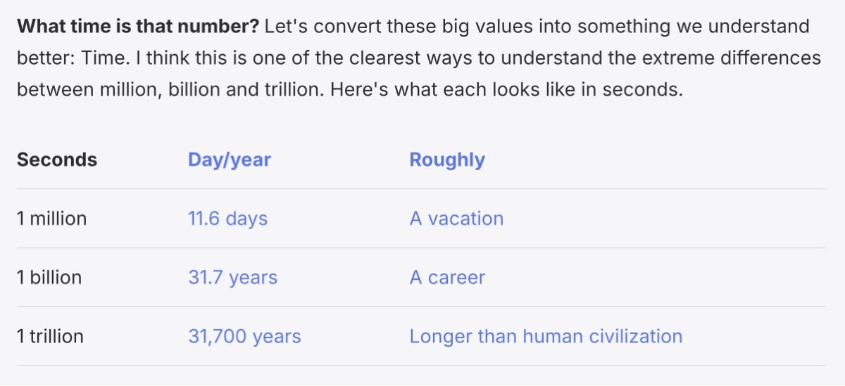
It’s our ethical duty to understand large numbers. “Our world is increasingly moving towards extreme values: Damages from climate change, deaths due to genocide, wealth that knows no bounds. We can’t tackle them if we can’t wrap our heads around [them].”
A Teen Reporter Searched for His Community in the Epstein Files. Adults Freaked Out. “Once everyone was back at school on Tuesday, the high schoolers lawyered up during their lunch hour.”
“A beloved, useful, free website, run carefully by a competent, honest person for nearly thirty years, was crushed between two features of the new AI economy.” (AI bots and prediction market dipshits.)
“In extreme cases, it can create a phantom homeland, for the sake of which one is ready to die or kill. Unreflective nostalgia can breed monsters.” On the good and bad types of nostalgia.
Following a prompt from Joanna at Cup of Jo… The local deli or sandwich shop names a sandwich after you. What would be on it? Perhaps another way of asking the question: what’s your favorite sandwich that’s a little bit unusual?
I love a classic BLT, banh mi, or jambon beurre, but a sandwich that is fairly unique to me is tuna salad (made with pickles, pickle juice, and scallions), havarti, lettuce, and tomatoes on good white bread or a kaiser roll. I think that would be The Kottke at the local deli. Either that or something chopped?
Why are American ambulances so expensive? In part because Medicare pays only a fraction of the actual cost of an ambulance ride and the uninsured often don’t pay at all, so the privately insured get bills of $13,000 for a $2600 ride.
We’re Squandering LEDs’ Potential to Save Our Night Skies. “Our main failure isn’t a technical one. It’s that we have yet to revise our thinking about lighting at night. We use LED technology just as we did the old sources of light.”
In addition to leading the animation studio at the National Film Board of Canada, René Jodoin made several animated films that explored geometric forms and motion, including the one above, A Matter of Form from 1984.
Set to the rousing notes of Schubert’s Military March, this animation film is an ingenious example of how a single point can be the building-block for a multiplicity of shapes and configurations. Lines and forms grow out of the point, eventually covering the entire screen in splashes of colour. This is geometric wizardry at its colourful best. A film without words.
I’m not saying my affinity for such animations is because I watched so much Sesame Street as a kid, but I’m not not saying it either.
Here’s another of Jodoin’s films, Dance Squared:
You can watch more of Jodoin’s work in this YouTube playlist. (via the kid should see this)
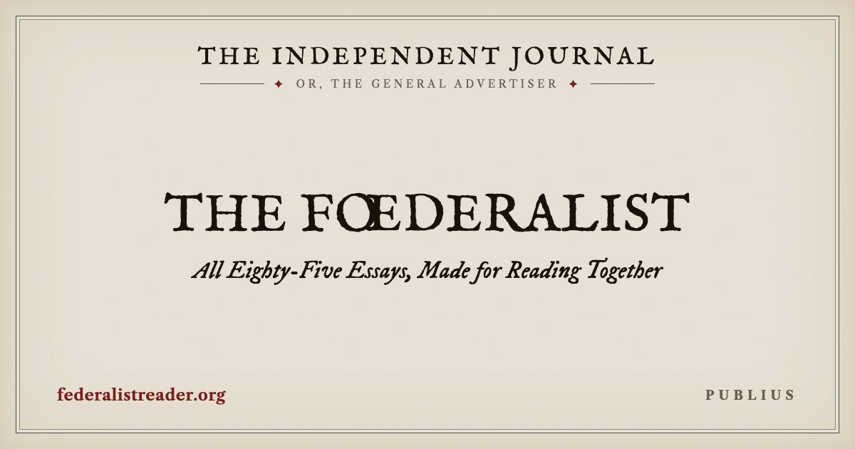
An online edition of all 85 of the Federalist Papers, presented as they were originally serialized in newspapers, with on eye on good typography and readability.
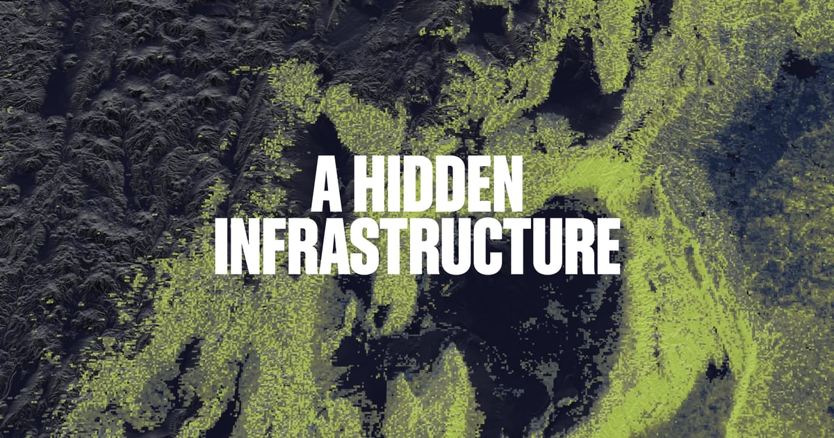
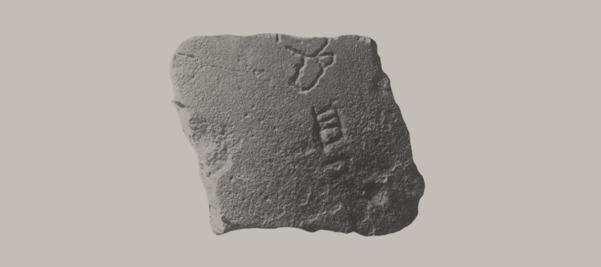
“This map shows the predicted density of underground networks created by arbuscular mycorrhizal fungi. These networks form one of Earth’s circulatory systems, moving massive amounts of carbon, nutrients, and water across plant communities.”
Oh wow, The Verge made a 70-minute video on how The Clapper became a viral sensation. When I was a kid, we didn’t have a Clapper, no one I knew had one, and I couldn’t understand why every single household didn’t have one of these magical devices.
Well, this is just absolutely lovely: photographer and artist Jan Erik Waider shot these videos of cracked-but-unbroken Baltic Sea ice undulating with the gentle motion of the sea. Mesmerizing…I could watch these for hours.
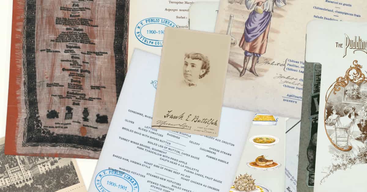
What do America’s earliest restaurant menus teach us about America? “A menu describes what a restaurant serves — but a menu also describes who is being served. They reflect the class, gender, political, technological, and environmental shifts of history.”
A list of Jurassic Park computers in excruciating detail, including an Apple Powerbook 100, a SGI R4000 Indigo, the Motorola Envoy (PDA), and some Thinking Machines CM-5s. “This is a Unix system, I know this!”
Using William Blake (aka “the patron saint of unclassifiable artists”) as an example, Evan Puschak’s latest video explores how society often rejects artists whose work doesn’t fit neatly into established categories and frameworks of criticism and commerce.
What you’re seeing here, these are not paintings. They’re prints of engravings from Blake’s illuminated books, which he designed, wrote, etched, colored, and printed himself using a technique that he invented. These extraordinary books are works of art that mix and synthesize categories. And as a result, the art world of the late 17 and early 1800s didn’t really know what to make of them. And Blake never sold more than a handful.
A digital museum of video game levels…you can move freely around each level using your keyboard. Heavy on Nintendo games (Mario Kart 64, Wii Sports, etc.) but also includes Portal, Halo, Katamari Damacy, GTA III, and World of Warcraft.
The Cassette Tapes of the Great Migration, a collection of oral histories recorded in Michigan in the 1970s of Black people who had previously escaped the Jim Crow South. “If we don’t get it from those individuals, then we can’t get it from anyone else.”
“Researchers let AI models run a simulated society. Claude was the safest — and Grok committed 180 crimes and went extinct within 4 days.”
Near the end of 1995, the artist and producer Brian Eno wrote the following about new media in his diary, which entries were later collected in a book called A Year with Swollen Appendices.
Whatever you now find weird, ugly, uncomfortable and nasty about a new medium will surely become its signature. CD distortion, the jitteriness of digital video, the crap sound of 8-bit — all these will be cherished and emulated as soon as they can be avoided.
It’s the sound of failure: so much of modern art is the sound of things going out of control, of a medium pushing to its limits and breaking apart. The distorted guitar is the sound of something too loud for the medium supposed to carry it. The blues singer with the cracked voice is the sound of an emotional cry too powerful for the throat that releases it. The excitement of grainy film, of bleached-out black and white, is the excitement of witnessing events too momentous for the medium assigned to record them.
Note to the artist: when the medium fails conspicuously, and especially if it fails in new ways, the listener believes something is happening beyond its limits.
Nailed it.
Google Is Building an A.I. Fence Around the Internet It Once Championed. “Google has often said it was ‘sending out more traffic & the web is bigger than ever. And then right next to that is a bunch of publishers whose businesses are getting destroyed.’”
vintage post from Oct 2015
· gift link
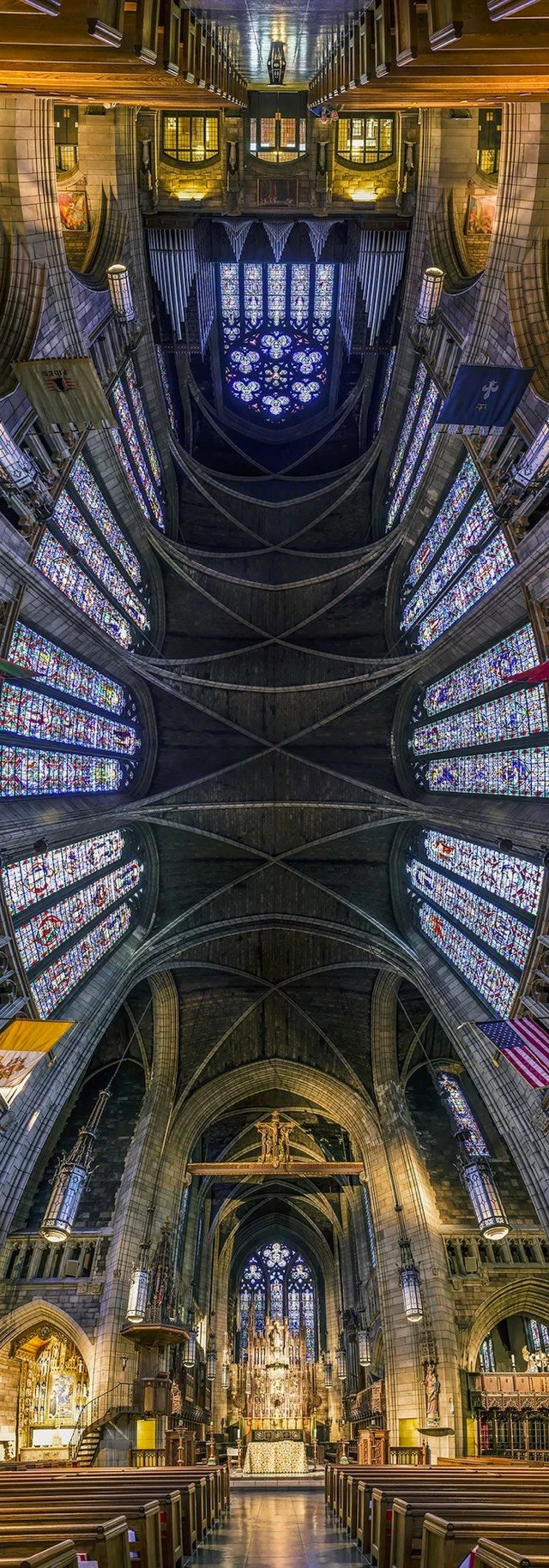

From photographer Richard Silver, vertical panoramic photos of churches that emphasize their often incredible ceilings. (via ignant)
I’m a Scholar of Genocide. We’re Entering a Terrifying New Era. “It is a future in which other nations or leaders may have an incentive to pursue genocidal policies knowing they will not only get away with murder but may even benefit from it.”
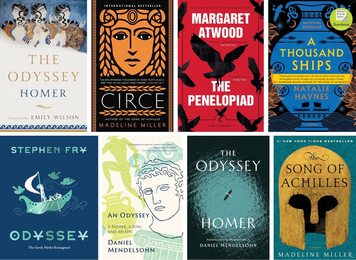
I’m currently doing the thing I do after seeing a movie (The Odyssey) I really enjoyed or found interesting: digging into related media. Yesterday I had an hour in the car, so I listened to this episode of The Daily podcast with Madeline Miller and Emily Wilson.
I think it’s quite odd to think that one book or one translation erases the others. I mean, if people prefer some other translation or if people want to read the Greek, I would love for them to do that. I think it’s great. I have no desire to legislate about which versions of “The Odyssey,” or of any ancient text, people want to engage with. So I think there’s something quite strange about the idea that the canon doesn’t have room for many, many different interpretations, translations, engagements, reinventions.
I’ve also flagged this New York Review of Books podcast with Daniel Mendelsohn, another NYT podcast with Madeline Miller, and this WNYC podcast with Emily Wilson for future listening.
As for reading, Wilson and Mendelsohn both did contemporary translations of The Odyssey within the past few years: The Odyssey translated by Emily Wilson (I loved this, read it aloud to my kids) and The Odyssey translated by Daniel Mendelsohn. Actor Stephen Fry recently did a more approachable reimagining of The Odyssey. The Odyssey: A Graphic Novel by Gareth Hinds is even more accessible, especially for younger readers.
Miller is the author of two great novels based on the Iliad and the Odyssey: Circe (my personal favorite of the two…I love this book and tell everyone to read it)1 and The Song of Achilles.
Other novels based on Homer’s works: The Penelopiad by Margaret Atwood and A Thousand Ships by Natalie Haynes.
Mendelsohn also wrote An Odyssey: A Father, A Son, and an Epic back in 2018; it sounds really interesting:
When eighty-one-year-old Jay Mendelsohn decides to enroll in the undergraduate Odyssey seminar his son teaches at Bard College, the two find themselves on an adventure as profoundly emotional as it is intellectual. For Jay, a retired research scientist who sees the world through a mathematician’s unforgiving eyes, this return to the classroom is his “one last chance” to learn the great literature he’d neglected in his youth—and, even more, a final opportunity to more fully understand his son, a writer and classicist.
Do you have any recommendations for podcasts or favorite Odyssey translations/retellings?
The trailer for Behemoth!, a forthcoming film written and directed by Tony Gilroy (Michael Clayton, Andor) and starring Pedro Pascal & Olivia Wilde. Great trailer: it pulls you in without revealing anything about the plot.
On the use of AI for creative work (type design in this case). “A tool that shields us from the friction of the work is compelling, but if we don’t experience the friction, we will never change the work.”
Mission Impossible. Oppenheimer. F1. The Odyssey. Top Gun: Maverick. Mad Max: Fury Road. Inception. Dune. Filmmakers and studios who make movies like these love to emphasize their heavy use of practical effects, i.e. real cars jumping real bridges or real people hanging off of real airplanes. “No CGI”, they say, despite the hundreds of names in the visual effects section of the films’ credits.
In his six-part series, Jonas Ussing, who co-owns a visual effects studio in Denmark, takes a look at these “No CGI” films and shows us just how much digital graphical effects goes into them. For instance, did you know that every single flying jet in Top Gun: Maverick, a movie we were assured was all practical effects, was built with CGI? Take a look:
His latest video is all about Christopher Nolan:
I’ve only watched bits and pieces of these videos so far (the Nolan one is 71 minutes long), but when ILM’s Todd Vaziri says something film-related is good, it’s good.
The official trailer for Avengers: Doomsday. They’ve gotten (some of) the band back together — perhaps this will be a return to form for Marvel?
New lecture series from authoritarianism scholar Timothy Snyder: Hitler and Stalin Today. “The course begins with the colonial background that made totalitarianism possible, and which remains an essential element of our politics now.”
The Lost Joy of Music Piracy. “Still to this day, I’ve never seen such an actively maintained network of knowledge and output, it really sucked me in.”
Artist Lewis Prosser describes himself on Instagram as an “absurdist basket-maker”. His costumes for a project called Making Merrie reflect that self-description.

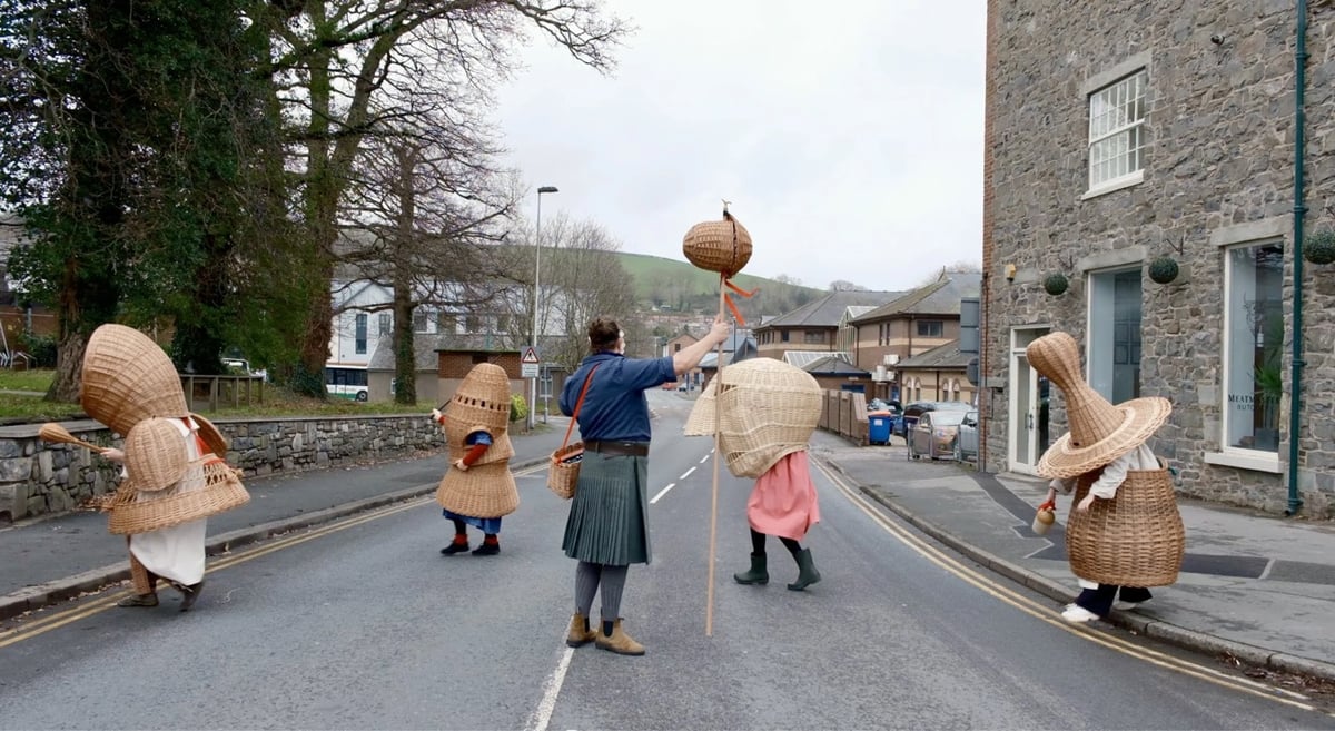
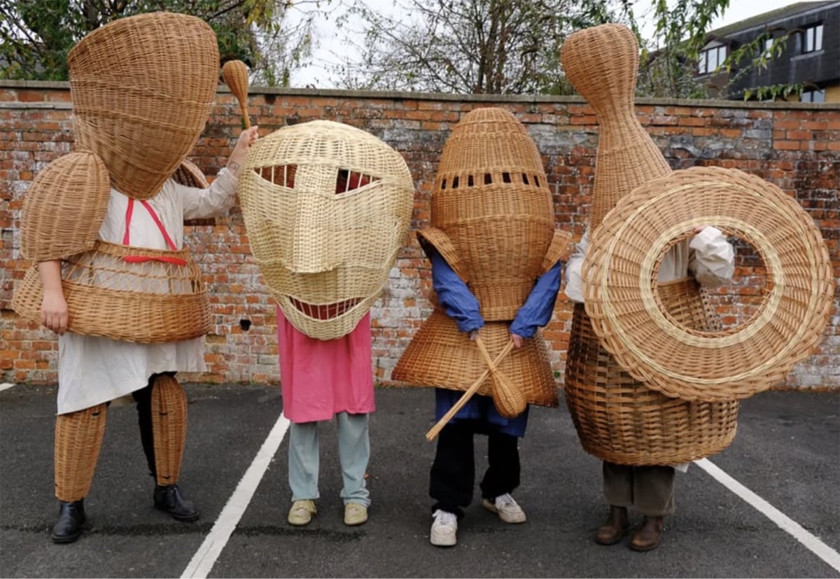
Making Merrie explores the material culture of folk theatre. Inspired by mummers’ plays and masked traditions along the Wales/England border, Making Merrie combines craft, performance, and language to reflect on cultural heritage and exchange.
Mummers’ plays are traditional folk performances with roots over 500 years old, often tied to Christmas and New Year. Full of humour and spontaneous revelry, these plays were staged in streets, homes, or pubs by amateur troupes, telling simple stories of combat, death, and miraculous revival. Unlike the religious Mystery Plays, mummers’ plays are secular, carnivalesque, and performed for community fun.
The project features large-scale wicker costumes, handcrafted using regional willow basketry techniques, highlighting basketry as an essential human skill we’re at risk of forgetting—a skill that, if lost, means losing part of what it is to be human.
(via colossal)
Excerpt from a longer (podcast) conversation with John Waters about how he used to work at Mary Oliver’s bookstore in Provincetown. “They had this bookshop where you were allowed to be mean to the customers. It was really fun.”
Filmmaker Ava DuVernay is making a documentary about the 14th amendment, “spotlighting America’s long running and sometimes bloody battle with itself over who is a citizen and how much freedom they get”.
On Japan’s visible evidence of care. “American service providers, private and public, increasingly run like ghost ships. Japanese technology and design seemed in greater service to humans, their journeys, and enterprises.”
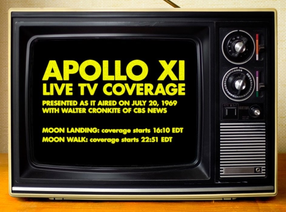
57 years ago today, on July 20, 1969, Neil Armstrong & Buzz Aldrin landed on the Moon and went for a little walk. For the 18th year in a row, you can watch the original CBS News coverage of Walter Cronkite reporting on the Moon landing and the first Moon walk on a small B&W television, synced to the present-day time. Just open this page in your browser today, July 20th, and the coverage will start playing at the proper time. Here’s the schedule (all times EDT):
4:10:30 pm: Moon landing broadcast starts
4:17:40 pm: Lunar module lands on the Moon
4:20:15 pm - 10:51:26 pm: Break in coverage
10:51:27 pm: Moon walk broadcast starts
10:56:15 pm: First step on Moon
11:51:30 pm: Nixon speaks to the Eagle crew
12:00:30 am: Broadcast end (on July 21)
Set an alarm on your phone or calendar! Also, this works best on an actual computer but I think it functions ok on phones and tablets if necessary.
Back in 2018, I wrote a bit about what to look out for when you’re watching the landing:
The radio voices you hear are mostly Mission Control in Houston (specifically Apollo astronaut Charlie Duke, who acted as the spacecraft communicator for this mission) and Buzz Aldrin, whose job during the landing was to keep an eye on the LM’s altitude and speed — you can hear him calling it out, “3 1/2 down, 220 feet, 13 forward.” Armstrong doesn’t say a whole lot…he’s busy flying and furiously searching for a suitable landing site. But it’s Armstrong that says after they land, “Houston, Tranquility Base here. The Eagle has landed.”. Note the change in call sign from “Eagle” to “Tranquility Base”. :)
Two things to listen for on the broadcast: the 1201/1202 program alarms I mentioned above and two quick callouts by Charlie Duke about the remaining fuel towards the end: “60 seconds” and “30 seconds”. Armstrong is taking all this information in through his earpiece — the 1202s, the altitude and speed from Aldrin, and the remaining fuel — and using it to figure out where to land.
I suspect like many of you, I saw The Odyssey this weekend. I really liked it and the more I read & think about the film, the more it grows in my esteem. This thread by Mmina Maclang-Tamayo (spoilers!) is pretty much how I interpreted what Nolan was trying to convey.
As it turns out, it was 10,000% important that Christopher Nolan’s The Odyssey was delivered in American accents, beyond just the Emily Wilson linguistics of it all.
It’s because it was about America.
I didn’t think it’d be possible to spoil a 3000 year-old epic, but here’s a 🧵
The emphasis on what’s happening back in Ithaca, with the royal courts and suitors to Penelope reflect upon the internal politics of taking the anxieties of the people about external invaders to attempt to seize power.
Then, Odysseus returns with the revelation: the feared invaders, “The Sea People”, were them all along.
Zeus’ Law has an uncanny resemblance to Christian teaching. “Whatsoever you do to the least of My brothers, that you do unto Me”. (Matthew 25:40)
That America proudly keeps envoking the Abrahamic God in its identity as a nation, and its government attempting to justify their actions in the name of such a God, yet turn around and gravely mistreat the immigrants on their doorstep, and antagonize their own allies, is a betrayal of its identity.
The film warns: America has broken Zeus’ Law.
Steve Donner shared some interesting thoughts in his reading of the film:
20. The point: Nothing is sacred in war, and we have lost all respect for basic decency and hospitality. We’re all the violators; we are all the suitors, we are all the cyclops. Consequently, all the towers and temples burn (“the burning roof and tower, and Agamemnon dead”). It’s Odysseus’ guilt about his foreign wars manifesting again and he’s spent years avoiding the truth.
21. That’s why he’s unconsciously avoided home for twenty years: he simply cannot face what he has become, nor does he wish to show his shame to his wife and son.
I’m looking forward to seeing the movie again in a couple of weeks. In the meantime, what did you think of The Odyssey? And if you read or listened to something interesting or provocative about the film, please share links!
From BBC Earth, the trailer for Evolution, a five-part series premiering on PBS in October. “Ponder this: All the incredible diversity of animal life on Earth sprang from a single organism. Every animal, no matter how weird, is related to every other.”
Older posts


Socials & More