Advertise here with Carbon Ads

This site is made possible by member support. โค๏ธ

Big thanks to Arcustech for hosting the site and offering amazing tech support.

When you buy through links on kottke.org, I may earn an affiliate commission. Thanks for supporting the site!

kottke.org. home of fine hypertext products since 1998.

๐Ÿ”  ๐Ÿ’€  ๐Ÿ“ธ  ๐Ÿ˜ญ  ๐Ÿ•ณ๏ธ  ๐Ÿค   ๐ŸŽฌ  ๐Ÿฅ”

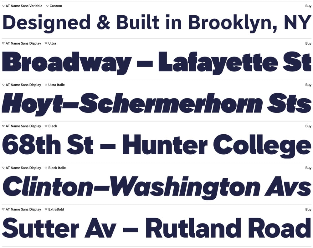
Name Sans

sample text at different type sizes for a typeface called Name Sans

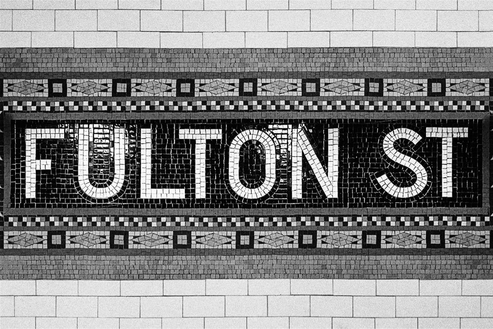
a sample of the mosaic tile lettering found in NYC subway stations. This one reads 'Fulton St'.

Name Sans is a typeface based on the tile mosaic lettering found in NYC subway stations.

The architects and craftworkers who designed & laid these tiles used a letter construction that was part geometric and part grotesque, with typographic optical corrections often either exaggerated or totally missing. Name Sans interprets these ideas into an extensive type system that is at once anonymous and full of personality, useful for everything from branding to wayfinding to digital interfaces.

Lovely. I like this a lot.

Comments  

Sort by: thread โ€” thread . latest . faves

This thread is closed for new comments & replies. Thanks to everyone for participating!