kottke.org posts about logos
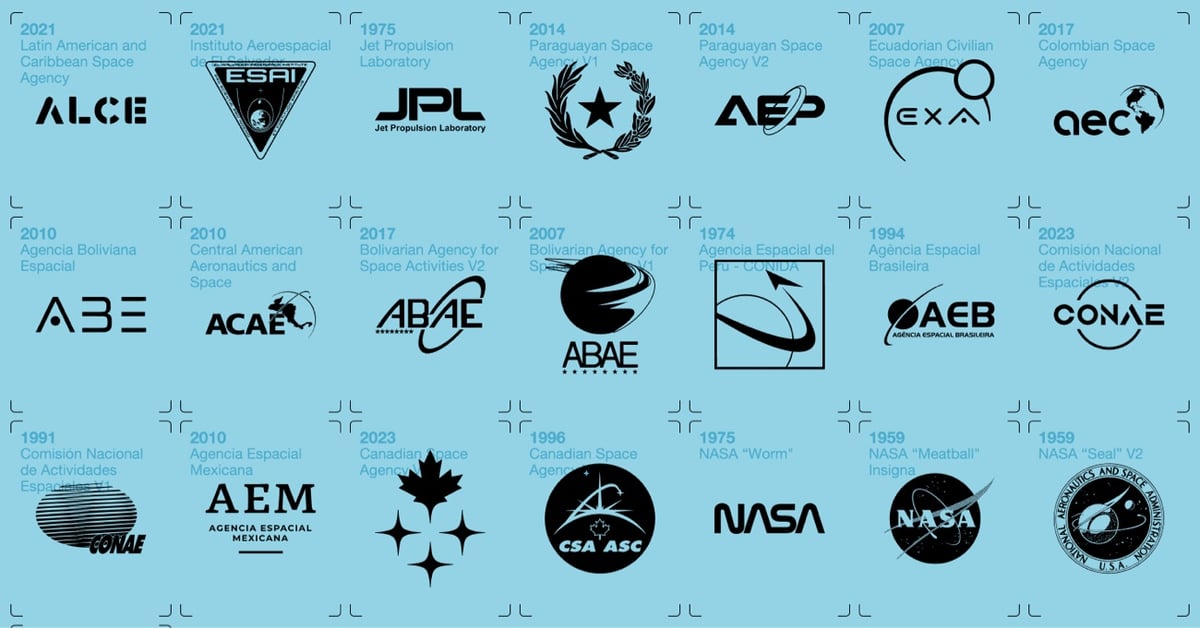

Good luck losing less than an hour to this: a huge archive of logos for government, non-profit, private, military, and even fictional space agencies and companies. There is also a book, but it looks like it was only available on Kickstarter — hopefully it’ll be republished? (via sidebar)
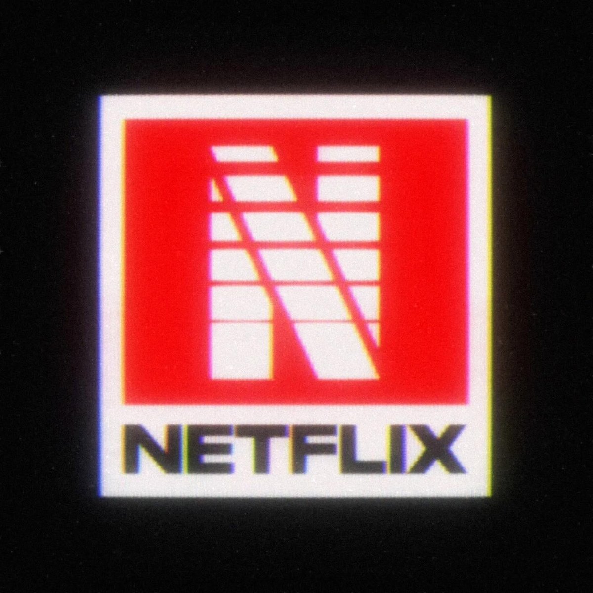
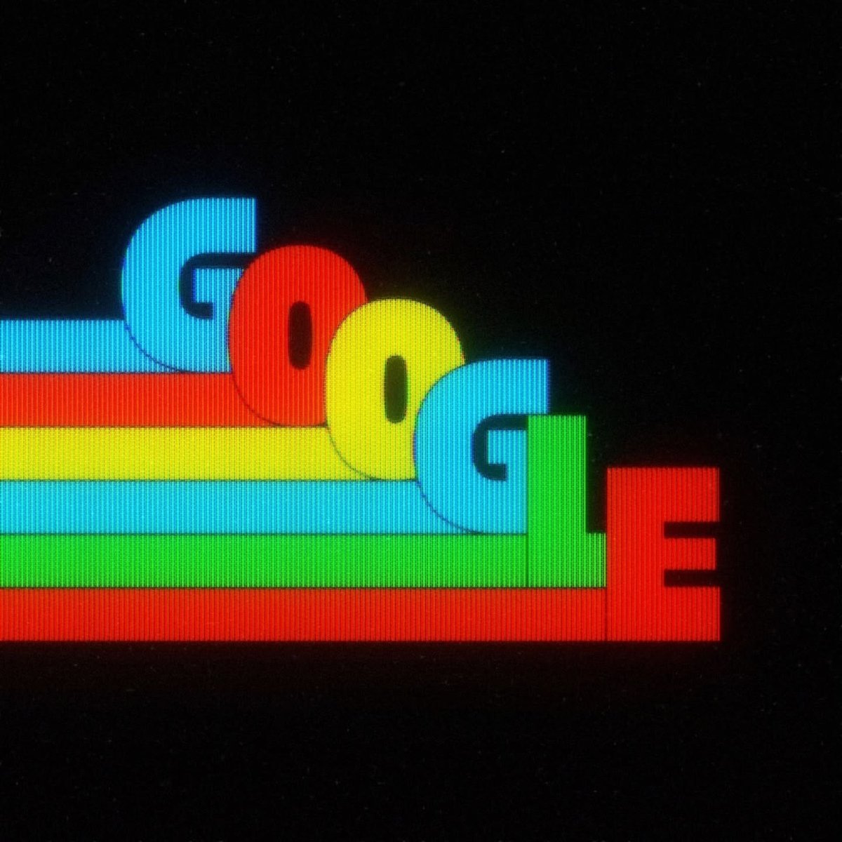
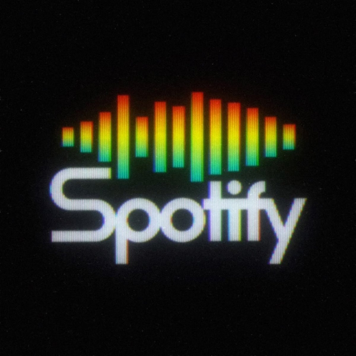
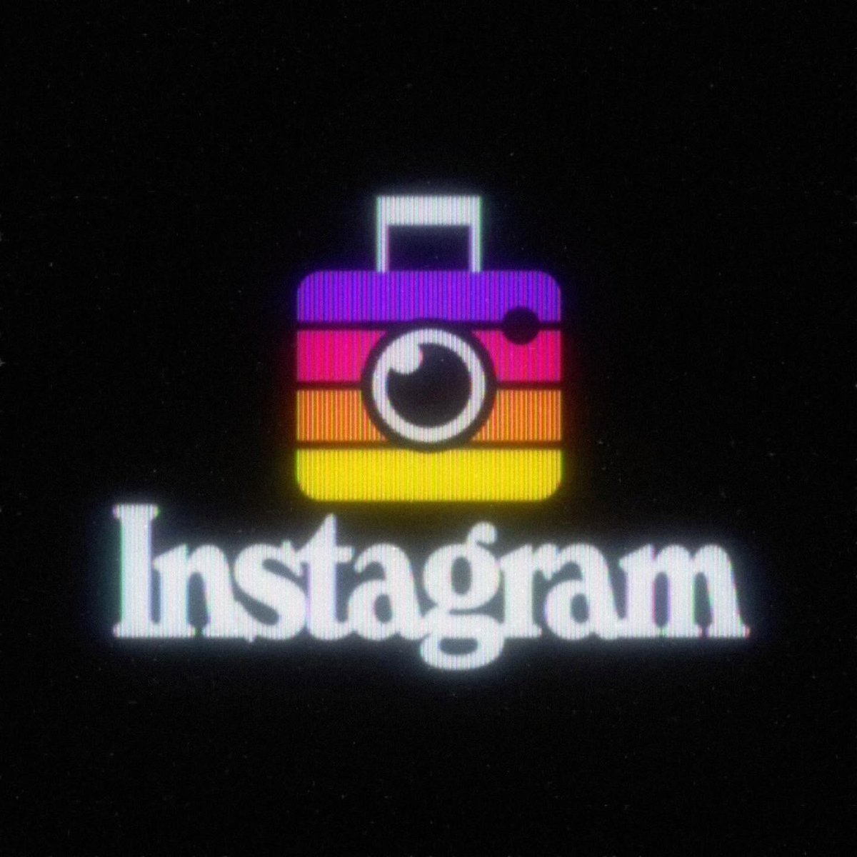
Kostya Petrenko makes 80s versions of tech/media company logos as if they’ve been screencapped from CRT displays. I think my favorite of his might be the retro OpenAI logo, which you can see in this reel.
See also Medieval Versions of Contemporary Corporate Logos.
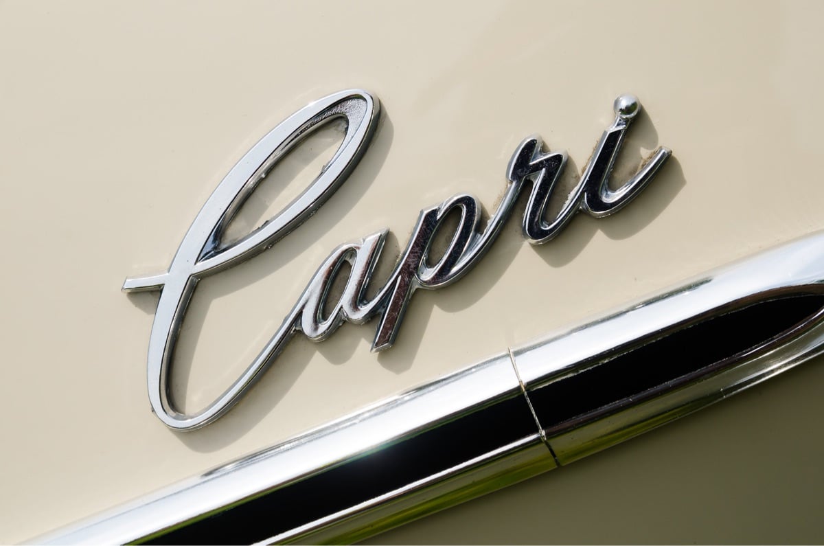
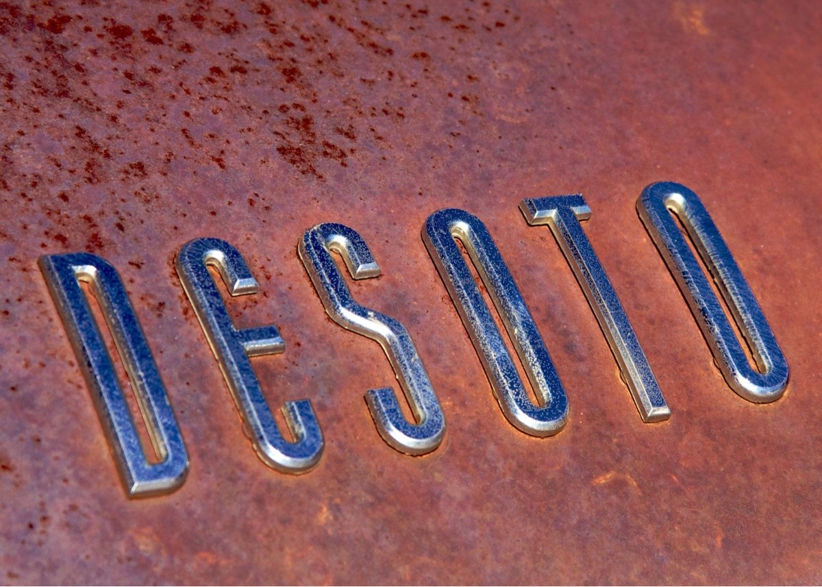
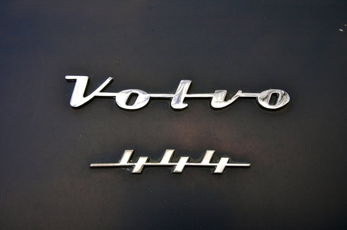
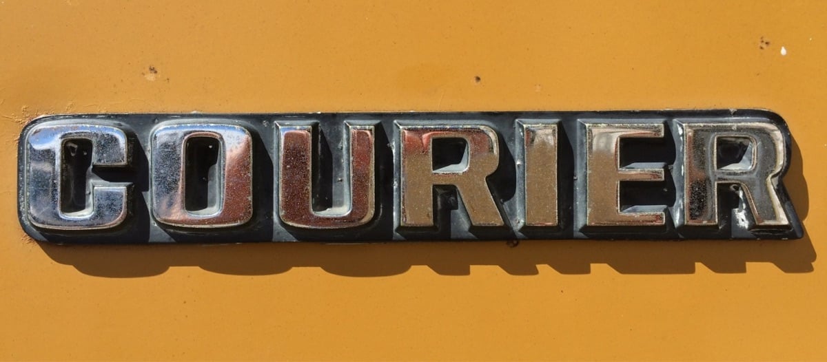
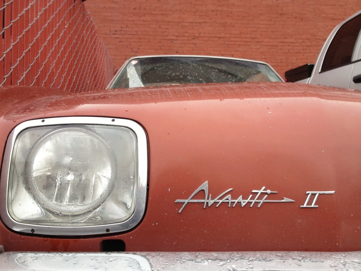
A site called Chromeography collects chrome logos and typography from vintage cars & electric appliances. As I was looking through these, I wondered: “What the hell is chrome anyway?” So I looked it up:
Chrome plating (less commonly chromium plating) is a technique of electroplating a thin layer of chromium onto a metal object. A chrome plated part is called chrome, or is said to have been chromed. The chromium layer can be decorative, provide corrosion resistance, facilitate cleaning, and increase surface hardness. Sometimes, a less expensive substitute for chrome, such as nickel may be used for aesthetic purposes.
(via @presentandcorrect)
Jigar Patel uses 3D modelling software to imagine factory production lines that “build” logos and app icons for brands like Instagram, Netflix, Apple, Spotify, Amazon, and many others. He’s also posted a bunch of behind-the-scenes videos about how he does it — love it when artists show their work.
You can also follow Patel’s work on Instagram and TikTok.(thx, michael)
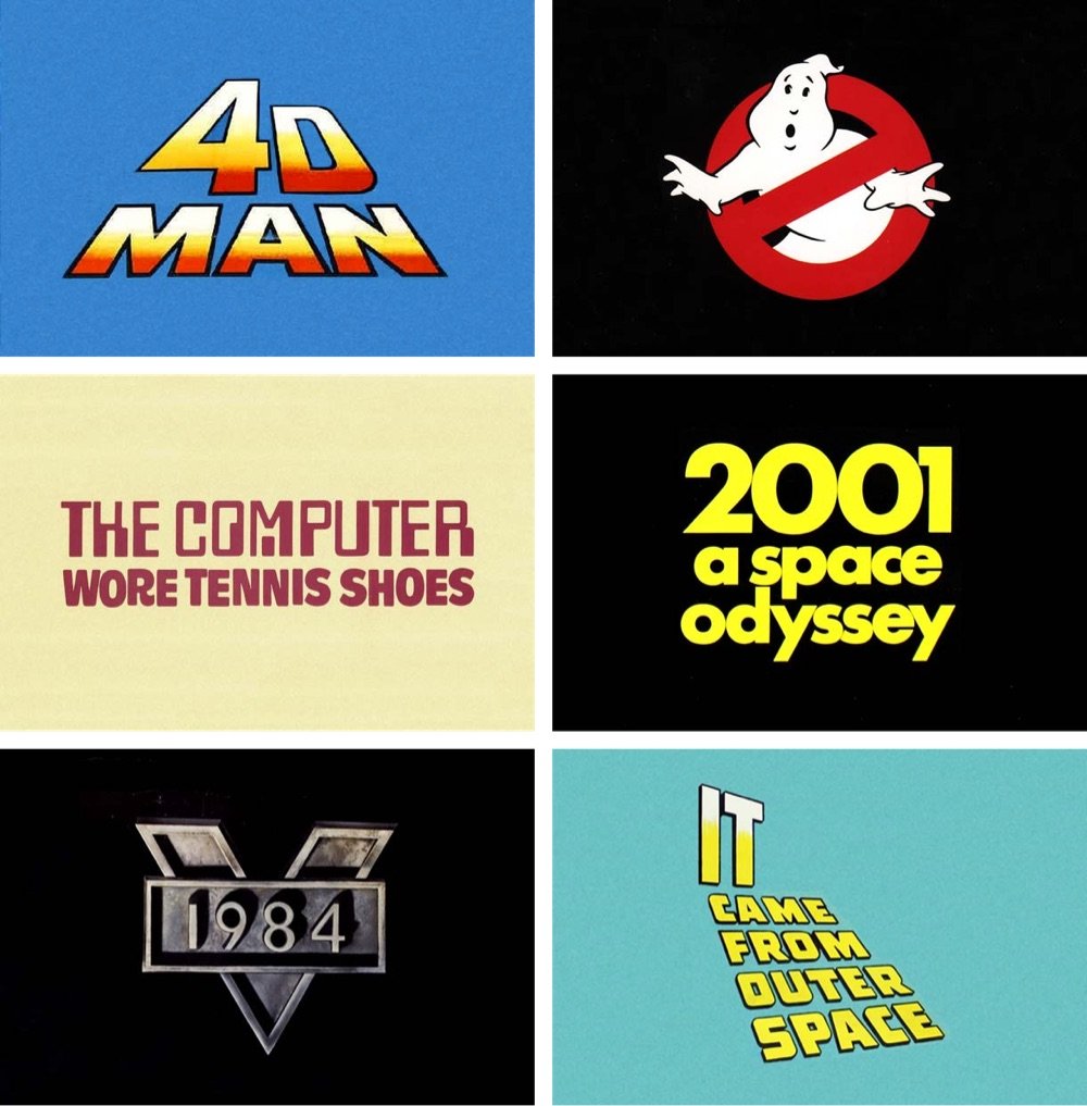
Loving scrolling through this collection of sci-fi movie logos from Reagan Ray.
As is the case with most of my logo posts, it’s been fun to pick up on the trends. There’s the trick where they remove the segments from the top half of the letters like Blade Runner, or the embossed brushed metal of Robocop. Glowing letters were a big trend that started in the late 80s, most likely set off by the Alien franchise. And I can never get enough of the 3D type in early films.
You can check out more of Ray’s logo collections here.
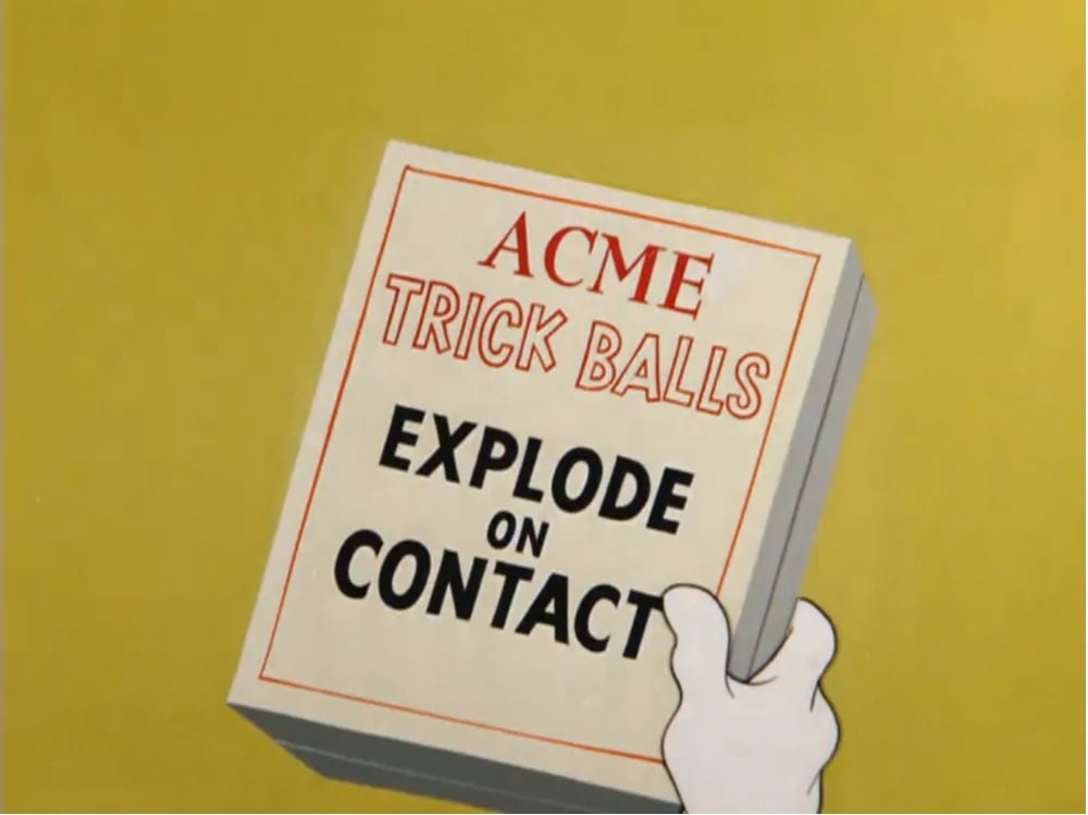
The Fictional Brands Archive is a collection of fictional brands found in movies, TV shows, and video games — think Acme in Looney Tunes, Pixar’s Monsters, Inc., and Nakatomi Corporation from Die Hard. Very cool. But gotta say though, the dimming mouseover effect makes this more difficult to use than it needs to be… (via sidebar)
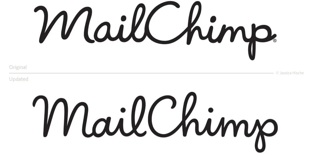
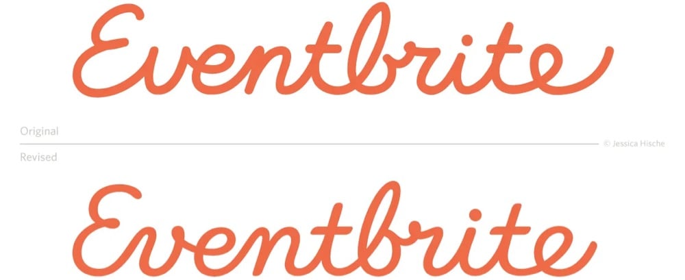
This is a nice little interview with designer Jessica Hische on how she steps in to help companies refresh their logos.
There are a number of reasons why companies decide that a refresh — rather than a rebrand — is the right move. Many of the companies I work with simply want a logo asset that is easier for their designers to work with. Sometimes there are issues with the current logo that make it harder to design around, or make it less flexible on different design applications. For example, logos with long ascenders and descenders create difficulties with balancing whitespace, and logos with tight counterforms or complex details don’t scale well.
Aside from adding utility, refreshes can be a nice way to make an older logo asset play well with a new brand system — we can make subtle tweaks to letterforms that make it better match new typefaces chosen for the brand or blend with the mood of photography better.
You can see a bunch of logo before & afters at Print or on her website — and her recent work for Squier is here. The differences may look negligible, but in each case, the new version is cleaner and easier to read — they just look nicer and smoother after Hische is done with them.
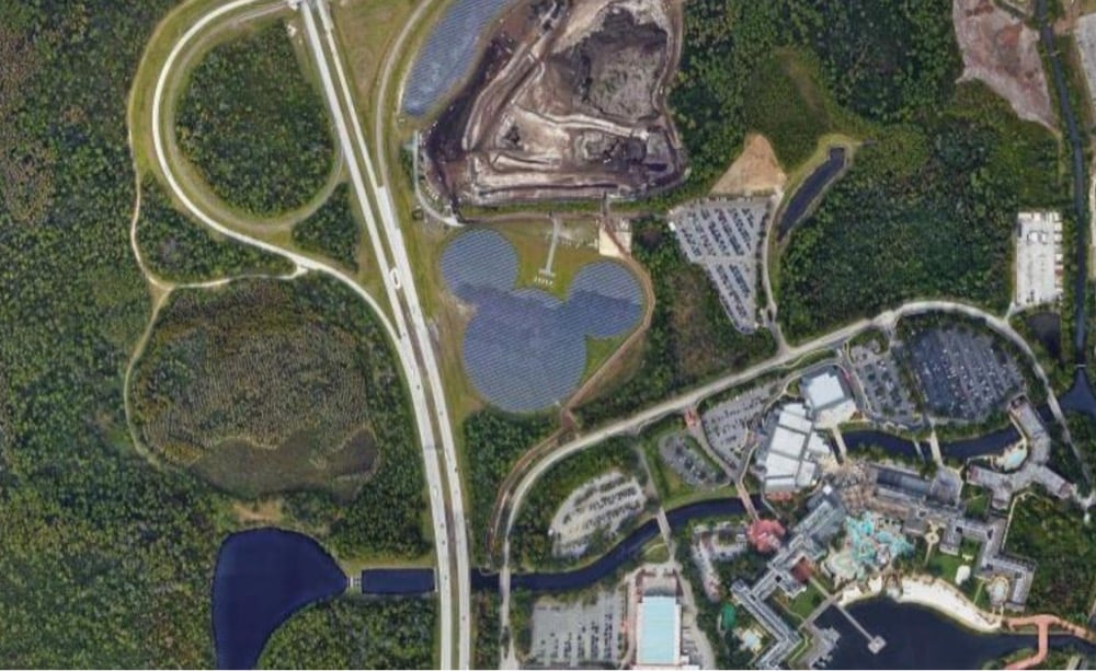
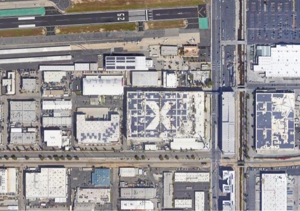
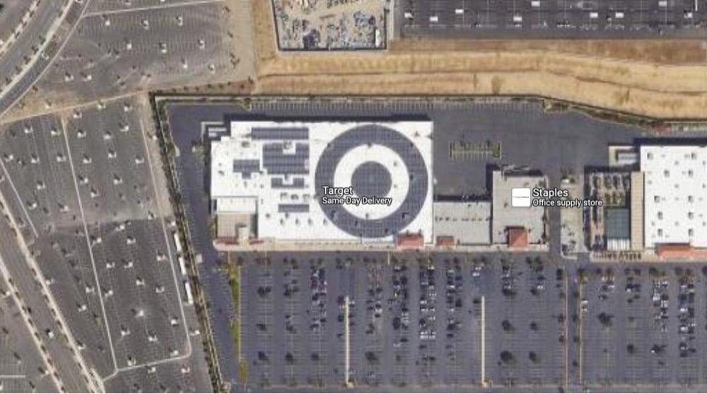
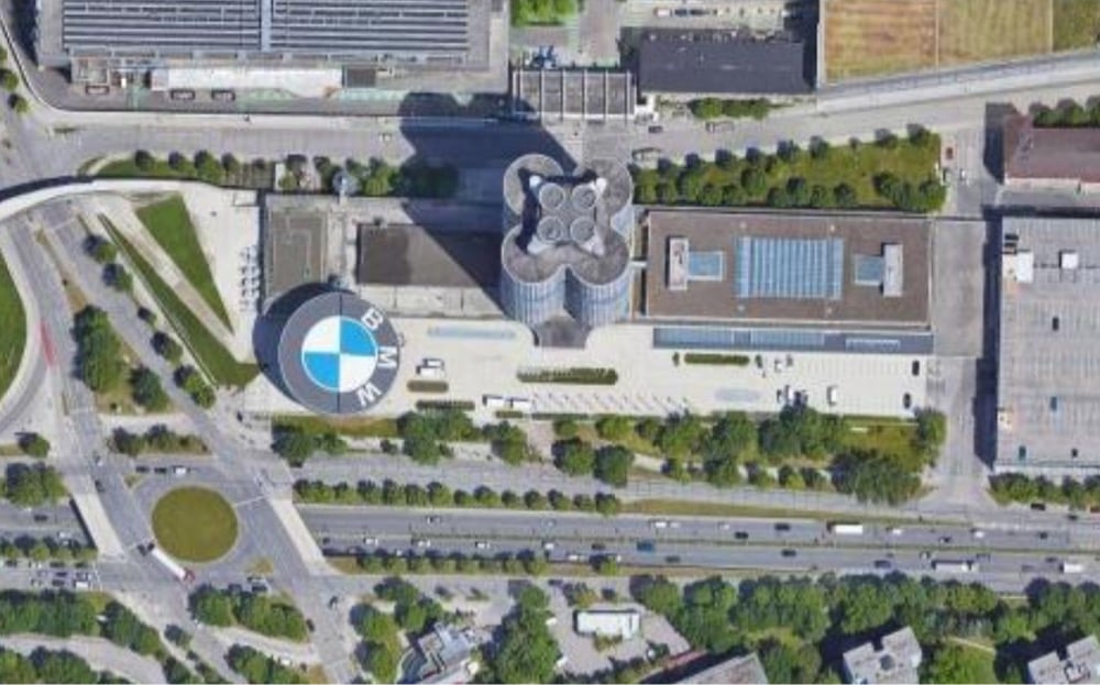
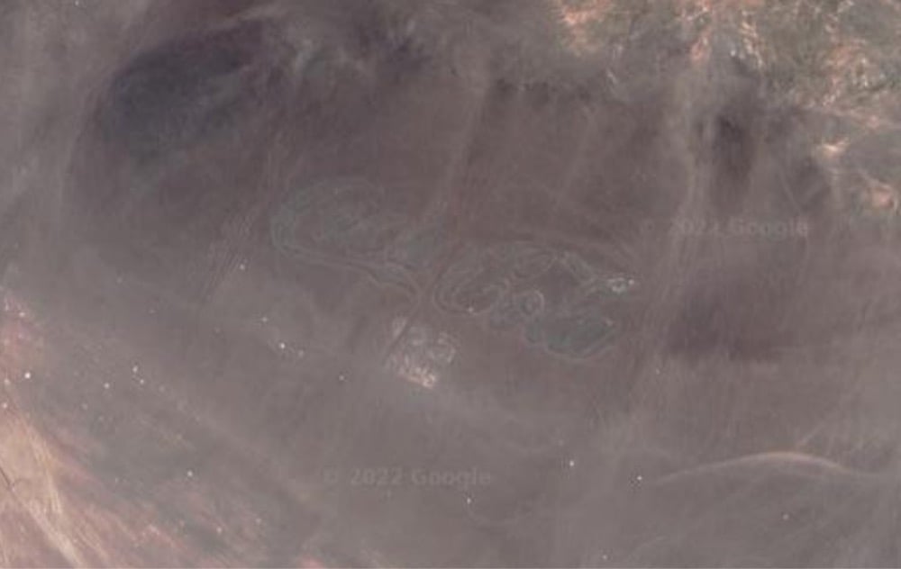
Elissaveta M. Brandon recently wrote about the uptick in companies placing huge logos, often drawn in solar panels, so that they can be seen in satellite imagery. I collected images of a few examples of logos that are viewable from space above: a solar array at Walt Disney World, an X on the roof of the SpaceX HQ, a Target logo on top of a Target store, the BMW Museum, and a huge Coca-Cola logo that’s been in the Chilean desert since 1986 (and is therefore difficult to see on satellite imagery). (via clive thompson)
I love these medieval versions of familiar logos by Ilya Stallone, available on his Instagram account.
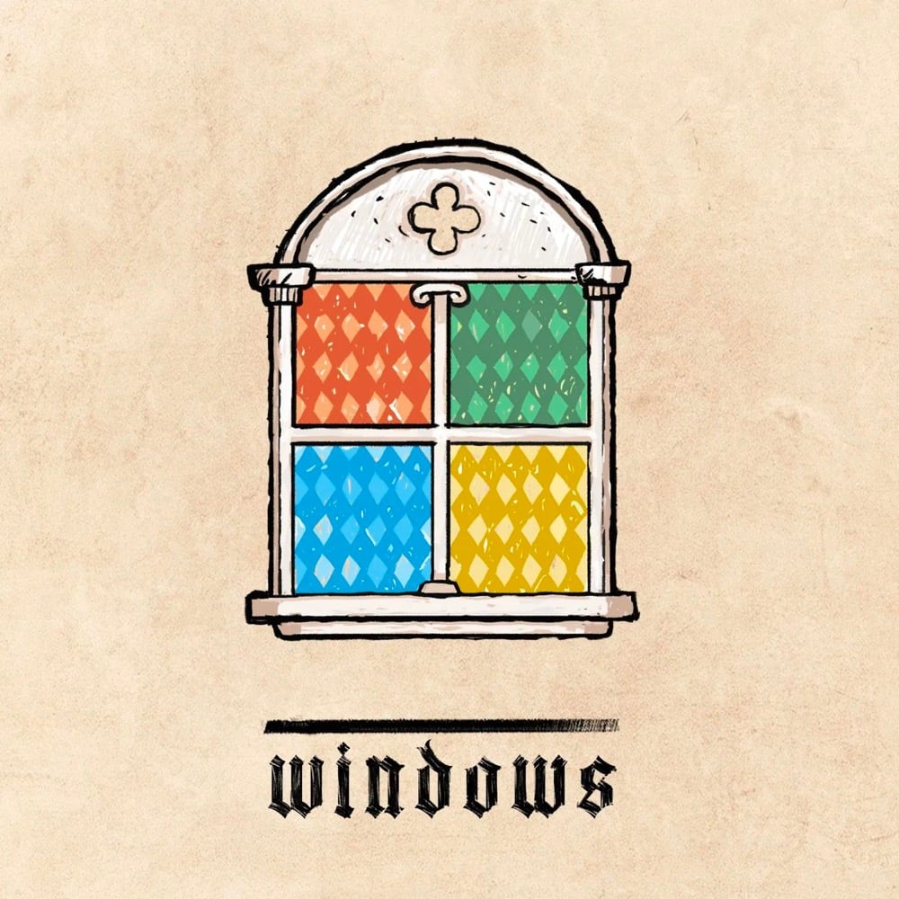
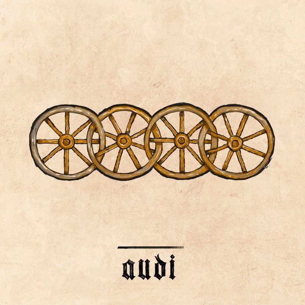
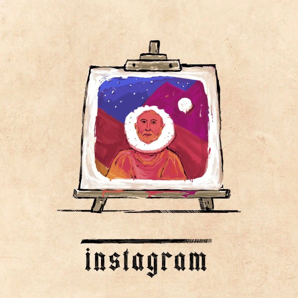
The best ones cleverly translate the central element in the logo into something more temporally appropriate — e.g. the figurative MS windows into actual stained glass, Instagram’s camera into a colorful painting, Audi’s rings into wagon wheels. (via sidebar)
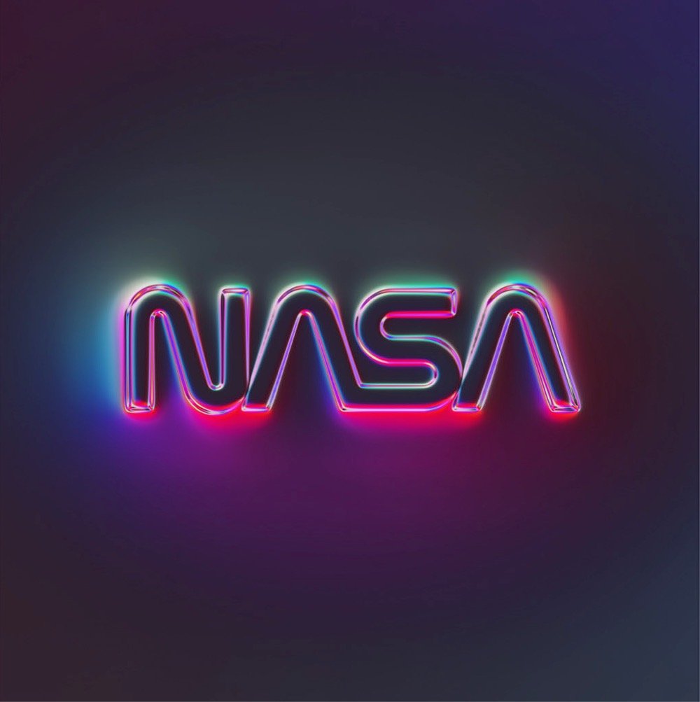
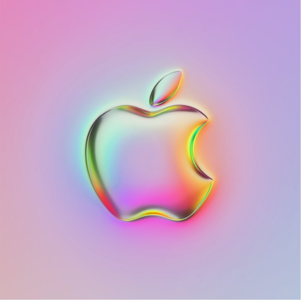
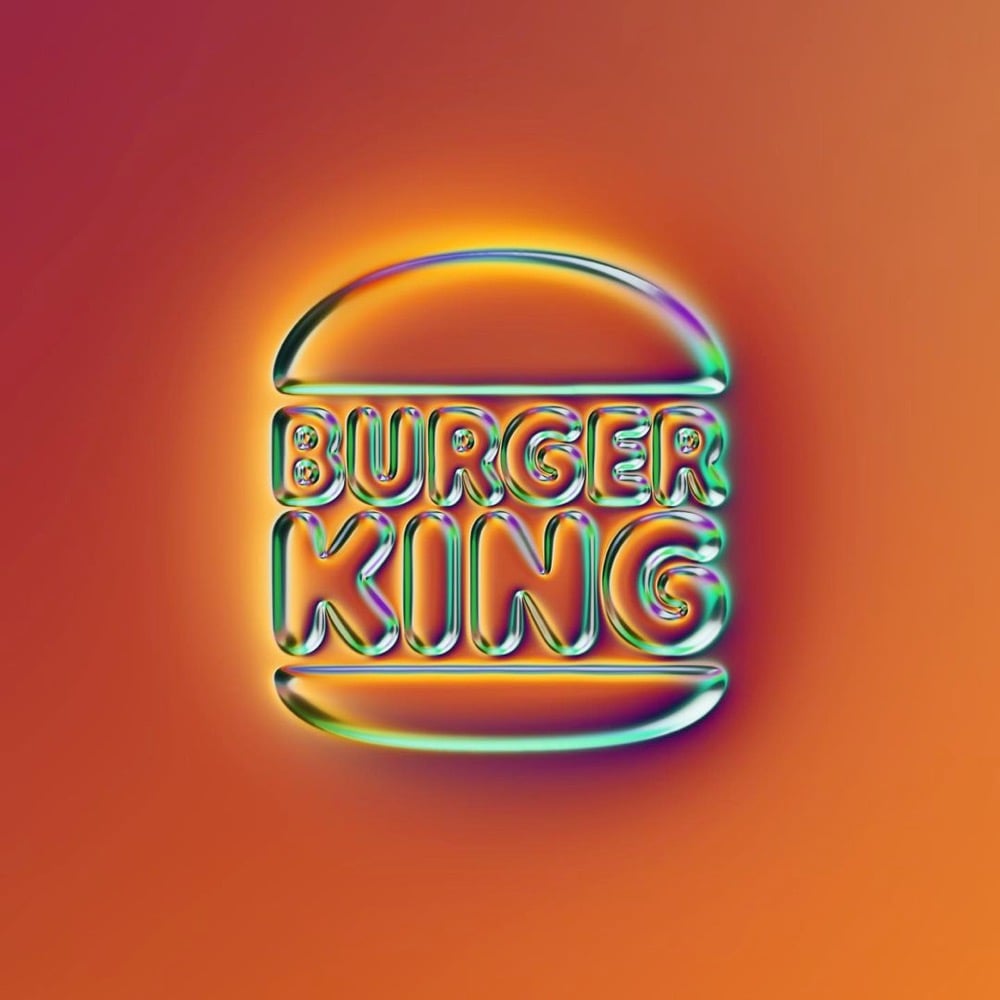
I love these colorfully chromed-out logos designed by Martin Naumann — you can find dozens of them on his Instagram and at Behance. You can also buy an icon set of these logos for your phone.
As he explained on Behance, Naumann’s process for designing these is surprisingly simple — he zooms way in on RGB noise to generate a background gradient, blurs the logo, and then refracts the background using the height map. Cool! (via moss & fog)
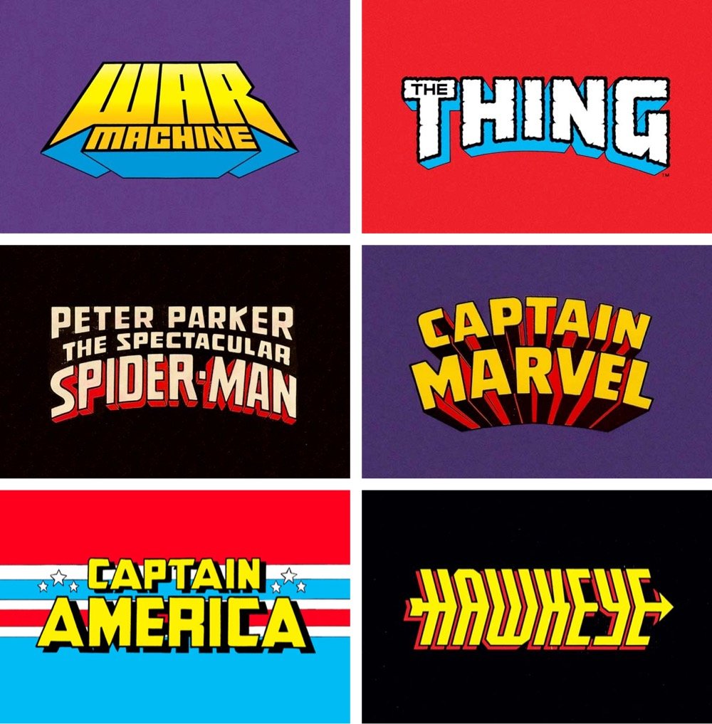
Reagan Ray has compiled a collection of hand-lettered Marvel superhero logos from before the computer animation era. (via print)
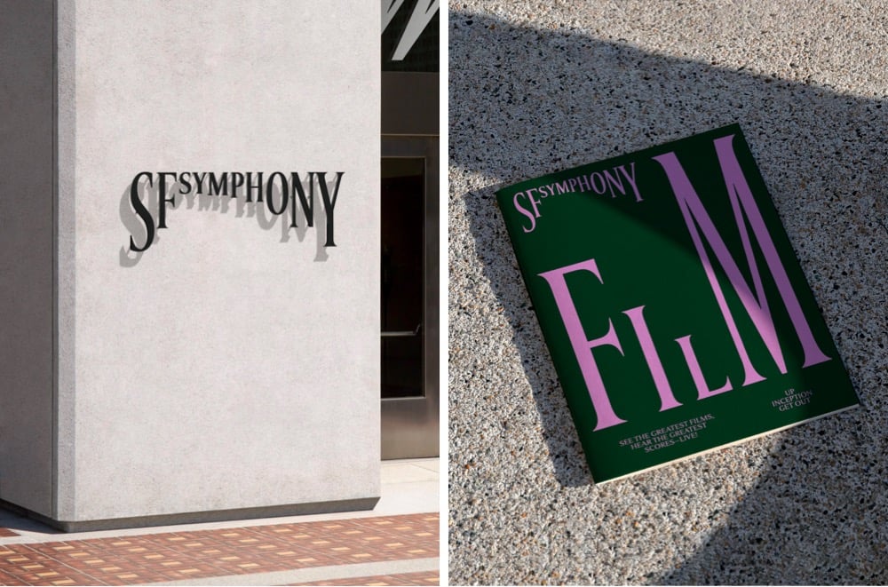
Design studio Collins has created a new brand identity for the San Francisco Symphony that uses type in a playful, almost musical way. This brief video demonstration is worth 1000 words:
Even better, you can experiment with your own type and music with the Symphosizer web toy. I made this (to the beat of Daft Punk):
(via @dkhamsing)
I’d like to take a brief moment at the end of this weird and difficult week to appreciate this monogram that’s part of Burger King’s new brand identity.
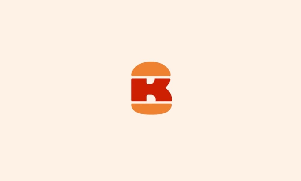
B + K + burger = perfect. I hereby dub this new tiny logo “The Slider”. It was designed by Stephen Kelleher Studio; you can see some of their other “explorations” as they worked on refining the finished monogram. Reminds me of Sandwich’s excellent logo.
On Tuesday, Joe Biden announced that Senator Kamala Harris would be his vice-presidential running mate. The campaign was quickly updated to include a new Biden-Harris logo designed by Hoefler&Co. in collaboration with Biden campaign advisor Robyn Kanner:
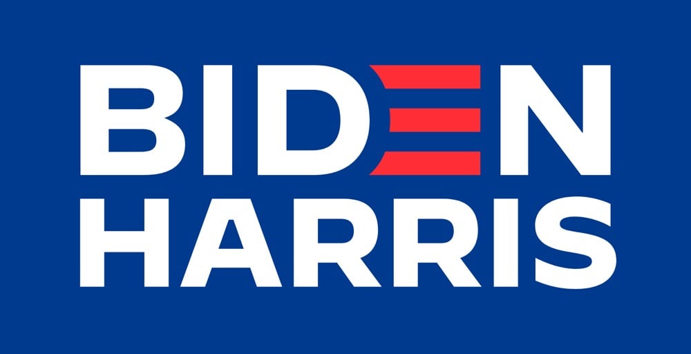
But the designer of the logo wasn’t told who the running mate would be beforehand, so how did the campaign get it out so quickly? According to Jonathan Hoefler, the design team designed a whole collection of logos for potential candidates gleaned from reading the media tea leaves.
A consequential decision at an unpredictable time, conducted under absolute secrecy, poses an interesting dilemma to the typographer: how do you create a logo without knowing for certain what the words will say? Logos, after all, are meaningfully informed by the shapes of their letters, and a logo designed for an eisenhower will hardly work for a taft. The solution, naturally, involves the absurd application of brute force: you just design all the logos you can think of, based on whatever public information you can gather. Every credible suggestion spotted in an op-ed was added to the list that we designers maintained, and not once did the campaign even hint at a preference for one name over another.
I would love to see some of those alternate designs (Biden-Warren!), but there’s no way in hell they’ll ever see the light of day, especially before the election.
Update: Several designers weigh in on the new logo. I love Debbie Millman’s take:
I never, ever thought I’d say this after a lifetime in professional branding, but on the spectrum of good branding versus effective branding, I’d say at this point it is irrelevant. Frankly, the Biden-Harris logo could have been scribbled on a napkin and I’d be happy. Trump’s brand is beyond repair and is now more dangerous than ever. The soul of our country is at stake.
That logos don’t matter that much (unless they are either great or horrible) is probably true more often than designers and branding folks would care to admit.
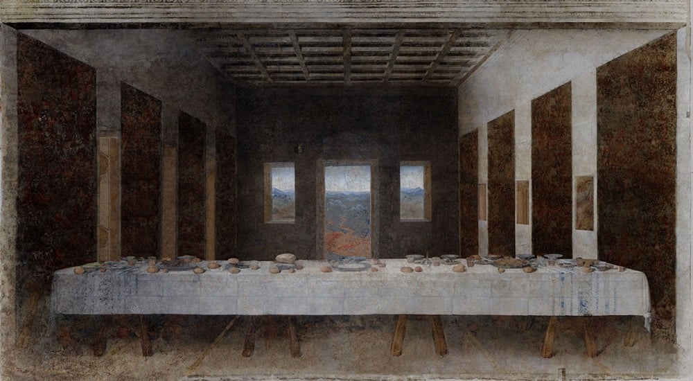
While it predates the COVID-19 pandemic and its accompanying social distancing by several years, José Manuel Ballester’s Concealed Spaces project reimagines iconic works of art without the people in them (like what’s happening to our public spaces right now). No one showed up for Leonardo’s Last Supper:
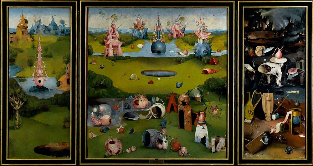
Hieronymus Bosch’s The Garden of Earthly Delights is perhaps just as delightful without people:
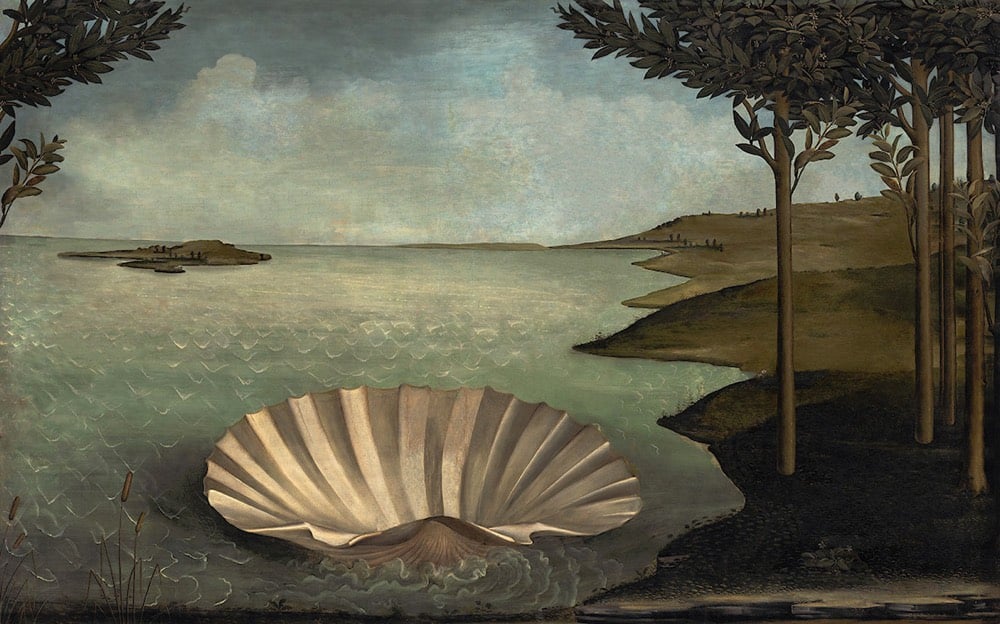
And Botticelli’s The Birth of Venus has been rescheduled:
Ben Greenman, Andy Baio, and Paco Conde & Roberto Fernandez have some suggestions for new album covers:
Designer Jure Tovrljan redesigned some company logos for these coronavirus times.
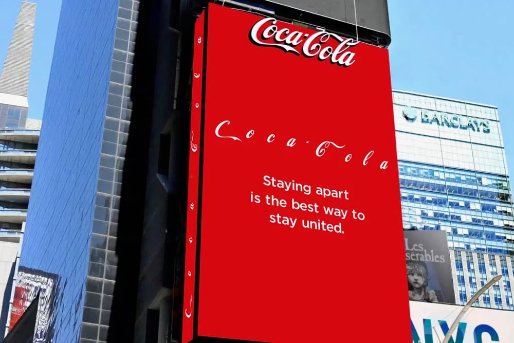
Coca-Cola even modified their own logo on a Times Square billboard to put some distance between the letters.
(via colossal & fast company)
Update: Some emoji designed specifically for COVID-19. The Earth with the pause button is my favorite. (via sidebar)
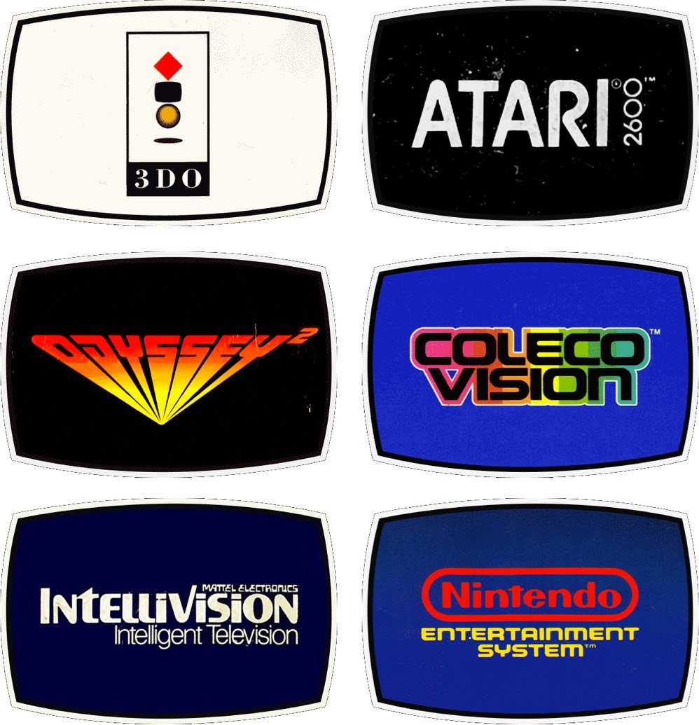
Reagan Ray has collected the logos of video game consoles from 1976 to the present. He ignores the first generation of consoles because there would have been too many to include. (Historical interlude: I didn’t know gaming consoles were broken down into generations. Apparently we’re in the 8th generation now — Wii U, PS4, Xbox One, and Switch.)
See also Ray’s collections of classic airline logos, record label logos, 80s action figure logos, American car logos, etc..
From Metrobits, a fantastic resource for all things to do with metros and subways around the world, comes this collection of metro logos (older page w/ larger logos here).
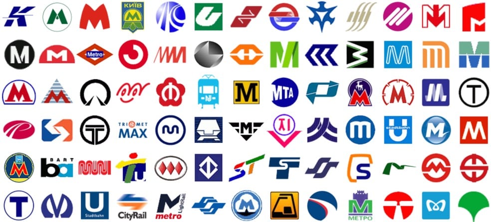
See also metro fonts (names + designers), fare collection schemes, and ratings of the art and architecture of metro stations from around the world (highest marks go to Moscow, Paris, Saint Petersburg, and Stockholm). The Moscow and Saint Petersburg stations are incredible.
On Oct 21, the emblem for the 2024 Summer Olympics and Paralympics was unveiled in Paris, site of the Games. It features a round symbol that represents a gold medal, the Olympic flame, and Marianne, the “national personification of the French Republic since the French Revolution”.
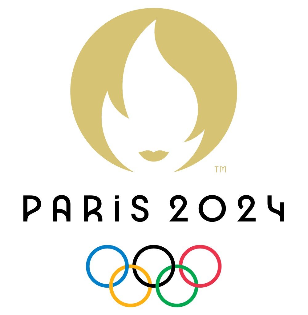
The emblem’s Marianne is quite chic, so Parisian freelance journalist Megan Clement concocted a vignette of that young woman’s life. It begins like so:
The French Olympic logo tumbles out of bed on a Parisian morning. She tousles her messy bob, dons breton stripes and ballet flats and whisks down the stairs from her fifth-floor apartment to grab a baguette before enigmatically texting two men who are pursuing her romantically.
The French Olympic logo has an expresso and a cigarette for lunch.
(via @legalnomads)
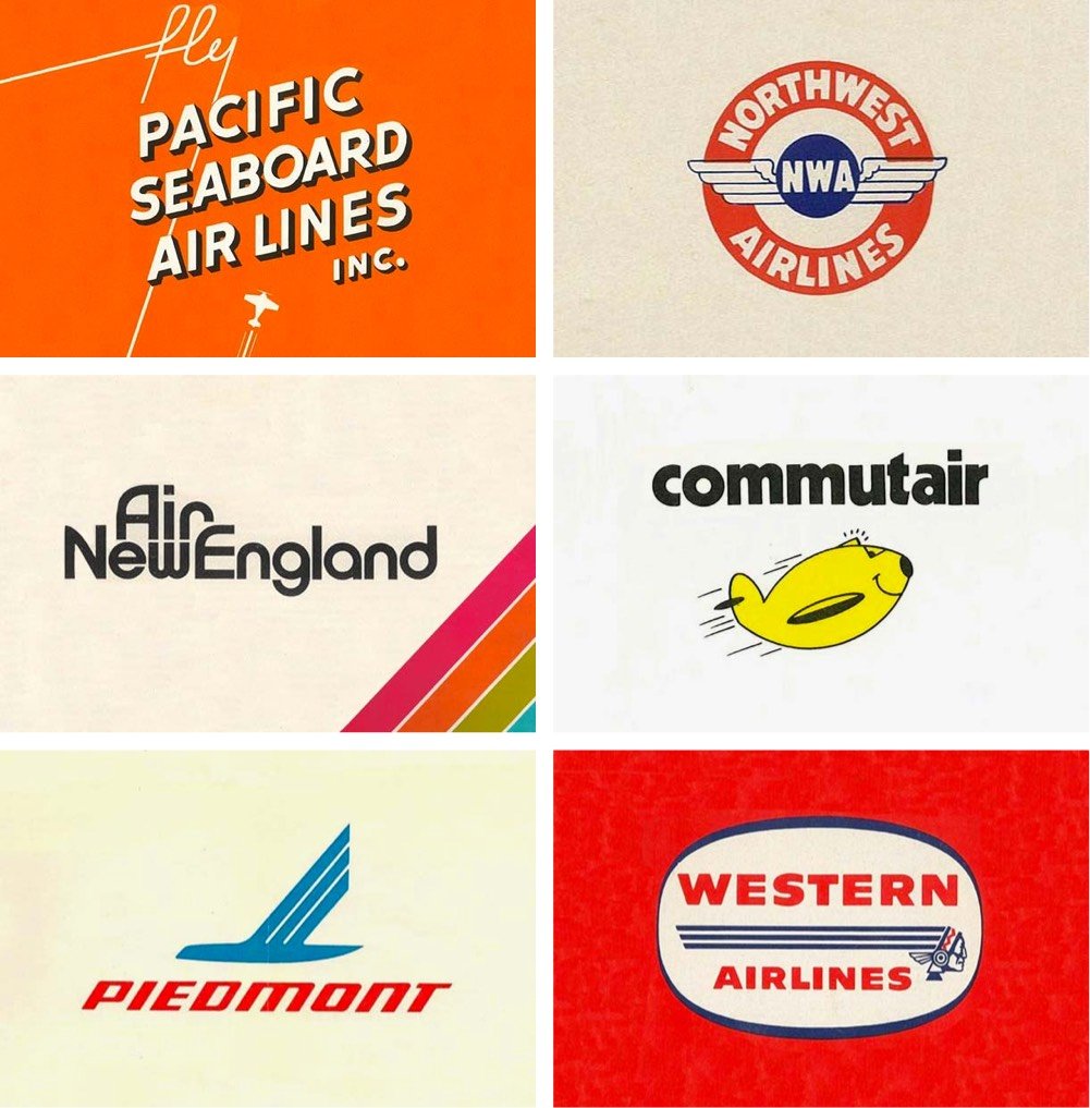
Reagan Ray has collected a bunch of classic logos from American airlines, from the big ones (Delta, United) to small regional airlines (Pennsylvania Central, Cardiff and Peacock) to those no longer with us (Pan Am, TWA, Northwest). I sent him the logo for my dad’s old airline, Blue Line Air Express…I hope it makes it in!
See also Reagan’s collections of record label logos, 80s action figure logos, American car logos, VHS distributor logos, and railway logos. Careful, you might spend all day on these… (via @mrgan)
Update: Ray was kind enough to add Blue Line into the mix! Thank you!
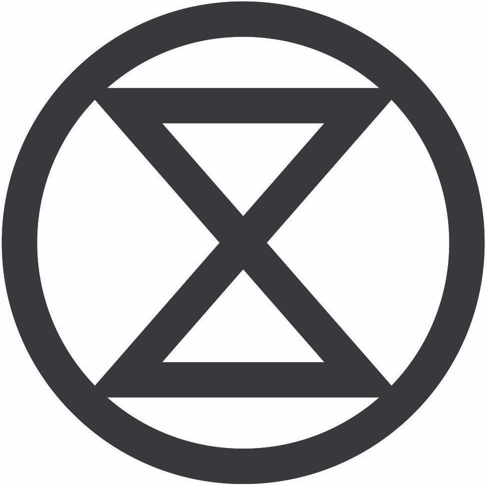
With its recent use by the participants in the Extinction Rebellion, the extinction symbol has become much more widely known, on its way to becoming the peace symbol of the climate movement.
The symbol above represents extinction. The circle signifies the planet, while the hourglass inside serves as a warning that time is rapidly running out for many species. The world is currently undergoing a mass extinction event, and this symbol is intended to help raise awareness of the urgent need for change in order to address this crisis. Estimates are that somewhere between 30,000 and 140,000 species are becoming extinct every year in what scientists have named the Holocene, or Sixth Mass Extinction. This ongoing process of destruction is being caused by the impact of human activity. Within the next few decades approximately 50% of all species that now exist will have become extinct. Such a catastrophic loss of biodiversity is highly likely to cause widespread ecosystem collapse and consequently render the planet uninhabitable for humans.
The symbol and a stencil template are available for download “for non-commercial purposes”.
There’s a disclaimer at the bottom of the page about merchandise, which reads in part:
No extinction symbol merchandise exists, and it never will do. The free use of the extinction symbol by individuals in their personal artwork or other forms of expression is strongly welcomed and encouraged, but any form of commercial use of the symbol is completely against its ethos and should therefore be refrained from. To reiterate, please do not use the symbol on any items that will be sold, or for any other fundraising purposes. There are no exceptions to this policy.
Here’s the thing: I want a t-shirt with the extinction symbol on it so I can signify my support (in a small way) for climate justice. If I’m reading this correctly, I can make a t-shirt for myself but not have one made for me? Or can I have a single print-on-demand shirt made for me at cost? Making my own shirt (I’d need to buy a bunch of single-use supplies) or getting a one-off printed doesn’t seem very climate-friendly at all. How about taking orders from other interested folks (like you all) and selling the shirts at cost? That seems much more climate-friendly but also firmly against the symbol maker’s strict policy.
I think we’re bumping up against an inconvenient truth about capitalism here: it is sometimes (or perhaps even often) the most efficient and least wasteful way to produce something because it’s actually a deeply collectivist endeavor. Let’s say you’re holding a climate protest, 100,000 people are coming, and those people want to bring shirts or signs or other protest equipment to the protest to “advertise” their displeasure to those watching, near and far. Is it more climate friendly for all those people to individually buy supplies and each produce their own things or would it be better to rely on a organization whose sole purpose is to produce protest supplies (using carbon-free energy and materials) and pay them more than the cost of the supplies so they can provide their employees a living wage and even advertise their services a little so they can actually remain in the protest supplies business and take even more advantage of economies of scale to keep prices down? Run it as a non-profit if you’d like. That seems far less wasteful to me than people buying one-off supplies, even on a group basis.
You might interject here that producing anything that uses any natural resources for such a protest is wasteful and unethical. I think that’s a fair point! What’s the ROI for protest materials? Is it wasteful to spend a little CO2 now to possibly save a bunch of CO2 in the future or is it smart? Gah, all I want is a shirt to express myself! Are there any simple and ethical solutions in a world that’s so densely networked and interconnected?
To commemorate the 100-year anniversary of the founding of the Bauhaus design movement, 99designs challenged their community of designers to reimagine the logos of famous brands in a Bauhaus style. (via moss & fog)
Bloomberg Businessweek asked eight designers to design a logo for Trump’s proposed new branch of the military, Space Force. 89-year-old Milton Glaser, designer of the iconic I ❤ NY logo, can still bring the heat:
I really really *really* want this on a hat. (via df)
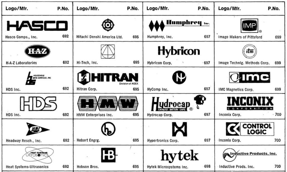
This 1985 catalog for engineers contains hundreds and hundreds of tech logos from the 70s and 80s. They are glorious.
Marcin Wichary turned more than 1400 of these logos into a screensaver “for your random viewing pleasure”.
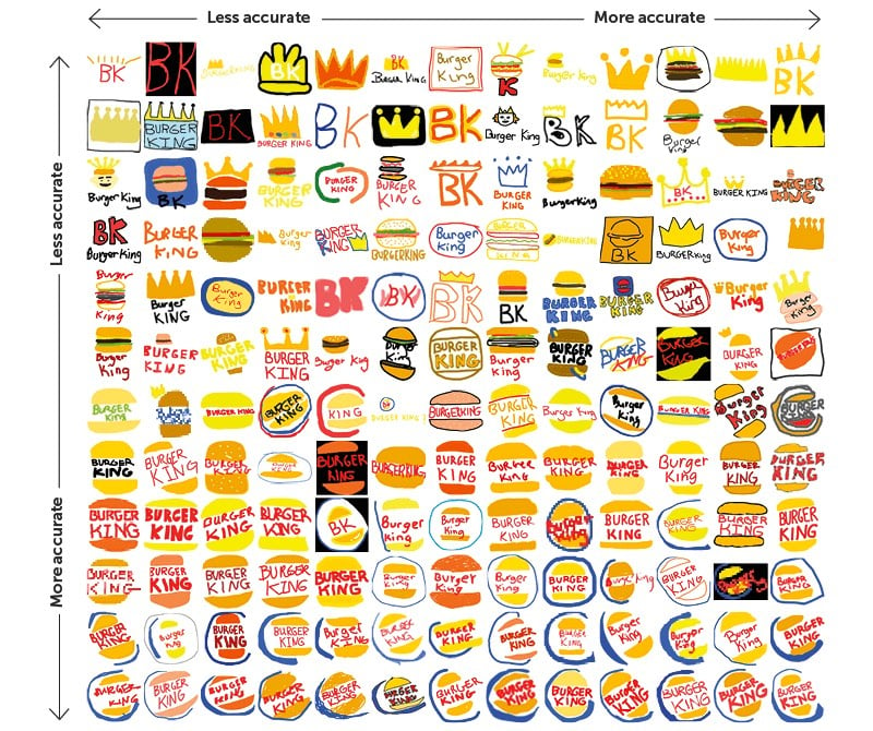
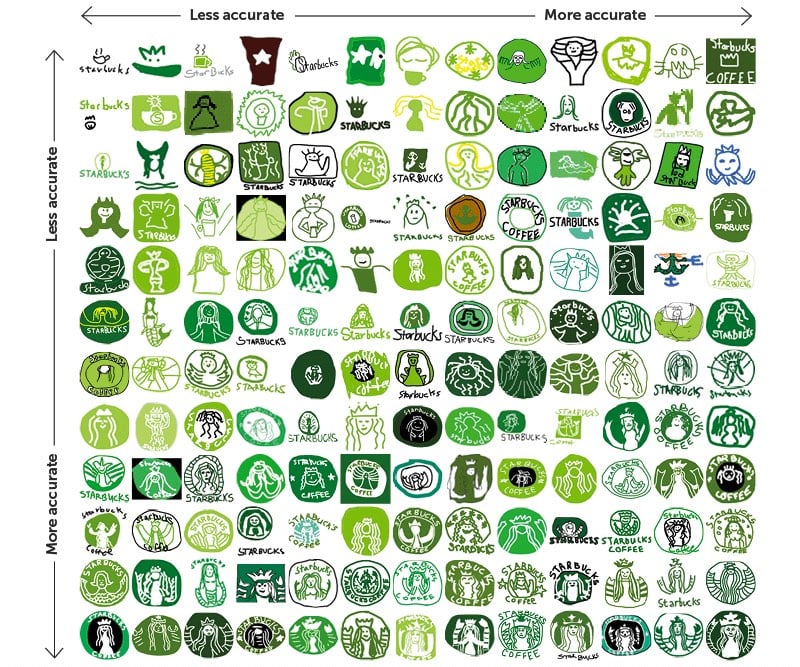
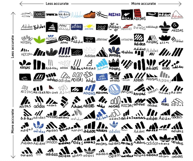
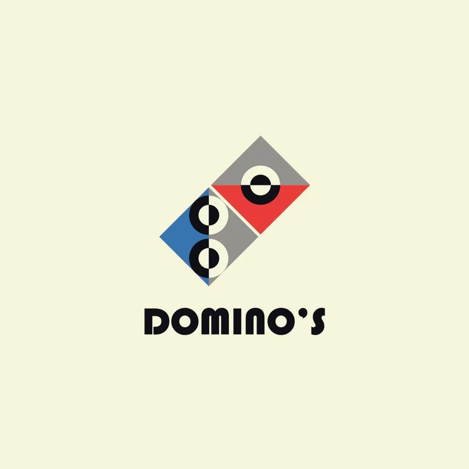
Signs.com asked dozens of Americans to draw the logos of well-known companies from memory, including Domino’s, Apple, Adidas, and Starbucks. As you can see, there was a wide range in aptitude and some logos fared better than others; overall the Starbucks and Foot Locker logos were the worst drawn while Ikea and Target were the best represented.
There is also this (a true story):
Adidas, the second largest sportswear company in the world, acquired its three-stripes logo in 1952 from footwear brand Karhu Sports for two bottles of whiskey and the equivalent of $2,000.
See also drawing all 50 states from memory, can you draw a working bicycle from memory?, and maps drawn from memory.
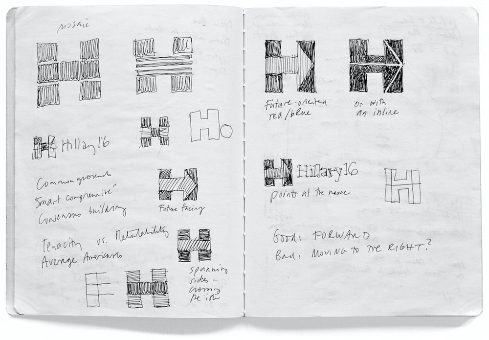
Pentagram’s Michael Bierut and his team designed the identity for Hillary Clinton’s 2016 Presidential campaign (of which I was not initially a fan but came around later). Here’s how it happened.
I put together a three-person team: me, designer Jesse Reed, and project manager Julia Lemle. We would work in secret for the next two months. Our first meeting with the Clinton team began with a simple statement: “Our candidate has 100 percent name recognition.” There is a well-known marketing principle that is often credited to midcentury design legend Raymond Loewy. He felt that people were governed by two competing impulses: an attraction to the excitement of new things and a yearning for the comfort provided by what we already know. In response, Loewy had developed a reliable formula. If something was familiar, make it surprising. If something was surprising, make it familiar.
That same principle applies to political campaigns. In 2008 Sol Sender, Amanda Gentry and Andy Keene were faced with the challenge of branding a candidate who had anything but name recognition. Barack Obama’s design team responded with a quintessentially professional identity program, introducing — for the first time — the language of corporate branding to political marketing. Obama’s persona — unfamiliar, untested, and potentially alarming to much of the voting public — was given a polished logo and a perfectly executed, utterly consistent typographic system. In short, they made a surprising candidate seem familiar.
We faced the opposite problem. Our candidate was universally known. How could we make her image seem fresh and compelling?
This is a great look at how a designer at the top of his game approaches a problem…and reckons with failure. Even this little bit:
It wasn’t clever or artful. I didn’t care about that. I wanted something that you didn’t need a software tutorial to create, something as simple as a peace sign or a smiley face. I wanted a logo that a five-year-old could make with construction paper and kindergarten scissors.
Leading up to the election, how many photos did you see of Hillary logos hand-drawn by kids on signs and t-shirts? Lots and lots…my kids even got into the act.
Anyway, a huge contrast to the process and impact of the Trump campaign’s identity.
Logobook is a growing catalog of “the finest logos, symbols & trademarks” in the world. The 5000+ logos are divided into groups like letters & numbers, shapes, animals, objects, and nature and are extensively categorized by industry, designer, and country of origin. Great resource.
They’re backed up with new submissions right now, but you can still send them your logos and they’ll get back to you when submissions are open again. (via @buzz)
Just learned/realized that the old logos for Reebok, Apple, and Trapper Keeper all use the same typeface, Motter Tektura.
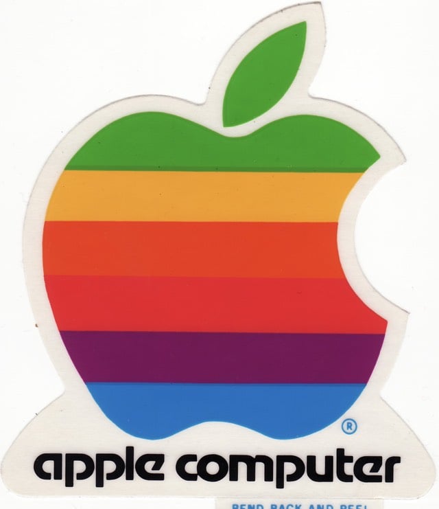
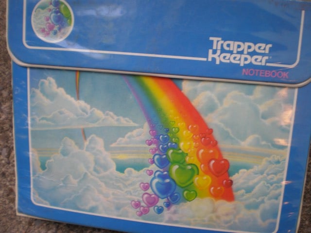
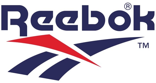
(via @pieratt)
From 1969, this is the video that Saul Bass made to pitch AT&T on a new corporate identity. What a time capsule. Here’s the logo, which remained in use until 1983, when Bass designed the “Death Star” logo to replace it.
….and it still looks like a middlebrow kids clothing brand logo.
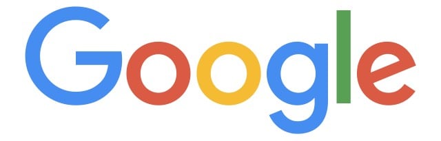
So why are we doing this now? Once upon a time, Google was one destination that you reached from one device: a desktop PC. These days, people interact with Google products across many different platforms, apps and devices-sometimes all in a single day. You expect Google to help you whenever and wherever you need it, whether it’s on your mobile phone, TV, watch, the dashboard in your car, and yes, even a desktop!
Today we’re introducing a new logo and identity family that reflects this reality and shows you when the Google magic is working for you, even on the tiniest screens. As you’ll see, we’ve taken the Google logo and branding, which were originally built for a single desktop browser page, and updated them for a world of seamless computing across an endless number of devices and different kinds of inputs (such as tap, type and talk).
Update: The design team shares how they came up with the new logo.
Update: When I said that Google’s new logo “still looks like a middlebrow kids clothing brand logo”, this is pretty much what I meant.
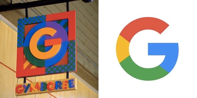
Gymboree’s identity (1993-2000) vs. Google’s new identity (Sep 01, 2015)
(via @buzz)
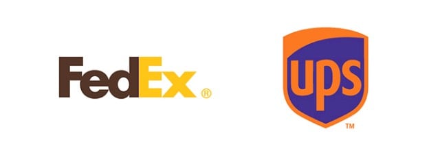
Paula Rúpolo took some famous brands’ iconic logos (McDonald’s, Starbucks, eBay) and swapped the colors with logos of their competitors (Subway, Dunkin Donuts, Amazon). Here’s FedEx and UPS:
Older posts
.svg)
Socials & More