kottke.org posts about Jessica Hische
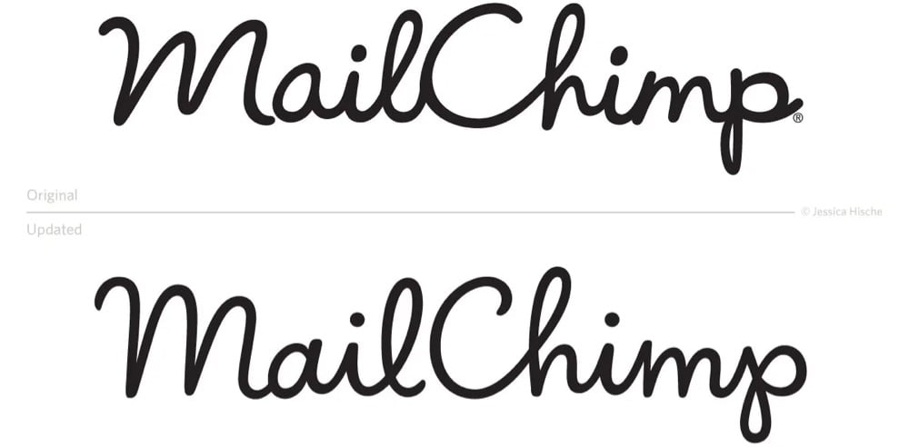
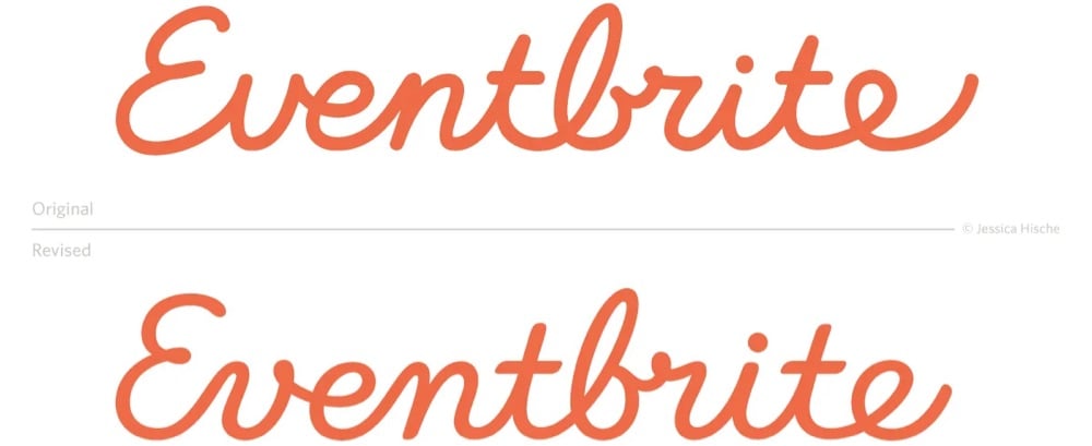
This is a nice little interview with designer Jessica Hische on how she steps in to help companies refresh their logos.
There are a number of reasons why companies decide that a refresh — rather than a rebrand — is the right move. Many of the companies I work with simply want a logo asset that is easier for their designers to work with. Sometimes there are issues with the current logo that make it harder to design around, or make it less flexible on different design applications. For example, logos with long ascenders and descenders create difficulties with balancing whitespace, and logos with tight counterforms or complex details don’t scale well.
Aside from adding utility, refreshes can be a nice way to make an older logo asset play well with a new brand system — we can make subtle tweaks to letterforms that make it better match new typefaces chosen for the brand or blend with the mood of photography better.
You can see a bunch of logo before & afters at Print or on her website — and her recent work for Squier is here. The differences may look negligible, but in each case, the new version is cleaner and easier to read — they just look nicer and smoother after Hische is done with them.
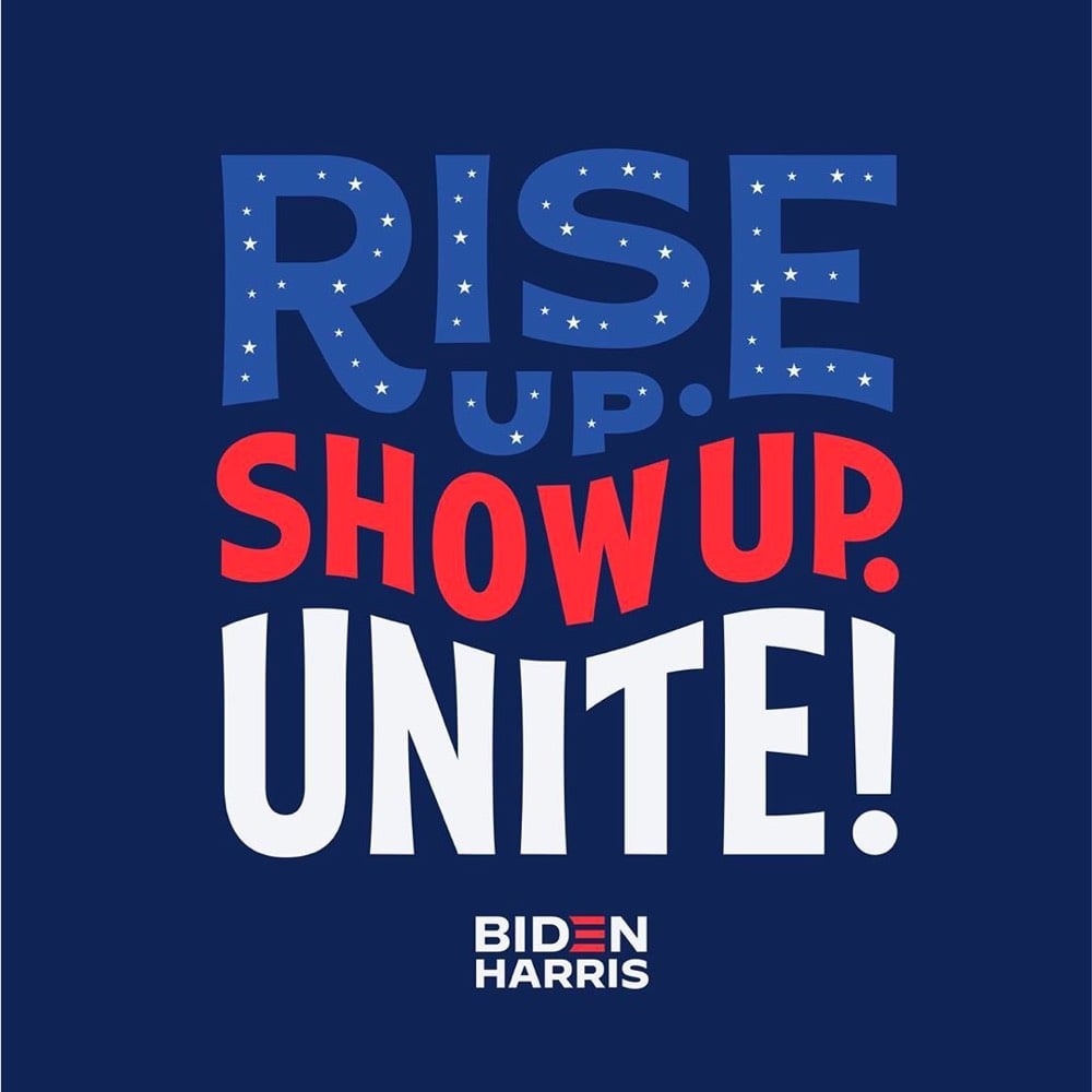
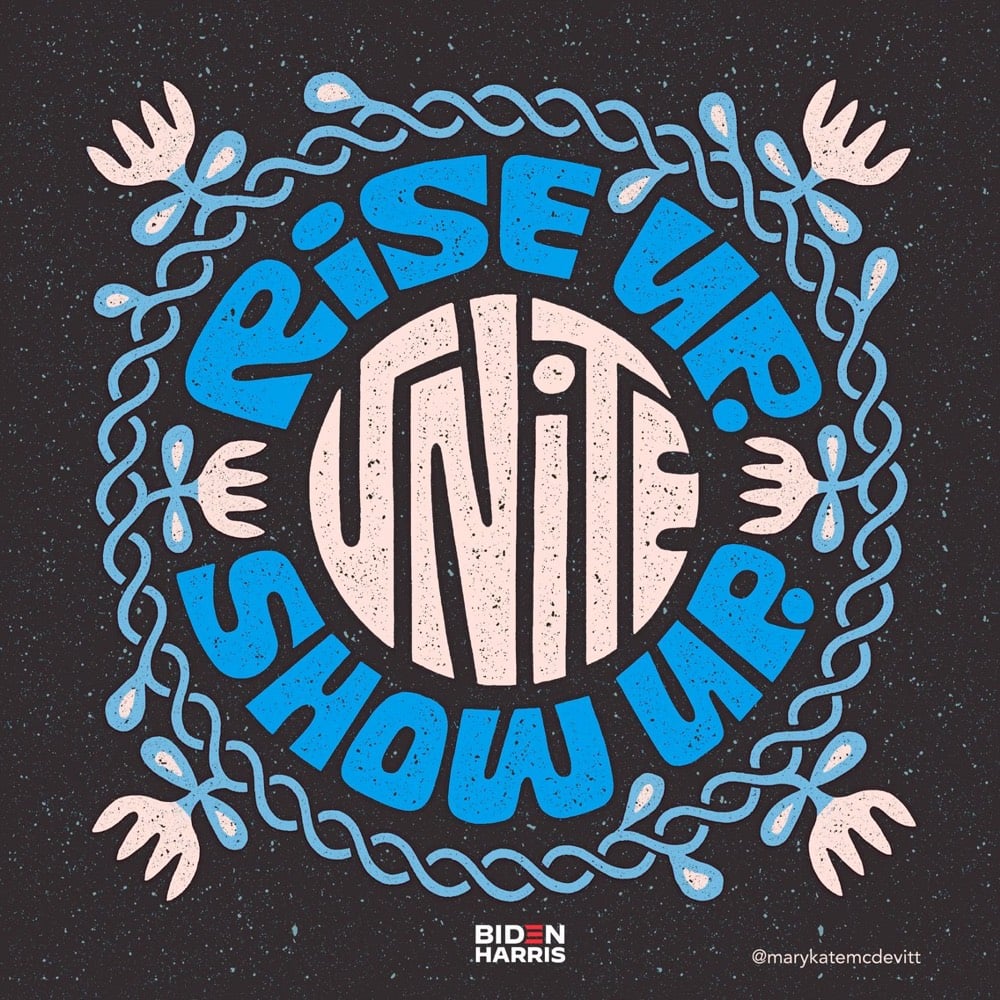
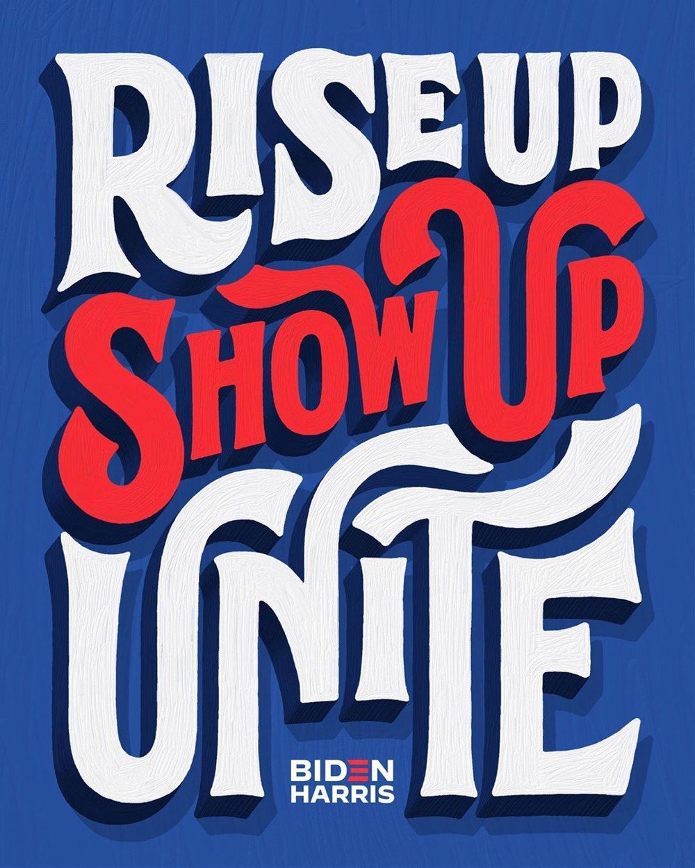
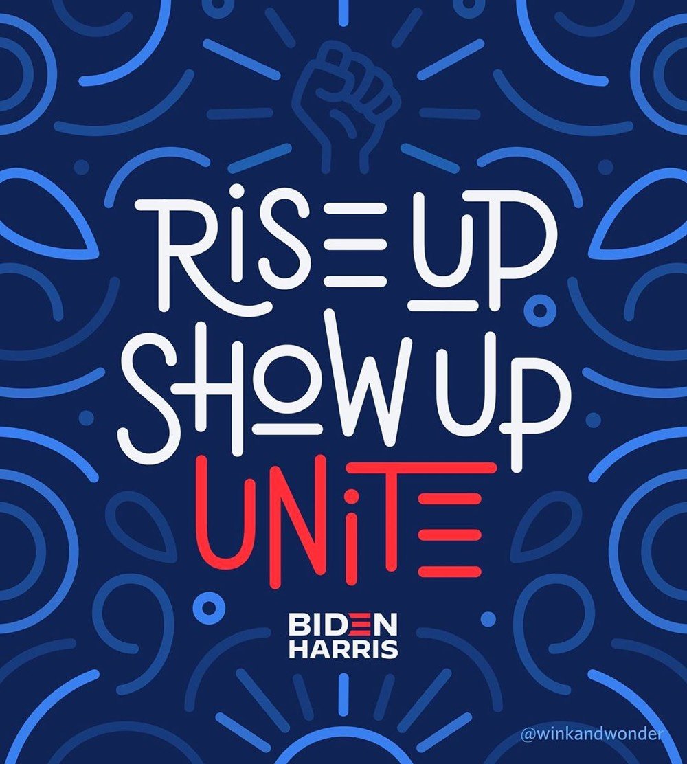
A group of creatives led by Jessica Hische are creating unofficial posters for the Biden/Harris campaign in order to increase visibility of the campaign.
Last week, I [Jessica Hische] had a good conversation with the Biden creative team. I shared that one of my concerns for the upcoming election was the lack of visible support for the campaign. There are a lot of folx within the creative world and beyond posting on social media about voting (a wonderful and necessary message), but few of those posts mention the candidates by name. It’s somewhat implied that if you’re promoting voting or voting rights that you’re likely voting Biden and encouraging a Biden vote, but it’s not explicit. There’s a “I guess I’ll vote for him if I have to” vibe throughout leftist social media, but exasperated resignation doesn’t get people to the polls.
From top to bottom, art by Jessica Hische, Mary Kate McDevitt, Lauren Hom, and Joanna Muñoz. You can participate by downloading a template that includes the Biden/Harris logo — you can find the link at the bottom of the article.
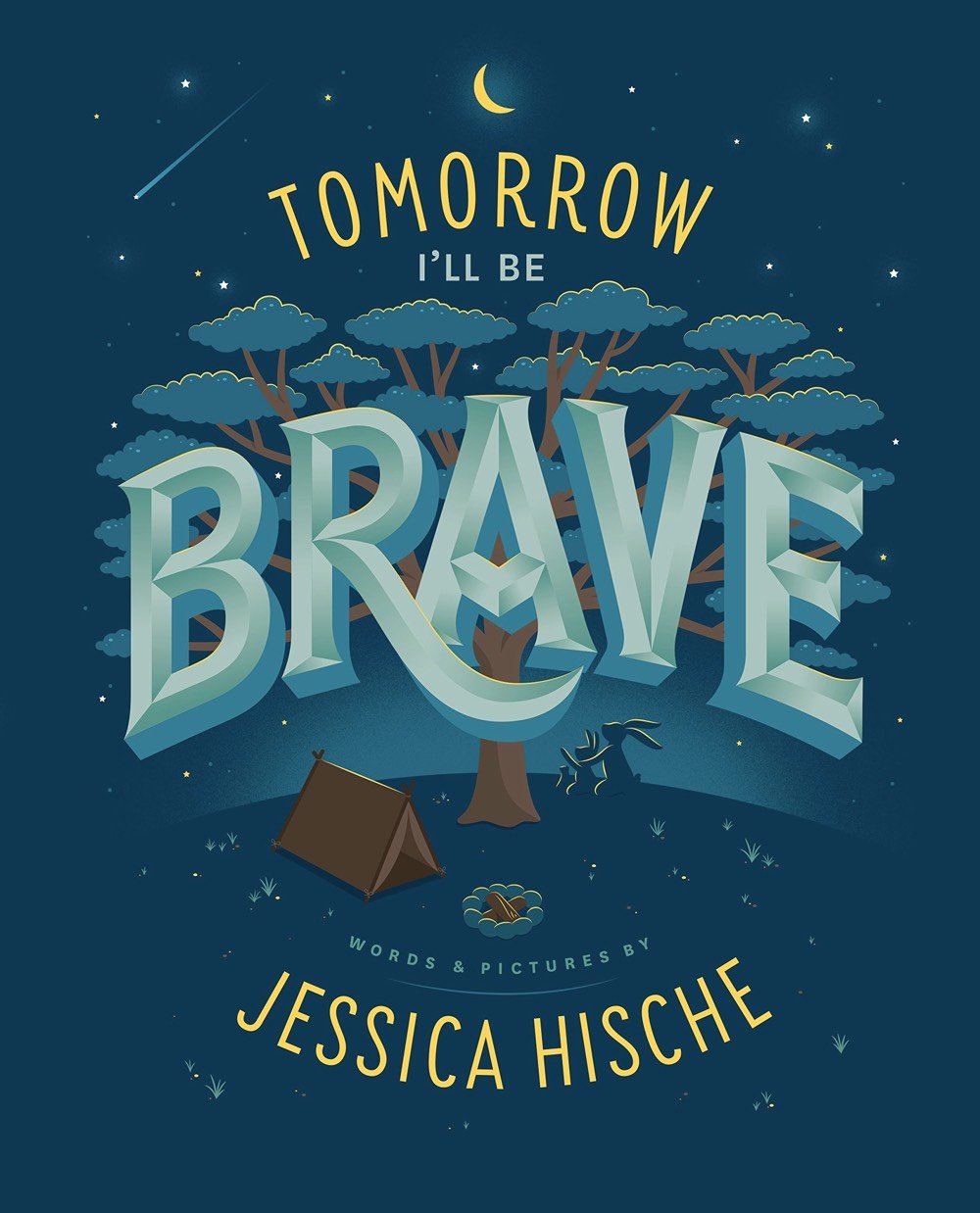
Illustrator Jessica Hische (who did the typeface for Moonrise Kingdom, among many other wonderful things) has written and illustrated a children’s book called Tomorrow I’ll Be Brave.
Lyrically written and beautifully illustrated by award-winning lettering artist Jessica Hische, this book takes readers on a fantastic journey that encourages them to be adventurous, strong, smart, curious, creative, confident, and brave — reassuring them that if they haven’t been able to be all or any of those things today, there is always tomorrow, which is full of endless opportunities.
You can see some spreads from the book on Hische’s site.
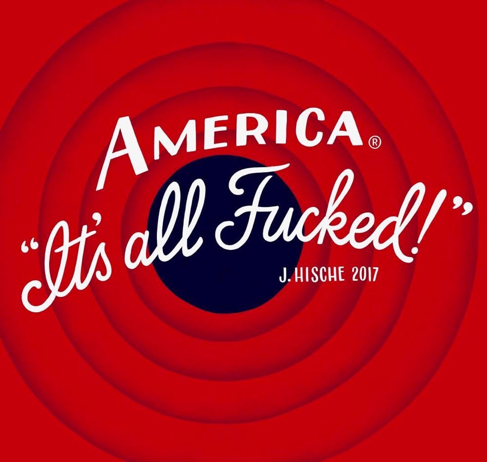
It’s been a loooong couple of days / weeks / months / years / decades / centuries / millennia, hasn’t it? Sometimes you have to laugh, just a little. And then back to it. Thanks for the chuckle, Jessica Hische.
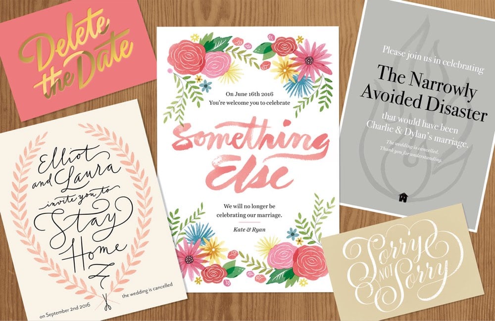
For a NY Times piece on cancelled weddings, Jessica Hische created these anti-invitations in the style of fancy wedding invites.
My thoughts immediately went to fancy wedding stationery, and I had a lot of fun both writing and designing these fake anti-invitations. I tried to poke fun at some of the current trends in wedding stationery design, which meant I got to have fun playing with watercolors!
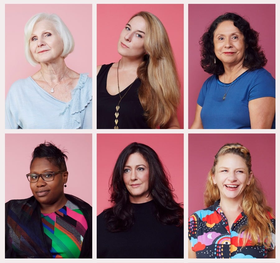
Photographer Helena Price, who you may recall from the Techies project earlier this year, has created a project called The Pussy Project about “women’s perspectives on the significance of this election and its ramifications on society.”. Photos of women are paired with each person’s thoughts on the election. Price explains how the project came about on Medium:
The name is a trigger for all of us. For many it represents the moment in the Trump campaign that incited so many women to finally get angry, get involved and speak out. That shift — the sudden activation of women across America to vocalize their feelings about this election — is what I set out to explore with this project.
Happy to see several women I know and admire interviewed for this…plus Jessica Hische did the logo and Maggie Mason edited the interviews.
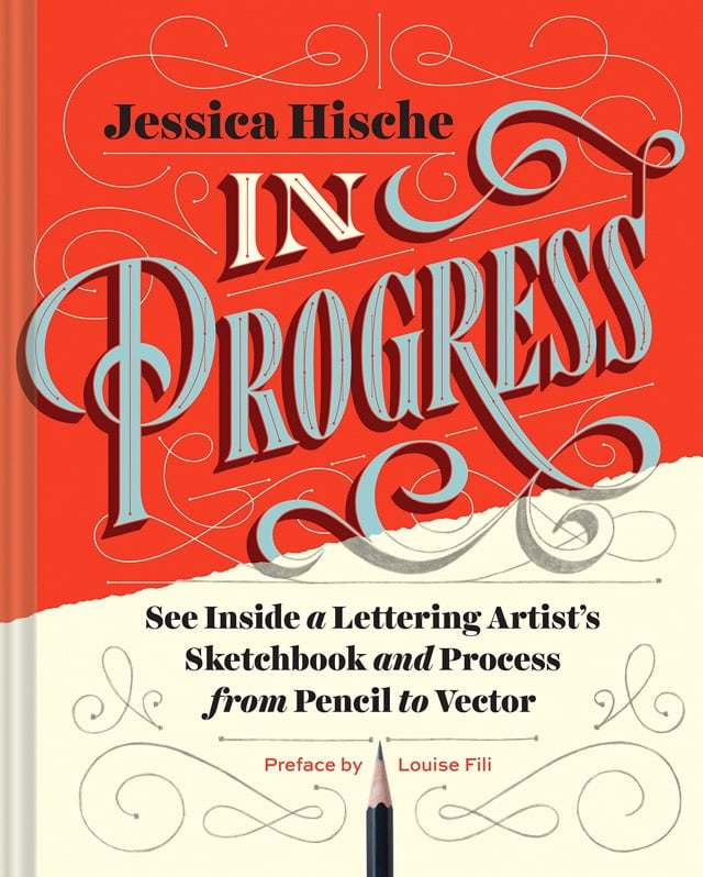
One of my favorite designers, Jessica Hische (she did the film titles for Moonrise Kingdom), is coming out with a new book in September called In Progress: See Inside a Lettering Artist’s Sketchbook and Process, from Pencil to Vector.
This show-all romp through design-world darling Jessica Hische’s sketchbook reveals the creative and technical process behind making award-winning hand lettering. See everything, from Hische’s rough sketches to her polished finals for major clients such as Wes Anderson, NPR, and Starbucks. The result is a well of inspiration and brass tacks information for designers who want to sketch distinctive letterforms and hone their skills.
Hische made a video offering a quick tour of the book:
Looks great!
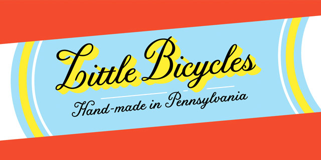
Jessica Hische and Font Bureau have teamed up to offer the typeface Hische designed for Wes Anderson’s Moonrise Kingdom. Meet Tilda (great name). Art of the Title interviewed Hische about the typeface last year.
The Art of the Title chats with the excellent Jessica Hische about the lettering and type design she did for Wes Anderson’s Moonrise Kingdom.
To me, that was really fun because if you think about New England in the ’60s… it’s not like most places would be staying on top of the most current trends in type, using typefaces that were released that very year. So, using something from the ’40s made sense to me. If you think about a small, conservative New England town, lord knows all the printers and designers in town are probably still using type from years ago. I think when people think about historical type references, they often don’t think about that. You should be reaching from that time period to 15 - 20 years earlier and then you’ll be getting stuff that’s quote-unquote “current.”
And she’s releasing the typeface commercially so everyone can use it! Yay!




Socials & More