The Art of the Logo Refresh


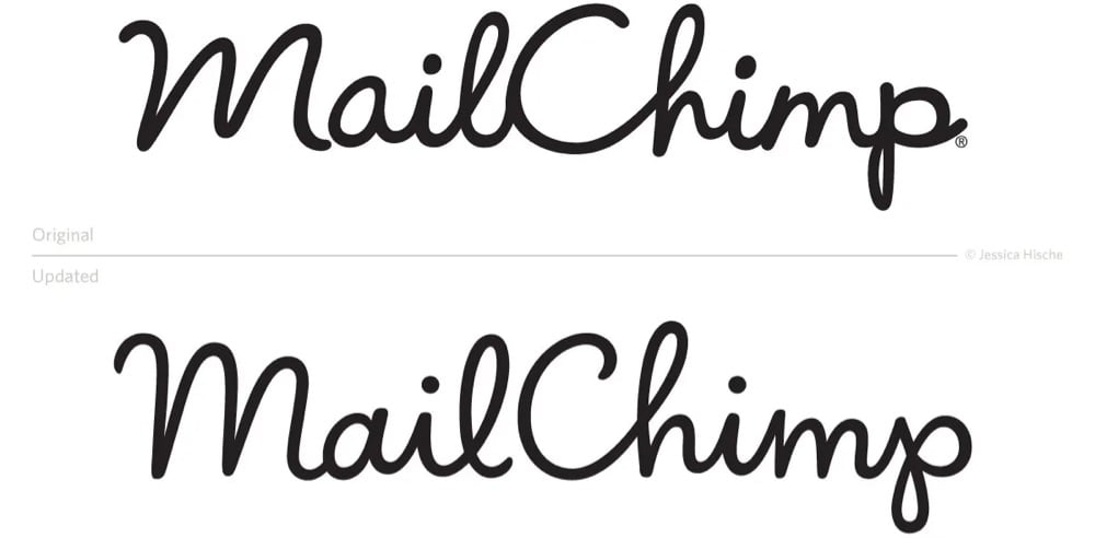
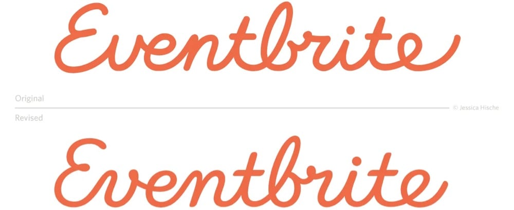
This is a nice little interview with designer Jessica Hische on how she steps in to help companies refresh their logos.
There are a number of reasons why companies decide that a refresh — rather than a rebrand — is the right move. Many of the companies I work with simply want a logo asset that is easier for their designers to work with. Sometimes there are issues with the current logo that make it harder to design around, or make it less flexible on different design applications. For example, logos with long ascenders and descenders create difficulties with balancing whitespace, and logos with tight counterforms or complex details don’t scale well.
Aside from adding utility, refreshes can be a nice way to make an older logo asset play well with a new brand system — we can make subtle tweaks to letterforms that make it better match new typefaces chosen for the brand or blend with the mood of photography better.
You can see a bunch of logo before & afters at Print or on her website — and her recent work for Squier is here. The differences may look negligible, but in each case, the new version is cleaner and easier to read — they just look nicer and smoother after Hische is done with them.


Socials & More