Google has a new logo
![]()
….and it still looks like a middlebrow kids clothing brand logo.
So why are we doing this now? Once upon a time, Google was one destination that you reached from one device: a desktop PC. These days, people interact with Google products across many different platforms, apps and devices-sometimes all in a single day. You expect Google to help you whenever and wherever you need it, whether it’s on your mobile phone, TV, watch, the dashboard in your car, and yes, even a desktop!
Today we’re introducing a new logo and identity family that reflects this reality and shows you when the Google magic is working for you, even on the tiniest screens. As you’ll see, we’ve taken the Google logo and branding, which were originally built for a single desktop browser page, and updated them for a world of seamless computing across an endless number of devices and different kinds of inputs (such as tap, type and talk).
Update: The design team shares how they came up with the new logo.
Update: When I said that Google’s new logo “still looks like a middlebrow kids clothing brand logo”, this is pretty much what I meant.
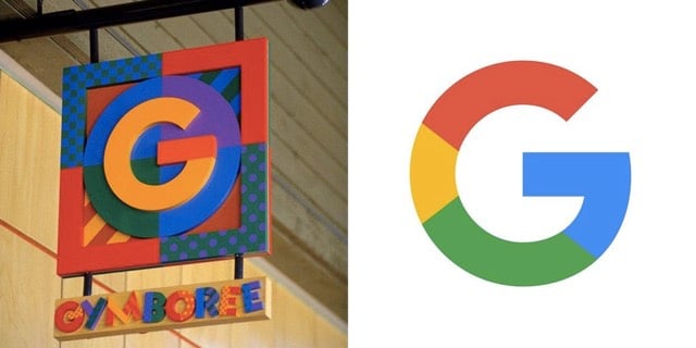
Gymboree’s identity (1993-2000) vs. Google’s new identity (Sep 01, 2015)
(via @buzz)
Socials & More