kottke.org posts about branding
The Fictional Brands Archive is a collection of fictional brands found in movies, TV shows, and video games — think Acme in Looney Tunes, Pixar’s Monsters, Inc., and Nakatomi Corporation from Die Hard. Very cool. But gotta say though, the dimming mouseover effect makes this more difficult to use than it needs to be… (via sidebar)
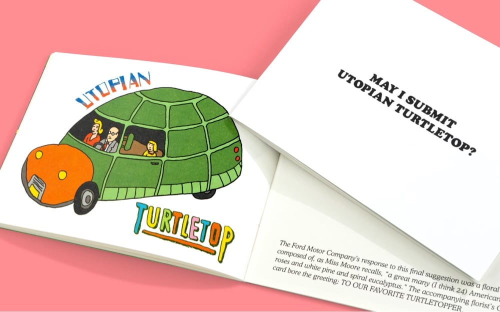
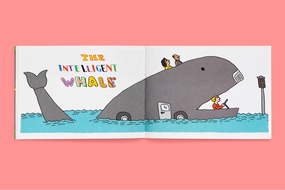
In 1955, the Ford Motor Company hired poet Marianne Moore to come up with some names for their revolutionary new car. Moore ended up submitting some amazing names, including “Silver Sword”, “Intelligent Whale”, “Angel Astro”, and “Utopian Turtletop”.
What Moore lacked in corporate nomenclature experience, she made up for in enthusiasm and imagination: she submitted over two dozen names for consideration, each one more delightful — and unlikely — than the last. In the end, the poet’s suggestions were rejected and the company’s chairman himself named the vehicle. Thus was born the notorious car known as the Edsel.
Ford realized perhaps too late that they shouldn’t have, in fact, sent a poet — but we’re sure glad they did.
Back here in the present day, Pentagram commissioned the legendary Seymour Chwast to turn Moore’s amazing collection of names into a booklet of illustrations that imagine what these cars might look like.
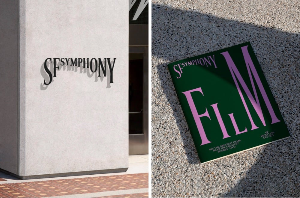
Design studio Collins has created a new brand identity for the San Francisco Symphony that uses type in a playful, almost musical way. This brief video demonstration is worth 1000 words:
Even better, you can experiment with your own type and music with the Symphosizer web toy. I made this (to the beat of Daft Punk):
(via @dkhamsing)
I’d like to take a brief moment at the end of this weird and difficult week to appreciate this monogram that’s part of Burger King’s new brand identity.
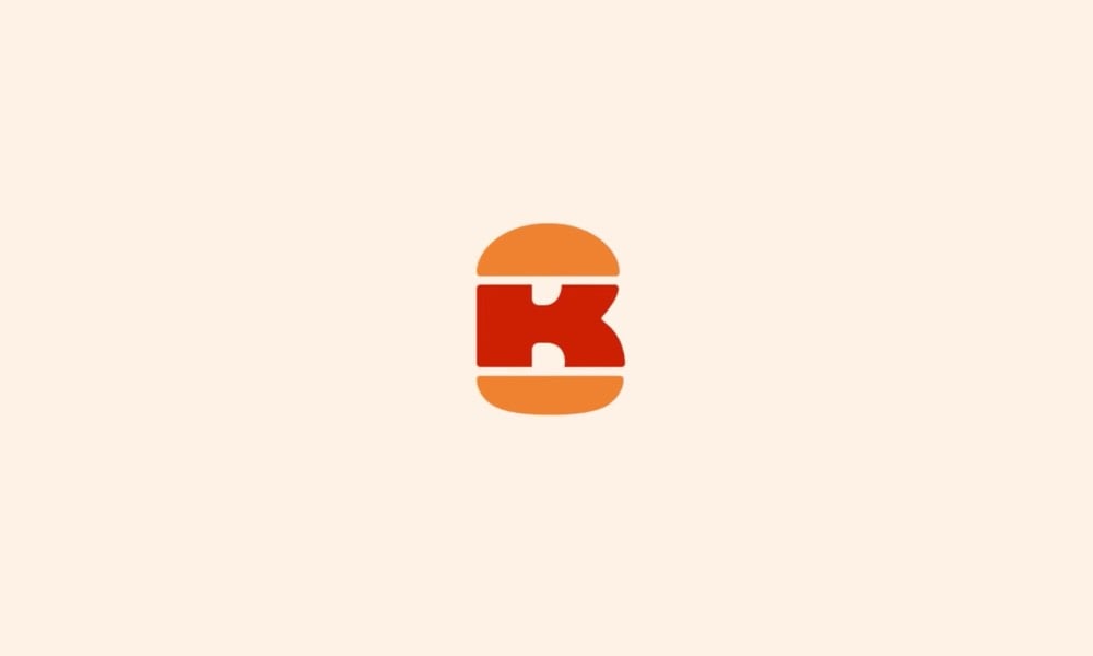
B + K + burger = perfect. I hereby dub this new tiny logo “The Slider”. It was designed by Stephen Kelleher Studio; you can see some of their other “explorations” as they worked on refining the finished monogram. Reminds me of Sandwich’s excellent logo.
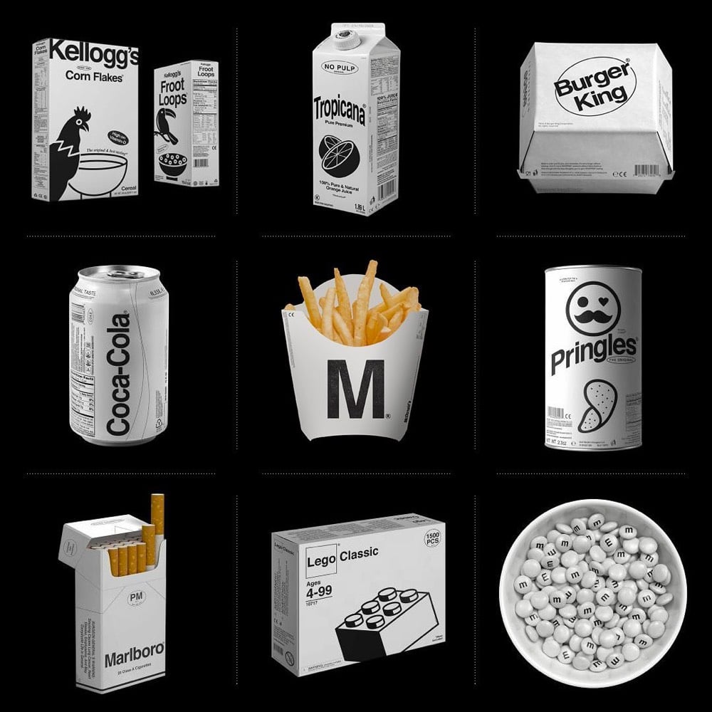
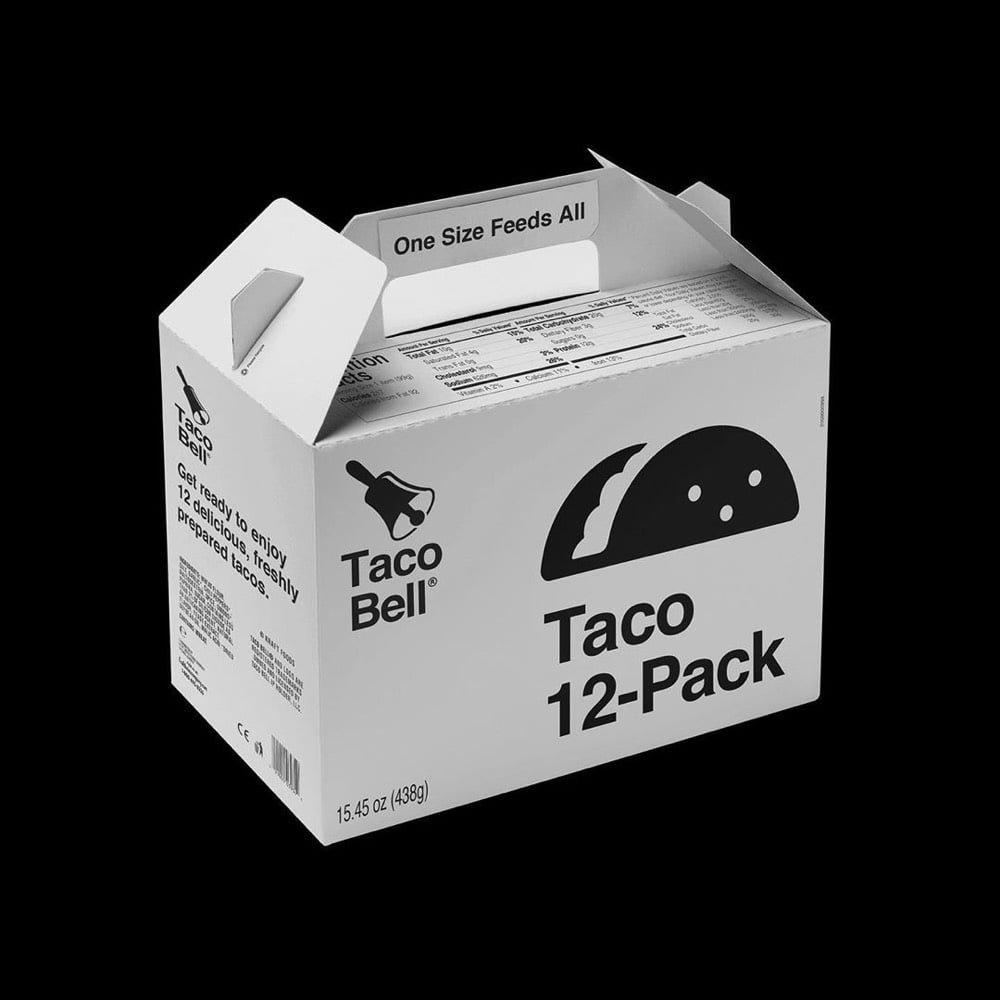
Designer Kunel Gaur, head of a creative agency called Animal, has redesigned the packaging for several familiar brands using minimal black & white graphics and unadorned typography. The designs don’t seem to be collected in one place, so you’ll have to poke around his Instagram to find them.
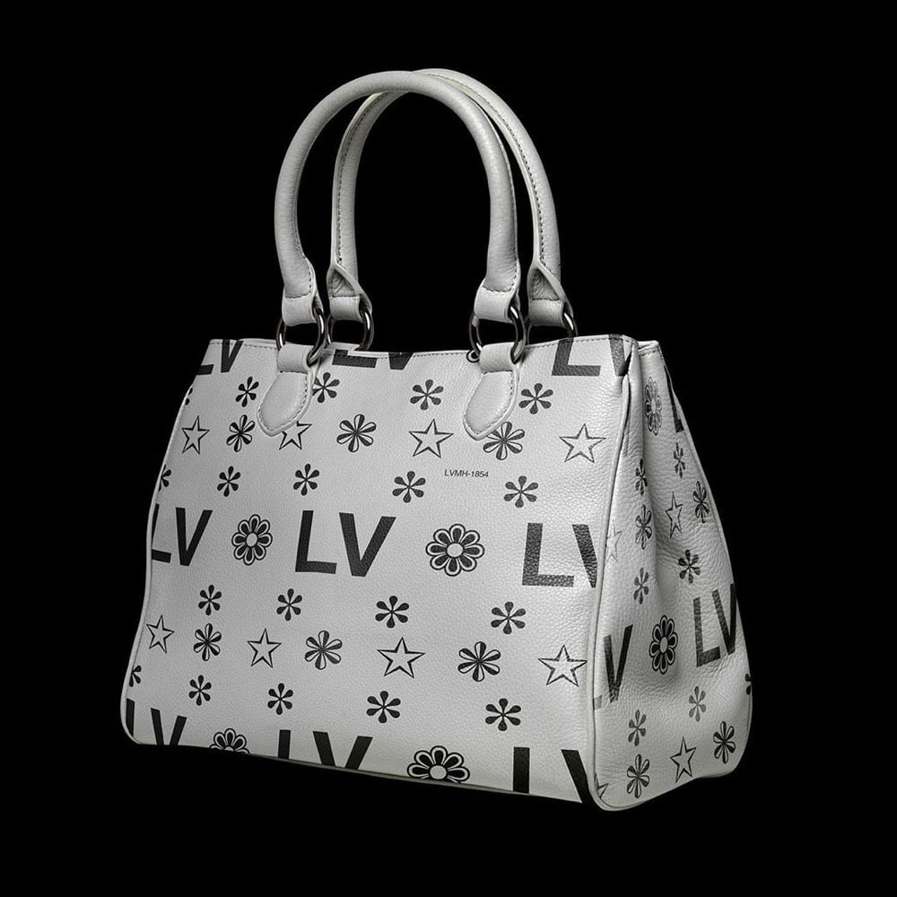
That LV bag actually looks like something Virgil Abloh would design — it would sell like hotcakes. Dye it millennial pink and you’ve got a freaking worldwide sensation. Fashion design is so easy!! (via moss & fog)
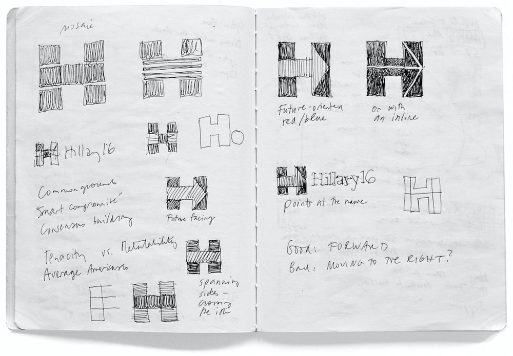
Pentagram’s Michael Bierut and his team designed the identity for Hillary Clinton’s 2016 Presidential campaign (of which I was not initially a fan but came around later). Here’s how it happened.
I put together a three-person team: me, designer Jesse Reed, and project manager Julia Lemle. We would work in secret for the next two months. Our first meeting with the Clinton team began with a simple statement: “Our candidate has 100 percent name recognition.” There is a well-known marketing principle that is often credited to midcentury design legend Raymond Loewy. He felt that people were governed by two competing impulses: an attraction to the excitement of new things and a yearning for the comfort provided by what we already know. In response, Loewy had developed a reliable formula. If something was familiar, make it surprising. If something was surprising, make it familiar.
That same principle applies to political campaigns. In 2008 Sol Sender, Amanda Gentry and Andy Keene were faced with the challenge of branding a candidate who had anything but name recognition. Barack Obama’s design team responded with a quintessentially professional identity program, introducing — for the first time — the language of corporate branding to political marketing. Obama’s persona — unfamiliar, untested, and potentially alarming to much of the voting public — was given a polished logo and a perfectly executed, utterly consistent typographic system. In short, they made a surprising candidate seem familiar.
We faced the opposite problem. Our candidate was universally known. How could we make her image seem fresh and compelling?
This is a great look at how a designer at the top of his game approaches a problem…and reckons with failure. Even this little bit:
It wasn’t clever or artful. I didn’t care about that. I wanted something that you didn’t need a software tutorial to create, something as simple as a peace sign or a smiley face. I wanted a logo that a five-year-old could make with construction paper and kindergarten scissors.
Leading up to the election, how many photos did you see of Hillary logos hand-drawn by kids on signs and t-shirts? Lots and lots…my kids even got into the act.
Anyway, a huge contrast to the process and impact of the Trump campaign’s identity.
Logobook is a growing catalog of “the finest logos, symbols & trademarks” in the world. The 5000+ logos are divided into groups like letters & numbers, shapes, animals, objects, and nature and are extensively categorized by industry, designer, and country of origin. Great resource.
They’re backed up with new submissions right now, but you can still send them your logos and they’ll get back to you when submissions are open again. (via @buzz)
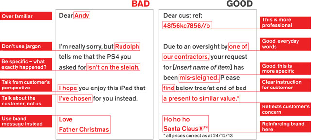
Communications agency Quietroom came up with a tongue-in-cheek set of brand guidelines for Santa Claus outlining a brand refresh for the jolly Pole dweller.
Logo Tourist is a project by Risto-Jussi Isopahkala that depicts cityscapes and famous Parisian landmarks made up of famous logos. Here’s the Arc de Triumph (sponsored by Pepsi and Adidas):
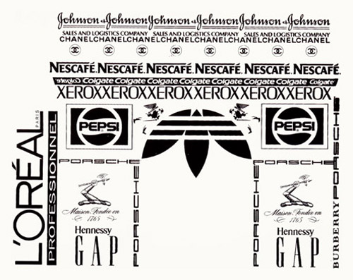
See also Logorama.
A brand timeline portrait shows all the different brands a person uses and interacts with during the course of a typical day.
Originated by Jane Sample, dozens of other people have also created portraits. (via rocketboom)
Update: Make your own at Brand My Day.
Steven Heller asks why Tropicana redesigned the packaging for their orange juice.
What could Arnell, the agency that did the deed, have been thinking? It’s one thing to change the logo; it’s another to abandon the mnemonic orange with the straw in it. As package imagery goes, it was pretty smart, and decidedly memorable.
He goes on to call the redesign “a big tactical mistake”. I’m a Tropicana drinker and I think the new packaging sucks. It’s impossible to figure out at a glance which juice is which because all the packages look the same, aside from some thin lines at the very top. Horrible.
Brand New runs down the best and worst new logos of 2008. Some of the bad ones are downright awful…the WGN one is crazy bad.
Great two-part video interview with Sol Sender about designing the logo for the Obama campaign. Includes some early design sketches and other designs that made it to the final phase. (via quips)
Steven Heller spoke with the designer Sol Sender about his iconic Obama “O” logo.
Well, the “O” was the identity for the Obama ‘08 campaign and the campaign is over. That doesn’t mean that the mark will be forgotten; I think the memorabilia from this campaign will have a long shelf life and will stand as a visible symbol of pride for people who supported the candidate and for those who see it as a representation of a watershed moment for our country. As far as having another life, I can’t say. Perhaps the 2012 campaign will hark back to it in some way.
Sender’s web site has a bit more info on the development of the Obama brand.
Photos of 99 different ecstasy pills with logos on them, including those with McDonald’s, Mercedes, MTV, Harry Potter, and Apple logos.
The huge media conglomerates are re-imagining their cash-cow brands like Mickey Mouse, Bugs Bunny, and Strawberry Shortcake for today’s generation of kids. Poochie, anyone?
You want a dark, Goth version of Tweety Bird? Have at it.
This isn’t going to end well.
From an article in Monocle about the Baselworld watch fair.
Swiss watch brands are patriotic to a fault. Rolex is one of the few high-end manufacturers that does not stamp “Swiss Made” on the watch face in the belief that Rolex defines Switzerland rather than the other way around.
Now *that’s* a brand.
Brand Tags asks people what they think of in association with particular brands and then the results are displayed as tag clouds. For instance, Playboy, Nike, Apple, and MTV. See also Celeb Tags.
What I Learned Today asked an interesting question on Friday:
What is the fastest “0 to global” brand? Basically, what brand (company, product, person, any entity that holds a brand identity) do you think gained awareness the fastest. Reblog your answer, if you’re so inclined. TBC Monday (taking a snowboard trip to Stowe this weekend).
Tumblr doesn’t allow comments, so let’s open them up here. What’s your best guess?
Color Matters examines four legal battles over color trademark infringement in packaging and branding, each decided by a test of “color functionality.”
The U.S. courts denied Ambrit’s request for protection of blue, on the basis that royal blue when used to package frozen desserts was functional and could not be monopolized in a trademark. The ruling stated “Royal blue is a ‘cool color;’ it is suggestive of coldness and used by a multitude of ice cream and frozen dessert producers.” Although the ruling acknowledged the issue of protecting the consumer from confusion, preventing a monopoly of a functional color was a greater issue.
(via CG Explorer)
Now you can buy a house modeled after one of Martha Stewart’s three houses. People love these houses so much that sales are bucking the downturn in new home sales. Says a representative for the company building the homes: “It’s our version of the iPhone. It illustrates the power of something different with a brand tied to it.”
On brand indentities that are flexible (vs. those that are static). Examples: Google’s logo, Target’s bullseye, and Saks’ jumbly identity. “As advertising agencies lose their grip on the communications channels, the logos are starting to come out of the corner. Once pushed as far over to the bottom right as possible, they’re becoming central to communication, no longer content to just be the the full-stop at the end of a piece of branded communication.” (via quipsologies)
A rare positive review from Speak Up of the new London 2012 that everyone else in the world seems to hate. “I believe, despite any ensuing boo’s, that this is some of the most innovative and daring identity work we have seen in this new millennium, and the lack of cheesy and imagination-impairing gradients gives me hope that identity work can still be resurrected on a larger scale.”
Update: Coudal loves the logo.
Mocketing: making fun of your product or brand in order to sell the product and build the brand. Found out about mocketing from this Book Design Review post on a book called Unmarketable.
I feel like I’ve linked to this before but here it is again (maybe): a list of how companies got their names. “Mattel - a portmanteau of the founders names Harold ‘Matt’ Matson and Elliot Handler.” (via khoi)
Instead of giving out wasteful schwag bags and tshirts that no one wears, the Interesting 2007 conference is asking participants to provide their own used tshirts (they’ll screenprint the logo on it) and will be using plain old plastic bags with the conference logo screenprinted on them. What a great twist on recycling. (via bbj)
Older posts
Socials & More