kottke.org posts about timelines
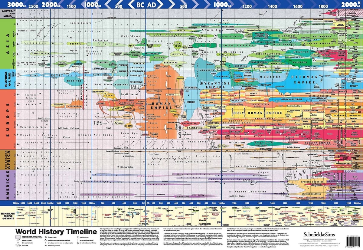
This World History Timeline (2016) shows how nations, empires, and ruling groups shifted and evolved across the globe from 3000 BCE to the present. It takes a second to understand what you’re looking at — I thought it was a sort of stretched geographical map at first. Get your own here.
The chart is based on Joseph Priestley’s A New Chart of History (1769):
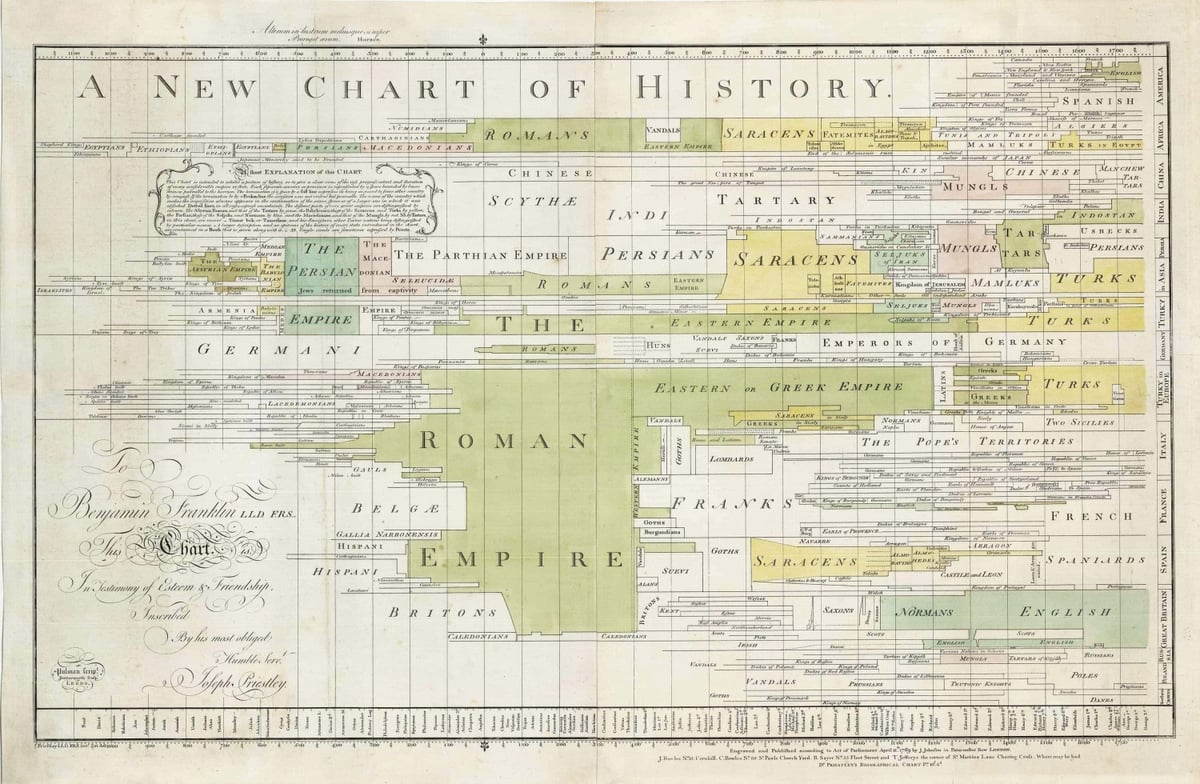
Priestley is best known for his co-discovery of oxygen.
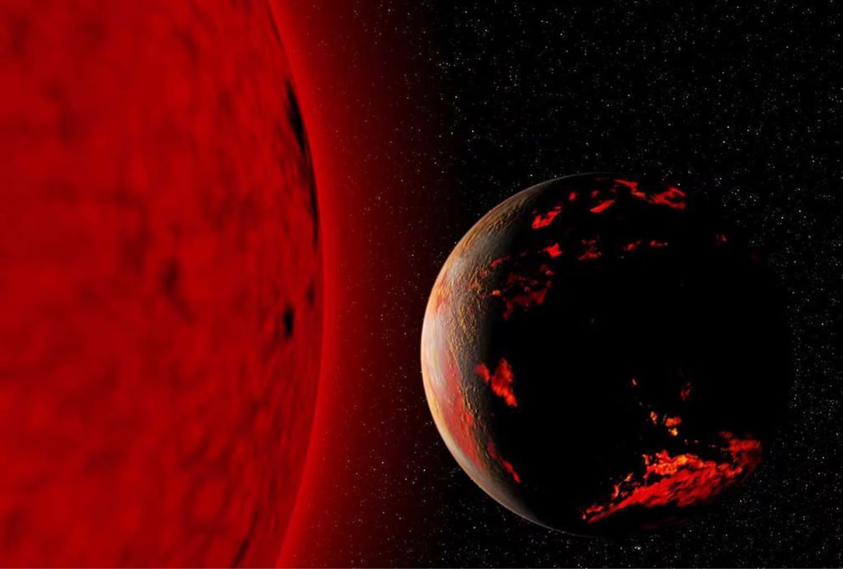
Ross Anderson and I share a favorite web page, Wikipedia’s Timeline of the Far Future, which he wrote about for the Atlantic: For How Much Longer Can Life Continue on This Troubled Planet?
Like the best sci-fi world building, the Timeline of the Far Future can give you a key bump of the sublime. It reminds you that even the sturdiest-seeming features of our world are ephemeral, that in 1,100 years, Earth’s axis will point to a new North Star. In 250,000 years, an undersea volcano will pop up in the Pacific, adding an extra island to Hawaii. In the 1 million years that the Great Pyramid will take to erode, the sun will travel only about 1/200th of its orbit around the Milky Way, but in doing so, it will move into a new field of stars. Our current constellations will go all wobbly in the sky and then vanish.
Some aspects of the timeline are more certain than others. We know that most animals will look different 10 million years from now. We know that the continents will slowly drift together to form a new Pangaea. Africa will slam into Eurasia, sealing off the Mediterranean basin and raising a new Himalaya-like range across France, Italy, and Spain. In 400 million years, Saturn will have lost its rings. Earth will have replenished its fossil fuels. Our planet will also likely have sustained at least one mass-extinction-triggering impact, unless its inhabitants have learned to divert asteroids.
I wrote about the timeline back in 2012 (and again in 2017 & 2019).
The timeline of the far future article is far from the longest page on Wikipedia, but it might take you several hours to get through because it contains so many enticing detours. What’s Pangaea Ultima? Oooh, Roche limit! The Degenerate Era, Poincar’e recurrence time, the Big Rip scenario, the cosmic light horizon, the list goes on and on.
To mark the 10th anniversary of their YouTube channel, Kurzgesagt has released a video timeline of the Earth’s evolution, all 4.5 billion years of it. The video is 60 minutes long, which means that each second shows about 1 million years. And it’s kind of a music video…of sorts? There’s talking but there are definitely stretches of just music and visuals…it’s not your usual science explainer video.
Hop on a musical train ride and experience how long a billion years really is. It’s the perfect background for your next party, a great way to take a break from studying, or a fascinating companion while you’re on the go.
This video is an animated history of the shifting borders of Europe from 400 BCE to the present. This is a very nation-centric view of European history (and I would mute the music and use your own soundtrack), but it’s still worth a look.
This animation shows how humans have spread and organized themselves across the Earth over the past 200,000 years. The time lapse starts with the migration of homo sapiens out of sub-Saharan Africa 200,000 years ago, with a few thousand years passing every second. As the agricultural revolution gets underway and the pace of civilization quickens, the animation slows down to hundreds of years per second and eventually, as it nears modern times, 1-2 years per second.
See also time lapse animations of the history of Europe from the fall of Rome to modern times and human population through time. (via open culture)
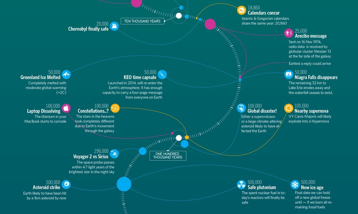
Timeline of the far future is one of my favorite pages on Wikipedia. It details what might happen to humanity, human artifacts, the Earth, the solar system, and the Universe from 10,000 years from now until long past the heat death of the Universe. Information is Beautiful has made a lovely infographic of the timeline.
Reading through the timeline is a glorious way to spend time…here are a few favorites I noticed this time around as well as some from my first post.
August 20, 10,663: “A simultaneous total solar eclipse and transit of Mercury.”
20,000 years: “The Chernobyl Exclusion Zone, the 1,000 sq mi area of Ukraine and Belarus left deserted by the 1986 Chernobyl disaster, becomes safe for human life.”
296,000 years: “Voyager 2 passes within 4.3 light-years of Sirius, the brightest star in the night sky.”
1 million years: “Highest estimated time until the red supergiant star Betelgeuse explodes in a supernova. The explosion is expected to be easily visible in daylight.”
1 million years: “On the Moon, Neil Armstrong’s ‘one small step’ footprint at Tranquility Base will erode by this time, along with those left by all twelve Apollo moonwalkers, due to the accumulated effects of space weathering.”
15.7 million: “Half-life of iodine-129, the most durable long-lived fission product in uranium-derived nuclear waste.”
100 million years: “Future archaeologists should be able to identify an ‘Urban Stratum’ of fossilized great coastal cities, mostly through the remains of underground infrastructure such as building foundations and utility tunnels.”
1 billion years: “Estimated lifespan of the two Voyager Golden Records, before the information stored on them is rendered unrecoverable.”
4 billion years: “Median point by which the Andromeda Galaxy will have collided with the Milky Way, which will thereafter merge to form a galaxy dubbed ‘Milkomeda’.”
7.59 billion years: The Earth and Moon are very likely destroyed by falling into the Sun, just before the Sun reaches the tip of its red giant phase and its maximum radius of 256 times the present-day value. Before the final collision, the Moon possibly spirals below Earth’s Roche limit, breaking into a ring of debris, most of which falls to the Earth’s surface.
100 billion years: “The Universe’s expansion causes all galaxies beyond the Milky Way’s Local Group to disappear beyond the cosmic light horizon, removing them from the observable universe.”
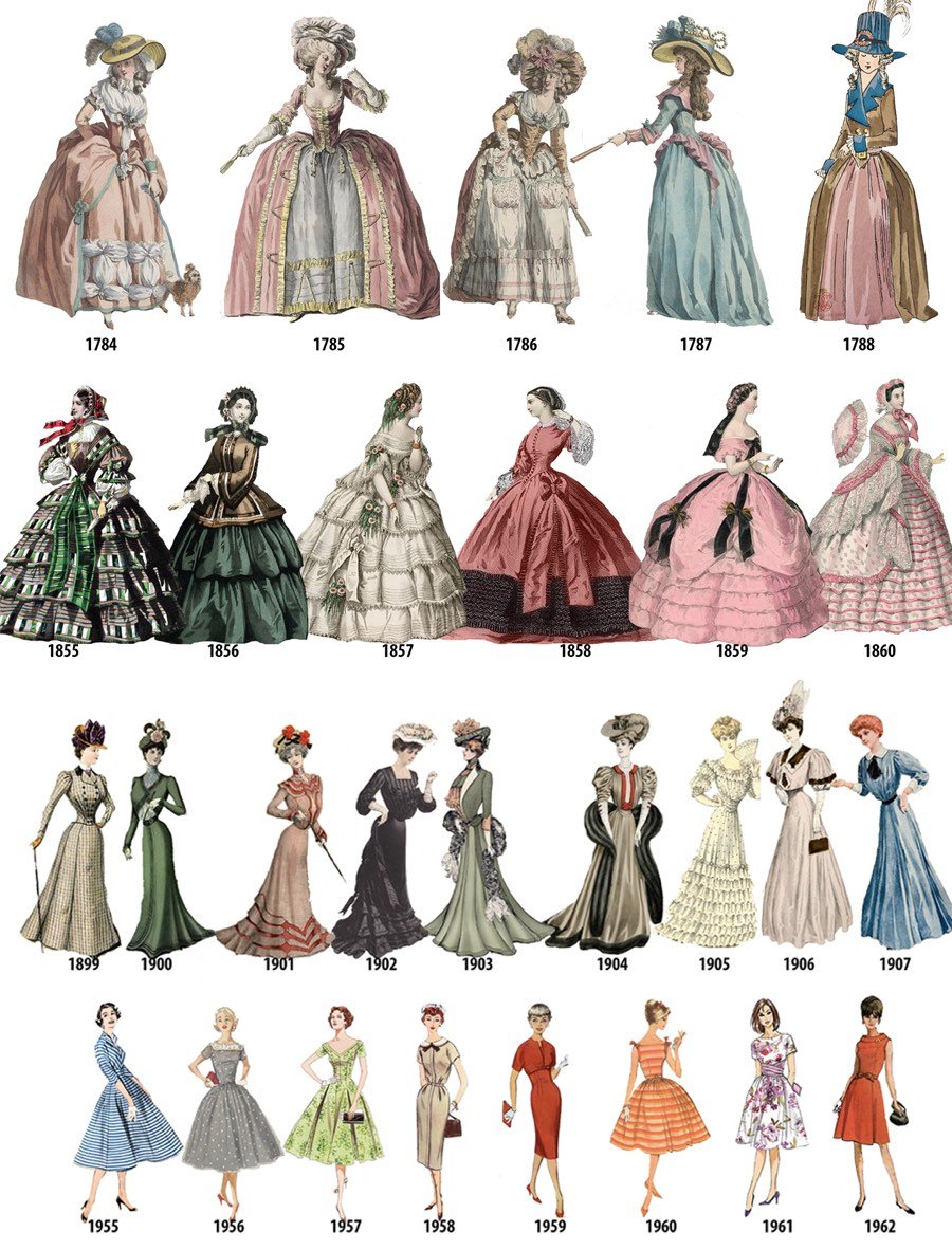
Part of the appeal of watching period shows like Mad Men and Downton Abbey that happen over the course of many years is observing how fashion changes. Collected from a number of fashion plates, this image shows what a woman might have worn each year from 1784 to 1970. (I’m guessing the image only goes up through 1970 because photography made fashion plates increasingly irrelevant.)
Fashion plates do not usually depict specific people. Instead they take the form of generalized portraits, which simply dictate the style of clothes that a tailor, dressmaker, or store could make or sell, or demonstrate how different materials could be made up into clothes. The majority can be found in lady’s fashion magazines which began to appear during the last decades of the eighteenth century.
The above-the-knee dress makes its first appearance in the late 1920s (and then not again until the 60s) and everything is a dress or a skirt until the pantsuit in 1970.
During the 1960s trouser suits for women became increasingly widespread. Designers such as Foale and Tuffin in London and Luba Marks in the United States were early promoters of trouser suits. In 1966 Yves Saint-Laurent introduced his Le Smoking, an evening pantsuit for women that mimicked a man’s tuxedo. Whilst Saint-Laurent is often credited with introducing trouser suits, it was noted in 1968 that some of his pantsuits were very similar to designs that had already been offered by Luba Marks, and the London designer Ossie Clark had offered a trouser suit for women in 1964 that predated Saint Laurent’s ‘Le Smoking’ design by two years. In Britain a social watershed was crossed in 1967 when Lady Chichester, wife of the navigator Sir Francis Chichester, wore a trouser suit when her husband was publicly knighted by Queen Elizabeth II.
The last item about Lady Chichester was marked with a “citation needed” on Wikipedia, but I found a YouTube video of Chichester’s knighting and sure enough, his wife is wearing a bright red pantsuit (and he’s wearing what looks like a baseball cap (but is likely a sailor’s cap)).
In just the past 10 years, the number of earthquakes in the central US (and particularly Oklahoma) has risen dramatically. In the 7-year period ending in 2016, there were more than three times the number of magnitude 3.0+ earthquakes than in the previous 36 years. Above is a video timeline of Oklahoma earthquakes from 2004-2016. At around the midpoint of the video, you’ll probably say, “wow, that’s crazy”. Keep watching.
These earthquakes are induced earthquakes, i.e. they are caused by humans. Fracking can cause induced earthquakes but the primary cause is pumping wastewater back into the ground. From the United States Geological Survey’s page on induced earthquake myths & misconceptions (a summarized version of this paper):
Wastewater disposal wells typically operate for longer durations and inject much more fluid than hydraulic fracturing, making them more likely to induce earthquakes. Enhanced oil recovery injects fluid into rock layers where oil and gas have already been extracted, while wastewater injection often occurs in never-before-touched rocks. Therefore, wastewater injection can raise pressure levels more than enhanced oil recovery, and thus increases the likelihood of induced earthquakes.
Of course, this wastewater is a byproduct of any oil & gas production, including fracking. But specifically in Oklahoma’s case, the induced earthquakes have relatively little to do with fracking:
In contrast, in Oklahoma spent hydraulic fracturing fluid represents 10% or less of the fluids disposed of in salt-water disposal wells in Oklahoma (Murray, 2013). The vast majority of the fluid that is disposed of in disposal wells in Oklahoma is produced water. Produced water is the salty brine from ancient oceans that was entrapped in the rocks when the sediments were deposited. This water is trapped in the same pore space as oil and gas, and as oil and gas is extracted, the produced water is extracted with it. Produced water often must be disposed in injection wells because it is frequently laden with dissolved salts, minerals, and occasionally other materials that make it unsuitable for other uses.
From Aron Strandberg,1 this is a timeline visualization of the age of the world’s population from 1960-2060. The world’s human population has increased rapidly in the last couple centuries, most recently doubling since 1970:
A tremendous change occurred with the industrial revolution: whereas it had taken all of human history until around 1800 for world population to reach one billion, the second billion was achieved in only 130 years (1930), the third billion in less than 30 years (1959), the fourth billion in 15 years (1974), and the fifth billion in only 13 years (1987).
But watching that video, you’ll realize that the world’s population will not reach 20 or 30 billion in 2050 — human civilization is getting old.
This interactive map shows where the 79 million people who have immigrated to the US from 1820 to 2013 came from. In the past, incoming residents from Canada, Italy, Germany, and Ireland were prevalent, but more recently Mexico, China, and the Philippines have led the way.
What I think is particularly interesting about immigration to the U.S. is that each “wave” coming in from a particular country has a story behind it — usually escaping persecution (e.g. Jews escaping Russia after the May Laws were enacted, the Cuban Revolution) or major economic troubles (e.g. the Irish Potato Famine, the collapse of southern Italy after the Italian Unification).
There are plenty of dark spots on United States’ history, but the role it has played as a sanctuary for troubled people across the world is a history I feel very proud to be a part of.
The graph of incoming immigrants as a percentage of the total US population is especially instructive. Though higher than it was in the 60s and 70s, relative immigration rates are still far below what the country saw in the 1920s and before.
This is cool and a little mesmerizing: animated US maps showing the most popular baby name in each state from 1910 to 2014 for boys and girls. There are three separate visualizations. The first just shows the most popular baby name in each state. Watch as one dominant name takes over for another in just a couple of years…the Mary to Lisa to Jennifer transition in the 60s and 70s is like watching an epidemic spread. Celebrity names pop up and disappear, like Betty (after Betty Boop and Betty Grable?) and Shirley (after Shirley Temple) in the 30s. The boy’s names change a lot less until you start getting into the Brandons, Austins, and Tylers of the 90s.
The next visualization shows the most particularly popular name for each state, e.g. Brandy was the most Louisianan name for female newborns in 1975. And the third visualization shows each name plotted in the averaged geographical location of births — so you can see, for example, the northward migration of Amanda during the 80s.
P.S. Guess what the most popular boy’s name in the state of my birth was the year I was born? And the most particularly popular boy’s name in the state I moved to just a year later? Jason. I am basic af.
Update: From Flowing Data, some graphs of the most unisex names in US history. (thx, paul)
From the American Museum of Natural History, an animated timeline map of human population growth from 100,000 BCE to the present.
It took 200,000 years for our population to reach 1 billion. And only 200 years to reach 7 billion.
Interesting to see that the only sustained decline in the world’s overall population over the past 2000 years was during the bubonic plague outbreak during the Middle Ages.
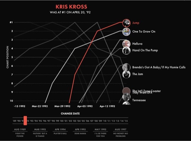
The product of a collaboration between Polygraph and Billboard, this interactive timeline lets you listen to the top rap song in the US from 1989 to 2015 as you see the single jockeying in the top 10.
Whoa, Histography is a super-cool interactive timeline of historical events pulled from Wikipedia, from the Big Bang to the present day. The site was built by Matan Stauber as his final project at the Bezalel Academy of Arts and Design. This is really fun to play with and I love the style.
From the David Rumsey Map Collection, a remarkable timeline/history of the world from 4004 BC to 1881 called Adams’ Synchronological Chart. This is just a small bit of it:
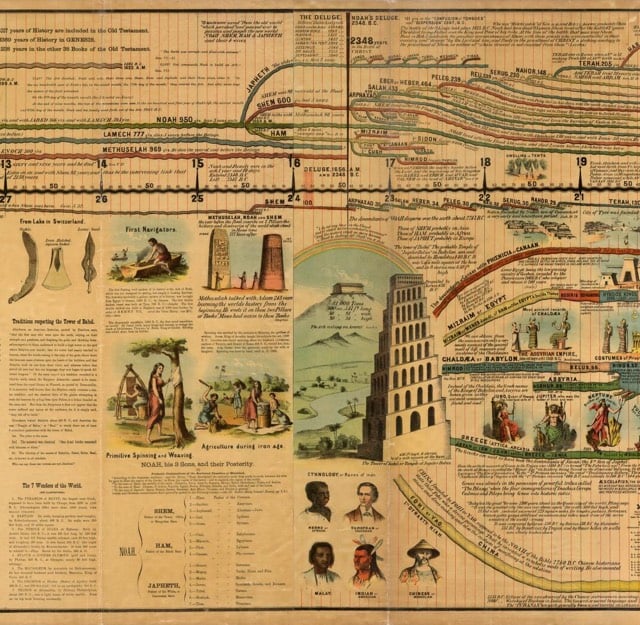
According to Rumsey’s site, the full timeline is more than 22 feet long. (via @john_overholt)
Update: A replica of this chart is available on Amazon in a few different iterations…I’m going to give this one a try. Apparently the charts are popular in Sunday schools and such because the timeline uses the Ussher chronology where the Earth is only 6000 years old.
The timeline of the far future artice is far from the longest page on Wikipedia, but it might take you several hours to get through because it contains so many enticing detours. What’s Pangaea Ultima? Oooh, Roche limit! The Degenerate Era, Poincaré recurrence time, the Big Rip scenario, the cosmic light horizon, the list goes on and on. And the article itself is a trove of fascinating facts and eye-popping phrases. Here are a few of my favorites. (Keep in mind that the universe is only 13.75 billion years old. Unless we’re living in a computer simulation.)
50,000 years: “Niagara Falls erodes away the remaining 32 km to Lake Erie and ceases to exist.”
1 million years: “Highest estimated time until the red supergiant star Betelgeuse explodes in a supernova. The explosion is expected to be easily visible in daylight.”
1.4 million years: “The star Gliese 710 passes as close as 1.1 light years to the Sun before moving away. This may gravitationally perturb members of the Oort cloud; a halo of icy bodies orbiting at the edge of the Solar System. As a consequence, the likelihood of a cometary impact in the inner Solar System will increase.”
230 million years: “Beyond this time, the orbits of the planets become impossible to predict.”
800 million years: “Carbon dioxide levels fall to the point at which C4 photosynthesis is no longer possible. Multicellular life dies out.”
4 billion years: “Median point by which the Andromeda Galaxy will have collided with the Milky Way, which will thereafter merge to form a galaxy dubbed ‘Milkomeda’.”
7.9 billion years: “The Sun reaches the tip of the red giant branch, achieving its maximum radius of 256 times the present day value. In the process, Mercury, Venus and possibly Earth are destroyed. During these times, it is possible that Saturn’s moon Titan could achieve surface temperatures necessary to support life.”
100 billion years: “The Universe’s expansion causes all galaxies beyond the Milky Way’s Local Group to disappear beyond the cosmic light horizon, removing them from the observable universe.”
1 trillion years: “The universe’s expansion, assuming a constant dark energy density, multiplies the wavelength of the cosmic microwave background by 10^29, exceeding the scale of the cosmic light horizon and rendering its evidence of the Big Bang undetectable.”
1 quadrillion years: “Estimated time until stellar close encounters detach all planets in the Solar System from their orbits. By this point, the Sun will have cooled to five degrees above absolute zero.”
10^65 years: “Assuming that protons do not decay, estimated time for rigid objects like rocks to rearrange their atoms and molecules via quantum tunneling. On this timescale all matter is liquid.”
10^10^56 years: “Estimated time for random quantum fluctuations to generate a new Big Bang, according to Caroll and Chen.”
Read the whole thing, it’s worth the effort. (via @daveg)
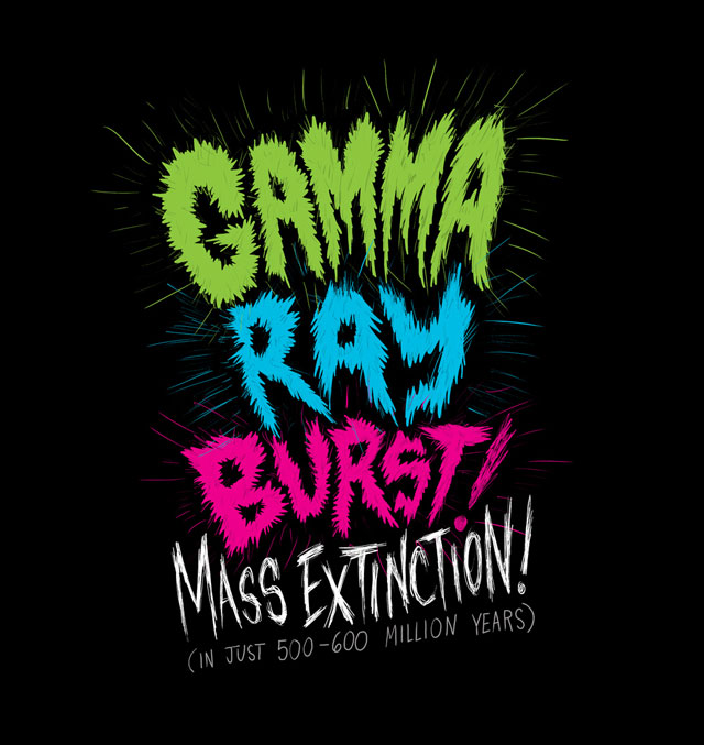
Note: Illustration by Chris Piascik…prints & more are available.
This Tumblr filled with hand-drawn timelines is wonderful…the Troublemaker of the Moment timeline is a favorite.
The NY Times’ Paper Cuts blog calls Cartographies of Time “the most beautiful book of the year”. I cannot disagree. In attempting to answer the question “how do you draw time?”, the authors present page after page of beautiful and clever visual timelines.
Cartographies of Time is the first comprehensive history of graphic representations of time in Europe and the United States from 1450 to the present. Authors Daniel Rosenberg and Anthony Grafton have crafted a lively history featuring fanciful characters and unexpected twists and turns. From medieval manuscripts to websites, Cartographies of Time features a wide variety of timelines that in their own unique ways-curving, crossing, branching-defy conventional thinking about the form. A fifty-four-foot-long timeline from 1753 is mounted on a scroll and encased in a protective box. Another timeline uses the different parts of the human body to show the genealogies of Jesus Christ and the rulers of Saxony. Ladders created by missionaries in eighteenth-century Oregon illustrate Bible stories in a vertical format to convert Native Americans. Also included is the April 1912 Marconi North Atlantic Communication chart, which tracked ships, including the Titanic, at points in time rather than by their geographic location, alongside little-known works by famous figures, including a historical chronology by the mapmaker Gerardus Mercator and a chronological board game patented by Mark Twain. Presented in a lavishly illustrated edition, Cartographies of Time is a revelation to anyone interested in the role visual forms have played in our evolving conception of history.
The book is also available at Amazon.
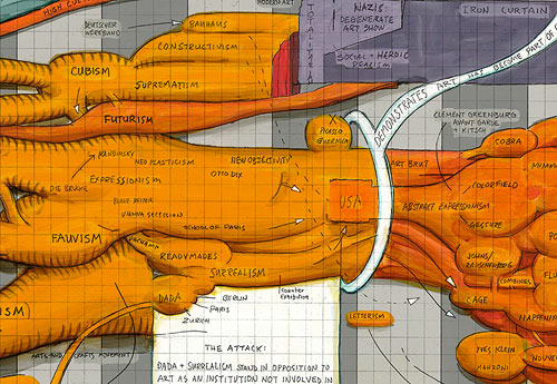
Ward Shelley paints these wonderfully intricate timelines of different things…his life, Frank Zappa’s career, and the history of the avant garde.
You know that image that’s been going around that shows several revisions to the Pepsi logo while the Coca-Cola logo is the same as it’s been since 1885? It tells a compelling story…Pepsi shifting its brand every few years in an attempt to catch up to steady market leader Coca-Cola. But of course it’s bullshit…Armin Vit constructs a more accurate brand timeline that shows many Coca-Cola logos over the years.
A brand timeline portrait shows all the different brands a person uses and interacts with during the course of a typical day.

Originated by Jane Sample, dozens of other people have also created portraits. (via rocketboom)
Update: Make your own at Brand My Day.
The NY Times has a timeline map showing what people from around the country said on Twitter during the Super Bowl broadcast. I like the emoticons tab but they also should have included a profanity tab.
The Food Timeline shows which foods were invented when. Ok, not invented, exactly, but first eaten. A tasting menu:
Pretzels, 5th century AD.
Pork and beans, 1475.
Foie gras, 1st century AD.
Croissants, 1686.
Chop suey, 1896.
Popcorn, 3600 BC.
Swedish meatballs, 1754.
(via snarkmarket)
When I was a kid, “oldies” music and movies seemed ancient. Even though I’m now in my 30s, the entertainment that I watched and listened to in my youth still feels pretty recent to me. Raiders of the Lost Ark wasn’t all that long ago, right? But comparing my distorted recall of childhood favorites to the oldies of the time jogs my memory in unpleasant ways. For example:
Listening to Michael Jackson’s Thriller today is equivalent to listening to Elvis Presley’s first album (1956) at the time of Thriller’s release in 1982. Elvis singles in 1956 included Blue Suede Shoes, Hound Dog, and Love Me Tender.
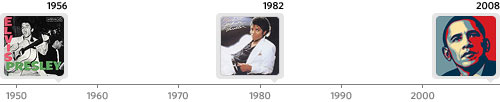
If you’re around my age, how old do you feel right now? Here are some other examples of timeline twins:
Watching Star Wars today is like watching It’s a Wonderful Life (1946) in 1977. It’s a Wonderful Life was nominated for an Oscar the following year along with Ethel Barrymore (b. 1879) and Lilian Gish (b. 1893).
Listening to Nirvana’s Smells Like Teen Spirit today is equivalent to playing Terry Jack’s Seasons In The Sun (1974) in 1991.
Watching The Godfather today is like watching Charlie Chaplin’s Modern Times (1936) in 1972. Modern Times was a silent film (Chaplin’s last).
Listening to the Sex Pistols’ Never Mind the Bollocks (1977) today…well, they didn’t really have rock or pop albums back in 1946. But popular songs on the radio were sung by Frank Sinatra, Perry Como, Nat King Cole, and Dinah Shore, as well as many performers and their orchestras.
Back to the Future (1985) —> To Kill a Mockingbird (1962)
Die Hard (1988) —> Bullitt (1968)
Radiohead, OK Computer (1997) —> Bon Jovi, Slippery When Wet (1986)
A timeline of the greatest American breakfast cereals, from Grape Nuts in 1897 to Cheerios in 1941 to the present day. (via geek out new york)
A fantastically extensive timeline of recorded information “from cave paintings to the internet”. It’s an expanded version of the timeline that appears in the book, From Gutenberg to the Internet (more info), which seems really interesting.
From Gutenberg to the Internet presents 63 original readings from the history of computing, networking, and telecommunications arranged thematically by chapters. Most of the readings record basic discoveries from the 1830s through the 1960s that laid the foundation of the world of digital information in which we live. These readings, some of which are illustrated, trace historic steps from the early nineteenth century development of telegraph systems — the first data networks — through the development of the earliest general-purpose programmable computers and the earliest software, to the foundation in 1969 of ARPANET, the first national computer network that eventually became the Internet. The readings will allow you to review early developments and ideas in the history of information technology that eventually led to the convergence of computing, data networking, and telecommunications in the Internet.
(via design observer)
A timeline of human history (mostly sex and violence) by Milo Manara. NSFW.
A very interesting extinction timeline from 1950-2050. Blogging is predicted to die out around 2023, the same time as Web 2.0, The Maldives, and spelling. The last to go? Death. It’s based on the creator’s book, Future Files: A History of the Next 50 Years.
Older posts

Socials & More