kottke.org posts about population
I’ve always been a little fascinated by the list of the largest cities throughout history, so this animated version from Ollie Bye is right up my alley. While watching, it’s interesting to think about what makes cities grow large at specific times: a mixture of economics, demography, social movements, empire/colonialism, technology, and the like.
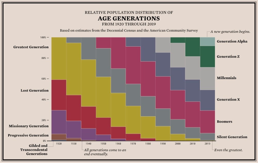
From Flowing Data, a stacked bar chart showing the relative population distribution of age generations from 1920 to the present. The thing that’s really apparent to me in this graph is how the size, increased life expectancy, and better quality of life of the Silent and (especially) Baby Boomer generations really shifted the social order in America. It’s a triple whammy: this large group of very healthy people stuck around so much longer than the previous generations that they were able to keep their wealth and political/corporate power instead of handing it off to the next generations. It’s a generational firewall — they didn’t leave any room for their children or grandchildren. Instead, Gen X and Millennials got branded as lazy/apathetic and financially careless. (via @mikey_two)
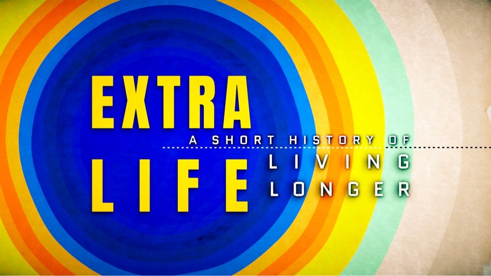
In the past 120 years, global life expectancy has risen from 32 years to 72 years, an astounding increase. In a thread announcing his new book/TV project, Steven Johnson says:
The doubling of human life expectancy is the single most important development of our era. If a newspaper came out only once a century, that extra lifespan would be the banner headline: world wars, moon landings, the Internet would all be below the fold.
Johnson will explore this century-headlining development in an upcoming PBS series (co-hosted with David Olusoga) and a book, Extra Life: A Short History of Living Longer.
A study in how meaningful change happens in society, Extra Life is an ode to the enduring power of common goals and public resources. The most fundamental progress we have experienced over the past few centuries has not come from big corporations or start-ups. It has come, instead, from activists struggling for reform; from university-based and publicly funded scientists sharing their findings open-source-style; and from nonprofit agencies spreading new innovations around the world.
I ran across this Facebook post by Shannon Welch the other day and while I don’t agree with some of it (more about that in a bit), I do think there’s something to her argument that the density of the place you grew up in or have spent a lot of time in has an effect on how you view the world, your neighbors, and your political situation.
So why does this matter? Because how you were raised and how you live has a huge impact on what matters to you from your politicians and your government.
Those I know that grew up in less dense areas had to be self-reliant. When calling 911 means you’re likely waiting 20 minutes or longer for police, an ambulance, or a fire truck. You have to be able to defend yourself, handle your own first aid, and rely on your neighbors to help in critical emergency situations. When I tell people in Southern California that where I grew up had volunteer firefighters and EMTs they don’t believe me.
The more rural you are, the less you rely on government entities for your day-to-day needs. The most rural have well water, septic systems, take their trash to the dump, if it snows, they have a vehicle that can plow, and the truly rural use propane for power and heat. They are not reliant on most services provided by the public utilities. They use guns as tools to protect their animals and their family from prey and from vermin. They do not really encounter homeless people, as even the poorest can usually find a shack to live out of and require a vehicle to get around. These people in less dense areas do not depend on the government to solve their problems. They’d prefer government stay out of their lives completely. Less taxes, less oversight, less being told what to do. To the rural, it seems like every time the government interferes in their life, they lose another freedom, and their quality of life diminishes.
Those I know that grew up in more dense areas are used to calling 911 to handle emergencies. Their streets are swept in the summer and plowed in the winter. Their trash is picked up on the same day weekly. They don’t have space for cars and tools, so they tend to take public transportation or walk. They call someone when something breaks that requires tools they don’t own. They are used to encountering the homeless on the streets as part of their daily life. The truly poor and homeless usually end up in cities as the services to help the sick, mentally ill and the poorest among us are more available in dense areas. So the wealthy interact with the poor in cities far more than they do in rural areas. Those in higher density areas are willing to pay for government services because they are a regular part of their daily lives and make life more manageable. Without these services, the quality of life they know would not exist.
But I don’t think the following is at all accurate though — perhaps a case of overstatement to prove a point:
I truly believe our population density experience matters more to our political views than education, income, race, gender or sexuality.
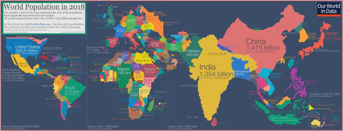
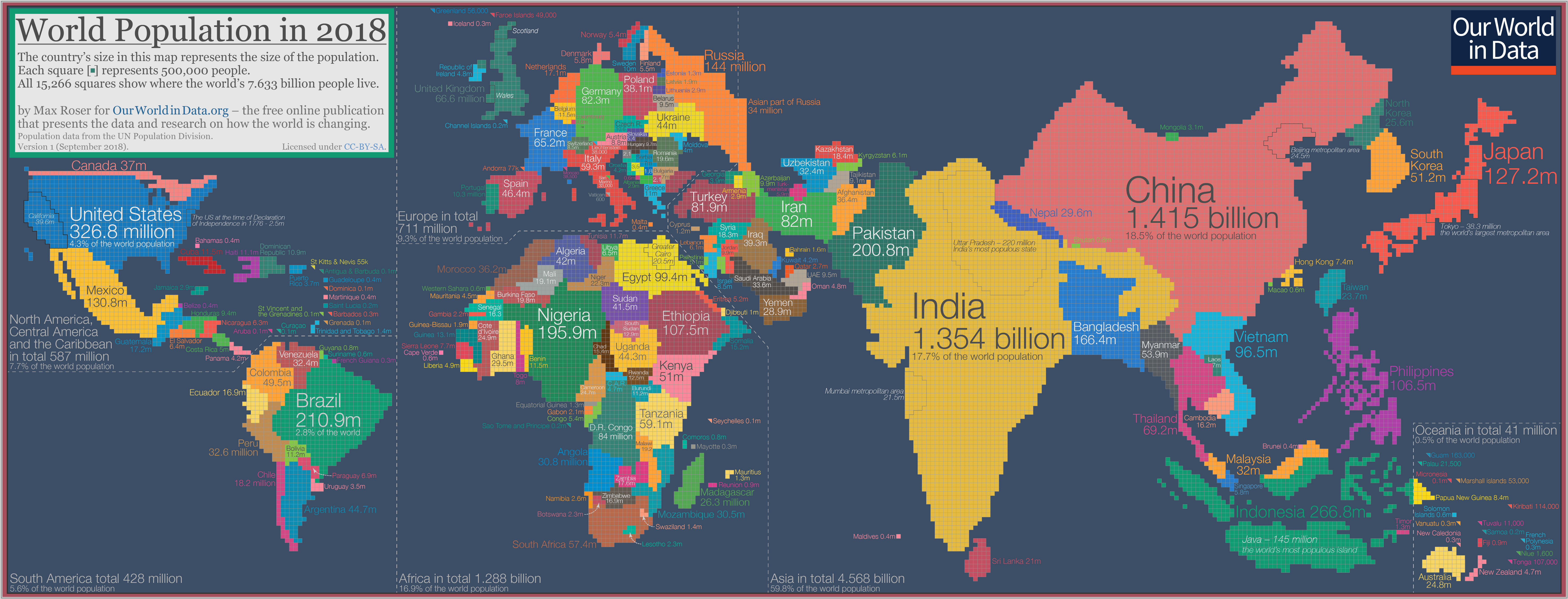
Max Roser has constructed a cartogram of the world where the size of the countries are determined by their populations (big version of the image here). He refers to it as “the map we need if we want to think about how global living conditions are changing”.
The cartogram is made up of squares, each of which represents half a million people of a country’s population. The 11.5 million Belgians are represented by 23 squares; the 49.5 million Colombians are represented by 99 squares; the 1.415 billion people in China are represented by 2830 squares; and this year’s entire world population of 7.633 billion people is represented by the total sum of 15,266 squares.
As the size of the population rather than the size of the territory is shown in this map you can see some big differences when you compare it to the standard geographical map we’re most familiar with. Small countries with a high population density increase in size in this cartogram relative to the world maps we are used to — look at Bangladesh, Taiwan, or the Netherlands. Large countries with a small population shrink in size — talking about you Canada, Mongolia, Australia, and Russia.
Some observations (Roser has many more if you click through):
1. Look at how teeny Russia is. (So is Canada.)
2. Seriously, Bangladesh, Pakistan, Nigeria, Indonesia, and Brazil all have larger populations than Russia. Japan, Ethiopia, and Mexico are very close.
3. 60% of the world’s population lives in Asia.
4. 5 times as many people live in Madagascar as do Ireland. The populations of Ireland + the Scandinavian countries = the population of Peru.
5. Europe is tiny. Guns, Germs, and Steel, yo.
6. India and China. Damn.
I would love to see an animated version of this cartogram from like 1950 to 2100 (like this one of the US).
Update: Jakub Nowosad built an animated map of the world’s population changes from 1800-2100 and documented the steps so you can make your own variation.
Except for the top three, I’m not sure I could have come up with most of the top 10 largest US cities by population. I’ll give you minute to guess…
…
…
1. NYC
2. LA
3. Chicago
4. Houston
5. Phoenix
6. Philadelphia
7. San Antonio
8. San Diego
9. Dallas
10. San Jose
I dunno, San Antonio at #7 really threw me for a loop. Bigger than Dallas? Bigger than San Francisco (by more than 600,000 people)? Of course, when metropolitan areas are taken into account, the picture changes. The San Antonio area drops to #30 while the Bay Area hits #5.
When I was a kid, the list looked a little different…LA had not yet passed Chicago for #2 and Texas had only two cities in the top 10 (and no Austin creepin’ in 11th place):
1. New York
2. Chicago
3. Los Angeles
4. Philadelphia
5. Houston
6. Detroit
7. Dallas
8. San Diego
9. Phoenix
10. Baltimore
That list still carries more weight in my brain than the current ranking. The facts you learn in school influence how you view your country. And some of those facts, dubbed mesofacts by Sam Arbesman, change slowly, so slowly that you’re tricked into thinking they haven’t changed at all. The average age of the US Senate right now is 62. The version of the population list that many Senators learned in school was probably from the 1950 census (or perhaps the 1960 one) and our current President, at 70 years of age, was possibly taught the list from the 1940 census. The entries on those older lists look much more like the industrial America celebrated by truck and beer commercials and represented by classic baseball and football teams — the America that is to be made great again: Detroit, Cleveland, St. Louis, and Pittsburgh.
Another instructive list to look at in this regard is the list of cities that had populations of at least 100,000 people but have since dropped below that threshold. On the list (with the % drop in parentheses) are:
Canton, Ohio (-39%)
Gary, Indiana (-59%)
Scranton, Penn (-46%)
Flint, Michigan (-50%)
Erie, Penn (-29%)
Utica, NY (-40%)
That the idea embodied by those kinds of cities still holds much sway in American politics shouldn’t be so surprising.
From Aron Strandberg,1 this is a timeline visualization of the age of the world’s population from 1960-2060. The world’s human population has increased rapidly in the last couple centuries, most recently doubling since 1970:
A tremendous change occurred with the industrial revolution: whereas it had taken all of human history until around 1800 for world population to reach one billion, the second billion was achieved in only 130 years (1930), the third billion in less than 30 years (1959), the fourth billion in 15 years (1974), and the fifth billion in only 13 years (1987).
But watching that video, you’ll realize that the world’s population will not reach 20 or 30 billion in 2050 — human civilization is getting old.
Because many people have trouble with very large numbers, what if you reimagined the billions of humans on Earth as a slightly more manageable number? Say, 100? If 100 people represented the current population of the Earth:
25 people would be 0-14 years old
31 would be Christian
23 would be Muslim
15 would be Hindu
6 would speak Spanish
5 would speak English
54 would be urban dwellers
11 would live on less than $1.90 USD per day
95 live in an area with a mobile-cellular network
And some that are not on that page:
1 person would die every 15 months
2 people would be born every 6 months
1350 people would have died, all-time
From the American Museum of Natural History, an animated timeline map of human population growth from 100,000 BCE to the present.
It took 200,000 years for our population to reach 1 billion. And only 200 years to reach 7 billion.
Interesting to see that the only sustained decline in the world’s overall population over the past 2000 years was during the bubonic plague outbreak during the Middle Ages.
The center of the population of the United States has been moving steadily west and south since 1790. This video shows the progression until 2010:
You can step through the animation yourself on the US Census Bureau site. It’s interesting to see how even the changes are…there was one big jump from 1850 to 1860 and a slow down in westward migration from 1890 to 1940, but other than that, it shifted west about 40-50 miles each decade.
This is likely the pull-quote of the week (I’ve seen it on about 20 sites in the last 10 minutes):
Of all the people in human history who ever reached the age of 65, half are alive now.
But only by a little…there’s lots more to chew on in the full article. Like how 65 became the retirement age:
The idea of a retirement age was invented by Otto von Bismarck in the 1880s, when as chancellor of Germany he needed a starting age for paying war pensions. He chose the age of 65 because that was typically when ex-soldiers died.
If the population density of the United States was equal to that of Brooklyn, the entire US population would fit into New Hampshire.
The state would be ruined, though (imagine a Brooklyn-like sprawl of that size), but the rest of the country would be green and pleasantly devoid of people!
If you used Manhattan’s population density, Dense US would shrink to more than half that size, roughly the area of Teton County in Wyoming. Manila, the capital of the Philippines, has the highest population density of any city in the world (111,000 people per square mile)…if the US was that dense, the population would fit into any number of tiny Alaskan islands you’ve never heard of or a square 52 miles on a side.
David Galbraith graphs the population of Rome from 300 BC to the present.
The population [of Rome] during the Renaissance was miniscule (yet it was still a global center), when Michelangelo was painting the Sistine Chapel it was considerably smaller than a town like Palo Alto is today (60K); Rome at its nadir was about the size of Google (20K employees); the growth of Rome during the Industrial era is much greater than the rise of Ancient Rome.
David, you should check out The Inheritance of Rome; I’m about 100 pages in and pretty interesting so far. Also, it would be instructive to do the same graph but Rome’s population as a percentage of world population.
Compare and contrast: a map of the center of the world’s population (currently located in the northern part of south Asia) and a global accessibility map, which shows the travel time to major cities. (via lone gunman & stamen)
Population densities in the United States vary over nine orders of magnitude.
In case you’re wondering, the most densely populated block group is one in New York County, New York — 3,240 people in 0.0097 square miles, for about 330,000 per square mile. The least dense is in the North Slope Borough of Alaska — 3 people in 3,246 square miles, or one per 1,082 square miles. The Manhattan block group I mention here is 360 million times more dense than the Alaska one; population densities vary over a huge range.
That’s approximately the same range from the height of an iPod to the diameter of the Earth. (via fakeisthenewreal)
In Brazil, soap operas, and specifically the small families they depicted, might have been a form of birth control, lowering the fertility of the audience:
In 1960, the average Brazilian woman had 6.3 children. By 2000, the fertility rate was down to 2.3. The decline was comparable to China’s, but Brazil didn’t have a one-child policy. In fact, for a while it was even illegal to advertise contraceptives.
Many factors account for the drop in Brazilian fertility, but one recent study identified a factor most people probably wouldn’t consider: soap operas (novelas). Novelas are huge in Brazil, and the network Rede Globo effectively has a monopoly on their production…
Using census data from 1970 to 1991 and data on the entry of Rede Globo into different markets, the researchers found that women living in areas that received Globo’s broadcast signal had significantly lower fertility. (And yes, the study did control for all sorts of factors and addressed the concern that the entry of Globo might have been driven by trends that also contribute to fertility decline. I’ll spare you the gory econometric details.) Additionally, people in areas with Globo’s signal were more likely to name their children after novela characters, suggesting that it was the novelas specifically, and not TV in general, that influenced childbearing.
Update (by jkottke): The Sabido Method:
Named after the pioneer in application of this entertainment-education strategy, Miguel Sabido, the Sabido Method is based on character development and plot lines that provide the audience with a range of characters that they can engage with — some good, some not so good — and follow as they evolve and change. Sabido developed this methodology when we was Vice President for Research at Televisa in Mexico in the 1970s.
According to the Mexican government’s national population council, a soap opera called Acompaname was responsible for large increases in people requesting family planning information, contraceptive sales, and enrollment in family planning clinics. From 1977 to 1986, when these soap operas were on, Mexico’s population growth rate fell by 34%. The Sabido Method was also recently covered in the New Yorker. (thx, omegar)
For years, a myth has stated that the number of people currently living outnumber the number of people who have died. Not true says demographer Carl Haub: over 100 billion people have died on earth, compared to 6.5 billion current residents. (via 3qd)
America the Overfull, Paul Theroux’s New Year’s musing on an America with twice as many people as when he grew up. “We are passing through a confused period of aggression and fear, characterized by our confrontational government, the decline of diplomacy, a pugnacious foreign policy and a settled belief that the surest way to get people to tell the truth is to torture them. It is no wonder we have begun to squint at strangers. This is a corrosive situation in a country where more and more people, most of them strangers, are a feature of daily life. Americans as a people I believe to be easygoing, compassionate, not looking for a fight. But surely I am not the only one who has noticed that we are ruder, more offhand, readier to take offense, a nation of shouters and blamers.” (thx, youngna)
Malcolm Gladwell on how the demographics of companies affects their financial health. At the time of its bankruptcy in 2001, Bethlehem Steel “had twelve thousand active employees and ninety thousand retirees and their spouses drawing benefits. It had reached what might be a record-setting dependency ratio of 7.5 pensioners for every worker.” More from Gladwell on the piece here and here.
Socials & More