kottke.org posts about Rome
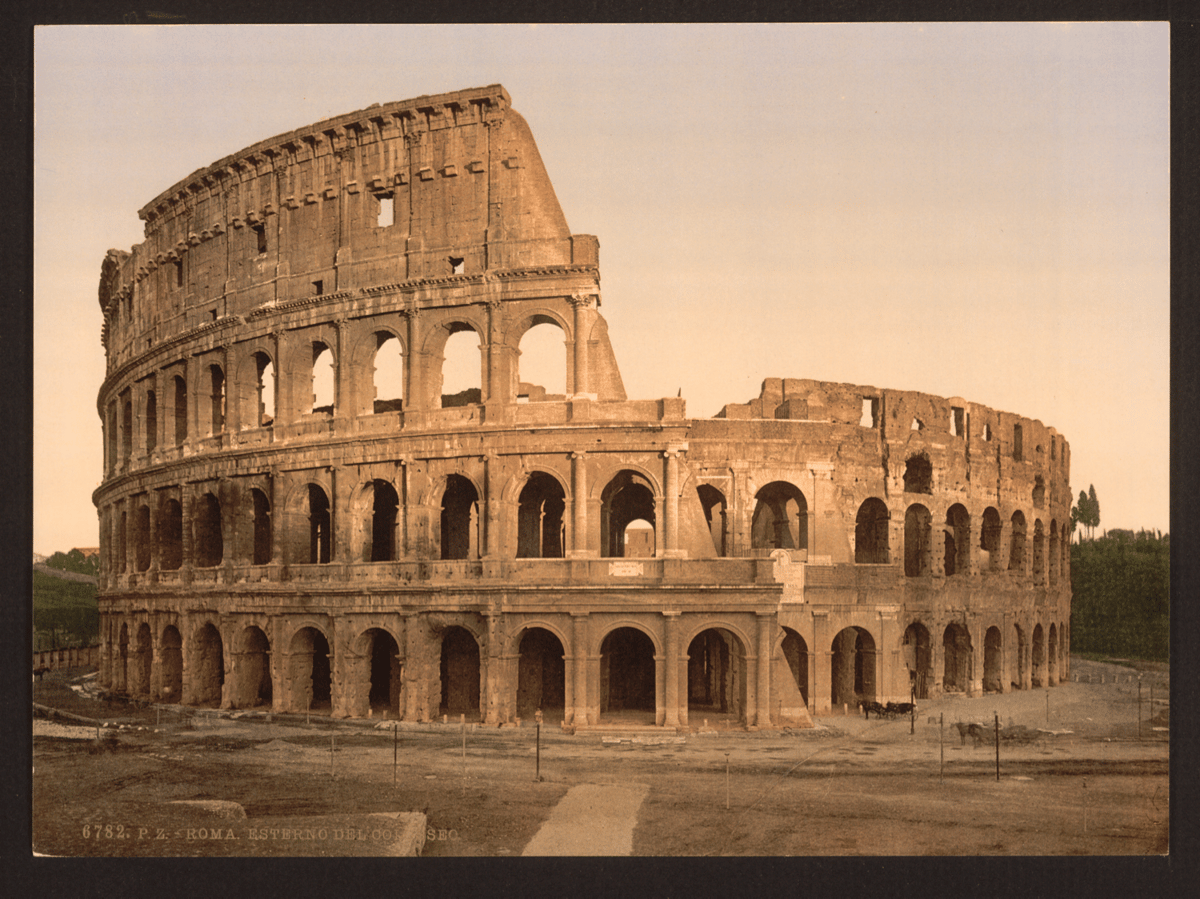
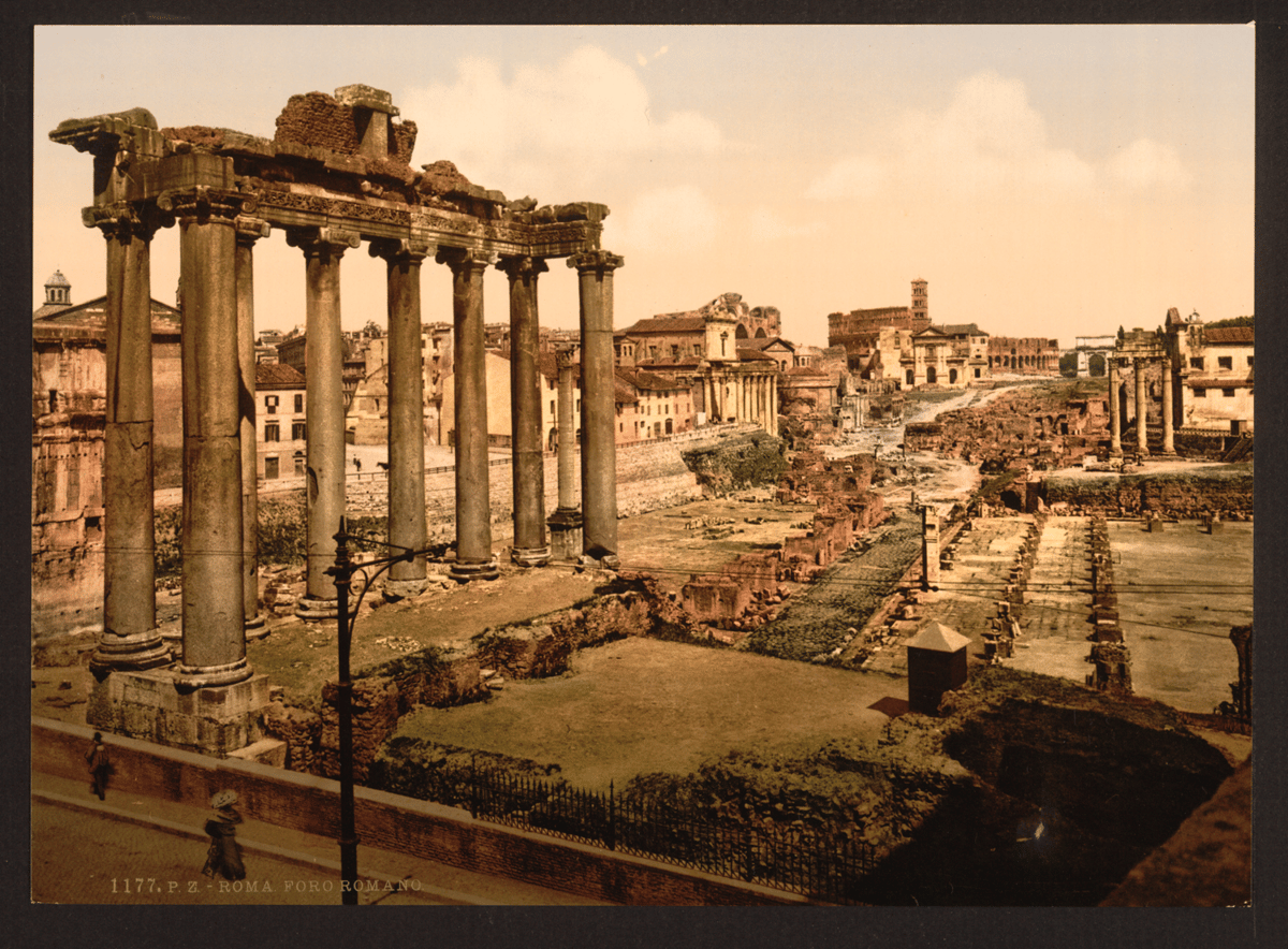
The Library of Congress houses an online collection of 48 color photographs of Rome taken in the 1890s. The prints were created using the photochrom process:
The prints look deceptively like color photographs. But when viewed with a magnifying glass the small dots that comprise the ink-based photomechanical image are visible. The photomechanical process permitted mass production of the vivid color prints. Each color in the final print required a separate asphalt-coated lithographic stone, usually a minimum of six stones and often more than ten stones.
If you look at the individual items from the collection (like the shot of the Colosseum), you’ll notice that the photographers were uncredited:
The names of individual photographers are rarely identified on the photochrom prints. Initials on the original negatives and entries in the Detroit Publishing Company ledgers at the Colorado Historical Society sometimes reveal the image creator.
(via open culture)
Ok, having been all over the western Mediterranean for the past two weeks, I’m back. *sigh* Here, without comment or context (I know, I know), are some of the things I saw:


Not pictured: a bunch of amazing food we ate over the course of the trip.


I’m in Rome with my family to celebrate a milestone. We went to the Borghese Gallery this morning and I got to see my favorite sculpture, Bernini’s Ratto di Proserpina. A masterpiece. The photos both do and do not do it justice — so grateful to get to see it in person.
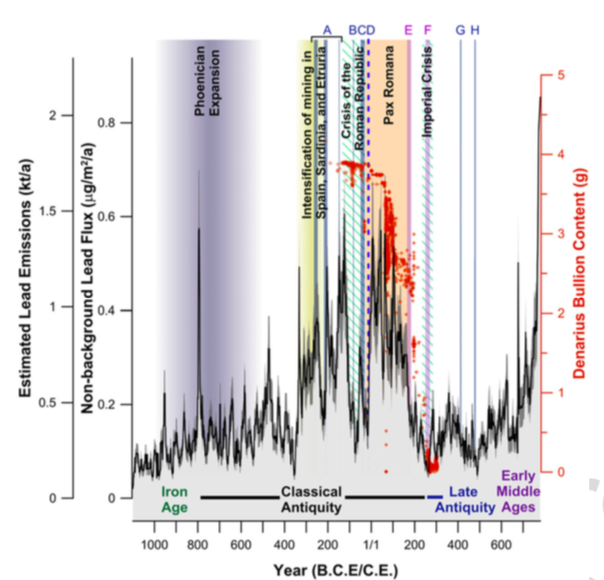
A new study published in Proceedings of the National Academy of Sciences analyzes deep ice cores in Greenland for traces of lead pollution in antiquity. This pollution, the scholars claim, matches the production of Roman silver coins from impure alloys from mines in what’s now modern Spain. In short, we can see Roman monetary production, and by proxy, peaks and valleys in the economy throughout the Roman world, on an extremely granular basis, captured year-by-year in arctic ice.
In 218 B.C., for instance, when Rome fought with Carthage in the Second Punic War, lead pollution appears to fall—and then it rises, abruptly, as Roman soldiers seized Carthaginian mines in southern Spain and put them to use. It also detects nonviolent events: When Rome debased its currency, reducing the amount of silver in each denarius coin in 64 A.D., lead pollution in the air fell…. When compared with other studies, research suggests that Western Europe may have seen higher lead emissions during the Pax Romana than at any time prior to the Industrial Revolution, nearly 1,800 years later.
Which is, of course, part of the lesson: one argument holds that lead pollution, both in the air, in water pipes, and other uses throughout Rome, eventually slowly poisoned and destroyed the Roman Empire, along with plagues, imperial overreach, and political dysfunction. Our civilization, however, is at least documenting its own destruction in the written record in much greater detail.
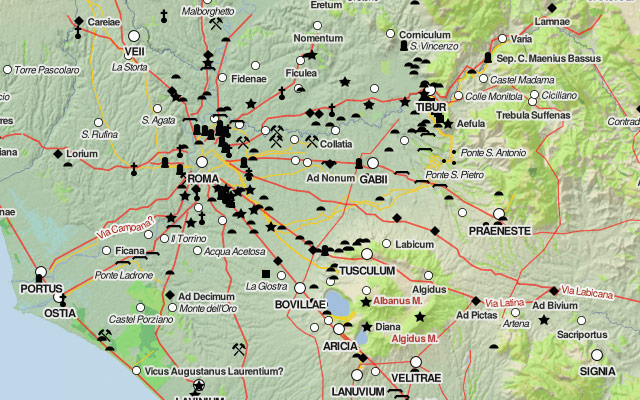
The Digital Atlas of the Roman Empire lets you explore ancient Rome in a Google Maps interface. (via @pbump)
Update: From Vox, 40 Maps That Explain the Roman Empire.
Two thousand years ago, on August 19, 14 AD, Caesar Augustus died. He was Rome’s first emperor, having won a civil war more than 40 years earlier that transformed the dysfunctional Roman Republic into an empire. Under Augustus and his successors, the empire experienced 200 years of relative peace and prosperity. Here are 40 maps that explain the Roman Empire — its rise and fall, its culture and economy, and how it laid the foundations of the modern world.
In Jospeh Tainter’s The Collapse of Complex Societies, the author argues that the fall of Rome happened because “the usual method of dealing with social problems by increasing the complexity of society [became] too costly or beyond the ability of that society”. Basically when Rome stopped expanding its territory, the fallback was relying solely on agriculture, a relatively low-margin affair.
The distances, now no longer adjacent to easily accessible coastline, were making the cost of conquest prohibitive. More to the point, the enemies Rome faced as it grew larger were vast empires themselves and were more than capable of defeating the Roman legions.
It was at this point that Rome had reached a turning point: no longer would conquest be a significant source of revenue for the empire, for the cost of further expansion yielded no benefits greater than incurred costs. Conjointly, garrisoning its extensive border with its professional army was becoming more burdensome, and more and more Rome came to rely on mercenary troops from Iberia and Germania.
The result of these factors meant that the Roman Empire began to experience severe fiscal problems as it tried to maintain a level of social complexity that was beyond the marginal yields of it’s agricultural surplus and had been dependent upon continuous territorial expansion and conquest.
Hopefully I don’t have to draw you a picture of how this relates to large bureaucratic companies.
David Galbraith graphs the population of Rome from 300 BC to the present.
The population [of Rome] during the Renaissance was miniscule (yet it was still a global center), when Michelangelo was painting the Sistine Chapel it was considerably smaller than a town like Palo Alto is today (60K); Rome at its nadir was about the size of Google (20K employees); the growth of Rome during the Industrial era is much greater than the rise of Ancient Rome.
David, you should check out The Inheritance of Rome; I’m about 100 pages in and pretty interesting so far. Also, it would be instructive to do the same graph but Rome’s population as a percentage of world population.
Socials & More