kottke.org posts about demographics
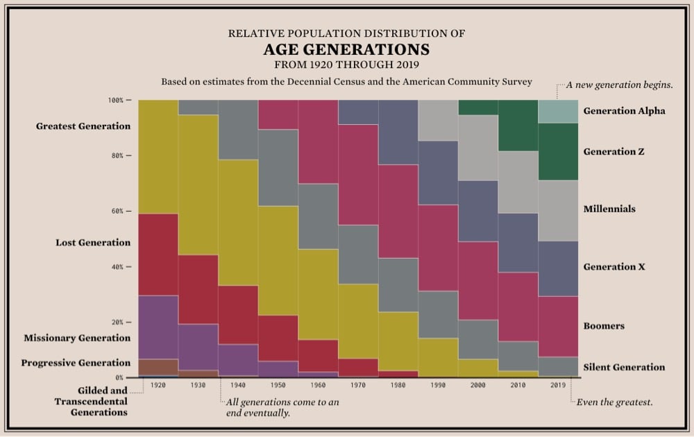
From Flowing Data, a stacked bar chart showing the relative population distribution of age generations from 1920 to the present. The thing that’s really apparent to me in this graph is how the size, increased life expectancy, and better quality of life of the Silent and (especially) Baby Boomer generations really shifted the social order in America. It’s a triple whammy: this large group of very healthy people stuck around so much longer than the previous generations that they were able to keep their wealth and political/corporate power instead of handing it off to the next generations. It’s a generational firewall — they didn’t leave any room for their children or grandchildren. Instead, Gen X and Millennials got branded as lazy/apathetic and financially careless. (via @mikey_two)

In the past 120 years, global life expectancy has risen from 32 years to 72 years, an astounding increase. In a thread announcing his new book/TV project, Steven Johnson says:
The doubling of human life expectancy is the single most important development of our era. If a newspaper came out only once a century, that extra lifespan would be the banner headline: world wars, moon landings, the Internet would all be below the fold.
Johnson will explore this century-headlining development in an upcoming PBS series (co-hosted with David Olusoga) and a book, Extra Life: A Short History of Living Longer.
A study in how meaningful change happens in society, Extra Life is an ode to the enduring power of common goals and public resources. The most fundamental progress we have experienced over the past few centuries has not come from big corporations or start-ups. It has come, instead, from activists struggling for reform; from university-based and publicly funded scientists sharing their findings open-source-style; and from nonprofit agencies spreading new innovations around the world.
Demography is destiny, or so the saying goes. So this YaleGlobal report on the global population trends is worth paying attention to if you want to know where the world (and world politics) is going. Here’s the gist:
The world population now stands at 7.8 billion inhabitants, having reached the 7 billion milestone in 2011. Demographers expect the 8 billion milestone in 2023, with global population projected to reach 9 billion by 2037 and 10 billion by 2056. This growth is slightly faster than projections from just a few years ago.
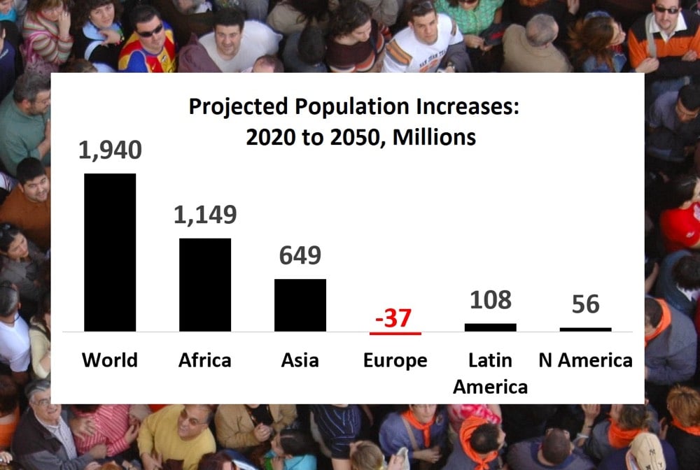
World population currently grows at 1 percent annually, having peaked at 2.1 percent in 1968. That annual growth rate is expected to continue declining, reaching 0.5 percent by midcentury. The current annual increase of world population is 81 million, lower than the peak level of 93 million in 1988. Annual additions are projected to continue declining, reaching 48 million by 2050. Of the nearly 2 billion increase in world population expected by midcentury, most will take place in less developed regions. Africa leads, expected to add more than 1 billion people over the coming three decades, followed by Asia with about 650 million. Europe’s population, in contrast, is projected to decrease by 37 million over this period.
India will soon pass China as the most populous country in the world and Nigeria’s population will double to blow right by the US for #3 in the world:
Two countries have reached the billion mark: China and India, each with current populations of 1.4 billion, reached that milestone in 1980 and 1997, respectively. India’s current rate of demographic growth is double China’s, 1.0 versus 0.5 percent. India’s population could overtake China’s by 2027. No other country is expected to reach a billion during the 21st century. Nigeria, projected to grow to 733 million by century’s close, will move into third place by midcentury, overtaking the United States, anticipated to have 434 million people by 2100.
The populations of some countries will more than double by the middle of this century while the populations in other countries will decline:
The population growth is extraordinary, with most occurring in the world’s poorer countries. More than 50 developing countries, most in Africa, post growth rates no less than 2 percent per annum. By midcentury about half of those countries are projected to see their populations more than double, including Angola, Burkina Faso, Democratic Republic of Congo, Mozambique, Niger, Nigeria, Tanzania and Uganda.
At the same time, some 20 countries, particularly more developed countries, navigate uncharted demographic territory of population decline and rapid aging. These include Greece, Hungary, Italy, Japan, Poland and Spain. This number could nearly triple by midcentury, and expected newcomers to population decline will soon include China, Germany, Russia and South Korea.
Using 2020 census estimates, a series of six maps and the accompanying article from William H. Frey at the Brookings Institution show how the racial makeup on the United States is expected to have changed since the last census in 2010.
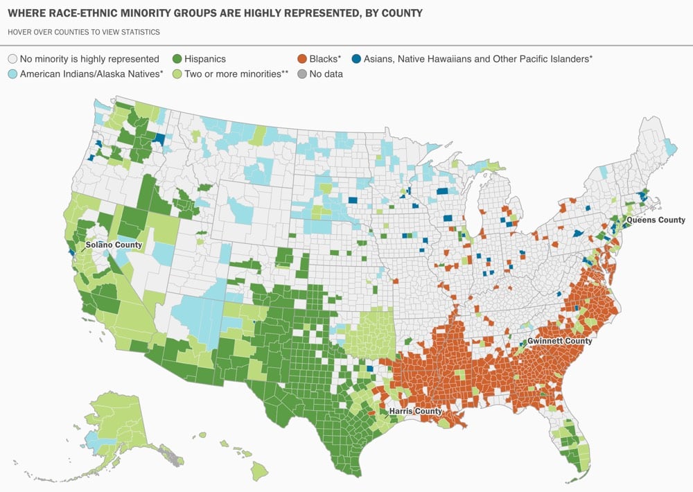
Hispanics and Asian Americans are the fastest-growing racial minority groups nationally, increasing by 18.6% and 27.4%, respectively, from 2010 to 2018. There is also a growing dispersion of both groups to new destinations, which tend to lie further afield than the familiar large metro areas.
In 1990, 39% of all U.S. Hispanics resided in just four metro areas: Los Angeles, New York, Miami, and Chicago. In 2018, 39% of U.S. Hispanics resided in seven metro areas, with Houston, Riverside, Calif., and Dallas added to the list (and each eclipsing Chicago in size). And beyond these, Hispanic growth is high in areas with smaller Hispanic settlements in all parts of the country.
Because many people have trouble with very large numbers, what if you reimagined the billions of humans on Earth as a slightly more manageable number? Say, 100? If 100 people represented the current population of the Earth:
25 people would be 0-14 years old
31 would be Christian
23 would be Muslim
15 would be Hindu
6 would speak Spanish
5 would speak English
54 would be urban dwellers
11 would live on less than $1.90 USD per day
95 live in an area with a mobile-cellular network
And some that are not on that page:
1 person would die every 15 months
2 people would be born every 6 months
1350 people would have died, all-time
From the WSJ, a big package on how life will be in 35 years: 2050: Demographic Destiny. In the developed world, the future will be smaller.
Next year, the world’s advanced economies will reach a critical milestone. For the first time since 1950, their combined working-age population will decline, according to United Nations projections, and by 2050 it will shrink 5%.
As Dave Pell writes in Nextdraft:
In other words, it turns out that the big problem in the world isn’t that there are too many people, but rather that there are too few (Thanksgiving dinners excepted).
This is likely the pull-quote of the week (I’ve seen it on about 20 sites in the last 10 minutes):
Of all the people in human history who ever reached the age of 65, half are alive now.
But only by a little…there’s lots more to chew on in the full article. Like how 65 became the retirement age:
The idea of a retirement age was invented by Otto von Bismarck in the 1880s, when as chancellor of Germany he needed a starting age for paying war pensions. He chose the age of 65 because that was typically when ex-soldiers died.
Pew Research Center’s interactive maps of migration flows in the US are pretty interesting. The region map makes it seem as though the Northeast is rapidly losing population to the South but the states map clarifies the picture…the flow looks to be hundreds of thousands of retirees moving to Florida and Georgia.
19.20.21 (19 cities in the world with 20 million people in the 21st century) is a nice site for an effort to undertake “a five-year study that will encompass all aspects of the phenomenon of supercities” but the real attraction are the maps of the world’s largest cities through time (Menu/10 Largest Cities). In 1000, the largest city in the world was Cordova, Spain and by 1500, 4 of the top 10 were in China and one was in Nepal. (via snarkmarket)
An analysis of how populations are growing and shifting around the US, with a focus on the policital consequences. He splits the country into four main areas: Coastal Megalopolises, Interior Boomtowns, Rust Belt, and Static Cities. “The bad news for them is that the Coastal Megalopolises grew only 4% in 2000-06, while the nation grew 6%. […] You see an entirely different picture in the 16 metro areas I call the Interior Boomtowns (none touches the Atlantic or Pacific coasts). Their population has grown 18% in six years.”
The must-see link for today is Social Explorer. Jump right to the maps section or to the New York City % White 1910-2000 and the the New York City % Black 1910-2000 slideshows. Running the shows forward, you can see blacks settling into Harlem, Brooklyn, and Queens and then spreading out from there. I wish it were slightly easier to make slideshows, but it’s still really fun to play around with all the maps. (via vsl)
Nine months after the World Cup, Germany is experiencing a baby boom, which is good news because Germany’s birth rate is among the lowest in the world.
Morning subway demographics in NYC. Early morning blue collar workers give way to late morning white collar workers. (via capn)
Socials & More