kottke.org posts about typography
In some workplaces, people use Helvetica to conduct business because it conveys a sense of order and authority. In other workplaces, people use Comic Sans, which conveys a sense of casual chaos. Designer Alexander Pravdin decided to combine the two typefaces into one diabolical font: Comic Helvetic. You can download it here.
If you need me for the rest of the day, I’ll be over in the corner trying to decide where these three typefaces fit on the alignment chart. (via print)
Update: See also Comic Neue. (via @DirkOlbrich)
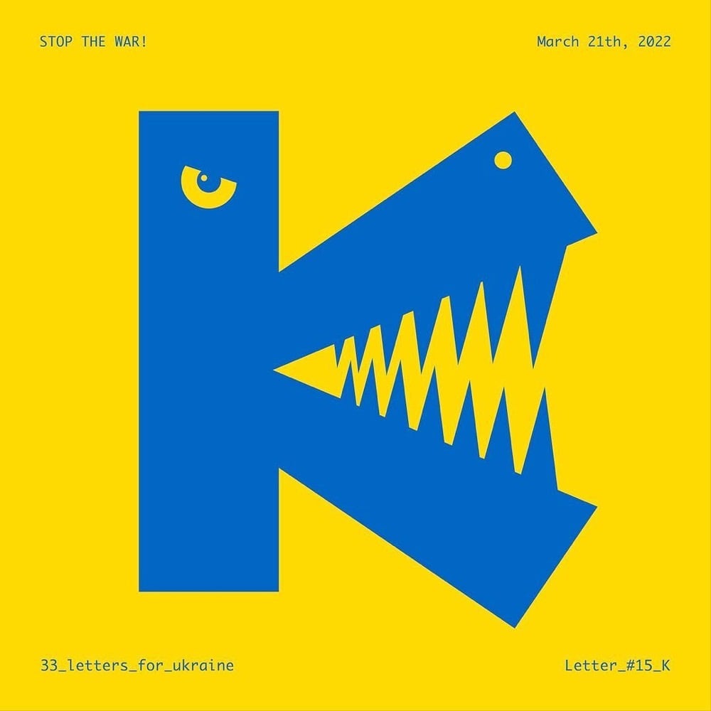
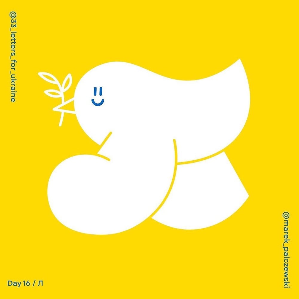
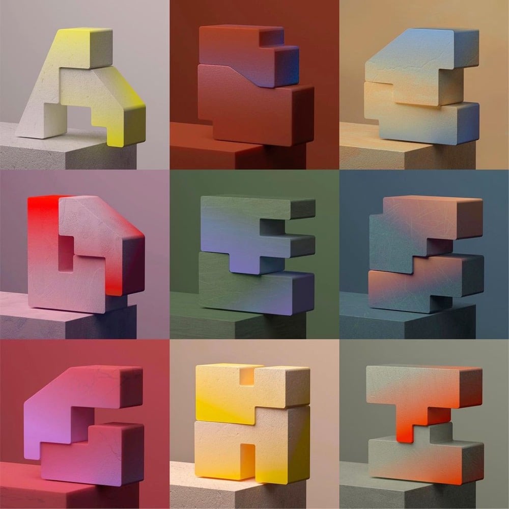
A pair of Polish designers have organized a challenge for designers around the world called 33 Letters for Ukraine: to create letterforms of the Ukrainian alphabet “as a sign of solidarity”. Each day until April 6th, a new letter is chosen and featured on their Instagram account — you can see some of the work above. It’s Nice That has a piece on the challenge.
Speaking on the thinking behind 33 Letters, Alina says: “To put it briefly, we have two main goals for the project — promoting the Ukrainian alphabet and encouraging people to donate to organisations helping Ukraine. The Instagram challenge is an essential starting point, and we loved to see so many designers getting involved and expressing their solidarity by drawing the letters. But equally important are tangible results: collecting funds and education.”
To do so, they are hoping to sell original artworks and prints of the letters once the project has finished, and then they plan to exhibit all of the works as part of a fundraiser, though the venue is yet to be confirmed. “There are amazing designers taking part in the challenge, and it would be great to see their work shine also outside of Instagram,” says Alina.
(thx, jackson)
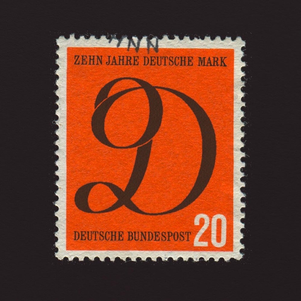
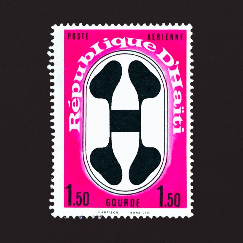
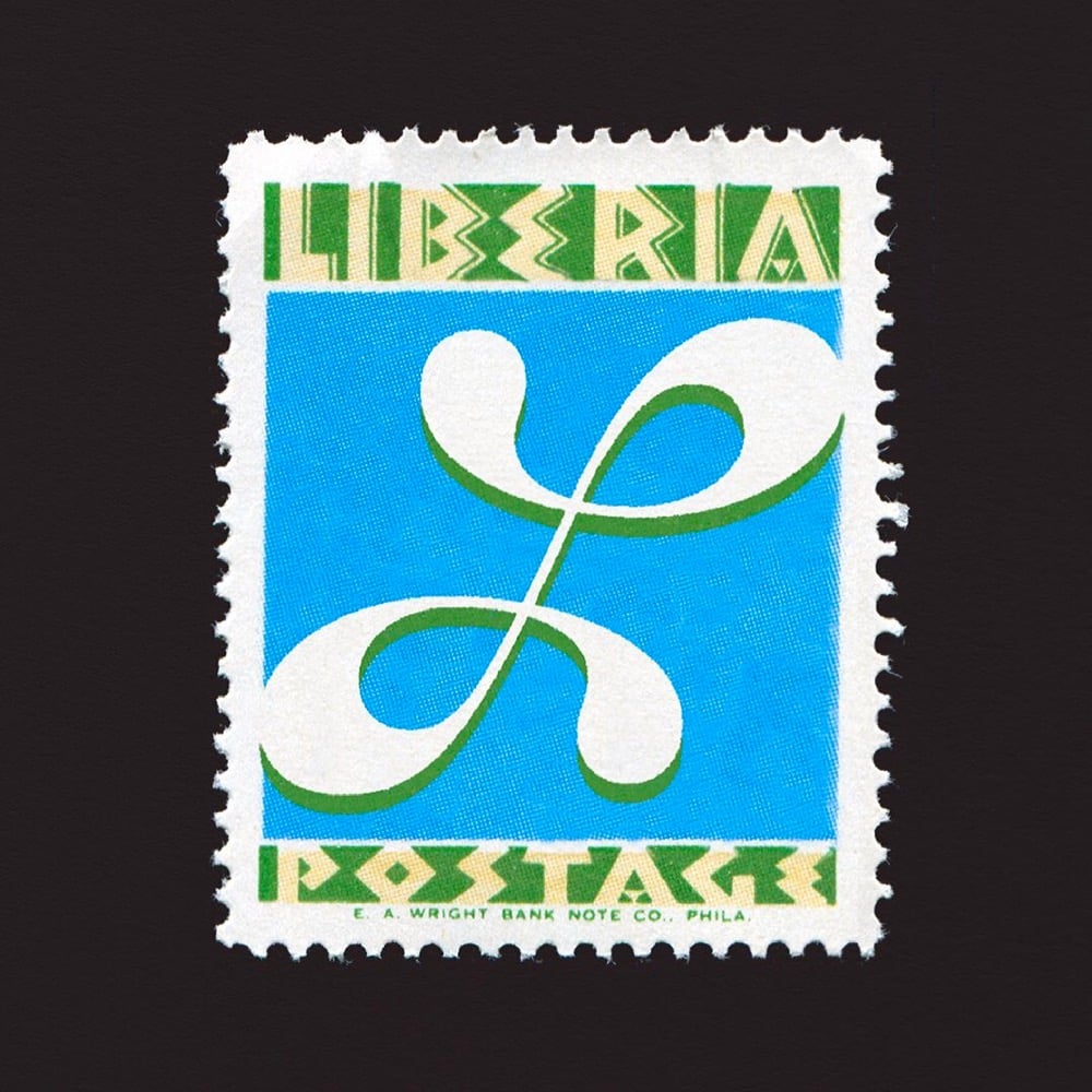
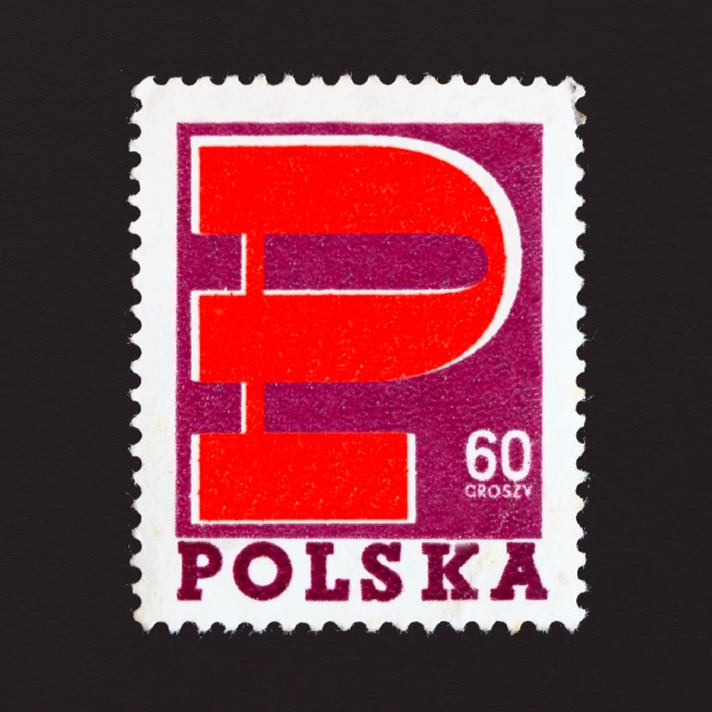
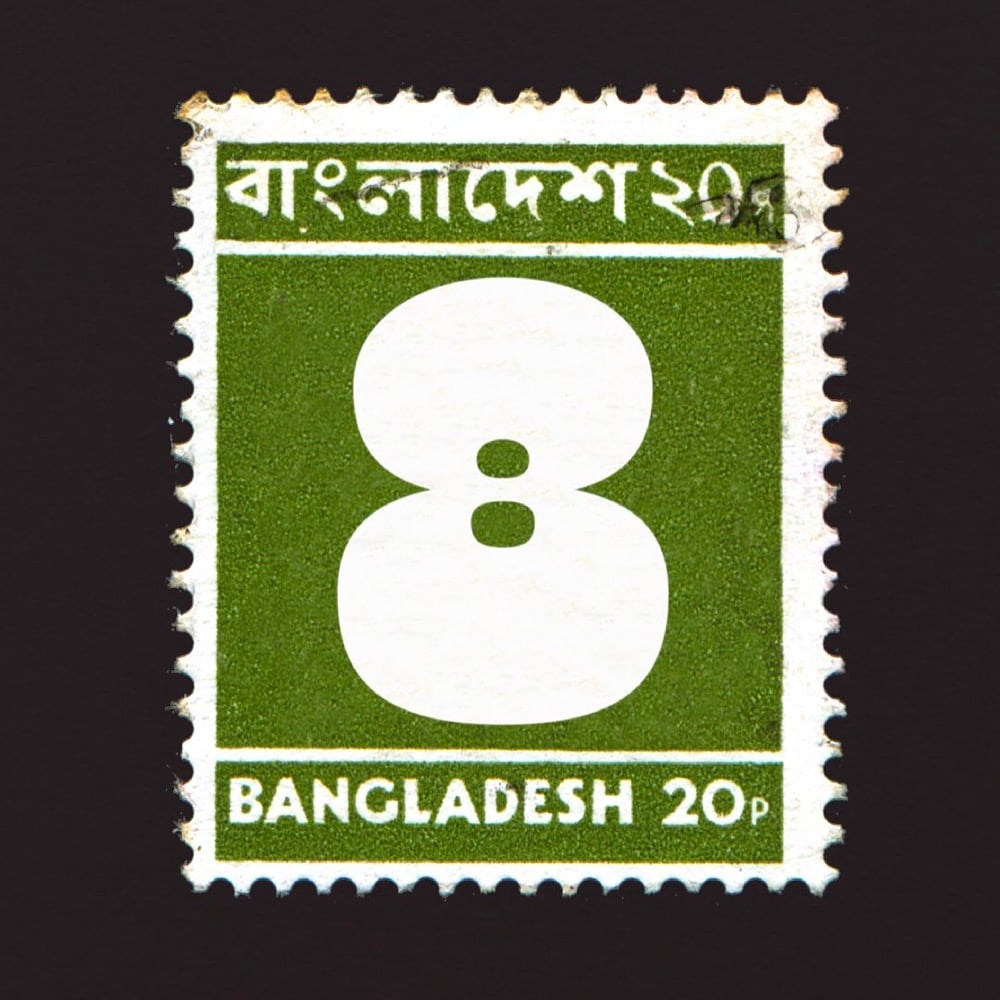
For last year’s 36 Days of Type challenge, artist and type designer Marie Boulanger selected 26 postage stamps from around the world with letters on them (C for Cuba, F for France, K for Kenya, etc.) and 10 stamps with the numerals 0-9 on them. What an amazing array of designs and lettering styles. I’ve included a few of my favorites above — you can see the rest on her Instagram or collected here in miniature.
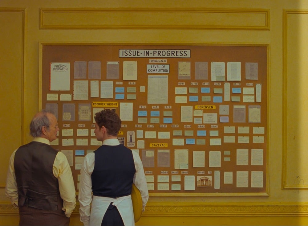
In an interview with Creative Boom, type designer Marie Boulanger talks about Wes Anderson’s use of type and typography in his films, specifically The French Dispatch.
I’m just speaking for myself, but I recently rewatched all of his films in chronological order. You can see typography become a more and more prominent component over time — it’s quite fascinating. In later films like Isle of Dogs and the French Dispatch, it almost becomes its own character rather than a visual or narrative flourish. Especially in a story about writers and publishing, every book, every page, every shop sign, every poster.
Even thinking about the three stories contained within the film, graphic design and typography are really at the core of each one: exhibition posters, protest signs and even menus. You piece a lot of key information together just through certain objects from the set, as well as emotional nuance: humour, joy, sadness. With such a huge part of the narration depending on typography, you have to expect a high level of detail.
Some people can be quite dismissive of Anderson’s work as preoccupied with mere aesthetics, so it’s great to hear Boulanger talk about the depth that something that’s ostensibly aesthetic like typography brings to his films. I loved the use of type in The French Dispatch…so much information conveyed with “just” words. (via sidebar)
For The Believer, Sarah K. Kramer wrote about a typeface called Jim Crow, how it came to be called that (its original name was Gothic Shade), and what its casual use by designers for decades means.
One of Seals’ pet peeves is “stereo-typography” — things like east Asian restaurants with brush-script logos — and in particular, he takes issue with the way designers often use “black weight” (very thick and bold) font to signify African American culture. For example, the Neuland typeface (designed in 1923 by Rudolf Koch) has been used on many covers of books by Black writers, like Richard Wright’s Native Son. One theory on the origin of the association of these black-weight fonts with Black culture is that they evoke woodblock typefaces printed on nineteenth century tobacco ephemera — an industry closely linked with slavery. Needless to say, much of this material featured racist imagery of African Americans. When Seals was contracted by HarperCollins to design a cover for Charles Blow’s The Devil You Know: A Black Power Manifesto, he definitely was not going to use a “black weight” font. Instead, he designed the cover with Ruby.
Ruby is a reworked version of Jim Crow from Tré Seals’ type foundry Vocal Type Co, which I covered here a few years ago. (thx, reed)
Craig Ward has been creating letterforms using Lego bricks and posting the results to Instagram. The ones I really love are the anti-aliased letters — reminds me of zooming all the way in to do detail work in Photoshop back when I was a web designer.
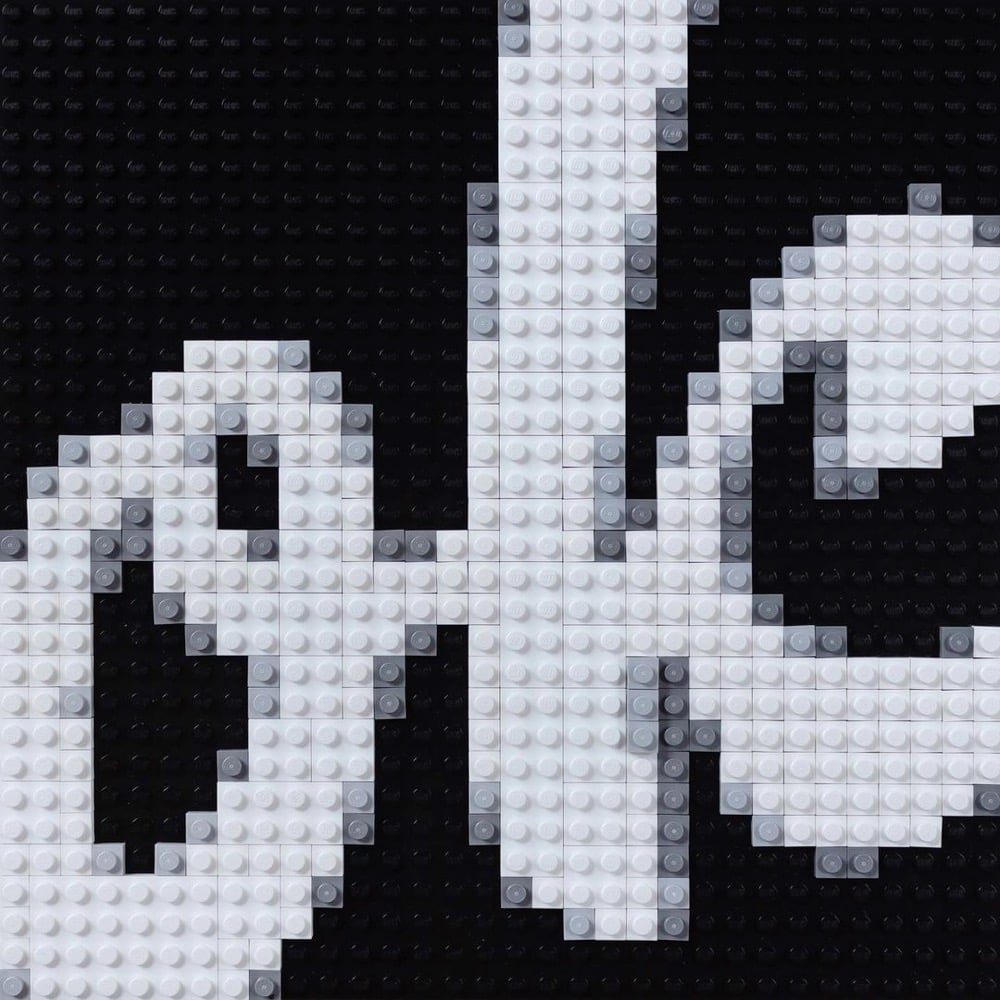
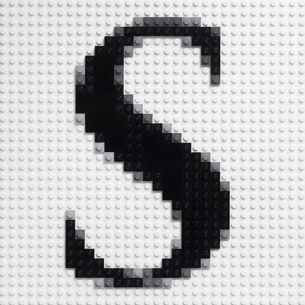
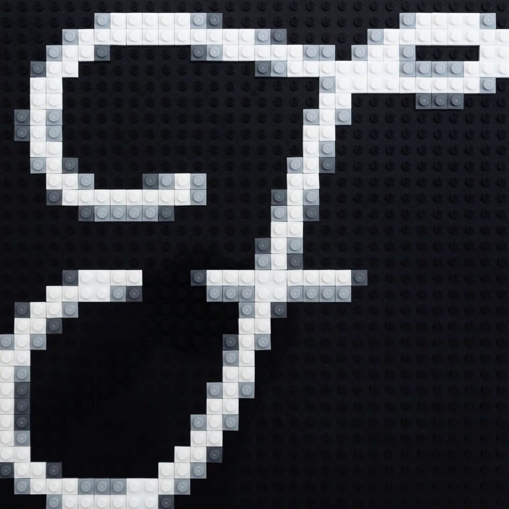
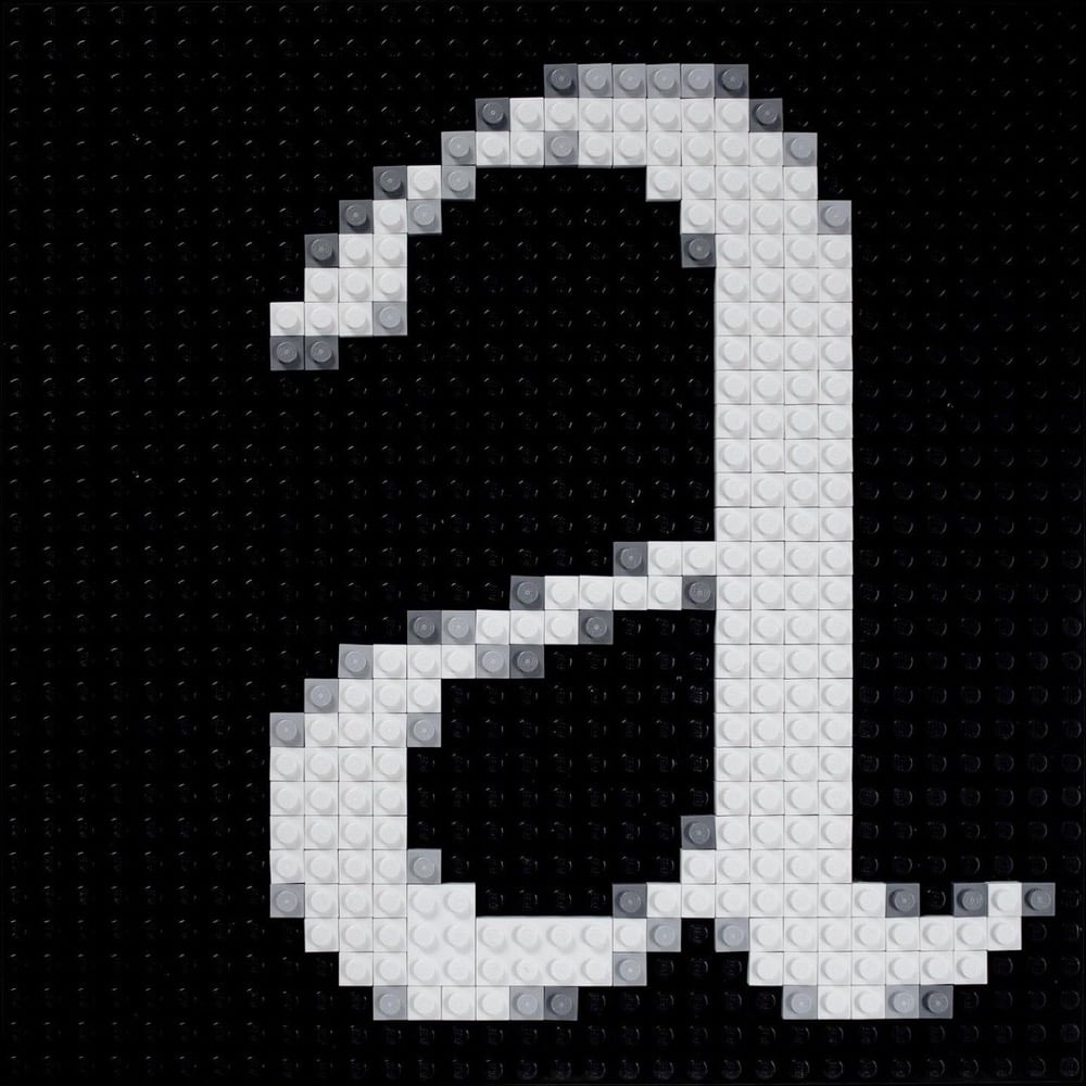
There is just something so satisfying about meticulously rendering digital artifacts in a physical medium like Lego.
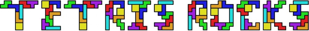
The father-son duo of Martin and Erik Demaine make typefaces that are algorithmic, mathematical, or puzzle-like in nature. For instance, here’s their Tetris font, where each letter is made up of the seven possible Tetris pieces:
Or their newest one, Everything, where each letter can be folded into any other letter:
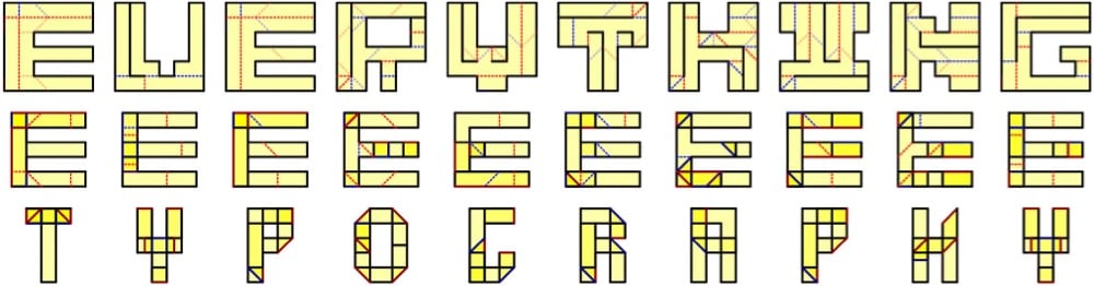
Everything to everything. This typeface illustrates how to fold any letter into any other letter, or more precisely, how to fold a piece of paper in the shape of any letter into the shape of any other letter. This lets you write one message inside another in a couple of ways. On the one hand, you could present the 6x6 crease patterns whose silhouettes look like one message (first text), and folding them reveals another message (second text). On the other hand, you could present the folded forms (as physical objects) whose silhouettes look like one message (second text), and unfolding them reveals another message (first text).
From a recent-ish profile of the Demaines and their typefaces in the NY Times:
In a 2015 paper, “Fun With Fonts: Algorithmic Typography,” the Demaines explained their motivations: “Scientists use fonts every day to express their research through the written word. But what if the font itself communicated (the spirit of) the research? What if the way text is written, and not just the text itself, engages the reader in the science?”
Inspired by theorems or open problems, the fonts — and the messages they compose — can usually be read only after solving the related puzzle or series of puzzles.
You can check out the rest of their typefaces on their website — they include fonts with infinitely tiling letters, Sudoku puzzle fonts, and a font whose letters are made up of shapes that can be packed into a 6x6 square. So fun!
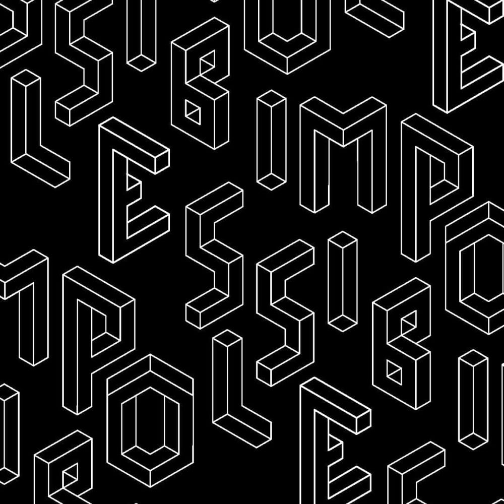
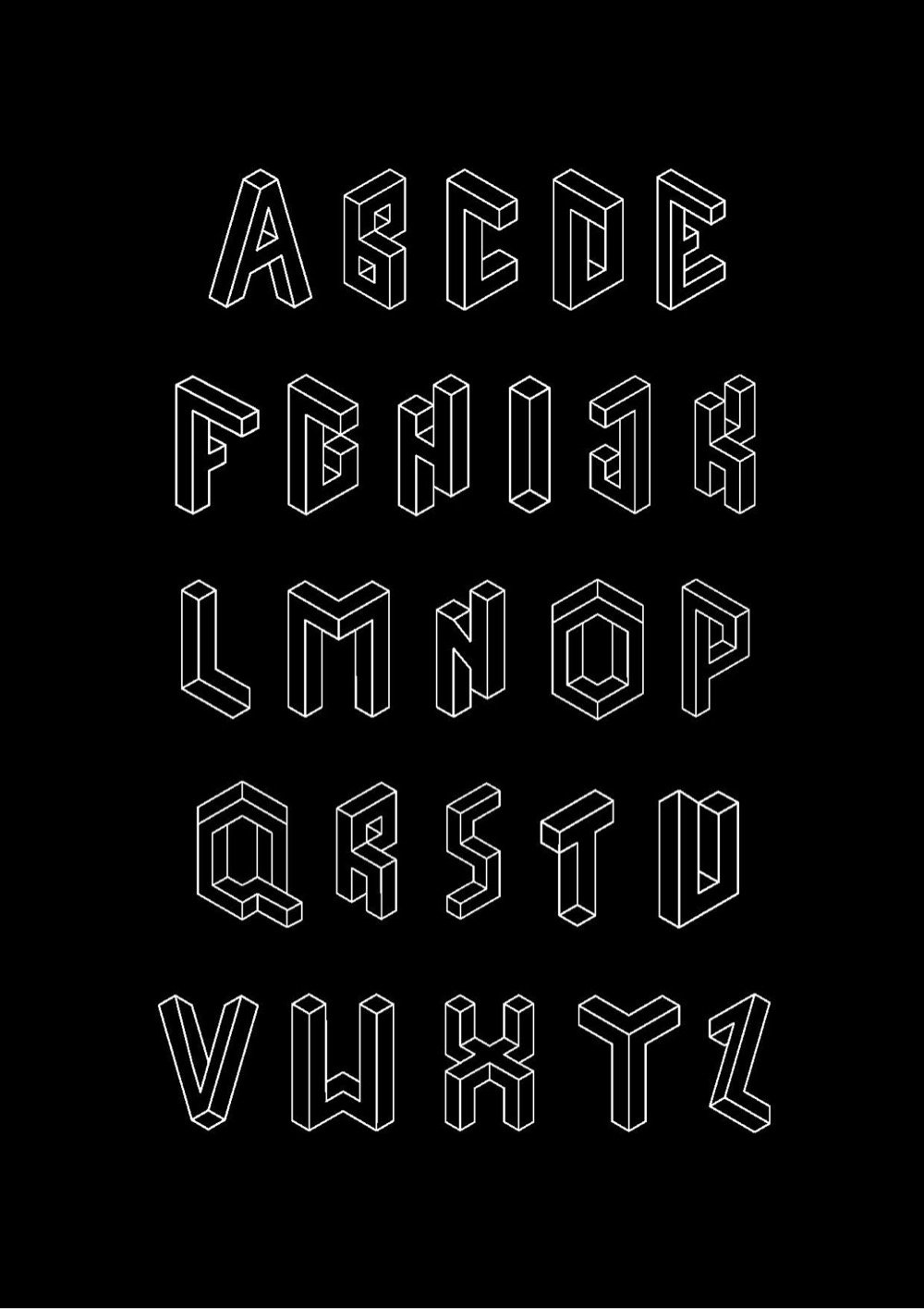
From Macedonian designer Fleta Selmani, a typeface called Impossible Type that was inspired by the impossible geometries of M.C. Escher.
See also more typefaces inspired by Escher’s work.
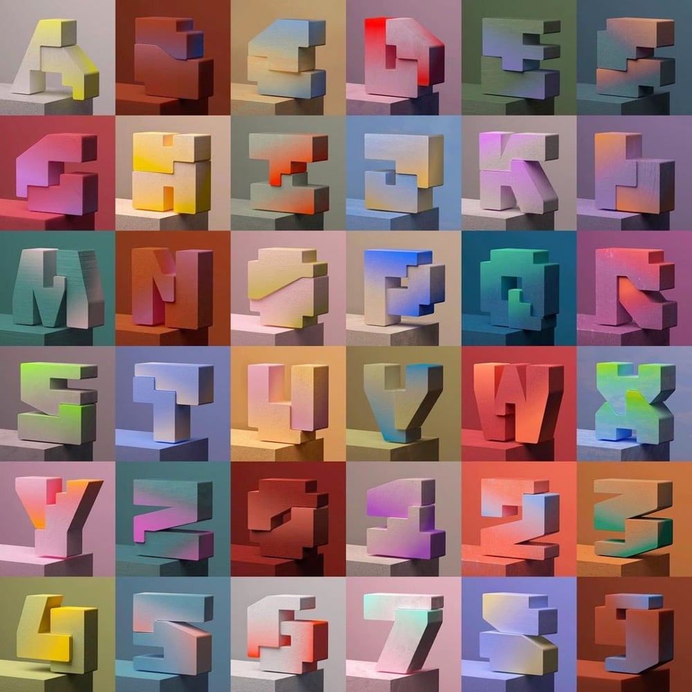
Adobe recently announced the winners of their 36 Days of Type contest and Khyati Trehan’s effort (pictured above) was among them. I also really liked David Oku’s colorful animated typeface. You can check out more work from this year’s project here and here (including this entry of handmade and found items).
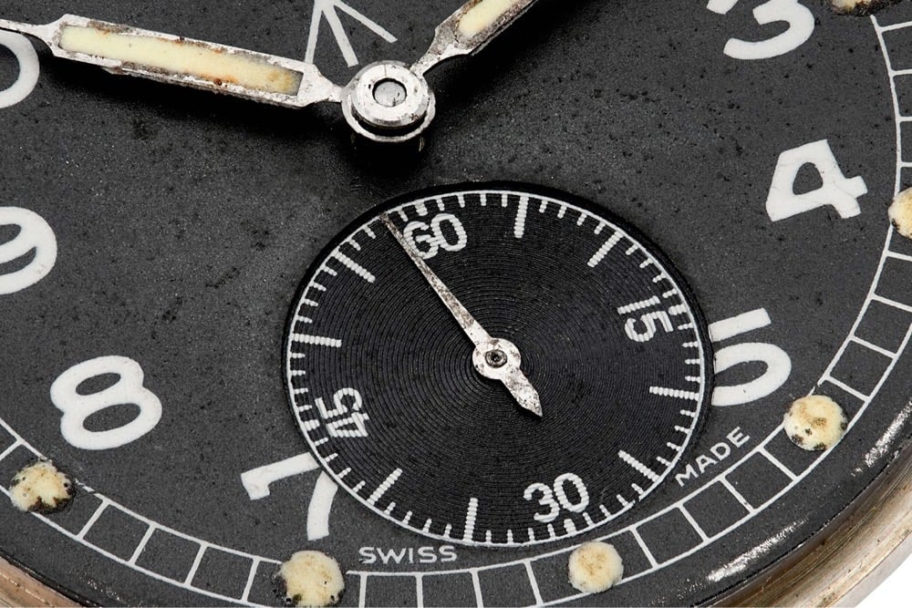
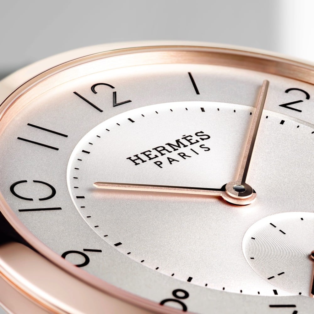
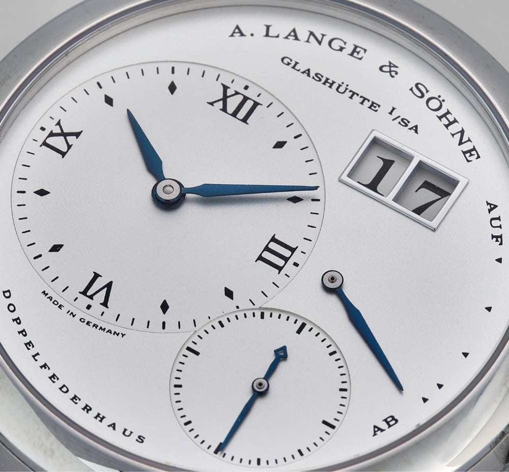
From Our Favourite Uses of Typography in Watches:
Good typography should be almost unnoticeable. Blending seamlessly into the rest of the design, it should tell you everything you need to know, without you being aware of it. Despite the many restrictions that are applied to dial layout, the creativity that can be seen in typography across horology is quite staggering. To put it simply, typography is the art and technique of arranging type to make written language legible and appealing when displayed. As the dial is the main point of interaction with a watch, it is arguably one of its most important parts, and certainly one that can produce the most emotion. This is why typeface can play such a vital, yet subtle, role in how we experience and feel about a certain piece.
(via the fox is black)
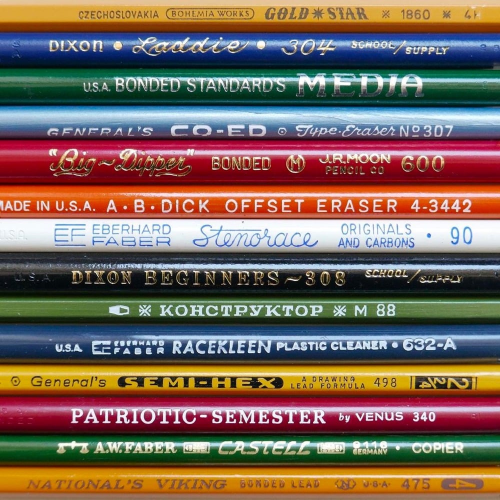
Even just looking at photos of pencils, I can still smell the sheets of mimeograph paper hot off the ditto machine.
The Type Directors Club has announced the winners of their two design competitions: TDC67 Communication Design and 24TDC Typeface Design. (via print)
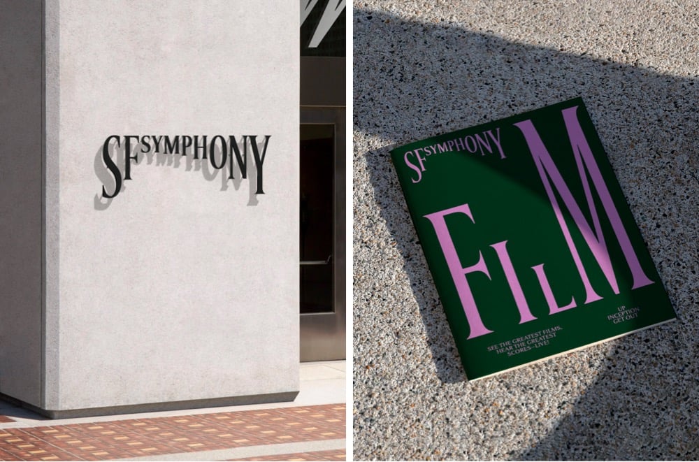
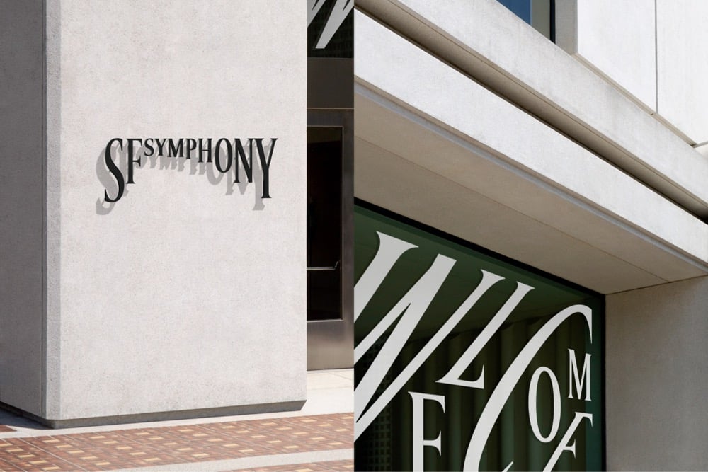
Design studio Collins has created a new brand identity for the San Francisco Symphony that uses type in a playful, almost musical way. This brief video demonstration is worth 1000 words:
Even better, you can experiment with your own type and music with the Symphosizer web toy. I made this (to the beat of Daft Punk):
(via @dkhamsing)
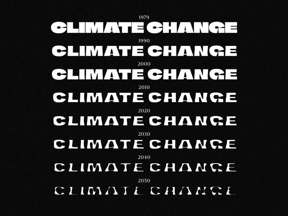
Finnish newspaper Helsingin Sanomat has released a free typeface called Climate Crisis that can help designers and the media visualize the urgency of the climate crisis.
The font is intended to be used by anyone who wishes to visualize the urgency of climate change. Especially the media can use it to enhance its climate-related storytelling through illustrations and dramatizations. Newspaper Helsingin Sanomat is at the moment using the font to draw attention to its climate-related stories.
The typeface has seven weights corresponding to data & projections of the minimum extent of the Arctic sea ice from 1979 to 2050. As you can see in the graphic above, the type gets thinner and thinner as the years pass. (via print)
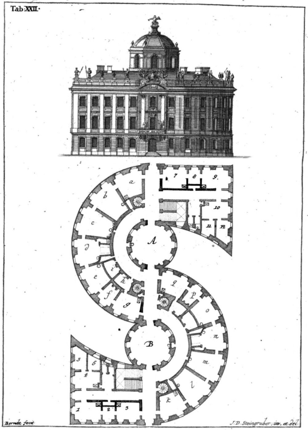
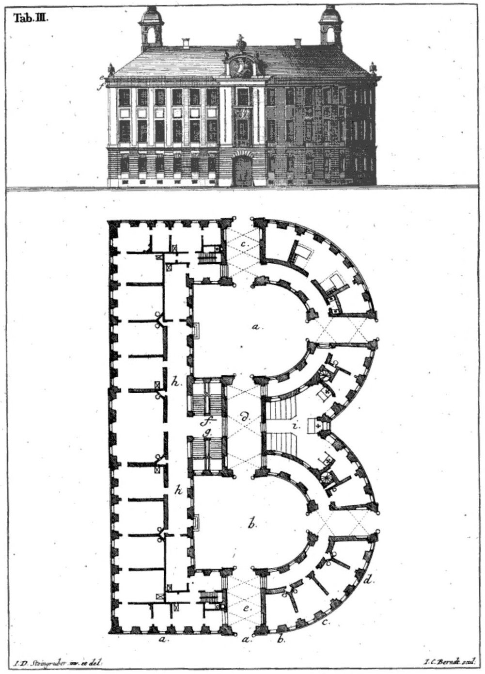
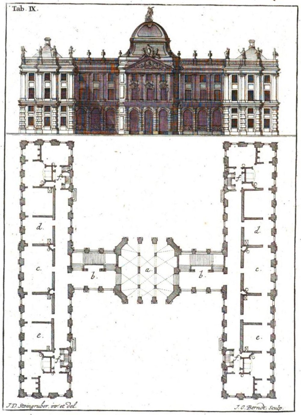
As someone who lives in an A-frame house, I love this architectural alphabet designed by Johann Steingruber in 1773. A typically great find by Present & Correct (see also).
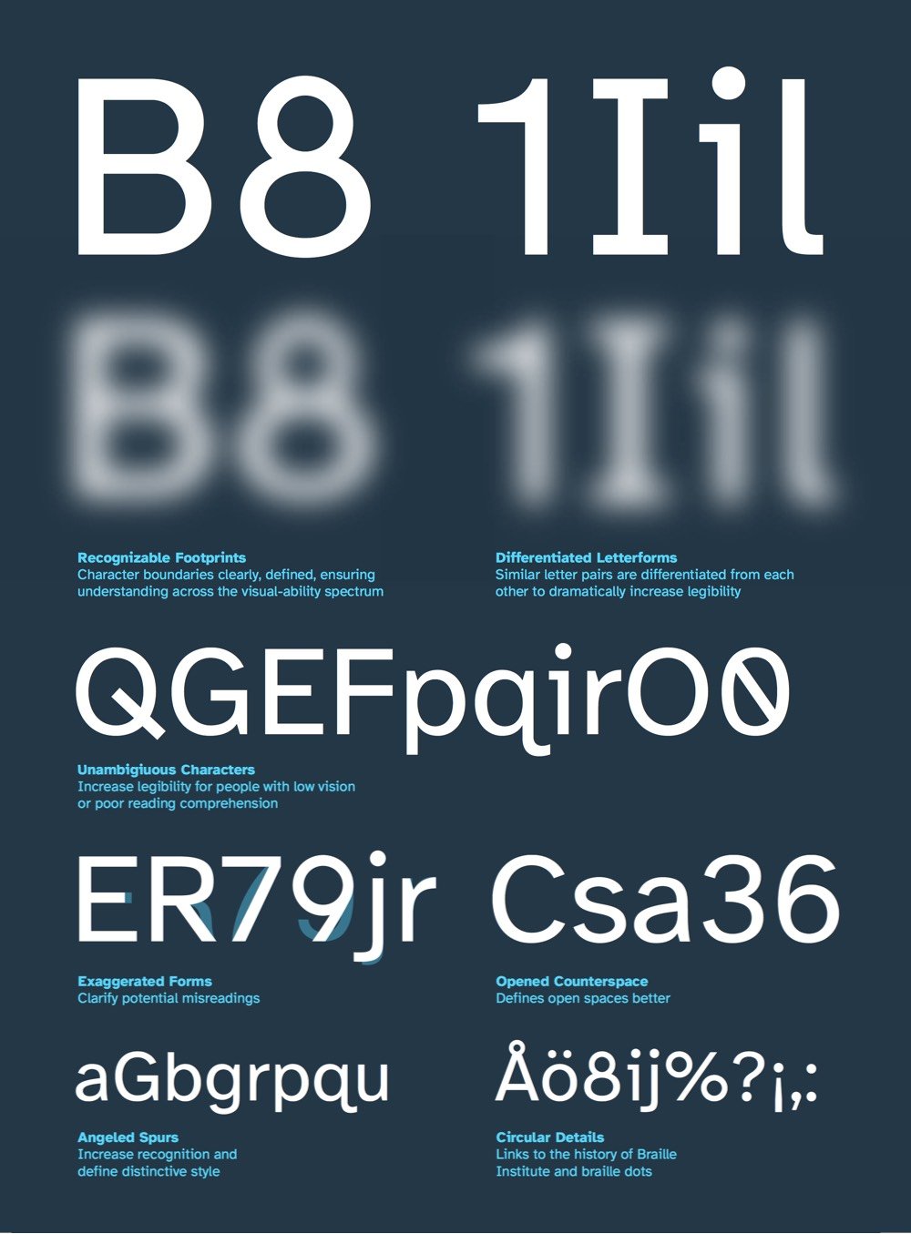
Atkinson Hyperlegible is a free typeface developed by the Braille Institute and Applied Design Works that makes text more readable for people with low vision.
“People may be surprised that the vast majority of the students who come to Braille Institute have some degree of vision,” says Sandy Shin, the institute’s vice president for marketing and communications. “They’re not 100% blind.”
Thus, most of the Braille Institute’s 37,000 clients across Southern California don’t depend on the dot-based Braille language. Instead, they rely on spoken-word tools and accessibility standards that encourage text publishers to think more carefully about the legibility of words on pages.
As you can see in the graphic above (taken from their summary PDF), Atkinson Hyperlegible’s letterforms are constructed so that each letter is as distinctive as possible so that it’s recognizable even when blurry or distorted by low vision. You can download Atkinson Hyperlegible on the Braille Institute site. (via print)
To celebrate the release of their latest limited edition memo books, Field Notes made a short documentary about The United States of Letterpress, featuring several letterpress practitioners from around the country.
I ran a pedal-powered letterpress machine for a few minutes several years ago and that huge machine whizzing away right in front of me was both magical (it stamps the ink right into the paper and it’s in your hands 2 seconds later) and terrifying (the massive flywheel could have ripped my arm clean off without slowing down). Danger and enchantment, what else do you need really?
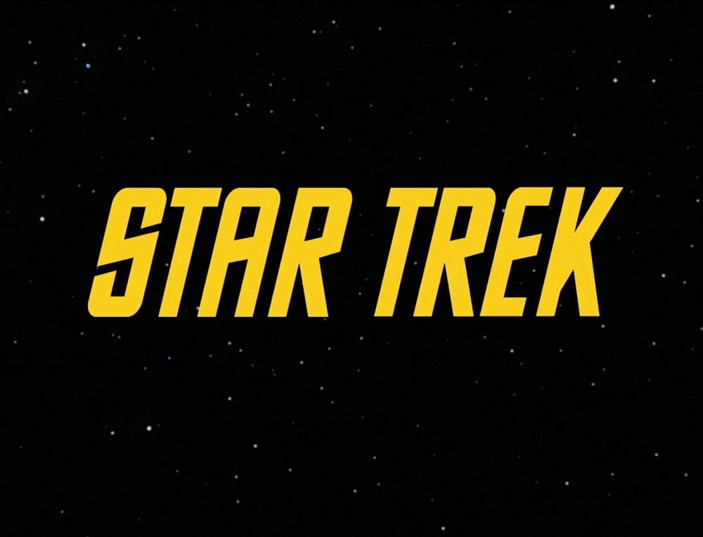
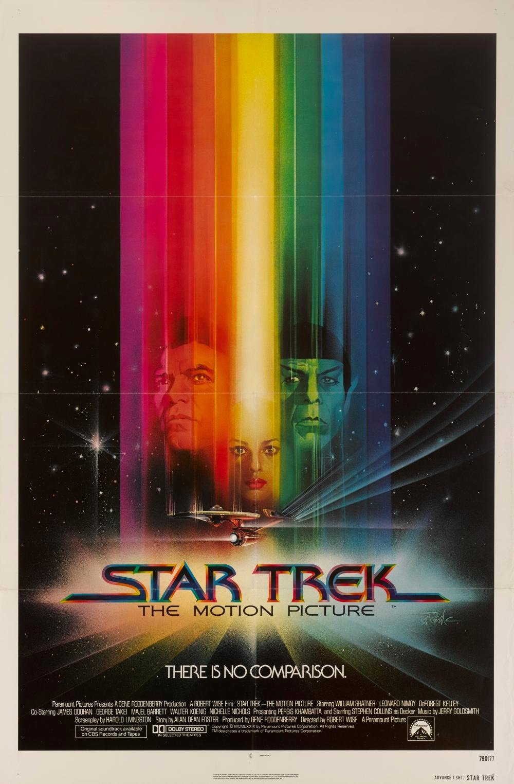
In an extended excerpt from his book Typeset in the Future: Typography and Design in Science Fiction Movies (Amazon), Dave Addey goes long on the typography and design of Star Trek: The Motion Picture (and Trek in general).
Alas, The Original Series’s inconsistent typography did not survive the stylistic leap into the 1970s. To make up for it, The Motion Picture’s title card introduces a new font, with some of the curviest Es known to sci-fi. It also follows an emerging seventies trend: Movie names beginning with STAR must have long trailing lines on the opening S.
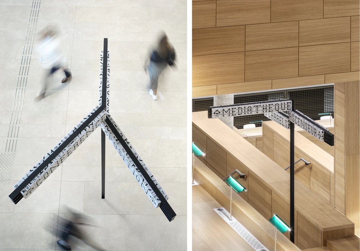
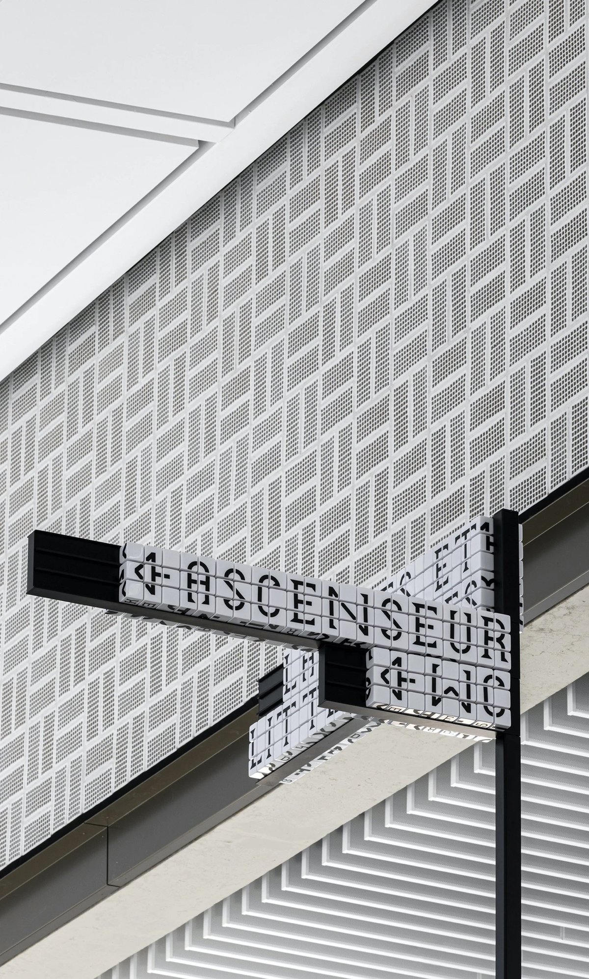
Sascha Lobe’s team at Pentagram has designed a functional and stylish modular signage system for the National Library of Luxembourg. The signs use cubes (inspired by LED clock displays?) that can be reconfigured into different words by library staff.
Numerical and alphabetical cubes are the foundation of the BnL’s modular signage system. In handling massive volumes of information and growing library collections, it is essential to free the library staff from rigid systems and equip them with the ability to easily make signage changes.
The flexible signage plan, consisting of 25,000 resin cubes, 6000 tableaus and 2,400 numerical shelving characters, enables staff to independently customize information as the library’s collection fluctuates. The resin cubes, constructed from a durable material, also translate the timelessness of the library and its long-standing presence throughout the years and into the future.
The only (but perhaps significant) downside to the signs is that they are not actually super legible when compared to a non-modular alternative. They sure do look great though.
Update: This post got shared on Twitter by a couple of librarian pals and Librarian Twitter was not impressed by this signage at all. Not legible, not accessible, and difficult/fiddly to maintain were the main complaints. As someone who believes that design is primarily about how something works and not how something looks, I’m a bit embarrassed that I didn’t hit that point harder in this post. I do love the aesthetics of the project, but from the photos, the legibility looks terrible. Maybe it’s different while navigating the space in person, but if not, you have to wonder how helpful hard-to-read signs are to patrons.
On Tuesday, Joe Biden announced that Senator Kamala Harris would be his vice-presidential running mate. The campaign was quickly updated to include a new Biden-Harris logo designed by Hoefler&Co. in collaboration with Biden campaign advisor Robyn Kanner:
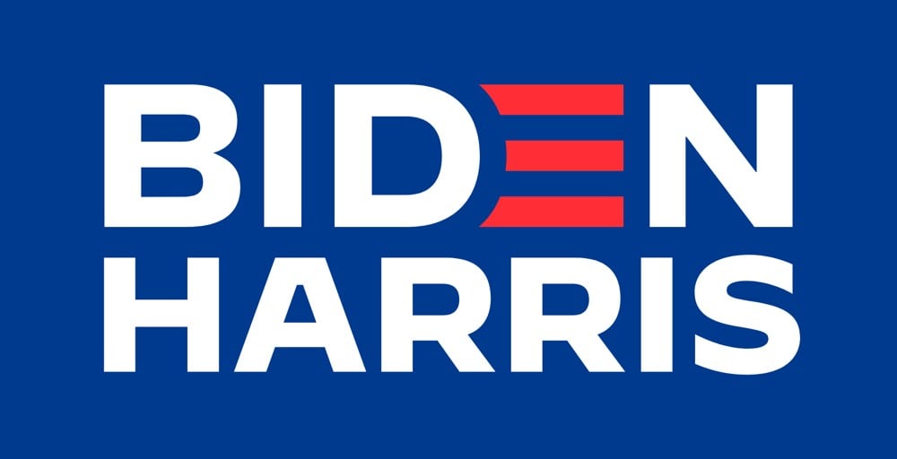
But the designer of the logo wasn’t told who the running mate would be beforehand, so how did the campaign get it out so quickly? According to Jonathan Hoefler, the design team designed a whole collection of logos for potential candidates gleaned from reading the media tea leaves.
A consequential decision at an unpredictable time, conducted under absolute secrecy, poses an interesting dilemma to the typographer: how do you create a logo without knowing for certain what the words will say? Logos, after all, are meaningfully informed by the shapes of their letters, and a logo designed for an eisenhower will hardly work for a taft. The solution, naturally, involves the absurd application of brute force: you just design all the logos you can think of, based on whatever public information you can gather. Every credible suggestion spotted in an op-ed was added to the list that we designers maintained, and not once did the campaign even hint at a preference for one name over another.
I would love to see some of those alternate designs (Biden-Warren!), but there’s no way in hell they’ll ever see the light of day, especially before the election.
Update: Several designers weigh in on the new logo. I love Debbie Millman’s take:
I never, ever thought I’d say this after a lifetime in professional branding, but on the spectrum of good branding versus effective branding, I’d say at this point it is irrelevant. Frankly, the Biden-Harris logo could have been scribbled on a napkin and I’d be happy. Trump’s brand is beyond repair and is now more dangerous than ever. The soul of our country is at stake.
That logos don’t matter that much (unless they are either great or horrible) is probably true more often than designers and branding folks would care to admit.
In this video from Vox, Estelle Caswell talks to Bethany Heck and Steven Heller about the seemingly ubiquitous typeface Cooper Black.
There’s a typeface that has made a resurgence in the last couple of years. It’s appeared on hip hop album covers, food packaging, and advertising. Perhaps you know it from the Garfield comics, Tootsie Roll logo, or the Pet Sounds album cover by the Beach Boys. It’s called Cooper Black, and its popularity and ubiquity has never waned in the hundred years since it was first designed.
Cooper Black tends to get a bad rap from type aficionados (too popular, too cartoony) but this video — and Heck’s comments in particular — have given me a new appreciation for it.
This morning, Carly Rae Jepsen released a new album called Dedicated Side B (stream here). Amidst rumors of fresh music, the pop star had been teasing fans with its release all week, including this video of a simulated chat posted to Twitter and Instagram yesterday.
Long-time readers will recognize that the chat text is displayed with typeface called Silkscreen, which I designed back in 1999, an era of small monitors and even smaller fonts.
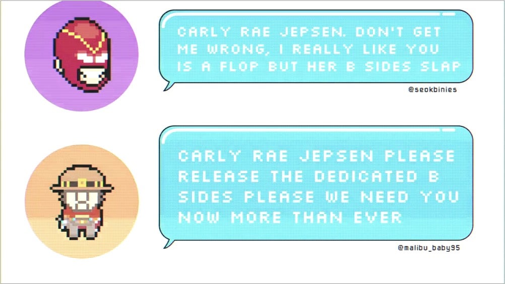
Back in the day, Britney Spears used Silkscreen on her website, and now it’s come (sorta) full circle with Jepsen. Silkscreen pops up here and there every few months, and I’m glad to see people are still getting some use out of it. It was retro when I made it and now its retro-ness is retro. Culture is fun! (thx to @desdakon for spotting this)
Yet another gem from the Kid Should See This: a performance of Sergei Prokofiev’s Peter and the Wolf that combines live action, animation, and creative typography.
Aided by Toshi Omagari, who wrote Arcade Game Typography, Vox’s Estelle Caswell explores the origins and history of 8-bit arcade fonts. From the description of the book:
Video game designers of the ’70s, ’80s, and ’90s faced color and resolution limitations that stimulated incredible creativity. With each letter having to exist in a small pixel grid, artists began to use clever techniques to create elegant character sets within a tiny canvas.
As the creator of a tiny pixelated typeface, I find this stuff infinitely fascinating.
Thinking that some people might need high quality entertainment while shut inside due to the COVID-19 pandemic, filmmaker Gary Hustwit is streaming his films online for free, one film per week. First up (from Mar 17-24) is Helvetica, his documentary on typography and graphic design. Here’s the trailer:
Click through to watch the whole film. (via daring fireball)
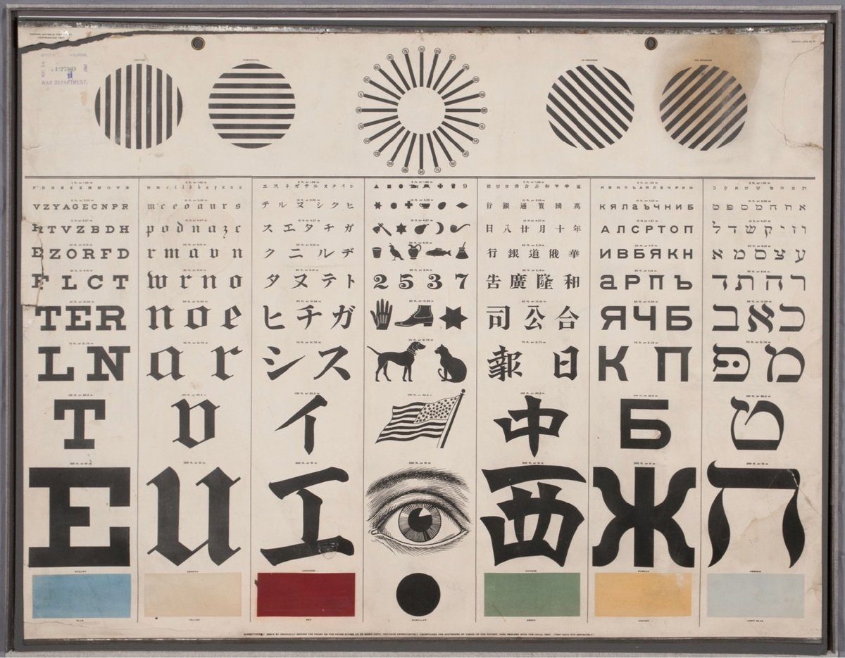
From the collection of the US National Library of Medicine, an eye test chart designed by George Mayerle around 1907 to be a complete vision testing solution for speakers of several languages.
Running through the middle of the chart, the seven vertical panels test for acuity of vision with characters in the Roman alphabet (for English, German, and other European readers) and also in Japanese, Chinese, Russian, and Hebrew. A panel in the center replaces the alphabetic characters with symbols for children and adults who were illiterate or who could not read any of the other writing systems offered. Directly above the center panel is a version of the radiant dial that tests for astigmatism. On either side of that are lines that test the muscular strength of the eyes. Finally, across the bottom, boxes test for color vision, a feature intended especially (according to one advertisement) for those working on railroads and steamboats.
Mayerle was a German optometrist working in San Francisco when he made the chart, designing it for use in a city with a diverse population. My pals at 20x200 are offering limited-edition prints of Mayerle’s chart in a variety of sizes.
See also the history & typography of eye test charts, Optician Sans (a font based on eye chart typography), and Eye Charts for Drones.
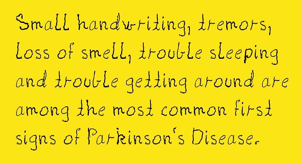
Shake is a typeface made from the real handwriting of a person living with Parkinson’s disease. Creative director Morten Halvorsen:
My mother was diagnosed with Parkinson’s eight years ago. And her handwriting has changed in the years since. I created this font to preserve her handwriting, and enable her to continue to write with her own letters.
A new version of the font will be available each year to capture his mother’s worsening condition. Donate a few dollars (or more!) to download the font — all proceeds go to finding a cure. You can also download a template so that you can document the handwriting of a loved one living with Parkinson’s — for a fee (donated to Parkinson’s research), Halvorsen will turn it into a font for you. (thx, kevin)
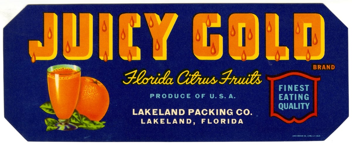
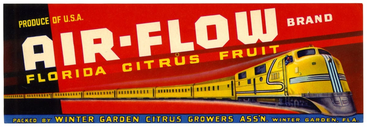
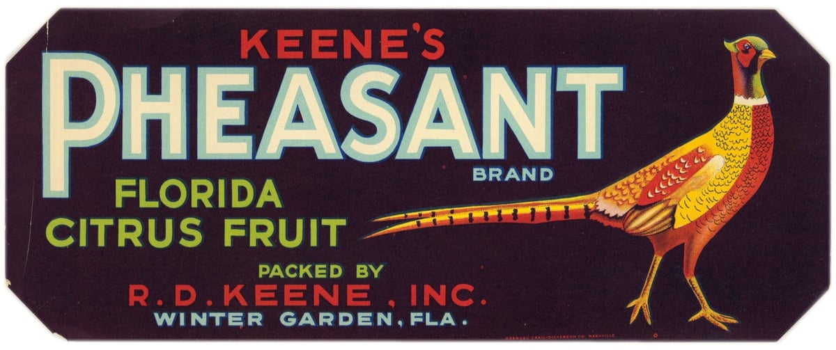
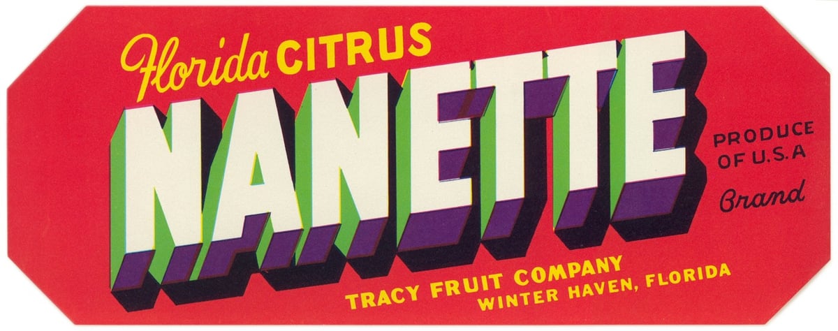
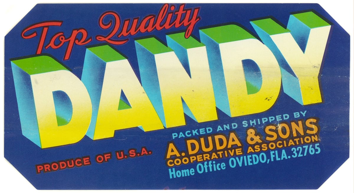
From the State Library of Florida comes a collection of more than 600 crate labels used by the citrus and vegetable industries from the 1920s to the 1950s.
To help give Florida fruits and vegetables an edge, growers looked to the booming produce packing industry in California, where advertisers were already using bold, elaborate labels to catch buyers’ attention. Florida companies began designing their wooden shipping crates and paper labels based on this successful model.
Paper crate labels were used in Florida from the late 1800s until the 1950s. The earliest paper labels were fairly generic and often didn’t include a brand name. Starting in the 1920s, advertisers began developing more complex marketing strategies, aiming to entice buyers with colorful brand names and imagery.
What an amazing variety of design and typographic styles. There’s also some questionable imagery in there as well: Mammy Brand, Dixieland Brand, Brave Vegetables, Indian Chief, etc.
See also The US Government’s Trove of Beautiful Apple Paintings. (via @john_overholt)
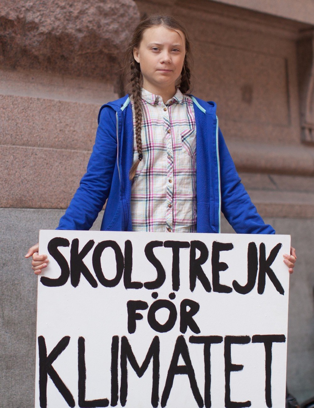
Inspired by the handwritten sign that climate activist Greta Thunberg has been using since beginning her climate strike in August 2018, a startup called Uno has produced a font of her handwriting available for free download.
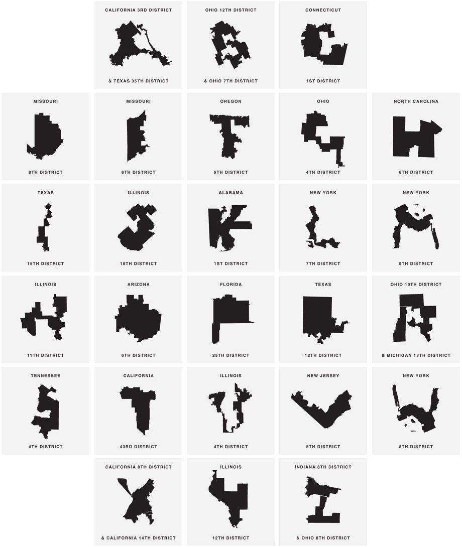
Gerry is a typeface where the letterforms are created from heavily gerrymandered Congressional districts. For example, the letter U is the 4th district in Illinois:
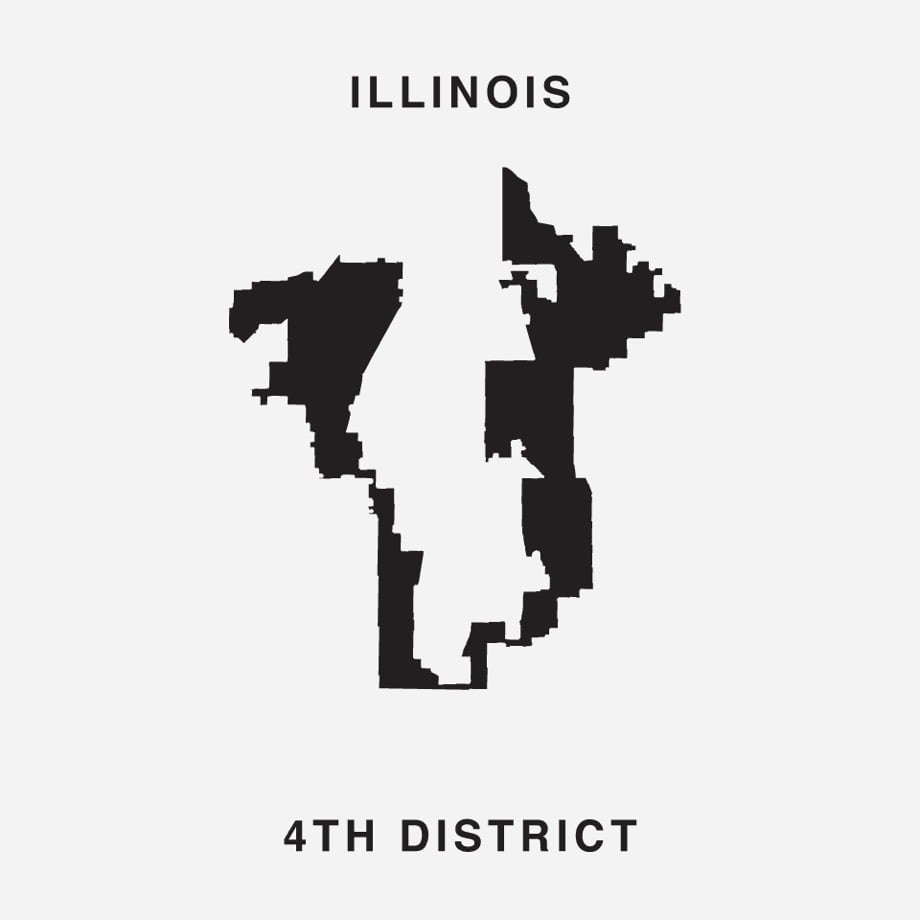
Click through to download the font for free and to tweet at your representative to stop gerrymandering.
Newer posts
Older posts
Socials & More