kottke.org posts about architecture
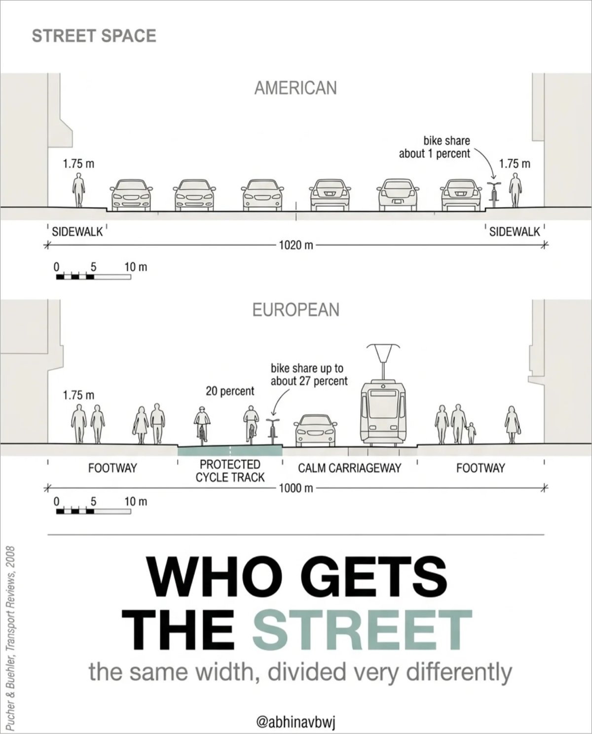
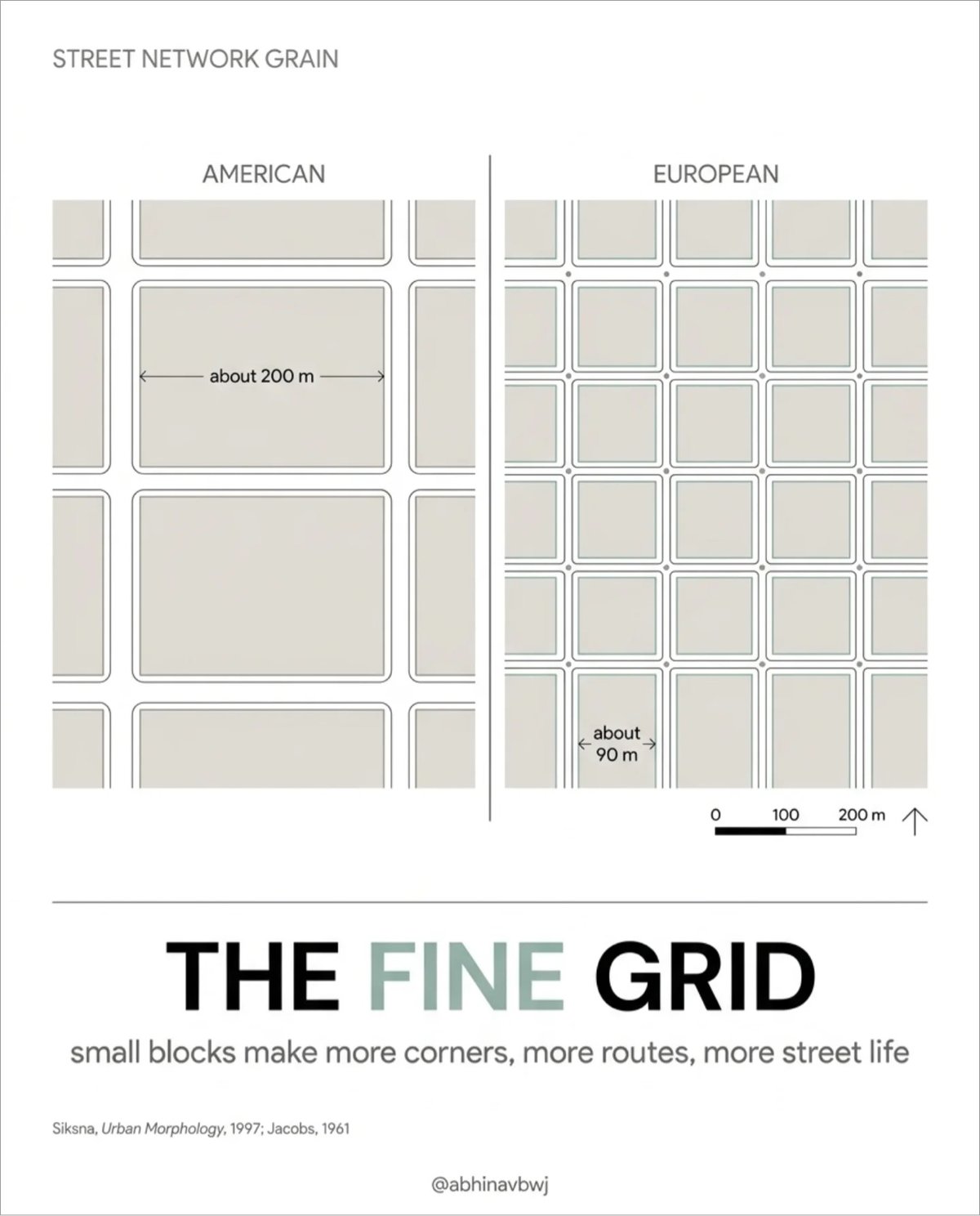
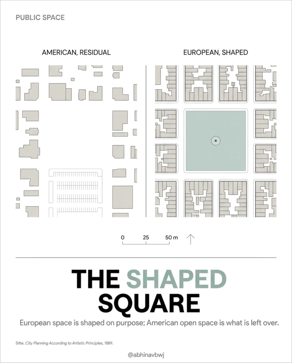
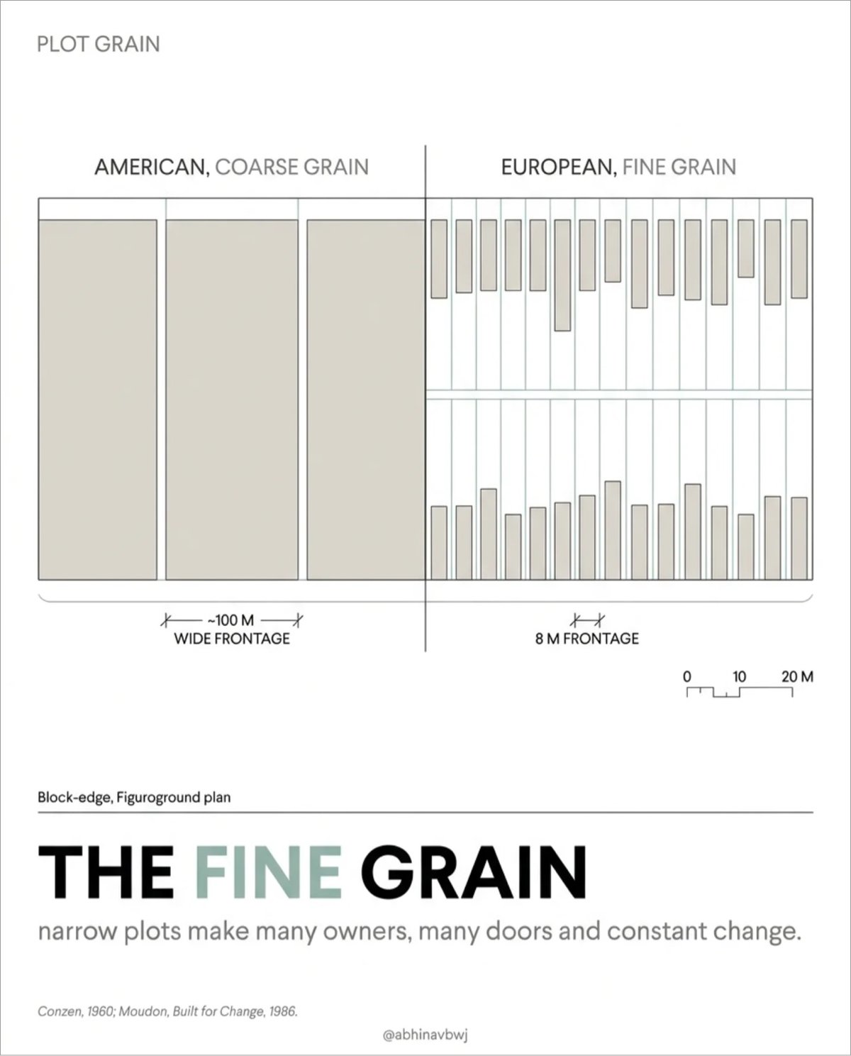
Architect and urban & computational designer Abhinav Bhardwaj made this great set of slides comparing urban design in the US and Europe, peppered with pithy observations like:
- European space is shaped on purpose: American open space is what’s left over.
- Small blocks make more corners, more routes, more street life.
- A fine grid offers hundreds of routes; the tree offers one way out.
(thx, meg)


I (weirdly?) love Amy Casey’s paintings of buildings in peril — being swallowed by the sea, being flung into the sky by wind.
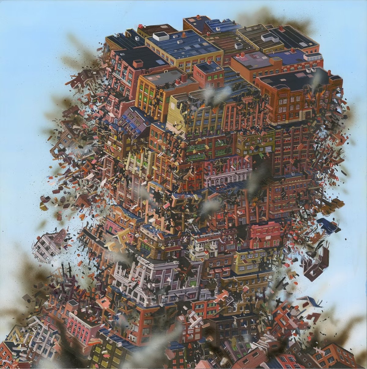
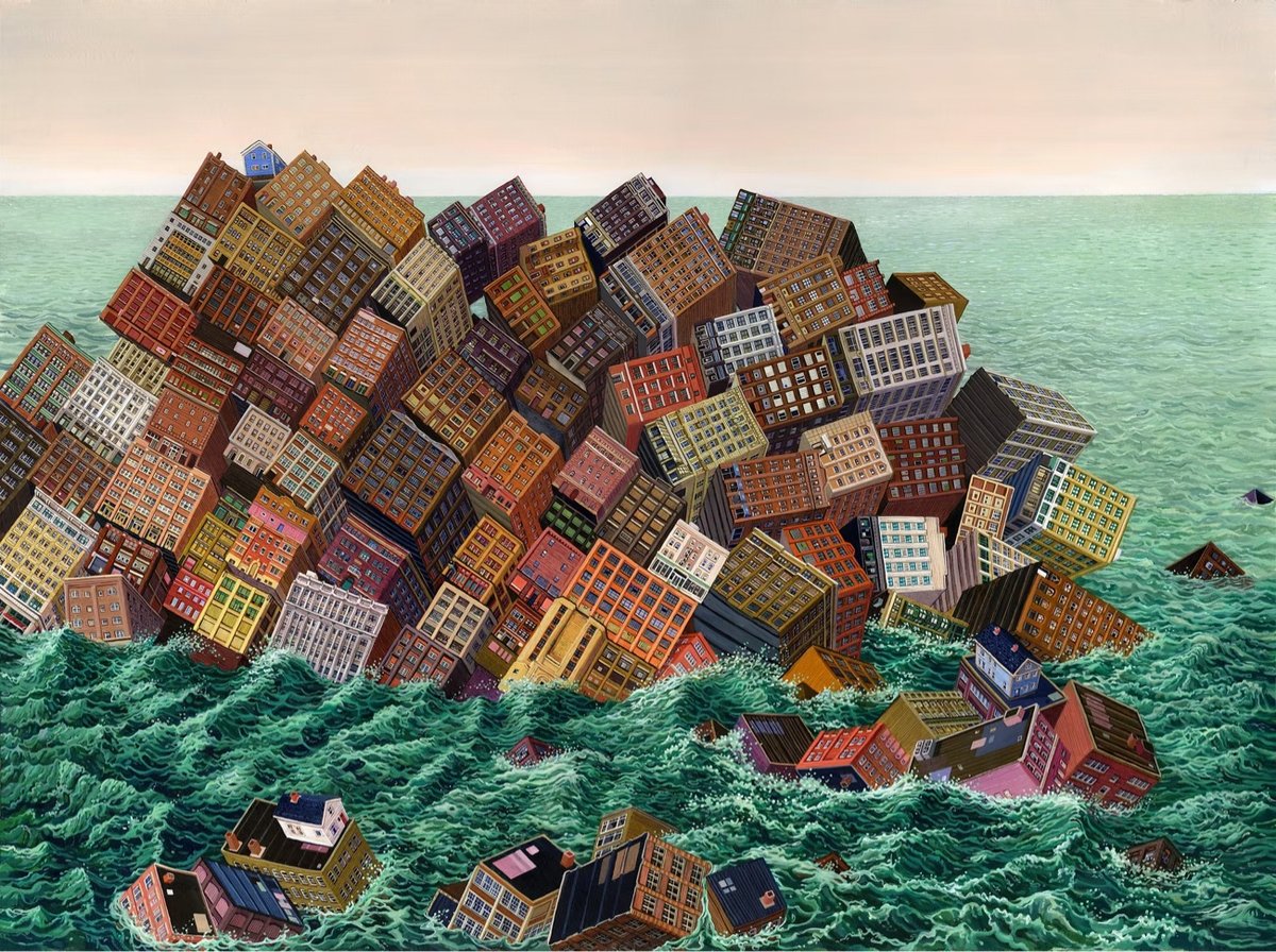

There’s an element of the Kowloon Walled City to Casey’s work, as well as Cloudy With a Chance of Meatballs (specifically the tomato tornado). (via colossal)

You know who else wanted to construct gaudy buildings in his own image? Here’s Timothy Ryback on Adolf Hitler’s obsession “with adding an expensive new wing to the Reich chancellery”.
The new annex, connected to the chancellery by a marble corridor hung with crystal chandeliers, was part of Hitler’s ambitious plans to align the Berlin cityscape with his vision for the future of the country. Hitler wanted a Triumphbogen, a triumphal arch, twice the size of the Arc de Triomphe in Paris. He wanted an “Avenue of Splendor” for military parades. “The Champs-Élysées is a hundred meters wide,” Hitler told Speer. “We will make our avenue twenty meters wider.” A planned Volkshalle was to accommodate 180,000. The Eiffel Tower could fit beneath its cupola. This “Hall of the People” was to be topped by the largest swastika on Earth. Berlin itself was to be rechristened as Weltstadt Germania, “Capital of the World.”
Ryback is the author of several books on Hitler and the Nazis, including his forthcoming 53 Days: How Hitler Dismantled a Democracy, which sounds like a must-read to me.
I’ve been enjoying the series of articles he’s been doing at The Atlantic about the parallels between Hitler and the dangers of Trump’s authoritarianism without ever explicitly mentioning Trump. In addition to the above piece about architecture, he’s written about Hitler’s Greenland Obsession, What Happened When Hitler Took On Germany’s Central Banker, Hitler Used a Bogus Crisis of ‘Public Order’ to Make Himself Dictator, Hitler’s Terrible Tariffs, and The Oligarchs Who Came to Regret Supporting Hitler. If it looks like a duck…
The Merchant’s House Museum was NYC’s first landmarked building, but until this year, the function of a small hidden passageway in the house was unknown. When historians and preservationists examined it in detail, they found that it was built by the first owner of the house, abolitionist Joseph Brewster, as a hiding place for enslaved people escaping from the South.
But when visitors head upstairs to the bedrooms on the second floor, there’s something strategically hidden within the walls of Manhattan’s first landmarked building: a link to the Underground Railroad.
“We knew it was here, but didn’t really know what we were looking at,” Camille Czerkowicz, the curator for the Merchant’s House Museum, said.
Now they know that the Merchant’s House was also a “safe house” for enslaved Africans who escaped bondage in the South.
Architects and preservationists recently investigated the building’s hidden vertical passageway along the west wall and examined it for themselves.
“I’ve been practicing historical preservation law for 30 years, and this is a generational find. This is the most significant find in historic preservation in my career, and it’s very important that we preserve this,” Michael Hiller, a preservation attorney and professor at Pratt Institute, said.
Underneath those built-in drawers is the path to freedom.
From NY Times reporter Anna Kodé (whose “intersection of culture and real estate” reporting I’ve been enjoying lately), a short video on the increasingly hostile architecture of NYC.
The spread of the leaning bench and the lack of seating at places like Moynihan or around the city signals to homeless individuals that they are not welcome in these places. It signals to all New Yorkers that these are not social places. These are places to simply pass through.
Here’s a video Vox did on the subject seven years ago.
Being in Japan is offering me such a contrast to so many things in the US. There are benches in public places here and they don’t have spikes all over them. Japan has the world’s lowest rate of homelessness, probably because they take care of people.
In America, we don’t provide housing or much of anything else for people (including a living wage or affordable health care) and the result is that no one can sit down in Penn Station or in a subway station and oh by the way, lots of people have nowhere to live. Why do we do this to ourselves? We could live better lives but we choose not to….for reasons?

An article about The Quintessential Urban Design of ‘Sesame Street’ with a bunch of photos? This is extremely up my alley. One of the show’s big influences when it began was Jane Jacobs’ landmark book, The Death and Life of Great American Cities, which informed the set design:
“Even if you hadn’t read Jane Jacobs, that book was so huge that it was in the air,” said Benjamin Looker, who is the author of “A Nation of Neighborhoods” and an associate professor of American studies at Saint Louis University.
The show’s creators, he said, were “assimilating some of the popular notions that she put into play about the value of the sidewalk and street life.”
On Sesame Street, the stoop, the outdoor-dining space in front of Hooper’s convenience store, and Elmo’s wide-open window blur the boundaries between public and private space, fostering neighborly interactions between characters.
Street noises in the background and neighbors hollering through windows signal to viewers that this block is not a wealthy one. The streetscape, Mr. Looker said, “is an extension of people’s homes.”
A friend shared that they recently visited the Sesame Street set and that is something I would very much like to do someday.
Slice of Life (trailer) is a feature-length documentary about the American Dream through the lens of former Pizza Huts that have been transformed into everything from bars to churches to candy stores to cannabis dispensaries. A woman who runs an LGBTQ+ church out of a former Pizza Hut says:
It’s the stained-glass windows that draw people and touch people, and I think really takes it out of the realm of a Pizza Hut. It’s the power of transformation. When things continue to transform, beauty can come from it, good things can come out of it.
You can rent or buy the film from their website.
I’ve written before about how Pizza Hut was a special place to visit when I was a kid:
Pizza Hut was the #1 eating-out destination for me as a kid. My family never ate out much, so even McDonald’s, Arby’s, or Hardee’s was a treat. But Pizza Hut was a whole different deal. Did I enjoy eating salad at home? No way. But I had to have the salad bar at Pizza Hut. Did I normally eat green peppers, onions, and black olives? Nope…but I would happily chow down on a supreme pizza at Pizza Hut.
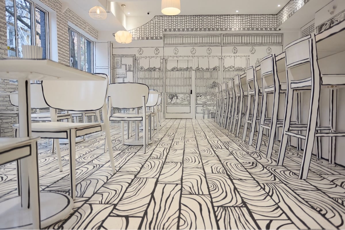
Whoa, look at the interior of this new Japanese restaurant in NYC called Shirokuro — all of the surfaces (floors, chairs, walls, counters, etc.) are painted to look like a 2-dimensional drawing. From Colossal:
“Shirokuro” translates to “white-black.” The New York Times shares that proprietor James Lim was inspired by an immersive, 2D restaurant he visited ten years ago in Korea, and he envisioned one of his own, now open in the East Village. To make the interior pop, he invited his friend, real estate agent and artist Mirim Yoo, to transform the space into an all-encompassing environment.
Here’s what it looks like with people and other non-b&w objects:

This reminds me of Alexa Meade’s work — it would be amazing to see a collab where Meade does up the servers (or guests) for a performance piece.
P.S. I want these 2-D Nikes. (via colossal)
Since 1997, using only Middle Ages tools & technology, a group has been building a medieval castle in a French forest.
In the heart of Guédelon forest, in an abandoned quarry, a team of master-builders is building a 13th-century castle from scratch. Quarrymen, stonemasons, carpenter-joiners, woodcutters, blacksmiths, tilers, carters and rope makers…are working together to revive heritage craft skills and to shed light on the world of medieval construction.
Here’s a quick, 2-minute video on the effort:
And here’s a longer look:
And from the Absolute History channel, a five-part series on how medieval castles are built, using Guédelon as an example; here’s the first video in the series:
If you find yourself in Burgundy, you can visit the castle — the construction is funded in part by visitors’ fees.
This is a really interesting video about something called the gang-nail plate, a construction innovation that enabled larger roofs to be built on houses, removed the need for internal load-bearing walls, and made the process of construction cheaper & more efficient.
While it helped streamline building processes and cut costs, it also encouraged rapid housing expansion and larger, more resource-intensive homes. The result was an architectural shift that contributed to suburban sprawl, increased energy demands, and homes increasingly treated as commodities rather than unique, handcrafted spaces. These changes reverberated through building codes, real estate markets, and even family life, influencing how we interact with our homes and one another.
The story of gang-nail plate illustrates an inescapable reality of capitalist economics: companies tend not to pass cost savings from efficiency gains onto consumers…they just sell people more of it. And people mostly go along with it because who doesn’t want a bigger house for the same price as a smaller one 10 years ago or a 75” TV for far less than a 36” TV would have cost 8 years ago or a 1/4-lb burger for the same price as a regular burger a decade ago? (via @mariosundar.bsky.social)
In this video, Sara Saadouni explains the three passive cooling techniques used by fellow architect Diébédo Francis Kéré in designing a school building in Burkina Faso, where temperatures can be quite warm all year. The roof is especially clever.
He introduced a curved double roof that created an air gap between the first and second roof. As the heat naturally rises and escapes into the gap, the prevailing winds quickly carry it away, accelerating this process and cooling the building more efficiently.
But that’s not all. The first roof is made up of perforated ceiling slabs, allowing the heat to escape more efficiently and therefore to be quickly transported by the wind.
The other genius idea was to also curve the roof, which allowed for the Venturi effect — a phenomenon where air speeds up as it moves through the narrower sections created by the curve and therefore boosting natural ventilation.
(via the kid should see this)
Trials rider Danny MacAskill finally got the chance to ride the angularly futuristic Adidas campus in Herzogenaurach, Germany.
The first time I got the invite to campus I immediately started riding the place in my mind. Riding all the rooftops, riding all the railings, you know, it’s a really interesting space. Not just anyone can go there! As soon as you see that kind of big overhanging piece of architecture or whatever, you immediately imagine the different things you could do up there. So, it was cool to finally get to come here to actually do it.
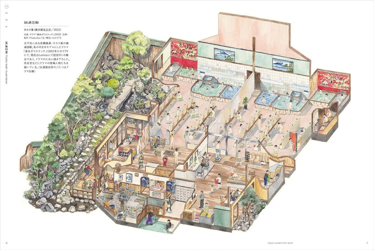
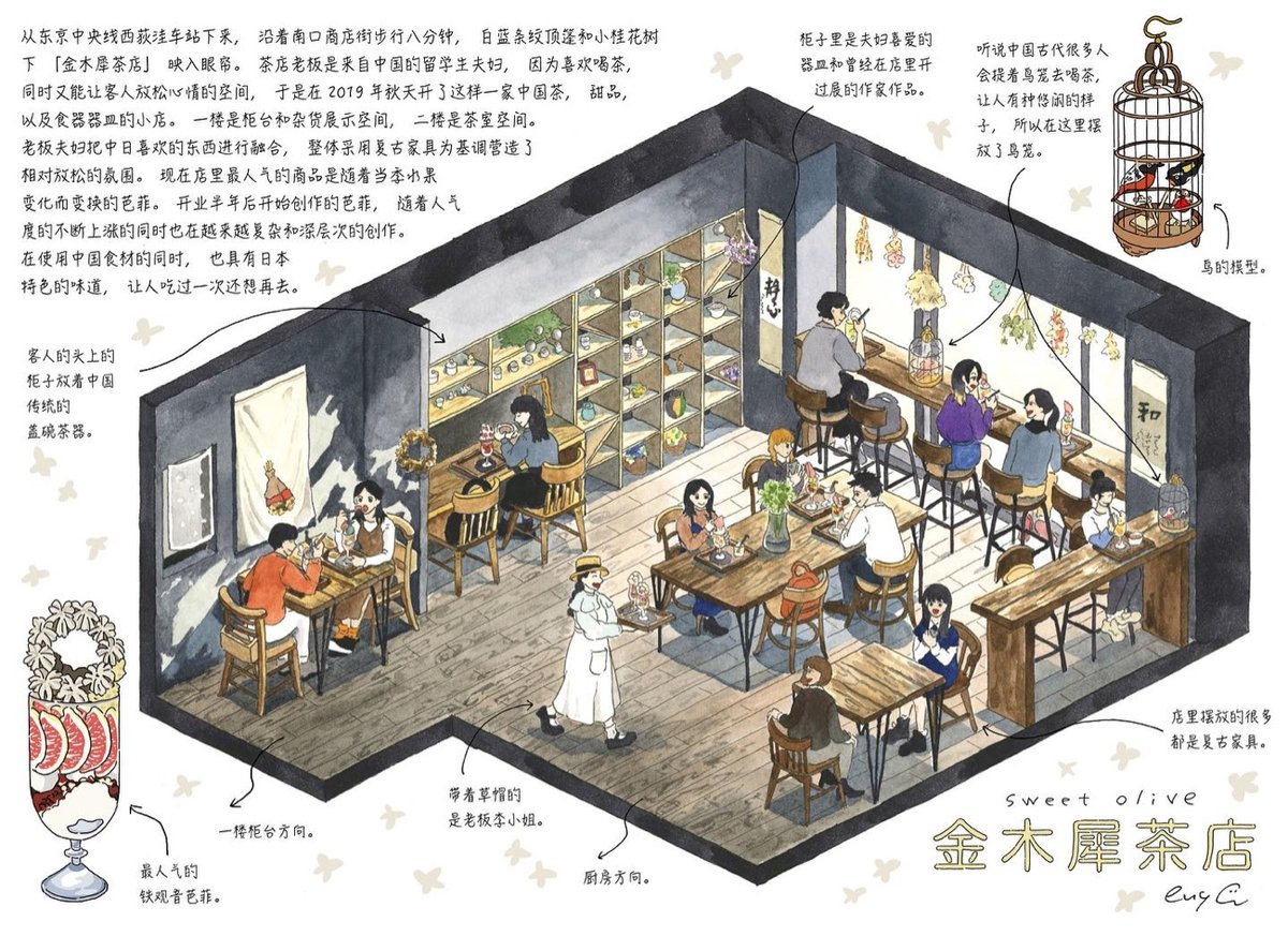
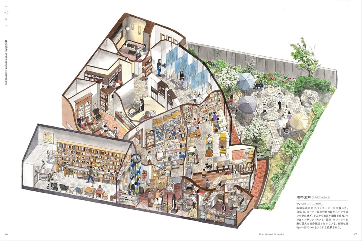
I love these isometric cutaway drawings by Japanese illustrator & architect Enya Honami. From Spoon & Tamago:
Honami is a skilled draughtswoman by trade, having obtained an MFA in architecture and working at a well-known Japanese architecture firm. But the grueling hours and workload eventually weighed on her physical and mental state and she fell ill, which turned out to be a blessing in disguise.
Enya’s doctor advised her to take some time off, and find a place where she can relax and warm her body. That’s how she discovered Kosugiyu, her local sento in Koenji. She quickly fell in love with her local hotbath and not only started working there but also began employing her architectural rendering skills to create illustrations of the space. Soon, others began asking her to draw their hotbaths as well and her clientele expanded from sento and even spread to kissaten.
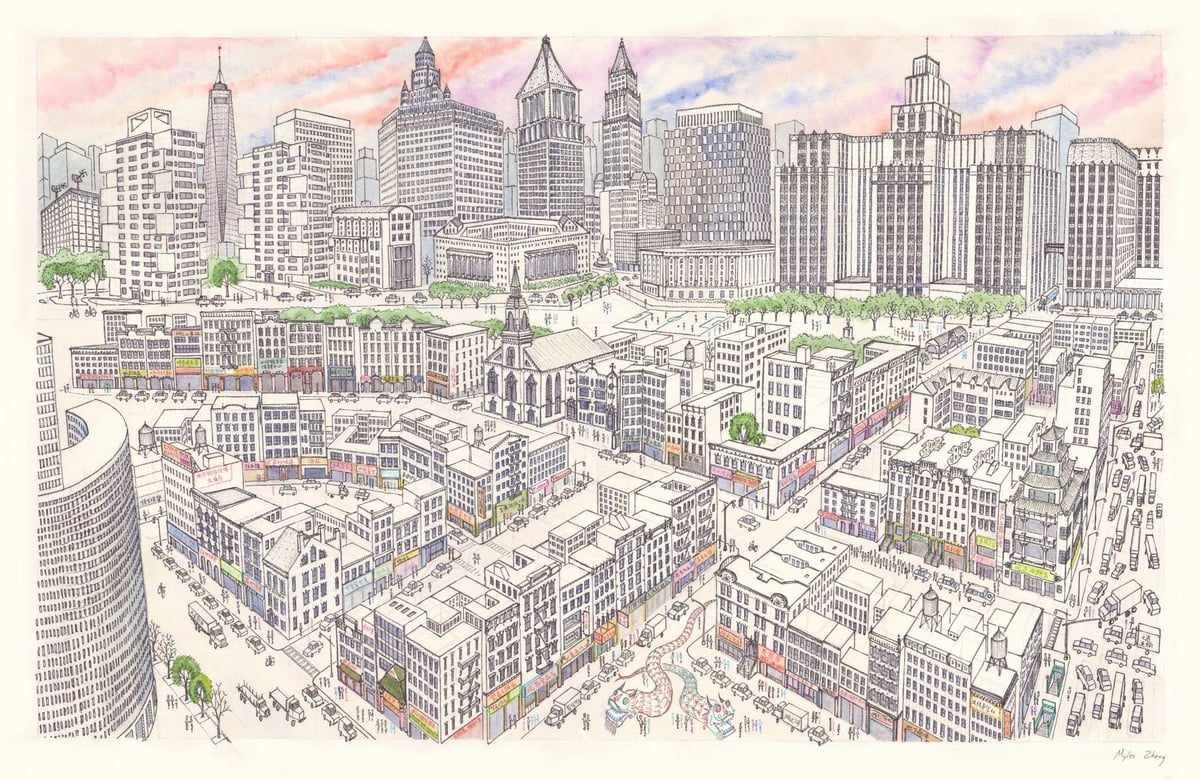
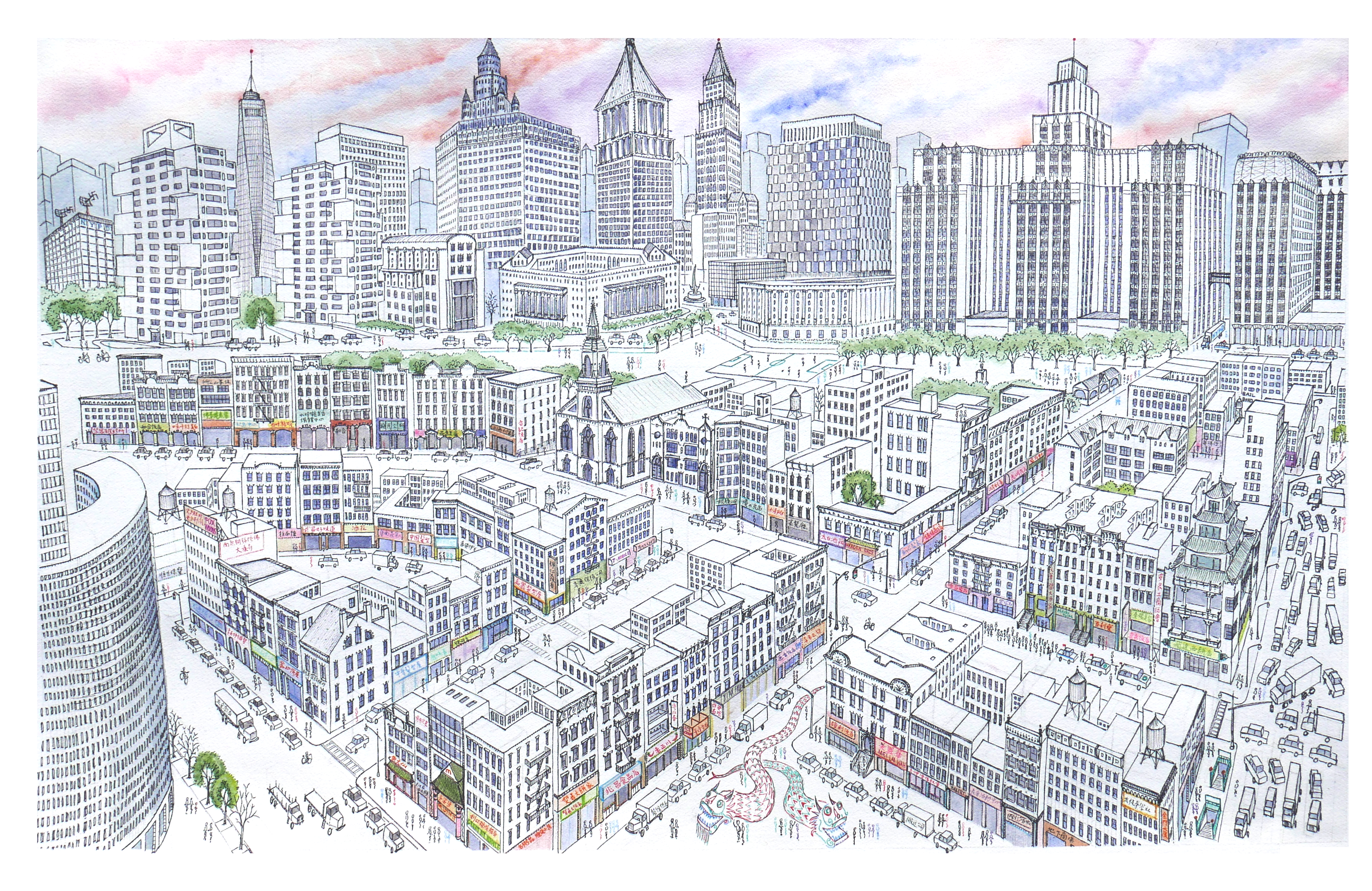
Myles Zhang, a PhD candidate in architectural history, created this drawing of Manhattan’s Chinatown several years ago.
Chinatown’s tenements are in the foreground, while the skyscraper canyons of Lower Manhattan rise above. This shows the area of Chinatown bordered by Bowery, Canal Street, and Columbus Park.
It took him around 60 hours to complete; he made a time lapse video of its creation:
There’s a very large scan of the image that’s worth looking at.
From Practical Engineering, this is a video explaining every type of bridge in just 15 minutes…or at least attempts to.
Without listing every bridge, there’s no true way to list every type of bridge. There’s too much nuance, creativity, and mixing and matching designs. But that’s part of the joy of paying attention to bridges. Once you understand the basics, you can start to puzzle out the more interesting details.
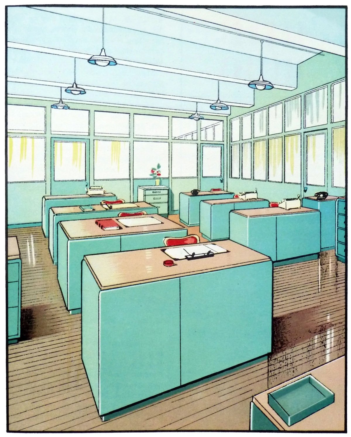
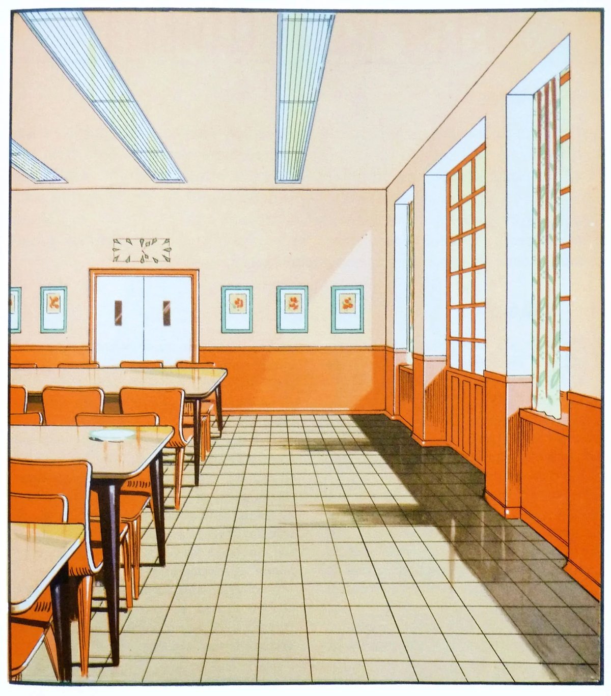
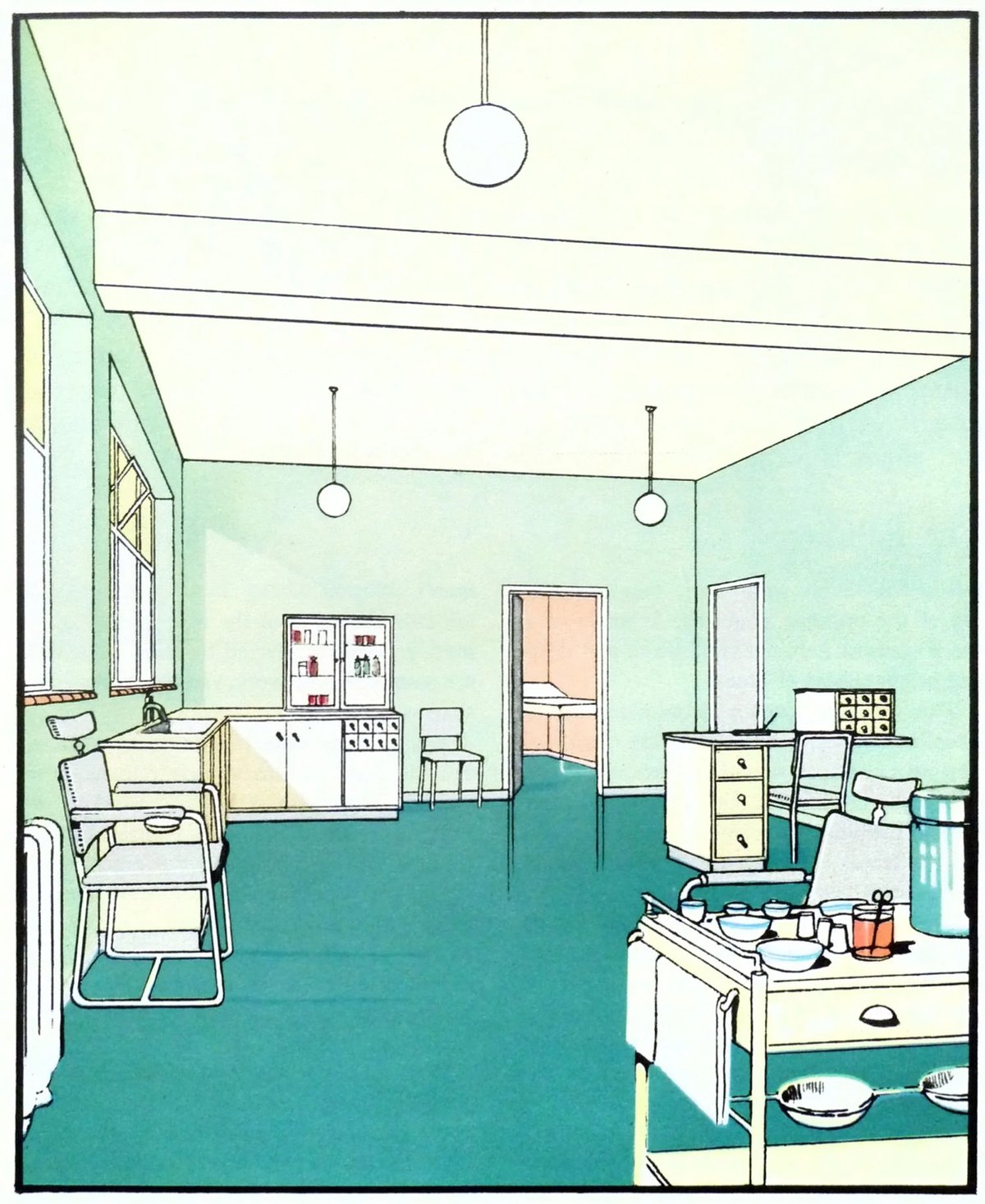
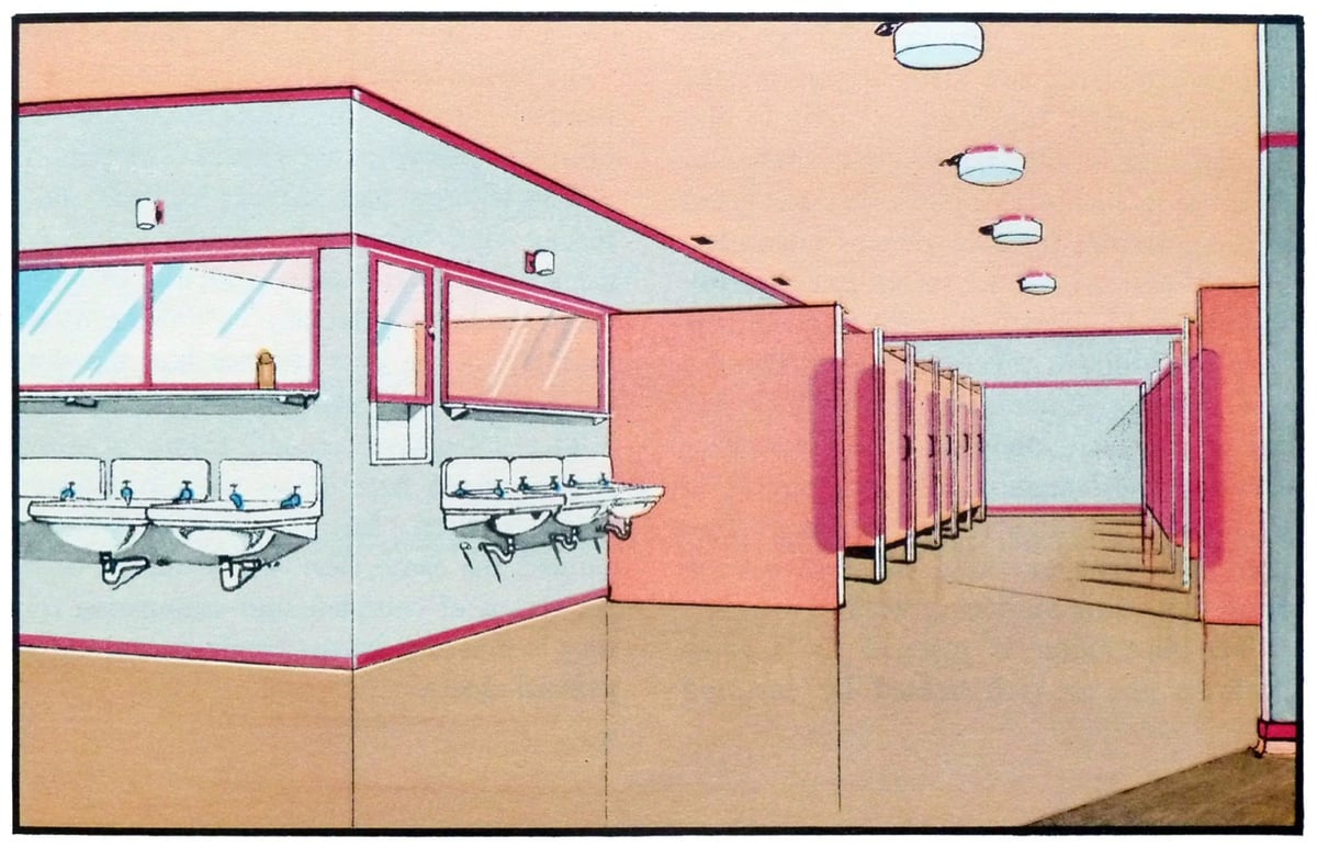
If you’re looking for some color palette inspiration, check out these scans from The Function of Colour in Factories, Schools & Hospitals (1930). Which is presumably a book? Whatever…the precision and colors of these illustrations are marvelous.
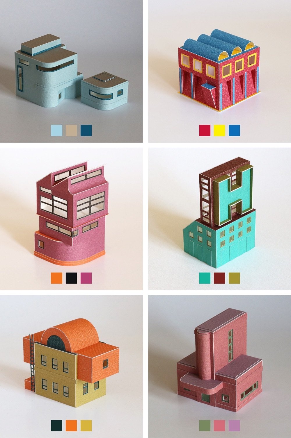
Papercraft artist Charles Young has been sourcing color combinations from this book and using them to construct extremely tidy and precise little buildings.
Starting in May 2020 I used Sanzo Wada’s Dictionary of Colour Combinations as inspiration for a new project introducing colour to my paper work for the first time. The book is made up of two, three and four colour combinations drawn from Japanese design and publishing in the early 20th century.
Check this out to get a sense of the scale — they’re really tiny. You can see many more of these on Instagram. It is actually hard to believe these are made out of paper and not computer generated. (via present & correct)
Designed by architect Thomas Randall-Page, the Cody Dock rolling footbridge opens with a “surprising and playful motion” to let boats pass through by simply rolling out of the way.
The bridge rolls on undulating rails cast into the concrete abutments on either bank. Ballast fills the top of each square portal, countering the weight of the bridge deck that connects them. This symmetry allows the whole bridge structure to smoothly role through 180 degrees to a fully inverted position facilitating movement of boats from the river to the dock. This finely balanced is this system allows the 13 tonne bridge to be operated via hand winches only.
Here’s a video about the then-proposed bridge from 2019 that shows the unique rolling mechanism:
And here’s a video from earlier this year that shows the design process and how the finished bridge works:
Designed by Olson Kundig Architects, the Maxon House features a studio that’s attached to the main house but can be rolled away on railroad tracks to be closer to the trees. From Dezeen:
The two-storey structure was based on the design of the “traditional caboose”. A workspace sits on the first level while the second, accessible via a steel ladder, serves as a cupola for taking in views and functions as a “calmer zone for creative exploration and restoration”.
The control panel that operates the rails was taken from a Burlington Northern locomotive, while the door colour and the wood used were directly informed by colours and materials commonly found on American trains.
The railroad ties for the track were repurposed from the Great Northern Railroad line, though the studio noted the steel tracks “are a much larger gauge than is typically used”.
There’s even a Wes Anderson connection (because of course there is):
Inspired by Wes Anderson’s love of trains in cinema, Maxon Railway takes some visual cues in the form of on-board artifacts and props from The Darjeeling Limited.
You can read lots more about the house and the railway, including more than you’d probably want to know about the history of rail travel and commerce in the Pacific Northwest.
In this video from Architectural Digest, architect Michael Wyetzner runs us through why American diners look the way they do. Early diners took their cues from trains:
So let’s take a look at a typical American diner. So the outside has a shape that’s reminiscent of a train. In fact, that’s how diners got their name. They’re named after the dining car on a train.
Many of the design elements in a diner are based on the necessities of dining on a train in a railroad car, like booth seating and counter seating, and an open kitchen.
So I like these two photos because they show all the elements that go into the classic American diner. On the exterior, you have that stainless steel smooth curvature, you’ve got that Art Deco typography. And then on the interior you have the checkered floor, you have the booths, you have the globes, and you have the jukebox.
In the early part of the 20th century, trains were the dominant form of travel. If you look at some of the earliest diners, they were in fact, actual train cars that were placed permanently on the ground.
Later, cars and space travel provided inspiration in the diner’s evolution.
Yesterday I posted about the 2023 Drone Photo Awards and one of my favorite shots was of a playground/park in Poland. My curious pal Neven tracked down more information about the park and, well, it’s so cool and cute!
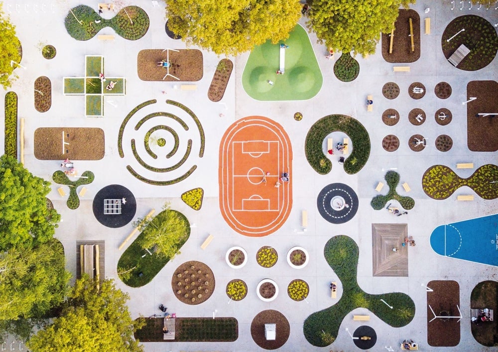
Here’s part of the description from the park’s creators, SLAS Architects:
“Activity zone” is a multifunctional public space which is the first phase of regeneration and integration of the University of Silesia campus with the urban tissue of Chorzów City.
The site is located in the place of the demolished military building with a number of old existing trees. “Activity zone” is designed as concrete platform strongly perforated and filled with a diverse programme that includes: students leisure zone, children’s play devices, fitness, individually designed elements of street furniture and greenery including all existing trees. Some parts of the garden are possible to develop by local seniors. The platform connects the diverse program, intensifies the use of the place and becomes itself an element of play. Variety of attractions enhance interactions between users of all age groups and integrates academic community with local inhabitants and the surrounding nature.
My only complaint: it’s maybe a little too small? But otherwise: top marks.
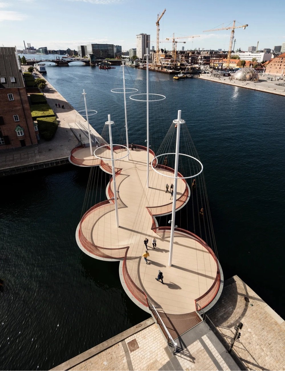
In 2015, artist Olafur Eliasson designed the Circle Bridge (Cirkelbroen) to span a canal in central Copenhagen. The pedestrian bridge was designed to slow people down a bit:
The bridge is made of five circular platforms, and it contributes to a larger circle that will form a pedestrian route around Copenhagen Harbour, where people — cycling, running, walking — can see the city from a very different perspective. As many as 5,000 people will cross this bridge each day. I hope that these people will use Cirkelbroen as a meeting place, and that the zigzag design of the bridge will make them reduce their speed and take a break. To hesitate on our way is to engage in bodily thought. I see such introspection as an essential part of a vibrant city.
Small boats can travel easily under the bridge but a section of the bridge also swings gracefully away to let larger boats pass. (via greg allen)
I’m totally charmed by this collection of Japanese company buildings from Spoon & Tamago that are shaped like things related to what they sell. For instance, here’s a chocolate factory that looks like a big chocolate bar:
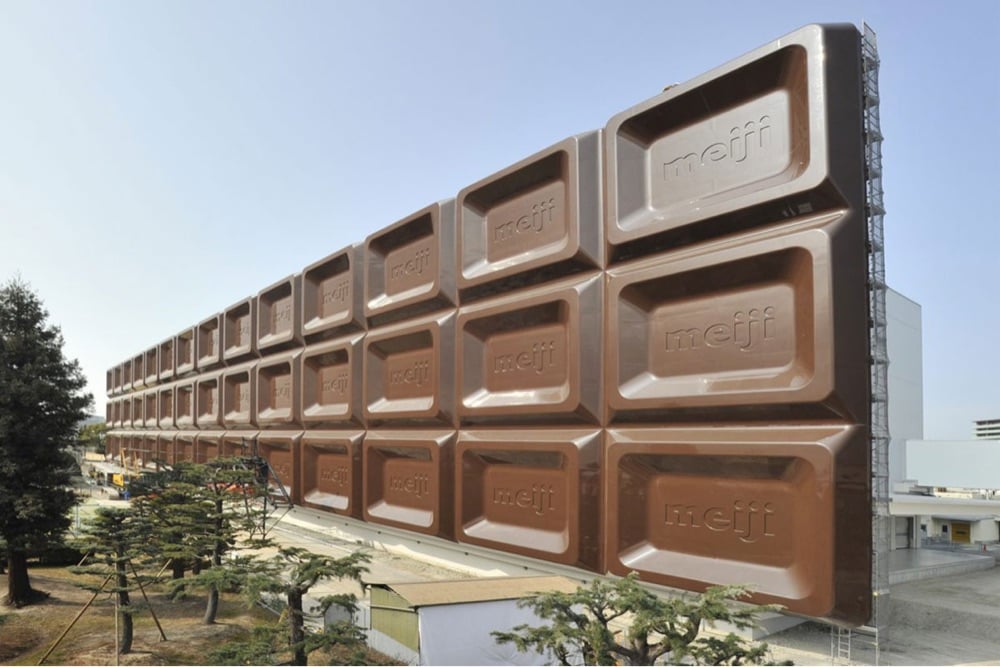
You’ll have to click through to see the rest, which include a building for a pet food company shaped like a dachshund and tanks at a brewery painted to look like beer glasses.
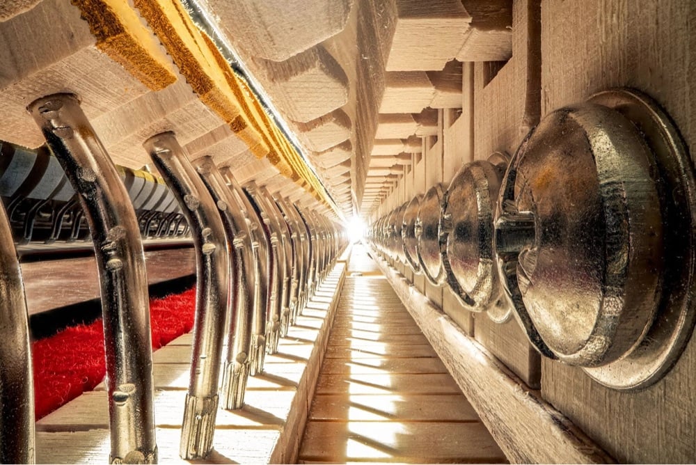
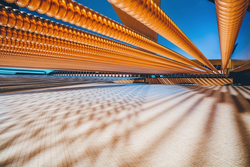
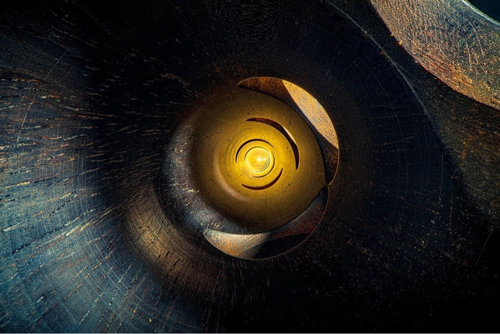
Charles Brooks takes photographs of the insides of musical instruments like pianos, clarinets, violins, and organs and makes them look like massive building interiors, enormous tunnels, and other megastructures. So damn cool. Some of the instruments he photographs are decades and centuries old, and you can see the patina of age & use alongside the tool marks of the original makers. Prints are available if you’d like to hang one of these on your wall.
And if you liked those, don’t miss these Dreamy Cave-Like Photos Taken Inside Musical Instruments. (via moss & fog)
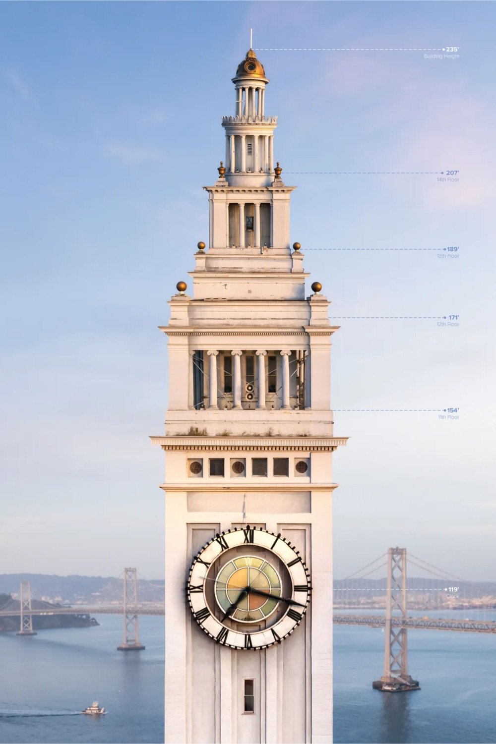
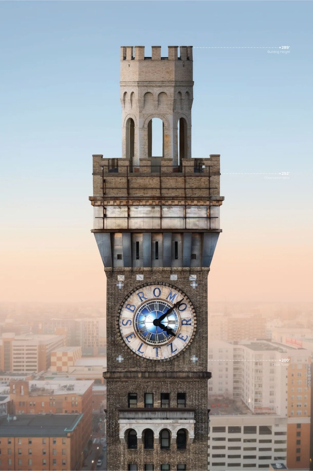
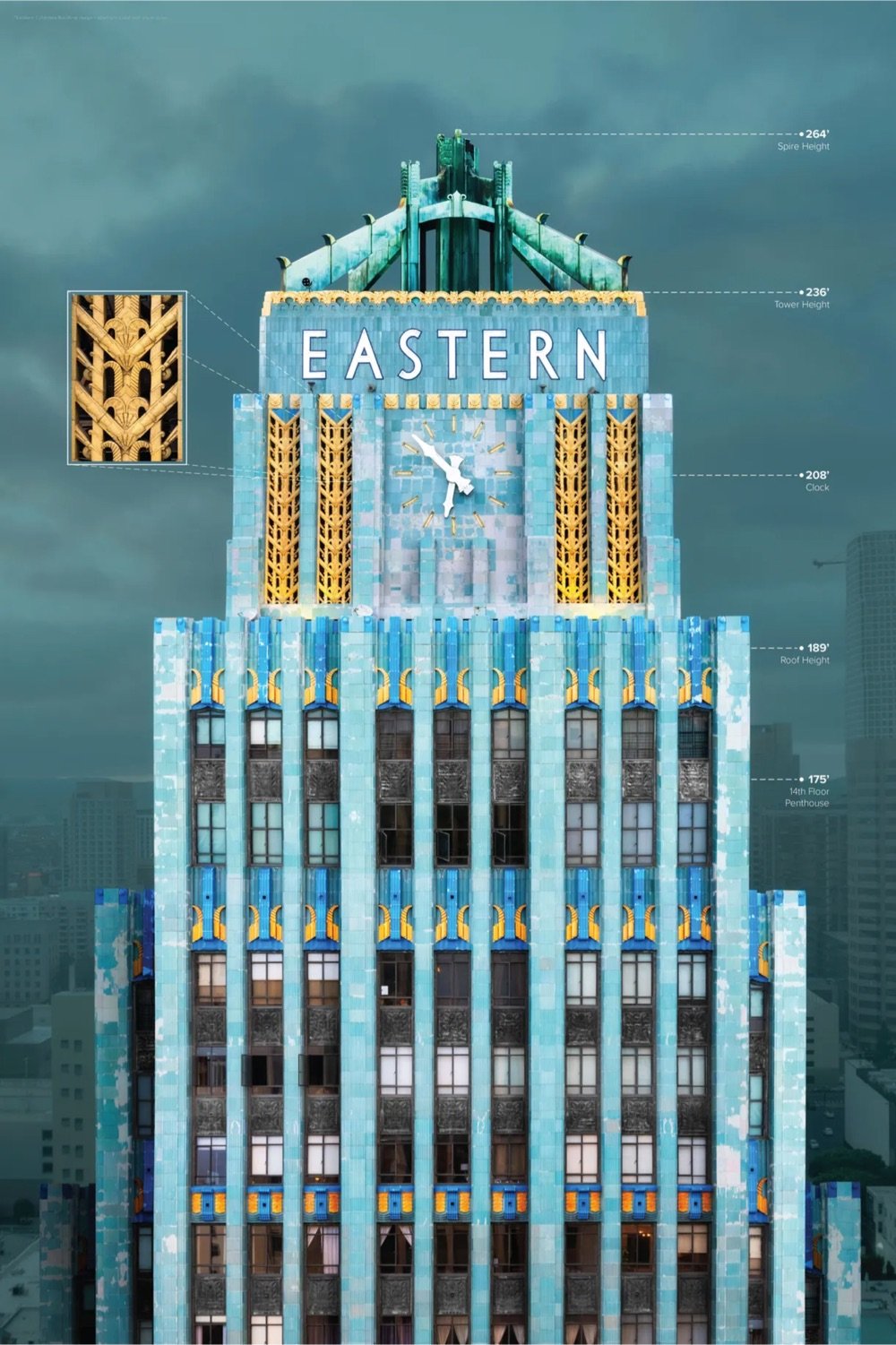
Using drones, a team led by photographer Chris Hytha has been traveling around the country capturing images of the tops of some of America’s most beautiful and notable early 20th century skyscrapers.
The prosperity of early 20th century America resulted in a boom of skyscrapers that still tower over cities across the country today. Focusing on the character and craftsmanship on display at the top of these landmark buildings in a way that can’t be seen from street level, the Highrises Collection reveals fascinating details and stories of these distinctly American icons.
They’ve done almost a hundred of them so far and are planning on adding about 100 more to the tally before they are finished. Hytha recently shared some of his favorite Art Deco buildings from the project. (via @mwilkie)
Based in Dubai, video artist André Larsen spends a lot of time shooting the Burj Khalifa which, at 2,722 feet and 163 floors, is the world’s tallest building. In this video, a drone piloted by Larsen dives the entire height of the building…and it’s kind of astounding just how much of it there is. Floors whiz past by the dozen and still there’s so far to go.
I was skeptical but if you listen carefully, there are some really solid ideas in this video on why designing cities around lots of cars makes sense.
Brb, currently buying some cars and moving to cities.
Dang, look at these new mosaics by Kiki Smith and Yayoi Kusama for Grand Central Madison, the MTA’s newest LIRR station.
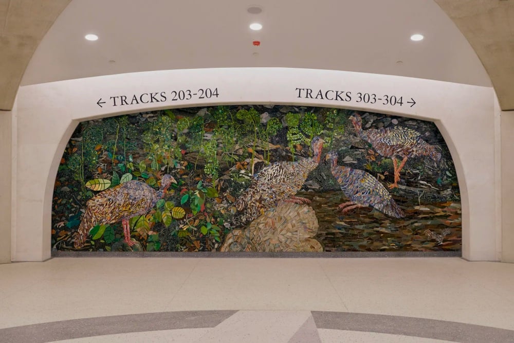

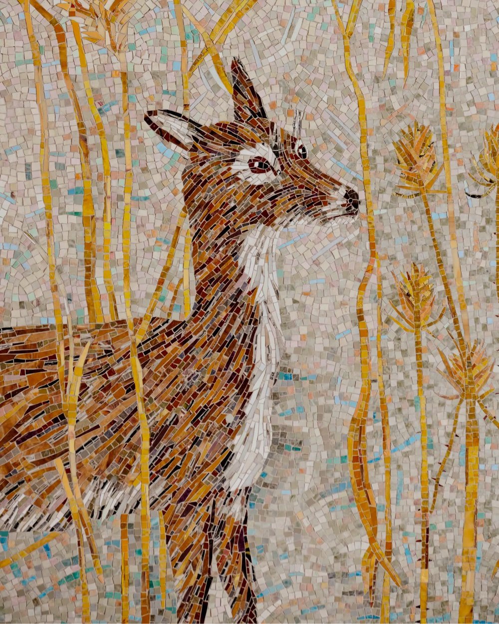
As a former (and future?) New Yorker, I know a lot of the city’s dwellers appreciate the MTA’s commitment to public art and to mosaics in particular. Like the Dude’s rug, it really ties the city together.
In this video, using before-and-after satellite imagery, Claire Weisz of WXY, an architecture and urban design firm, explains how her company helped redesign three of NYC’s unruliest intersections: Astor Place, Cooper Union, and Albee Square. Unsurprisingly, the redesigns all involved taking space away from cars and giving it to larger sidewalks and more green space, to benefit people other than drivers.
The bagworm caterpillar is quite the animal architect. In preparation for its transformation into a moth, the caterpillar builds itself a house that it carries around on its back out of materials it finds in its habitat, like sticks or leaves. When it enters the pupa stage, the caterpillar fastens the house to something solid and hunkers down inside.


I couldn’t source the top photo but the bottom two were taken by John Horstman, who has a bunch of incredible photos of bagworm caterpillar houses on Flickr. Nicky Bay has also taken many photos of bagworm caterpillar architecture.
Older posts
Socials & More