The Function of Colour in Factories, Schools & Hospitals (1930)
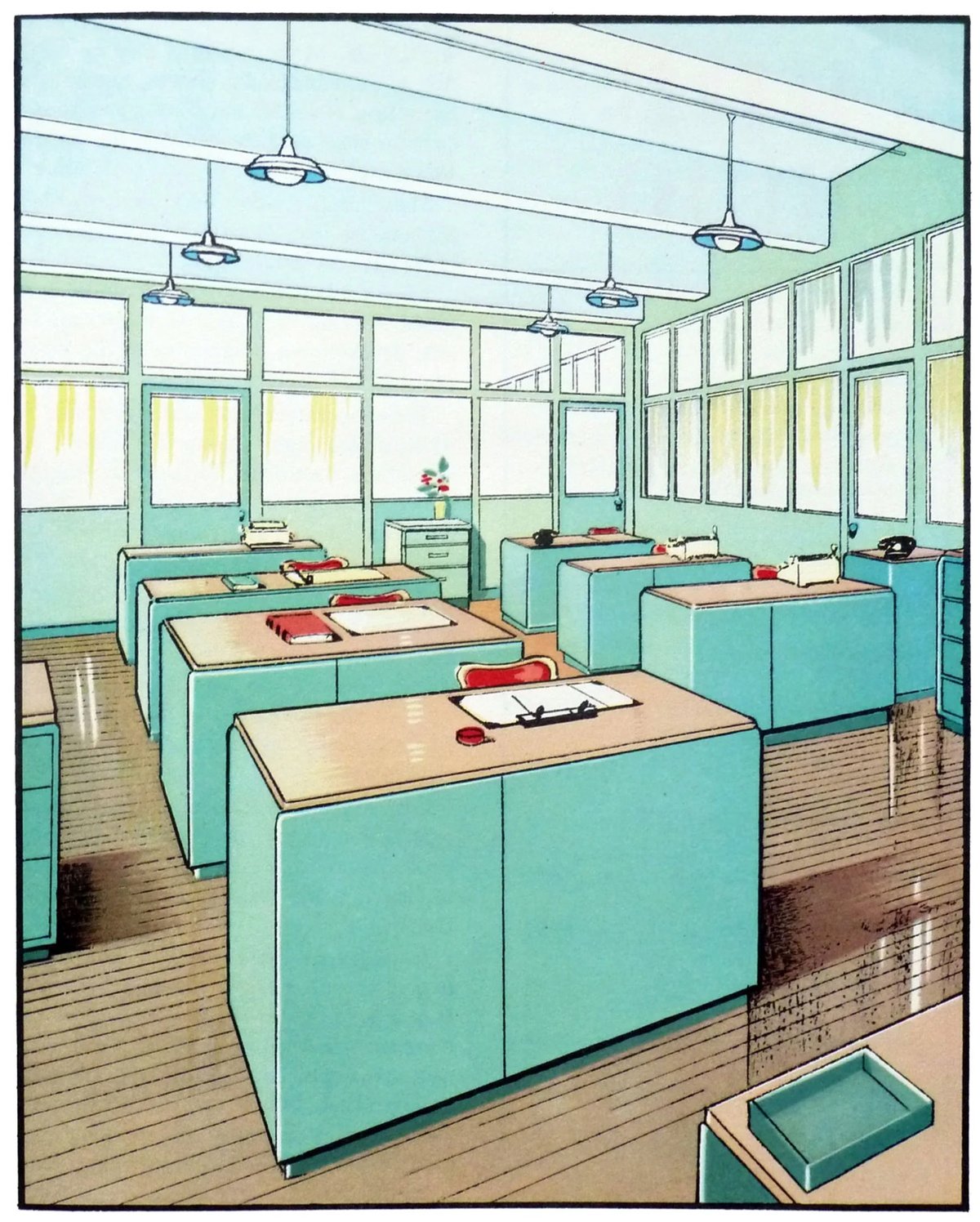
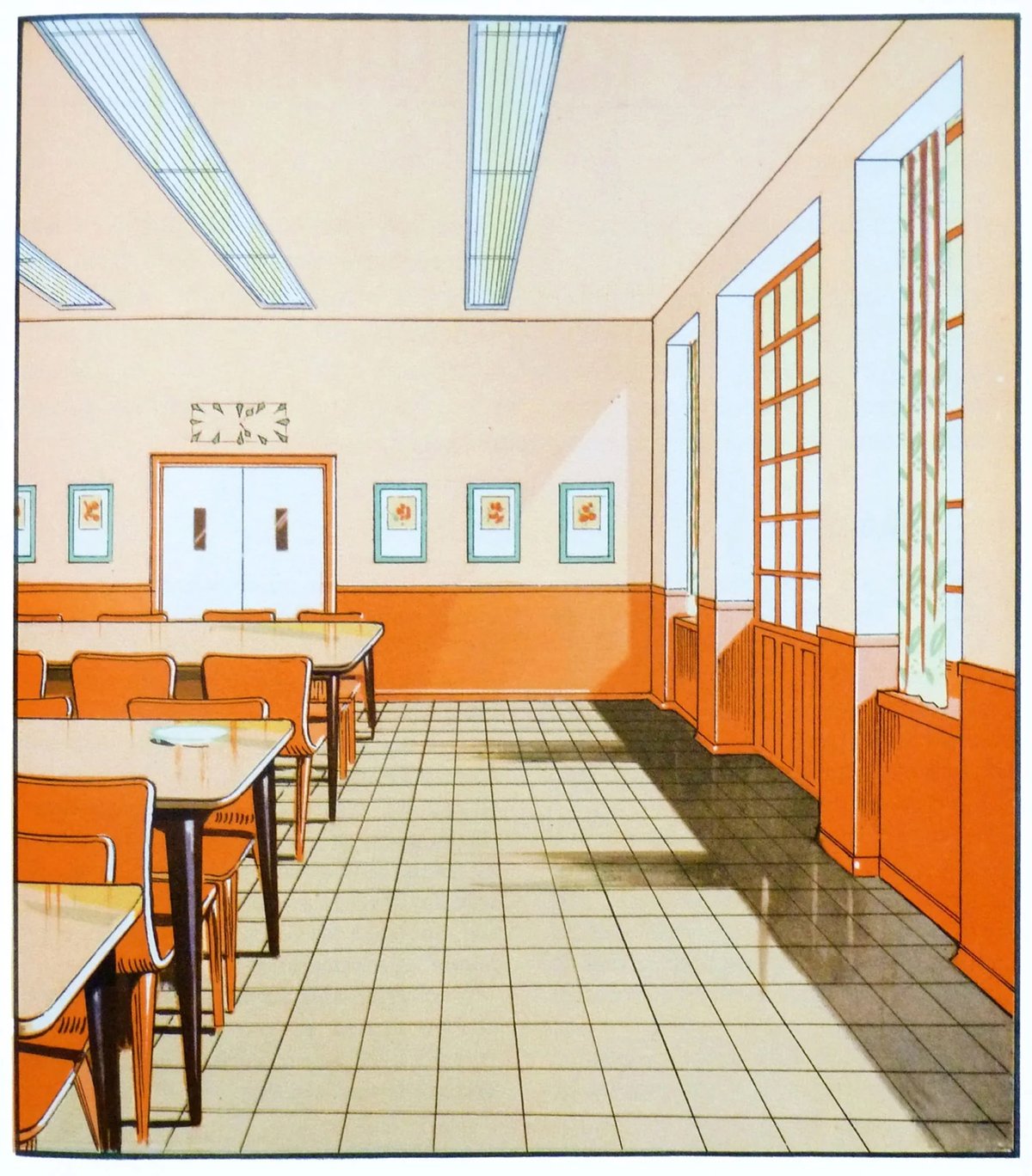
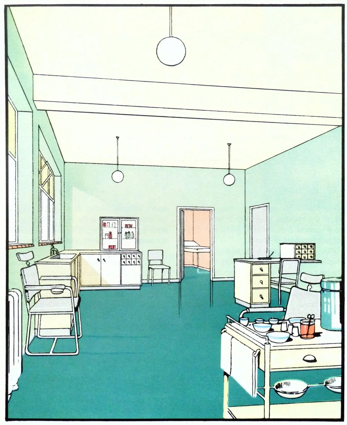
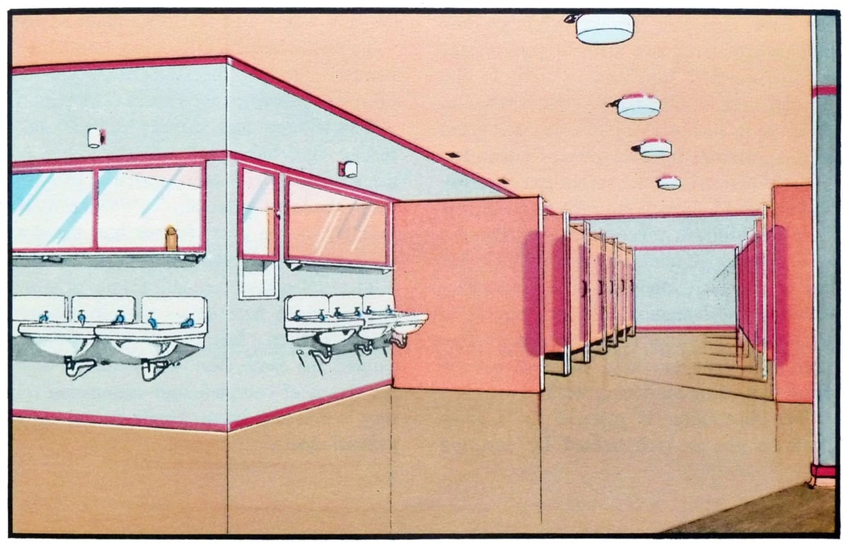
If you’re looking for some color palette inspiration, check out these scans from The Function of Colour in Factories, Schools & Hospitals (1930). Which is presumably a book? Whatever…the precision and colors of these illustrations are marvelous.

Comments 9
thread
latest
popular
I wonder how much of this is built on things like Kandinsky, "Über das Geistige in der Kunst" ("On the Spiritual in Art")? Mentally unearthing long ago undergrad theses where I read all his colour theory...
Reminds me of Owen Pomery, who I think I learned about from reading kottke.org. I love how clean and tidy the styles are, but still really warm, too. https://kottke.org/19/10/narrative-illustrator-owen-pomery
Wow, P&C providing zero useful information about the source material. "Scanned by us." Really? Grrrr.
This would arguably slot nicely into my collection of early 20th century German industrial photography books, but only if I can figure out what it is...
Yeah I poked around for a book by that title to no avail.
As best I can tell, it was published by a British paint company that seems no longer to be in business (though I did find a paint company with that name still in India & Bangladesh).
I emailed P&C, and they updated the page with the name of the book. Looks like it was a brochure-ish thing from a paint company. Ephemera like that is very hard to track down. They say they'll put their copy up for sale...
P&C emailed me again to add:
Reminds me of Herge's Tintin background drawings. → https://i.pinimg.com/originals/0f/1d/45/0f1d45eeae317eb8e0ebb0f4d9229a6f.jpg
Present and Correct posted some more scans from the book.
If you feel like this comment goes against the grain of the community guidelines or is otherwise inappropriate, please let me know and I will take a look at it.
This thread is closed for new comments & replies. Thanks to everyone for participating!