This morning, Carly Rae Jepsen released a new album called Dedicated Side B (stream here). Amidst rumors of fresh music, the pop star had been teasing fans with its release all week, including this video of a simulated chat posted to Twitter and Instagram yesterday.
Long-time readers will recognize that the chat text is displayed with typeface called Silkscreen, which I designed back in 1999, an era of small monitors and even smaller fonts.
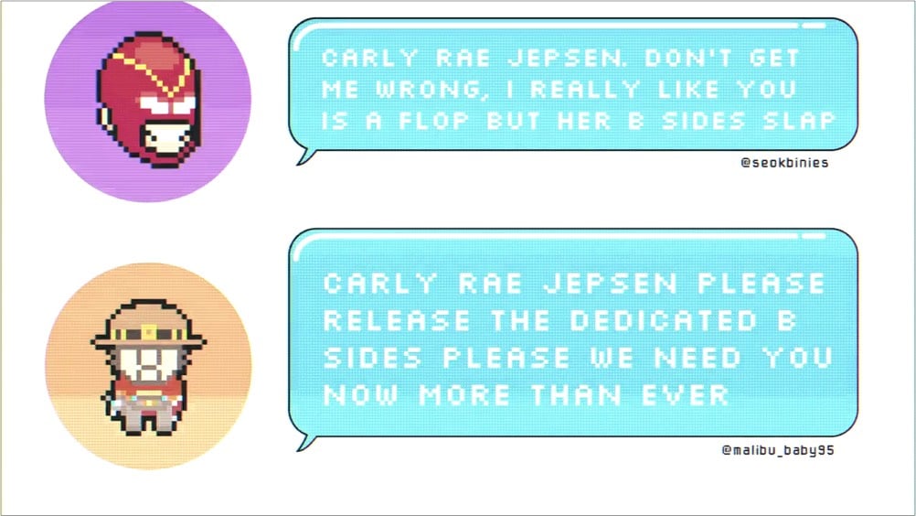
Back in the day, Britney Spears used Silkscreen on her website, and now it’s come (sorta) full circle with Jepsen. Silkscreen pops up here and there every few months, and I’m glad to see people are still getting some use out of it. It was retro when I made it and now its retro-ness is retro. Culture is fun! (thx to @desdakon for spotting this)
In addition to being well-suited to web graphics, Silkscreen works equally well in cross-stitch.
FontStruct is an awesomely simple online font creation tool. Just draw on a grid with simple Photoshop-like tools, save, and download a TrueType version of the fonts you’ve just created. If this had been around when I made Silkscreen, it would have taken so much less time.
Over at H&FJ, the H talks about the &.
As both its function and form suggest, the ampersand is a written contraction of “et,” the Latin word for “and.” Its shape has evolved continuously since its introduction, and while some ampersands are still manifestly e-t ligatures, others merely hint at this origin, sometimes in very oblique ways.
He goes on to describe several ampersands they’ve designed for their typefaces. When designing the ampersand for Silkscreen, I came up with a solution that many continue to dislike:

If you’re logged in to Flickr, you can see it action at a more appropriate size in the “prints & more” label above a photo. The symbol is basically a capital E with a vertical line through the middle…an e-t ligature that’s really more of an overstrike. I fashioned it after the way I hand-write my ampersand, which I got from my dad’s handwriting1. I don’t know where he got it from; it’s not a common way to represent that symbol, although I did find a few instances in the list of fonts installed on my computer.
I didn’t think about this way at the time, but the odd ampersand is one of the few distinguishing features of Silkscreen. There’s only so many ways you can draw letterforms in a 5x5 pixel space so a lot of the bitmap fonts like Silkscreen end up looking very similar. The ampersand gives it a bit of needed individuality. (The 4 is the other oddish character…it’s open at the top instead of diagonally closed.)
[1] Now that I think about it, I borrowed several aspects from my dad’s handwriting. I write my 7s with a bar (to distinguish them from 1s), my 8s as two separate circles rather than a figure-eight stroke, and my 4s with the open top. Oh, and a messy signature. ↩
Erik Spiekermann explains how Nokia’s corporate typeface came to be. Looks like it was based on one of Nokia’s onscreen bitmap fonts. I’ve always wanted to create a “real” version of Silkscreen like that.



Socials & More