kottke.org posts about typography
This is one of several alphabets assembled by Belgian type designer Clotilde Olyff from stones collected at the beach.
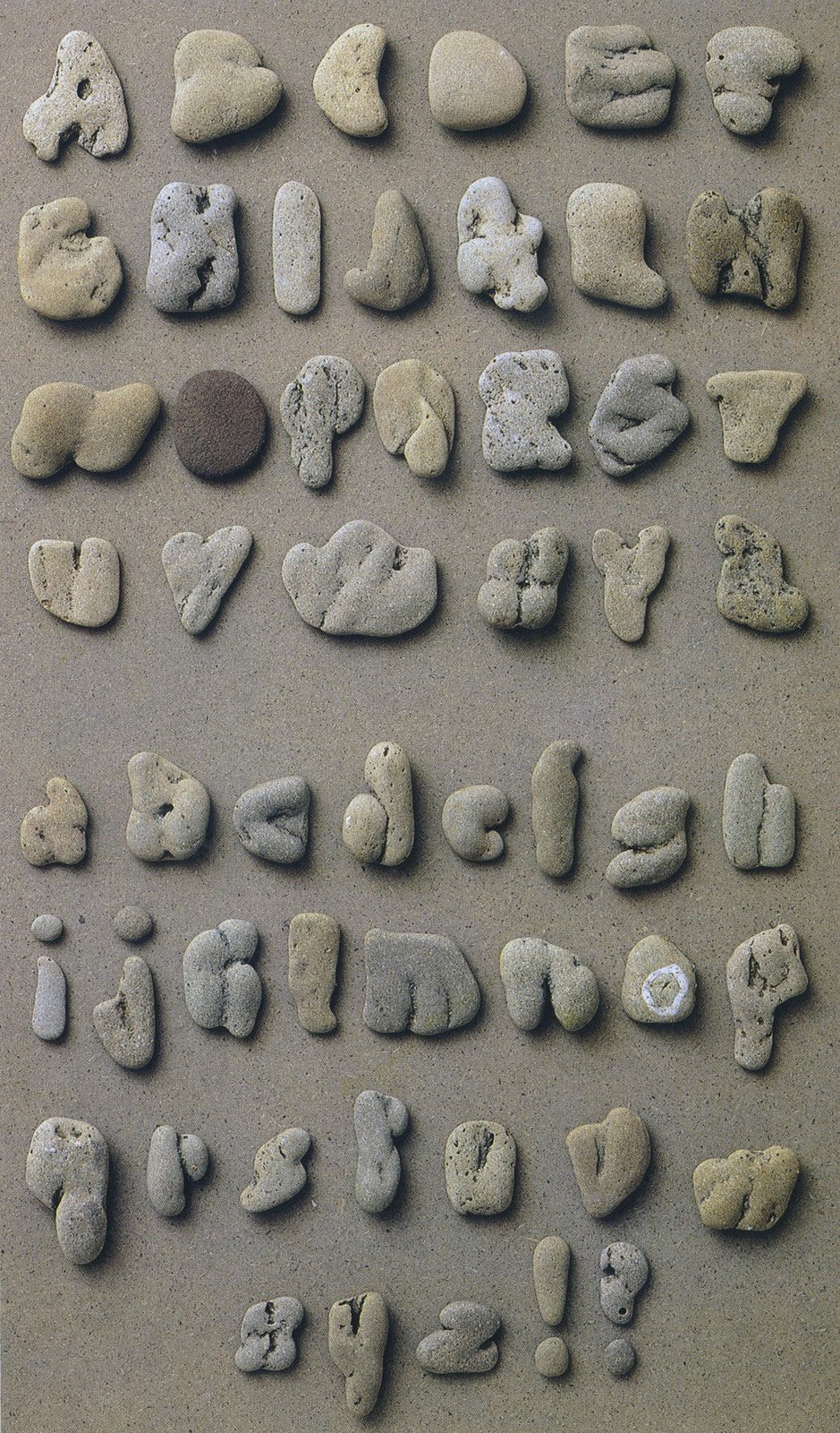
Here are a few more examples, some of which were featured in this book called 3D Typography:
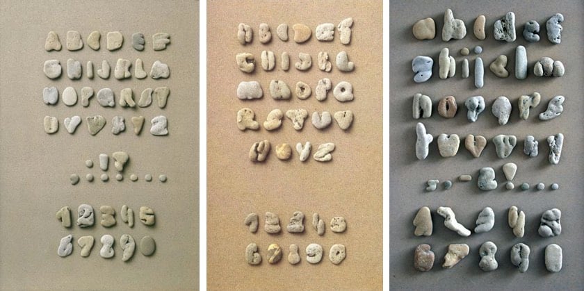
Well, I guess I have a new beachcombing activity for when I get tired of skipping rocks.
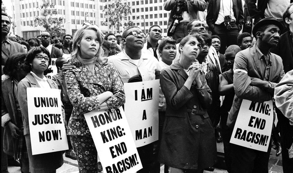
Vocal is a type foundry that makes typefaces that highlight the history of underrepresented people “from the Women’s Suffrage Movement in Argentina to the Civil Rights Movement in America”. For example, the Martin typeface is based on signs carried by marchers in the streets of Memphis after the assassination of Martin Luther King Jr.
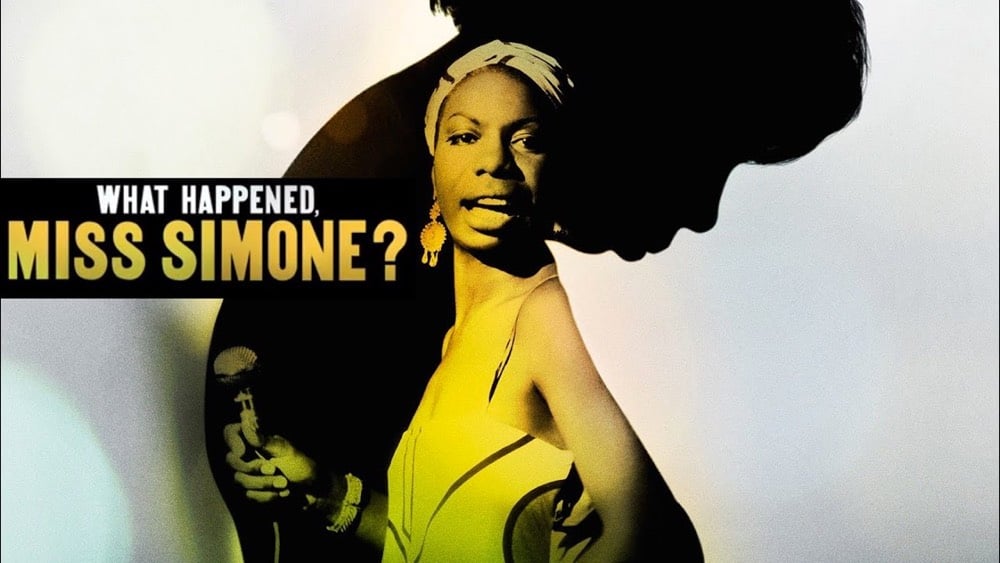
Netflix used Martin for What Happened Miss Simone?, Liz Garbus’ Nina Simone documentary:
(via @c_wolbrecht)
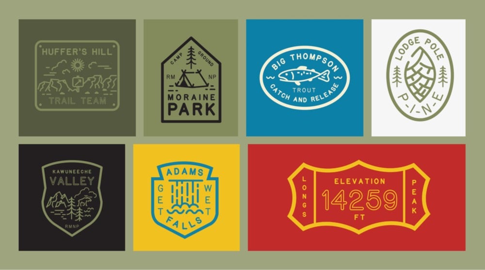
National Park is a typeface designed “to mimic the National Park Service signs that are carved using a router bit”.
I saw those familiar words. Set “National Park Service, United States Department of the Interior” — style. I wondered if it actually was a typeface or “font” that anyone could download and use? Do park rangers have this as a typeface on their computers to set in their word docs, pdfs and power point slides?
I had a sketchbook with me and took some rubbings of the letterforms and asked my friend Miles Barger, the Visual Information Specialist for Rocky, if he had the typeface. He asked the sign shop. No one has it? Turns out it isn’t a typeface at all but a system of paths, points and curves that a router follows.
The typeface comes in four weights and is available as a free download.
As part of their recent announcement of a new web design system for US government websites, the General Services Administration has also introduced a new typeface called Public Sans.
USWDS 2.0 adds built-in support for custom typefaces, and sometimes you need one that’s simple, neutral, and isn’t Helvetica. Public Sans is an open source, free license typeface (SIL Open Font License 1.1) designed and maintained by USWDS, adapted from Libre Franklin. Just as with our components, we intend Public Sans to be an example of how to design an accessible open source typeface with contributions and feedback from the public — to deliver a useful, neutral, sans serif and continuously improve it.
Always interesting when typefaces are described as “neutral”. I’ve never found that to be the case…
Monotype has introduced a new version of the Helvetica typeface called Helvetica Now.
Helvetica Now is a new chapter in the story of perhaps the best-known typeface of all time. Available in three optical sizes-Micro, Text, and Display-every character in Helvetica Now has been redrawn and refit; with a variety of useful alternates added. It has everything we love about Helvetica and everything we need for typography today. This is not a revival. This is not a restoration.
This is a statement.
Typographer Erik Spiekermann says:
This is the typeface Max Miedinger and Eduard Hoffmann would have designed back in 1957 if they had known about offset printing, small screens, browsers, digital design tools and UI designers.
I don’t know the author or typographer behind The Temporary State. There’s a contact address that reads “B. Tulskaya ul. 2-571, Moscow, Russia, 115191.” But Mx. Tulskaya (if that’s indeed the author) has made an outstanding pocket history of the use of italics in type, partly to defend against the fact that The Temporary State’s fonts do not use an italic typeface.
I knew, for instance, that Venetian printer Aldus Manutius is generally credited with introducing italics into European print (partly, the histories say, to imitate Latin handwriting, and partly as a space-saving device). I did not know that after other printers began to copy Manutius’s use of italics, the Venetian Senate granted Aldus exclusive right to use them.
I knew that Italian futurist poet and manifesto-writer Filippo Marinetti championed a wide range of typographic innovations; I did not know (or had forgotten) that he wished to reserve italic type for “a series of similar and swift sensations,” while bold would be used for the imitation of heavy tones, and so on. A kind of emotional functionalism in type.
It is strange, how Marinetti in his call for revolution against “the Poetry Book” doesn’t see any problem with italics. Somehow, Roman numerals are an issue, but the use of highly decorative imitation of a 16th century pretty handwriting is a futuristic expression, not part of the “typographic harmony” ensemble. It is even stranger, that he doesn’t address the application of italic itself, as his idea of highlighting the page with «3-4 colors and 20 different typefaces» is very close to how the use of italic is regulated in the Chicago Manual. The only difference is: where Marinetti suggests «20 different typefaces», Chicago suggests only one — italic. So, seemingly to achieve Marinetti’s idea all that is needed is to diversify the means of text highlighting. And it’s not like there are no alternative typographic traditions, which could be used to substitute the italic.
Much of the article is devoted to this; how you can achieve the typographic effect of italics (emphasis, foreign words, titles, etc.) without using italic type. Here the examples are legion. In German blackletter, foreign words (especially in Roman languages) would be put in Roman type, while emphasized words or phrases would be in boldface. In Cyrillic printing, especially in the Soviet period, you see “sperrsatz,” or wide spacing, to denote emphasis.
Bauhaus, following the German blackletter tradition, forsook italic typesetting altogether, opting for a combination of boldface, sperrsatz, and fonts of different sizes, all of which achieve the effect of italics without the pretense of adopting an old Latin handwriting style.
Since few social media networks support bold and italic typesetting, it’s interesting to think about the range of ways users still suggest italics or the effect of italics.
There’s pseudo-Markdown, in the form of
*italics*
or
_italics_
Of course, there’s
ALL CAPS
There are also memes and GIFs, which are a way of both drawing emphasis to text and giving it an emotional characterization that go far beyond what Marinetti could dream of with his really quite limited notion of “3 or 4 different colours and 20 different typefaces on the same page. That text itself would and could be animated, that it could be superimposed on a miniature movie that would explode into mostly-text networks, is a future Marinetti might have embraced, but one he couldn’t quite fully see.
(Via Robin Sloan)
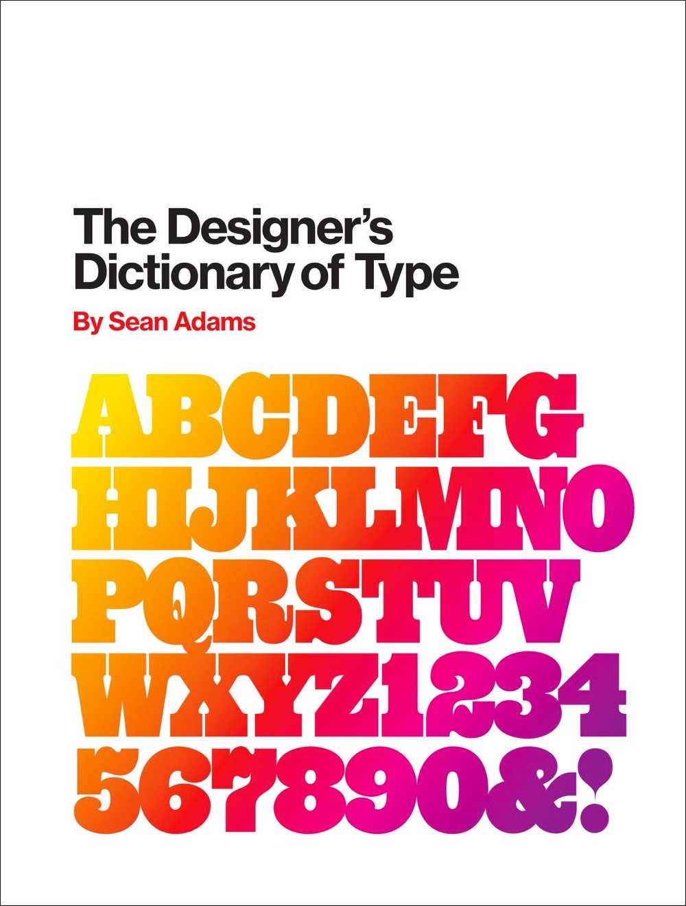
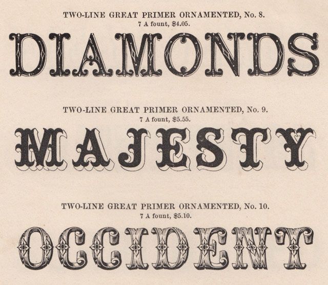
In his forthcoming book, The Designer’s Dictionary of Type, Sean Adams profiles 48 of the best-known typefaces in the world, from Helvetica and Garamond to Cooper Black and OCR-A. Fast Company has a short excerpt.
Cooper Black has a close association with the 1970s; however, Oswald Cooper actually created the typeface in 1921. Cooper designed the Black weight after releasing a larger Cooper Old Style family of fonts. The forms are based on old style serif typefaces but are “fat” and soft. This type of letterform gained popularity between 1910 and 1920. Other designers worked with similar forms, such as Frederic Goudy and his typefaces Goudy Heavy Face and Pabst Extra Bold. In the 1960s and 1970s, designers looking for alternatives to cold Swiss modernism and Helvetica looked back and revived Cooper Black. Its soft forms worked exceptionally well with phototypesetting, which allowed for extremely tight kerning. Both the counterculture movement and low-end DIY design adopted Cooper Black. By the end of the 1970s, the typeface was ubiquitous, but it again fell out of fashion as the New Wave movement gained momentum.
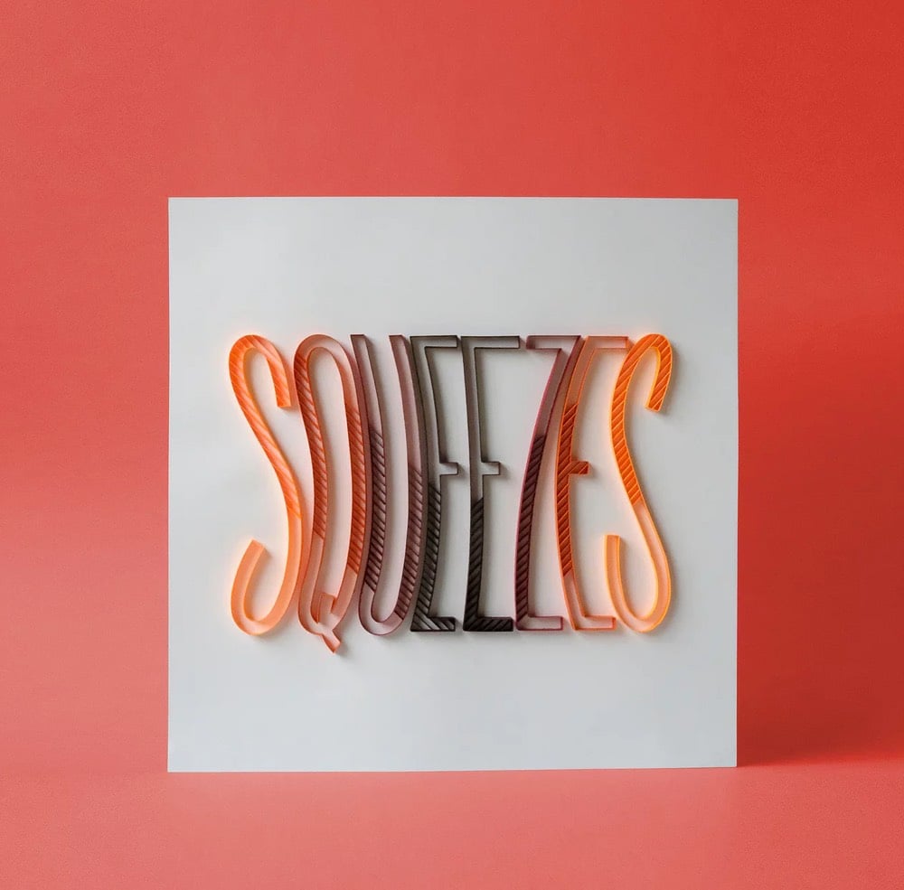
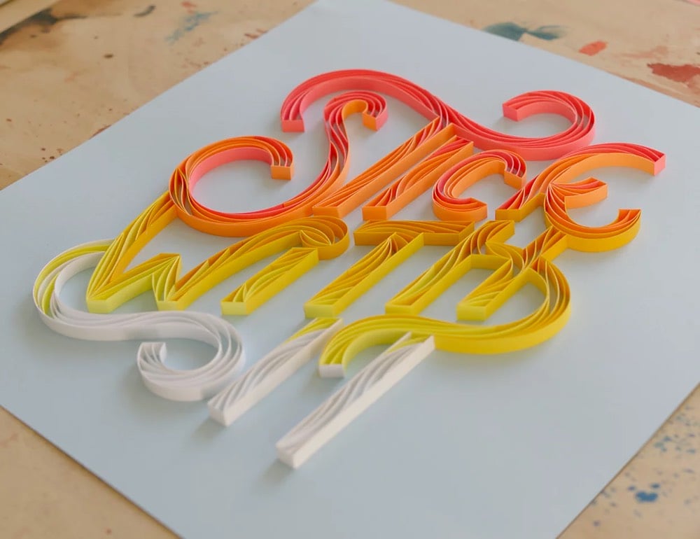
Paper artist Alia Bright combines papercraft and typography to make these colorful, um, sculptures? Texts? They’re super-cool, whatever you call them. Here’s a close-up of one of the pieces, all made by hand of course:
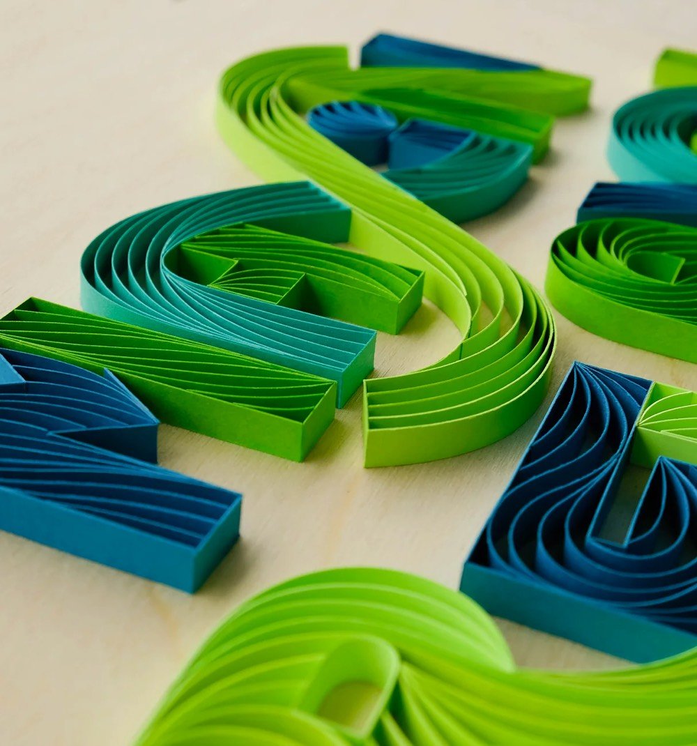
You can keep up with Bright’s newest work on Instagram. (via swissmiss)
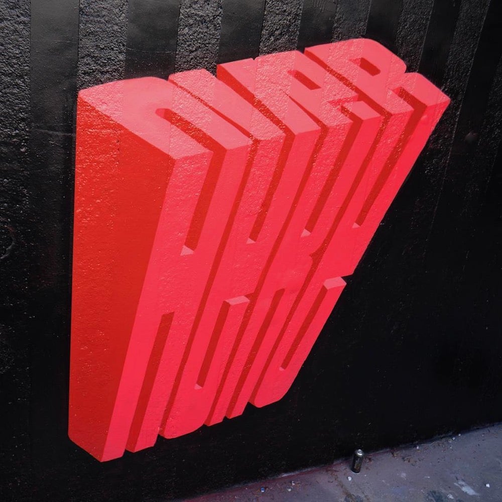
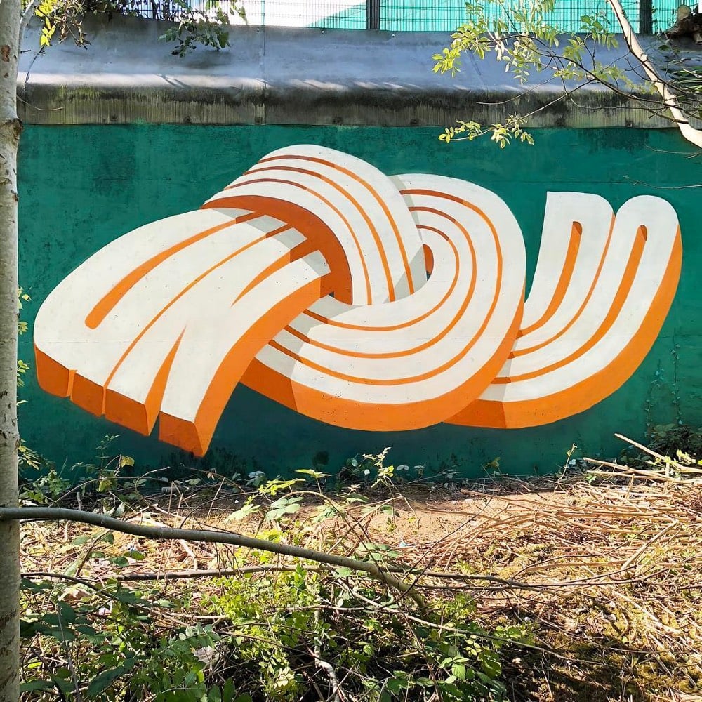
I love this chunky/wavy typographic street art by Pref. He spoke with Colossal back in May about his art.
“Since then I have pushed and experimented with this idea of overlapping words, seeing how many I can fit into the space of one word, and then slowly boiling it down and simplifying this idea to become more legible,” he tells Colossal. “This in turn lead more to the use of ‘typography’ throughout my style as you see today. I have always been interested in the idea of graffiti speaking to the general public, rather than just other graffiti writers, and readable letters or a more ‘typographic’ approach has been a good route to that.”
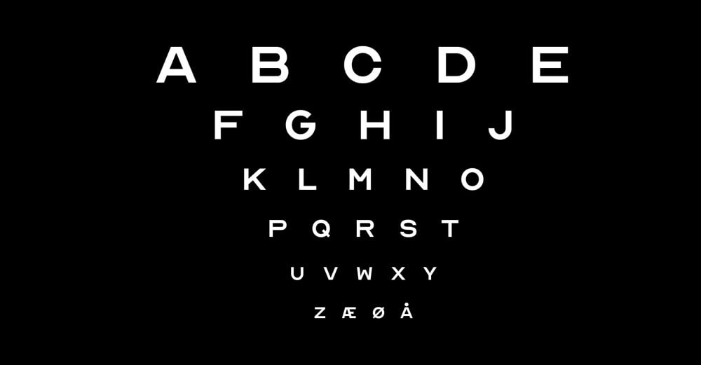
Eye charts at your optometrist’s office typically only have 10 letters on them: CDHKNORSVZ. Inspired by that lettering, creative agency ANTI Hamar and typographer Fábio Duarte Martins have expanded that abbreviated alphabet into a free font with a full alphabet called Optician Sans. Here’s a video look at how they did it:
(via khoi)
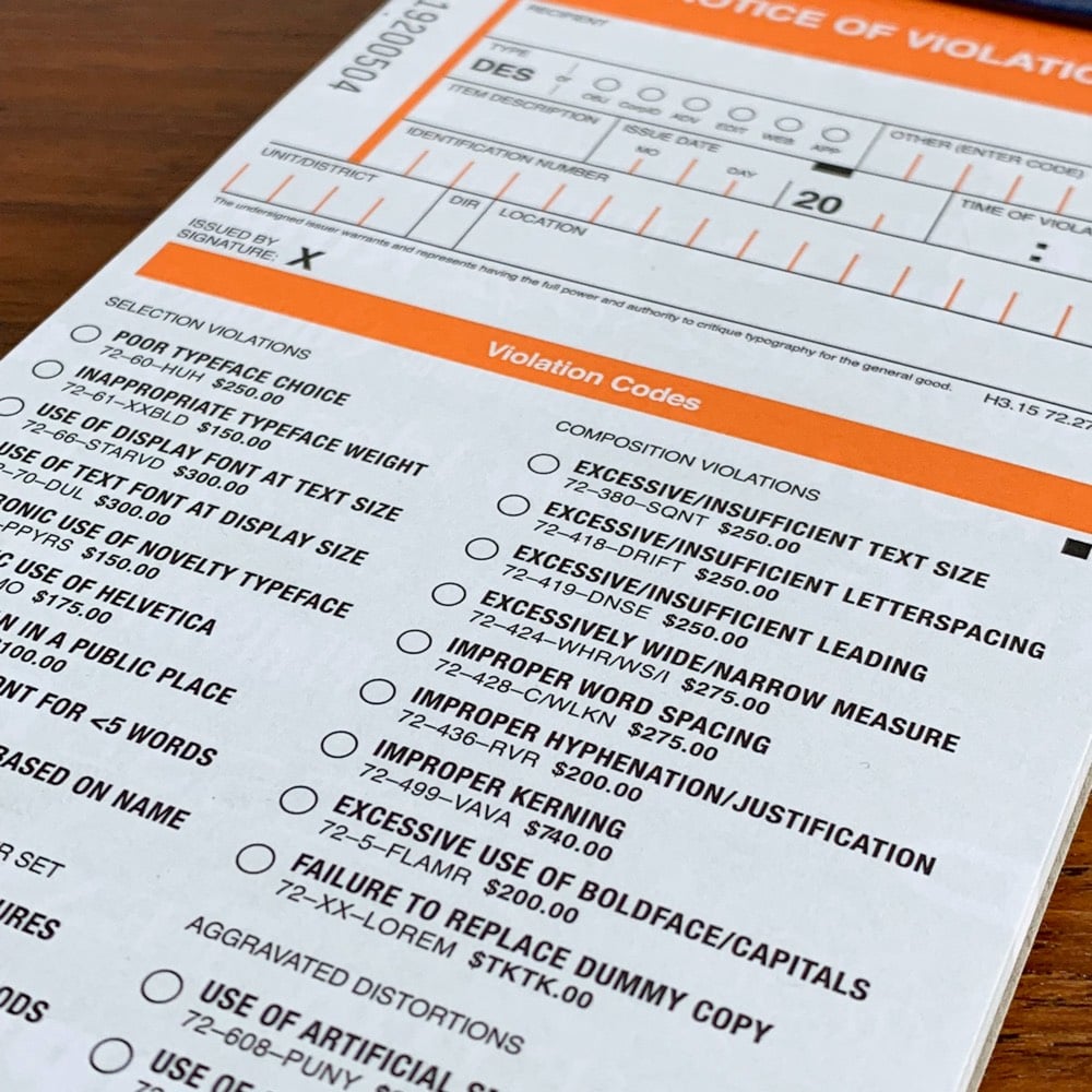
Hoefler & Co are selling copies of The Typographic Ticket Book for type nerds on the go. The idea is that when you’re out and about, you can issue citations for “use of display font at text size” or “unironic use of Helvetica” to people and businesses misusing type.
Contains fifty tickets, each neatly perforated for a satisfyingly loud rip prior to presentation. Bound in soul-deadening municipal pressboard, with a heavy-duty 100pt millboard backing, and foil stamped with an official-looking clip art emblem in gold. Police uniform not included, nor recommended. For novelty use only.
Looks like the book contains a few in-jokes as well…I spotted “$TKTK” as the fine for “failure to replace dummy copy” and the kerning on the fine for “improper kerning” looks a liiittle tight to me.
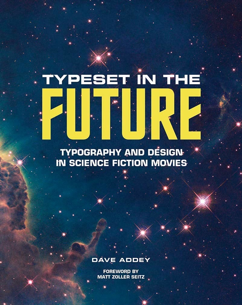
Inspired by the website of the same name, Dave Addey’s Typeset in the Future will look at how design and typography is used to build futuristic worlds in science fiction movies like 2001, Wall-E, Star Trek, and Blade Runner.
The book delves deep into 2001: A Space Odyssey, Star Trek: The Motion Picture, Alien, Blade Runner, Total Recall, WALL-E, and Moon, studying the design tricks and inspirations that make each film transcend mere celluloid and become a believable reality. These studies are illustrated by film stills, concept art, type specimens, and ephemera, plus original interviews with Mike Okuda (Star Trek), Paul Verhoeven (Total Recall), and Ralph Eggleston and Craig Foster (Pixar).
You can pre-order the book on Amazon.
In the early 90s, a digital typeface designed in the 80s — but based on the letterforms used in a Roman column completed in 113 AD — became the go-to typeface for movie poster designers. (Reminder: everything is a remix.) It was used on posters for movies like The Bodyguard, Crouching Tiger Hidden Dragon, Children of Men, and Quiz Show. This Vox video details the rise of the Trajan typeface in movie poster design and why its not used that often by big movies anymore.
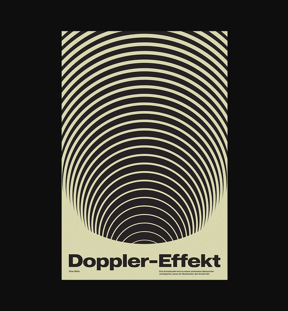
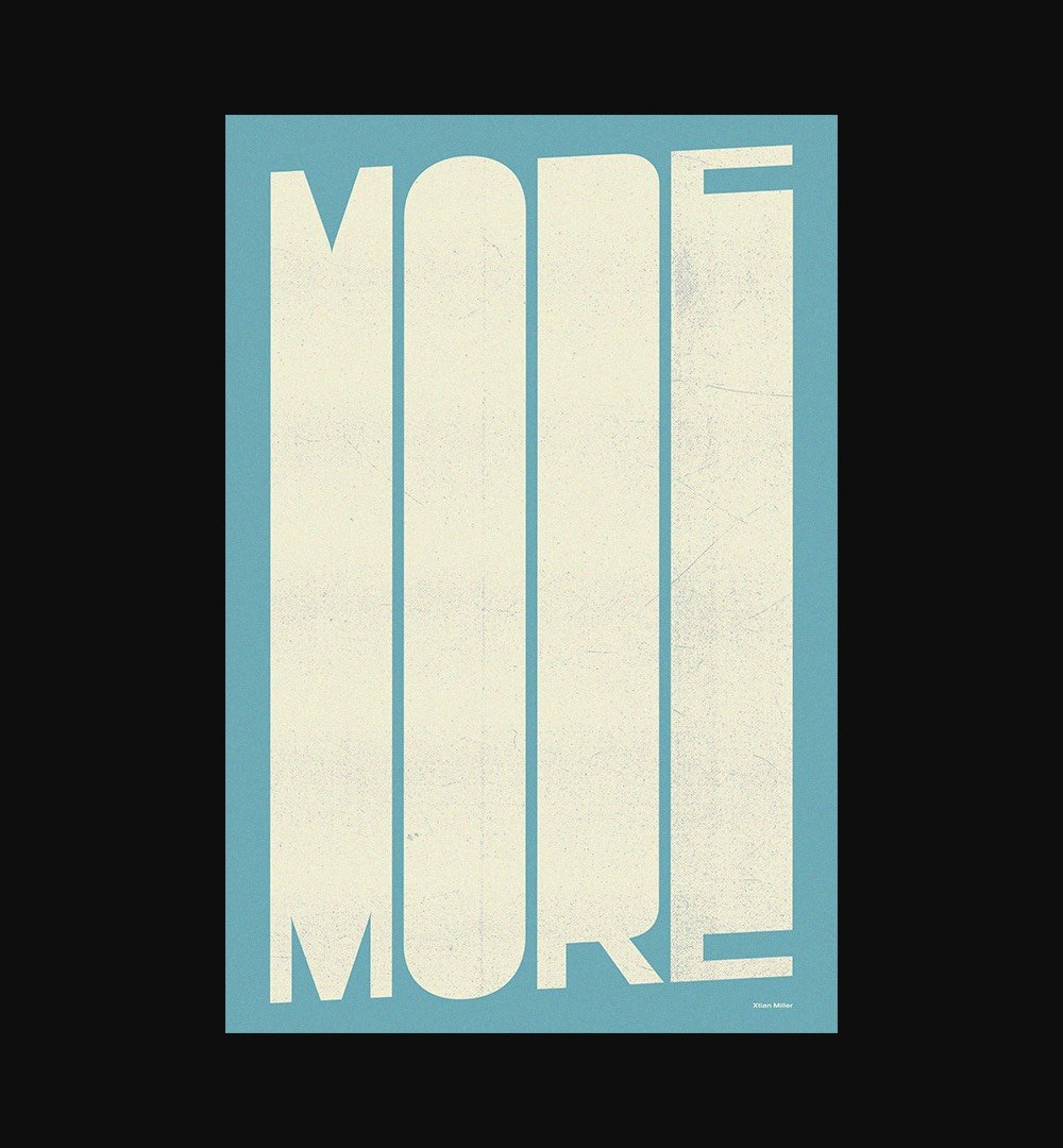
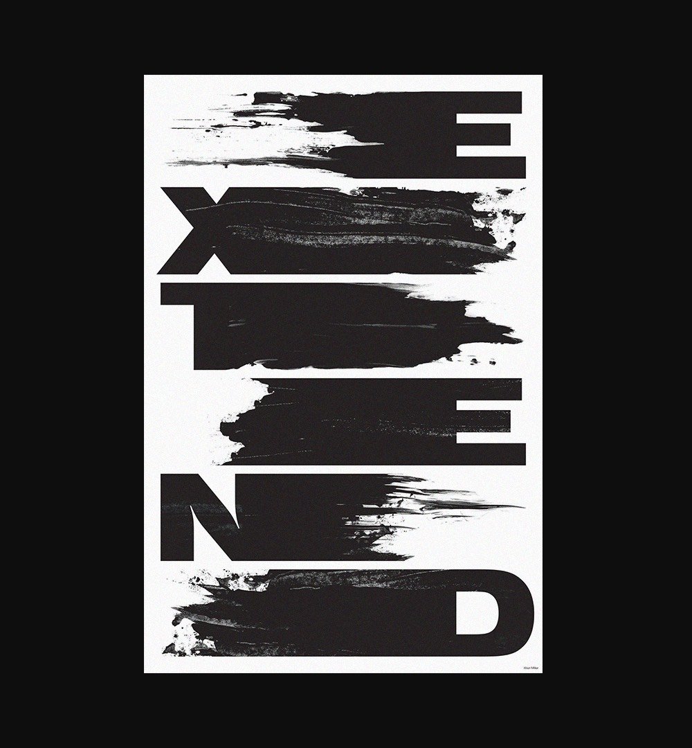
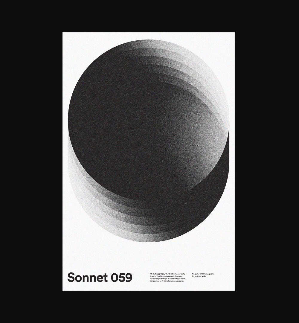
Designer Xtian Miller designs new posters “nearly every day”. You can see his prodigious output on Dribbble and Instagram. His website is worth a look as well. (via the outline)
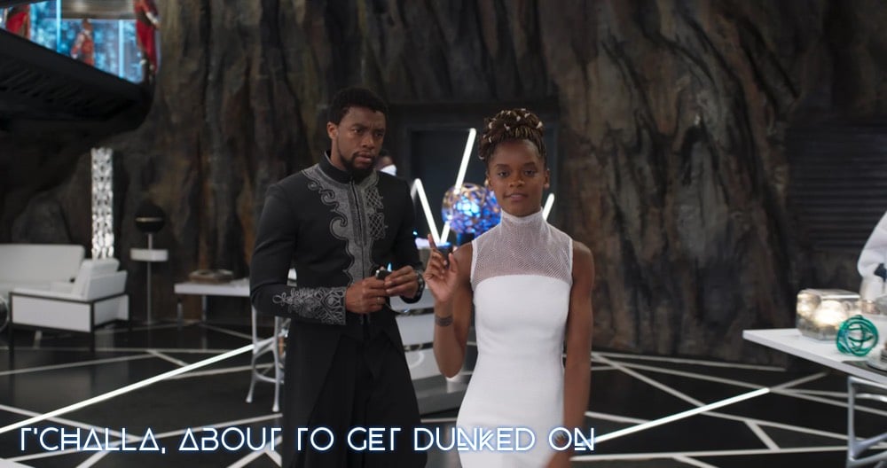
If you’ve seen Black Panther, you likely noticed the distinctive typeface used for the location labels and, more prominently, in the ending credits:
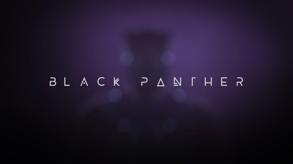
The typeface is called BEYNO and was designed by Swiss designer and illustrator Fabian Korn. It looks like some of the letters were slightly modified for the movie (the “E” and “Y” for example). You can buy the original font from Korn for $5 on Creative Market so you can make your own captions from the movie:
Fonts in Use took a crack at identifying the crazy quilt of typefaces used on the label of Huy Fong sriracha.
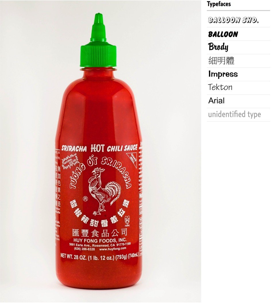
The most prominent Latin text elements are rendered in a variety of informal script typefaces released by American Type Founders in the 20th century, namely Balloon and its shaded counterpart, Balloon Drop Shadow, as well as Brody. Smaller text on the back of the bottle is set in Impress and Tekton.
And they threw Arial in there for good measure. Oof. Don’t miss the first comment about the label’s Chinese fonts; “In the West, PMingLiu has become a prominent component of what some might call the “Asian diaspora aesthetics”. In East Asia, it is seen as the signature for those typographically unenlightened.”
P.S. No one knows who drew the label’s iconic rooster. And remember when people were stockpiling Huy Fong sriracha due to shortages? Simpler times.
Update: After I wondered on Twitter what the Huy Fong sriracha label would look like if the great Modernist designer Massimo Vignelli designed it, the folks at Major Interactive came up with this:
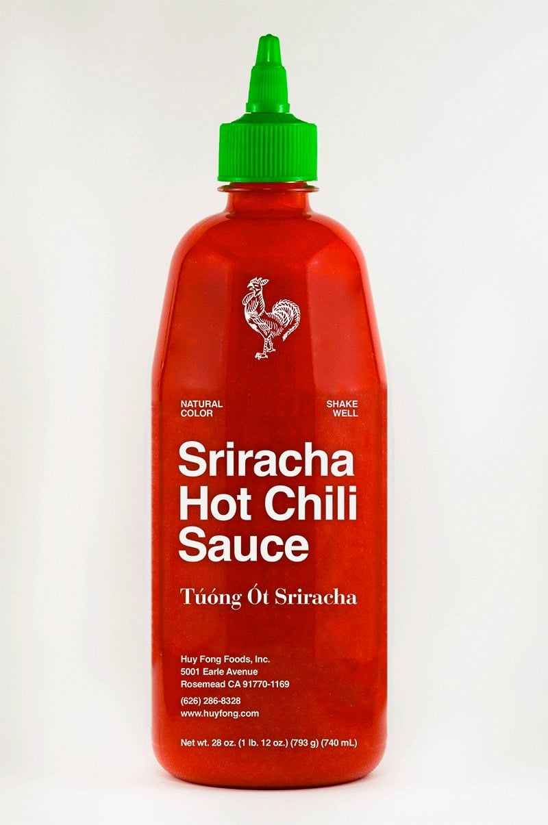
*slow clap*
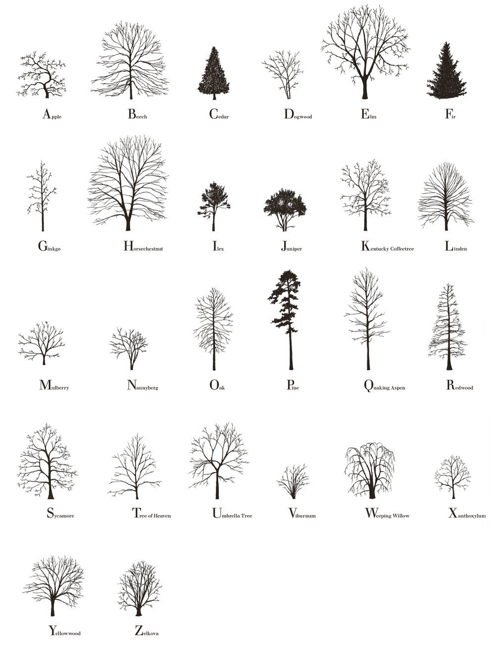
The Tree Alphabet was made by Katie Holten and was used in her book, About Trees (Amazon), which features writing from Jorge Luis Borges, Charles Darwin, Ada Lovelace, Elizabeth Kolbert, and Robert Macfarlane.
In ABOUT TREES, Katie Holten invites us to enter some of these forests. She has created a Tree Alphabet and used it to translate a compendium of well known, loved, lost and new writing. She takes readers on a journey from ‘primeval atoms’ and cave paintings to the death of a 3,500 year-old cypress tree, from Tree Clocks in Mongolia and forest fragments in the Amazon to Emerson’s language of fossil poetry, unearthing a grove of beautiful stories along the way.
The Trees font file is available for free download and prints of the Tree Alphabet are available as well.
In his newest video, Evan Puschak talks about Arrival, calling it “a response to bad movies”. Arrival was perhaps my favorite film of 2016, and I agree with him about how well-made this film is. There’s a top-to-bottom attention to craft on display, from how it looks to how it was cast (Amy Adams was the absolute perfect choice for the lead) to the integration of the theme with story to how expertly it was adapted from Ted Chiang’s Story of Your Life. The whole thing’s tight as a drum. If you happened to miss it, don’t watch this video (it gives the whole thing away) and go watch it instead…it’s available to rent/buy on Amazon.
Looking back through the archives, I’m realizing I never did a post about Arrival even though I collected some links about it. So, linkdump time!
Wired wrote about how the movie’s alien alphabet was developed.
Stephen Wolfram wrote about his involvement with the science of the film — his son Christopher wrote Mathematica code for some of the on-screen visuals. 1
Science vs Cinema explored how well the movie represented actual science:
Screenwriter Eric Heisserer wrote about how he adapted Chiang’s short story for the screen.
Jordan Brower wrote a perceptive review/analysis that includes links to several other resources about the film.
Update: The director of photography for Arrival was Bradford Young, who shot Selma and is currently working on the Han Solo movie for Disney. Young did an interview with No Film School just before Arrival came out.
I’m from the South, so quilts are a big part of telling our story. Quilting is ancient, but in the South it’s a very particular translation of idea, time, and space. In my own practice as an image maker, I slowly began to be less concerned with precision and more concerned with feeling.
Quiltmakers are rigorous, but they’re a mixed media format. I think filmmaking should be a mixed media format. I’m just really honoring what quiltmakers do, which is tell a story by using varying texture within a specific framework to communicate an idea. For me, with digital technology, lenses do that the best. The chips don’t do it now-digital film stock is basically all captured the same, but the lenses are how you give the image its textural quality.
(thx, raafi)
Update: James Gleick, author of Time Travel, wrote about Arrival and Story of Your Life for The New York Review of Books.
What if the future is as real as the past? Physicists have been suggesting as much since Einstein. It’s all just the space-time continuum. “So in the future, the sister of the past,” thinks young Stephen Dedalus in Ulysses, “I may see myself as I sit here now but by reflection from that which then I shall be.” Twisty! What if you received knowledge of your own tragic future-as a gift, or perhaps a curse? What if your all-too-vivid sensation of free will is merely an illusion? These are the roads down which Chiang’s story leads us. When I first read it, I meant to discuss it in the book I was writing about time travel, but I could never manage that. It’s not a time-travel story in any literal sense. It’s a remarkable work of imagination, original and cerebral, and, I would have thought, unfilmable. I was wrong.
(via @fquist)
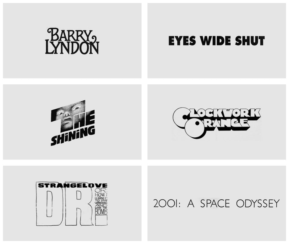
From designer Christian Annyas, an overview of the typography used in the titles and posters of Stanley Kubrick’s movies. Click on each graphic to see the poster or title sequence it was sourced from.
A lovely short video profile of Thomas Lilley, who is a roadliner in Glasgow. A roadliner is a person who paints the words and marks on roads with molten thermoplastic. Lilley does it quickly, freehand, and beautifully. The design firm who did the video above commissioned Lilley’s crew to make a custom typeface for them and their new logo.
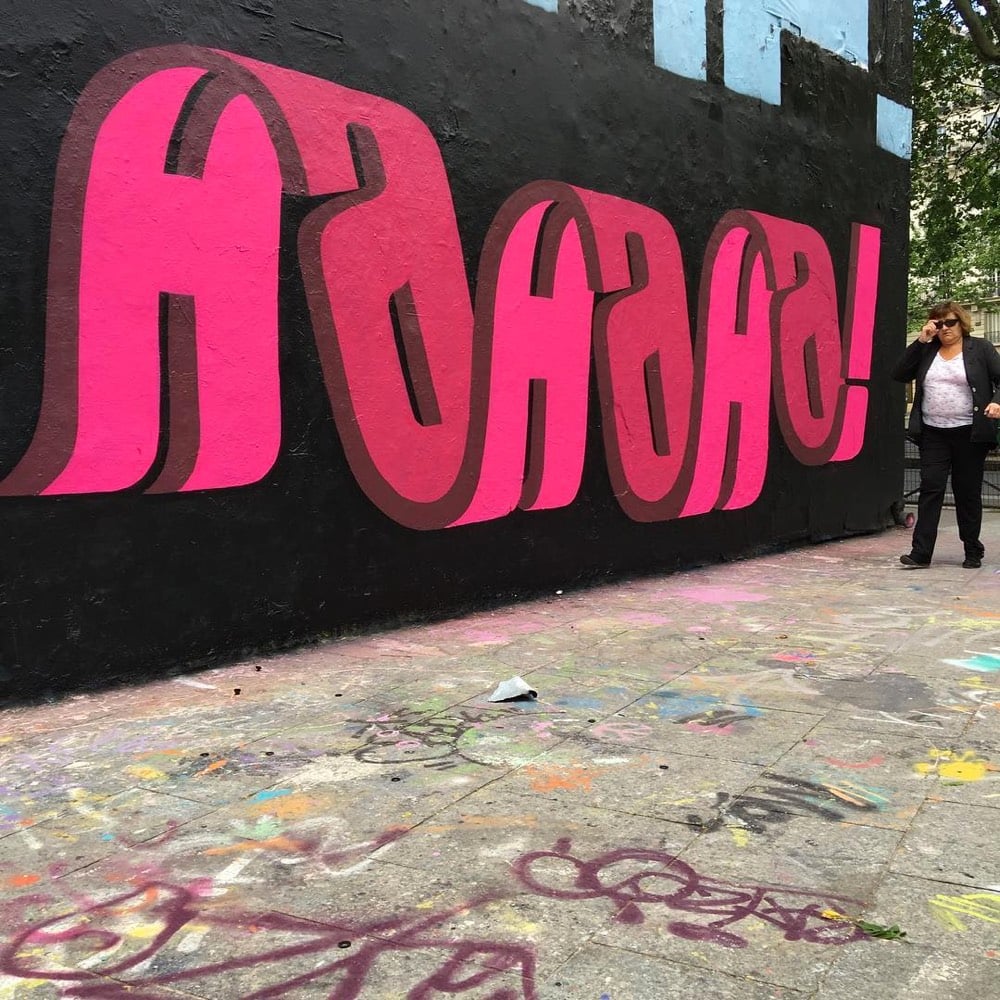
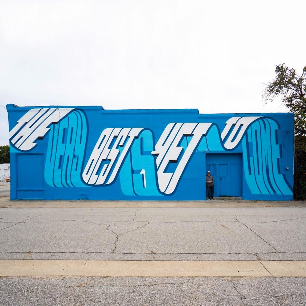
See also The art of street typography. (via @mathowie)
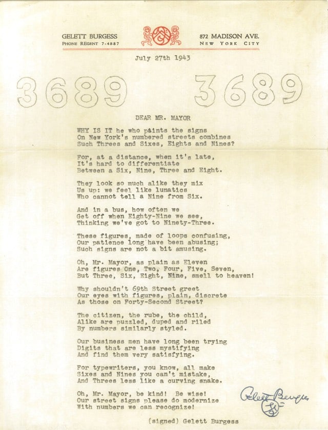
In 1943, artist and poet Gelett Burgess wrote a poem to New York Mayor Fiorello La Guardia complaining of the poor typography on some of the city’s street signs. La Guardia wrote back, also in verse. (via @john_overholt)
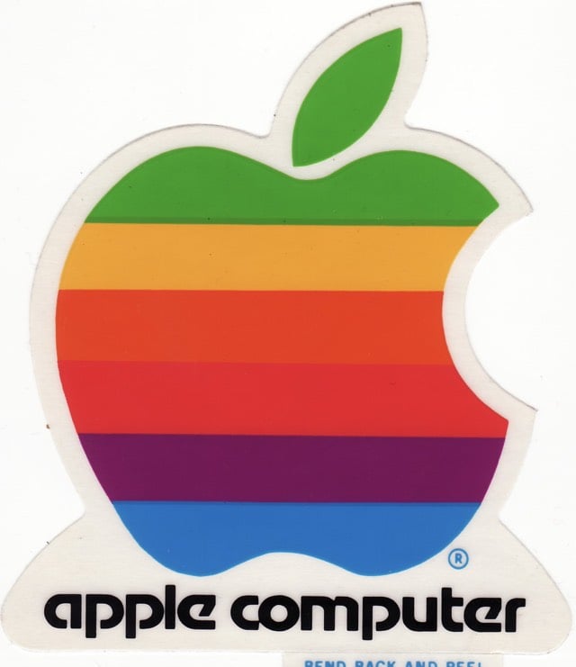
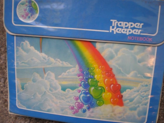
Just learned/realized that the old logos for Reebok, Apple, and Trapper Keeper all use the same typeface, Motter Tektura.
(via @pieratt)
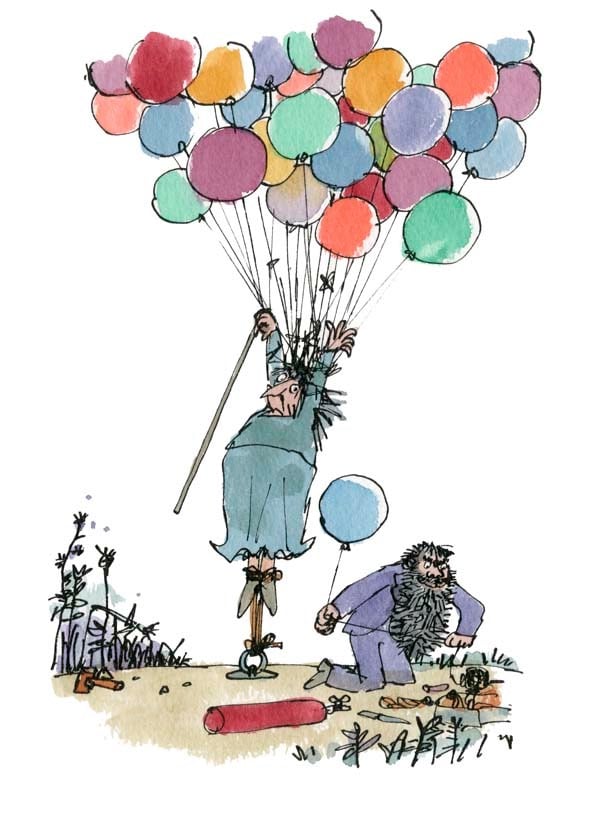
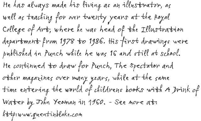
If you’ve read a book like Danny the Champion of the World or Charlie and the Chocolate Factory, you have seen the work of illustrator Quentin Blake.
Type foundry Monotype have created a typeface from Blake’s distinctive handwriting. Each letter has four variants so the text looks more random, like actual handwriting:
Inspired by the logo for Hillary Clinton’s 2016 Presidential run, designer Rick Wolff created an entire uppercase alphabet for a typeface he’s calling Hillvetica.
From his Twitter stream, it appears that Wolff is attempting to make an actual Hillvetica font so stay tuned. FYI, Pentagram partner Michael Bierut designed the logo. The simplicity is appealing, but overall I am not a big fan of the arrowed H.
Update: The Washington Post made a little text editor so you can write whatever you want in Hillvetica. The Clinton campaign has already put it to use:
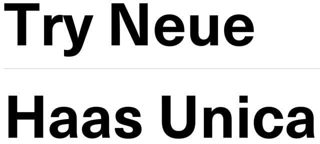
Conceived in the late 1970s as a hybrid of three of the most popular (and some would say, overused) sans-serif typefaces in the world, Haas Unica didn’t make the digital jump to personal computers in the 1980s. It was nearly forgotten, but has been revived by Monotype, which released Neue Haas Unica as a webfont today.
Unica® was an attempt to create the ultimate sans-serif - a hybrid of Helvetica, Univers and Akzidenz Grotesk. Designed by Team ‘77 and released to great acclaim in 1980, Unica went missing under a heap of legal disputes and has never been available as a full, digital typeface. Until now.
Unica’s story starts in the 1970s. Electronic, on-screen phototypesetting was gaining popularity, but most sans-serif typefaces on the market had been designed earlier, in the era of metal type. The revered Haas Type Foundry in Münchenstein, Switzerland, saw the chance to develop a new sans-serif face that was optimized for the new technology and filled the gap in the market. To develop their new product, they turned to Swiss type design trio, Team ‘77 (André Gürtler, Christian Mengelt and Erich Gschwind).
Team ‘77 set out to design a font based on Helvetica but drawing on other sans-serif typefaces, principally Univers. The name they gave it would also be a hybrid of the two.
The original name for Helvetica was Neue Haas Grotesk. Haas + Univers + Helvetica = Haas Unica.
Update: Several digital versions of Haas Unica have been available prior to this one.
For many years a digital version of Unica was available from Scangraphic (and Elsner+Flake) but it was pulled from the market due to a complaint by Linotype who claims the Haas rights. In 2008, Cornel Windlin did a Semibold for the the Schauspielhaus Zürich identity, used in 2009-10. Later, Louise Paradis created a revival named Unica Intermediate while doing research for the TM retrospective.
(via @typographica)
Although I am slowly coming around1 to Massimo Vignelli’s assertion that designers should only use a handful of typefaces, I enjoyed seeing Typographica’s list of their favorite typefaces of 2014.
Typeface design and distribution is in a state of rapid change. Last year we noted its diffusion around the globe, and that trend persists. The majority of font production is no longer concentrated in a few regional epicenters.
That goes for corporate epicenters as well. The independence of type designers themselves is increasingly evident. Small foundries have existed since the dawn of digital fonts, but now they are the norm. Only a handful of the selections in this year’s list were published by companies with more than ten employees.
I discovered that one of the selections, a beautiful custom typeface made for the reopening/rebranding of the Cooper Hewitt Design Museum (sample shown above), has been made available by the museum for free download (including a web fonts version).
I just upgraded to OS X Yosemite yesterday1 and the Helvetica as the system font is as jarring as everyone says it is. But that new Apple Watch font, San Francisco, seems really nice. So of course someone has worked out a way to use the Watch font as the system font on Yosemite. Here’s what you do…just type the following in Terminal.app:
ruby -e “$(curl -fsSL https://raw.github.com/wellsriley/YosemiteSanFranciscoFont/master/install)”
Then restart your computer. Full instructions are on GitHub. Here’s what it looks like:
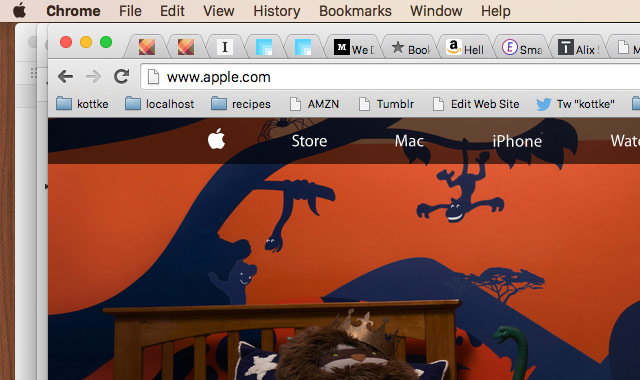
Pretty nice. But it’s not perfect. For instance, look at the text in the Chrome tabs…it’s not aligned correctly. And if you have the fast user switching menu enabled in the menu bar, that’s weirdly misaligned too. If you’d like, you can also switch back to using the previous font, Lucida Grande.
Jessica Hische and Font Bureau have teamed up to offer the typeface Hische designed for Wes Anderson’s Moonrise Kingdom. Meet Tilda (great name). Art of the Title interviewed Hische about the typeface last year.
From Tobias Frere-Jones, a short history of how typefaces get their names.
Years ago, I asked one of my mentors what he thought was the hardest part of designing a typeface. I was expecting “the cap S” or “the italic lowercase” or something like that. But he answered without hesitation: the name. Finding the name is the hardest part.
Newer posts
Older posts
Socials & More