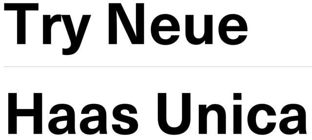
Haas Unica rides again

Conceived in the late 1970s as a hybrid of three of the most popular (and some would say, overused) sans-serif typefaces in the world, Haas Unica didn’t make the digital jump to personal computers in the 1980s. It was nearly forgotten, but has been revived by Monotype, which released Neue Haas Unica as a webfont today.
Unica® was an attempt to create the ultimate sans-serif - a hybrid of Helvetica, Univers and Akzidenz Grotesk. Designed by Team ‘77 and released to great acclaim in 1980, Unica went missing under a heap of legal disputes and has never been available as a full, digital typeface. Until now.
Unica’s story starts in the 1970s. Electronic, on-screen phototypesetting was gaining popularity, but most sans-serif typefaces on the market had been designed earlier, in the era of metal type. The revered Haas Type Foundry in Münchenstein, Switzerland, saw the chance to develop a new sans-serif face that was optimized for the new technology and filled the gap in the market. To develop their new product, they turned to Swiss type design trio, Team ‘77 (André Gürtler, Christian Mengelt and Erich Gschwind).
Team ‘77 set out to design a font based on Helvetica but drawing on other sans-serif typefaces, principally Univers. The name they gave it would also be a hybrid of the two.
The original name for Helvetica was Neue Haas Grotesk. Haas + Univers + Helvetica = Haas Unica.
Update: Several digital versions of Haas Unica have been available prior to this one.
For many years a digital version of Unica was available from Scangraphic (and Elsner+Flake) but it was pulled from the market due to a complaint by Linotype who claims the Haas rights. In 2008, Cornel Windlin did a Semibold for the the Schauspielhaus Zürich identity, used in 2009-10. Later, Louise Paradis created a revival named Unica Intermediate while doing research for the TM retrospective.
(via @typographica)


Socials & More