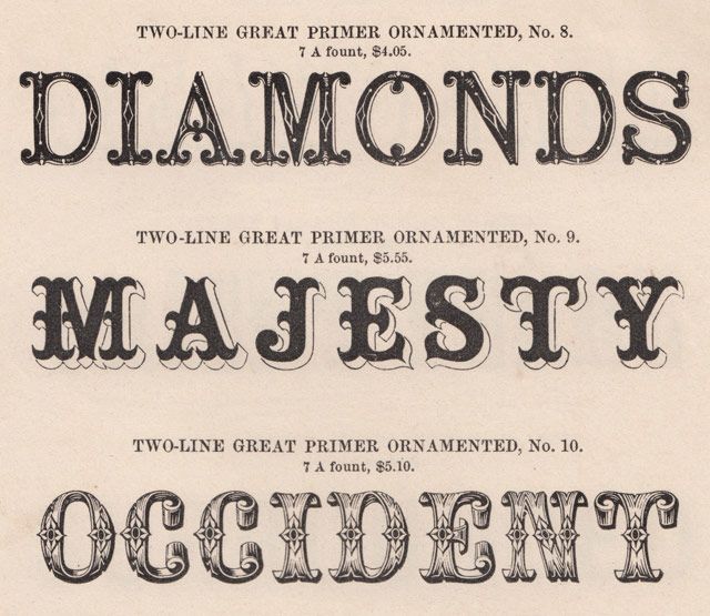
From Tobias Frere-Jones, a short history of how typefaces get their names.
Years ago, I asked one of my mentors what he thought was the hardest part of designing a typeface. I was expecting “the cap S” or “the italic lowercase” or something like that. But he answered without hesitation: the name. Finding the name is the hardest part.
While the story covers both sides of the dispute with detail and pathos, the most affecting bits treat how H & FJ worked together and the tiny details of the letters they made and loved:
At his computer, he drew an uppercase H, O, and D, because they contained flat and round elements that would determine how other letters looked. When he moved on to the G, the R, and the S, he started to deviate from the mathematical grid, hoping to give the font a subliminal playfulness. As he filled out the alphabet, the letters revealed a promising flexibility; if Frere-Jones set text in caps and spread the spacing out, the words felt authoritarian, imposing, and if he set them in lowercase and pulled the spacing in, they felt fresh and young. He tried to think of a name for the font that would showcase some of the more distinctive letters: the stark, powerful G; the circular o; the strange-tasting a. For a name, he thought about Goats, and Gomorrah. He finally settled on Gotham.
If the deep dive into the beauty and business of lettermaking doesn’t grab you, the essay’s packed with other-cultural analogies. My favorite is probably this: “According to a designer who used to work with Frere-Jones, his eye is so sharp that he can look at a printout of a letterform and tell if it’s one pixel off, the same way Ted Williams was said to be able to hold a baseball bat and tell if it was a half-ounce too heavy.”
Disclosure: Jason Fagone is my friend. Kottke.org uses Whitney Screensmart, a version of one of the fonts discussed in the article. Also one time Jonathan Hoefler got really mad at me because of a story I wrote about iPad magazines. The font people don’t play.
Update: If you want to know just how much the font people don’t play, I immediately was contacted by a friend to change “typographer” to “type designer.” I’ve spent years writing about this, and if I ever manage to get all of the terms right, the universe will collapse on itself.
For the first post on his new blog, Tobias Frere-Jones discovers that most of the type foundries in New York in the 1800s and 1900s were all located within a few blocks of each other in lower Manhattan. Why there? Newspapers and City Hall.
I was able to plot out the locations for every foundry that had been active in New York between 1828 (the earliest records I could find with addresses) to 1909 (see below). All of the buildings have been demolished, and in some cases the entire street has since been erased. But a startling picture still emerged: New York once had a neighborhood for typography.
Gruber beat me to the punch in noting that Frere-Jones’ site doesn’t use any of the fonts from the company he was recently ousted from but instead a pair of faces (Benton Modern and Interstate) he designed before he formed his partnership with Jonathan Hoefler. Before I discovered Whitney (another Frere-Jones creation), Interstate was my go-to font for graphics for the site. Big TFJ fan, is what I’m saying.
Oh, wow. Tobias Frere-Jones is suing his business partner Jonathan Hoefler over ownership of world-reknowned type foundry Hoefler & Frere-Jones.
Type designer Tobias Frere-Jones claims he has been cheated out of his half of the company by his business partner, Jonathan Hoefler. In a blistering lawsuit filed today in New York City, Frere-Jones says he was duped into transferring ownership of several fonts, including the world-famous Whitney, to Hoefler & Frere-Jones (HFJ) on the understanding that he would own 50% of the company.
“In the most profound treachery and sustained exploitation of friendship, trust and confidence, Hoefler accepted all of the benefits provided by Frere-Jones while repeatedly promising Frere-Jones that he would give him the agreed equity, only to refuse to do so when finally demanded,” the suit claims.
The full complaint is here. A descendant of Whitney (Whitney ScreenSmart) is what you’re reading right now and I was an early beta tester of H&FJ’s webfont service. This is gobsmacking news…I have no idea what to think about it. What a sad and strange situation. (via @khoi)
Update: H&FJ has released a statement from their general counsel:
Last week, designer Tobias Frere-Jones, a longtime employee of The Hoefler Type Foundry, Inc. (d/b/a “Hoefler & Frere-Jones”), decided to leave the company. With Tobias’s departure, the company founded by Jonathan Hoefler in 1989 will become known as Hoefler & Co.
Update: According to a document filed with the New York County Clerk, the matter between Hoefler and Frere-Jones “has been settled”. No other details are available at this time.
From the AIGA, a lovely short film on type designers Jonathan Hoefler and Tobias Frere-Jones. I love the bit about starting a typeface design with the O, H, and D. Elsewhere, Hoefler recommended other potential starting points:
Work out the B, the ampersand, and the bullet before you get too far: you’ll have to confront decisions about thinning strokes, intersections, and shapes without any counters, which might inform what you do on the other letters.
(via daring fireball)


Socials & More