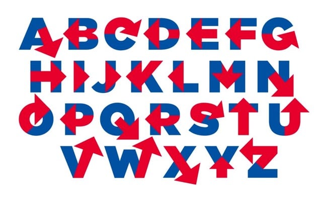
Hillary Clinton logo typeface
Inspired by the logo for Hillary Clinton’s 2016 Presidential run, designer Rick Wolff created an entire uppercase alphabet for a typeface he’s calling Hillvetica.

From his Twitter stream, it appears that Wolff is attempting to make an actual Hillvetica font so stay tuned. FYI, Pentagram partner Michael Bierut designed the logo. The simplicity is appealing, but overall I am not a big fan of the arrowed H.
Update: The Washington Post made a little text editor so you can write whatever you want in Hillvetica. The Clinton campaign has already put it to use:
Putting Hillary Bold to good use. http://t.co/NVtjlsoH5u pic.twitter.com/M3Q3nsWqyV
— Hillary Clinton (@HillaryClinton) April 14, 2015


Stay Connected