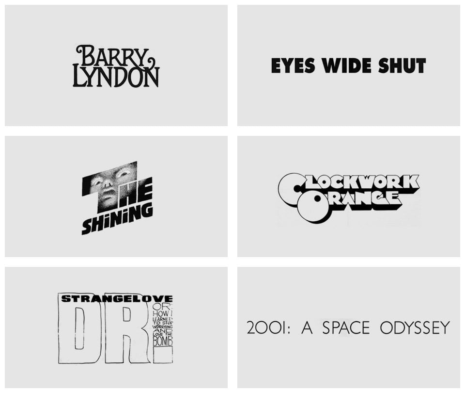
The typography of Stanley Kubrick

From designer Christian Annyas, an overview of the typography used in the titles and posters of Stanley Kubrick’s movies. Click on each graphic to see the poster or title sequence it was sourced from.


This site is made possible by member support. 💞
Big thanks to Arcustech for hosting the site and offering amazing tech support.
When you buy through links on kottke.org, I may earn an affiliate commission. Thanks for supporting the site!
kottke.org. home of fine hypertext products since 1998.
Beloved by 86.47% of the web.

From designer Christian Annyas, an overview of the typography used in the titles and posters of Stanley Kubrick’s movies. Click on each graphic to see the poster or title sequence it was sourced from.
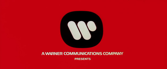
Fine work as usual from Christian Annyas: a look at the design of the Warner Bros logo from 1923 to the present. The classic “WB” shield of my Bugs-and-Daffy-saturated youth will always be a favorite, but I do like the Saul Bass logo of the 70s and early 80s:

Affleck’s Argo and Soderbergh’s Magic Mike both used the Bass logo in place of the contemporary logo, which is the kind of little detail I love.
Socials & More