The Typography of Star Trek
In an extended excerpt from his book Typeset in the Future: Typography and Design in Science Fiction Movies (Amazon), Dave Addey goes long on the typography and design of Star Trek: The Motion Picture (and Trek in general).
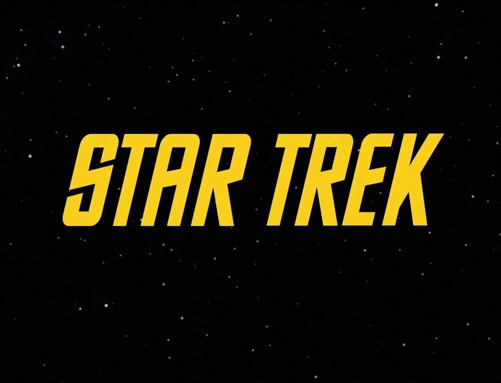
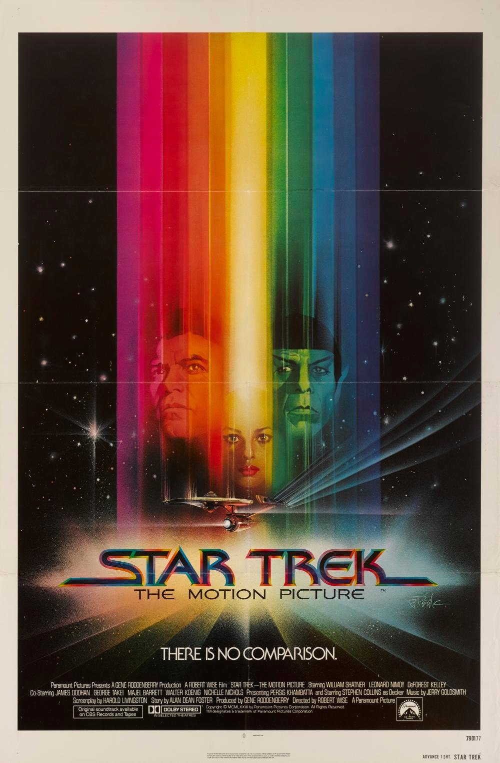
Alas, The Original Series’s inconsistent typography did not survive the stylistic leap into the 1970s. To make up for it, The Motion Picture’s title card introduces a new font, with some of the curviest Es known to sci-fi. It also follows an emerging seventies trend: Movie names beginning with STAR must have long trailing lines on the opening S.
Socials & More