A Free Hyperlegible Typeface from the Braille Institute
Atkinson Hyperlegible is a free typeface developed by the Braille Institute and Applied Design Works that makes text more readable for people with low vision.
“People may be surprised that the vast majority of the students who come to Braille Institute have some degree of vision,” says Sandy Shin, the institute’s vice president for marketing and communications. “They’re not 100% blind.”
Thus, most of the Braille Institute’s 37,000 clients across Southern California don’t depend on the dot-based Braille language. Instead, they rely on spoken-word tools and accessibility standards that encourage text publishers to think more carefully about the legibility of words on pages.
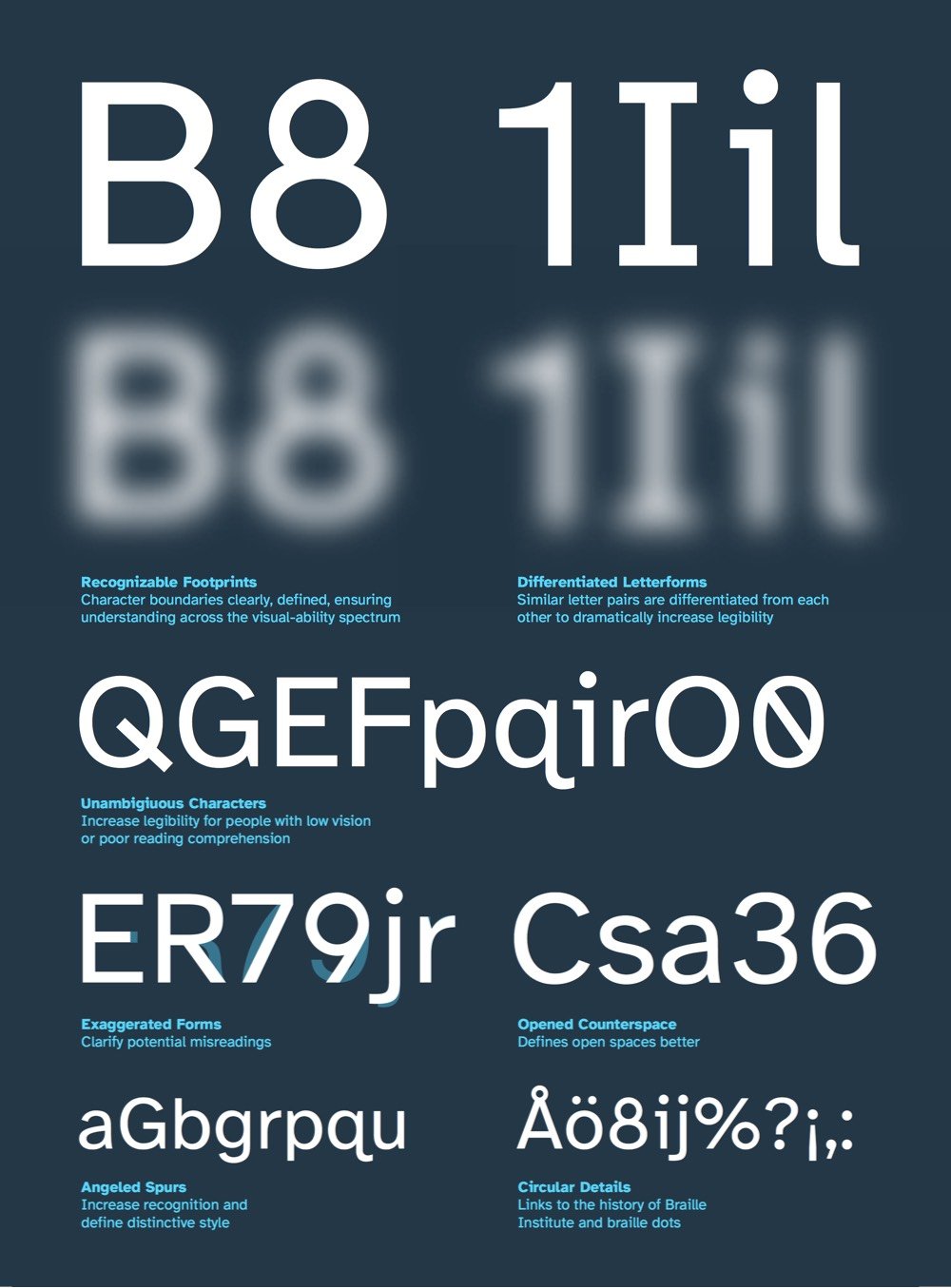
As you can see in the graphic above (taken from their summary PDF), Atkinson Hyperlegible’s letterforms are constructed so that each letter is as distinctive as possible so that it’s recognizable even when blurry or distorted by low vision. You can download Atkinson Hyperlegible on the Braille Institute site. (via print)

Socials & More