The Lost Typeface Recovered From the Thames River
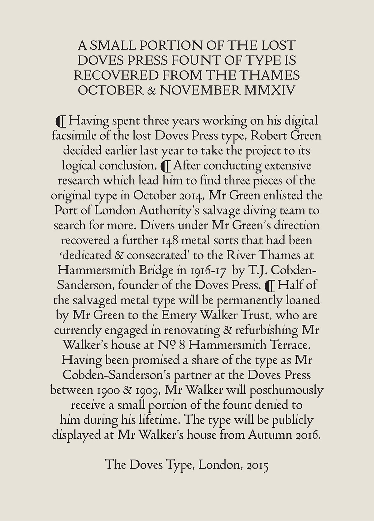
This is such a wild story. Two men, Thomas James Cobden-Sanderson & Emery Walker, founded the Doves Press in London in 1900. They made a typeface called Doves Roman:
During its short life early last century, the Doves Press printed and bound some of the finest books ever produced in England and its approach to typography and printing subsequently exerted a major influence over book design in Europe and the United States. Many of Cobden-Sanderson’s ideas would, decades later, find expression or adaptation in both Traditionalist and Modernist circles respectively.
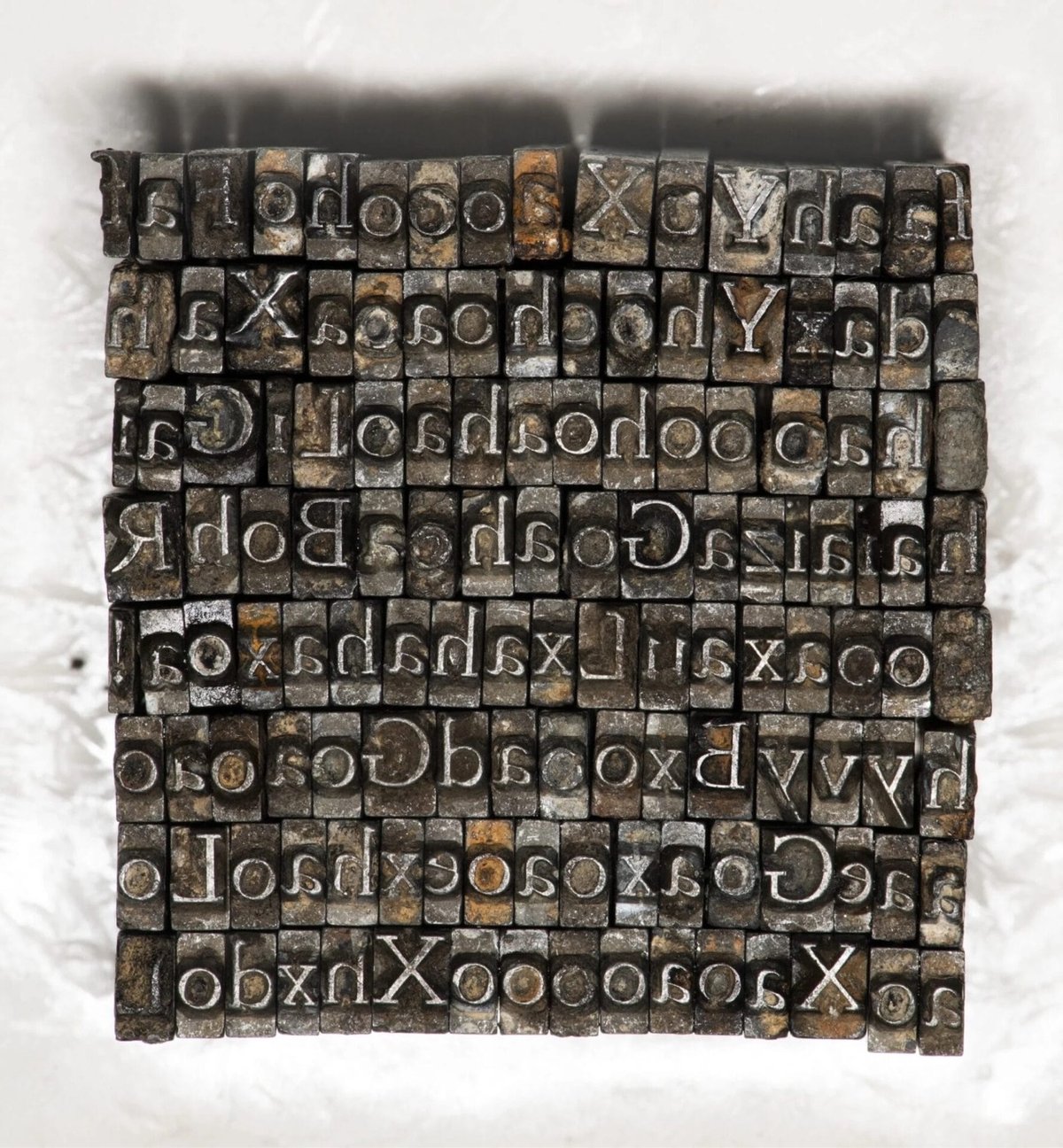
The partnership busted up and Cobden-Sanderson eventually took all of the lead type and dumped it in the Thames River. No more typeface.
The thought of ‘his’ typeface being used by anyone else, and in a manner beyond his control, prompted Cobden-Sanderson’s now infamous course of action. Only the Doves Press, run exclusively by him, could be bestowed the honour of printing his type. And so the mission to destroy it, beginning with the punches and matrices on Good Friday 1913, began. On an almost nightly basis from August 1916 the ailing septuagenarian dumped the type into the Thames, wrapped in paper parcels and tied with string; “bequeathed to the river” as he put it in his personal diary. Every piece of this beautiful typeface, more than a ton of metal, was destroyed in a prolonged ritual sacrifice.
Type designer Robert Green, working from printed materials, made a digital facsimile font of Doves Roman. In a bid to improve the font, he set out to find the lead type dumped in the river, aided by Cobden-Sanderson’s diary entries of the type-destroying mission. He found a few of the metal sorts (i.e. pieces of lead type) and with assistance from the Port of London Authority’s diving team, ended up retrieving 151 metal sorts in all, “out of a possible 500,000”.
Here’s a short film about the recovery of the type:
You can testdrive and buy the text and headline typefaces that Green created using the recovered sorts. (via colossal)
Comments 3
By all counts Cobden-Sanderson was an asshole. I read these events years ago and my first thought was ‘who cares — that typeface looks way too dated…’. My younger self, very much impressed by the work of Frutiger and the first generation of digital type designers, was a bit harsh, me thinks nowadays.
It is of course a design of great typographical and historic significance and by destroying it mister C-S was no better than the Taliban, ISIS and other brutes. Hence my turn-around.
The digital form is a very good recreation, but it lacks the feel of foundry type, with its slight imperfections due to circumstances during the production proces and the unavoidable wear on the matrices (the earliest in the run were always the best).
On another note: prop–makers for television and film always spoil the — not always present — effort of using period true typefaces by producing the ‘printed’ matter on laserprinters, or even worse inkjetprinters, often on the wrong kind of paper, with results that are abhorrent to (semi)professional typographers and graphic designers (and hopefully also historians)… Many a movie and tv–moment has been spoiled for me by this phenomenon.
Excuse me for this mini–rant, please.
Cheers!
I agree that the new version is kind of too perfect to look like a real foundry type. It seems more like the ideal (or modernized) version of the typeface than like a re-creation of the way it would have looked. I like it, personally. I think it looks elegant and modern(ist).
Such a great story. And it's really a wonderful looking font. Elegant but not pretentious or flashy.
If you feel like this comment goes against the grain of the community guidelines or is otherwise inappropriate, please let me know and I will take a look at it.
This thread is closed for new comments & replies. Thanks to everyone for participating!