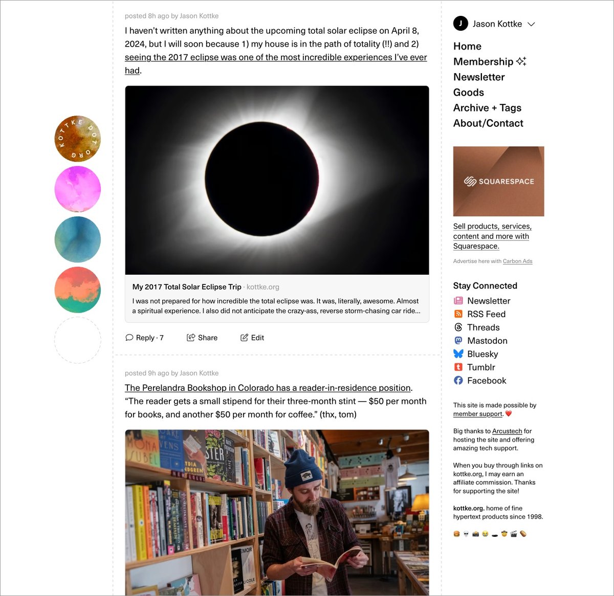
Based on your feedback & bug reports, I’ve made some changes to the new site design, including a less-dark dark mode and a light/dark mode toggle (just below the right sidebar menu). More to come!


Advertise here with Carbon Ads
This site is made possible by member support. 💞
Big thanks to Arcustech for hosting the site and offering amazing tech support.
When you buy through links on kottke.org, I may earn an affiliate commission. Thanks for supporting the site!
kottke.org. home of fine hypertext products since 1998.
Beloved by 86.47% of the web.
Comments 18
thread
latest
popular
That dark mode icon… most impressive.
It's no moon, that's for sure.
You almost could have used the Jedi and Sith logos, Jason.
* toggles *
tysm for the dark mode toggle! (and as Enrique pointed out, the dark mode icon is *kisses fingers icon*)
I love seeing new dots every time I load the site btw: seeing a particularly harmonious combination is like hearing the coin sound in Mario. You may have created a gamified logo.
The other day I saw a color combination that really really worked and I felt sad that it was likely the only time I'd see that combo for the rest of my life. Some consolation that it was only true for that particular order, so maybe I'll see that combo again, ordered differently.
The less-dark dark mode is perfect.
Agreed.
Yep. Now that the dark mode is less dark, I won't need to use the toggle. (But appreciate that it's there)
I like the redesign quite a lot - esp. the updated font, but miss the whitespace around the text. I used the Styler Chrome plugin to fix it for myself, fairly simple to do:
.big-hug .grid-container {
max-width: none;
}
.big-hug #content-container {
max-width: 700px;
margin: 0 auto;
width: 100%;
}
Perfect - Thanks Jason!
Definitely falling in the minority here, but the design is borked in a few ways on Firefox 😔
The toggle was going to really be my only request!
Outside of that, if there were a way to be notified that someone has replied to your comment, I'd love something like that. Though I have no idea if that would be hard to implement!
I love where the site is going, JK!
Oh man, I didn't realize how badly I wanted a less-dark dark mode until it arrived. Well done.
FWIW I vastly prefer looking at the site on my phone than my laptop now... I don't know why I like the logo at the top so much more, but the side logo is taking me so long to get used to. I'm sure I'm just used to it from the old site.
I've noticed that the "refresh" link at the top always says 1 new post now, no matter many new posts there are since the last page load. Previously it seemed accurate. (this is on Mac/Safari)
Very low priority bug report: in Firefox only, when I click "Show Full Post" on Edith's diary comics, it expands and scrolls all the way down to the last panel.
Always worth manually scrolling back up though: I really love what Edith contributes to the site.
Ditto.
Well, I can't help you with the bug, but this did make my day!
Hello! In order to comment or fave, you need to be a current kottke.org member. If you'd like to sign up for a membership to support the site and join the conversation, you can explore your options here.
Existing members can sign in here. If you're a former member, you can renew your membership.
Note: If you are a member and tried to log in, it didn't work, and now you're stuck in a neverending login loop of death, try disabling any ad blockers or extensions. Or try logging out and then back in. Still having trouble? Email me!
In order to comment or fave, you need to be a current kottke.org member. Check out your options for renewal.
If you feel like this comment goes against the grain of the community guidelines or is otherwise inappropriate, please let me know and I will take a look at it.
This thread is closed for new comments & replies. Thanks to everyone for participating!