kottke.org posts about design
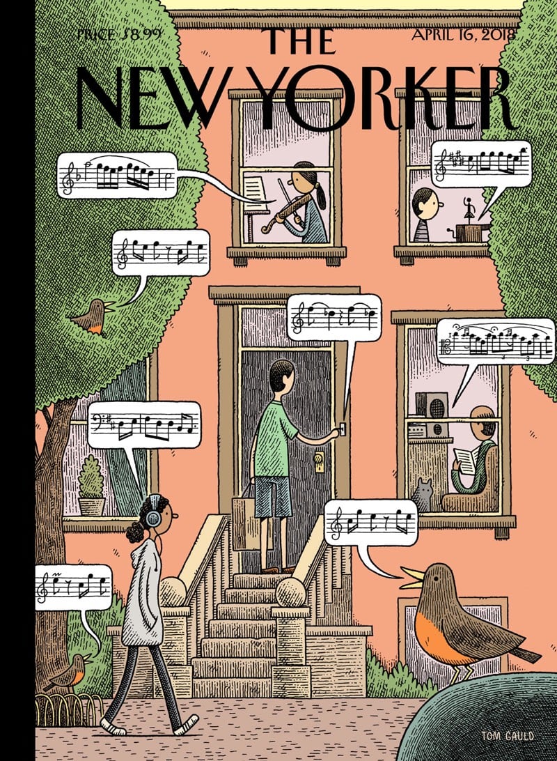
The New Yorker has a fun cover this week from cartoonist Tom Gauld. The New York street scene shows bits of music being played and listened to by people and birds and if you click through to the interactive version, you can listen to what each snippet of musical notation sounds like.
In his early sketches, Gauld had only vague notions of the music he’d like to include, and “placeholder nonsense” in the speech bubbles. “If, like me, you’re musically illiterate, then the notes give a suggestion of what’s going on sonically,” he said. “But I also wanted the scores to make sense to those who can read music.”
To achieve that goal, he enlisted the help of fact checker Fergus McIntosh, a veteran chorister. Together, the duo struck upon a repertoire that includes Vivaldi’s “Spring”; Stravinsky’s “The Rite of Spring”; Beethoven’s “Spring Sonata”; the folk song “One Morning in Spring”; and birdsong from the American robin, which tends to appear in springtime after local migration.
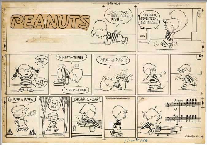
Found this via Austin Kleon, who remarks that Charles Schulz was similarly faithful in using accurate musical notation in Peanuts cartoons.
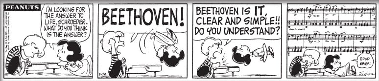
When Schroeder pounded on his piano, his eyes clenched in a trance, the notes floating above his head were no random ink spots dropped into the key of G. Schulz carefully chose each snatch of music he drew and transcribed the notes from the score. More than an illustration, the music was a soundtrack to the strip, introducing the characters’ state of emotion, prompting one of them to ask a question or punctuating an interaction.
Schulz used music so extensively in some of his strips that they didn’t really make much sense if you didn’t know how to read music:
When Beethoven gave the Hammerklavier to the publisher, he bragged, “Now you will have a sonata that will keep the pianists busy when it is played 50 years hence.” In this Sunday strip, Schulz most fully develops the idea of the preparations required to storm “Mount Everest.” Before marching to the piano with determination, Schroeder prepares himself for this mighty undertaking with seven different kinds of exercise and a “carb-loading” bowl of cereal, almost as if he were preparing to climb a mountain!
Dieter Rams is one of the world’s most influential designers. Rams acolyte and Apple design chief Jony Ive has said of him:
Dieter Rams’ ability to bring form to a product so that it clearly, concisely and immediately communicates its meaning is remarkable… He remains utterly alone in producing a body of work so consistently beautiful, so right, and so accessible.
Gary Hustwit, director of Helvetica and Objectified, is making a documentary about Rams called Rams. Here are three short clips from the film:
Rams will include in-depth conversations with Dieter, and dive deep into his philosophy, his process, and his inspirations. But one of the most interesting parts of Dieter’s story is that he now looks back on his career with some regret. “If I had to do it over again, I would not want to be a designer,” he’s said. “There are too many unnecessary products in this world.” Dieter has long been an advocate for the ideas of environmental consciousness and long-lasting products. He’s dismayed by today’s unsustainable world of over-consumption, where “design” has been reduced to a meaningless marketing buzzword.
The movie will have original music by Brian Eno and will be released sometime later this year.
Update: Wallpaper has a trailer for the film, which looks minimalistic af.
From Evan Puschak, a quick video on dark patterns, UI design that tricks users into doing things they might not want to do. For instance, as he shows in the video, the hoops you need to jump through to delete your Amazon account are astounding; it’s buried levels deep in a place no one would ever think to look. This dark pattern is called a roach motel — users check in but they don’t check out. I wonder how much this single pattern has added to Jeff Bezos’ personal net worth?
Somehow, I happily watched all 26 minutes of this video on how to make 29 different pasta shapes by hand. Pasta architecture is fascinating!
Semolina pasta is a southern Italy specialty. From that dough, Luca makes cavatelli, malloreddus, lorighittas, cencioni, capunti, strascinati, culurgionis, and sagne incannulate. From the egg dough, D’Onofrio makes fusilli al ferretto, tagliatelle, tortellini, farfalle, garganelli, anolini, cappelletti, tagliolini, agnolotti, sacchetti. From the spinach dough, Luca makes foglie d’ulivo, trofie, fagiolini, and pappardelle. From the cuttlefish squid ink pasta dough, D’Onofrio makes orecchiette, strichetti, fettuccine, and corzetti.
(via the kid should see this)

Scarfolk is a dystopian satire site about an English town that’s stuck in a 1970s time loop.
Scarfolk is a town in North West England that did not progress beyond 1979. Instead, the entire decade of the 1970s loops ad infinitum. Here in Scarfolk, pagan rituals blend seamlessly with science; hauntology is a compulsory subject at school, and everyone must be in bed by 8pm because they are perpetually running a slight fever. “Visit Scarfolk today. Our number one priority is keeping rabies at bay.” For more information please reread.
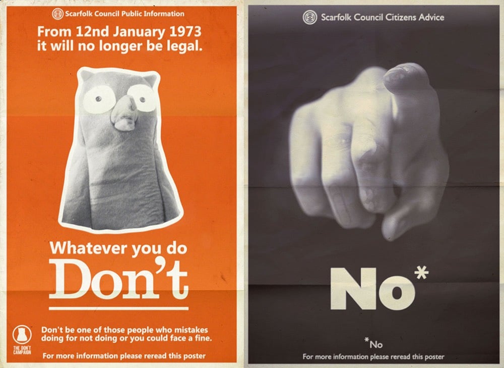
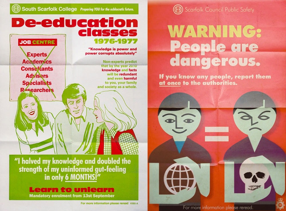
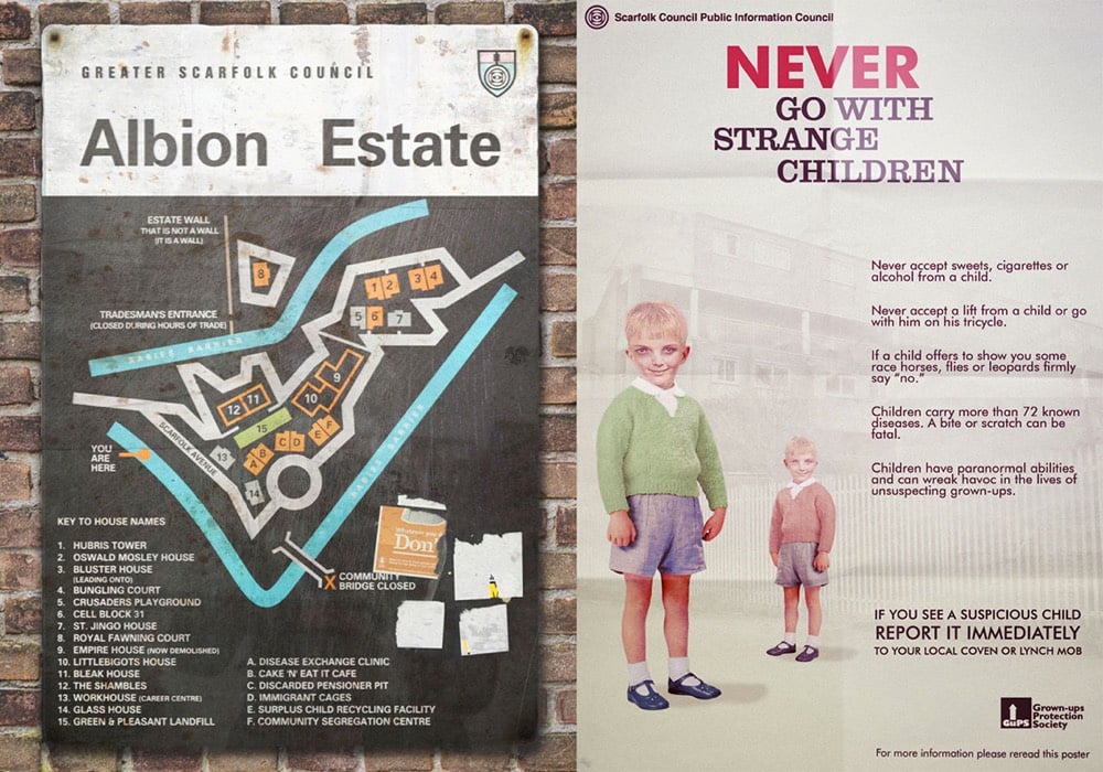
The slogans and advertisements the site produces are fantastic. It’s Nice That has a good overview of the some of the best pieces.
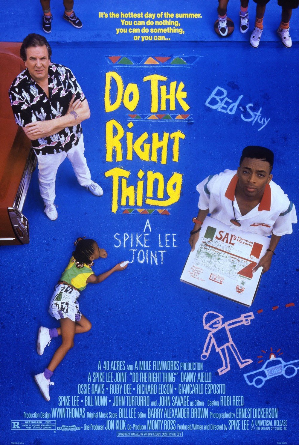
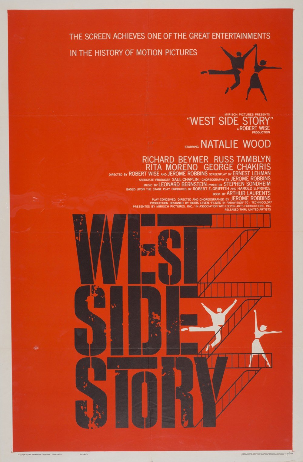
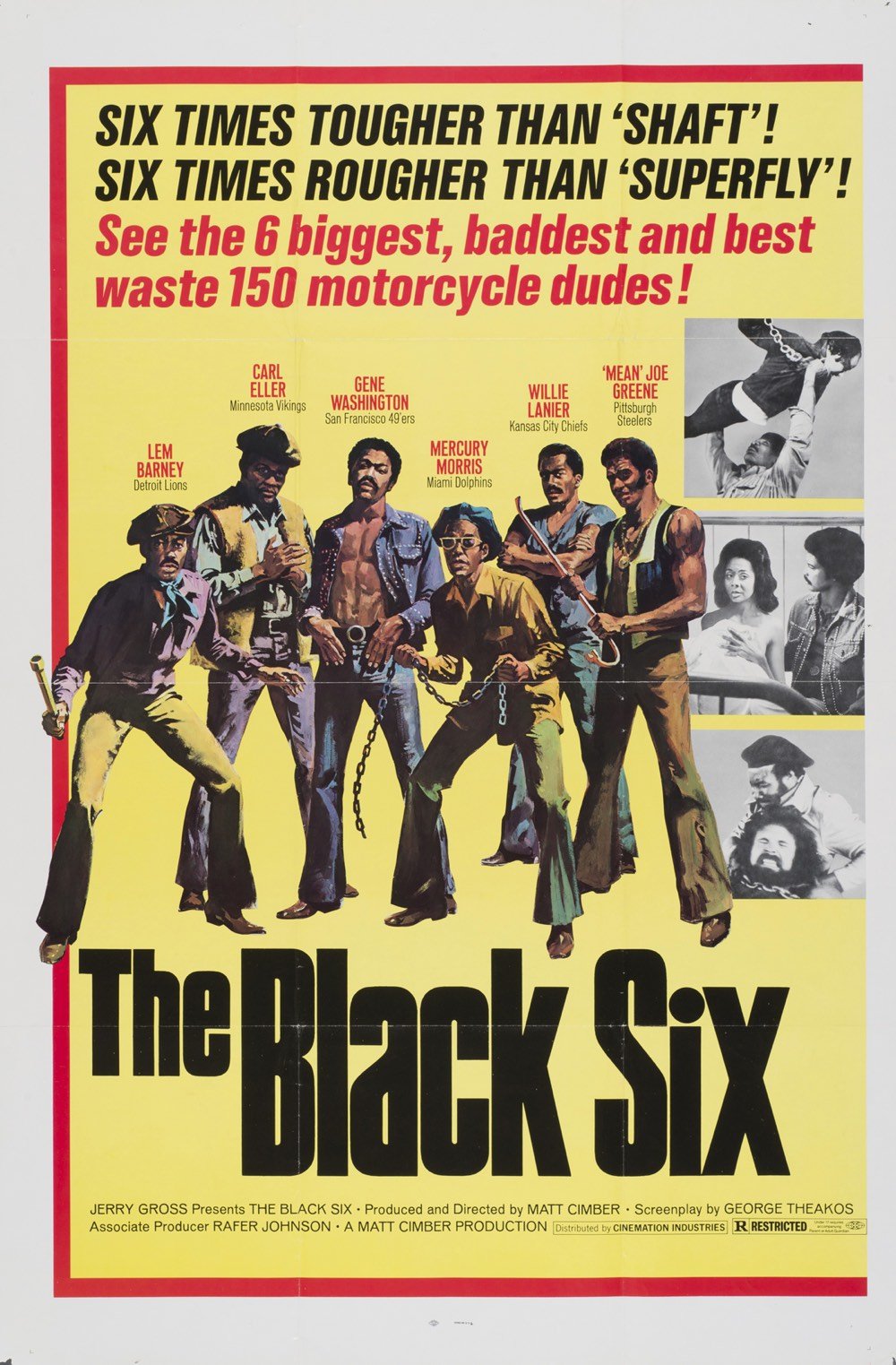
As an art director in the 80s and 90s, Tom Martin created some of that era’s most memorable movie posters. In this post, Tony Pierce writes about the creation of seven of Martin’s most iconic posters, including those for Jurassic Park, Do The Right Thing, Twins, and Schindler’s List.
On a very different Steven Spielberg film, Schindler’s List, some of the submissions that weren’t chosen as the final poster are as interesting as the one that was due to the fame of their designers.
Tony Seiniger, Anthony Goldschmidt, and Bill Gold were among the designers who took a crack at the poster. And then there was legendary designer Saul Bass.
“It was one of the high points of my career,” Martin says. “I was in a meeting at a sound studio and it was Saul Bass, Steven Spielberg, and myself, in a room, looking at Saul’s poster.”
Even though Bass was well established at that point in his career he still fought for his ideas and pitched his posters to Spielberg with as much conviction as anyone.
“There was still that competitive drive,” Martin remembers. “Saul was still competitive. He still wanted to be chosen, still… wanted that approval.”
Unfortunately for Bass, his work ultimately lost out to independent art director Georgia Young who designed the final poster.
See also this massive online collection of movie posters and this other massive online collection of movie posters.
If you’ve seen Black Panther, you likely noticed the distinctive typeface used for the location labels and, more prominently, in the ending credits:
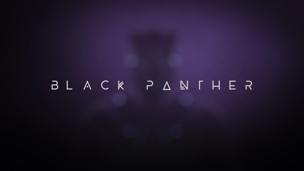
The typeface is called BEYNO and was designed by Swiss designer and illustrator Fabian Korn. It looks like some of the letters were slightly modified for the movie (the “E” and “Y” for example). You can buy the original font from Korn for $5 on Creative Market so you can make your own captions from the movie:

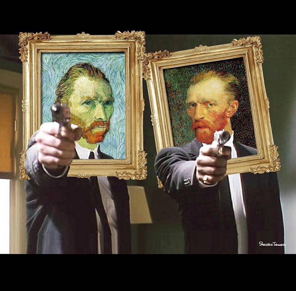

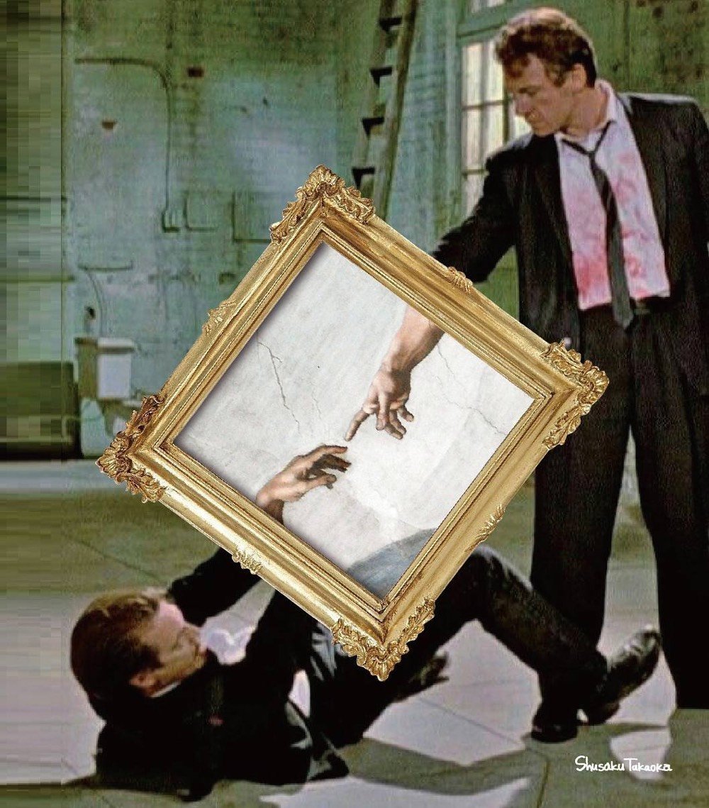
Japanese graphic designer Shusaku Takaoka takes famous artworks and cleverly incorporates them into movies scenes or celebrity photos. If you scroll back through his earlier photos,1 you can see him experimenting with various techniques before hitting his stride around September of last year.
Fonts in Use took a crack at identifying the crazy quilt of typefaces used on the label of Huy Fong sriracha.

The most prominent Latin text elements are rendered in a variety of informal script typefaces released by American Type Founders in the 20th century, namely Balloon and its shaded counterpart, Balloon Drop Shadow, as well as Brody. Smaller text on the back of the bottle is set in Impress and Tekton.
And they threw Arial in there for good measure. Oof. Don’t miss the first comment about the label’s Chinese fonts; “In the West, PMingLiu has become a prominent component of what some might call the “Asian diaspora aesthetics”. In East Asia, it is seen as the signature for those typographically unenlightened.”
P.S. No one knows who drew the label’s iconic rooster. And remember when people were stockpiling Huy Fong sriracha due to shortages? Simpler times.
Update: After I wondered on Twitter what the Huy Fong sriracha label would look like if the great Modernist designer Massimo Vignelli designed it, the folks at Major Interactive came up with this:

*slow clap*
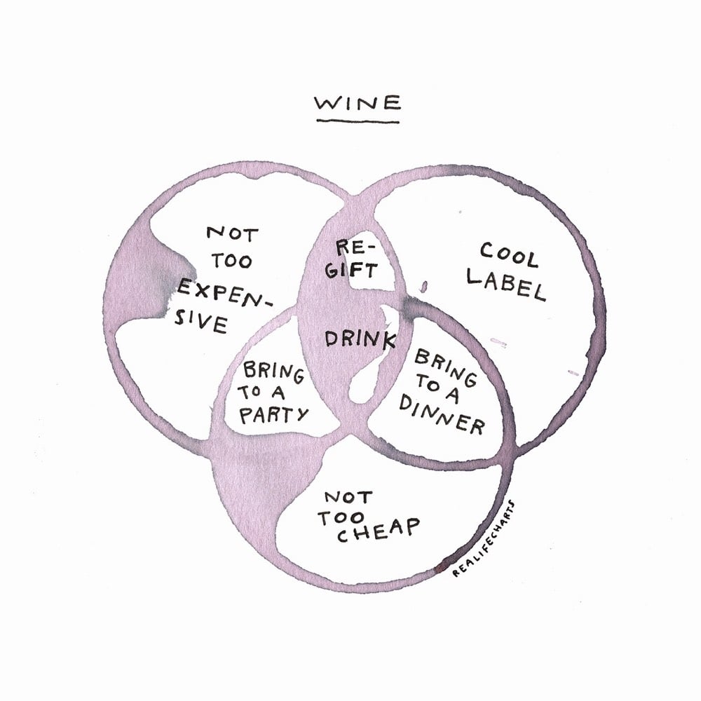
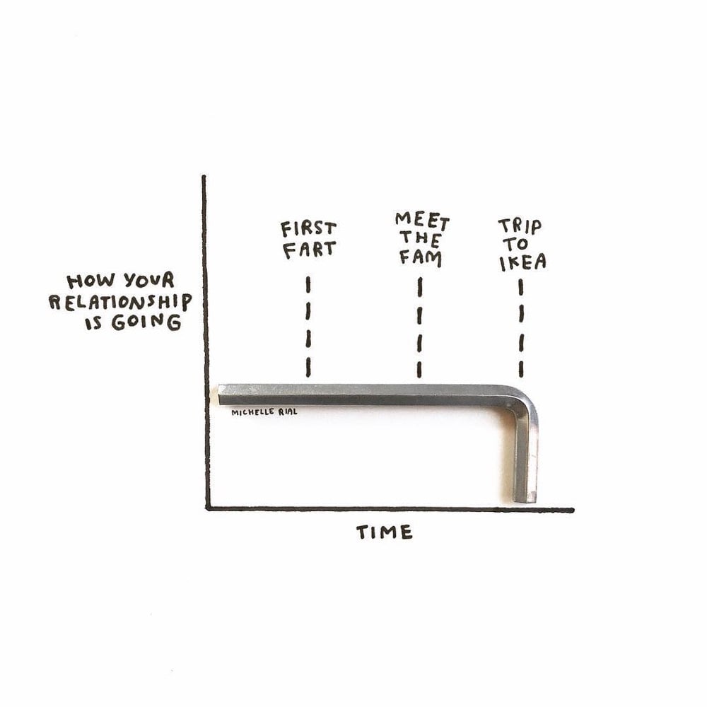
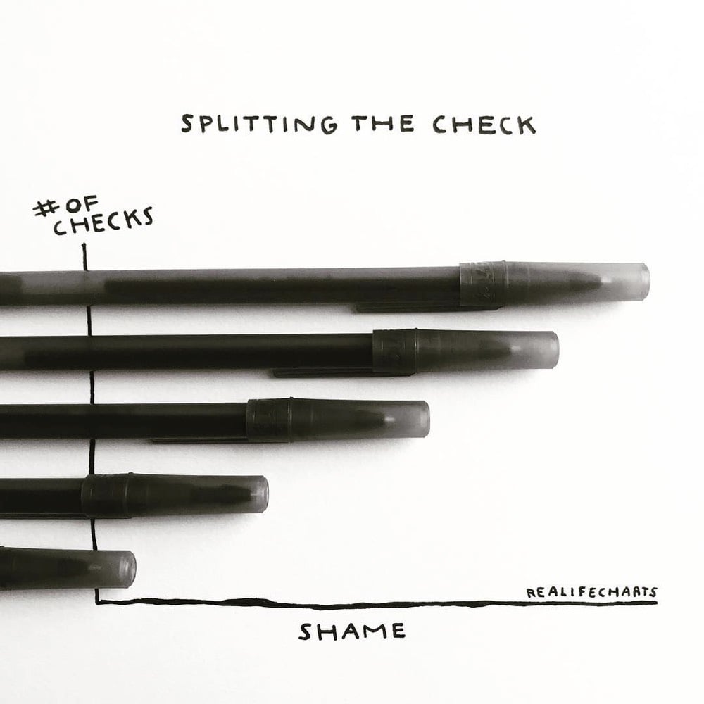
Designer Michelle Rial makes these clever and charming charts and posts them to her Instagram account. Some of the charts are hand-drawn but my favorite ones are made using real world objects, like the ones above. Reminds me of XKCD, Christoph Niemann, and Mari Andrew. Rial has posters, mugs, tote bags, and other items featuring her charts for sale on Society6.
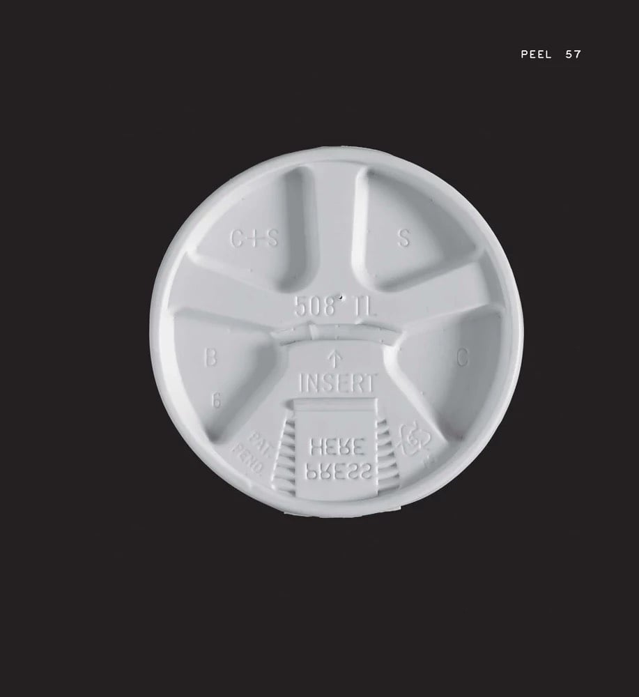
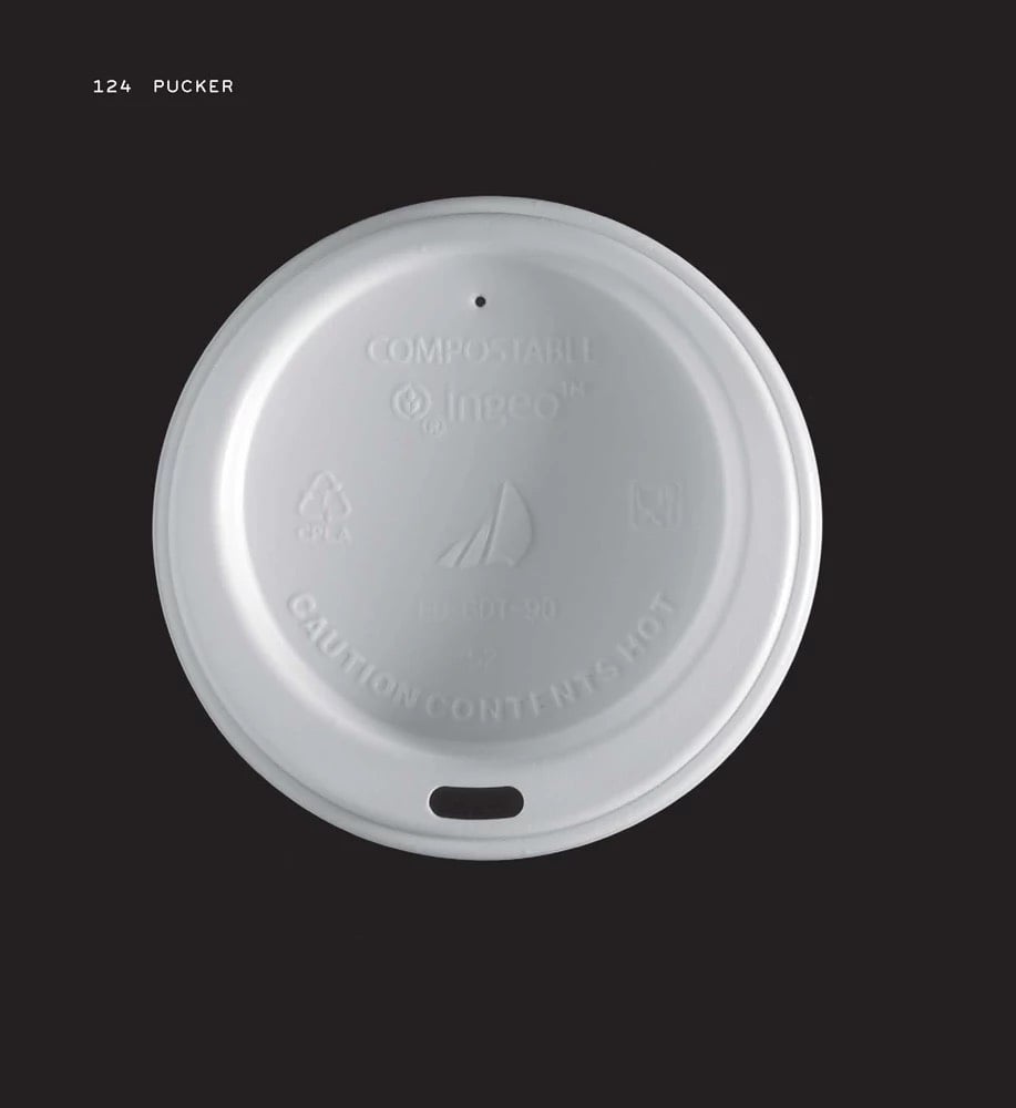
You’d think it’d be simple enough: make a disposable lid for a takeout coffee cup. You should be able to drink the coffee without removing the lid and the lid should stay on if the cup tips over (most of the time). But this simple design challenge has been solved in many different ways, as evidenced in Louise Harpman’s and Scott Specht’s forthcoming book, Coffee Lids: Peel, Pinch, Pucker, Puncture.
The book is a partial catalogue of the authors’ extensive collection of coffee lids. Photos of the lids are organized into groups based on what you do with the lid to get at that sweet sweet beverage: peel, pinch, pucker, or puncture. They explained the four types of lid in an article for Cabinet magazine in 2005.
Certain lids, such as the Solo Traveler (1986) designed by Jack Clements, require the drinker only to place his or her mouth over the protruded polystyrene proboscis. The pucker-type lid requires its user to drink through the lid, not from the cup, as is the case in the peel-type lids. The Solo Traveler is the lid that Phil Patton championed in his 1996 article in I.D. magazine and also the lid that art and design curator Paola Antonelli selected for inclusion in last year’s Museum of Modern Art exhibition, “Humble Masterpieces.” This type of lid offers a certain degree of “mouth comfort” and also has added “loft” space within the structure of the lid to accommodate beverages with frothy tops.
What a phrase: “protruded polystyrene proboscis”. Harpman also gives a short tour of the collection in this video:
In September of 1937, Joseph Friedman was awarded a U.S. Patent for a “drinking tube” with a flexible neck, aka the bendy straw.
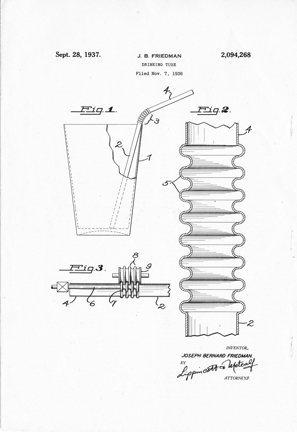
My invention provides a flexible portion in the straw positioned near one end so that a bend may be made at a point above the rim or lip of the container and the upper, or mouthpiece end of the straw may then be angularly directed to enter the mouth readily without the customer assuming an awkward position.
Derek Thompson describes the moment of inspiration and subsequent experimentation that led to the bendy straw’s invention:
Half a century after Marvin Chester Stone found grass in his julep, Joseph B. Friedman was sitting at his brother’s fountain parlor, the Varsity Sweet Shop, in the 1930s, watching his little daughter Judith fuss over a milkshake. She was drinking out of a paper straw, so we can be assured that the milkshake did not taste like grass. But since Stone’s paper straw was designed to be straight, little Judith was struggling to drink it up.
Friedman had an idea. As the Smithsonian’s Lemelson Center explains, he brought a straw to his home, where he liked to tinker with inventions like “lighted pencils” and other newfangled writing equipment. The straw would be a simple tinker. A screw and some string would do.
Friedman inserted a screw into the straw toward the top (see image). Then he wrapped dental floss around the paper, tracing grooves made by the inserted screw. Finally, he removed the screw, leaving a accordion-like ridge in the middle of the once-straight straw. Voila! he had created a straw that could bend around its grooves to reach a child’s face over the edge of a glass.
Both straws and corrugated tubing had long existed, but no one thought to put them together until Friedman’s malt shop eureka.
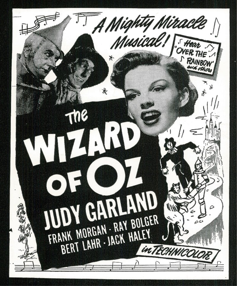
The Harry Ransom Center at the University of Texas at Austin is currently digitizing and putting online their collection of more than 10,000 movie posters.
The collection encompasses upwards of 10,000 posters and spans decades: from when the film industry was just beginning to compete with vaudeville acts in the 1920s to the rise of the modern megaplex and drive-in theaters in the 1970s. The sizes range from that of a small window card to that of a billboard.
You can browse the collection here. They’ve scanned over 4000 of the posters already and there are currently 500 posters available online, but more of them “will incrementally be made accessible online”.
See also a short film about a one-of-a-kind collection of letterpress plates for printing film advertisements and an amazing online collection of 40,000 vintage film posters. (via @john_overholt)
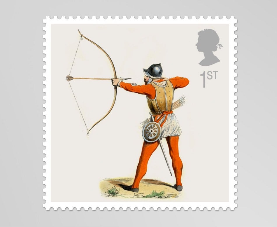
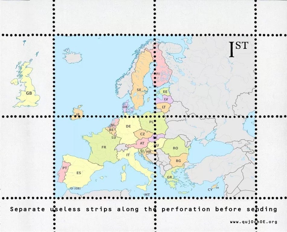
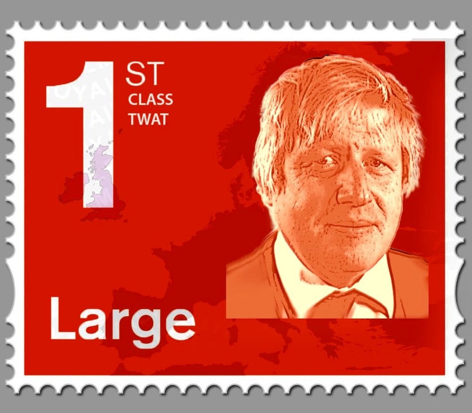
After British MP Andrea Leadsom called for the Royal Mail to issue a postage stamp commemorating Brexit, some people who are not entirely in favor of leaving the EU have posted their best efforts at a stamp design on Twitter under the #brexitstamps hashtag. A few of my favorites:
Note: The image at the top of this post does not show the actual interface. See the update below.
The Honolulu Civil Beat has tweeted a screenshot of the interface that was used to send an real alert for a nonexistent incoming ballistic missile on Saturday morning.

Instead of selecting “DRILL - PACOM (CDW) - STATE ONLY” from what looks more like a list of headlines on The Drudge Report than a warnings & alerts menu, the operator chose “PACOM (CDW) - STATE ONLY” and sent out a real alert.
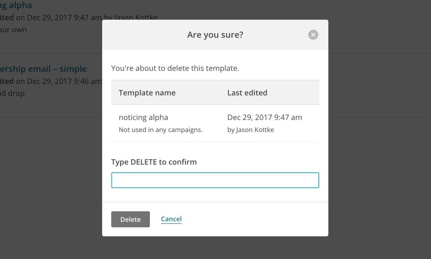
The design for this is obviously terrible. As others have noted, there are better interfaces for confirming much more trivial actions on our phones. In Mailchimp, the service that powers the Noticing newsletter, you are asked to manually type in the word “DELETE” as a confirmation for deleting a template (an action a tiny bit less consequential than sending out a ballistic missile launch alert):
But the response to the false alarm has been worse. The employee who triggered the erroneous alert has been “reassigned” and, as the news cycle continues to wind itself up, it wouldn’t surprise me if he were soon fired. And the fix for this, again per the Honolulu Civil Beat, is the addition of the “BMD False Alarm” link at the top of the menu, presumably so that if a real alert is sent out again in the future, it can be followed by a message saying, “actually, that was a drill”.
Hopefully this, uh, “redesign” is temporary and a full overhaul is in the works. That menu is a really dangerous bit of interface design and adding an “oopsie, we didn’t mean it” button doesn’t help. The employee made a mistake but it’s not his fault and he shouldn’t be fired for it. The interface is the problem and whoever caused that to happen — the designer, the software vendor, the heads of the agency, the lawmakers who haven’t made sufficient funds available for a proper design process to occur — should face the consequences. More importantly, the necessary changes should be made to fix the problem in a way that’s holistic, resilient, long-lasting, and helps operators make good decisions rather than encouraging mistakes.
Update: John Allspaw, who worked at both Etsy and Flickr at a time when they thought deeply about design and engineering process, says that a wider view is needed to truly understand what happened and fix it.
Focusing solely and narrowly on the “bad UI’ design in the Hawaii alert accident would be like focusing solely and narrowly on the F-15 misidentification in @scottsnook’s causal map in “Friendly Fire”.
Here’s the map he’s referring to, along with a link to a discussion of the F-15 incident described by Snook in the context of causal landscapes.

To compound this challenge, people want definitive 1-2 word answers, as if life was a series of mechanical operations and it was possible to affix blame and diagnose faults. If a copying machine jams, there is usually a mechanical reason — a sheet of paper may have gotten stuck in the assembly and once it is removed, the problem is solved. Mechanical problems like this are determinate; there is a cause and it can be identified. Yet most of our problems are not mechanical. They are not determinate. There is not a single cause. There are multiple, intersecting causes and we may never uncover some of the most important causes. We live in a multi-cause, indeterminate world and our attempts to understand why events occurred will usually be frustrating. We cannot expect specific single-cause 1-2 word answers.
It’s easy to say that the menu is wrong and it should be redesigned. But how did that menu come to be? What’s the context? What does the casual landscape look like here? Back to Allspaw (emphasis mine):
How are operators of the alert system involved in the design of their tools? How have those tools changed over time, across staff changes and feedback rounds? How do ‘near-misses’ happen with this system? How many operators are familiar with these tools and how many are new?
What does this system look like (not just UI) contrasted with other states with similar systems? How have accidental false-alarms been caught before? What data is collected about the type of work (difficulty, frequency, procedure-updating, etc.) including upward mgmt?
In other words: we focus on the UI because unhelpful UI is endemic to software, and easily identified and cartoonishly convicted. But there’s always much more to the narrative of an accident.
As it says on the front page of the site for Allspaw’s new consulting firm (which works with groups facing problems just like the Hawaii alert snafu): “Incidents are encoded messages your system is sending you about how it really works.” I hope that message is being received by the Hawaii Emergency Management Agency in the right way.
Update: Honolulu Civil Beat is now reporting that the image above is not what the actual interface looks like.
However, state officials now say that image was merely an example that showed more options than the employee had on the actual screen.
“We asked (Hawaii Emergency Management Agency) for a screenshot and that’s what they gave us,” Ige spokeswoman Jodi Leong told Civil Beat on Tuesday. “At no time did anybody tell me it wasn’t a screenshot.”
HEMA won’t share what the interface actually looks like because of security concerns (which is understandable) but they did provide a new image that “better represents what an employee would have seen on Saturday”:

While this doesn’t look so much like a homepage from 1995, I would argue that fundamentally, the design (how it works, not how it looks) is unchanged. There are fewer options but the problematic similarity between options hiding vastly difference consequences remains. (via @andrewlong166)
Update: According to a federal investigation, the employee who sent out the alarm misheard a message played during a drill and thought it was the real thing. They have been fired.
This report, made public on Tuesday, said that the employee “has been a source of concern” to other staffers “for over 10 years.” The employee, who has been fired, has confused real world events and drills “on at least two separate occasions,” according to the report.
In addition to this person being fired last week, the head of the Hawaii Emergency Management Agency resigned Tuesday morning.
Regardless of the “cause”, the process for distinguishing between drills and real-world situations still seems problematic. And that UI is still bad.
In the 1970s, legendary industrial designer Dieter Rams formulated his now-famous ten principles for good design.
5. Good design is unobtrusive. Products fulfilling a purpose are like tools. They are neither decorative objects nor works of art. Their design should therefore be both neutral and restrained, to leave room for the user’s self-expression.
6. Good design is honest. It does not make a product more innovative, powerful or valuable than it really is. It does not attempt to manipulate the consumer with promises that cannot be kept.
Suzanne LaBarre of Co.Design has come up with an update of Rams’ list for 2018: 10 New Principles Of Good Design.
Good design is slow. For the past 20 years, tech has embraced a “move fast and break things” mantra. That was fine when software had a relatively small impact on the world. But today, it shapes nearly every aspect of our lives, from what we read to whom we date to how we spend money-and it’s largely optimized to benefit corporations, not users. The stakes have changed, the methods haven’t.
Good design is good writing. In his “2017 Design in Tech Report,” author John Maeda anointed writing as design’s newest unicorn skill. It’s easy to see why. With the rise of chatbots and conversational UI, writing is often the primary interface through which users interact with a product or service. (Siri’s dad jokes had to be written by someone.) But even designers who don’t work on interface copy should be able to articulate themselves clearly. The better their writing, the better their chances of selling an idea.
See also the tongue-in-cheek list of design principles updated for the tech industry, e.g. “Good design is pleasing your shareholders”.
In 1999, two friends went into a Nebraska antique shop and found a massive collection of letterpress blocks and plates that were used to make advertisements for movies in newspapers. They bought the whole shebang for $2000 and have spent the last 17 years cataloging and cleaning the 60,000 plates & blocks (here is just a partial inventory). The collection, which spans nearly the entire history of the film industry from the silent era to 1984, was recently appraised at ~$10 million and is available for acquisition.
The short film embedded above is a must-see for design/movie nerds…my jaw hit the floor when these pristine posters for movies that were 50, 60, 70 years old started rolling off of the letterpress. I mean, look at this stuff!
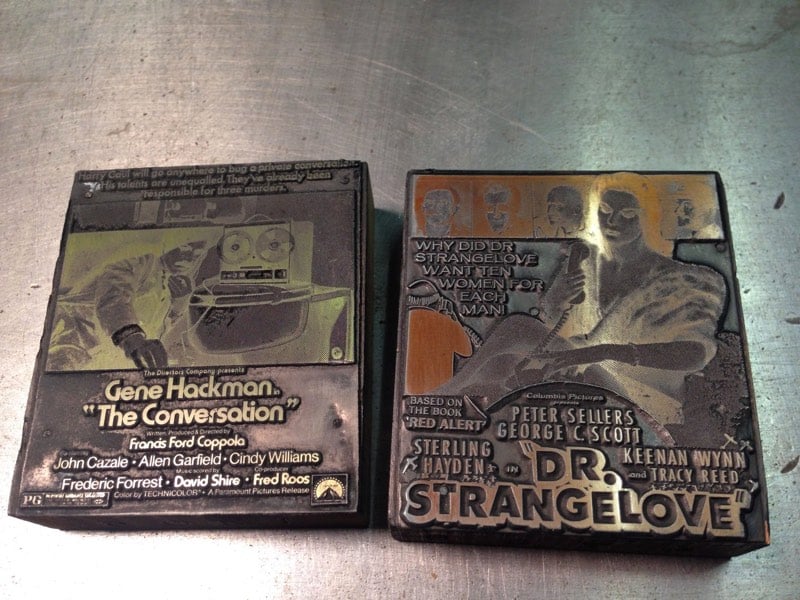
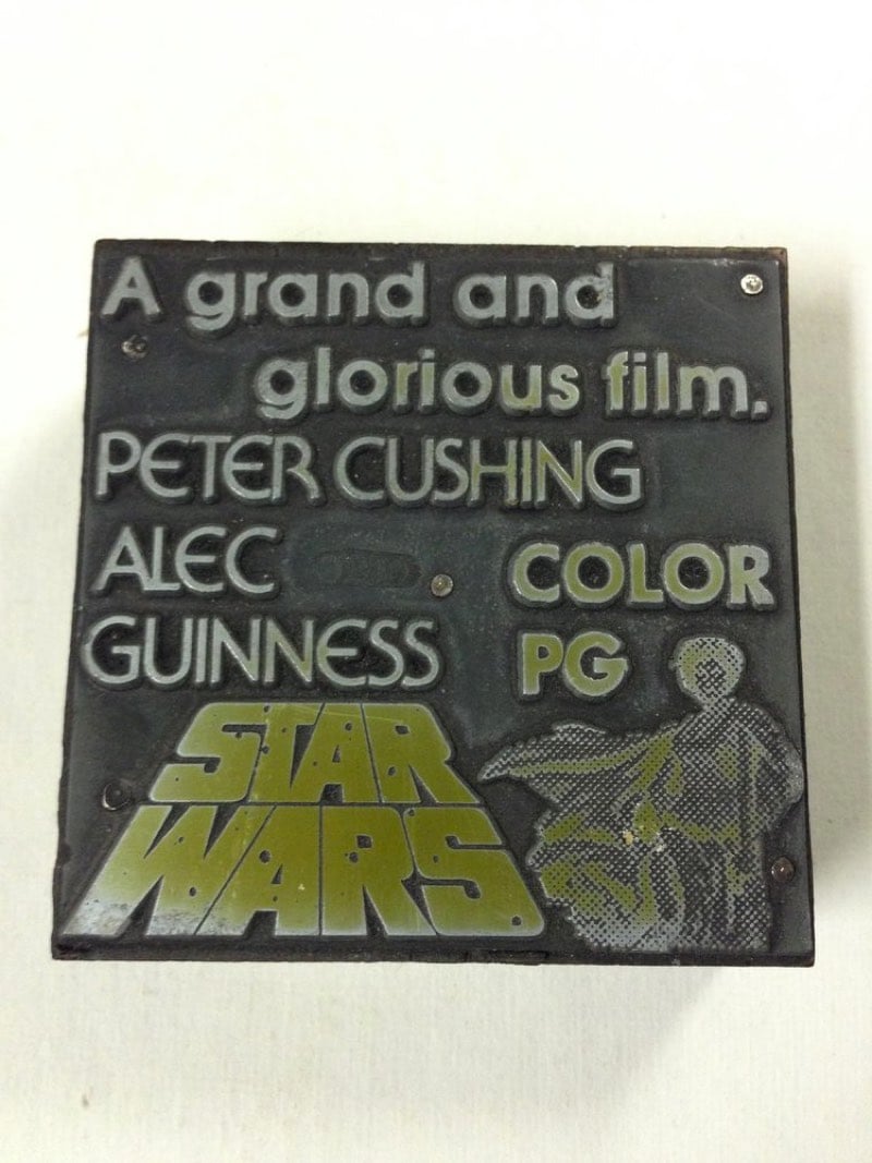
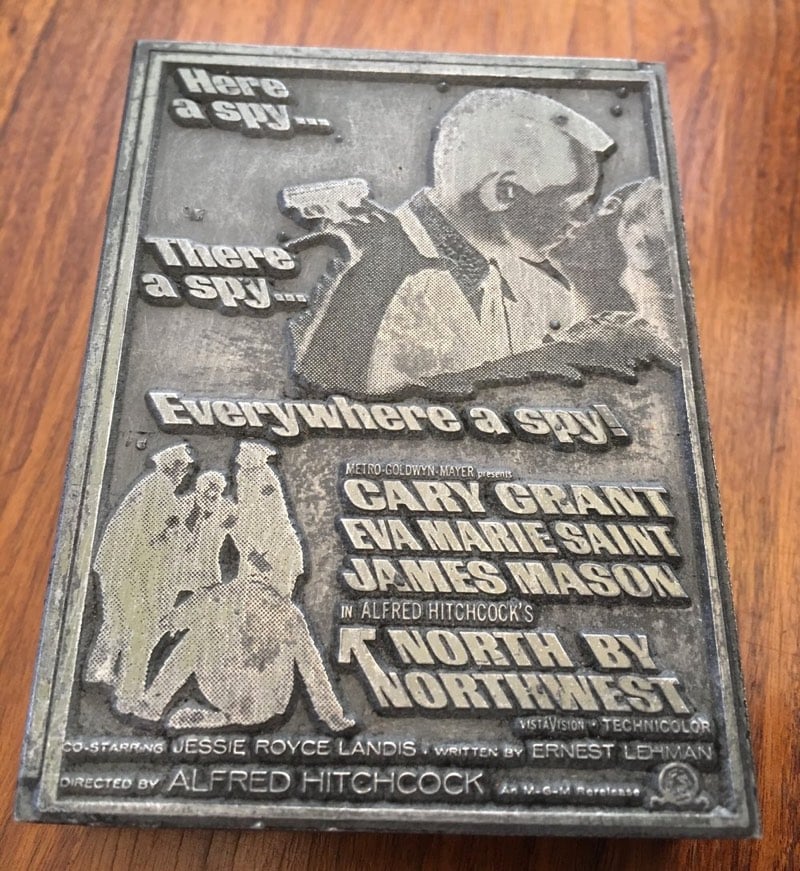
Note: I flipped the images of the plates so they would be readable. The actual plates are mirror images of the printed advertisements. Here’s what a print made from a plate looks like:
The other day, Google Ventures’ Daniel Burka asked his followers for suggestions on the best design books that aren’t about design. Burka offered up How Buildings Learn by Stewart Brand as his selection. Agreed! Here are the responses I found most interesting (some of which actually are about design, more or less):
The Death and Life of Great American Cities by Jane Jacobs, a reminder to put humans at the center of city planning.
Understanding Comics by Scott McCloud. I read this ages ago and still think about it all the time.
The Mezzanine by Nicholson Baker, a book that takes place entirely on an escalator ride.
Creativity, Inc. by Ed Catmull, about leadership, creativity, and storytelling at Pixar.
Read Burka’s summary of the thread at Medium (please clap).
Nature has amassed 3.8 billion years of R&D on how to engineer and design things and systems. So when designers are looking at how to solve problems, they should pay closer attention to how the evolutionary process dealt with similar situations. For example, an engineer working on a redesign of the Japanese bullet train used his birdwatching knowledge to borrow design elements from birds like a kingfisher, an owl, and a penguin.
Japan’s Shinkansen doesn’t look like your typical train. With its long and pointed nose, it can reach top speeds up to 150-200 miles per hour.
It didn’t always look like this. Earlier models were rounder and louder, often suffering from the phenomenon of “tunnel boom,” where deafening compressed air would rush out of a tunnel after a train rushed in. But a moment of inspiration from engineer and birdwatcher Eiji Nakatsu led the system to be redesigned based on the aerodynamics of three species of birds.
I love the idea of the Shinkansen as a chimerical creature constructed from the bodies of three very different types of birds. (via the kid should see this)
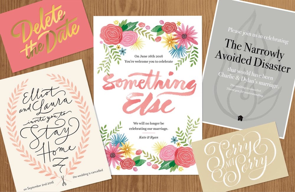
For a NY Times piece on cancelled weddings, Jessica Hische created these anti-invitations in the style of fancy wedding invites.
My thoughts immediately went to fancy wedding stationery, and I had a lot of fun both writing and designing these fake anti-invitations. I tried to poke fun at some of the current trends in wedding stationery design, which meant I got to have fun playing with watercolors!
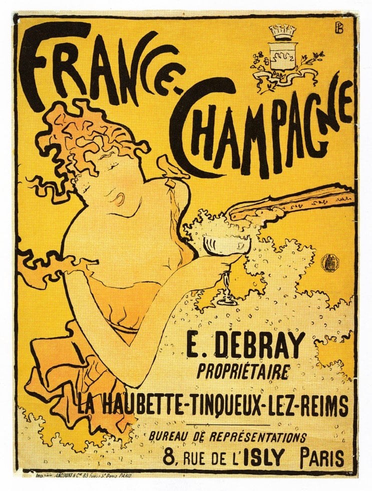
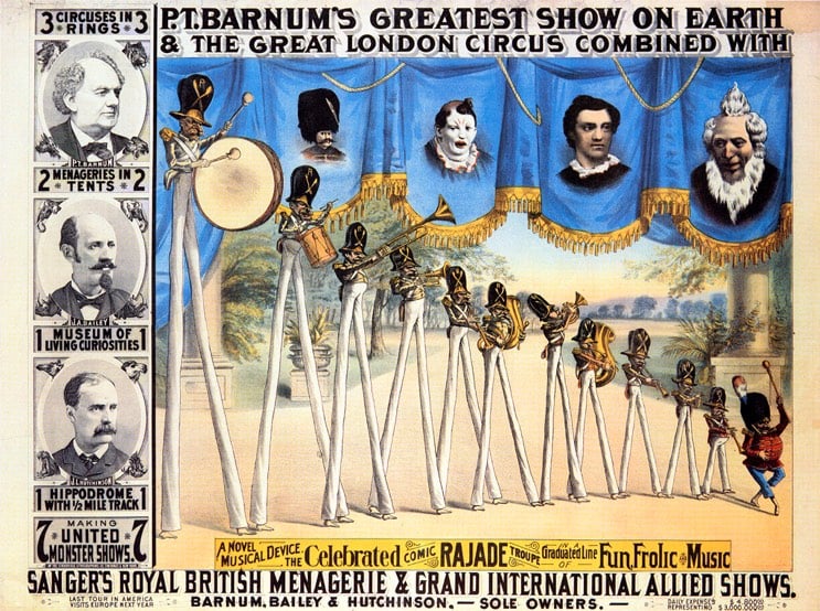
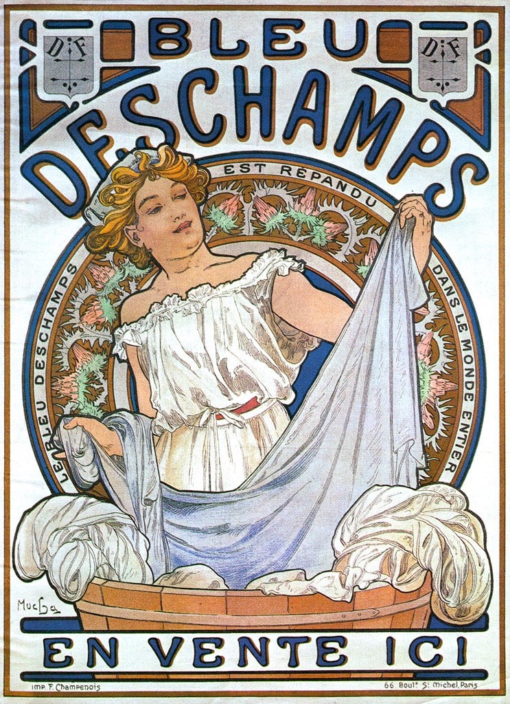
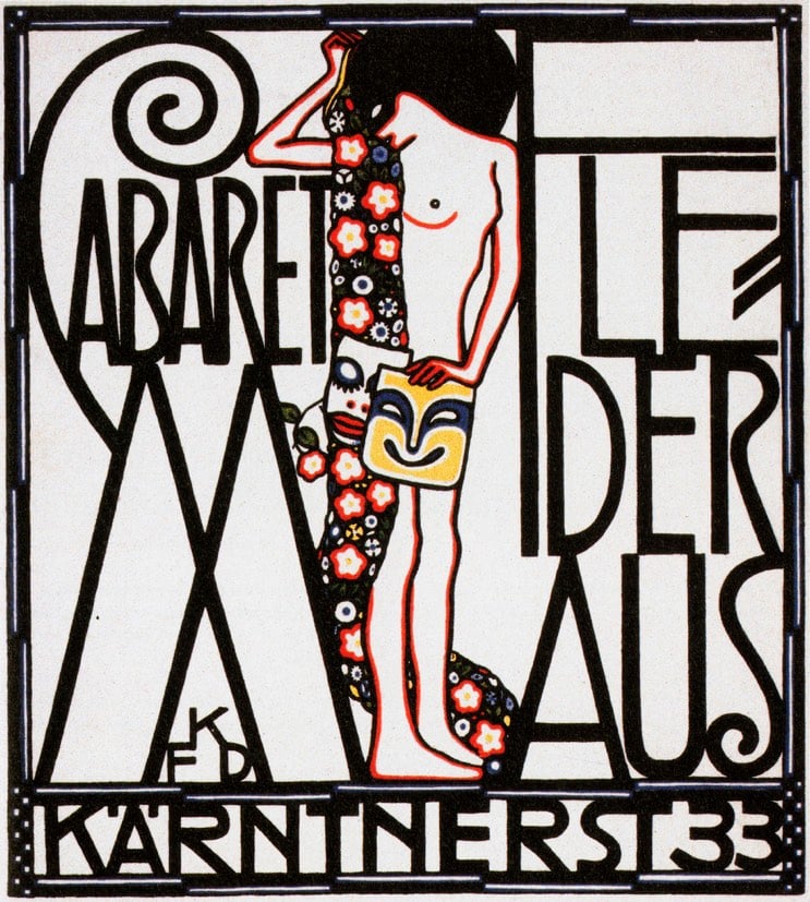
This collection of posters compiled by the library at the Minneapolis College of Art & Design is an amazing trove of turn-of-the-century design and illustration.
In the late nineteenth century, lithographers began to use mass-produced zinc plates rather than stones in their printing process. This innovation allowed them to prepare multiple plates, each with a different color ink, and to print these with close registration on the same sheet of paper. Posters in a range of colors and variety of sizes could now be produced quickly, at modest cost. Skilled illustrators and graphic designers — such as Alphonse Mucha, Jules Chéret, Eugène Grasset, and Henri de Toulouse-Lautrec — quickly began to exploit this new technology; the “Golden Age of the Poster” (1890s through the First World War) was the spectacular result.
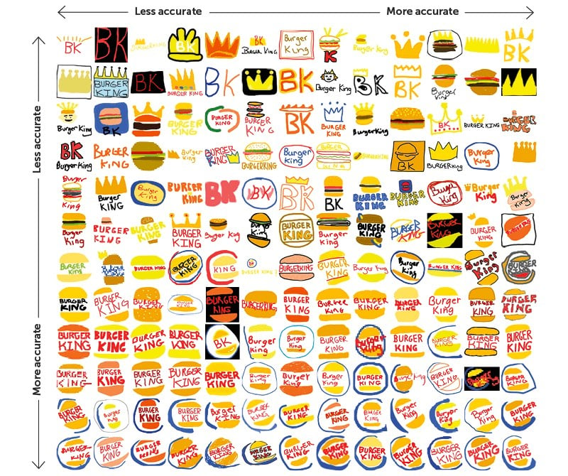
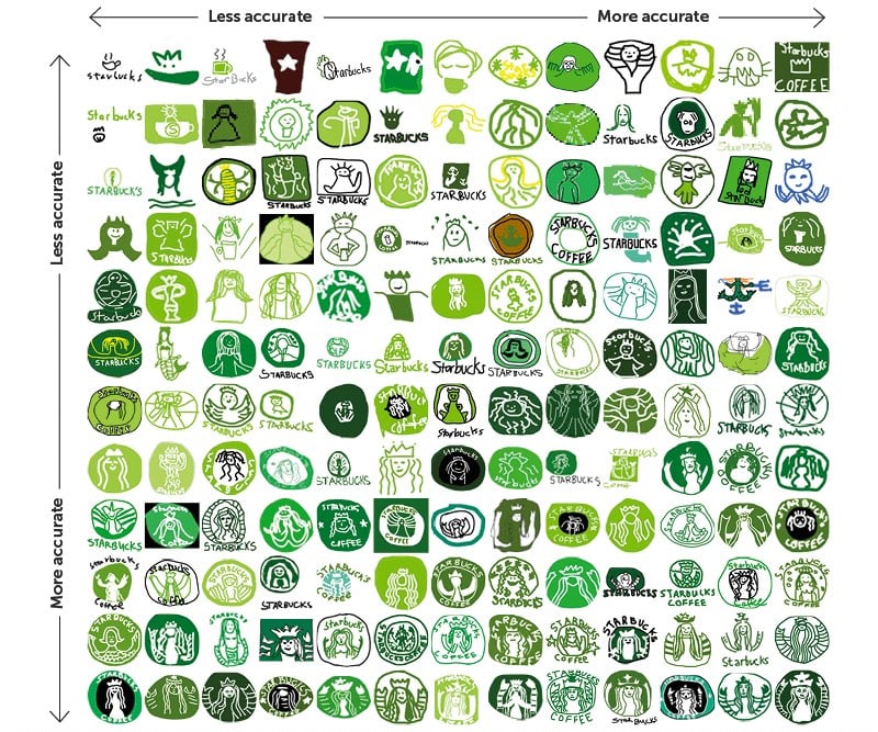
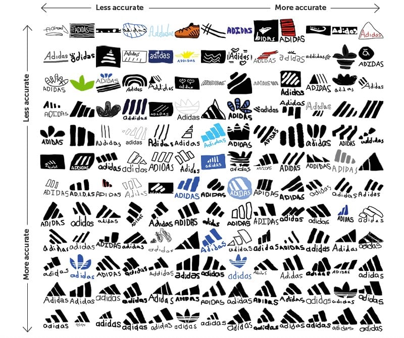
Signs.com asked dozens of Americans to draw the logos of well-known companies from memory, including Domino’s, Apple, Adidas, and Starbucks. As you can see, there was a wide range in aptitude and some logos fared better than others; overall the Starbucks and Foot Locker logos were the worst drawn while Ikea and Target were the best represented.
There is also this (a true story):
Adidas, the second largest sportswear company in the world, acquired its three-stripes logo in 1952 from footwear brand Karhu Sports for two bottles of whiskey and the equivalent of $2,000.
See also drawing all 50 states from memory, can you draw a working bicycle from memory?, and maps drawn from memory.

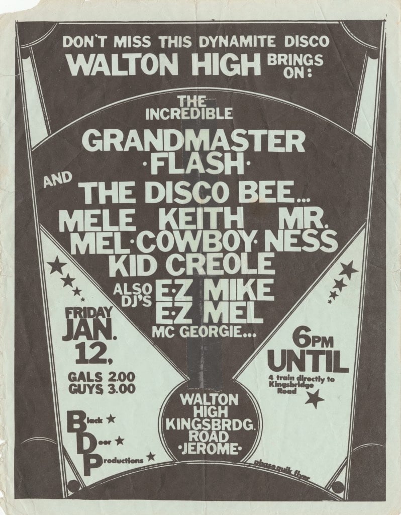
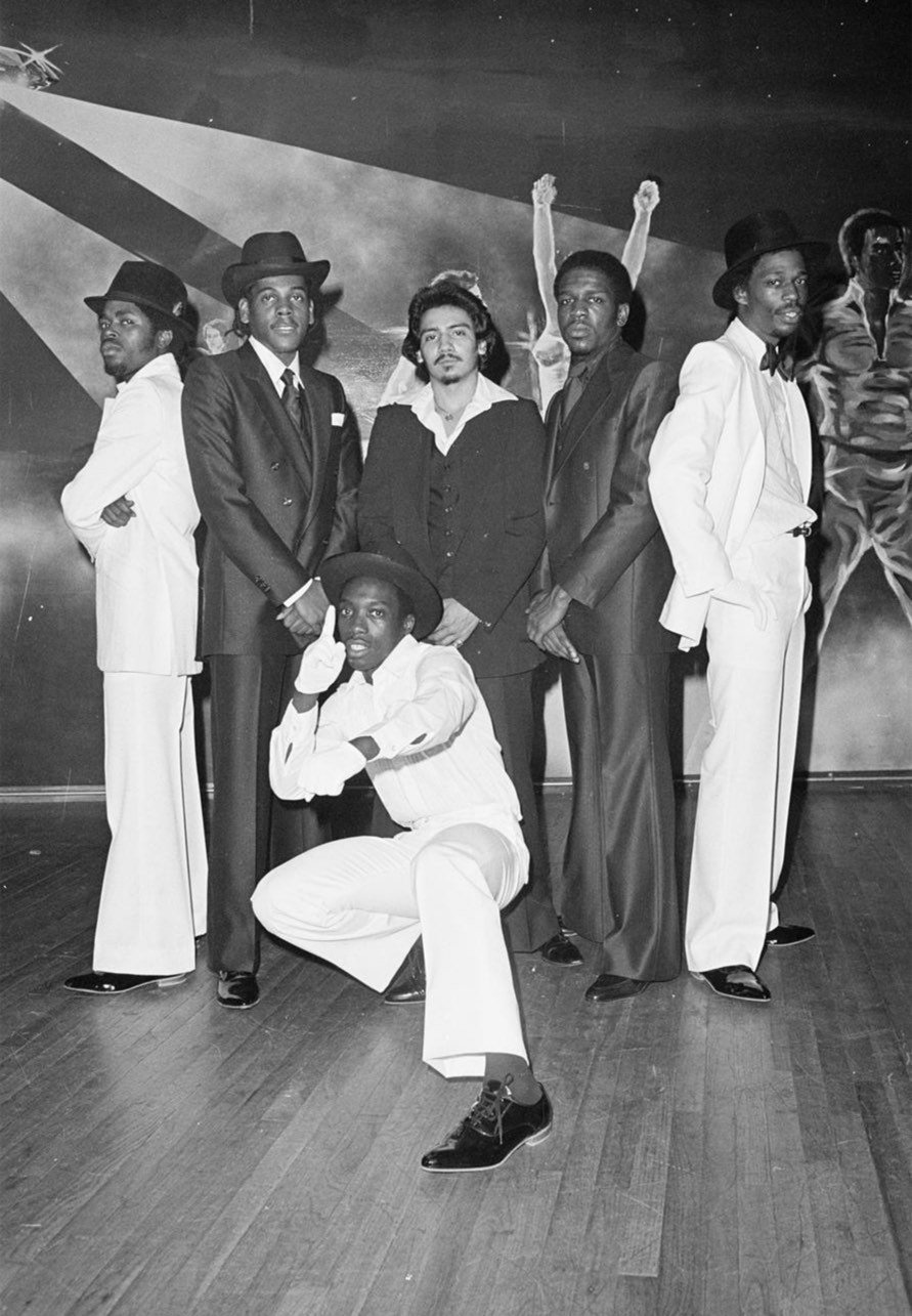
Cornell University has a hip hop collection with tens of thousands of objects in it: photos, posters, flyers, magazines, etc. Much of the collection is only available on site in Ithaca, NY by appointment, but parts of it have been digitized, like these party and event flyers:
Created entirely by hand, well before widespread use of design software, these flyers preserve raw data from the days when Hip Hop was primarily a live, performance-based culture in the Bronx. They contain information about early Hip Hop groups, individual MCs and DJs, promoters, venues, dress codes, admission prices, shout outs and more. Celebrated designers, such as Buddy Esquire (“The Flyer King”) and Phase 2, made these flyers using magazine cutouts, original photographs, drawings, and dry-transfer letters.
And the archive of Joe Conzo Jr., who photographed groups, parties, events, and the like in the South Bronx in the late 70s and early 80s (but FYI, the Conzo archive interface is more than a little clunky and there’s lots of non-hip hop stuff to wade through):
In 1978, while attending South Bronx High School, Conzo became friends with members of the Cold Crush Brothers, an important and influential early Hip Hop group which included DJs Charlie Chase and Tony Tone and MCs Grandmaster Caz, JDL, Easy AD, and Almighty KayGee. Conzo became the group’s professional photographer, documenting their live performances at the T-Connection, Disco Fever, Harlem World, the Ecstasy Garage, and the Hoe Avenue Boy’s Club. He also took pictures of other Hip Hop artists and groups, including The Treacherous 3, The Fearless 4, and The Fantastic 5.
These rare images capture Hip Hop when it was still a localized, grassroots culture about to explode into global awareness. Without Joe’s images, the world would have little idea of what the earliest era of hip hop looked like, when fabled DJ, MC, and b-boy/girl battles took place in parks, school gymnasiums and neighborhood discos.
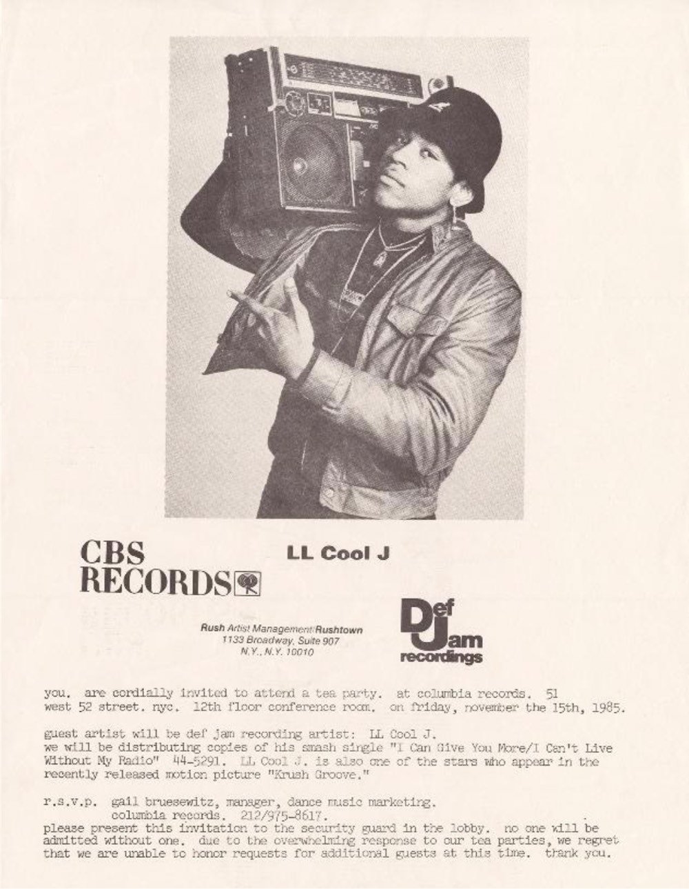
And most recently a portion of the Adler Hip Hop Archive, compiled by journalist and early Def Jam executive Bill Adler:
The Adler archive contains thousands of newspaper and magazine articles, recording industry press releases and artist bios, correspondence, photographs, posters, flyers, advertising, and other documents. These materials offer an unprecedented view into Hip Hop’s history and are made available here for study and research.
Fair warning: don’t click on any of those links if you’ve got pressing things to do…you could lose hours poking around.
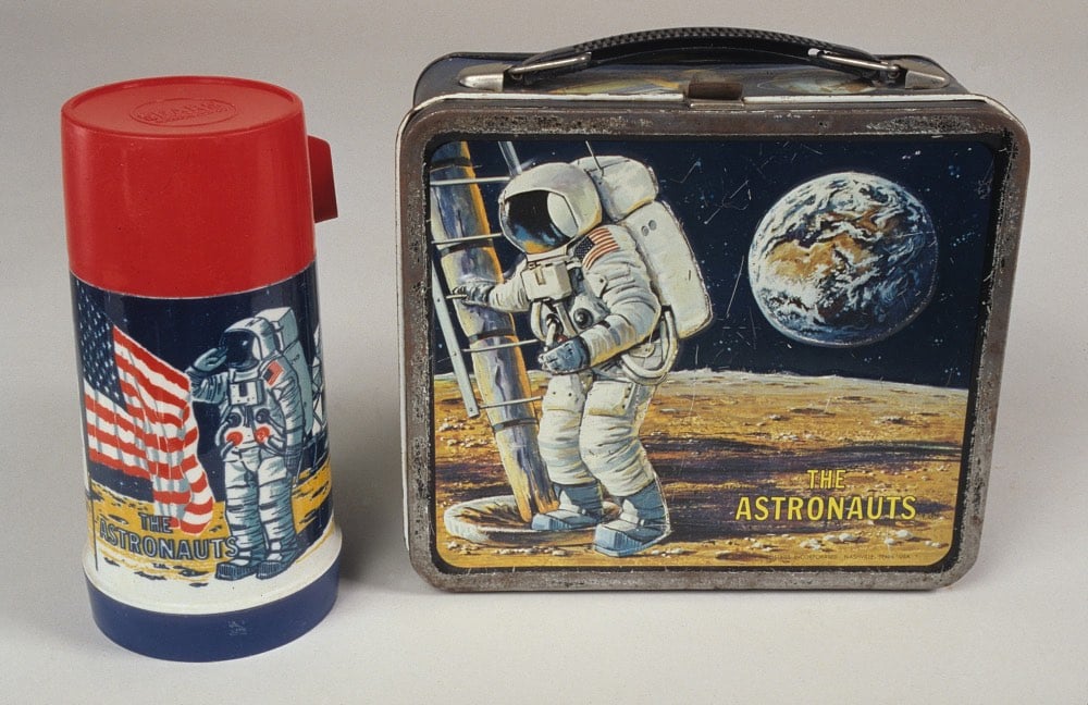
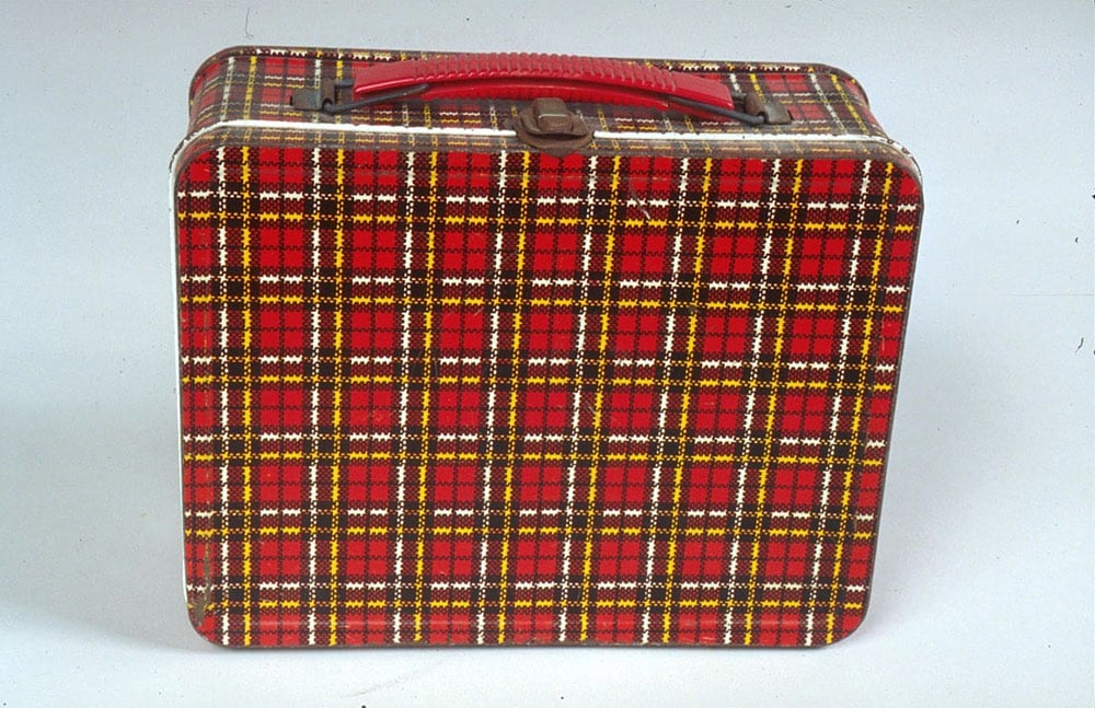
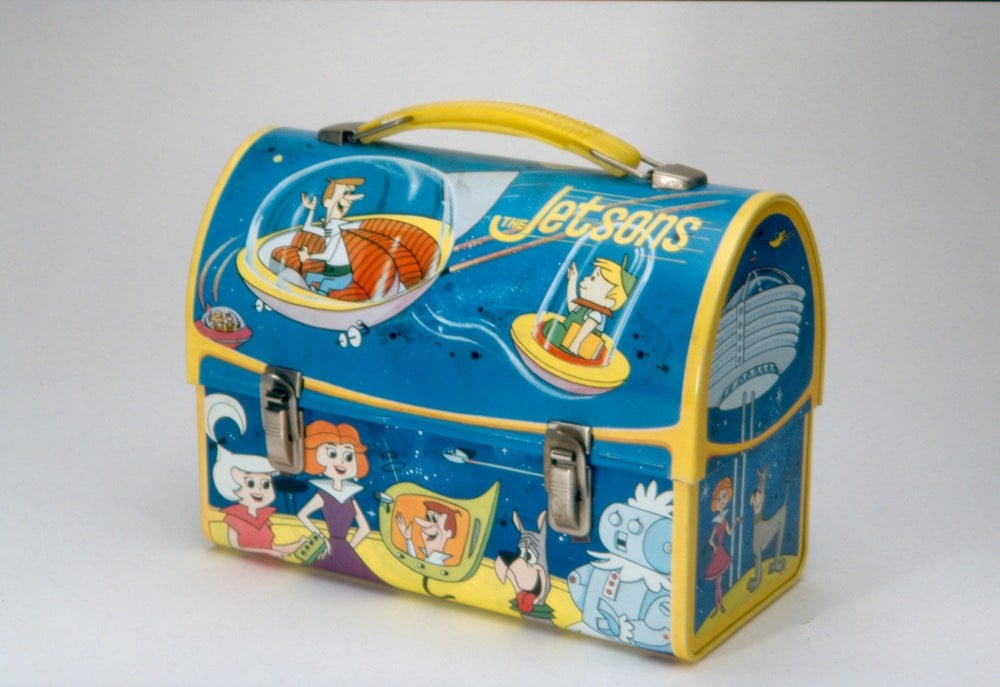
I have rarely clicked on a link as quickly as this one for A Visual History of Lunchboxes. For Design Observer, John Foster looked through the National Museum of American History’s online collection of lunchboxes and pulled out some gems.
My childhood lunchboxes didn’t make either collection’s cut. In grade school, I carried this Dukes of Hazzard lunchbox before switching to a red plastic Return of the Jedi lunchbox for the first couple years of middle school.
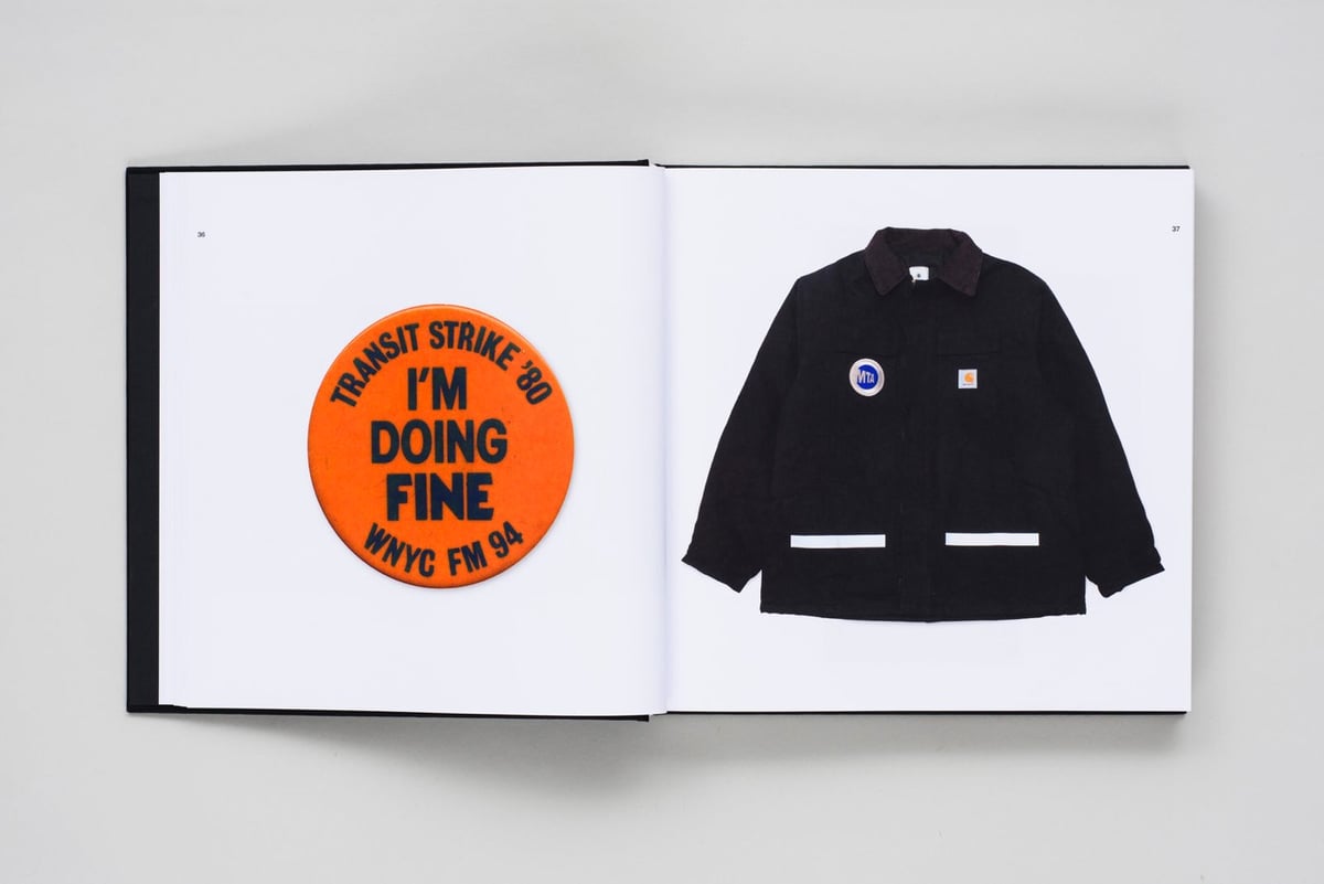
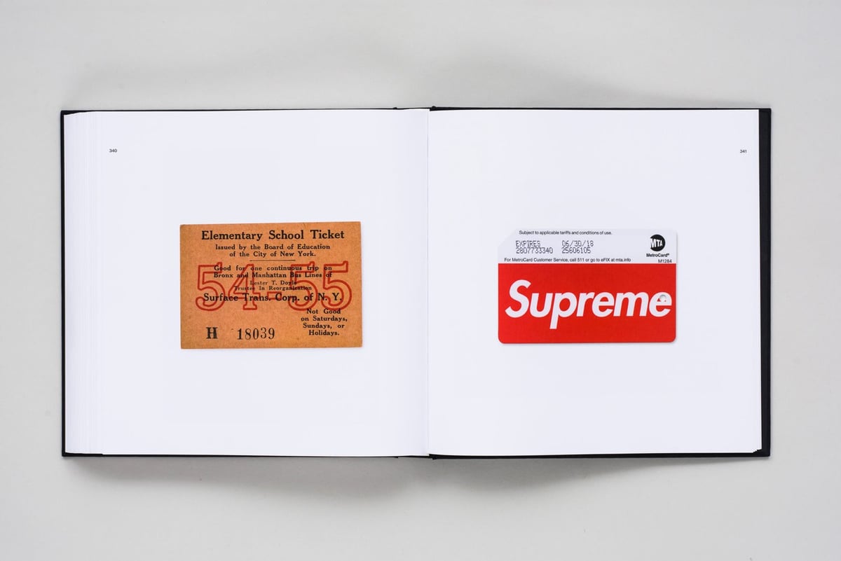
From the team that brought us the reissues of the NASA Standards Manual and the NYCTA Graphics Standards Manual comes New York City Transit Authority: Objects by Brian Kelley (@ Amazon), a book full of photographs of artifacts related to the NYC subway and other transit systems in the city.
Kelley started collecting MTA MetroCards in 2011, and he quickly became fascinated by other Subway-related objects. This catalogue is the first of its kind — presenting a previously uncollated archive of subway ephemera that spans three centuries.
Kelley posts photos of many of the artifacts he’s found on Instagram.
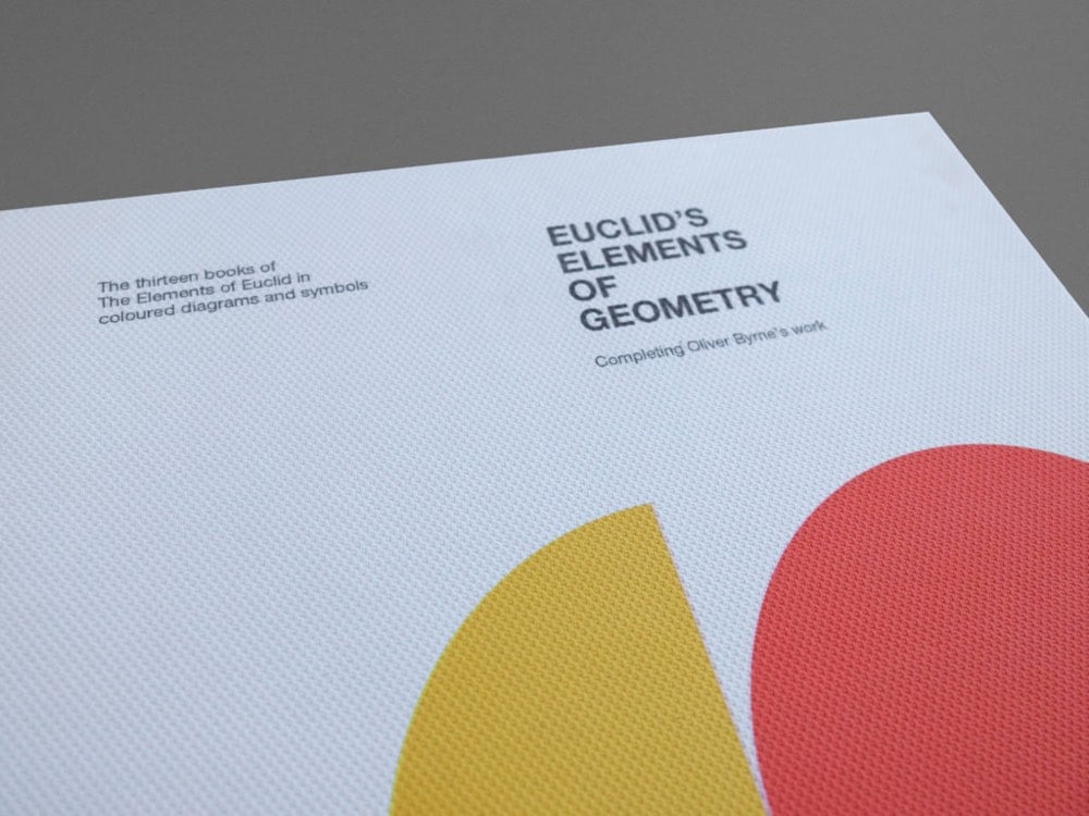
From Kronecker Wallis, the folks who brought you this reissue of Newton’s Principia, comes a new edition of Euclid’s Elements designed in a modernist Swiss Style.
Euclid’s Elements has been referred to as the most successful and influential textbook ever written. It was one of the very earliest mathematical works to be printed after the invention of the printing press and has been estimated to be second only to the Bible, in the number of editions published since the first printing in 1482.
The Elements is a mathematical treatise consisting of 13 books attributed to the ancient Greek mathematician Euclid. It is a collection of definitions, postulates, propositions (theorems and constructions), and mathematical proofs of the propositions. Elements is the oldest surviving large-scale deductive treatment of mathematics. It has proven instrumental in the development of logic and modern science.
The design and implementation of the book is based off of Oliver Byrne’s edition of Elements from 1847, of which Megan Mulder of the Z. Smith Reynolds Library writes:
Byrne’s Euclid is admired as much for its surprisingly modernist design and color palette — which seems to anticipate Bauhaus and De Stijl — as for its innovative pedagogy.
I have a copy of their Principia reissue (it’s beautiful), so I’m looking forward to this one.
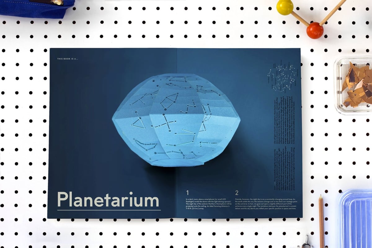
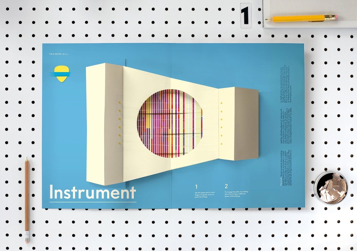
A couple of years ago, I told you about designer Kelli Anderson’s upcoming book, This Book is a Planetarium. It took awhile to get everything just right, but I’m happy to report the book will finally be out in early October.
Defying every expectation of what a book can be, this pop-up extravaganza transforms into six fully functional tools: a real working planetarium projecting the constellations, a musical instrument complete with strings for strumming, a geometric drawing generator, an infinite calendar, a message decoder, and even a speaker that amplifies sound. Artist Kelli Anderson contributes enlightening text alongside each pop-up, explaining the scientific principles at play in her constructions and creating an interactive experience that’s as educational as it is extraordinary.
Here’s a video of Anderson playing with two of the six contraptions. She sent me a preview of the book in the form of the planetarium pop-up page (accompanied by one of these cool cards) and when I cracked it open, I actually squealed. Seriously, this thing is super awesome. We took it and my iPhone flashlight into the darkest room in the house and sure enough, there was the Big Dipper projected onto the ceiling…my kids could barely stop saying “this is so cool”. Really looking forward to seeing the real thing in October.
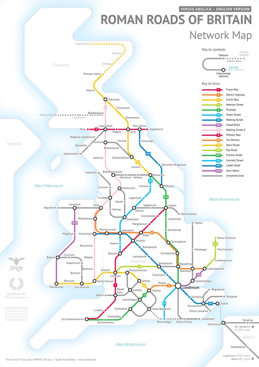
After completing his subway-style map of the roads of the entire Roman Empire, Sasha Trubetskoy began work on a highly requested follow-up: a similar map of the Roman roads in Britain.
This was far more complicated than I had initially anticipated. Not only were there way more Roman Roads in Britain than I initially thought, but also their exact locations and extents are not very clear. In a few places I had to get rather creative with the historical evidence.
As Wikipedia notes, most of the roads were completed by 180 AD and many of them are still in use today.
After the Romans departed, systematic construction of paved highways in the UK did not resume until the early 18th century. The Roman road network remained the only nationally-managed highway system within Britain until the establishment of the Ministry of Transport in the early 20th century.
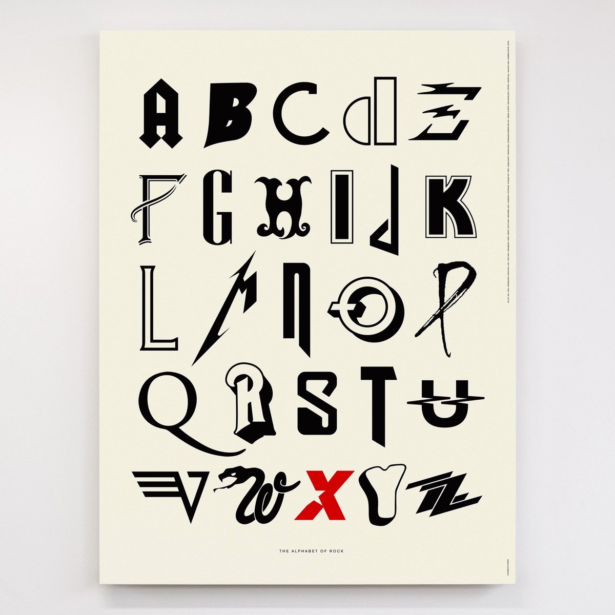
Dorothy has designed a pair of posters of alphabets fashioned from rock band logos: one for classic rock and one for alternative rock. How many of the band names do you know? Me? Fewer than I would like.
These reminded me of Evan Roth’s Graffiti Taxonomy prints.
Update: See also the ABCs of Heavy Metal poster by Aye Jay. (via @thoughtbrain)
Newer posts
Older posts
Socials & More