kottke.org posts about design
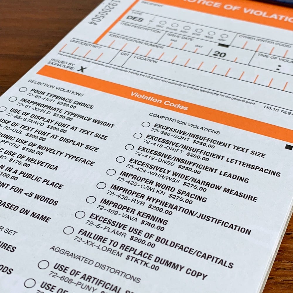
Hoefler & Co are selling copies of The Typographic Ticket Book for type nerds on the go. The idea is that when you’re out and about, you can issue citations for “use of display font at text size” or “unironic use of Helvetica” to people and businesses misusing type.
Contains fifty tickets, each neatly perforated for a satisfyingly loud rip prior to presentation. Bound in soul-deadening municipal pressboard, with a heavy-duty 100pt millboard backing, and foil stamped with an official-looking clip art emblem in gold. Police uniform not included, nor recommended. For novelty use only.
Looks like the book contains a few in-jokes as well…I spotted “$TKTK” as the fine for “failure to replace dummy copy” and the kerning on the fine for “improper kerning” looks a liiittle tight to me.
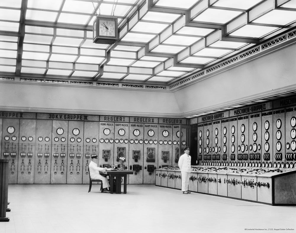
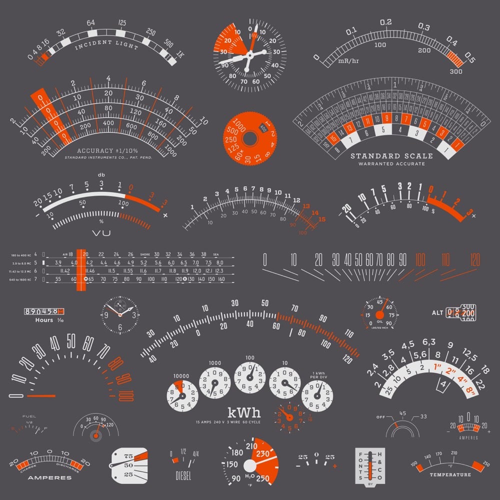
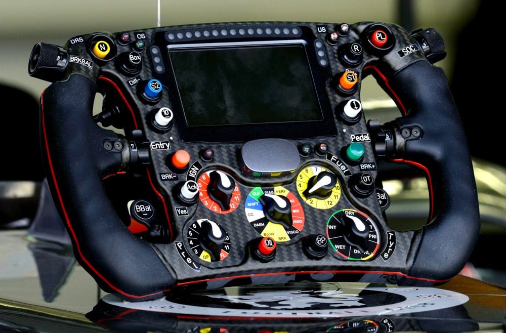
This blog collects examples of control panels, analog and digital. The site’s tagline reads “in praise of dials, toggles, buttons, and bulbs”.
Pictured here from top to bottom are a photo of a Berlin power station in 1928 by E.O. Hoppé, typography samples from Hoefler & Co, and the steering wheel from a Formula 1 car. (thx, paul)
Color Leap lets you time travel back through the color palettes of history, from colorful Egyptian sarcophagi circa 2000 BCE to stained glass windows circa 1000 CE to advertisements in the 1950s.
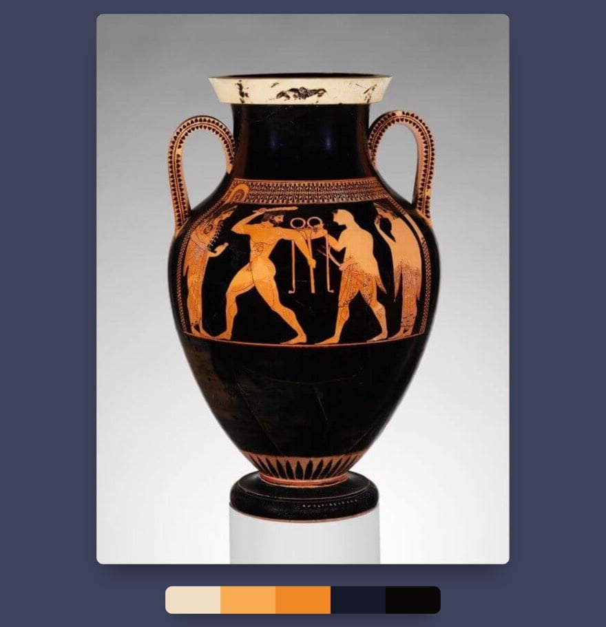
Clicking on the colors will copy the hex code for that color to your clipboard. (via design observer)
Ok, if you started using the web 15-25 years ago, prepare yourself for the nostalgic blast of the Web Design Museum.
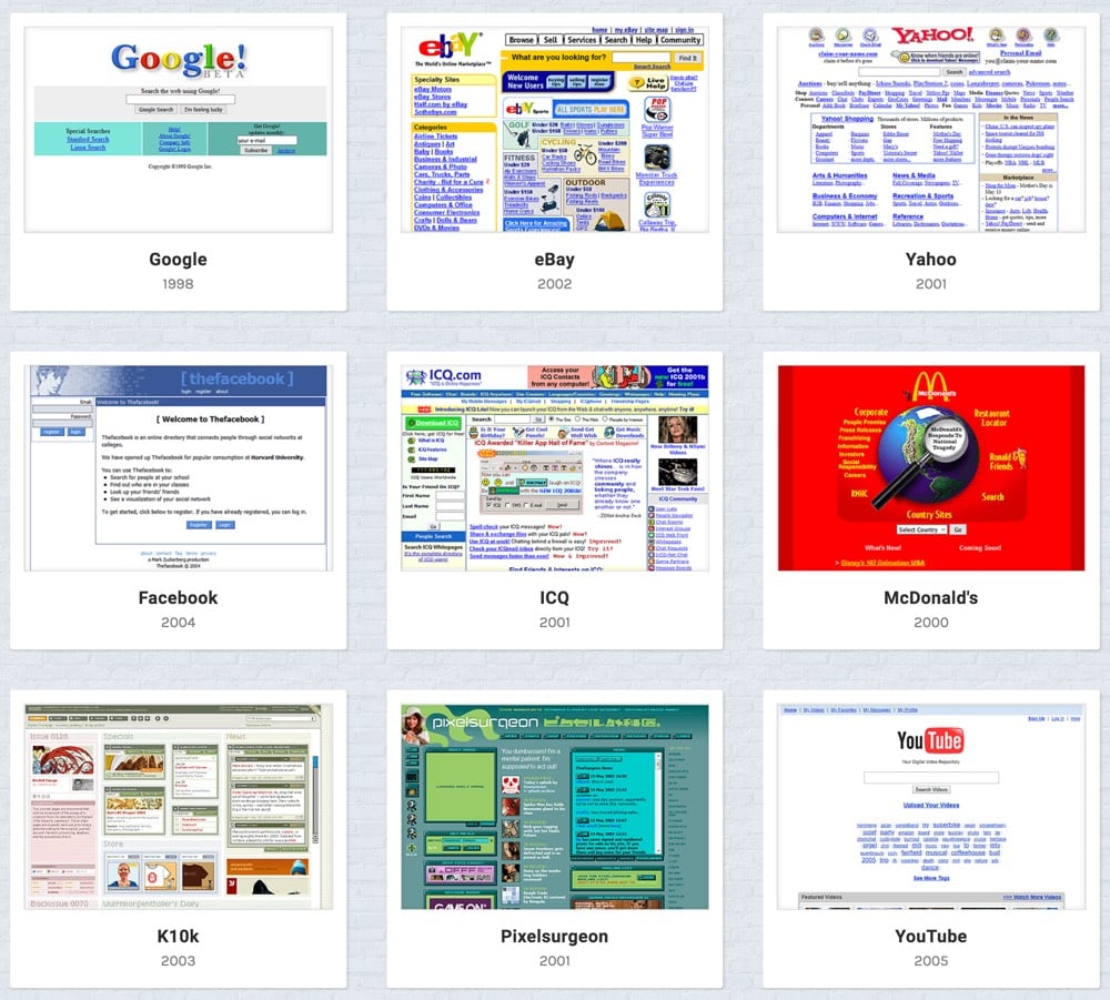
I remember all of these from back in the day — what a trip. Even kottke.org circa 1999 made it in there.
Published by the North American Cartographic Information Society, the upcoming 2018 Atlas of Design showcases 32 of the best maps made over the past 2 years. Atlas Obscura has a selection of maps featured in the book.
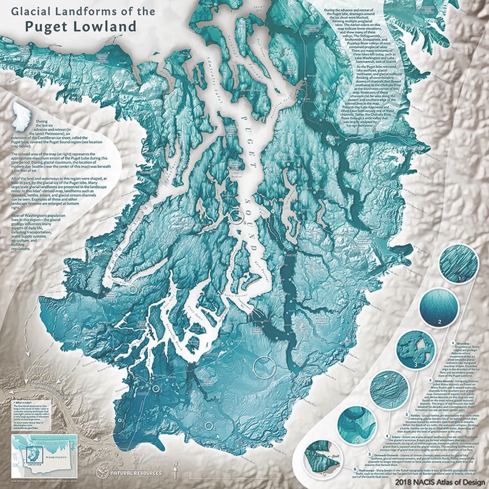
You can preorder the book here or view a list of all the maps and their designers included in the book.

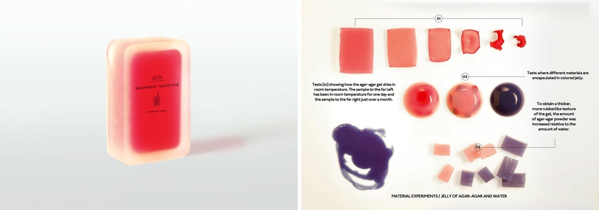
Inspired by natural packaging like egg shells and orange peels, Swedish design studio Tomorrow Machine created a series of biodegradable food packaging called This Too Shall Pass. Anna Glansén explained the project in an interview with Matters Journal.
Ok, so generally, “This Too Shall Pass” is a series of food packages where the package and its contents are working in symbiosis. In this project, we asked ourselves how packaging can be made in the near future using technology that is available today.
The smoothie’s package consists only of agar-agar seaweed and water. To open it you pick the top and the package will wither at the same rate as the smoothie. It is made for drinks that have a short life span and needs to be refrigerated. For example, fresh juice, smoothies and cream. The packaging reacts to its environment so you could, just by looking at the package, see if it has been exposed to excessive heat during transport.
The rice package is made of biodegradable beeswax. To open it you peel it like an orange. The package is designed to contain dry goods such as grains and rice.
The oil package is made of caramelised sugar, coated with wax. To open it you crack it like an egg. When the material is cracked the wax no longer protects the sugar and the package melts when it comes in contact with water. This package is made for oil-based food.
(via @pieratt)
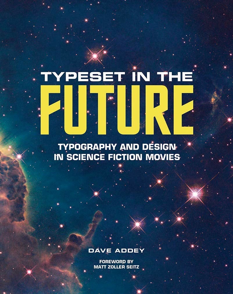
Inspired by the website of the same name, Dave Addey’s Typeset in the Future will look at how design and typography is used to build futuristic worlds in science fiction movies like 2001, Wall-E, Star Trek, and Blade Runner.
The book delves deep into 2001: A Space Odyssey, Star Trek: The Motion Picture, Alien, Blade Runner, Total Recall, WALL-E, and Moon, studying the design tricks and inspirations that make each film transcend mere celluloid and become a believable reality. These studies are illustrated by film stills, concept art, type specimens, and ephemera, plus original interviews with Mike Okuda (Star Trek), Paul Verhoeven (Total Recall), and Ralph Eggleston and Craig Foster (Pixar).
You can pre-order the book on Amazon.
Bloomberg Businessweek asked eight designers to design a logo for Trump’s proposed new branch of the military, Space Force. 89-year-old Milton Glaser, designer of the iconic I ❤ NY logo, can still bring the heat:
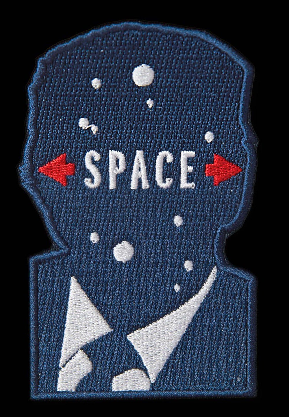
I really really *really* want this on a hat. (via df)

Joel Simon used a generative design process powered by a genetic algorithm to optimize the floor plans of buildings for different characteristics. That is, the algorithm “grew” buildings that had ideal floor plans for minimizing construction materials, shortest fire escape paths, and access to views — without worrying about how the buildings would actually be constructed.
The results were biological in appearance, intriguing in character and wildly irrational in practice.
As building materials and techniques continue to develop beyond the rectilinear bricks and concrete blocks, the “wildly irrational in practice” bit will become increasingly irrelevant. (via bb)
In the early 90s, a digital typeface designed in the 80s — but based on the letterforms used in a Roman column completed in 113 AD — became the go-to typeface for movie poster designers. (Reminder: everything is a remix.) It was used on posters for movies like The Bodyguard, Crouching Tiger Hidden Dragon, Children of Men, and Quiz Show. This Vox video details the rise of the Trajan typeface in movie poster design and why its not used that often by big movies anymore.
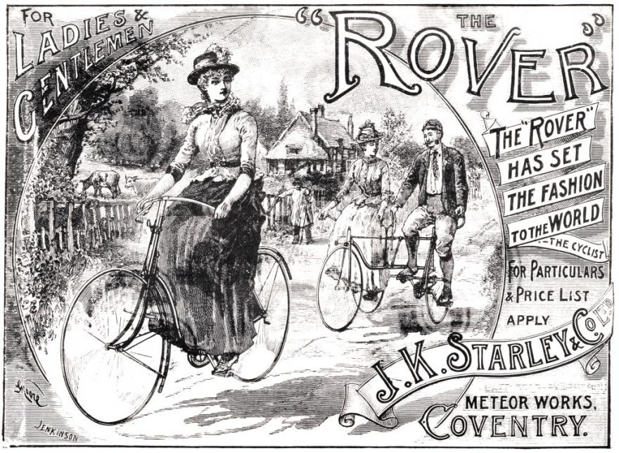
This excerpt from Margaret Guroff’s history The Mechanical Horse focuses on the democratization of the bicycle at the end of the nineteenth century, as new designs made bikes more appealing to businessmen, children, and especially women.
In the 1890s, bikes got lighter as well as more comfortable. The average weight of a bicycle dropped by more than half during the decades first five years, falling from 50 pounds to 23. And since new gearings were able to mimic wheels larger than those of the largest Ordinary, speed records fell too. In 1894, while riding a pneumatic-tired safety around a track in Buffalo, New York, the racer John S. Johnson went a mile in just over one minute and thirty-five seconds, a rate of nearly thirty-eight miles an hour. He beat the previous mile record for a safety by fourteen seconds, and the record for an Ordinary by nearly a minute — and the record for a running horse by one-tenth of a second.
The Ordinary — which had by then acquired the derisive nickname of penny-farthing, after the old British penny and much smaller farthing (quarter-penny) coins — became obsolete. High-wheelers that had sold for $150 to $300 just a year or two earlier were going for as little as $10.
The first safeties, meanwhile, cost an average of $150 during a time when the average worker earned something like $12 a week. At such prices, the new bikes targeted the same upscale demographic as the tricycle. But a strong market for safeties among well-to-do women goosed production, and competition among manufacturers reduced prices, making the bikes affordable to more would-be riders and further fueling demand. In 1895, Americas 300 bicycle companies produced 500,000 safeties at an average price of $75, according to one encyclopedias yearbook. Even manufacturers were surprised at the demand among women, who thrilled to the new machines exhilarating ride. As one female journalist wrote, “If a pitying Providence should suddenly fit light, strong wings to the back of a toiling tortoise, that patient cumberer of the ground could hardly feel a more astonishing sense of exhilaration than a woman experiences when first she becomes a mistress of her wheel.”
I really enjoyed Amber Case’s essay “The Hidden Cost of Touchscreens.” It’s a quick but surprisingly thorough look at where touchscreen interfaces are inappropriate or just plain go wrong.
For instance, touchscreens in cars are problematic for anything that’s going to be used during driving, because well, touchscreens require looking at a thing. For muscle memory and mission-critical tasks, physical buttons are better.
But I also appreciated her nuanced, experience-driven take on ways to improve touchscreen design, where too often clean aesthetics have pushed out strict usability.
Touchscreen design could benefit from some basic design principles. Color-based interfaces take less time to parse when they are glanced at. Image-based interfaces take longer for the brain to process, and the lack of contrast can be confusing, because each item must be distinguished from adjacent items. When so many images look alike, service workers must rely on position and muscle memory for speedy use.
When I worked in food service and in the mailroom, the uglier touchscreens were always easier to work with. They were color coded with bright, contrasting colors, making the boundaries between numbers or items very obvious. I found that the colors reduced mistakes. I’d usually tap the right items after barely even glancing at the interface. After a while, I’d only check the screen for mistakes at the end of the process, before submitting an order or printing a receipt.
I think touchscreens in general are more usable now than they used to be, simply because of learning effects: more of us are used to dealing with touch interfaces in lots of different contexts, and we translate that familiarity wherever we go. At a certain point, though, we bump up against some hard limits of the human brain, eyes, and hands. Trying to fight against those hardly ever turns out well.
Of course you know he designed the album cover for The Velvet Underground & Nico…Warhol’s name (and not the band’s or the album’s) is right there underneath the electric yellow banana. But he also designed covers for the likes of Paul Anka, John Lennon, The Rolling Stones, Count Basie, Diana Ross, Kenny Burrell, and Aretha Franklin.
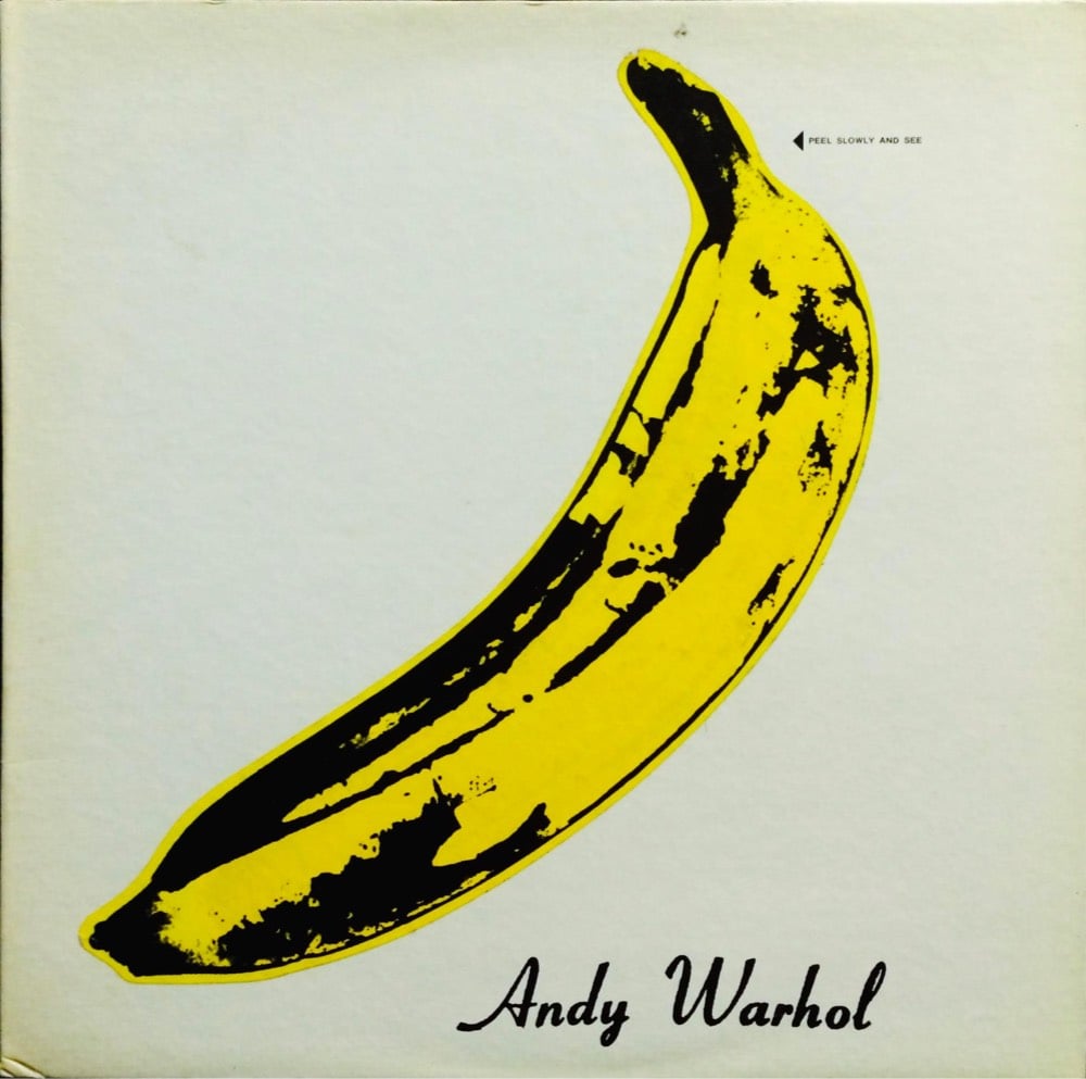
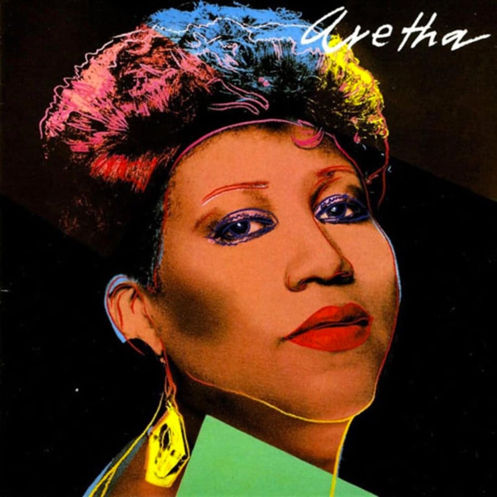
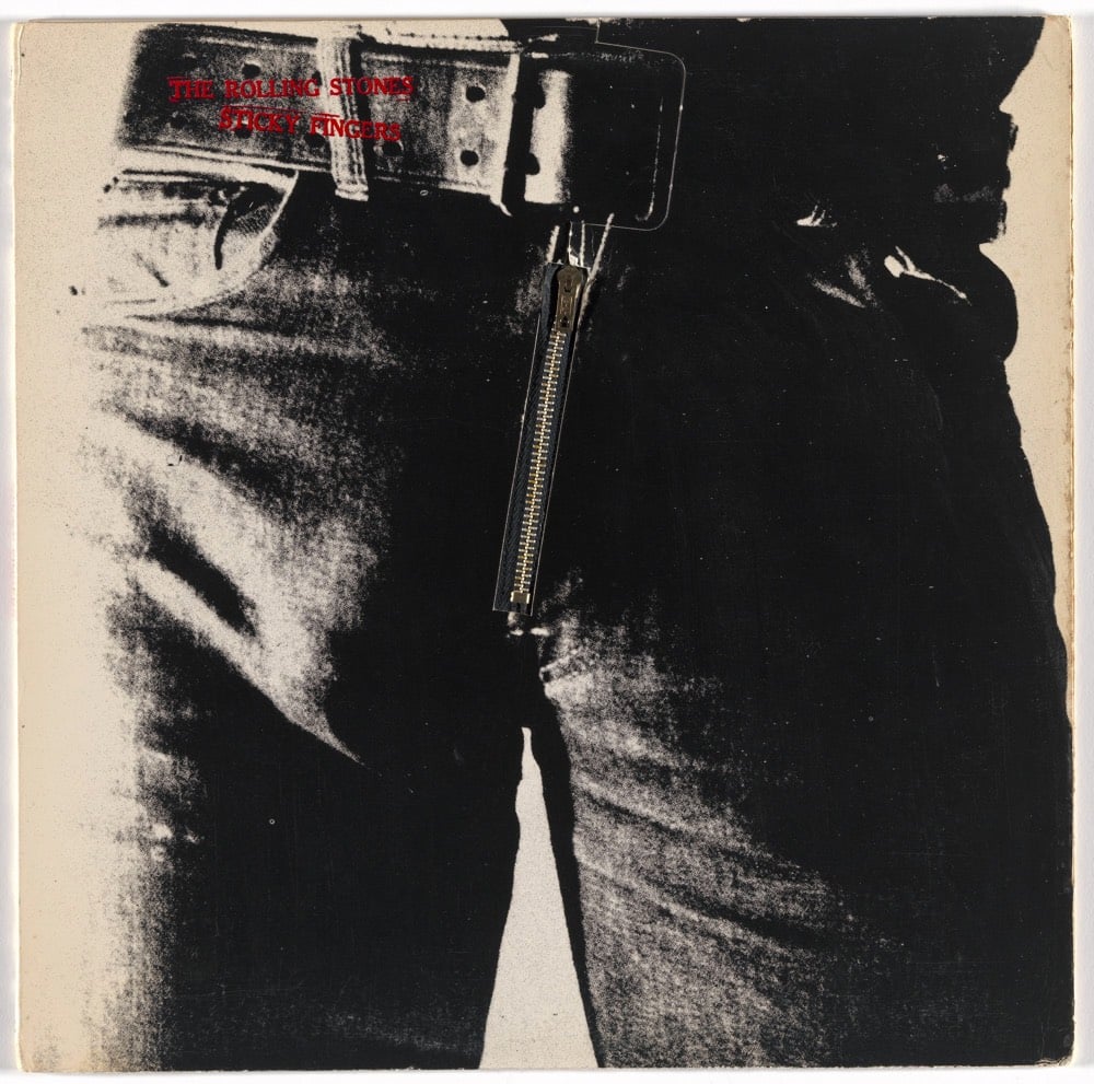
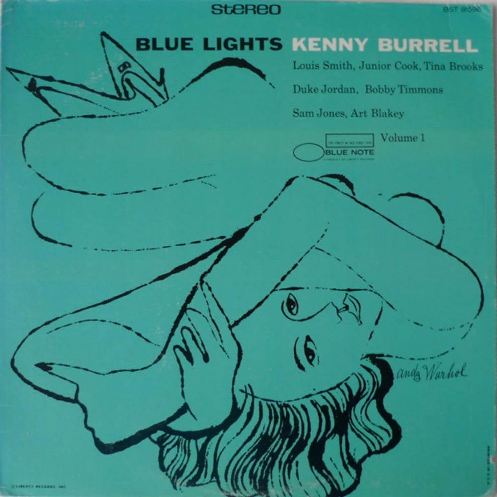
You can see more covers by Warhol here, here, and here. All of the covers he designed are collected in this book, Andy Warhol: The Complete Commissioned Record Covers.
The design of the automatic-drip coffee maker is super simple and clever. By using a one-way value to pump the water to the top of the maker to drip through the grounds, you can get away with using only one heating element at the bottom that both heats the water and keeps the brewed coffee hot.
To engineer an object means to make choices; I’ll show you with this coffeemaker. The key choice: to use a single heating element to keep the cost low — 9 bucks in the case of this coffeemaker. Now the heater must be below the carafe to keep the coffee warm yet it also needs to heat the water for brewing. And since the grounds are at the top, that presents a problem. How do you get the water from down here to up here?
Bill Hammack shows how this works in just over 2 minutes:
Hammack’s videos are great. He also did this 11-minute video about how aluminum cans are designed & engineered and it’s not boring even for a second. (via @macgbrown)
On Tinker Fridays, industrial designer dina Amin takes apart an item and makes a playful stop motion animation out of its parts.
I spent 2016 taking products that people decided to throw away apart and showing people (not the ones who threw away those products, but others on Instagram) what’s inside and transformed all the pieces to lil creatures by the magical power of stop motion.
You can find more of Amin’s work on her website, YouTube, Vimeo, and Instagram. (thx, samira)
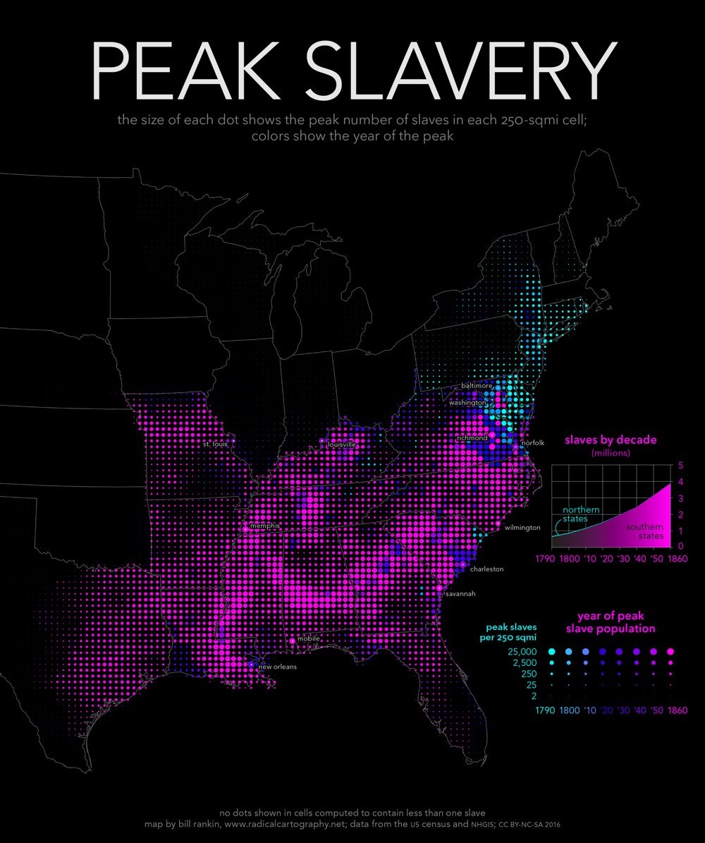
According to Whose Heritage?, a report by the Southern Poverty Law Center on public symbols of the Confederacy, progress over the past two years on removing statues, flags, and other symbols from public places has been slow.
The 2015 massacre of nine African Americans at the historic “Mother Emanuel” church in Charleston sparked a nationwide movement to remove Confederate monuments, flags and other symbols from the public square, and to rename schools, parks, roads and other public works that pay homage to the Confederacy. Yet, today, the vast majority of these emblems remain in place.
In this updated edition of the 2016 report Whose Heritage?, the SPLC identifies 110 Confederate symbols that have been removed since the Charleston attack — and 1,728 that still stand.
Still very much standing, for instance, the Mount Rushmore of the Confederacy in Georgia, a massive stone carving featuring Jefferson Davis, Robert E. Lee and Thomas “Stonewall” Jackson.
And perhaps even worse, not represented on this map are Confederate symbols that are part of the official identities of many Southern states. Did you know Mississippi’s official state flag still contains the Confederate battle flag?

As of the 2010 Census, ~37% of Mississippi’s population is African American and due to the relative youth of the state’s African Americans and the wealth of the state’s whites (who are able to send their kids to private school), most of the state’s public schools are majority black. That percentage would be much higher had not so many African Americans left the state during the Great Migration. The pledge to this flag, which is taught in public schools, reads “I salute the flag of Mississippi and the sovereign state for which it stands with pride in her history and achievements and with confidence in her future under the guidance of Almighty God.” Could you imagine being the descendant of a former slave being made to pledge allegiance to a symbol used by people who fought a war to deny the personhood of your ancestors?
Mississippi’s flag contains the most familiar reference to the Confederacy, but many other state flags have Confederate references. Georgia’s flag contained the Confederate battle flag from 1956 to 2003 and the current flag is modeled after the first national flag of the Confederacy. The flags of Florida and Alabama contain St. Andrew’s Crosses, thought to be references to the stars and bars of Confederate battle flag. The Arkansas state flag contains four stars on a white background, one of which represents the Confederacy, along with a deconstructed stars and bars pattern. North Carolina’s flag is based on a design adopted shortly after the state seceded from the United States. Residents of many states can also get official state license plates with Confederate symbols on them and some state seals have Confederate references.
Lots of progress still to go on that journey towards a post-racial America I guess…
Update: A new Confederate monument was just erected last week near Mobile, Alabama. Here’s what the plaque says about the Confederacy:
The northern Union aggressively prosecuted its war to subjugate the Confederate States. Union forces continued invading and waging war in the field, on cities, and on homesteads in the Confederacy causing more American deaths in both countries than the combined totalitarian regimes of the twentieth century. About two-thirds of these deaths were Union military sent to kill Confederate Americans. The Union’s army was about 3 times larger and it possessed about 20 times the industrial arms capacity of the CSA. It succeeded in militarily prevailing over the Confederate forces after four years. The last major land battle occurred in April of 1865 here and at Ft. Blakeley. The elected government of the CSA was scattered, the American States of that country occupied by northern forces, and the citizens’ rights suppressed.
In April 1865, the Union President was shot watching a comedy play in his capitol of Washington City — almost exactly four years after he sent his warships into the CSA initiating the War Between the States. The Confederacy’s President was seized and imprisoned in May 1865 after he had to flee his capitol of Richmond, Virginia, due to the approach of invading Union forces.
For many, the Civil War never quite ended.
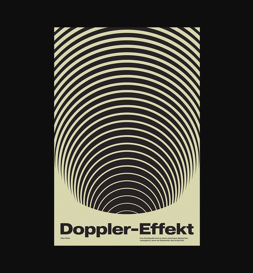
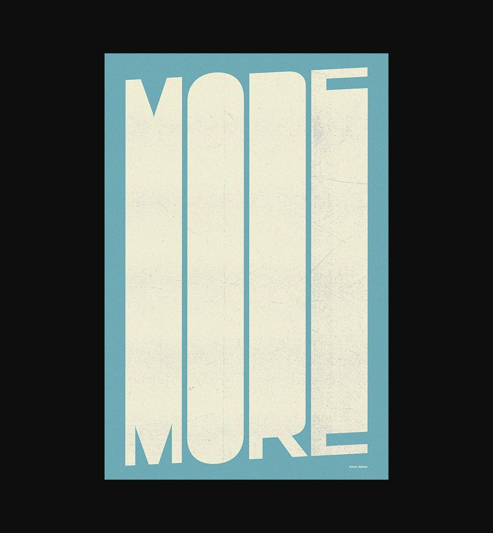
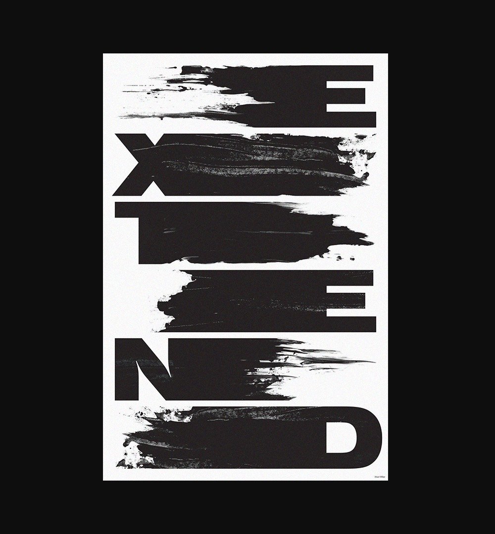
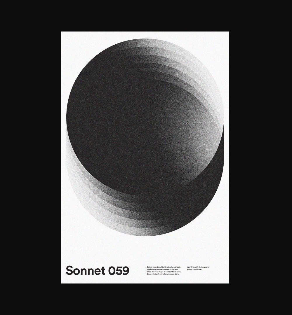
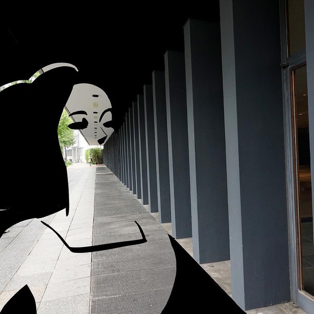
Designer Xtian Miller designs new posters “nearly every day”. You can see his prodigious output on Dribbble and Instagram. His website is worth a look as well. (via the outline)
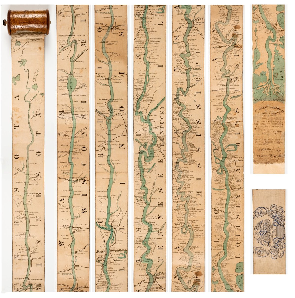
The Mississippi River runs for more than 2300 miles straight through the heartland of America, more or less straight from north to south. Representing the river in any detail presented a challenge for mapmakers wishing to provide maps to those wanting to travel along the river. In 1866, Coloney & Fairchild solved the problem by producing the Ribbon Map of the Father of Waters, a 2-inch wide & 11-foot long map that spooled up into a carrying case via a hand crank. From Nenette Luarca-Shoaf’s description of the map:
Coloney and Fairchild’s patented apparatus required that the single sheet be cut into strips, attached end-to-end, mounted on linen, and then rolled inside a wooden, metal, or paper spool (fig. 4). The resulting portability of the map was crucial because, as advertisements indicated, it was intended for business travelers, steamboat navigators, and tourists.
You can explore larger images of the ribbon map at the David Rumsey Map Collection or the American Antiquarian Society.
See also the meander maps of the Mississippi River. And I would love to see a satellite photo trip down the Mississippi like Best of Luck With the Wall, Josh Begley’s video journey along the 2000 miles of the US/Mexico border. (via open culture)
Update: In the 1840s, John Banvard painted a “moving panorama” of the Mississippi that measured 1300 feet in length. (via @mattbucher)
These posters designed by the NSA emphasizing the importance of security and secrecy to their employees are amazing. Declassified in mid-April 2018, most of the posters were produced in the 50s, 60s, and 70s and look as though they were cooked up by Salvador Dali or the Dadaists. Or even Mad Magazine. I mean:
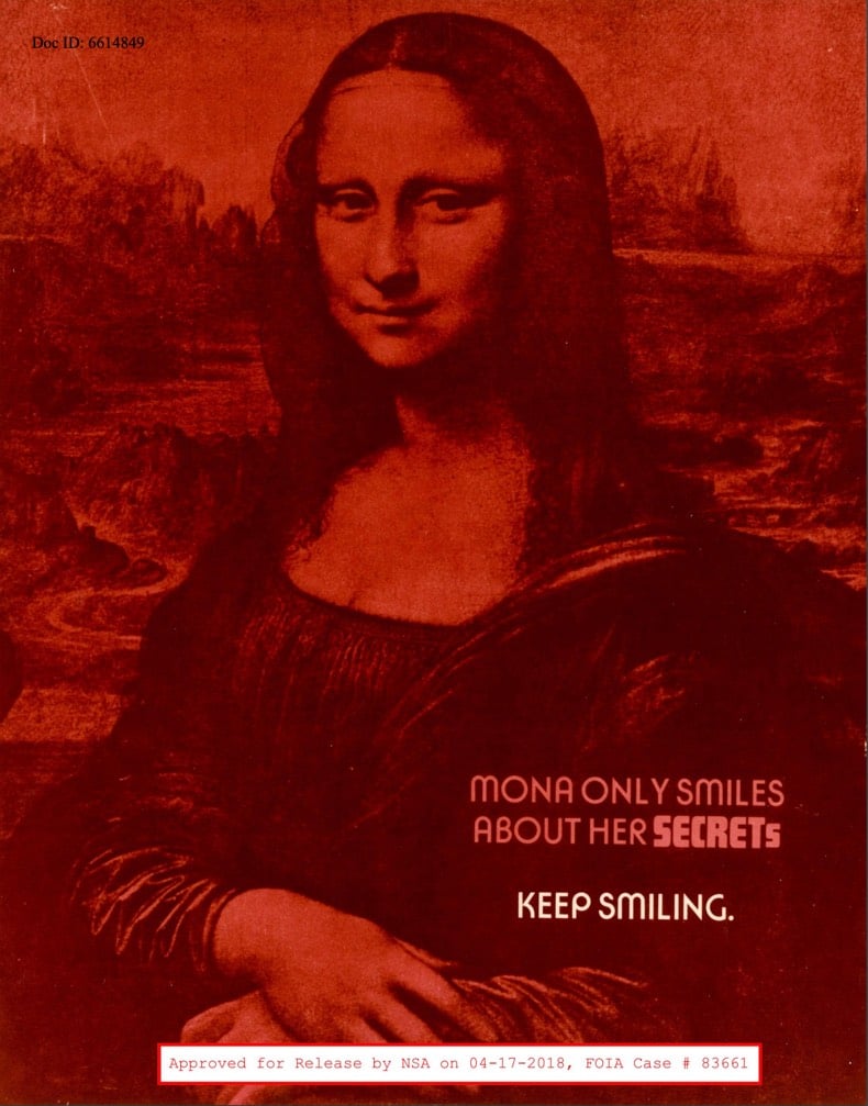
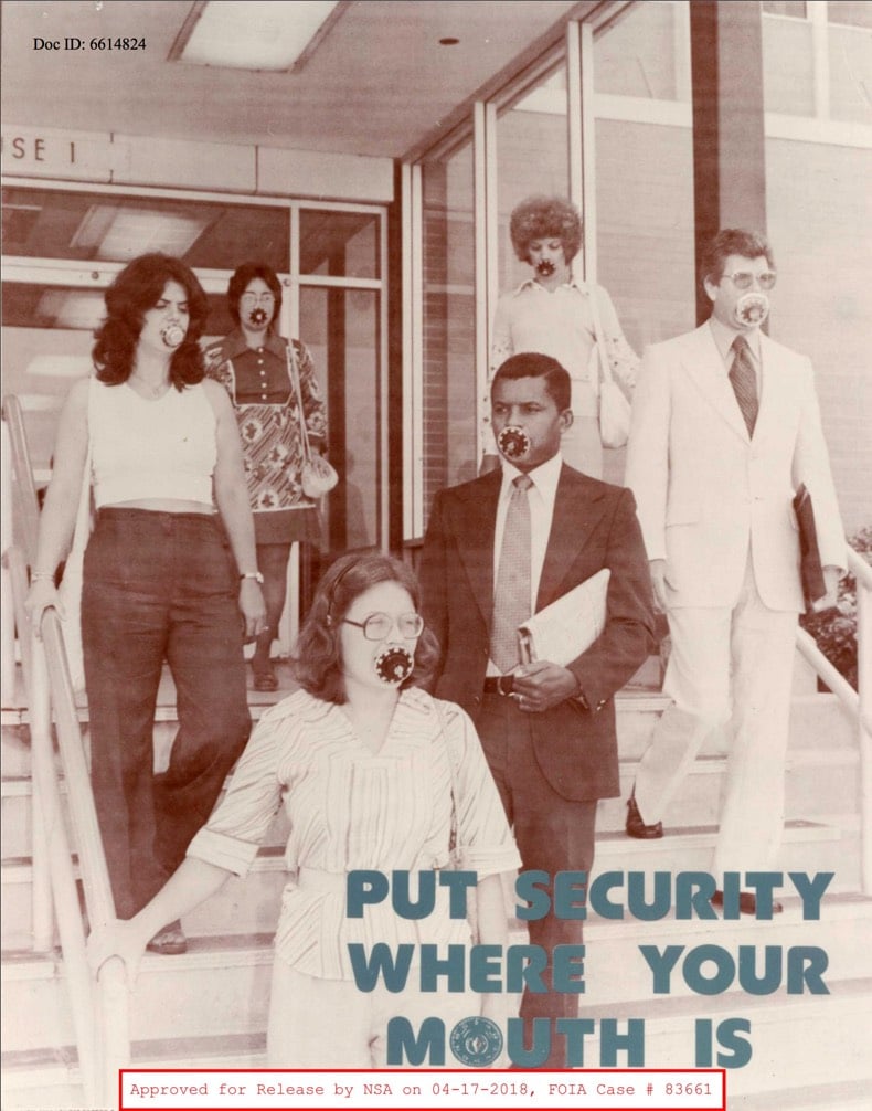
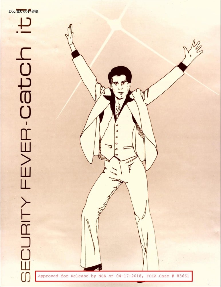
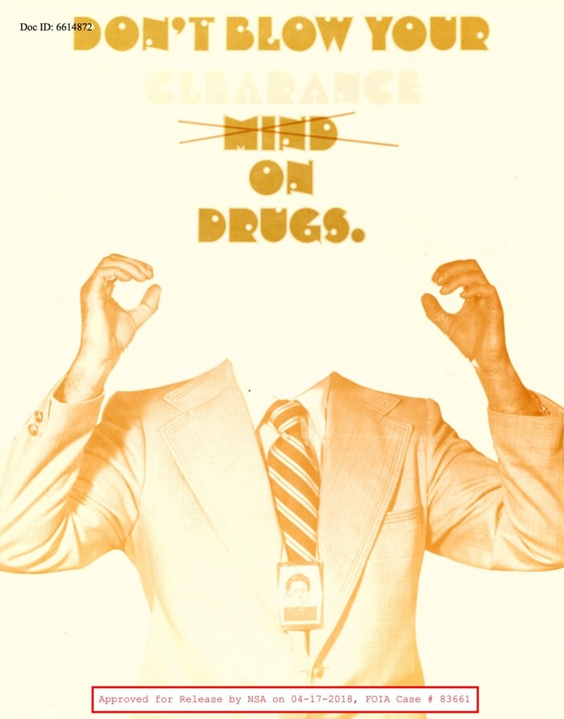
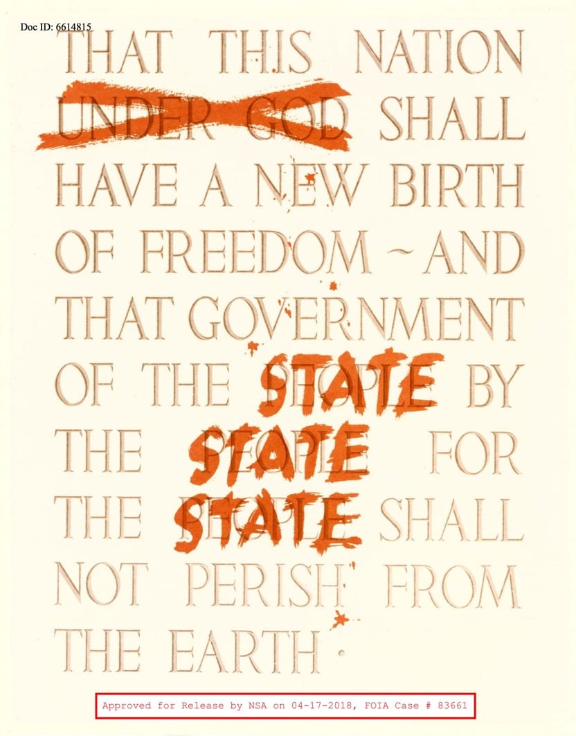
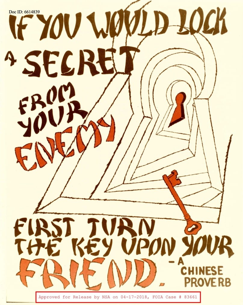
What fantastic design artifacts of that era. Many of them appear to be remixes/riffs of contemporary ad campaigns and messaging…you could easily imagine a security-themed distracted boyfriend or American Chopper poster hanging in today’s NSA offices.
I had a difficult time choosing just a few of these…many more are available in this PDF. (via hn)
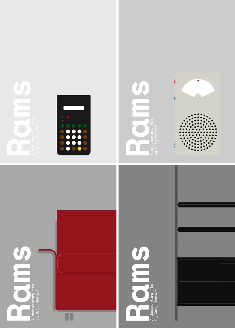
I really like these prints for Rams, Gary Hustwit’s upcoming documentary about the legendary Dieter Rams. Each print features an object designed by Rams or his design team: the T41 radio, the ET66 calculator, the 620 chair, and the 606 shelving system.
PS. You can still buy the calculator from Braun. Ok, it’s a reissue, but that means it won’t cost you 100s of dollars on eBay.
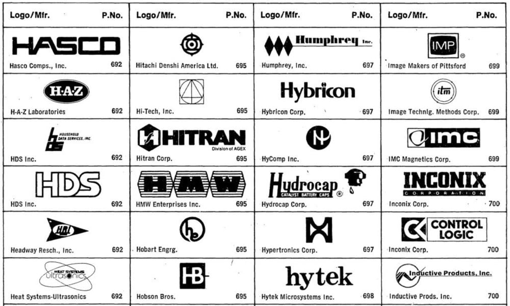
This 1985 catalog for engineers contains hundreds and hundreds of tech logos from the 70s and 80s. They are glorious.
Marcin Wichary turned more than 1400 of these logos into a screensaver “for your random viewing pleasure”.
For this year’s 36 Days of Type project, Ben Huynh submitted this 3D animation of the alphabet from A to Z. You can see animations of the individual letters on Huynh’s Instagram. (via colossal)
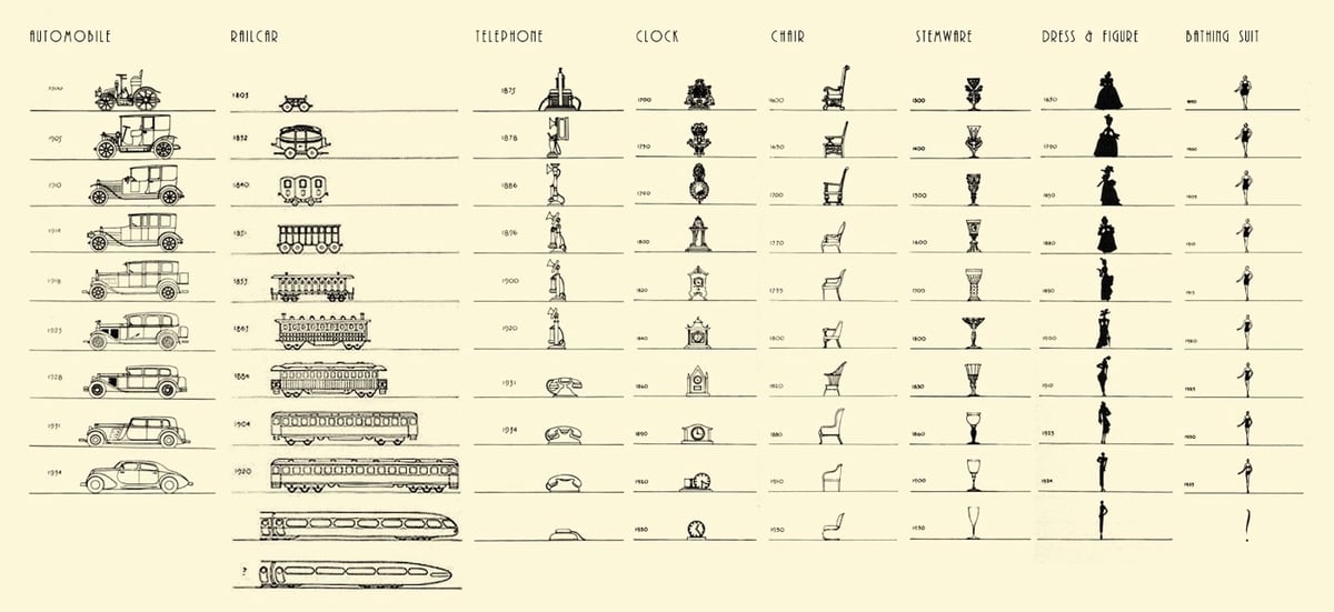
From legendary designer Raymond Loewy, a chart published in 1934 that shows the evolution in design of items such as cars, telephones, stemware, railcars, clocks, and women’s apparel. Loewy was known was “The Father of Streamlining” and these drawings very much reflect his design style. (via @michaelbierut)
Update: MacRae Linton chopped up Loewy’s chart into a proper timeline.

Speaking of great magazine covers, for their issue on plastic, National Geographic put artist Jorge Gamboa’s arresting plastic bag iceberg image on the cover. A simple yet powerful concept, perfectly executed.
Update: The iceberg plastic bag is not an original concept. Prior art includes a 2015 ad campaign for Tesco and a pair of stock images on Getty (date not listed). It’s unclear whether Gamboa created his image after seeing these images or if multiple people had this same idea. (via @krjohn01/status/997198395189223424)
I’m not specifically learning to draw right now but I do love how Ralph Ammer builds his lessons. Split into short exercises, the best parts are the animations he draws and integrates in his lessons as gifs. Much lighter and more pleasant to watch than a video, they are very short and looping so you can easily grasp what he’s explaining. Here are a few images from his most recent lesson.
Dynamic drawing:

Rotating cube and vanishing points:
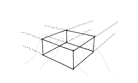
Perspective:
Your periodic reminder that Christoph Niemann is an unimaginably imaginative visual storyteller. This image is one of a series for the Deutsche Oper Berlin opera company; check out more of his work on Instagram.
Design? Parenting? Playgrounds? iPads? Architecture? Toys? Probably Lego? Alexandra Lange’s upcoming book about “how children’s playthings and physical surroundings affect their development”, The Design of Childhood, is firmly in my wheelhouse.
Parents obsess over their children’s playdates, kindergarten curriculum, and every bump and bruise, but the toys, classrooms, playgrounds, and neighborhoods little ones engage with are just as important. These objects and spaces encode decades, even centuries of changing ideas about what makes for good child-rearing — and what does not. Do you choose wooden toys, or plastic, or, increasingly, digital? What do youngsters lose when seesaws are deemed too dangerous and slides are designed primarily for safety? How can the built environment help children cultivate self-reliance? In these debates, parents, educators, and kids themselves are often caught in the middle.
It’s out in early June, but you can preorder it on Amazon.
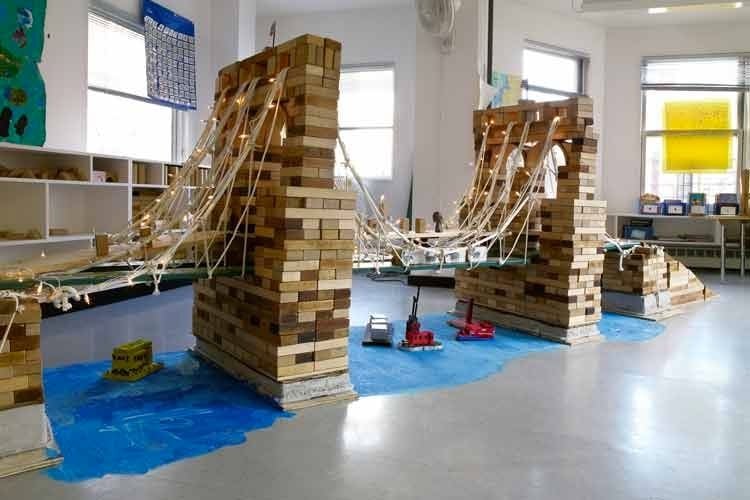
P.S. That photo is a model of the Brooklyn Bridge built by 7-year-olds at City & Country School in NYC made almost entirely out of unit blocks.
In the 7s, children engage in a formal study of the infrastructure and geography of New York City. Through extended block work, they explore the relationships among city systems of government, transportation, communications, commerce, and utilities. New issues continually arise: Who makes the laws, and how are they carried out? How does traffic flow? Where does water come from? The city study culminates with the building of a permanent city, complete with running water and electricity, and an historical study of the Brooklyn Bridge.
The blocks all have official names (like pillar, double unit, cylinder, etc.) but the kids have their own names for them based on the shapes: squarie, roundie, brickie, buttery (because it’s shaped like a stick of butter), half buttery, archie, rampie, cubie, longie, middlie, and so on. So for example, if you’re constructing a model of the Empire State Building, that might call for several longies, a few middlies & squaries as you get closer to the top, a buttery + half buttery for the spire, and then several strategically placed colorful cubies for the nighttime lights.
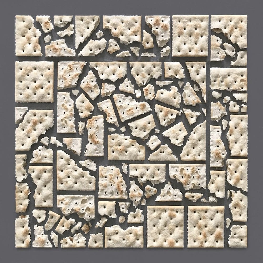
This arrangement of saltine crackers by artist and prop stylist Kristen Meyer is giving me all sorts of feelings. Meyer has done many other similar arrangements (see her site and Instagram) but the geometric chaos of this one is *kisses fingers*
See also gradient food photography, Always. Be. Knolling., common objects painstakingly organized into patterns, and Things Organized Neatly. (via colossal)
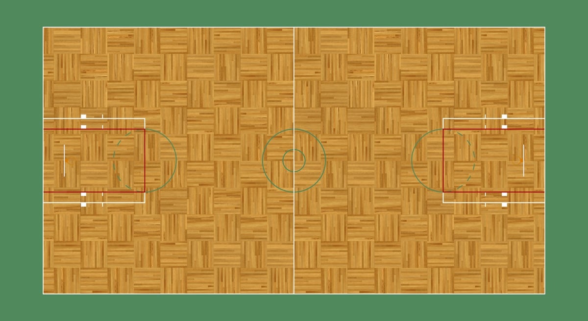
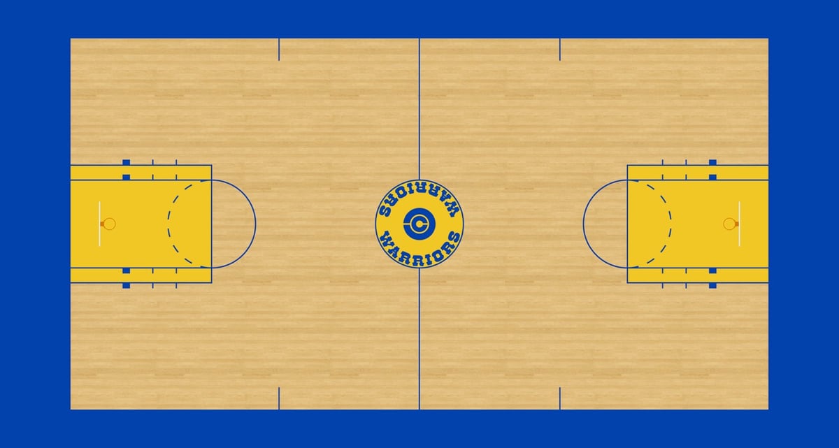
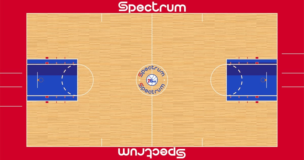
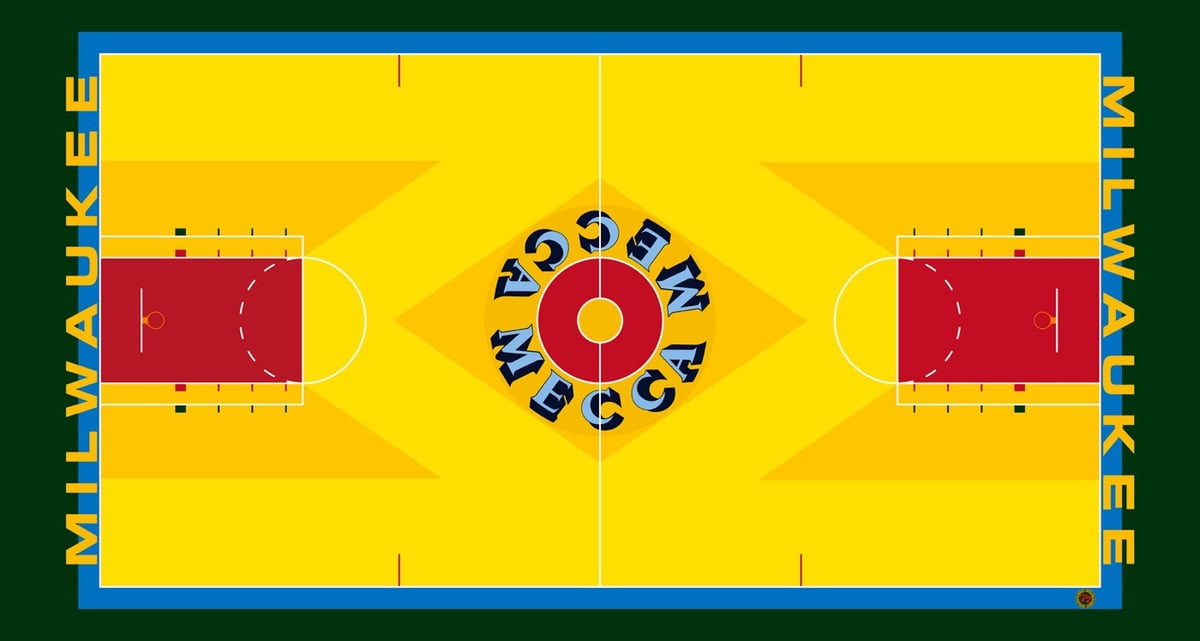
Flickr user kodrinsky has compiled a massive collection of more than 1100 illustrations of NBA courts dating back to the 50s, an online museum of basketball hardwood. The collection contains floors for every NBA team with additions documenting even small changes in arena names, team logos, free-throw lane layouts, paint schemes, sponsors, and even wood patterns.
Above are the courts for the Boston Celtics (1964-1966), the Golden State Warriors (1975-1979), the Philadelphia 76ers (1978-1979), and the Milwaukee Bucks (1977-1979).
Newer posts
Older posts
Socials & More