kottke.org posts about design
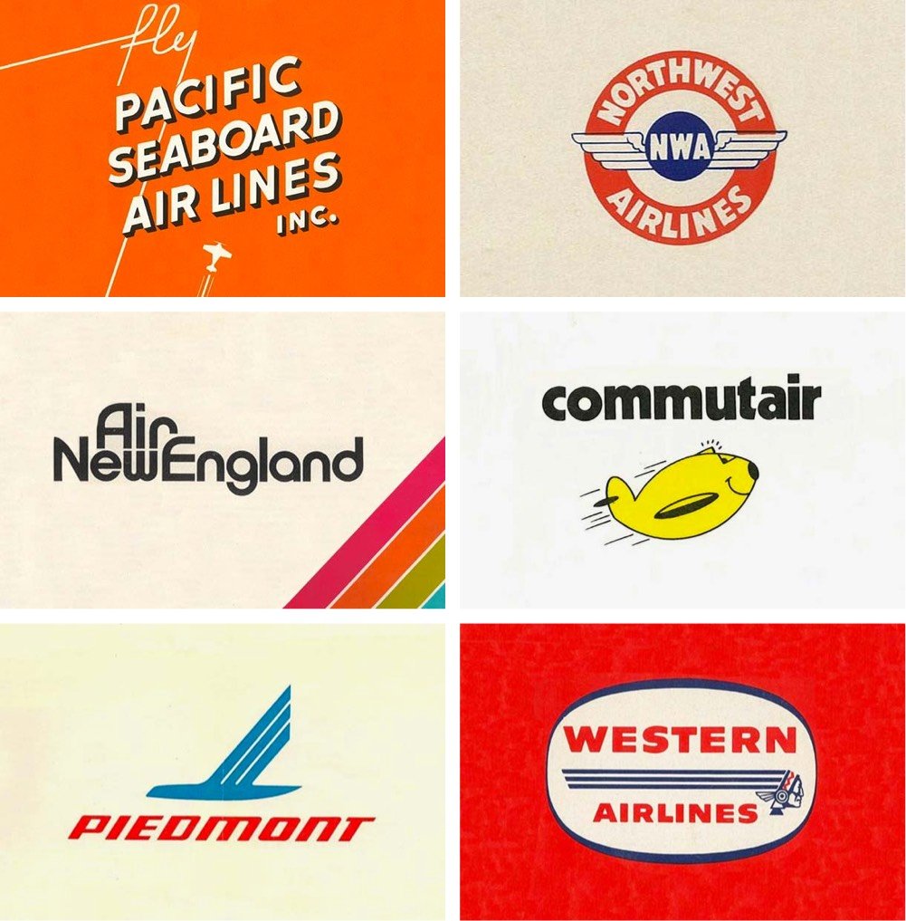
Reagan Ray has collected a bunch of classic logos from American airlines, from the big ones (Delta, United) to small regional airlines (Pennsylvania Central, Cardiff and Peacock) to those no longer with us (Pan Am, TWA, Northwest). I sent him the logo for my dad’s old airline, Blue Line Air Express…I hope it makes it in!
See also Reagan’s collections of record label logos, 80s action figure logos, American car logos, VHS distributor logos, and railway logos. Careful, you might spend all day on these… (via @mrgan)
Update: Ray was kind enough to add Blue Line into the mix! Thank you!
For the 1972 Summer Olympics in Munich, a team led by Otl Aicher designed the iconic identity for the event. The guidelines for the visual design were laid out in a manual produced in 1969, which contained the design systems governing how everything from signage and merchandise to tickets and even landscaping were to be produced.
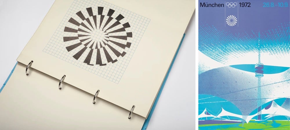
Now, a lovingly produced reprint of that manual is available for purchase on Kickstarter.
The visual modules — the typeface, the colors, the grid systems and the application methods — were the basis of all printed matter, merchandising products, signage, wayfinding systems, urban planning and landscaping.
“The freedom of play” was about ensuring “maximum variation” via “strict discipline and adherence to rules”, explained Otl Aicher in 1975.
(via steven heller)
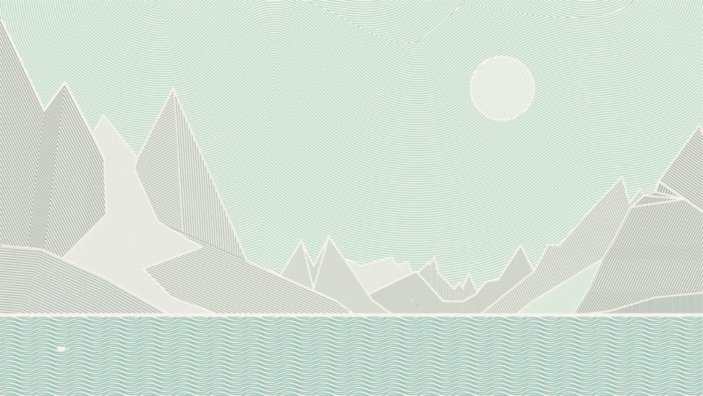
Back in 2014, a design studio called Neue won a national competition to redesign the Norwegian passport. What they came up with is bold and beautiful.
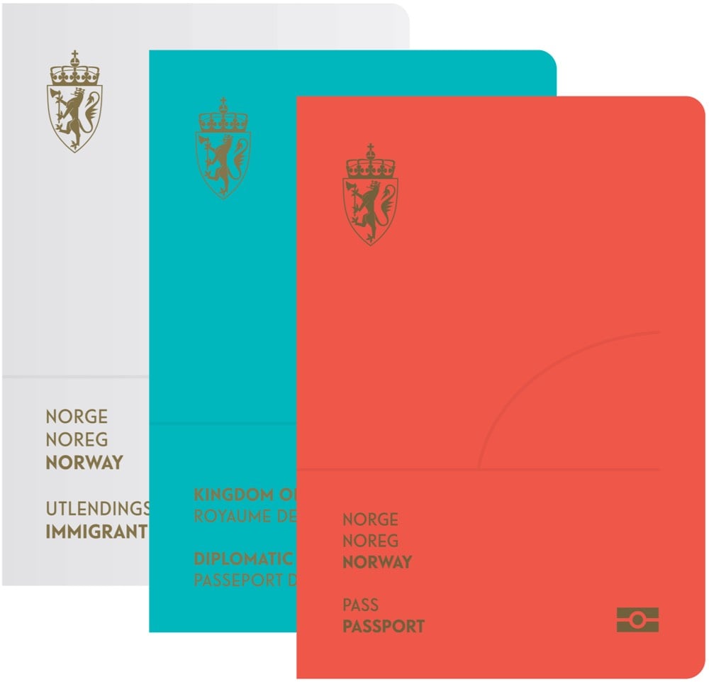
Norwegian landscapes fill the visa pages:
And if you shine a UV light on them, you can see the aurora borealis:

The landscapes surrounding us give a sense of belonging and pride, and fill a symbolic function for the entire nation. Images of scenery and landscape can easily become cliches, but by being widely accepted and deeply rooted in Norwegian culture, they are also very easy to identify with. In addition, to Norwegians, nature is more than beautiful scenery. It supplies us with rich fisheries, clean hydroelectric power, and various other industries.
I don’t think this new design has launched though…beyond a flurry of press about the competition back in 2014, I couldn’t find any evidence of the new design in the wild. (via dense discovery)
Ilia Blinderman of The Pudding has written a pair of essays about how to make data-driven visual essays. Part 1 covers working with data.
It’s worth noting here that this first stage of data-work can be somewhat vexing: computers are great, but they’re also incredibly frustrating when they don’t do what you’d like them to do. That’s why it’s important to remember that you don’t need to worry — learning to program is exactly as infuriating and as dispiriting for you as it is for everyone else. I know this all too well: some people seem to be terrific at it without putting in all that much effort; then there was me, who first began writing code in 2014, and couldn’t understand the difference between a return statement and a print statement. The reason learning to code is so maddening is because it doesn’t merely involve learning a set number of commands, but a way of thinking. Remember that, and know that the little victories you amass when you finally run your loop correctly or manage to solve a particular data problem all combine to form that deeper understanding.
Part 2 is on the design process.
Before you begin visualizing your data, think through the most important points that you’re trying to communicate. Is the key message the growth of a variable over time? A disparity between quantities? The degree to which a particular value varies? A geographic pattern?
Once you have an idea of the essential takeaways you’d like your readers to understand, you can consider which type of visualization would be most effective at expressing it. During this step, I like to think of the pieces of work that I’ve got in my archive and see if any one of those is especially suitable for the task at hand.
Check out The Pudding for how they’ve applied these lessons to creating visual essays about skin tone on the cover of Vogue or how many top high school players make it to the NBA.

With its recent use by the participants in the Extinction Rebellion, the extinction symbol has become much more widely known, on its way to becoming the peace symbol of the climate movement.
The symbol above represents extinction. The circle signifies the planet, while the hourglass inside serves as a warning that time is rapidly running out for many species. The world is currently undergoing a mass extinction event, and this symbol is intended to help raise awareness of the urgent need for change in order to address this crisis. Estimates are that somewhere between 30,000 and 140,000 species are becoming extinct every year in what scientists have named the Holocene, or Sixth Mass Extinction. This ongoing process of destruction is being caused by the impact of human activity. Within the next few decades approximately 50% of all species that now exist will have become extinct. Such a catastrophic loss of biodiversity is highly likely to cause widespread ecosystem collapse and consequently render the planet uninhabitable for humans.
The symbol and a stencil template are available for download “for non-commercial purposes”.
There’s a disclaimer at the bottom of the page about merchandise, which reads in part:
No extinction symbol merchandise exists, and it never will do. The free use of the extinction symbol by individuals in their personal artwork or other forms of expression is strongly welcomed and encouraged, but any form of commercial use of the symbol is completely against its ethos and should therefore be refrained from. To reiterate, please do not use the symbol on any items that will be sold, or for any other fundraising purposes. There are no exceptions to this policy.
Here’s the thing: I want a t-shirt with the extinction symbol on it so I can signify my support (in a small way) for climate justice. If I’m reading this correctly, I can make a t-shirt for myself but not have one made for me? Or can I have a single print-on-demand shirt made for me at cost? Making my own shirt (I’d need to buy a bunch of single-use supplies) or getting a one-off printed doesn’t seem very climate-friendly at all. How about taking orders from other interested folks (like you all) and selling the shirts at cost? That seems much more climate-friendly but also firmly against the symbol maker’s strict policy.
I think we’re bumping up against an inconvenient truth about capitalism here: it is sometimes (or perhaps even often) the most efficient and least wasteful way to produce something because it’s actually a deeply collectivist endeavor. Let’s say you’re holding a climate protest, 100,000 people are coming, and those people want to bring shirts or signs or other protest equipment to the protest to “advertise” their displeasure to those watching, near and far. Is it more climate friendly for all those people to individually buy supplies and each produce their own things or would it be better to rely on a organization whose sole purpose is to produce protest supplies (using carbon-free energy and materials) and pay them more than the cost of the supplies so they can provide their employees a living wage and even advertise their services a little so they can actually remain in the protest supplies business and take even more advantage of economies of scale to keep prices down? Run it as a non-profit if you’d like. That seems far less wasteful to me than people buying one-off supplies, even on a group basis.
You might interject here that producing anything that uses any natural resources for such a protest is wasteful and unethical. I think that’s a fair point! What’s the ROI for protest materials? Is it wasteful to spend a little CO2 now to possibly save a bunch of CO2 in the future or is it smart? Gah, all I want is a shirt to express myself! Are there any simple and ethical solutions in a world that’s so densely networked and interconnected?
As part of their recent announcement of a new web design system for US government websites, the General Services Administration has also introduced a new typeface called Public Sans.
USWDS 2.0 adds built-in support for custom typefaces, and sometimes you need one that’s simple, neutral, and isn’t Helvetica. Public Sans is an open source, free license typeface (SIL Open Font License 1.1) designed and maintained by USWDS, adapted from Libre Franklin. Just as with our components, we intend Public Sans to be an example of how to design an accessible open source typeface with contributions and feedback from the public — to deliver a useful, neutral, sans serif and continuously improve it.
Always interesting when typefaces are described as “neutral”. I’ve never found that to be the case…
Monotype has introduced a new version of the Helvetica typeface called Helvetica Now.
Helvetica Now is a new chapter in the story of perhaps the best-known typeface of all time. Available in three optical sizes-Micro, Text, and Display-every character in Helvetica Now has been redrawn and refit; with a variety of useful alternates added. It has everything we love about Helvetica and everything we need for typography today. This is not a revival. This is not a restoration.
This is a statement.
Typographer Erik Spiekermann says:
This is the typeface Max Miedinger and Eduard Hoffmann would have designed back in 1957 if they had known about offset printing, small screens, browsers, digital design tools and UI designers.
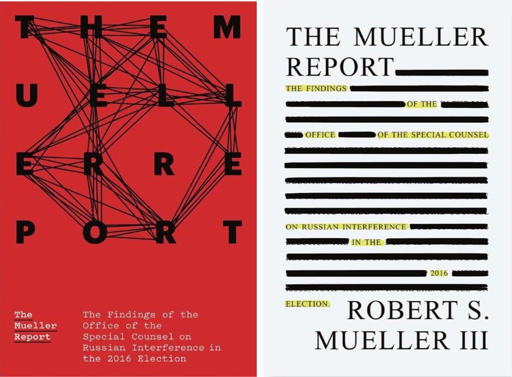
The New Yorker asked five designers to design book covers for the Mueller Report in the event that it’s eventually published. Here are my two favorites, by Michael Bierut and Na Kim:
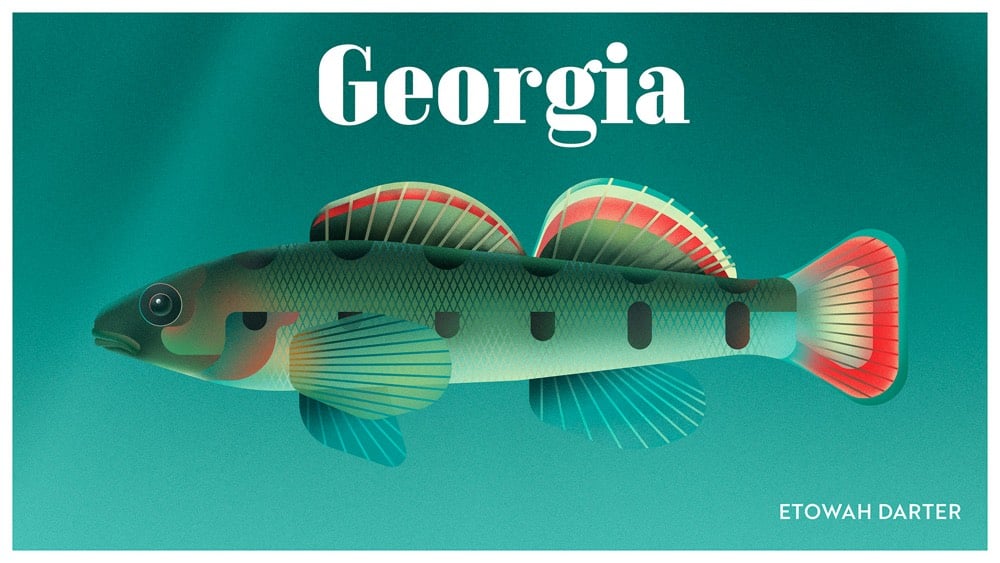
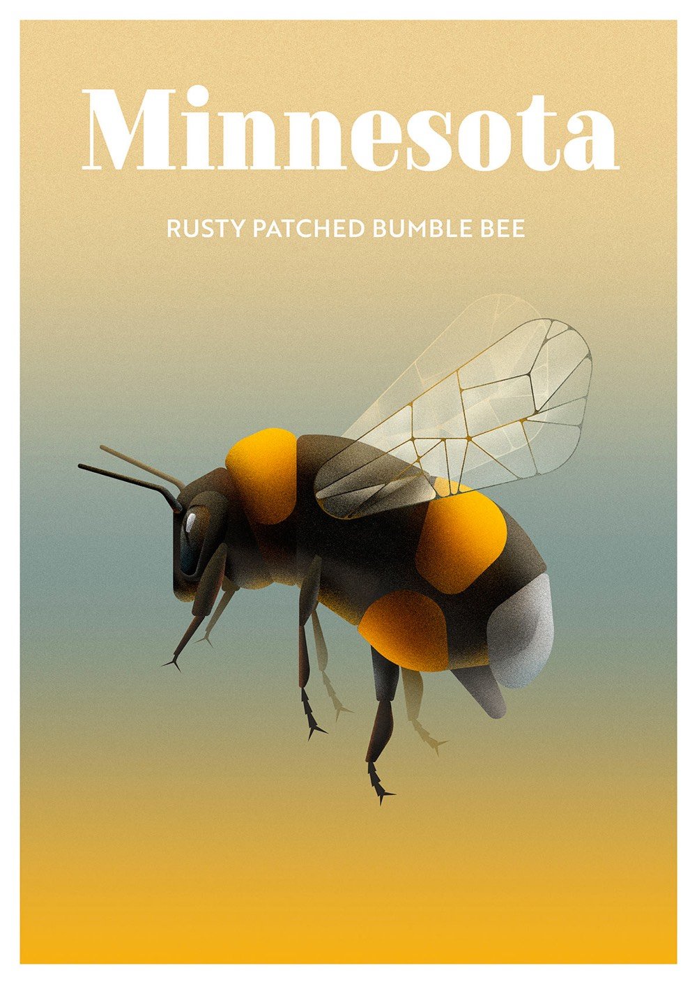


These visually striking posters showcase the most endangered animals from each of the 50 US states.
Here’s the story of the Uncompahgre fritillary butterfly from Colorado:
Colorado’s exotically-spelled native butterfly lives among snow willow patches high up in the San Juan Mountains. It has an ornate, retro look: rusty or light brown wings neatly segmented with inky black lines. Unfortunately, the Uncompahgre fritillary butterfly’s beauty has played a part in its downfall. Collectors, as well as trampling by people and livestock, have reduced their number to just 11 colonies.
We kill the things we love. (via moss and fog)
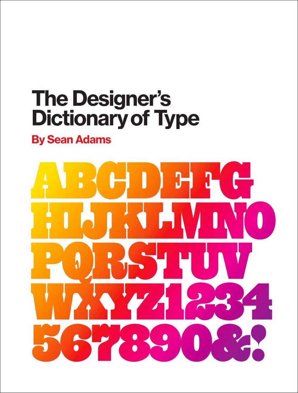
In his forthcoming book, The Designer’s Dictionary of Type, Sean Adams profiles 48 of the best-known typefaces in the world, from Helvetica and Garamond to Cooper Black and OCR-A. Fast Company has a short excerpt.
Cooper Black has a close association with the 1970s; however, Oswald Cooper actually created the typeface in 1921. Cooper designed the Black weight after releasing a larger Cooper Old Style family of fonts. The forms are based on old style serif typefaces but are “fat” and soft. This type of letterform gained popularity between 1910 and 1920. Other designers worked with similar forms, such as Frederic Goudy and his typefaces Goudy Heavy Face and Pabst Extra Bold. In the 1960s and 1970s, designers looking for alternatives to cold Swiss modernism and Helvetica looked back and revived Cooper Black. Its soft forms worked exceptionally well with phototypesetting, which allowed for extremely tight kerning. Both the counterculture movement and low-end DIY design adopted Cooper Black. By the end of the 1970s, the typeface was ubiquitous, but it again fell out of fashion as the New Wave movement gained momentum.
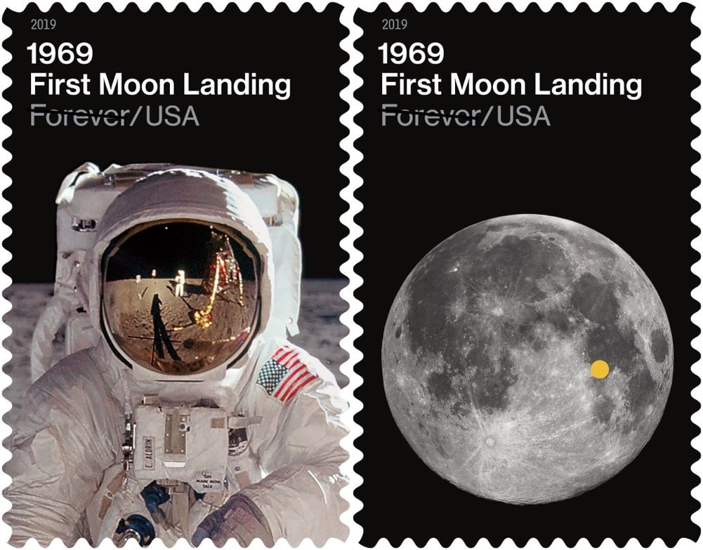
In commemoration of the 50th anniversary of the Apollo 11 Moon landing, the USPS is releasing a pair of stamps with lunar imagery.
One stamp features a photograph of Apollo 11 astronaut Buzz Aldrin in his spacesuit on the surface of the moon. The image was taken by astronaut Neil Armstrong. The other stamp, a photograph of the moon taken in 2010 by Gregory H. Revera of Huntsville, AL, shows the landing site of the lunar module in the Sea of Tranquility. The site is indicated on the stamp by a dot.
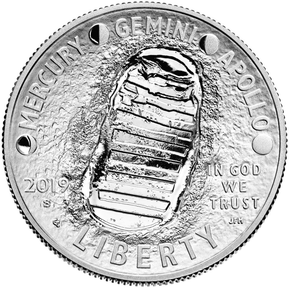
These pair nicely with the US Mint’s Apollo 11 commemorative coins.
(via swissmiss)
From London motion design studio Mr. Kaplin, an animated alphabet where the animation for each letter is a experiment that was completed in a single day.
See also The ABCs in Motion.
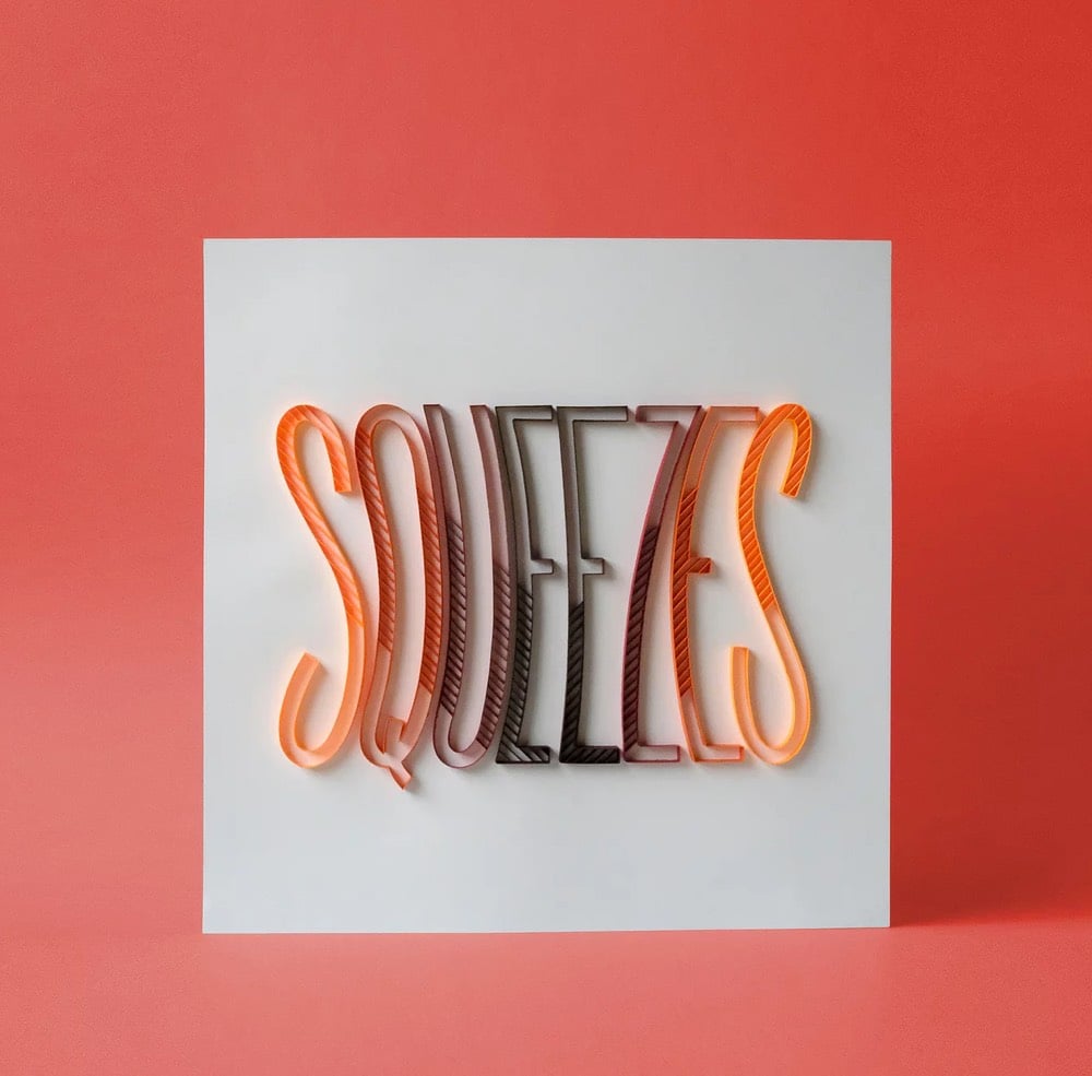
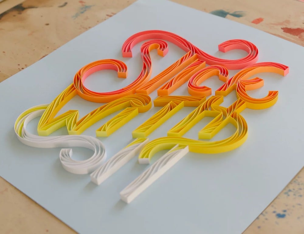
Paper artist Alia Bright combines papercraft and typography to make these colorful, um, sculptures? Texts? They’re super-cool, whatever you call them. Here’s a close-up of one of the pieces, all made by hand of course:

You can keep up with Bright’s newest work on Instagram. (via swissmiss)

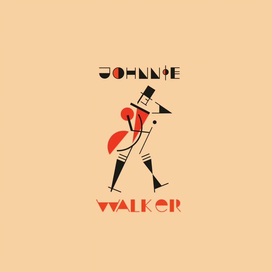
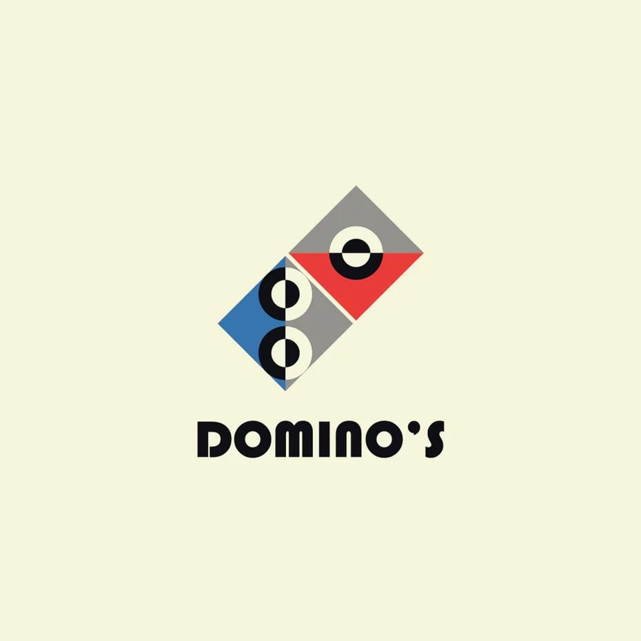
To commemorate the 100-year anniversary of the founding of the Bauhaus design movement, 99designs challenged their community of designers to reimagine the logos of famous brands in a Bauhaus style. (via moss & fog)
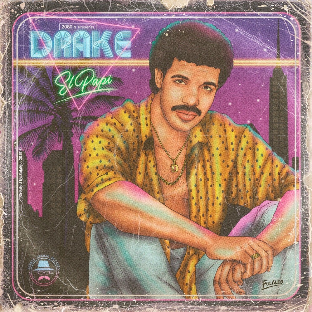
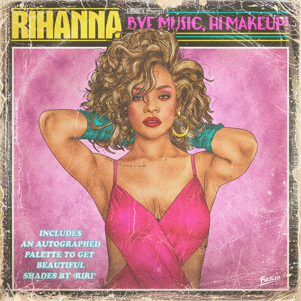
More retro goodness here (including The Weeknd, Skrillex, Taylor Swift, and Cardi B).
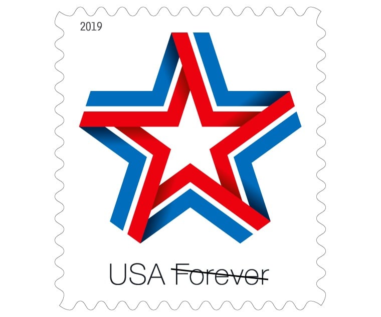
It was not my intention to turn kottke.org into a stamp blog (recently: Ellsworth Kelly, Leonardo da Vinci) but you know what they say: cool postage comes in threes. My pal Aaron James Draplin recently shared on Instagram that he was asked to submit some designs for a stamp for the USPS and then, because he’s an awesome designer, one of his designs is going to become an actual stamp.
TEARS ROLLING DOWN MY CHEEKS: Last thing I want ANY post I put up to sound like some sweaty, formal press release, so I’ll just come out and say it: I GOT TO MAKE A STAMP, YOU GUYS.
I’ve had to keep my big trap shut for over a year on this one. And I when I got the call to throw some designs into the ring, I have to tell you, even that nod was enough. It was enough just to be that close to one of my FAVORITE institutions of all time: The American postage stamp.
Here’s why he’s so fond of stamps (I totally agree):
You know why I love stamps so much? Because everyone needs a stamp. Everyone gets to enjoy the art on them. Too many times, art and design is only for those who can afford it. Stamps? They are a democratization of design. And that? That’s my favorite kind of graphic design.
The design is a perfect illustration of Draplin’s throwback design style — it’s got that Spirit of ‘76 thing going on but is also solidly contemporary, just like his work for Field Notes. (via df)
A couple of years ago, I wrote about the hand-drawn infographics of W.E.B. Du Bois, noting that the great African American author, sociologist, historian, and activist was also a hell of a designer. Now Whitney Battle-Baptiste and Britt Rusert have collected Du Bois’ data portraits of black America into a new book, W.E.B. Du Bois’s Data Portraits: Visualizing Black America.
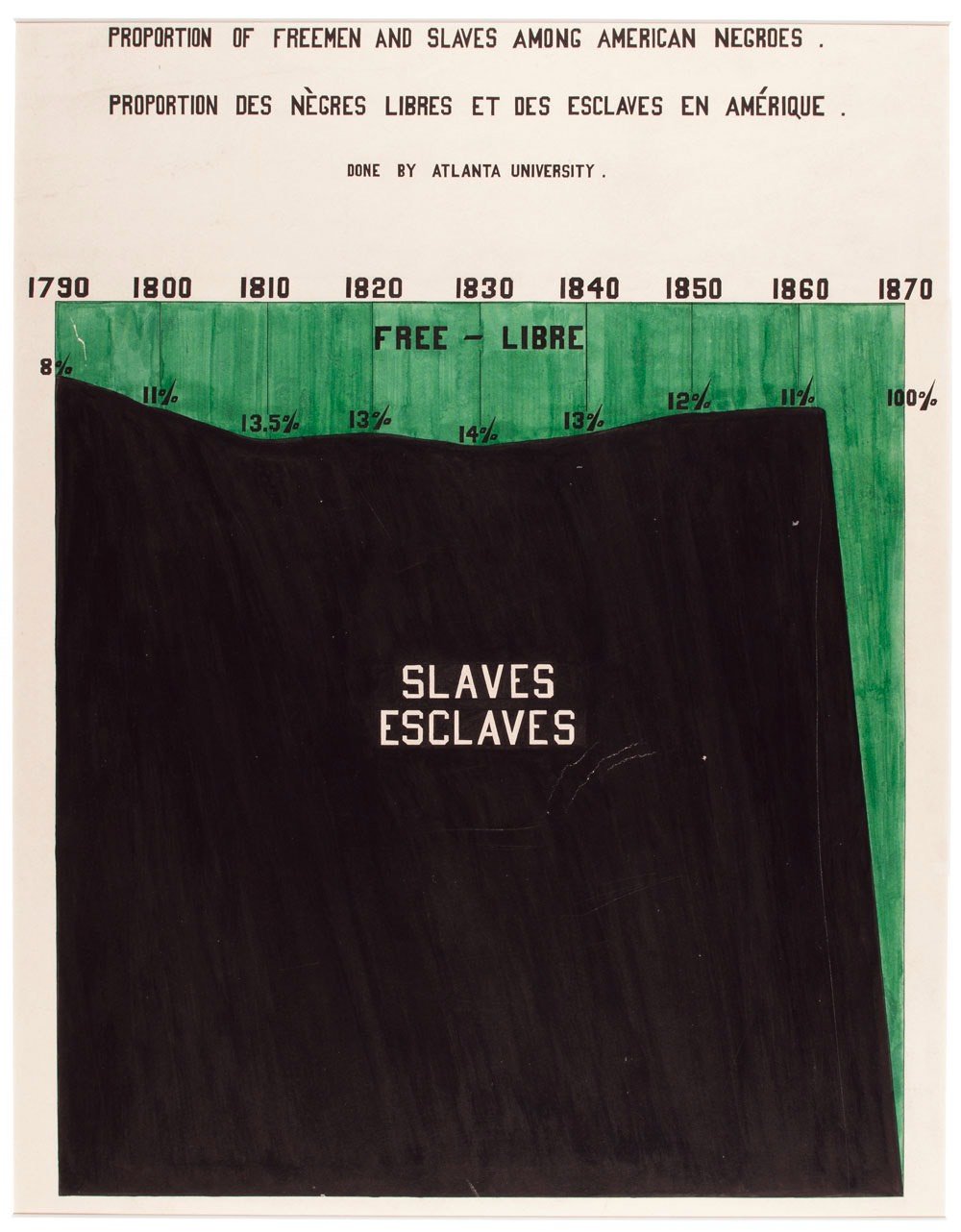
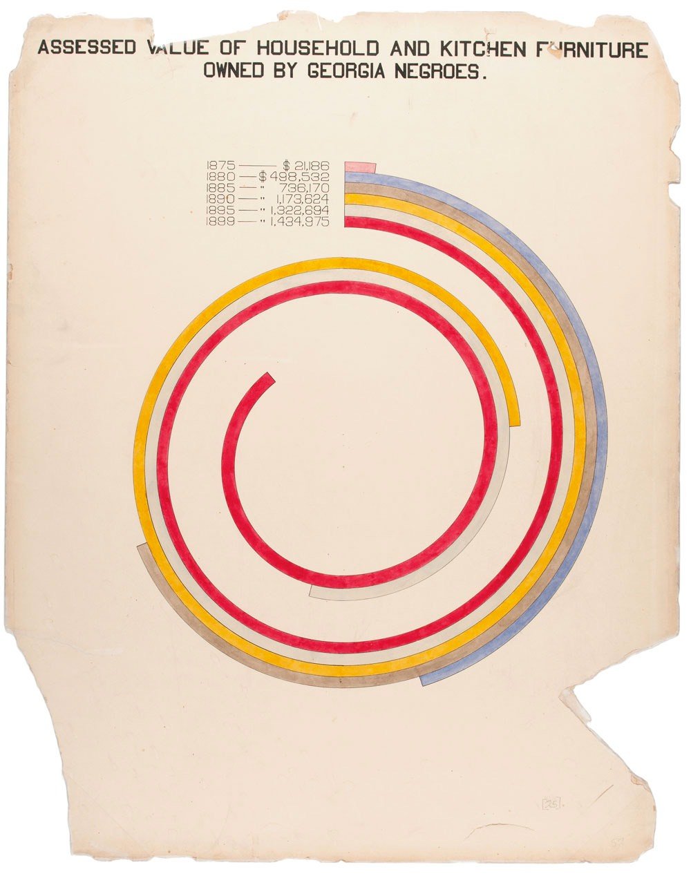
The colorful charts, graphs, and maps presented at the 1900 Paris Exposition by famed sociologist and black rights activist W. E. B. Du Bois offered a view into the lives of black Americans, conveying a literal and figurative representation of “the color line.” From advances in education to the lingering effects of slavery, these prophetic infographics — beautiful in design and powerful in content — make visible a wide spectrum of black experience.
W. E. B. Du Bois’s Data Portraits collects the complete set of graphics in full color for the first time, making their insights and innovations available to a contemporary imagination. As Maria Popova wrote, these data portraits shaped how “Du Bois himself thought about sociology, informing the ideas with which he set the world ablaze three years later in The Souls of Black Folk.”
Design historian Steven Heller collects vintage letterheads and shares some examples at Design Observer.
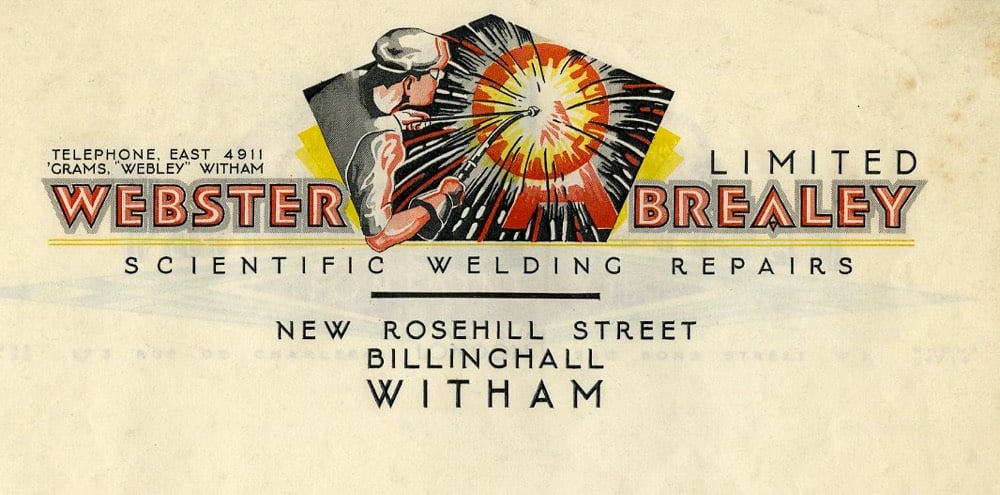
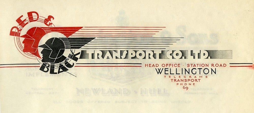
The design of blogs owes much to the letterhead (and, perhaps more obviously, to the newspaper masthead). Blog posts are, after all, public letters “to whom it may concern”. The first design I did for Gawker was quite letterheady and I loved & envied my pal Dean Allen’s letterhead-inspired design for Cardigan Industries.
Update: Loooots more great letterhead examples at Letterheady. (thx, jenni)
As part of their YouTube series on how the Saturday Night Live sausage is made, this short video details how the cue cards that the actors read from during the show are made and used. There’s even a tiny little bit in there about how they use whitespace (between words and lines) to make sure the cards are readable from a distance.
I am kind of amazed that the cue card process is still done by hand. I don’t want to see any hard-working staffers or interns getting fired, but it seems like a couple of fast large-format color printers capable of printing on poster stock and a block letter handwriting font could dramatically streamline the workflow, particularly when late-stage changes are needed.
I don’t know about you, but my house was blanketed with VHS tapes. The tapes were filled with episodes of Star Trek and movies meticulously taped from network TV without commercials — you had a to be a real Johnny-on-the-spot with the pause button or you’d miss a few post-commercial seconds of Chevy Chase’s antics in the G-rated version of National Lampoon’s Vacation. This video is a quick two-minute ode to the colorfully designed cases those tapes were sold in. Total memory bomb seeing these again.
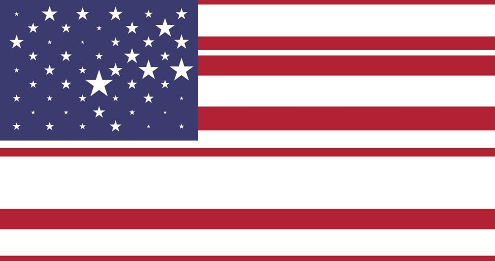
Toph Tucker has designed an algorithmic version of the US flag called the Flag of the Popular Vote, where the size of the stars and stripes are proportional to the current populations of the original 13 colonies (stripes) and current 50 states (stars). There’s also an animated version with tiny new stars appearing when new states are admitted into the union and the stars & stripes shift in size as populations grow. This New Aesthetic flag reminds me a bit of Rem Koolhaas’ proposed EU flag.
Check out these and many other top posters of the year at Creative Review, The Playlist, Little White Lies, and MUBI Notebook.
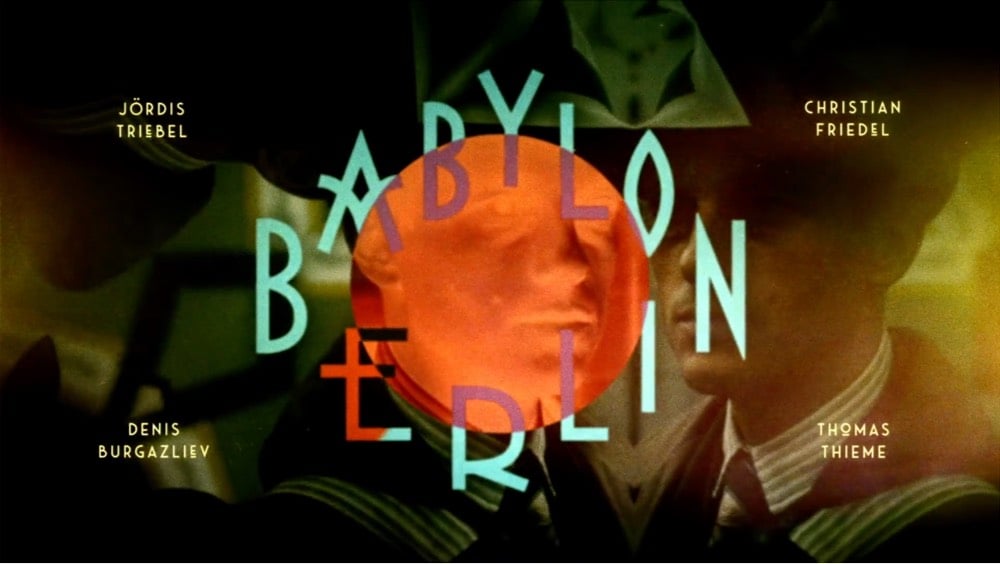
From the Art of the Title, the picks for the best opening credits sequences of the year. Their #1 is Babylon Berlin, which would have been my pick as well.
The list also includes the titles for Spider-Man: Into the Spider-Verse, which might be the most visually inventive box office #1 in recent memory.
Interestingly, two of the sequences on the list aren’t from film or TV but from conferences: Semi Permanent 2018 and Made In The Middle 2018. Only three out of the ten were from movies.
Book covers have long been one of my favorite design objects and with all the talented cover designers at work out there, 2018 produced a number of notable covers. In choosing some of my favorites below, I consulted Literary Hub’s 75 Best Books Covers of 2018 (according a panel of book designers), Paste’s 18 Best Book Covers of 2018, and The Casual Optimist’s Book Covers of Note 2018.
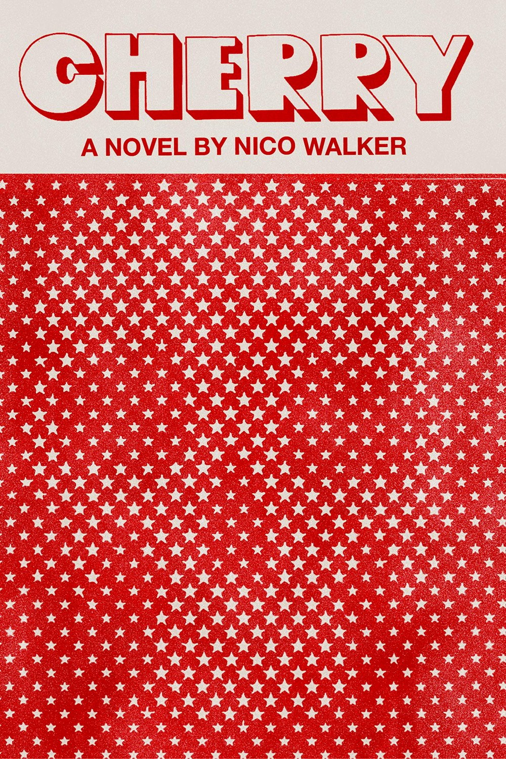
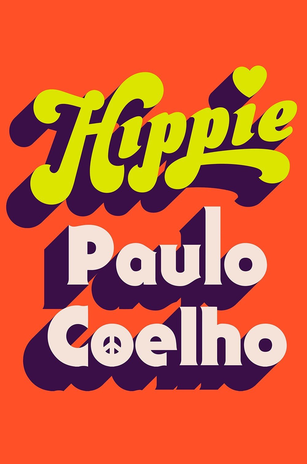
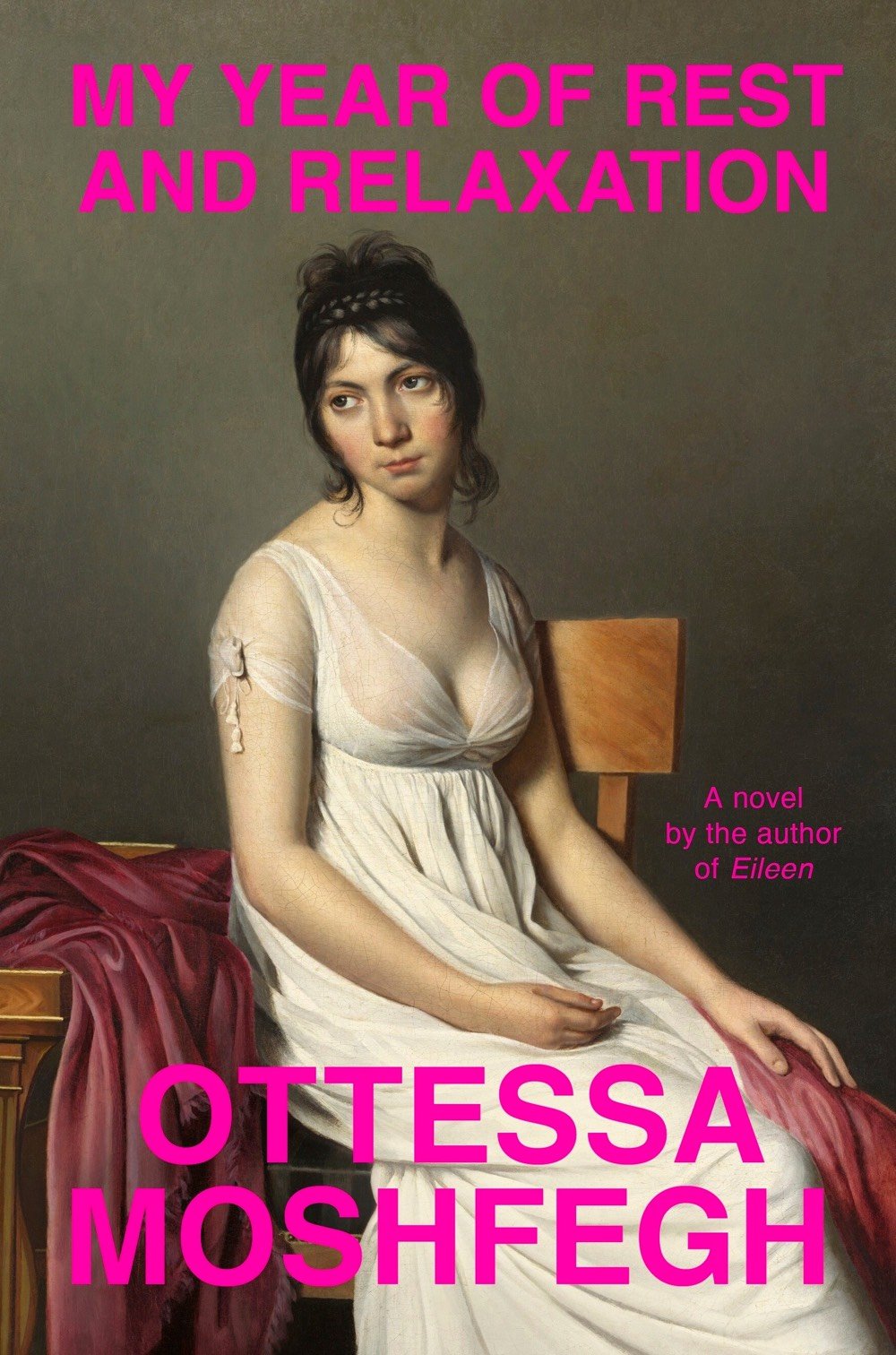
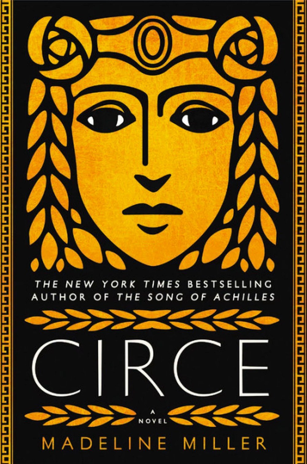
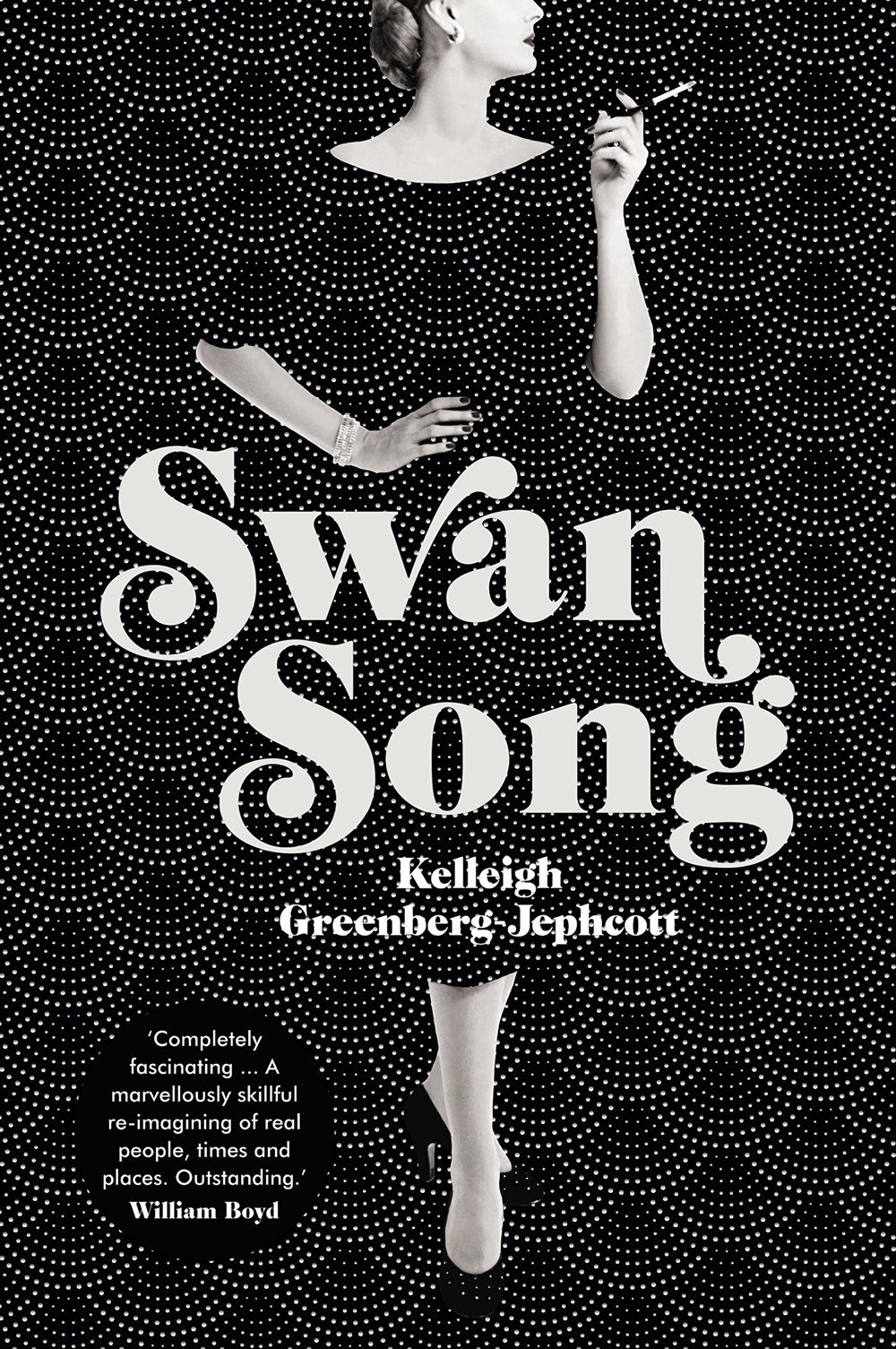
From top to bottom, Cherry by Nico Walker (designed by Janet Hansen), Hippie by Paulo Coelho (designed by Tyler Comrie), My Year of Rest and Relaxation by Ottessa Moshfegh (designed by Darren Haggar), Circe by Madeline Miller (designed by Will Staehle), and Swan Song by Kelleigh Greenberg-Jephcott (designed by Lauren Wakefield).
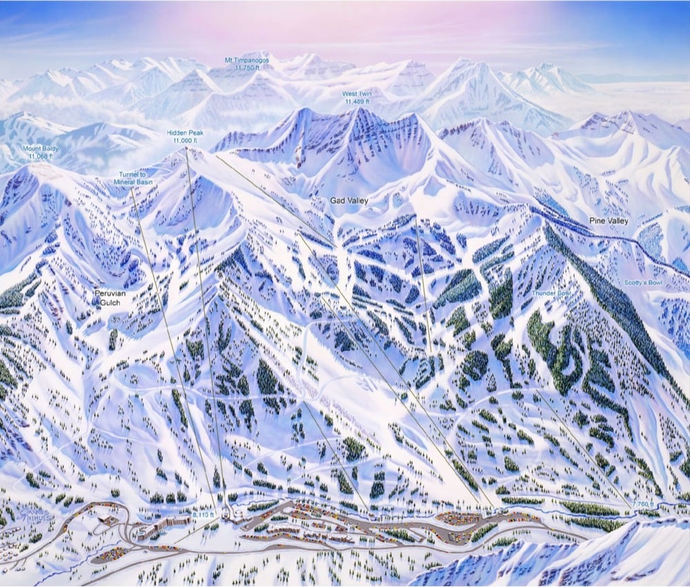
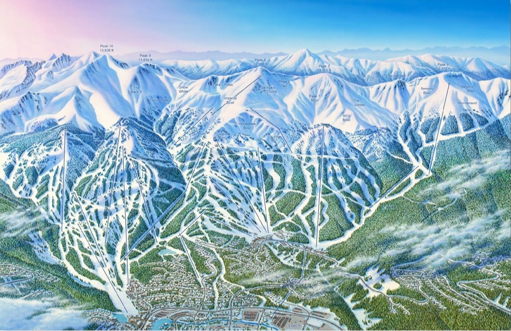
I’ve you’ve ever skied or snowboarded in the US, Canada, or many other spots around the world, chances are you’ve used a ski map painted by James Niehues. He’s hand-painted almost 200 trail maps for places like Alta, Vail, Big Sky, Okemo, and Mammoth.
Ski Magazine regularly ranks the Top 50 resorts in North America. Jim has hand painted 45 of them. His tools of choice are a camera, a notepad, a paintbrush and a canvas. Every painstaking detail — peaks, cliffs, trees and shadows — is painted by hand. Jim’s large and beautiful paintings have helped generations of skiers navigate and capture the unique character of each mountain. He has had more impact on the image and feel of skiing than almost anyone, yet few people know his name.
With the help of a small team, Niehues is publishing a hardcover coffee table book featuring all of his work along with a series of prints. Here are a couple of the maps that will be in the book:
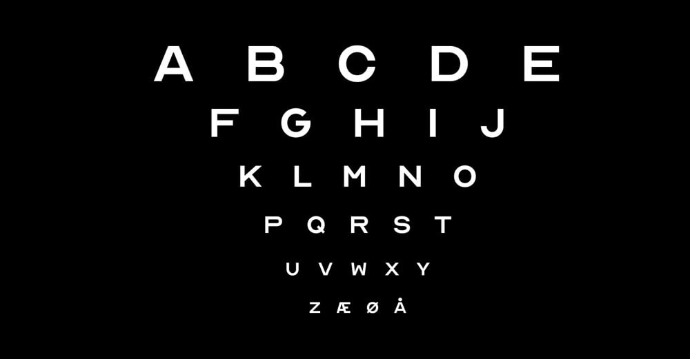
Eye charts at your optometrist’s office typically only have 10 letters on them: CDHKNORSVZ. Inspired by that lettering, creative agency ANTI Hamar and typographer Fábio Duarte Martins have expanded that abbreviated alphabet into a free font with a full alphabet called Optician Sans. Here’s a video look at how they did it:
(via khoi)
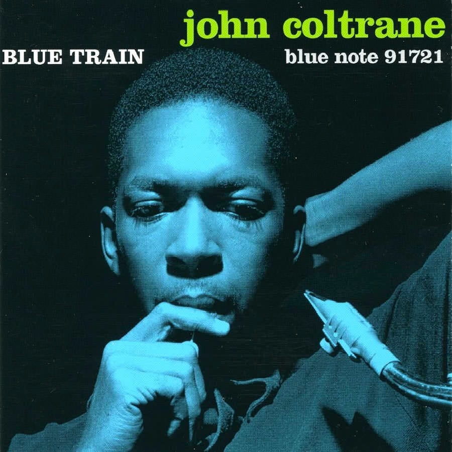
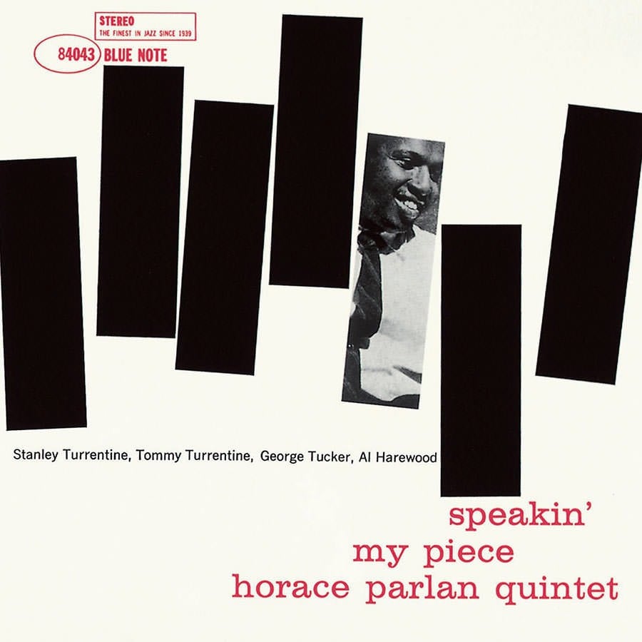
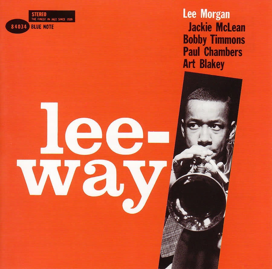
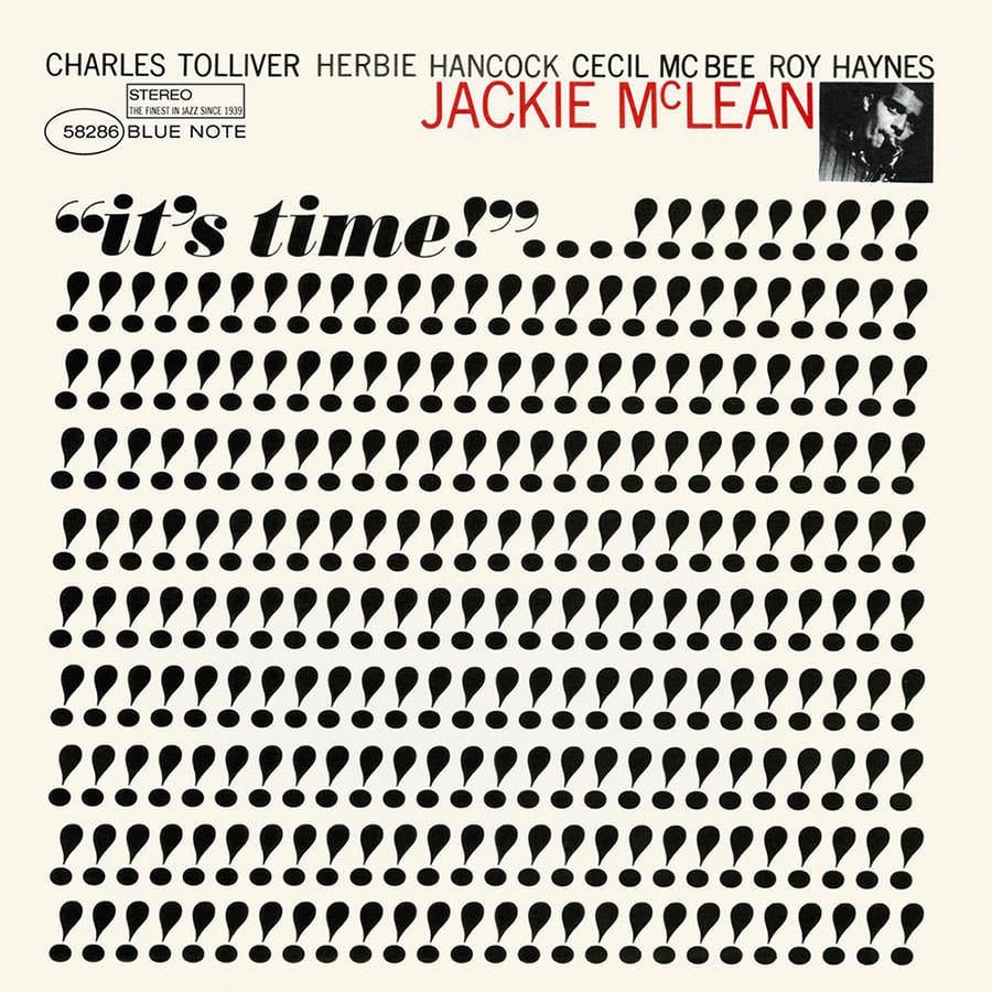
In part 2 of Earworm’s series on jazz, Estelle Caswell talks to producer Michael Cuscuna about the iconic album covers of Blue Note Records.
Inspired by the ever present Swiss lettering style that defined 20th century graphic design (think Paul Rand), Blue Note captured the refined sophistication of jazz during the early 60s, particularly during the hard bop era, and gave it a definitive visual identity through album covers.
The covers were the work of Reid Miles, who was paid $50 per cover but later landed a gig making ads for the likes of Coca-Cola to the tune of $1 million per year. Here are a few of the covers designed by Miles for Blue Note:
Film & design legend Pablo Ferro died this weekend at the age of 83. Ferro was known for designing the iconic opening title sequences for Dr. Strangelove and Bullitt (among others).
He also designed what is probably my favorite movie trailer, for A Clockwork Orange:
I wrote about Ferro’s work with Stanley Kubrick in this post 10 years ago. From a piece by Steven Heller that I linked to in the post:
Kubrick wanted to film it all using small airplane models (doubtless prefiguring his classic space ship ballet in 2001: A Space Odyssey). Ferro dissuaded him and located the official stock footage that they used instead. Ferro further conceived the idea to fill the entire screen with lettering (which incidentally had never been done before), requiring the setting of credits at different sizes and weights, which potentially ran counter to legal contractual obligations. But Kubrick supported it regardless. On the other hand, Ferro was prepared to have the titles refined by a lettering artist, but Kubrick correctly felt that the rough hewn quality of the hand-drawn comp was more effective. So he carefully lettered the entire thing himself with a thin pen.
The Art of the Title also interviewed Ferro about the Strangelove opening credits.
The titles for Strangelove were last-minute; I didn’t have much time to produce it. It came up because of a conversation between Stanley and I. Two weeks after I finished with everything, he and I were talking. He asked me what I thought about human beings. I said one thing about human beings is that everything that is mechanical, that is invented, is very sexual. We looked at each other and realized — the B-52, refueling in mid-air, of course, how much more sexual can you get?! He loved the idea. He wanted to shoot it with models we had, but I said let me take a look at the stock footage, I am sure that [the makers of those planes] are very proud of what they did and, sure enough, they had shot the plane from every possible angle.
Update: The Art of the Title also did a huge three-part interview with Ferro as a career retrospective. Great deep dive into a substantial career.
For Literary Hub, Alison Pearlman writes about how secret menus at fast food joints like In-N-Out (4x4, animal style) and McDonald’s (a McDonald’s Double Cheeseburger with a McChicken sandwich crammed into it) are an attempt by customers to push back against corporate standardization.
As you might guess, chain restaurants with units in the many hundreds or thousands lean toward standardization. The larger the chain, the more it regulates everything from menus to service, which creates the public perception of a homogenous and regimented operation.
This is the strongest at limited-service chains because every segment of the company-designed encounter between patron and server is at its most rote. Regulars are supposed to be addressed the same way as first-timers. Managers don’t encourage servers to recall a repeat customer’s favorite dish or how much ice she likes in her tea. That would only slow operations down-the kiss of death for a high-volume operation. If a server does become familiar with a repeat customer, that relationship could lead to special treatment, such as extra generous provisions of fries or special sauce, but interactions like these stray from the company line.
The piece is excerpted from Pearlman’s new book on the design of restaurant menus, May We Suggest: Restaurant Menus and the Art of Persuasion, which sounds fascinating. As a former designer who still very much thinks like one, almost every time I interact with a restaurant menu, I’m looking at how it’s arranged and designed. I think often of William Poundstone’s analysis of Balthazar’s menu.
2. The price anchor. Menu consultants use this prime space for high-profit items, and price “anchors”, in this case the Le Balthazar seafood plate, for $115 (£70). By putting high-profit items next to the extremely expensive anchor, they seem cheap by comparison. So, the triple-figure price here is probably to induce customers to go for the $70 (£43) Le Grand plate to the left of it, or the more modest seafood orders below it.)
And of course, there’s the 11-page menu from Shopsin’s circa-2004 that defies all rational analysis, a “tour de force of outsider information design”.
Newer posts
Older posts
Socials & More