kottke.org posts about design
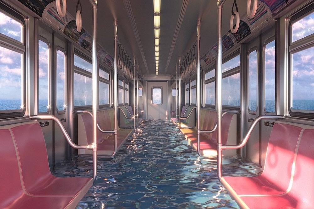
Inspired by a trip to Venice, the world’s most prominent example of what life could be like in many of our coastal cities in the years to come, Hayden Williams made a series of 3D rendered images showing what our world might look like underwater. (via the morning news)
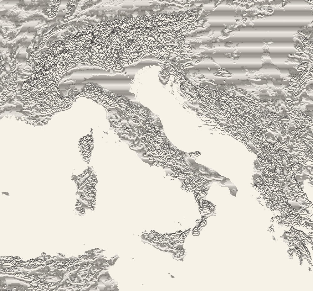
Using Andrei Kashcha’s Peak Map tool, you can create what’s called a ridgeline chart — picture the album cover for Joy Division’s Unknown Pleasures — of the elevation anywhere on the Earth. Try it out here. (via @eramirez)
Nathan Yau of Flowing Data picked his ten favorite data visualization projects for 2019. All the projects listed are worth a look … but maybe, just maybe, this post is really just an excuse to let my eyes feast upon Scott Reinhard’s historic topographic maps once again.
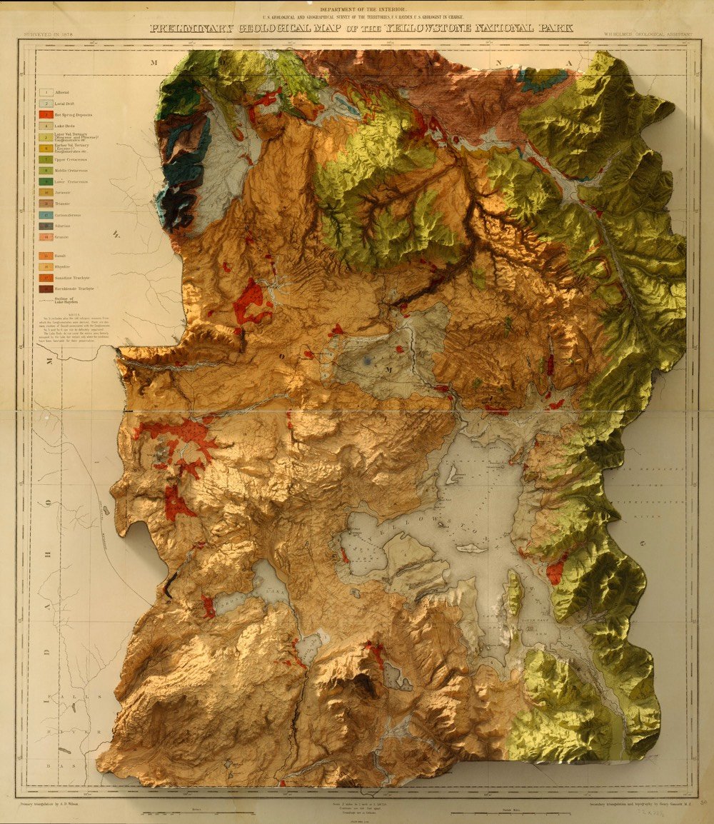
Designer Scott Reinhard takes old geological survey maps and combines them with elevation data to produce these wonderful hybrid topographic maps. From top to bottom, here are Reinhard’s 3D versions of a 1878 USGS Yellowstone map, a 1904 USGS map of Acadia National Park, and a 1899 USGS map of the Grand Tetons.
Product designer Jonna Breitenhuber has come up with an interesting way to get rid of plastic shampoo and body wash containers: by packaging the liquids in bottles made of slow-dissolving soap.
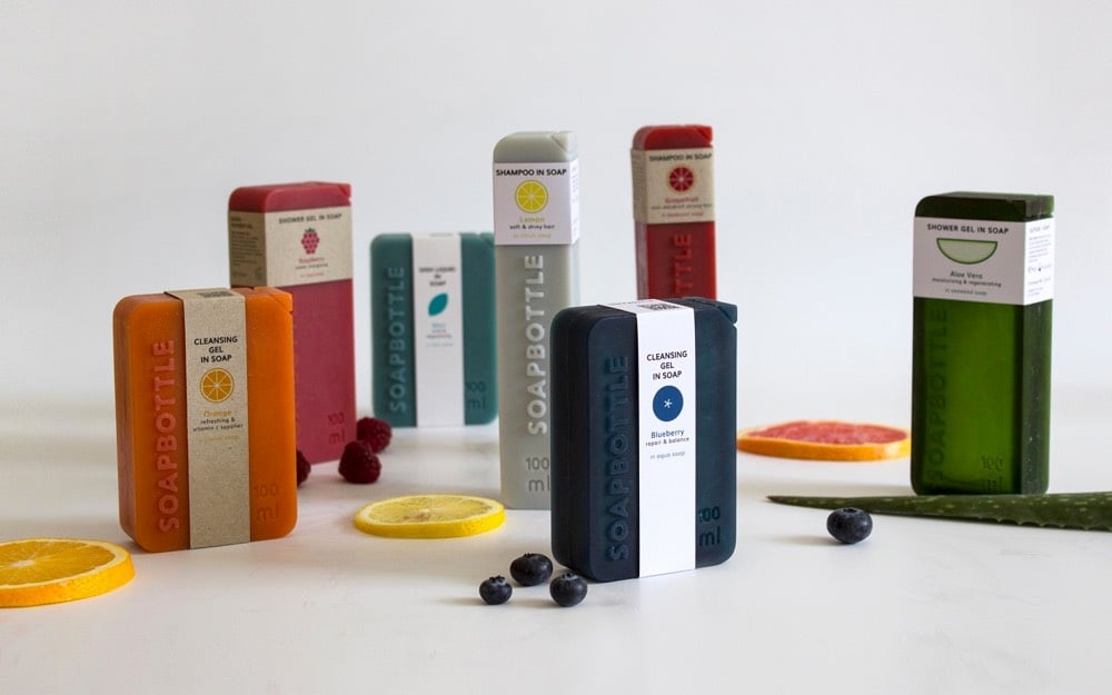
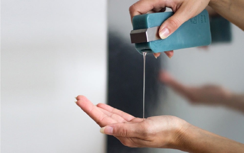
Soapbottle is a packaging made from soap. As the content within is being used, the soap packaging very gradually dissolves. When finished, remnants can be used again, as hand soap or processed into detergents. Soap is made of natural ingredients and is biodegradable: waste can be completely avoided.
You can see Soapbottle in action here:
I love that you open the bottle by cutting the corner off with a knife. See also Biodegradable Food Containers Inspired by Egg Shells & Orange Peels. (via moss & fog)
Update: The Soapbottle project has gone live on Kickstarter as an actual product.
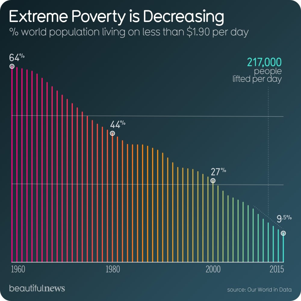
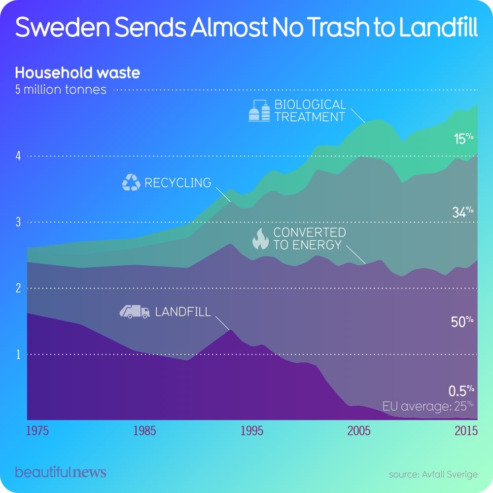
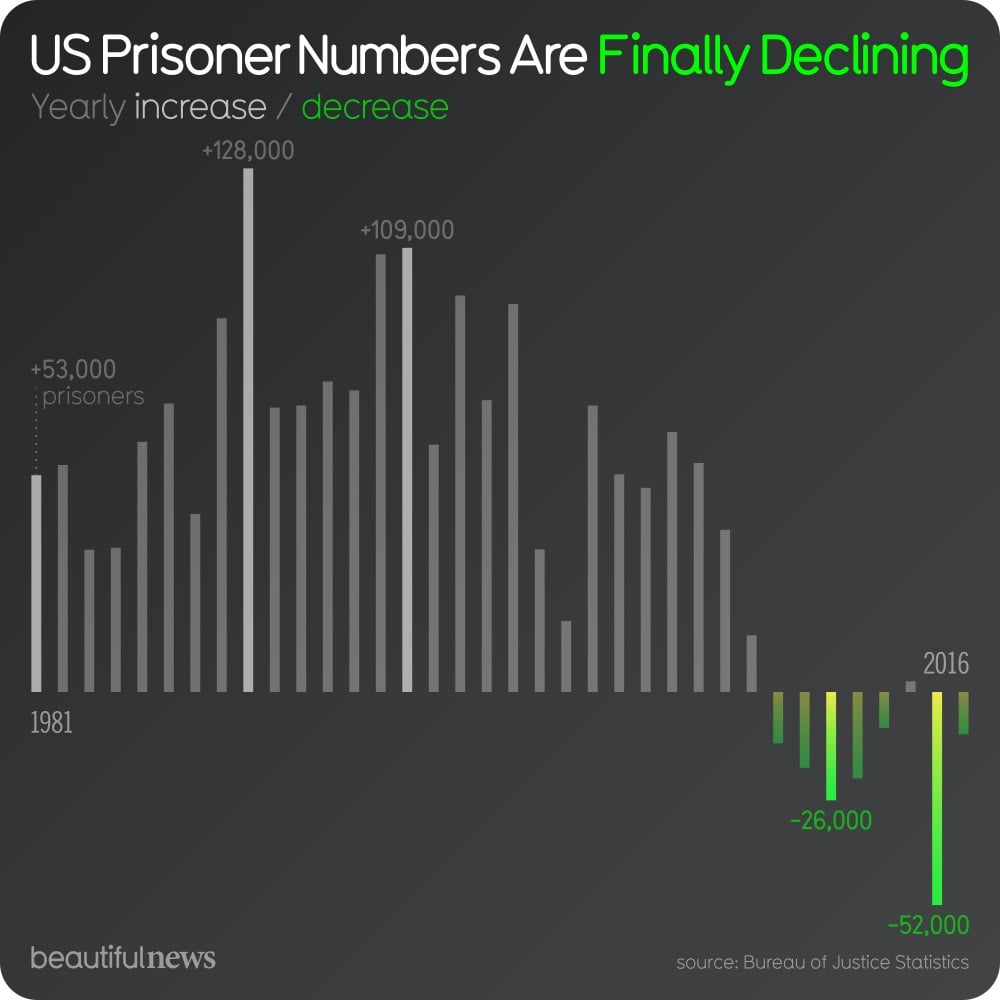
Each day since the beginning of October, the team of designers, technologists, and researchers at Beautiful News Daily (a project by Information Is Beautiful) have been posting infographics and data visualizations that share some good news about the world. The site’s tagline is “unseen trends, uplifting stats, creative solutions”.
The bad news we see everyday on news websites, newspaper front pages, and magazine covers is important (or can be, if it’s not designed to keep people frightened and hooked on the news), but the good news is just as significant (or can be, if it doesn’t cause you to forget the world’s true suffering and turmoil).
You can keep up with Beautiful News via their website, their weekly newsletter, or Twitter & Instagram. (via moss & fog)
For more than 11 years for a series he calls Everydays, Mike Winkelmann (aka Beeple) has been making a daily picture. As you might expect from the breakneck pace, some of them aren’t that interesting (there’s a lot of juvenile stuff here tbh), but my favorite ones are the Black Mirror-ish with decayed or repurposed pop cultural references.
You can view more of Winkelmann’s work on Behance, Tumblr, and his website. (via dense discovery)
I had somehow never registered this before, but it was (ridiculously) obvious once it was pointed out to me in this video: the psychedelic design of music posters in the 60s were inspired in part by the Art Nouveau movement of the late 1800s. For instance, here’s an absinthe advertisement from the 1890s and a 1966 Pink Floyd poster.

“You can draw a straight line between Art Nouveau and psychedelic rock posters,” Martin Hohn, president of the Rock Poster Society, says. “Mucha, Jules Chéret, Aubrey Beardsley. Borrow from everything. The world is your palette. It was all meant to be populist art. It was always meant to be disposable.” He later adds: “What the artists were saying graphically was the same thing the rock bands were saying musically.”
Delph Miniatures is a small company that makes what they call “modern miniatures”, 1/12th scale miniatures of everyday things like washing machines, ironing boards, and mobility scooters. Ellen Evans’ short documentary about the miniatures and the mother/daughter team who make them is completely delightful; I love everything about these women and their work.
They make contemporary miniatures because they want to represent our culture as it is right now and not as it was back in Victorian or Elizabethan times.
Our inspiration is not in resource books or museums, but physically around us, all the time, in our homes, in the shops of our home city, Bradford, and in the lives of our friends and family. We love creating something different and modern that someone wants. In this way our range has expanded as people have asked for more new things. Ideas are all around us. You may be living in a Victorian house but you still have your TV, your microwave, and your computer.
Just look at this meticulous work by Kath Holden and Margaret Shaw — the attention to detail is inspiring:
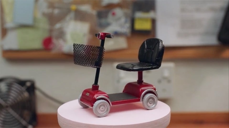
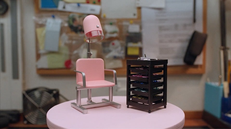
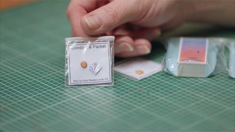
Yes, that’s a wee condom and its wrapper, which Delph assures us is made of actual latex and “the correct size diameter scaled down of a standard condom”. You can buy your own here for £8.58. The mobility scooter is £77.81 and you can buy everything you need to make a mini beauty salon right here, including a “free wifi” sign and dome-type security camera. Shop the rest of their store here..so many good things! (via the morning news)
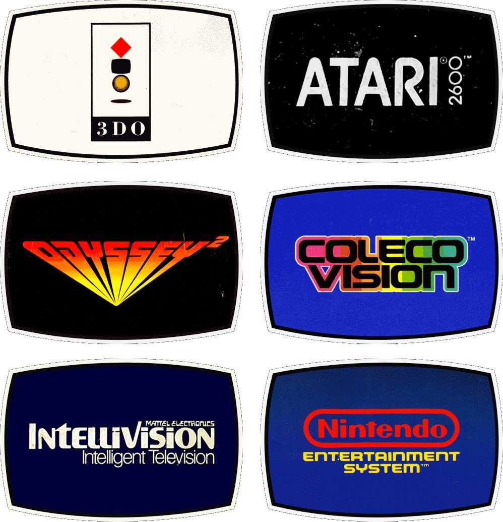
Reagan Ray has collected the logos of video game consoles from 1976 to the present. He ignores the first generation of consoles because there would have been too many to include. (Historical interlude: I didn’t know gaming consoles were broken down into generations. Apparently we’re in the 8th generation now — Wii U, PS4, Xbox One, and Switch.)
See also Ray’s collections of classic airline logos, record label logos, 80s action figure logos, American car logos, etc..
The Atlantic launched a new visual identity the other day, complete with a new logo, custom typeface, updated website, and iOS app. Here’s the first cover carrying the new look:
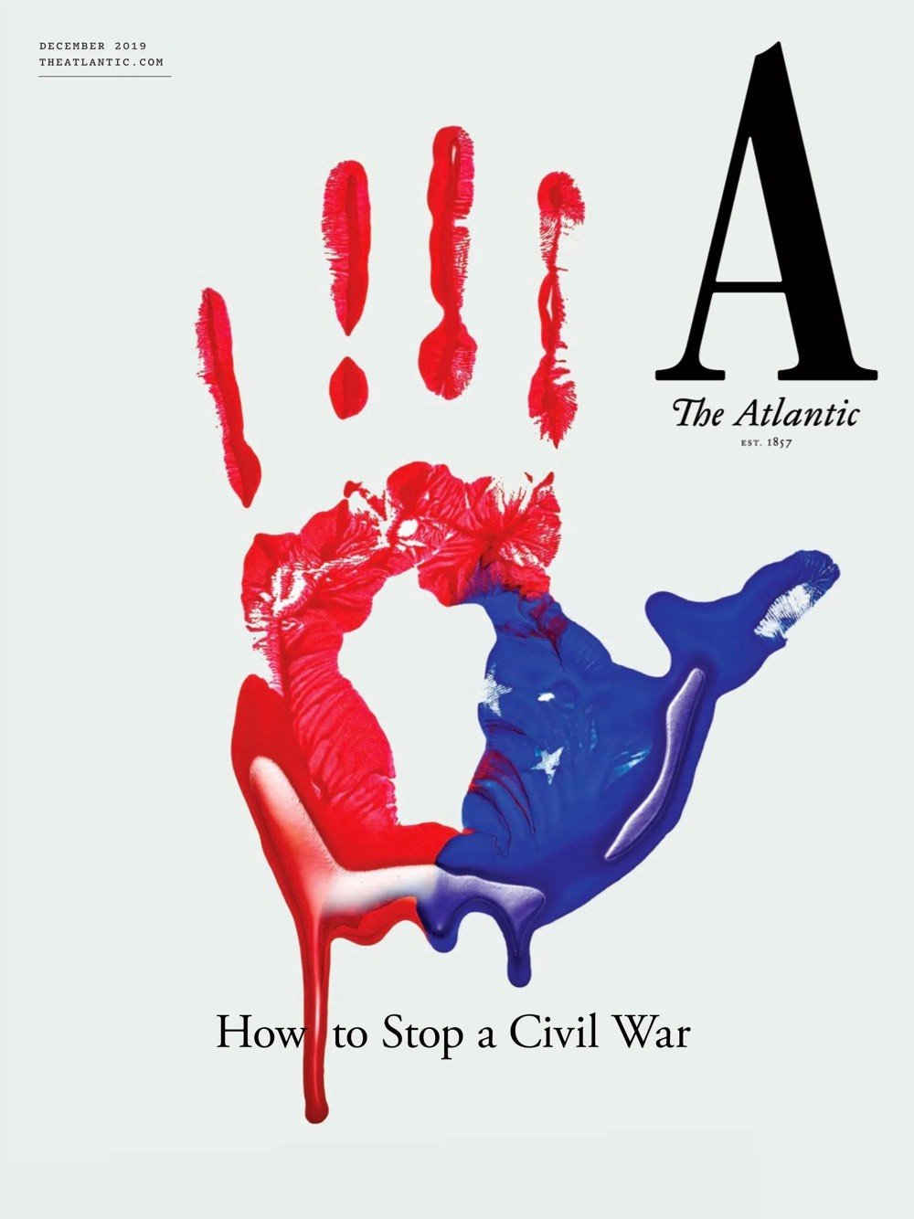
The effort was led by Peter Mendelsund and his senior art director Oliver Munday. You can hear the pair talk a bit about their process here:
And more from Mendelsund in this conversation with editor-in-chief Jeffrey Goldberg:
My favorite kind of design is a kind of time-released design, where you look at something and you have an immediate impression of it, and then you, upon further reflection, find something in the design that adds to or subverts that first impression.
Really nice work and methodology behind it. Hearing designers talk about how they approach their work always makes me miss practicing design on a daily basis, a former vocation of mine that seems very very far away these days.
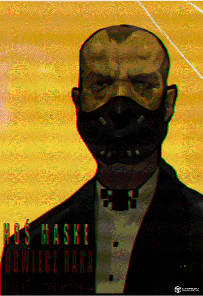
While we’re on the world building topic, here’s another article on design within games, this one about the posters used in the upcoming Control and the Polish cyberpunk-horror game Observer.
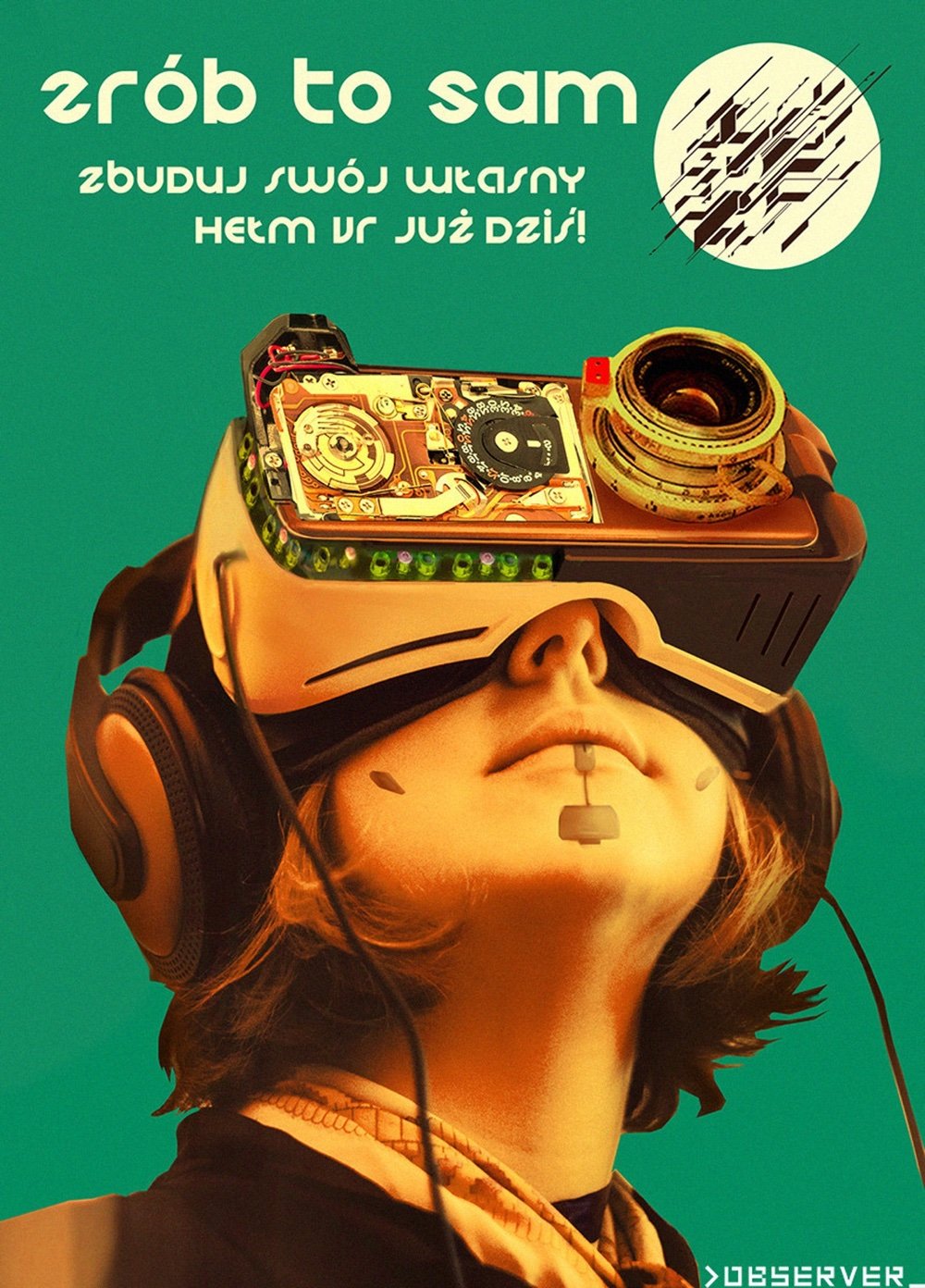
Alongside various made up advertisements, brands, book covers and propaganda signs, posters are symbolic of a larger universe, helping to broaden and flesh out any fictional world. An incredible amount of effort is put into creating video game settings, and the poster is but one of many tiny details carefully designed to draw you deeper.
The designers for both games were able to research the vast number of posters of different periods and locations to inform their own creations.
“Posters were a great tool for us to build a story and establish the world design. In one way, they show how this future world is organised, the rules of it etc. but they also represent the protagonist’s various dilemmas,” Lenart explains.
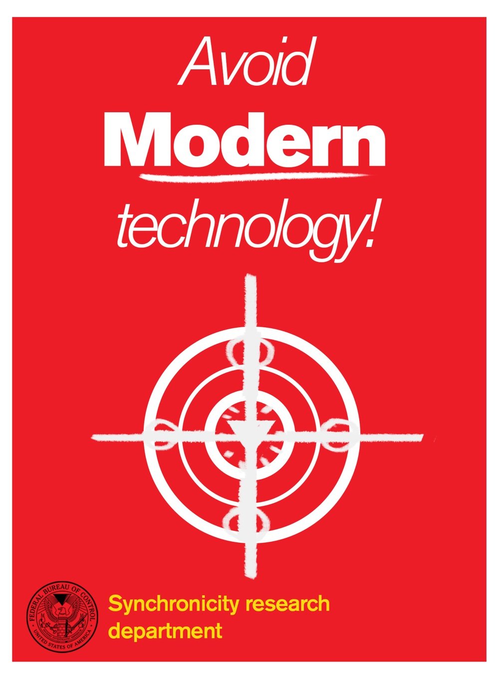
“If done right, [the posters] can help convey everything from small trivial details to the broader story arc. These aspects enrich and deepen the lore and the world.”
Can’t say I’m much of a gamer but I like when things intersect in interesting ways and the launch of Hideo Kojima’s Death Stranding is one of those times. This is a huge launch with lots and lots of coverage, you’ll probably be seeing it everywhere. The GameSport review, which gives a great idea of the look and gameplay, is above and here’s more of what it’s about, from the review at The Verge:
Death Stranding takes place in a distant future, one that has been ravaged by a largely unexplained phenomenon called the death stranding. It wiped out cities and almost all life while opening a gate between the worlds of the living and dead. Those ghostly BTs haunt forests and mountains, and certain humans called repatriates are able to return to life from a strange underwater space known as the Seam. Sam, played by Norman Reedus, is one of these repatriates. He’s also something of a post-apocalyptic delivery man, shuttling supplies from one settlement to the next. Early in the game, he’s given a particularly ambitious task: reunite America (now known as the UCA, or United Cities of America) by traveling across the country, connecting settlements to a sort of internet-like network. At the same time, Sam is trying to reach the west coast of the country to rescue his sister who has been captured by a terrorist organization.
David Erlich at IndieWire is calling it the best video game movie ever made.
Massive, moody, and — as usual for the video game auteur — weird as hell. The open-world experience has enough contemplative moments to make it feel like a “Grand Theft Auto” sequel directed by Andrei Tarkovsky, and it’s the greatest achievement yet from the most eccentric and forward-thinking designer of a medium in which virtually every large-scale project is created by committee.
But what I’d like to draw your attention to is where Kojima’s vision intersects with fashion and design. As Ryan Epps says at TheGamer, Death Stranding Is A Tangled Web Of Designer Collaborations.
Kojima not only intends on reshaping the landscape of conventional open-world gaming (and redefining the meaning of genre itself), but has his eyes set on revolutionizing narrative design and video game cinematography by way of listless immersion.
The motorbike is a collaboration with Norman Reedus’ television show The Ride, glasses are designed by French eyewear brand J.F.Rey, and some of the better looking clothing is designed by Errolson Hugh’s Acronym. While it edges (perhaps goes over for some) into product placement, it goes further, being co-designed for the game and each informing the other. The collaborations span the globe and form a mix to draw in more fans.
As so exemplified by these varied artists, designers, and thinkers, Kojima’s project will boast some of the most interesting forms of immersive insight. Much like how the gameplay itself finds players drawing the world back together in a time of hardship and desolation, the game’s own creation has been a global project that will, in essence, capture the hearts and minds of so many gamers just by the sheer amount of worldwide influence present in its DNA.
For my part, the collaboration with Acronym ( Hypebeast has a few details and pictures about the collaboration ) is especially of interest with Hugh’s design already being so adjacent to near-future fiction and cyberpunk aesthetics. According to GQ, he Sees the Future and he has been having this same kind of bidirectional influence with William Gibson for years.
Please dig through some of the links above if you like this aesthetic and keep an eye on these kinds of collaborations in world building, which are bound to multiply and “attach” more domains of gaming, movies, design, and architecture together.
From Metrobits, a fantastic resource for all things to do with metros and subways around the world, comes this collection of metro logos (older page w/ larger logos here).
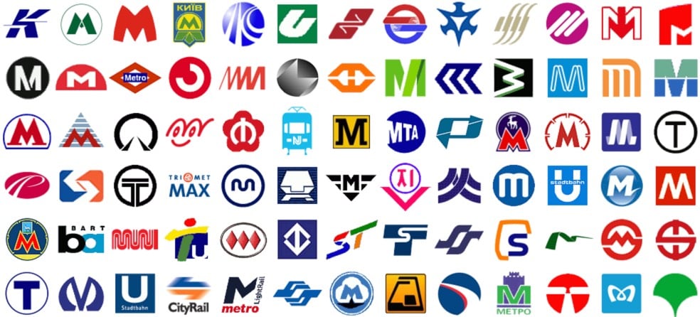
See also metro fonts (names + designers), fare collection schemes, and ratings of the art and architecture of metro stations from around the world (highest marks go to Moscow, Paris, Saint Petersburg, and Stockholm). The Moscow and Saint Petersburg stations are incredible.


From graphic designer Mariyan Atanasov comes Urban Tetris, in which apartment buildings in Sofia, Bulgaria are turned into a massive game of Tetris. If you’ve played a bunch of Tetris in your life, just looking at these images should trigger the familiar theme song in your head. Next: make this actually playable. (via colossal)
On Oct 21, the emblem for the 2024 Summer Olympics and Paralympics was unveiled in Paris, site of the Games. It features a round symbol that represents a gold medal, the Olympic flame, and Marianne, the “national personification of the French Republic since the French Revolution”.
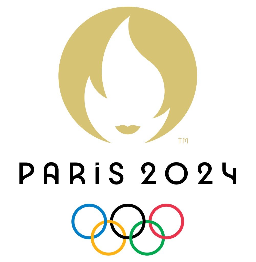
The emblem’s Marianne is quite chic, so Parisian freelance journalist Megan Clement concocted a vignette of that young woman’s life. It begins like so:
The French Olympic logo tumbles out of bed on a Parisian morning. She tousles her messy bob, dons breton stripes and ballet flats and whisks down the stairs from her fifth-floor apartment to grab a baguette before enigmatically texting two men who are pursuing her romantically.
The French Olympic logo has an expresso and a cigarette for lunch.
(via @legalnomads)
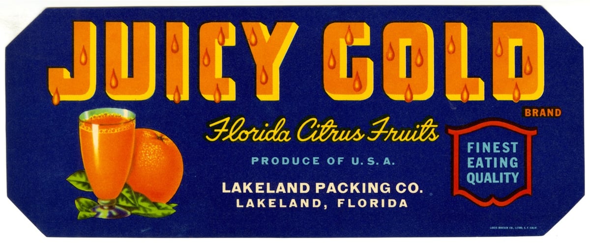
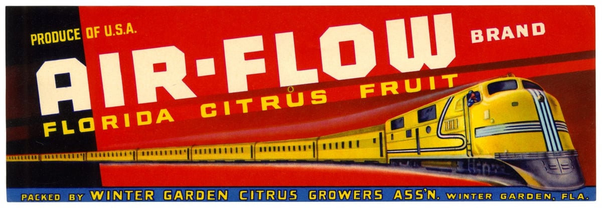
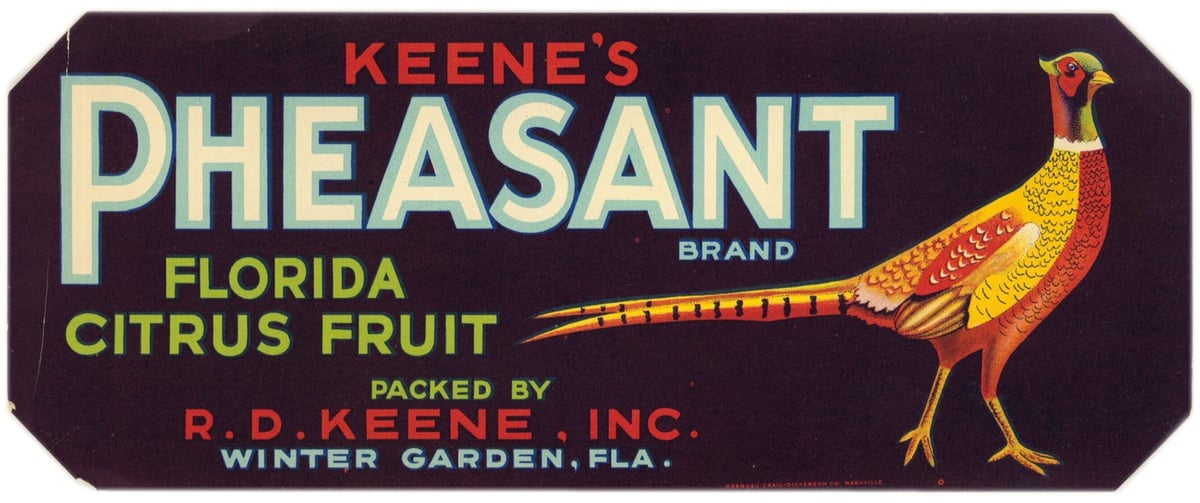
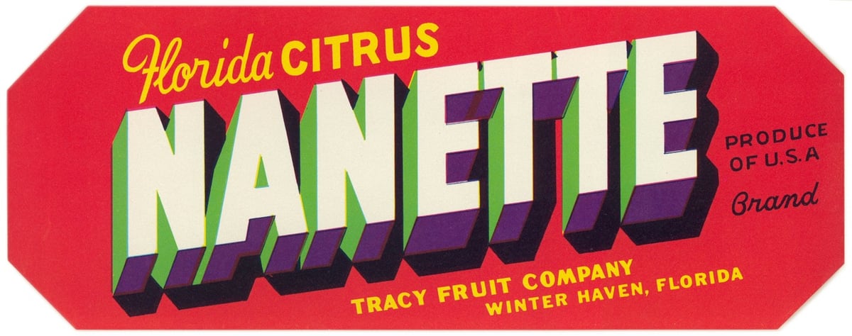
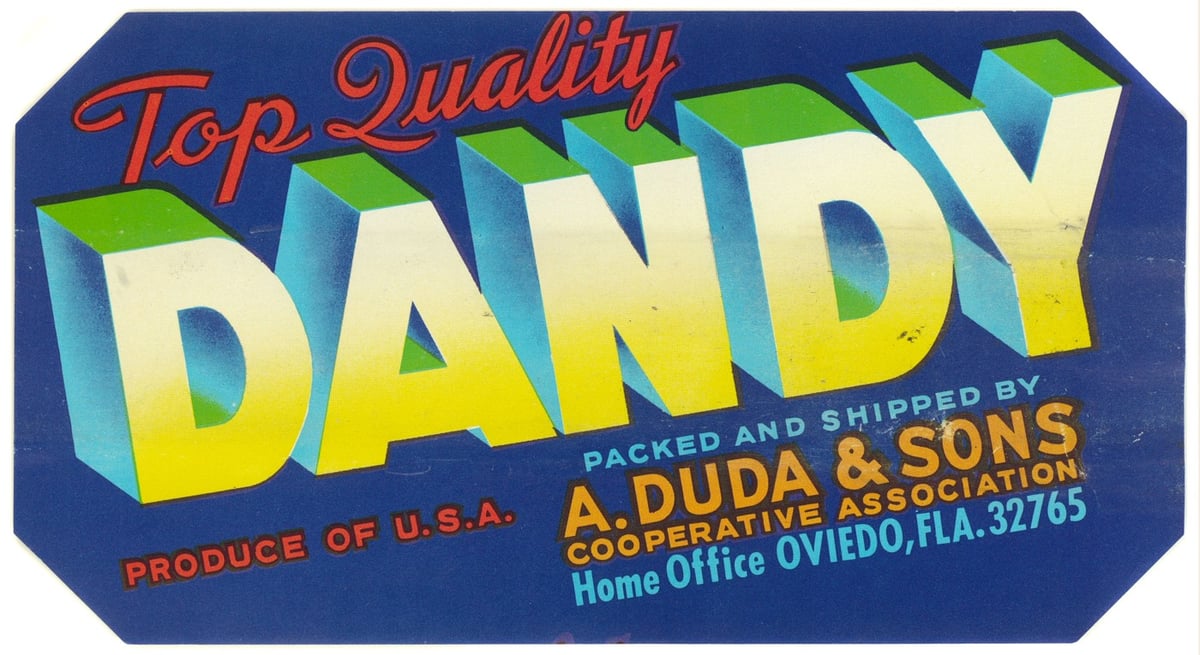
From the State Library of Florida comes a collection of more than 600 crate labels used by the citrus and vegetable industries from the 1920s to the 1950s.
To help give Florida fruits and vegetables an edge, growers looked to the booming produce packing industry in California, where advertisers were already using bold, elaborate labels to catch buyers’ attention. Florida companies began designing their wooden shipping crates and paper labels based on this successful model.
Paper crate labels were used in Florida from the late 1800s until the 1950s. The earliest paper labels were fairly generic and often didn’t include a brand name. Starting in the 1920s, advertisers began developing more complex marketing strategies, aiming to entice buyers with colorful brand names and imagery.
What an amazing variety of design and typographic styles. There’s also some questionable imagery in there as well: Mammy Brand, Dixieland Brand, Brave Vegetables, Indian Chief, etc.
See also The US Government’s Trove of Beautiful Apple Paintings. (via @john_overholt)
In Why Every CEO Needs to Think Like a Hacker, Stalker, or White Nationalist, Rob Walker argues that products should be designed with their worst potential users in mind.
“Red teaming” (creating a group with an explicitly adversarial role, to challenge an organization’s strategy or structures) happens in military and intelligence contexts, and even in tech design, when the underlying issue is security or fending off hackers. Maybe big digital-centric companies, and small ones that aspire to scale, need a variation that’s not about fending off direct adversaries. Imagine instead a sort of Black Mirror Department, devoted to nothing but figuring out how the product can be abused — and thus how to minimize malign misuse.
From the folks that produced the NYC Transit Authority Graphics Standards Manual and the NASA Standards Manual comes a new book, Parks, about the art, maps, and printed materials produced to support American’s national parks.
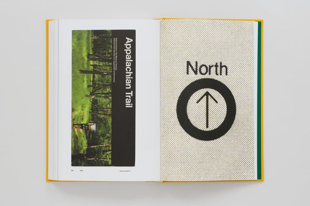
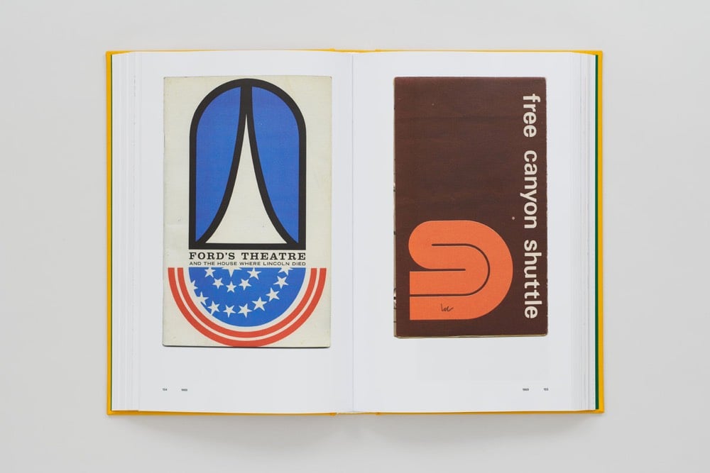
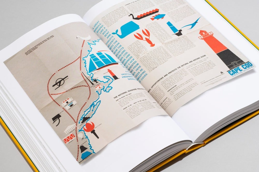
From the book’s introduction by Lyz Nagan-Powell:
If, as Wallace Stegner famously declared, the national parks are “America’s best idea,” how can we explore this idea? There is the historical aspect: America invented the concept of nationally owned and operated parks in 1872, when Ulysses S. Grant signed Yellowstone National Park into existence. But there is more to Stegner’s sentiment than just the invention of the parks. The rest of the quote goes on to say that the parks are “Absolutely American, absolutely democratic, they reflect us at our best rather than our worst.”
The national parks story isn’t simple or easy. It’s full of splendor and glory, as well as greed and exploitation. For every person who loves one of the parks like it’s their own home, there is another who resents the federal government for owning it. Even before Yellowstone became the first national park, park history was fraught with tension. Tension between preservation and use, between indigenous people and white explorers, between local rights and federal oversight, between wild freedom and human control, between park purists and park recreationists, and between commercial exploitation and historic value.
With this tense backdrop, or maybe because of it, art, imagery, writing, and design have played a vital role in the history of the national parks. Compelling creative materials that celebrated the land — including books, paintings, performances, and advertisements — have marked developments and milestones. These items have brought the rich landscapes and their scientific and historical significance to life.
Perhaps together, the tension and celebration make the National Park System - parks, monuments, natural areas, historic sites, and more - the perfect embodiment of America itself, and what the “best idea” of the parks is really all about.
Parks is out in October but you can pre-order it now.
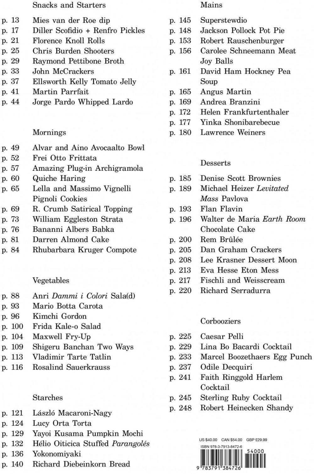
Le Corbuffet was a series of performances by artist Esther Choi that sought to bring together food with notable artists and designers, along with a healthy dose of puns. A cookbook based on the project will be out in October: Le Corbuffet: Edible Art and Design Classics. Here’s the page for Quiche Haring:
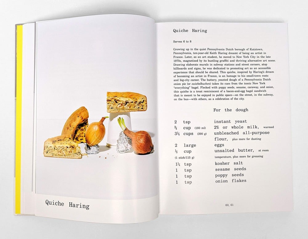
Other dishes include Rhubarbara Kruger Compote, Shigeru Banchan Two Ways, Yokonomiyaki, Rem Brûlée, and the Robert Rauschenburger. Here’s the full menu/table of contents:
Says Choi about where the idea for the project came from:
In 2014, I stumbled across an elaborate menu crafted by László Moholy-Nagy. The multi-panelled bill of fare was for a dinner held in tribute to the Bauhaus founder and architect, Walter Gropius, in 1937. Inspired by the menu for Gropius’s dinner, and the questions that it raised about the elitism of cultural production, I decided to conduct a social experiment a year later.
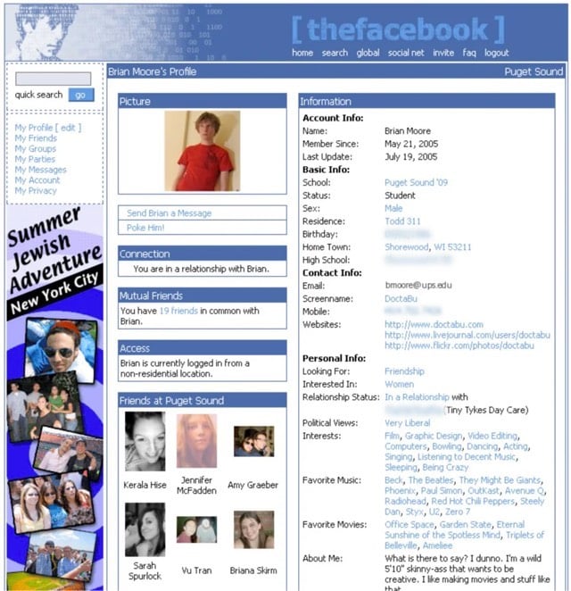
The mission of Version Museum is to record and present what the interfaces of software and websites looked like, from their earliest versions until now. The site’s tagline is “a visual history of your favorite technology”. Here’s the history of Facebook; an early screenshot:
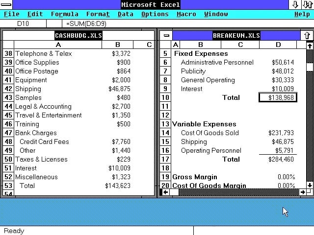
The first version of Microsoft’s Excel for Windows:
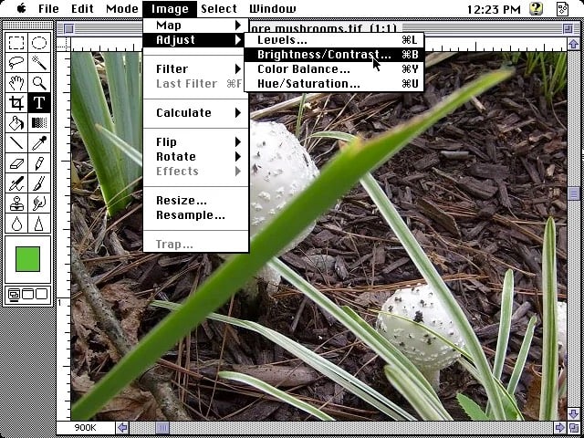
Adobe Photoshop:
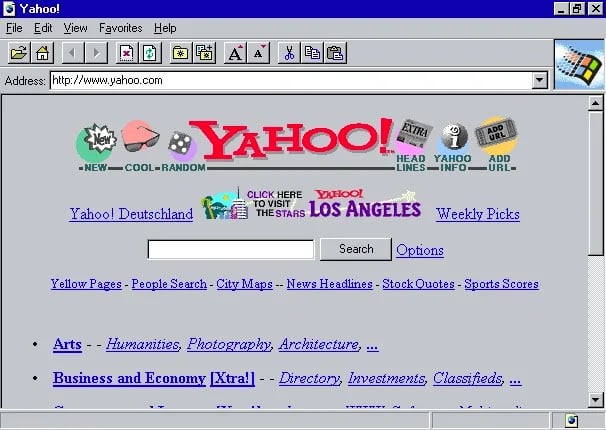
Internet Explorer (screenshot of the 1.0 version displaying a circa-1995 Yahoo! homepage):
The collection isn’t huge, but the father/son team behind it hits the high points, including Amazon, New York Times, OS X, and iTunes.
Update: One of the Facebook screenshots that the Version Museum is using included Brian Moore’s phone number and other personal information. Per Moore’s general request, I have blurred out that information and I hope the museum does the same. (thx, all)
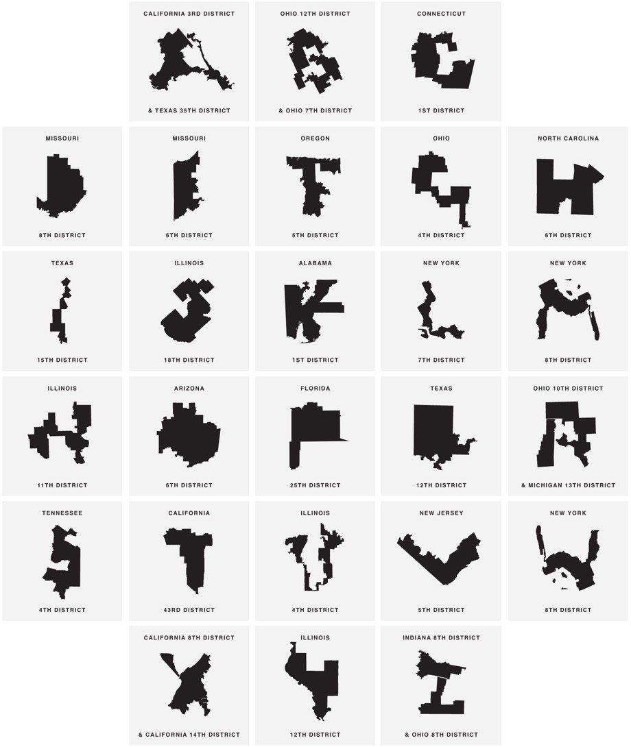
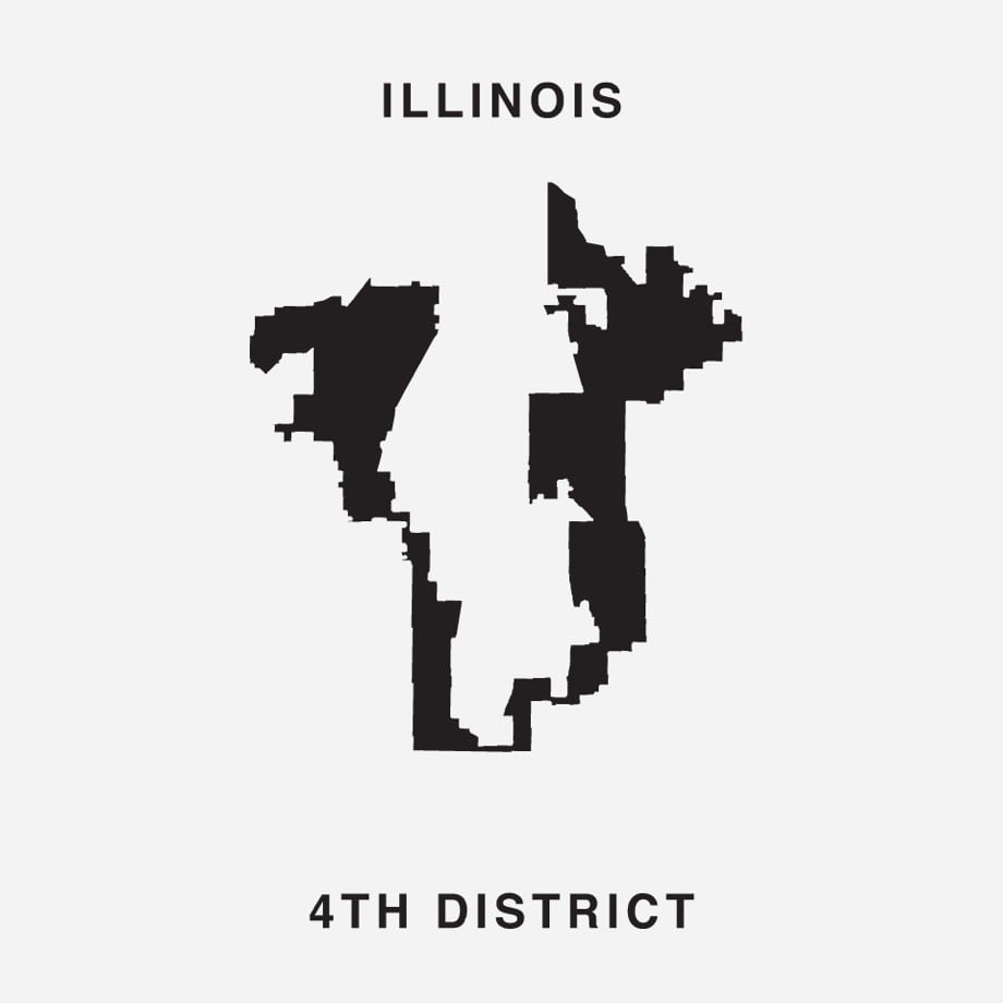
Gerry is a typeface where the letterforms are created from heavily gerrymandered Congressional districts. For example, the letter U is the 4th district in Illinois:
Click through to download the font for free and to tweet at your representative to stop gerrymandering.
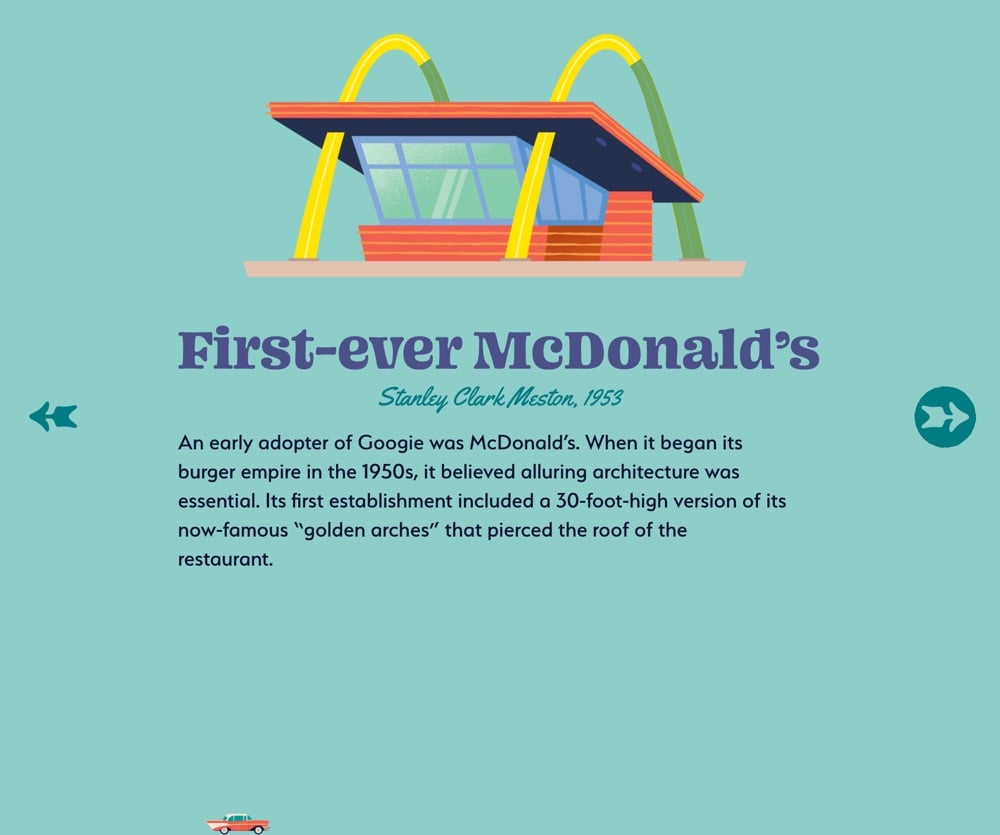
I know this probably isn’t brand new, but in the past couple of weeks I’ve noticed a few articles published by big media companies that are influenced by the design of Snapchat and Instagram Stories. Just to be clear, these aren’t published on Instagram (that’s been going on for years); they are published on media sites but are designed to look and work like Instagram Stories. The first one I noticed was this NY Times piece on Guantanamo Bay.

You can see the Instagram-style progress meter at the top. And then there’s Curbed’s The Ultimate Guide to Googie, where the progress meter is indicated more playfully by the little car at the bottom (it even switches directions based on whether you’re paging forward or back through the story). Curbed EIC Kelsey Keith says it was built using “Vox Media’s new custom storytelling kit tool”.
The third piece I can’t find again — I think it was a WSJ or Washington post article — but it too was influenced by the Stories format.
It’s a good move for these companies. Snap & Instagram have worked hard to pioneer and promote this format, it’s perfectly designed for mobile, and people (especially younger folks) know how to use it. Nominally, these articles are just slideshows, a format that online media companies have been using forever. But I’d argue there are some important differentiators that point to the clear influence of Instagram and to this being a newish trend:
1. The presentation is edge to edge with full-frame photos and auto-playing videos.
2. There’s no “chrome” as there would be around a slideshow and minimal indication of controls.
3. They read best on mobile devices in portrait mode.
4. The display of progress meters.
5. Navigation by swiping or tapping on the far left or right sides of the screen, especially on mobile.
Have you seen any other examples of media companies borrowing the Stories design from Instagram?
Update: Various media outlets are using Google’s AMP Stories to make these. You can see examples on CNN, the Atlantic, and Wired.
This is likely what my mystery third story was built with. (via @adamvanlente)
B-box is a beehive designed for use in close proximity to humans, like near your house or in an urban environment. It does this by separating the honey part of the hive from the area where the bees live and limiting their access to the hive through an entrance more than seven feet above the ground. Check out this video for details:
The makers of the B-box are seeking funding for the project on Indiegogo. Very tempting! (via colossal)
Saul Bass is one of the most celebrated designers of movie posters and title sequences in the short history of cinema. He created iconic poster designs for movies like Vertigo, The Shining, Anatomy of a Murder, and Schindler’s List. In this short film, we learn the strategy behind Bass’ designs: symbolize and summarize.
See also several rejected concepts by Bass for The Shining movie poster, with scribbled notes from Stanley Kubrick.
French artist and designer Paul Chadeisson has created a series of images of the megacities from Blade Runner, abandoned in some far future.
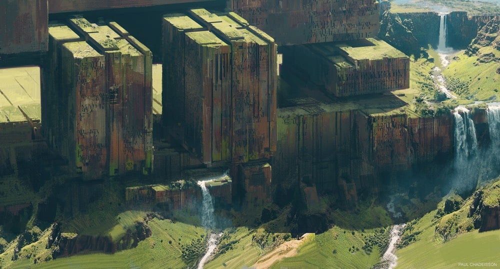
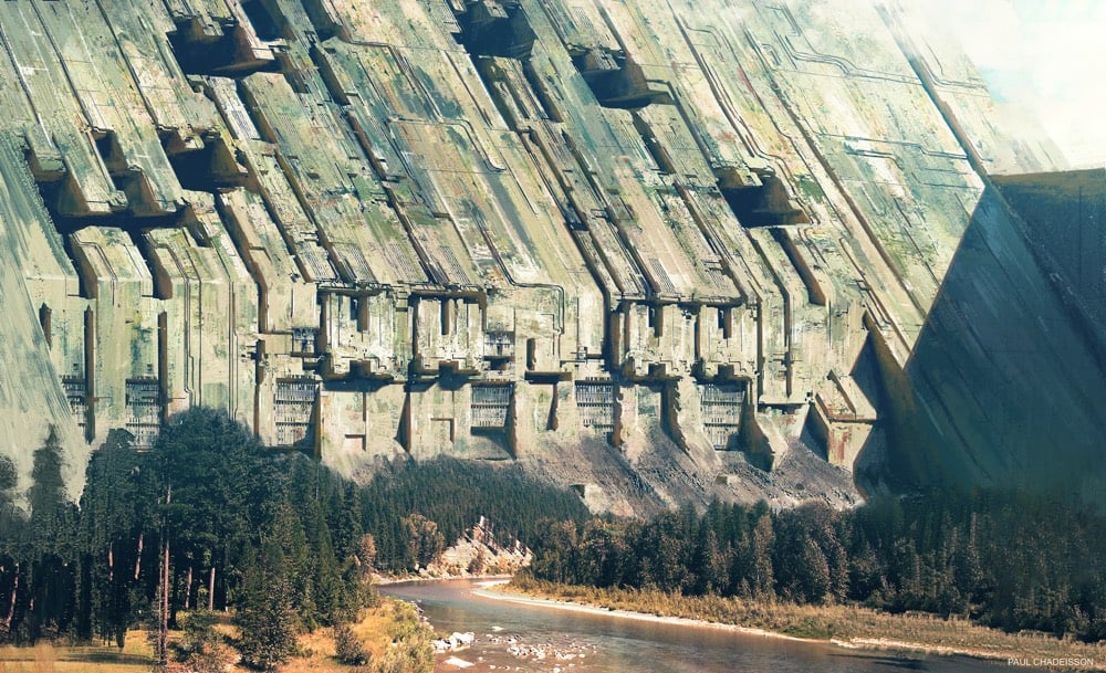
You can see more of Chadeisson’s work on Behance and Instagram.
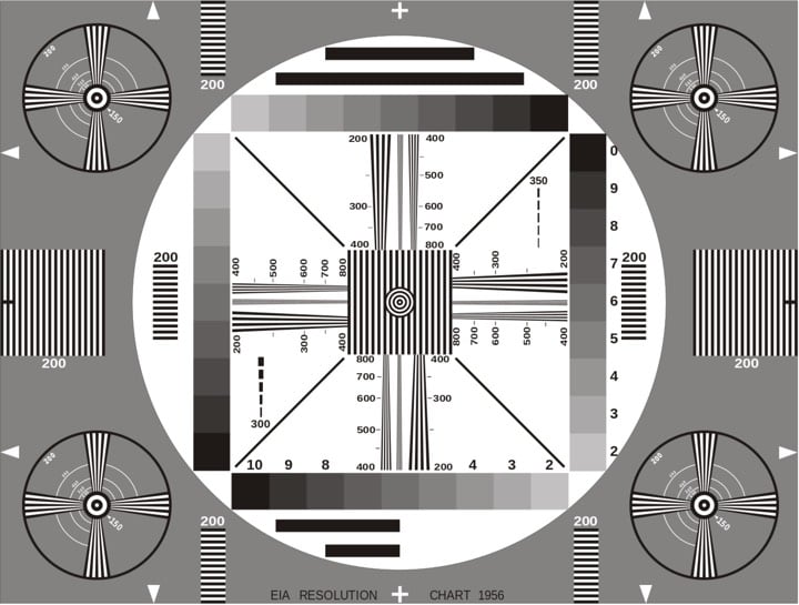
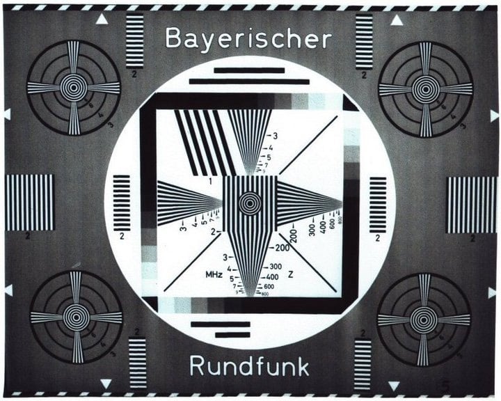
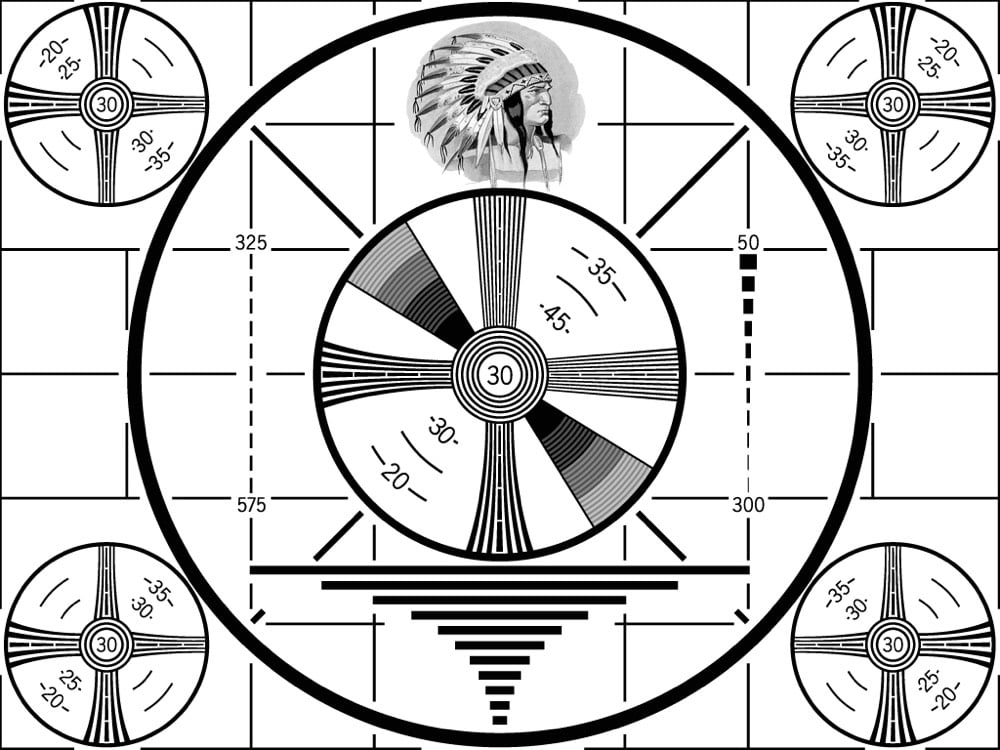
It’s hard to believe now, but television didn’t used to be a 24/7/365 affair. TV stations stopped broadcasting late at night and when they were off the air, they would commonly display a test pattern until programming resumed in the morning.
Used since the earliest TV broadcasts, test cards were originally physical cards at which a television camera was pointed, and such cards are still often used for calibration, alignment, and matching of cameras and camcorders.
From Wikimedia Commons and Present & Correct, here are some vintage test patterns:
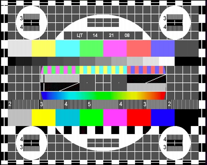
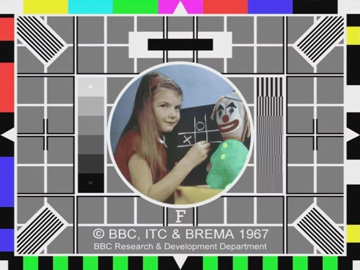
As you might expect, the BBC test card with the girl and clown has both a backstory and a cult following.
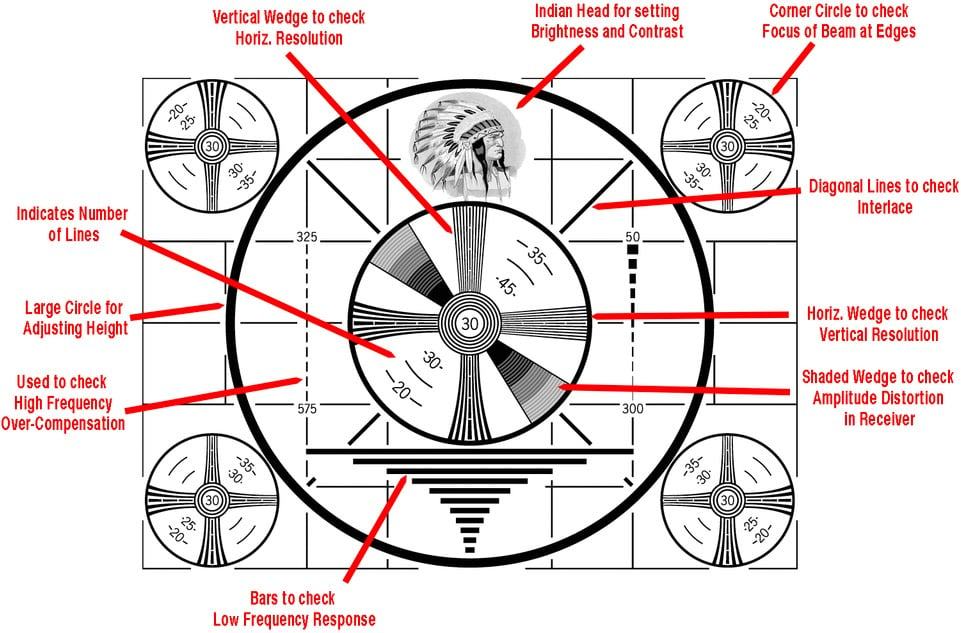
One of the most-used test images was RCA’s “Indian-head” test pattern:
As this annotated version shows, each of the card’s elements had a specific testing purpose:
If you’re feeling extra nostalgic, here’s 36 minutes of vintage test patterns from all around the world:
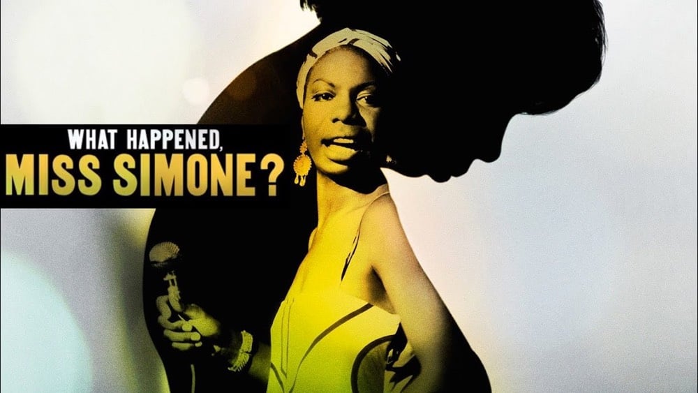
Vocal is a type foundry that makes typefaces that highlight the history of underrepresented people “from the Women’s Suffrage Movement in Argentina to the Civil Rights Movement in America”. For example, the Martin typeface is based on signs carried by marchers in the streets of Memphis after the assassination of Martin Luther King Jr.
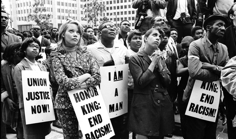
Netflix used Martin for What Happened Miss Simone?, Liz Garbus’ Nina Simone documentary:
(via @c_wolbrecht)
Oh just some flowers & plants casually strolling into my life every spring to brighten up my life after a long winter:
Watching that video almost makes me sneeze though too. From Universal Everything’s Superconsumers project…many more videos of walking things here and at Vimeo and Instagram.
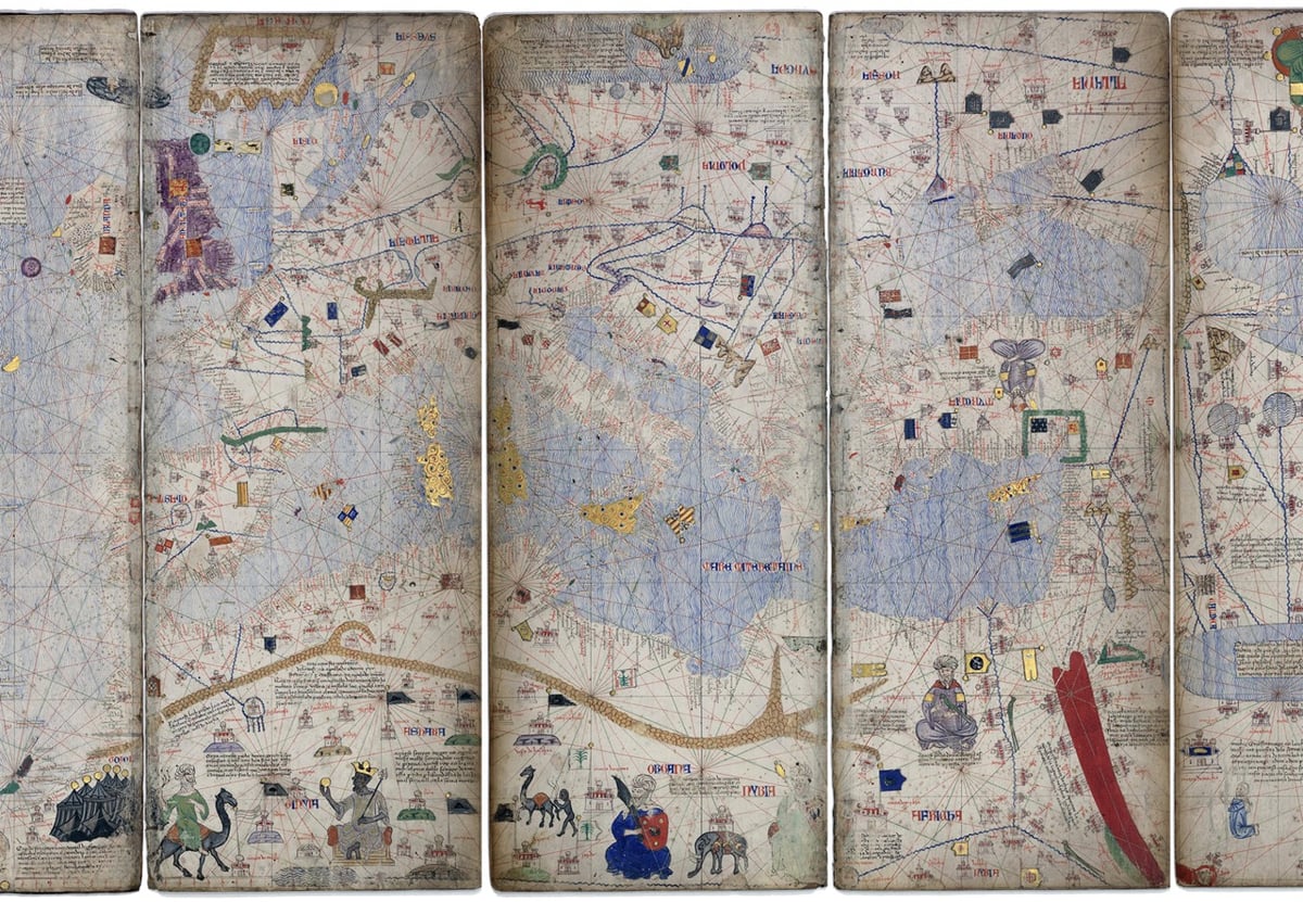
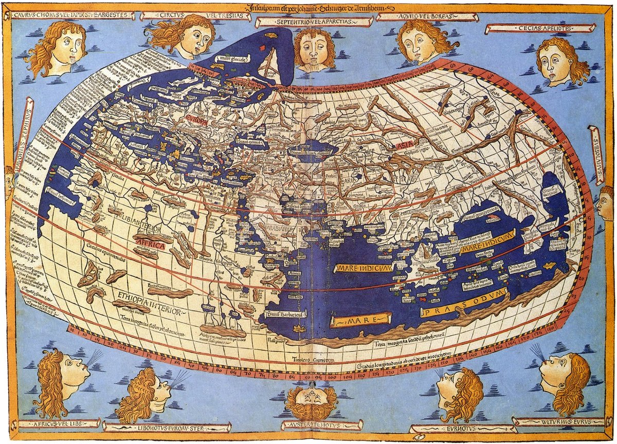
First You Make the Maps is a survey of mapping technology by Elizabeth Della Zazzera showing how, starting at the end of the Middle Ages, better maps facilitated the European discovery of the Americas, the explosion of global trade, the enslavement of Africans, and the colonization by Europeans of much of the world.
While geographically accurate maps had existed before, the Age of Exploration saw the emergence of a sustained tradition of topographic surveying. Maps were being made specifically to guide travelers. Technology progressed quickly through the centuries, helping explorers and traders find their way to new imperial outposts — at least sometimes. On other occasions, hiccups in cartographic reasoning led their users even farther astray.
(via @ktguru)
Design firm Pentagram has brought in a new partner to their New York office, information designer Giorgia Lupi, who joins heavy hitters like Michael Bierut, Paula Scher, and Eddie Opera. I remain fascinated with how Pentagram operates:
Established in 1972, the firm has a collectivist attitude and adheres to a longstanding constitution, which exists in its original form with only small modifications. It spreads profits and decision-making power equally among its self-governed partners — all designers — irrespective of seniority or how much business they brought in during a given year. There’s no CEO. The partners do collaborate with one another, often across disciplines, but essentially operate their own studios, though the local offices meet on a weekly basis and the entire group convenes twice a year. These all-partner meetings, chaired by one of the partners on a rotating basis, are about sharing work with the group and discussing business dynamics, Pentagram’s publishing program, its website, and trends in the industry.
The process for bringing in a new partner can take years from start to finish and requires the unanimous consent of the rest of the partners:
“One vote against and it’s over, truly,” says Miller. “We’ve seen it happen.”
I’ve often thought about if a collective structure could work for independent content sites. I wouldn’t want to sell kottke.org to anyone, but the idea of sharing resources and infrastructure with a couple dozen similar sites is appealing. You could collect the sites into a membership bundle; hire dedicated staff for customer support, ad sales, & devops; do cross-promotion, syndicate the content via a meta-site, and generally help small indie sites punch above their weight. This is what The Deck could have evolved into, I suppose. Aw well.
Newer posts
Older posts
Socials & More