kottke.org posts about design
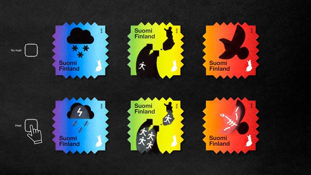
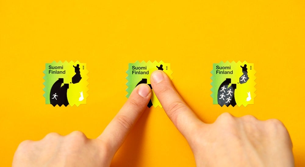
The Finnish Post Office tapped design firm Berry Creative to create this series of heat-reactive postage stamps that reveal messages about the effects of climate change when you activate them with heat (like a finger pressing on them). Each stamp tells a little two-act story about a different aspect of climate change: global temperature increase, climate refugees migrating, and endangered wildlife. Very clever design and I love the aesthetics too. (via moss & fog)
To celebrate the release of their latest limited edition memo books, Field Notes made a short documentary about The United States of Letterpress, featuring several letterpress practitioners from around the country.
I ran a pedal-powered letterpress machine for a few minutes several years ago and that huge machine whizzing away right in front of me was both magical (it stamps the ink right into the paper and it’s in your hands 2 seconds later) and terrifying (the massive flywheel could have ripped my arm clean off without slowing down). Danger and enchantment, what else do you need really?
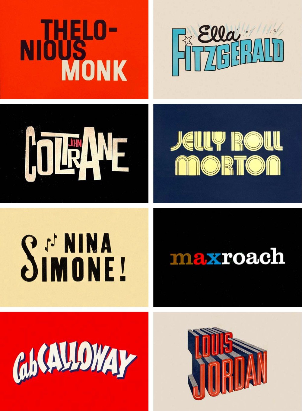
Reagan Ray (previously) surveyed 100s of iconic covers of jazz albums (Blue Note, anyone?) and isolated the lettering of the artists’ names. I love these sorts of compilations — this is like a mini-tour through the history of graphic design in the 20th century.
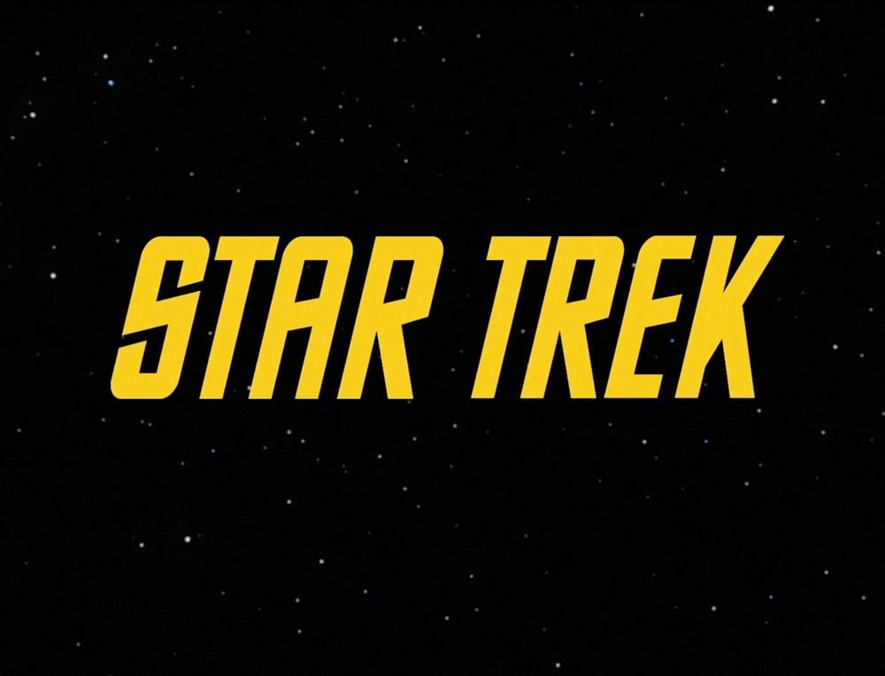
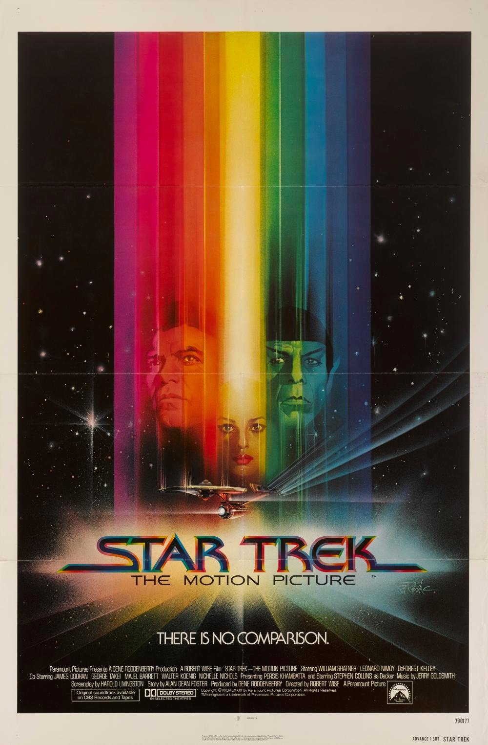
In an extended excerpt from his book Typeset in the Future: Typography and Design in Science Fiction Movies (Amazon), Dave Addey goes long on the typography and design of Star Trek: The Motion Picture (and Trek in general).
Alas, The Original Series’s inconsistent typography did not survive the stylistic leap into the 1970s. To make up for it, The Motion Picture’s title card introduces a new font, with some of the curviest Es known to sci-fi. It also follows an emerging seventies trend: Movie names beginning with STAR must have long trailing lines on the opening S.


Study of the Creative Specimens is a collection of fantastical hybrid creatures created for Adobe’s 99U conference by Mark Brooks and illustration studio alademosca. Prints are available from Paper Chase Press. (via colossal)
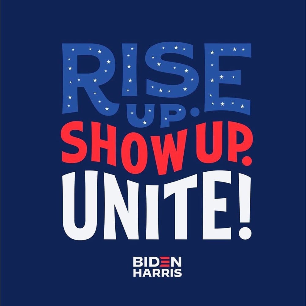
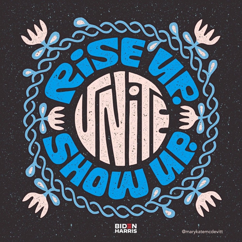
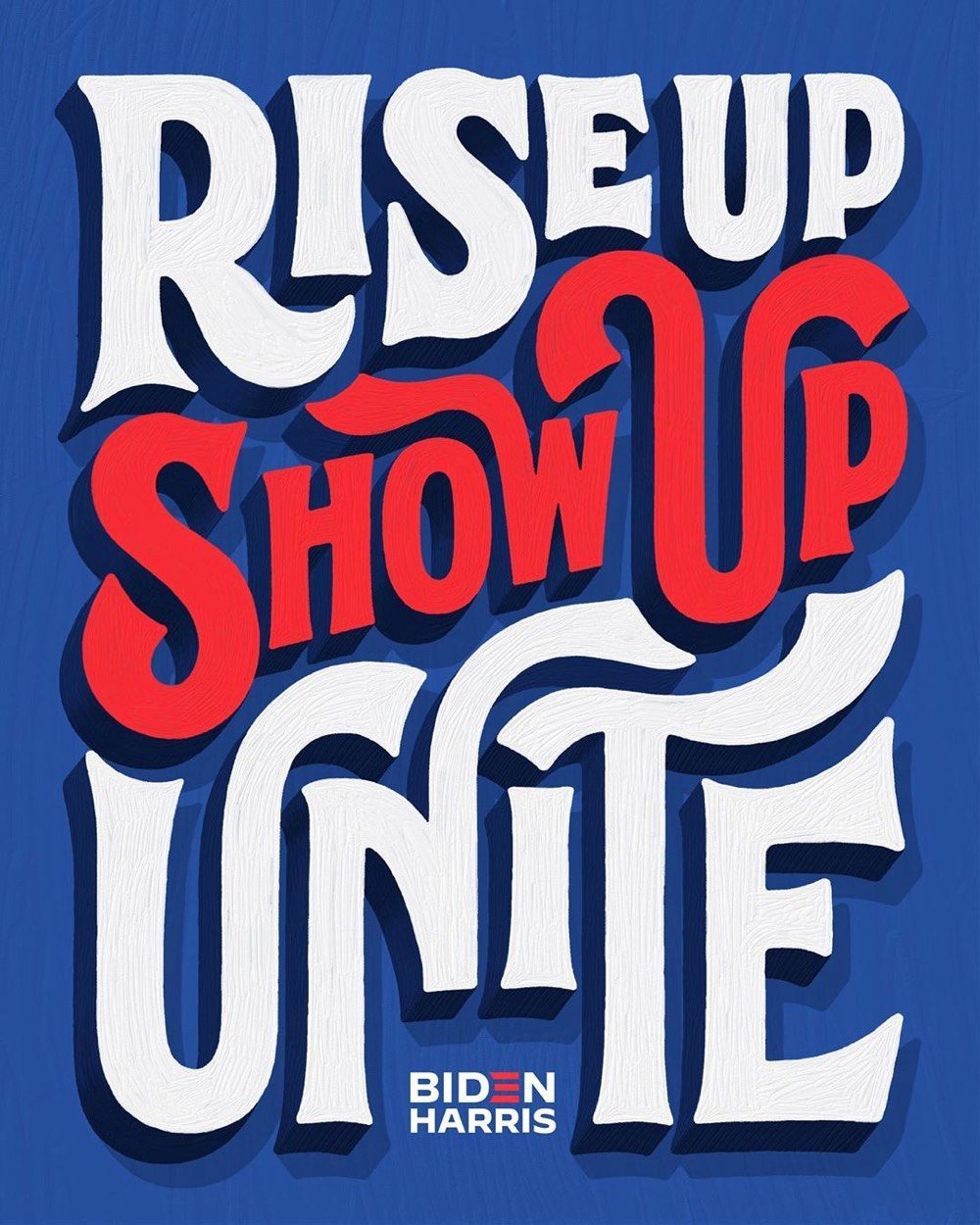
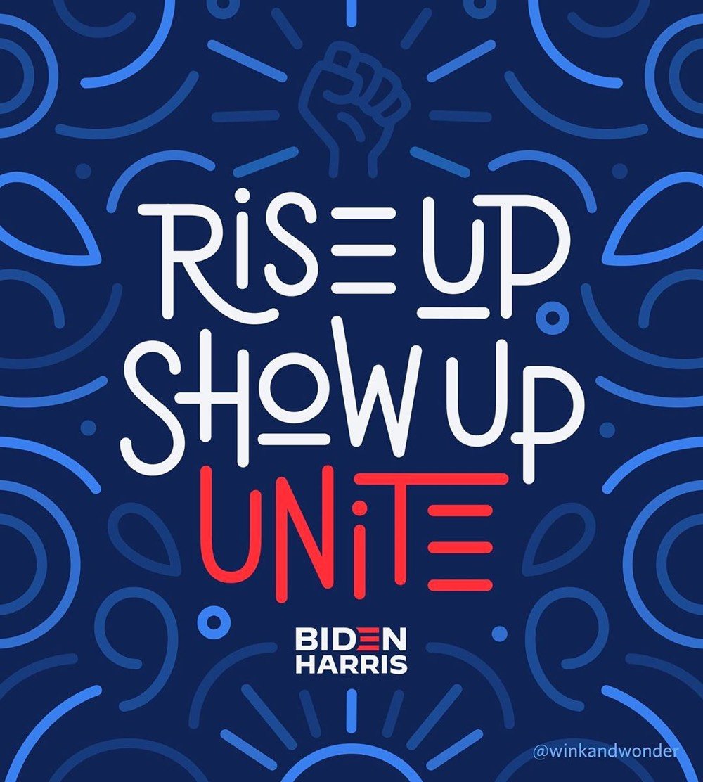
A group of creatives led by Jessica Hische are creating unofficial posters for the Biden/Harris campaign in order to increase visibility of the campaign.
Last week, I [Jessica Hische] had a good conversation with the Biden creative team. I shared that one of my concerns for the upcoming election was the lack of visible support for the campaign. There are a lot of folx within the creative world and beyond posting on social media about voting (a wonderful and necessary message), but few of those posts mention the candidates by name. It’s somewhat implied that if you’re promoting voting or voting rights that you’re likely voting Biden and encouraging a Biden vote, but it’s not explicit. There’s a “I guess I’ll vote for him if I have to” vibe throughout leftist social media, but exasperated resignation doesn’t get people to the polls.
From top to bottom, art by Jessica Hische, Mary Kate McDevitt, Lauren Hom, and Joanna Muñoz. You can participate by downloading a template that includes the Biden/Harris logo — you can find the link at the bottom of the article.
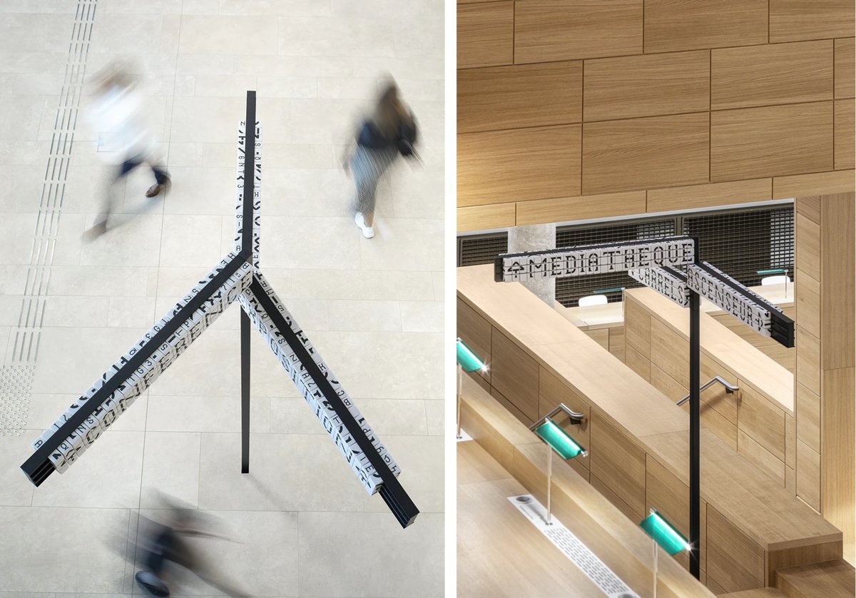
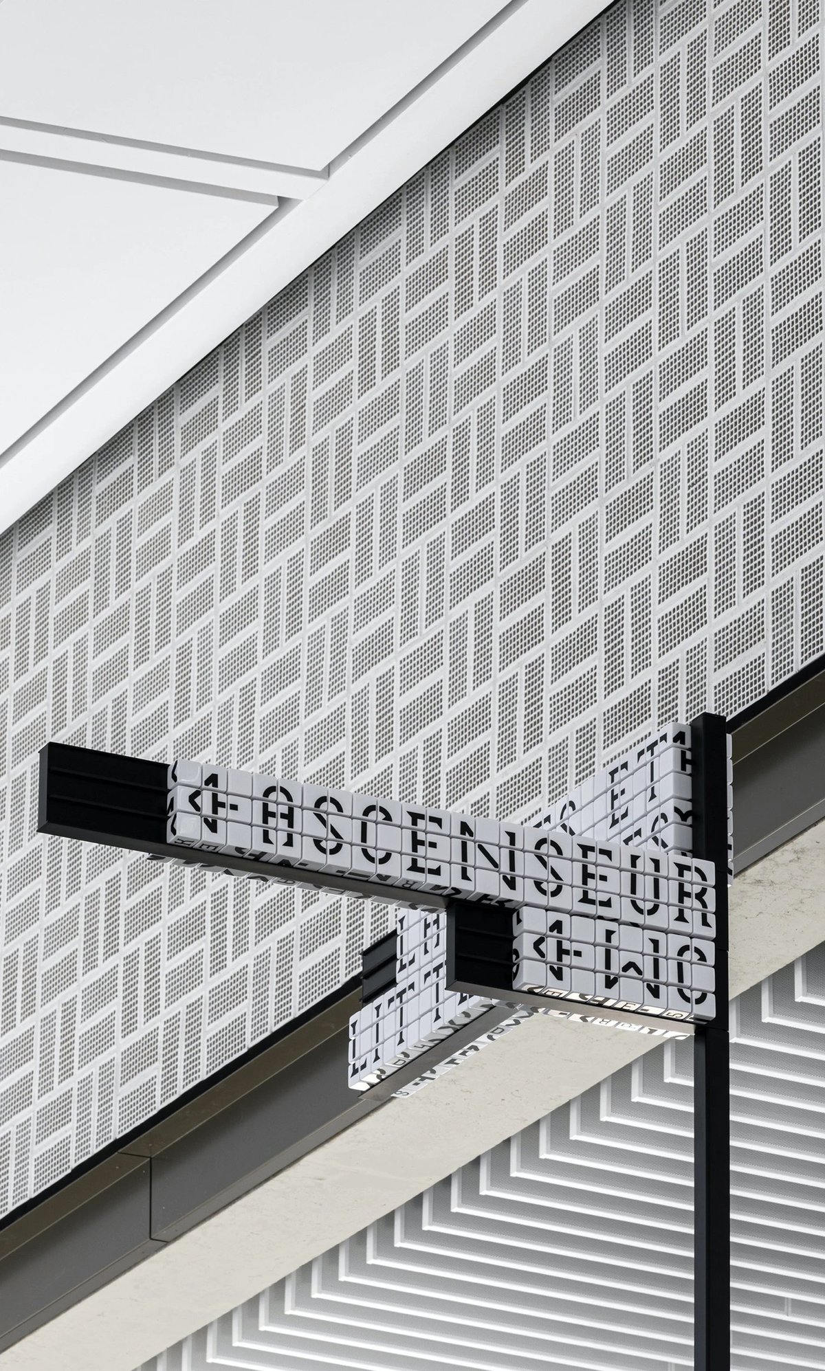
Sascha Lobe’s team at Pentagram has designed a functional and stylish modular signage system for the National Library of Luxembourg. The signs use cubes (inspired by LED clock displays?) that can be reconfigured into different words by library staff.
Numerical and alphabetical cubes are the foundation of the BnL’s modular signage system. In handling massive volumes of information and growing library collections, it is essential to free the library staff from rigid systems and equip them with the ability to easily make signage changes.
The flexible signage plan, consisting of 25,000 resin cubes, 6000 tableaus and 2,400 numerical shelving characters, enables staff to independently customize information as the library’s collection fluctuates. The resin cubes, constructed from a durable material, also translate the timelessness of the library and its long-standing presence throughout the years and into the future.
The only (but perhaps significant) downside to the signs is that they are not actually super legible when compared to a non-modular alternative. They sure do look great though.
Update: This post got shared on Twitter by a couple of librarian pals and Librarian Twitter was not impressed by this signage at all. Not legible, not accessible, and difficult/fiddly to maintain were the main complaints. As someone who believes that design is primarily about how something works and not how something looks, I’m a bit embarrassed that I didn’t hit that point harder in this post. I do love the aesthetics of the project, but from the photos, the legibility looks terrible. Maybe it’s different while navigating the space in person, but if not, you have to wonder how helpful hard-to-read signs are to patrons.
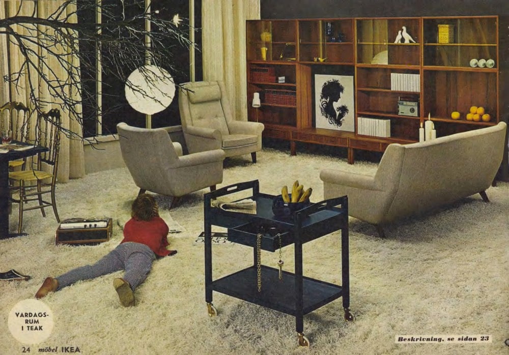
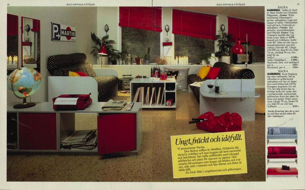
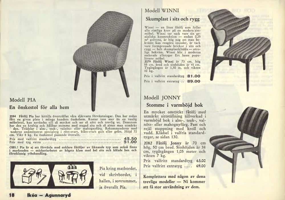
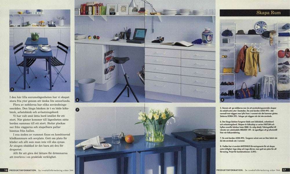
Ikea has uploaded scans of all 72 years of their annual catalogs, from 1950 to 2021, to their online museum. (The company’s optimism that there will be a 2021 is heartening.) An entertaining time machine of Scandinavian design trends.
On Tuesday, Joe Biden announced that Senator Kamala Harris would be his vice-presidential running mate. The campaign was quickly updated to include a new Biden-Harris logo designed by Hoefler&Co. in collaboration with Biden campaign advisor Robyn Kanner:
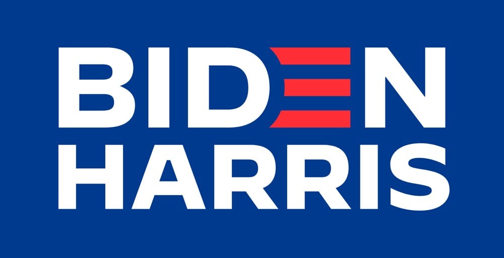
But the designer of the logo wasn’t told who the running mate would be beforehand, so how did the campaign get it out so quickly? According to Jonathan Hoefler, the design team designed a whole collection of logos for potential candidates gleaned from reading the media tea leaves.
A consequential decision at an unpredictable time, conducted under absolute secrecy, poses an interesting dilemma to the typographer: how do you create a logo without knowing for certain what the words will say? Logos, after all, are meaningfully informed by the shapes of their letters, and a logo designed for an eisenhower will hardly work for a taft. The solution, naturally, involves the absurd application of brute force: you just design all the logos you can think of, based on whatever public information you can gather. Every credible suggestion spotted in an op-ed was added to the list that we designers maintained, and not once did the campaign even hint at a preference for one name over another.
I would love to see some of those alternate designs (Biden-Warren!), but there’s no way in hell they’ll ever see the light of day, especially before the election.
Update: Several designers weigh in on the new logo. I love Debbie Millman’s take:
I never, ever thought I’d say this after a lifetime in professional branding, but on the spectrum of good branding versus effective branding, I’d say at this point it is irrelevant. Frankly, the Biden-Harris logo could have been scribbled on a napkin and I’d be happy. Trump’s brand is beyond repair and is now more dangerous than ever. The soul of our country is at stake.
That logos don’t matter that much (unless they are either great or horrible) is probably true more often than designers and branding folks would care to admit.
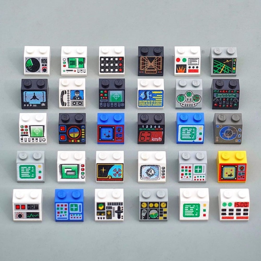
I thought George Cave’s The UX of LEGO Interface Panels was going to be a fun distraction, but it’s actually a great layperson’s explanation, using familiar Lego pieces, of how interfaces work in the real world and the design considerations that go into building them.
Shape coding is one approach to differentiation, but there are many others. Colour coding is perhaps the only one to break into our everyday vocabulary, but we can add four more: size, texture, position and operation coding. Together these six are our allies in the design of error-proof interfaces.
Size, shape and colour-coding are the fundamentals: quick-wins that can fix a lot of interface problems. Texture is also a great differentiator for blind operation, particularly on small dials requiring precise control.
(via sidebar)
Malofiej have announced their 28th International Infographics Awards for 2020, which they refer to as “the Pulitzers for infographics”. You can check out some of the top infographics here, culled from newspapers, magazines, and online media from around the world. The full list is available here, complete with links to the online winners.
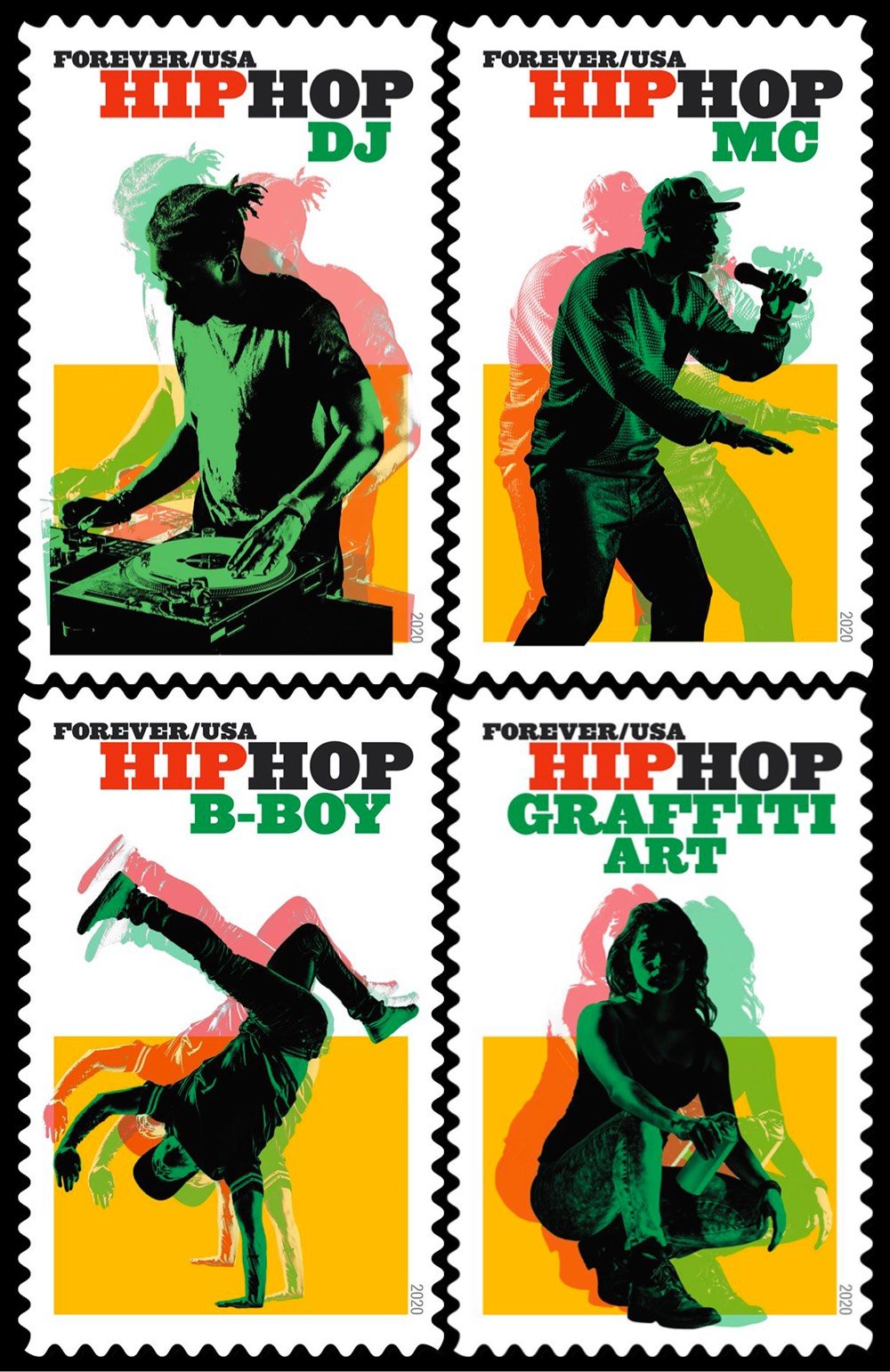
On July 1, the USPS is introducing a set of four stamps celebrating hip hop. The stamps were designed by Antonio Alcalá based on photographs by Cade Martin. In an interview with Steven Heller, Alcalá explained how he thought about the design process:
Hip Hop has a long and rich history, and from the start, I knew I wouldn’t be able to represent its totality in one set of stamps. But because it is such an important part of our nation’s art, and one of our most significant cultural contributions to the world, I knew we needed to at least begin representing it somehow. Hip Hop has four widely recognized key elements, or “pillars”: Rap, DJs, Graffiti, and B-boying (known more broadly as break-dancing). Using contemporary images that quickly and accurately depict the genres eased the burden of having to represent the many histories within the subject.
You can preorder the hip hop stamps on the USPS website.
In this video from Vox, Estelle Caswell talks to Bethany Heck and Steven Heller about the seemingly ubiquitous typeface Cooper Black.
There’s a typeface that has made a resurgence in the last couple of years. It’s appeared on hip hop album covers, food packaging, and advertising. Perhaps you know it from the Garfield comics, Tootsie Roll logo, or the Pet Sounds album cover by the Beach Boys. It’s called Cooper Black, and its popularity and ubiquity has never waned in the hundred years since it was first designed.
Cooper Black tends to get a bad rap from type aficionados (too popular, too cartoony) but this video — and Heck’s comments in particular — have given me a new appreciation for it.
This morning, Carly Rae Jepsen released a new album called Dedicated Side B (stream here). Amidst rumors of fresh music, the pop star had been teasing fans with its release all week, including this video of a simulated chat posted to Twitter and Instagram yesterday.
Long-time readers will recognize that the chat text is displayed with typeface called Silkscreen, which I designed back in 1999, an era of small monitors and even smaller fonts.
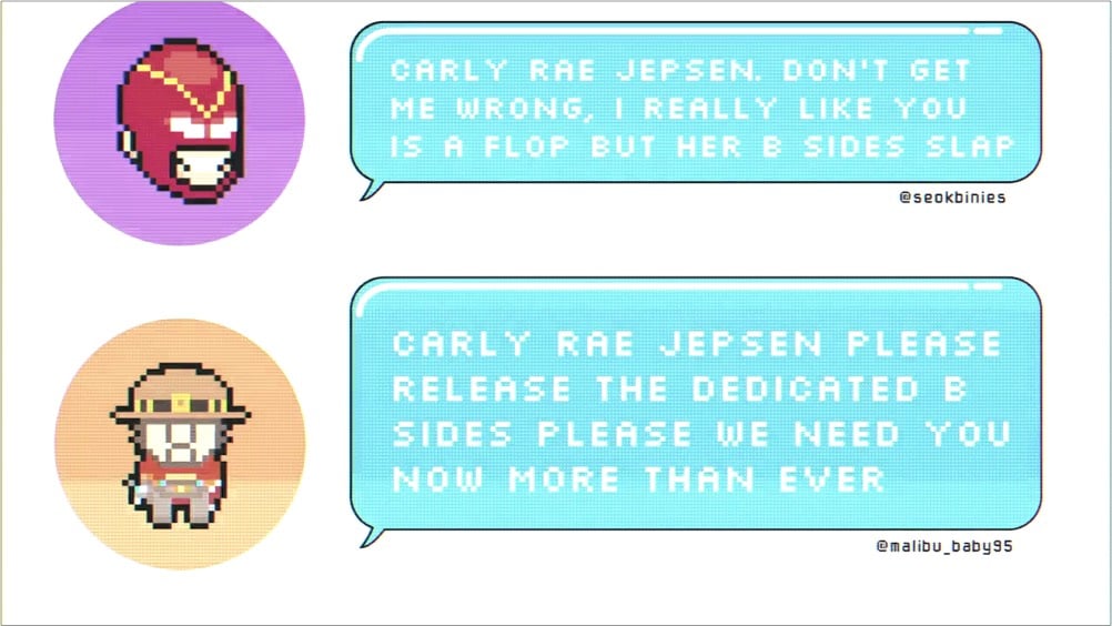
Back in the day, Britney Spears used Silkscreen on her website, and now it’s come (sorta) full circle with Jepsen. Silkscreen pops up here and there every few months, and I’m glad to see people are still getting some use out of it. It was retro when I made it and now its retro-ness is retro. Culture is fun! (thx to @desdakon for spotting this)
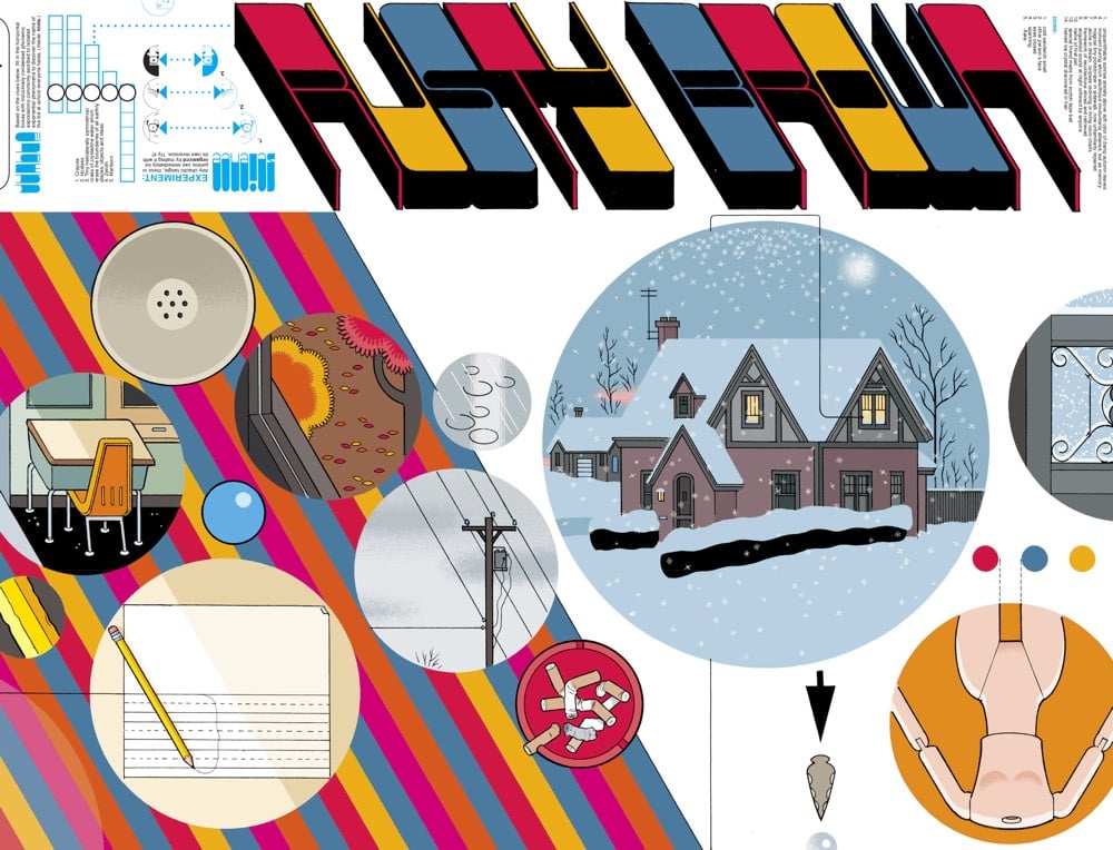
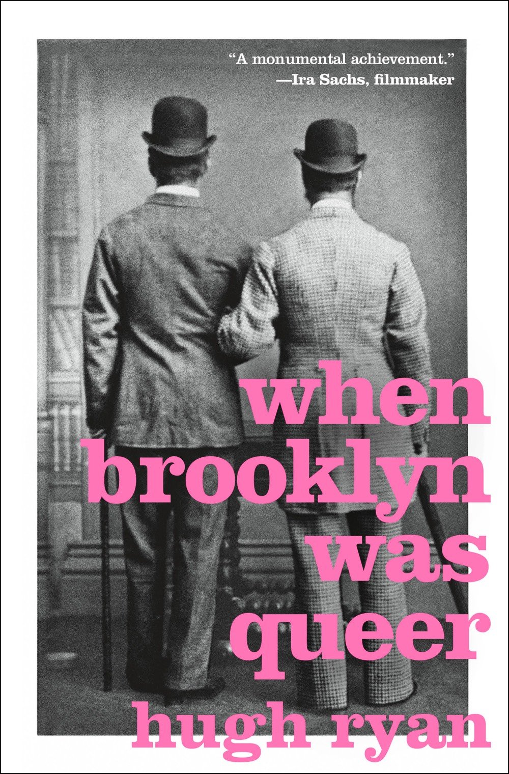
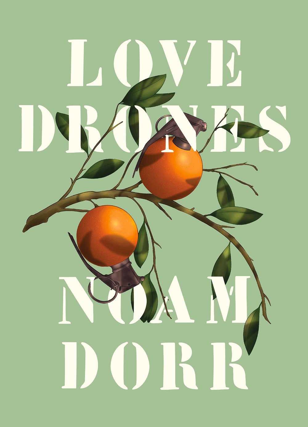
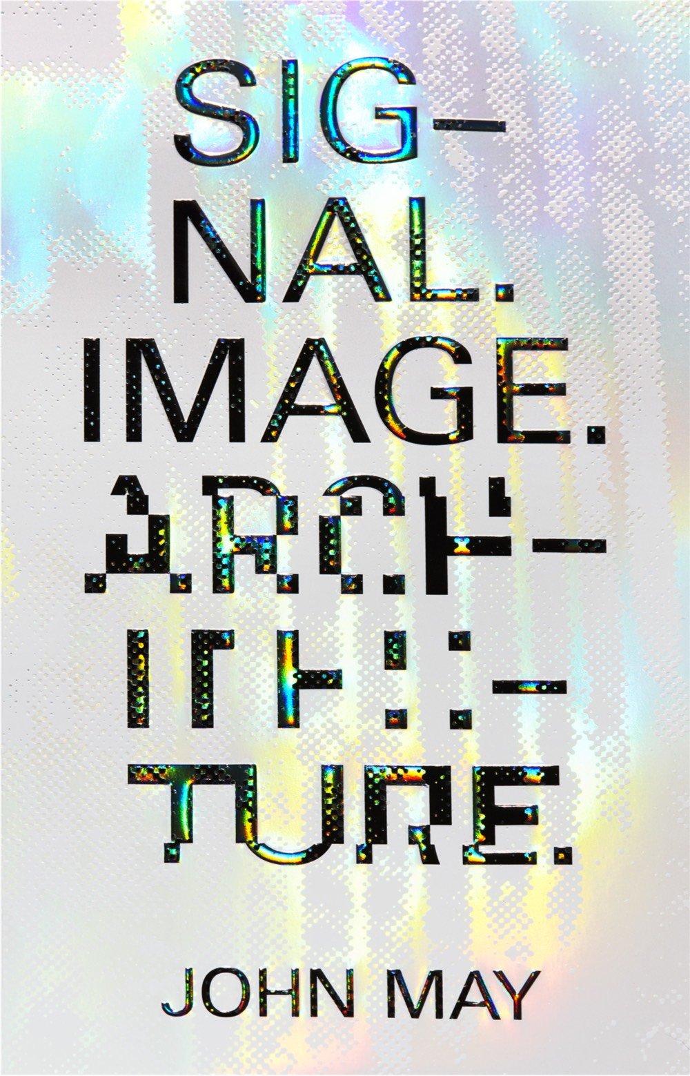
The AIGA has announced the winners of its annual 50 Books / 50 Covers competition for books published in 2019. The competition recognizes excellence in both book design and book cover design — some of the winners placed in both categories. You’ll notice there are not a lot of books here that you’d find on the front table of the bookstore — the winners tend to be from smaller publishers and/or academic in nature and/or about art or design. For lists containing more mainstream books, check out the lists from the NY Times, Buzzfeed, and Lithub.
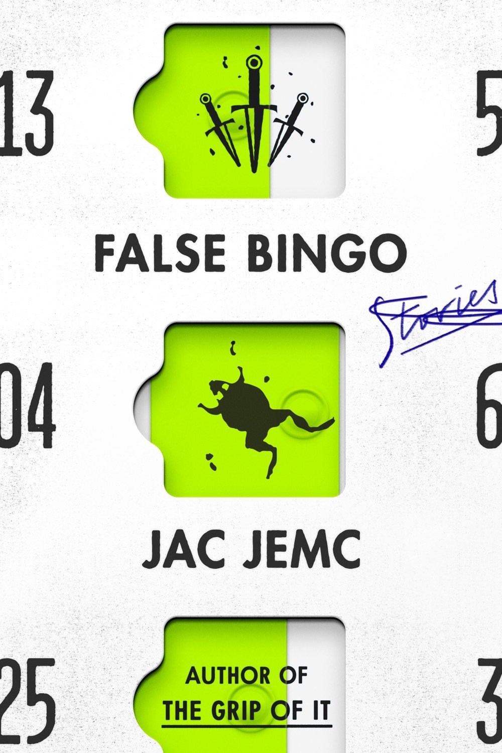
The books pictured above (from top to bottom) are Rusty Brown by Chris Ware, When Brooklyn Was Queer by Hugh Ryan, Love Drones by Noam Dorr, Signal. Image. Architecture. by John May, and False Bingo by Jac Jemc.
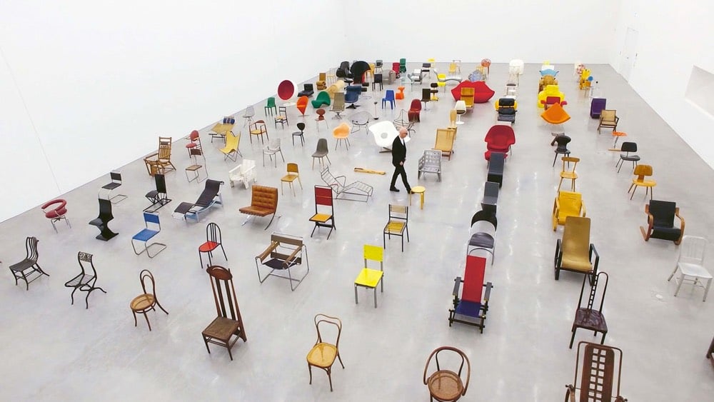
For a limited time, you can view the feature length documentary Chair Times: A History of Seating online for free courtesy of Vitra, a Swiss design company. Here’s a trailer:
In the focus are 125 objects from the Collection of the Vitra Design Museum. Arranged according to their year of production, they illustrate development from 1807 to the very latest designs straight off the 3D printer, forming a timeline to modern seating design.
Accompanying the film is a book of the same name. (via moss & fog)
Aided by Toshi Omagari, who wrote Arcade Game Typography, Vox’s Estelle Caswell explores the origins and history of 8-bit arcade fonts. From the description of the book:
Video game designers of the ’70s, ’80s, and ’90s faced color and resolution limitations that stimulated incredible creativity. With each letter having to exist in a small pixel grid, artists began to use clever techniques to create elegant character sets within a tiny canvas.
As the creator of a tiny pixelated typeface, I find this stuff infinitely fascinating.
Soon after the CDC started to mobilize to address Covid-19, medical illustrators Alissa Eckert & Dan Higgins were asked to create this illustration of a coronavirus that could be used as the “face” of the epidemic.

The novel coronavirus, like all viruses, is covered with proteins that give it its character and traits. There are the spike proteins, or S-proteins — the red clusters in the image — which allow the virus to attach to human cells. Envelope or E-proteins, represented by yellow crumbs, help it get into those cells. And membrane proteins, or M-proteins, shown in orange, give the virus its form.
In a video released last February, Eckert explained a little about what she does at CDC.
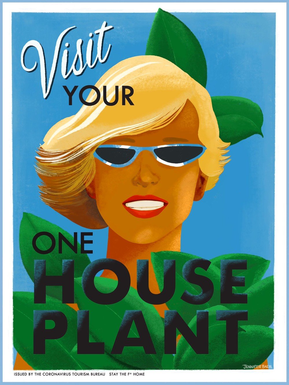
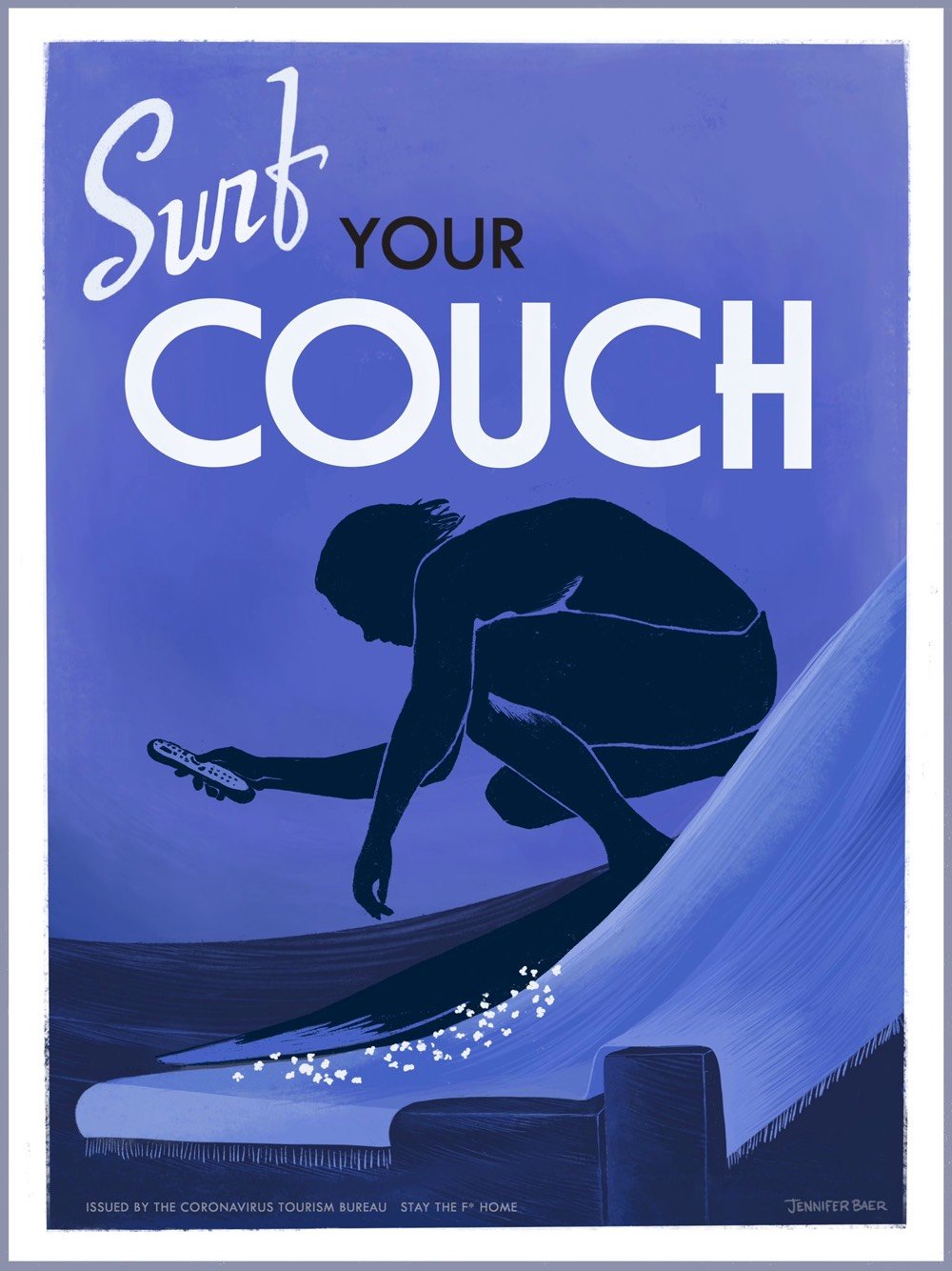
Jennifer Baer of the “Coronavirus Tourism Bureau” made some travel posters designed to get you interested in staying inside and exploring your own home during the pandemic. Posters are available for purchase.
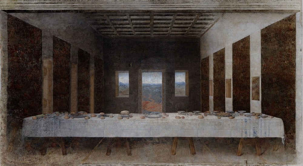
While it predates the COVID-19 pandemic and its accompanying social distancing by several years, José Manuel Ballester’s Concealed Spaces project reimagines iconic works of art without the people in them (like what’s happening to our public spaces right now). No one showed up for Leonardo’s Last Supper:
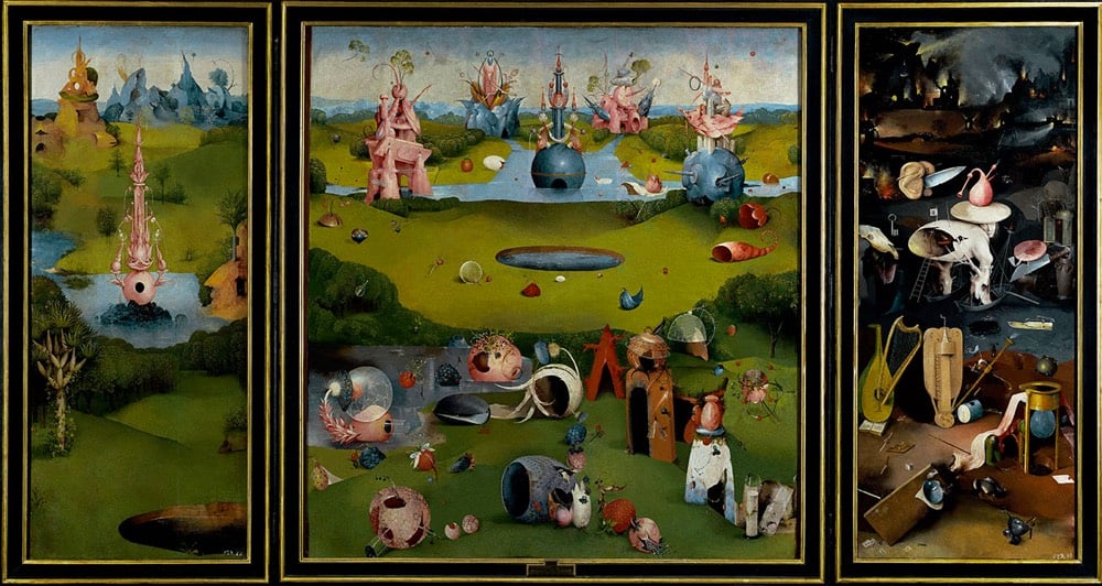
Hieronymus Bosch’s The Garden of Earthly Delights is perhaps just as delightful without people:
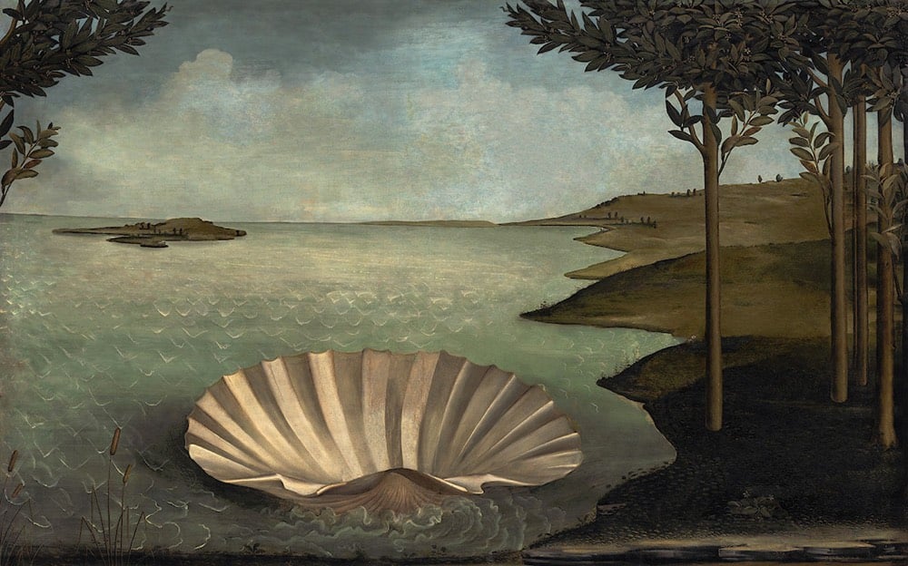
And Botticelli’s The Birth of Venus has been rescheduled:
Ben Greenman, Andy Baio, and Paco Conde & Roberto Fernandez have some suggestions for new album covers:
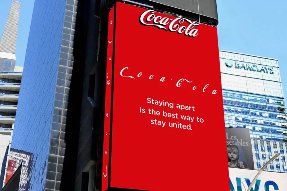
Designer Jure Tovrljan redesigned some company logos for these coronavirus times.
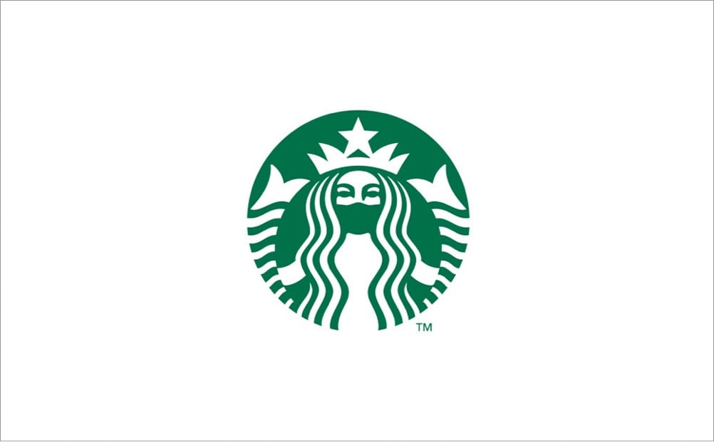
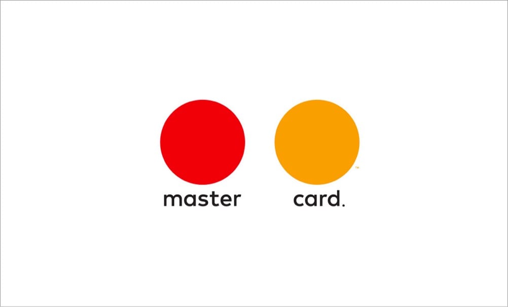

Coca-Cola even modified their own logo on a Times Square billboard to put some distance between the letters.
(via colossal & fast company)
Update: Some emoji designed specifically for COVID-19. The Earth with the pause button is my favorite. (via sidebar)
Thinking that some people might need high quality entertainment while shut inside due to the COVID-19 pandemic, filmmaker Gary Hustwit is streaming his films online for free, one film per week. First up (from Mar 17-24) is Helvetica, his documentary on typography and graphic design. Here’s the trailer:
Click through to watch the whole film. (via daring fireball)
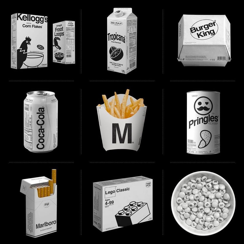
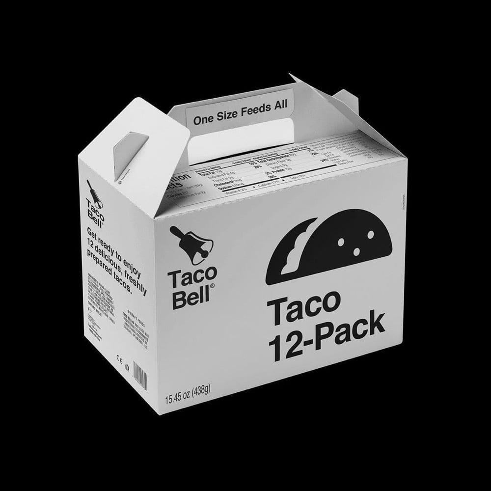
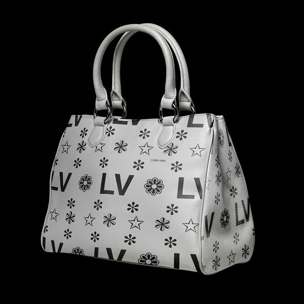
Designer Kunel Gaur, head of a creative agency called Animal, has redesigned the packaging for several familiar brands using minimal black & white graphics and unadorned typography. The designs don’t seem to be collected in one place, so you’ll have to poke around his Instagram to find them.
That LV bag actually looks like something Virgil Abloh would design — it would sell like hotcakes. Dye it millennial pink and you’ve got a freaking worldwide sensation. Fashion design is so easy!! (via moss & fog)
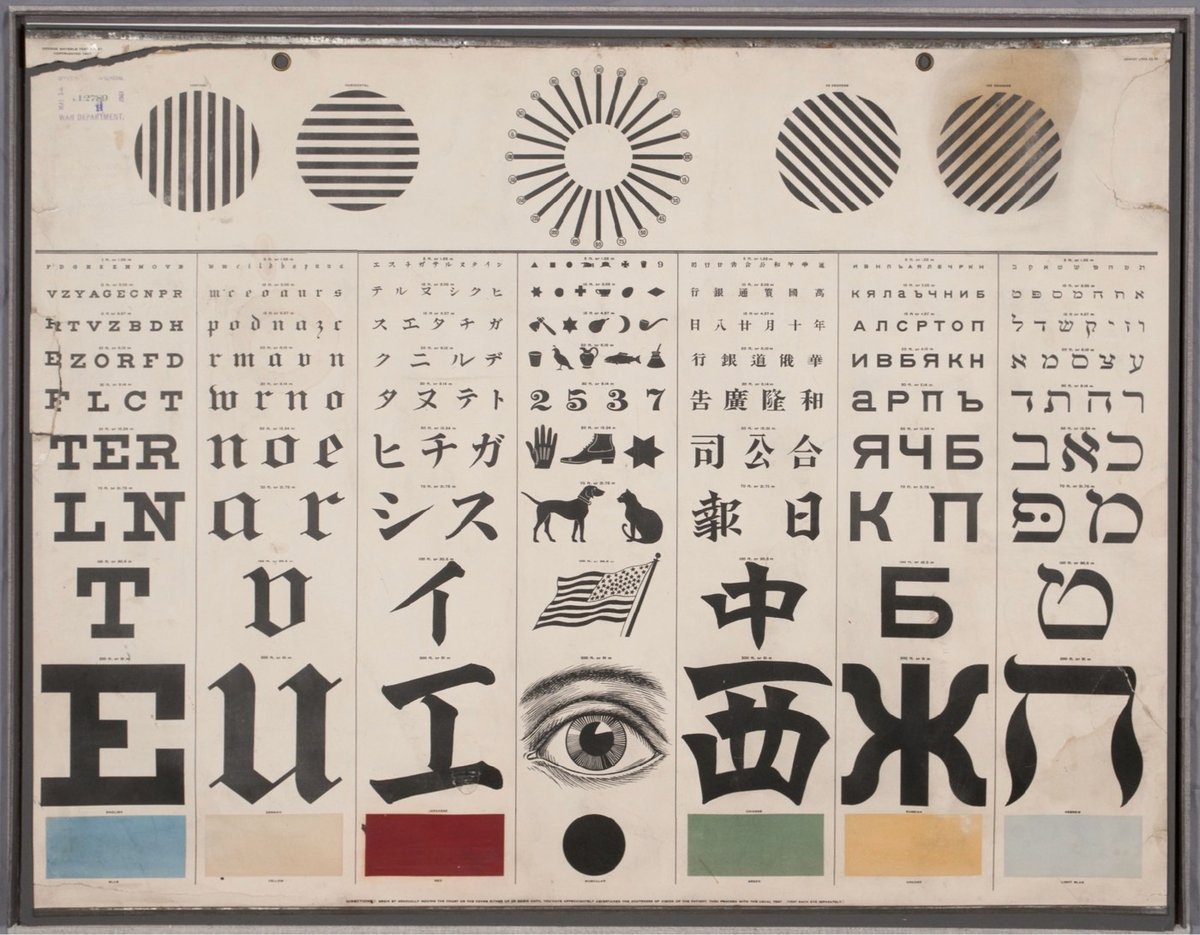
From the collection of the US National Library of Medicine, an eye test chart designed by George Mayerle around 1907 to be a complete vision testing solution for speakers of several languages.
Running through the middle of the chart, the seven vertical panels test for acuity of vision with characters in the Roman alphabet (for English, German, and other European readers) and also in Japanese, Chinese, Russian, and Hebrew. A panel in the center replaces the alphabetic characters with symbols for children and adults who were illiterate or who could not read any of the other writing systems offered. Directly above the center panel is a version of the radiant dial that tests for astigmatism. On either side of that are lines that test the muscular strength of the eyes. Finally, across the bottom, boxes test for color vision, a feature intended especially (according to one advertisement) for those working on railroads and steamboats.
Mayerle was a German optometrist working in San Francisco when he made the chart, designing it for use in a city with a diverse population. My pals at 20x200 are offering limited-edition prints of Mayerle’s chart in a variety of sizes.
See also the history & typography of eye test charts, Optician Sans (a font based on eye chart typography), and Eye Charts for Drones.
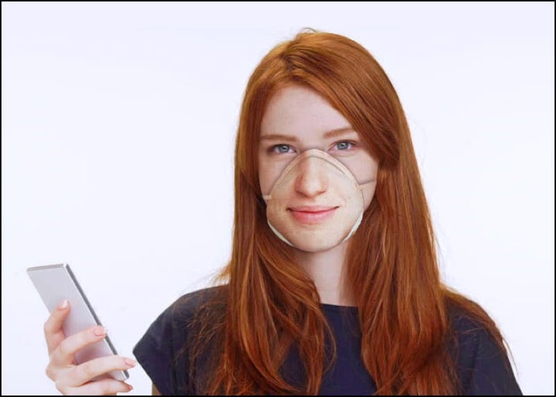
This site is making N95 respirator masks that work with facial recognition software, so that, for example, you can unlock your phone while still wearing a mask.
After uploading your face, we use computational mapping to convert your facial features into an image printed onto the surface of N95 surgical masks without distortion.
Our printer uses inks made of natural dyes. It’s non-toxic and doesn’t affect breathability.
You can use your mask for everyday life as a barrier for airborne particle droplets.
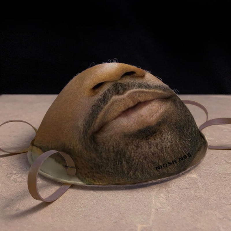
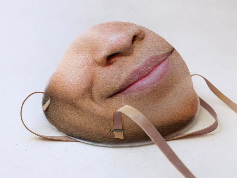
It is unclear whether these will actually ship or not — “Q: Is this a joke? A: Yes. No. We’re not sure.” — but they’re definitely not planning to make them while there are mask shortages related to COVID-19. And it appears the masks will work with iPhones…you just add a new face (while wearing the mask) to your phone’s face database.
Over a period of three months, Seung Lee knit a blanket showing a visualization of his infant son’s sleep patterns from birth to his first birthday.
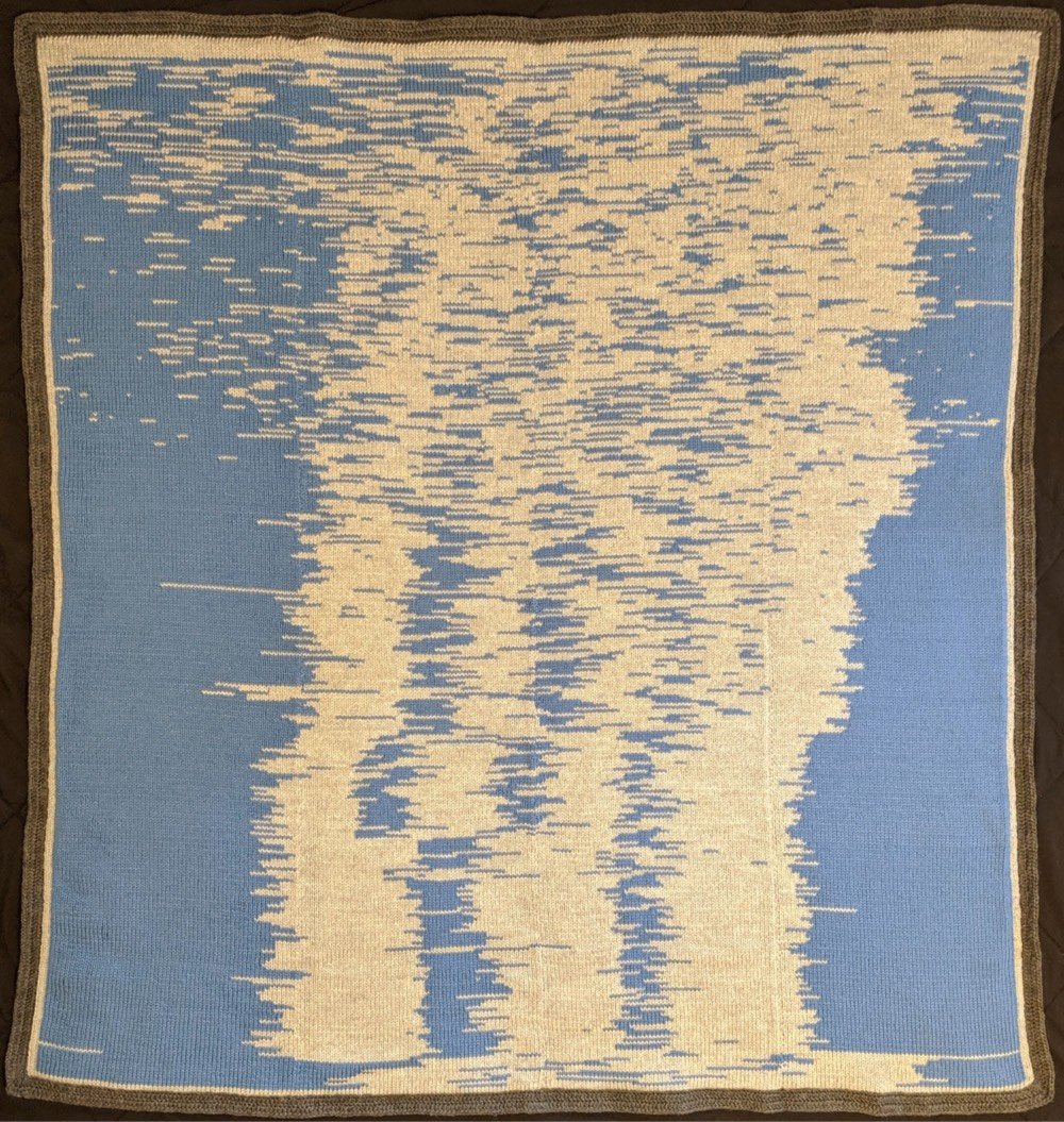
The sleep data was collected with the BabyConnect app which lets you export to CSV. The CSVs were filtered and converted into JSON (using Google Apps Script and Python) which could then be used for visualization and tracking.
Brilliant. This deservedly made Flowing Data’s list of the Best Data Visualization Projects of 2019. See also Global Warming Blankets and this train delay scarf.
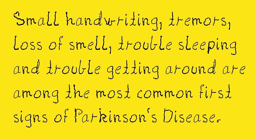
Shake is a typeface made from the real handwriting of a person living with Parkinson’s disease. Creative director Morten Halvorsen:
My mother was diagnosed with Parkinson’s eight years ago. And her handwriting has changed in the years since. I created this font to preserve her handwriting, and enable her to continue to write with her own letters.
A new version of the font will be available each year to capture his mother’s worsening condition. Donate a few dollars (or more!) to download the font — all proceeds go to finding a cure. You can also download a template so that you can document the handwriting of a loved one living with Parkinson’s — for a fee (donated to Parkinson’s research), Halvorsen will turn it into a font for you. (thx, kevin)
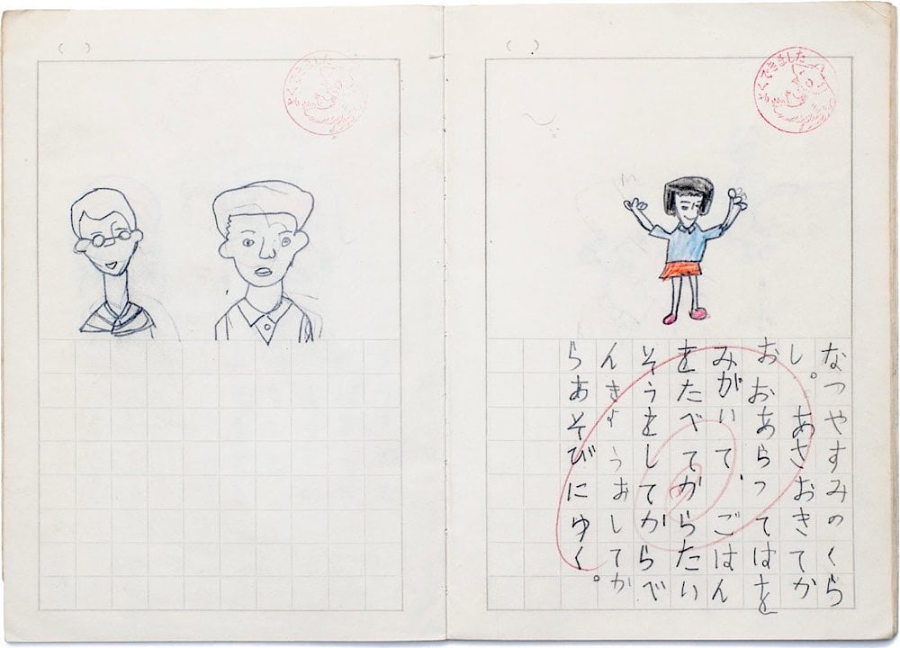
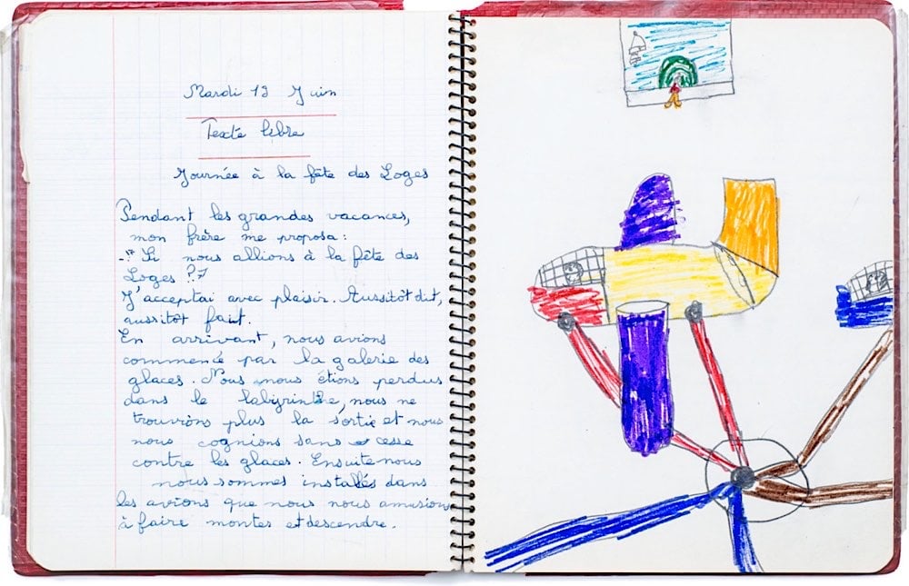
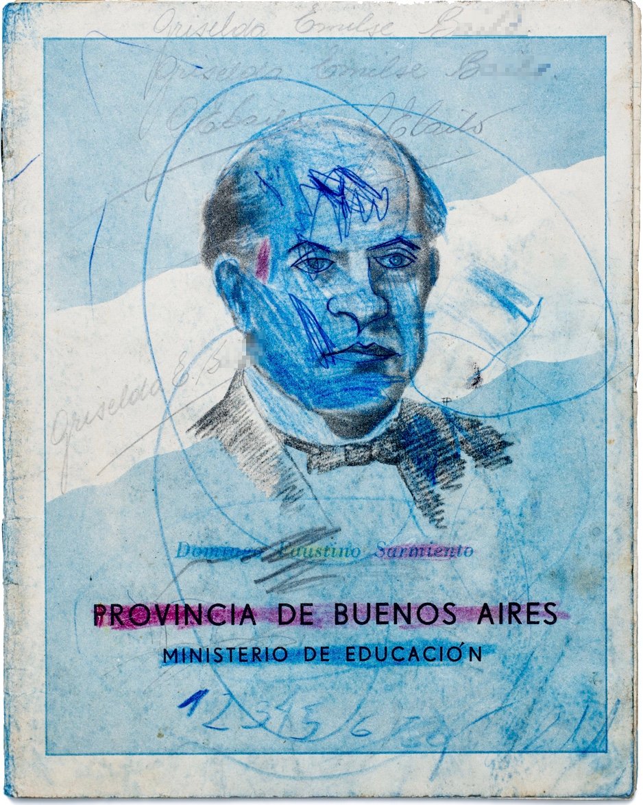
For the past 15 years, the folks at the Exercise Book Archive have been compiling a collection of children’s school notebooks from around the world. In the extensive digital archive, you can find writings, drawings, and aimless doodling in exercise books from as far back as 1773 from countries like the US, Ghana, Latvia, Brazil, and Finland.
The Exercise Book Archive is an ever-growing, participatory archive of old exercise books that allows everyone to discover the history, education, and daily life of children and youth of the past through this unique material. The Archive includes hundreds of exercise books from more than 30 different countries and dated from the late 1700s to the early 2000s. It is preserved and managed by the Milan-based NPO Quaderni Aperti (literally, Open Exercise Books).
If you follow them on Instagram, they are pulling some interesting pieces out of the archive. And if you happen to have any old exercise books from your youth (or your parents’ or grandparents’ youth) lying around, you can donate them to the cause.
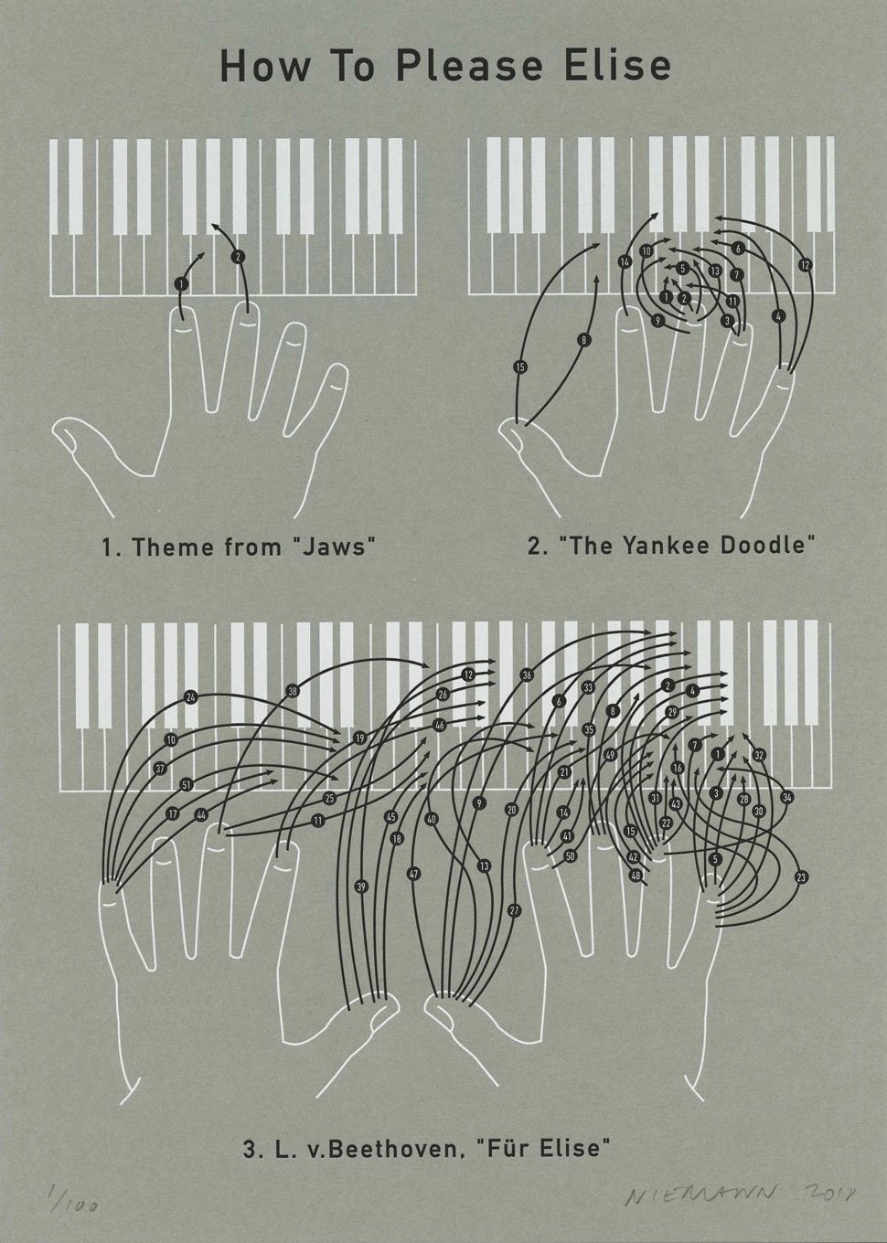
Christoph Niemann with a clever take on the Beethoven composition for piano, Für Elise. He’s offering it as a letterpress print — but supplies are low so order quick if you want one.
And according to Niemann, the chart has been factchecked and is accurate.
Wow, check out the official posters for the Tokyo 2020 Olympic and Paralympic Games.
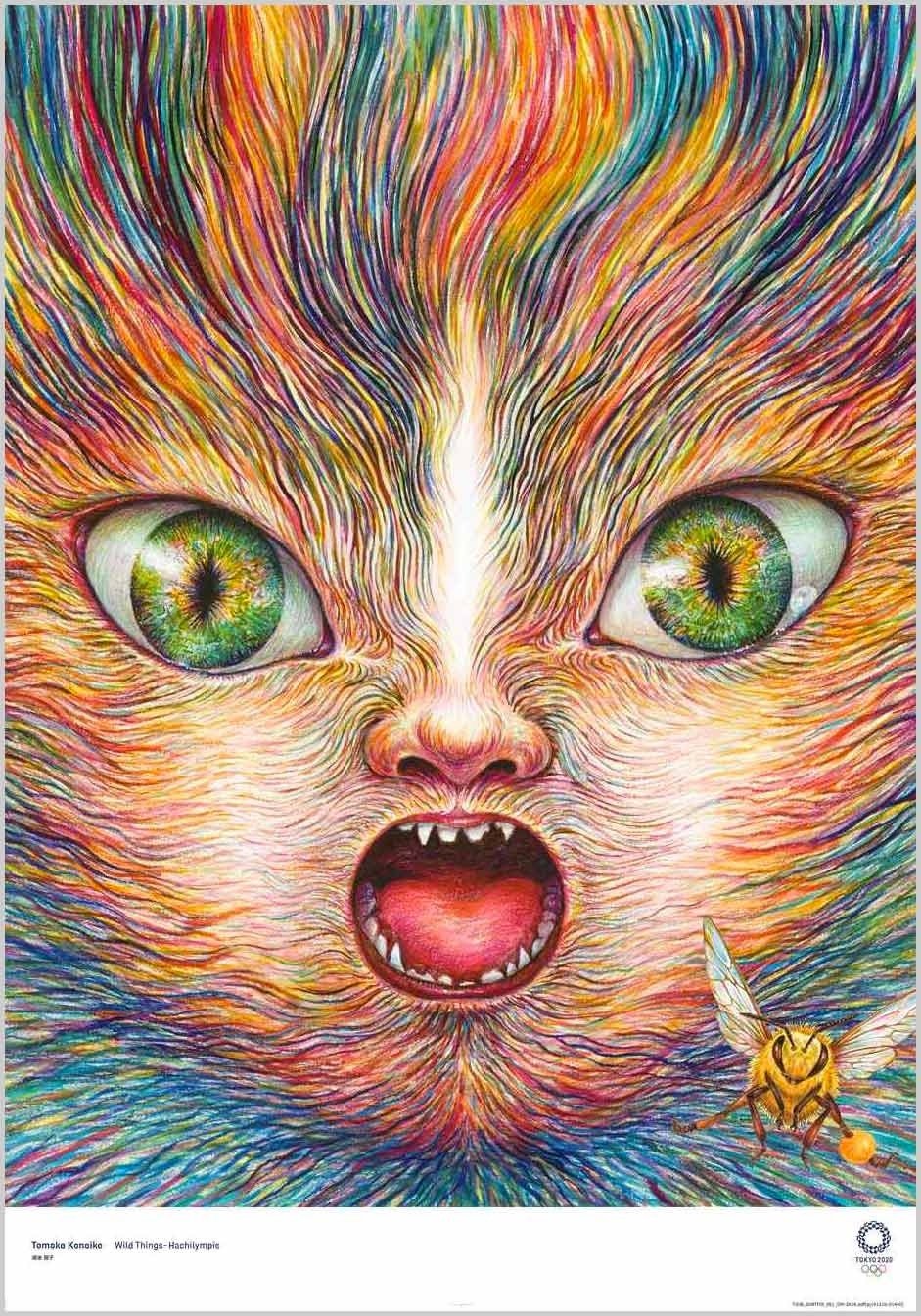
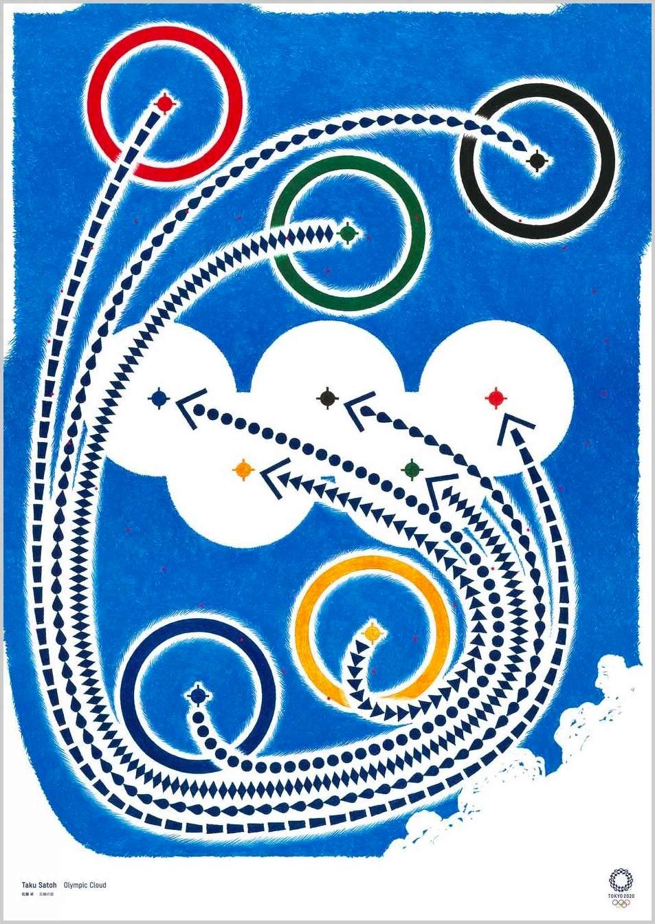
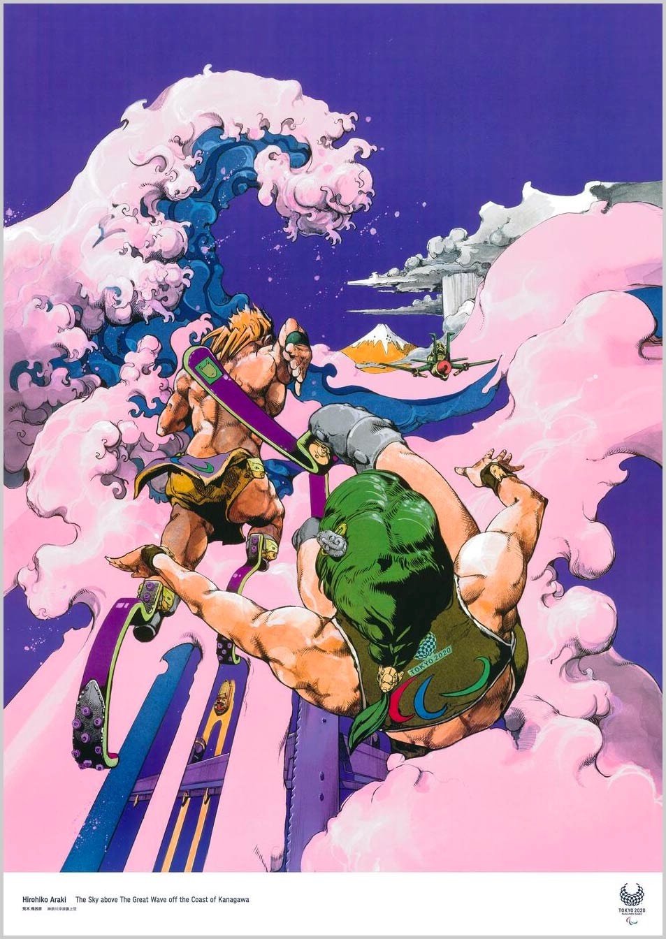
What an amazing array of styles and disciplines — there’s manga, shodo (calligraphy), Cubism, photography, surrealism, and ukiyo-e. That stunning poster at the top is from Tomoko Konoike — fantastic. As you can see, posters from past Olympics have tended towards the literal, with more straightforward depictions of sports, the rings, stadiums, etc. Kudos to the organizers of the Tokyo Games for casting their net a little wider. Love it. (via sidebar)
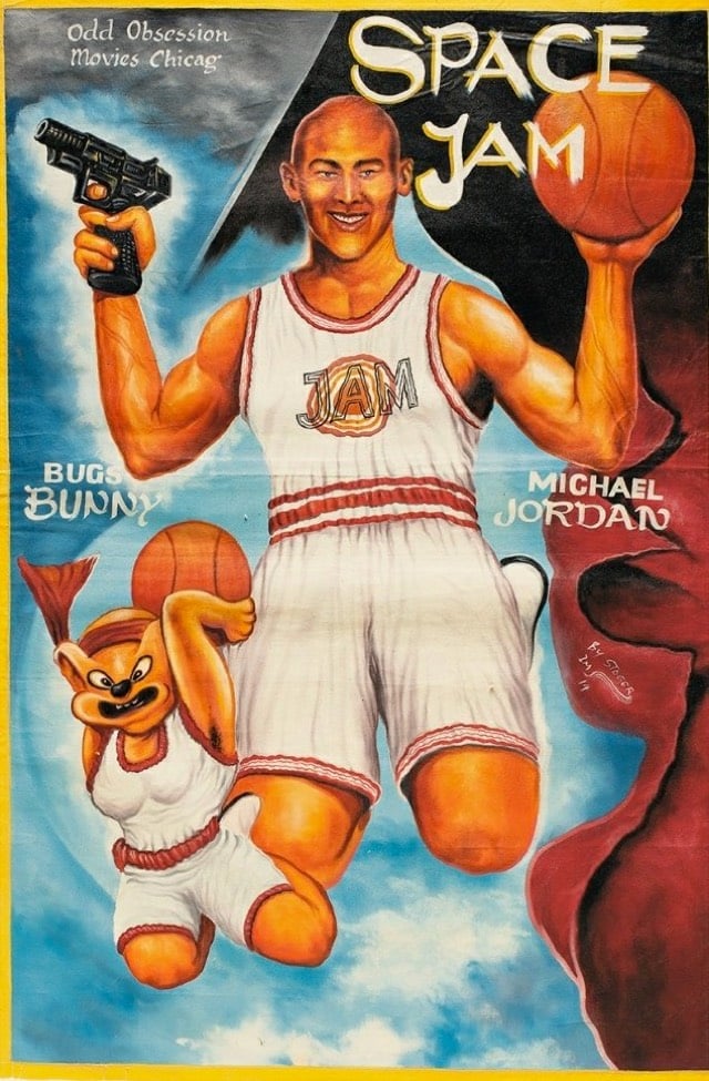
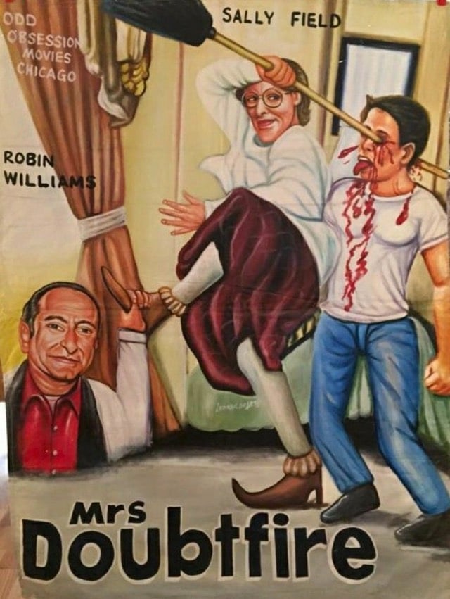
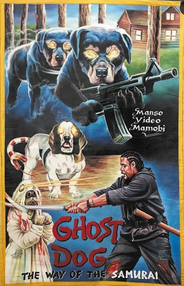
In order to drum up business for local movie theaters in Africa (most notably in Ghana), theater owners would commission local artists to paint movie posters.
When Frank Armah began painting posters for Ghanaian movie theaters in the mid-1980s, he was given a clear mandate: Sell as many tickets as possible. If the movie was gory, the poster should be gorier (skulls, blood, skulls dripping blood). If it was sexy, make the poster sexier (breasts, lots of them, ideally at least watermelon-sized). And when in doubt, throw in a fish. Or don’t you remember the human-sized red fish lunging for James Bond in The Spy Who Loved Me?
“The goal was to get people excited, curious, to make them want to see more,” he says. And if the movie they saw ended up surprisingly light on man-eating fish and giant breasts? So be it. “Often we hadn’t even seen the movies, so these posters were based on our imaginations,” he says. “Sometimes the poster ended up speaking louder than the movie.”
You can check out more of these amazing artworks in this Twitter thread, this BBC story, on the AIGA site, and at Poster House, which has an exhibition of these posters up through Feb 16.
Update: I removed this modern-day spoof of the Ghanaian posters from the post. The tell is the reference to this amazing GIF. (thx, erik)
Newer posts
Older posts
Socials & More