kottke.org posts about The Pudding
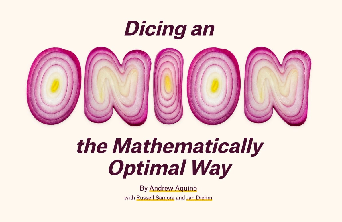
The latest post from The Pudding starts off about as good as possible to attract the likes of me: “This is a project about onions and math.” I mean, yes. I’m in. And I enjoyed the interactive article, Dicing an Onion the Mathematically Optimal Way, but the design was absolutely delightful and onion-y:


They even used an onion gradient for the border of the page. This must have been so fun to work on! Initially, I thought they’d designed the onion font, but a quick search turned up Handmadefont’s OnioType Font:

From the description, it sounds like the letterforms are made from real onions:
Each letter is lovingly crafted from a perfectly sliced red onion, where nature’s concentric rings do most of the design heavy-lifting. Vivid purples, tender whites, and sudden flashes of yellow form shapes so unexpectedly elegant, you’ll never look at a salad the same way again.
But I dunno…Photoshop might be a better guess. Still! I love this font and kudos to The Pudding for putting it to good use.
I love this: The Pudding ran an online experiment where they started with a shape (like a straight line or circle) and asked people to trace, as best they could, the tracing of the person before them. This resulted in a series of “flipbook” animation of how the shapes evolved over time — invariably, a squiggle.
One thing I noticed right away was how all the squiggles ended up squished over on the right side of the screen. The Pudding team had a theory on why that happened (the 3:20 mark in this video):
I found this study from like 35 years ago - they were trying to figure out why people kept missing their targets on touch screens. They found people tended to touch below their target and people tended to touch closer to the edges of the screen. And so I figure if it’s like right-handers who are missing, you’re going to be missing to the right. We probably had about half the users on mobile and 90% of the those half are probably going to be right-handed so it would make sense that it would gradually go to the right.
Go read the rest of the post — they also did an experiment about people’s inclination to draw penises on “any free-form drawing project on the internet”. (via waxy)
This is a teenager is an interactive data visualization by Alvin Chang about a group of American teenagers that have been tracked in a longitudinal study since 1997 (they are around 40 years old now). The video version of the visualization is embedded above.
A year from now, in 1998, a researcher named Vincent Felitti will publish a paper that drastically changes the way we think about these kids — and their childhood.
The research will show that these childhood stressors and traumas — called Adverse Childhood Experiences — have a lifelong effect on our health, relationships, happiness, financial security, and pretty much everything else that we value. It will kickstart decades of research that shows that our childhood experiences shape our adulthood far more than we ever thought.
This is a good companion to a recent post, End-Stage Poverty Is Killing People in Safety Net-Free America.
Ok this video from The Pudding is cool for two different reasons. First, you learn about which NBA player had the most unexpectedly great performance since 1985 (e.g. when a guy who is usually good for 6-8 pts inexplicably drops 50). But, you also get a fun little tutorial in how statistical analysis works and the importance of paying attention to the right data in order to get an answer that’s actually meaningful and relevant. How to interpret data in this way is an under-appreciated aspect in the bombardment of data and statistics we see in the media these days and teaching more people about it doesn’t have to be boring or stuffy.
The Pudding also sets an example here by working in the open: the data they used for their analysis is available on Github.
Ilia Blinderman of The Pudding has written a pair of essays about how to make data-driven visual essays. Part 1 covers working with data.
It’s worth noting here that this first stage of data-work can be somewhat vexing: computers are great, but they’re also incredibly frustrating when they don’t do what you’d like them to do. That’s why it’s important to remember that you don’t need to worry — learning to program is exactly as infuriating and as dispiriting for you as it is for everyone else. I know this all too well: some people seem to be terrific at it without putting in all that much effort; then there was me, who first began writing code in 2014, and couldn’t understand the difference between a return statement and a print statement. The reason learning to code is so maddening is because it doesn’t merely involve learning a set number of commands, but a way of thinking. Remember that, and know that the little victories you amass when you finally run your loop correctly or manage to solve a particular data problem all combine to form that deeper understanding.
Part 2 is on the design process.
Before you begin visualizing your data, think through the most important points that you’re trying to communicate. Is the key message the growth of a variable over time? A disparity between quantities? The degree to which a particular value varies? A geographic pattern?
Once you have an idea of the essential takeaways you’d like your readers to understand, you can consider which type of visualization would be most effective at expressing it. During this step, I like to think of the pieces of work that I’ve got in my archive and see if any one of those is especially suitable for the task at hand.
Check out The Pudding for how they’ve applied these lessons to creating visual essays about skin tone on the cover of Vogue or how many top high school players make it to the NBA.


Socials & More