kottke.org posts about animation
Aardman’s official Wallace & Gromit YouTube channel is livestreaming what appears to be the four shorts featuring the duo: A Grand Day Out, The Wrong Trousers, A Close Shave, and A Matter of Loaf or Death.
I can’t find any further information about the stream — if those are the only animations that are available, if any of the movies are included, how long the stream will be up. But I’m watching The Wrong Trousers right now and eating a bit of cheese, so all is right with the world.
Loop is an award-winning animated short featuring a society where people live a perfectly looping existence, all in rhythm. Then one day…
In 2002, Aardman Animations produced a series of short episodes called Wallace & Gromit’s Cracking Contraptions. In each episode, Wallace unveils a new invention, which Gromit then has to deal with. For the holiday season, Aardman has packaged a few of these short shorts into this compilation, Wallace & Gromit’s Cracking Christmas, free to watch on YouTube.
You can watch a longer compilation of (I believe) all of the episodes here.
Aardman even produced a new episode this year, in the form of a clothing commercial:
I hadn’t seen most of these before; I legit laughed out loud several times while watching.
See also: Nick Park demonstrates how to draw Gromit.
Papers is a 3-minute animated short film made by Yoshinao Satoh from what must be thousands of newspaper scans. The animation set to Different Trains by Steve Reich & Kronos Quartet. I love this style of collage animation.
I love the look of this black & white animated video made by Anthony Dickenson from thousands of hand-painted frames for Rival Consoles’ song Soft Gradient Beckons. Stick around after the song ends for a behind-the-scenes look at how it was made.
If I plan too much, it’s often disappointing. It’s much nicer if I just let it go the way it wants to go. But obviously sometimes it just doesn’t work and, you know, that’s okay. Sometimes, the mistakes are the bits that really reveal kind of new techniques. I love these little moments of imperfection. Otherwise, you know, you might as well just build it in AI.
The skateboard dolly! (via colossal)
Following on from last year’s successful trial, the Australian Open is once again broadcasting all their matches, nearly live and in their entirety, on YouTube — but with animated avatars in place of the players. Here’s how it looks in practice, kind of Wii Tennis; this is a match between Coco Gauff and Jodie Burrage from a few days ago (the animation starts just before the 35-minute mark:
The matches are only delayed by two minutes (the system needs some rendering time) and viewers get to hear the the audio & commentary from the actual match. From The Guardian:
The technology made its debut at the grand slam last year and audiences peaked for the men’s final, the recording of which has attracted almost 800,000 views on YouTube. Interest appears to be trending up this year and the matches are attracting roughly four times as many viewers than the equivalent time in 2024.
The director of innovation at Tennis Australia, Machar Reid, said although the technology was far from polished it was developing quickly. “Limb tracking is complex, you’ve got 12 cameras trying to process the silhouette of the human in real time, and stitch that together across 29 points in the skeleton,” he said. “It’s not as seamless as it could be – we don’t have fingers – but in time you can begin to imagine a world where that comes.”
Re: not seamless, here’s a recent blooper reel:
Back in 2023, the NFL and Disney collaborated on a Toy Story version of an NFL game, the NHL broadcast an animated hockey game in 2024, and last month the NFL did another animated broadcast with characters from The Simpsons playing key roles.
I’ve shared animator Nick Murray Willis’ videos before — he takes snippets of sound & dialogue from sports commentary & movies and creates context-shifted animations from them. For instance, in the two videos above with football (soccer) commentary, a commentator’s chant of “Messi, Messi, Messi” becomes a French street performer thanking the crowd (“merci, merci, merci”).
(Ok, I’ve caught myself attempting to explain humor, so I’m gonna wrap this up by urging you to watch the videos if you want.)
10,946 is a mesmerizing stop-motion film by Daren Jannace composed of drawings on Post-It notes. He created 30 drawings a day for an entire year and then animated them: “Set at 30 frames a second, each second represents 1 day.” The animation is accompanied by audio Jannace recorded on his phone during the year.
If you watch the whole thing, you get to experience what a year feels like if days were shrunk down into seconds. (via colossal)
This is great: a 25-minute interview with legendary animator Chuck Jones as he sits and draws some of his iconic characters (Bugs Bunny, Porky Pig, Daffy Duck). He told this anecdote about how Steven Spielberg and George Lucas were both influenced by a particular space-themed cartoon of his:
Porky was just a kind of a little third-string Boy Scout and was not very interesting to me. And then when I put him in a picture called Duck Dodgers in the 24th and a Half Century. Spielberg used that picture in Close Encounters the Third Kind - when his kids were watching television in the picture, they were watching Duck Dodgers in the 24th and a Half Century. And Lucas told me that he saw that picture when he was 12 years old and when when he opened Star Wars in San Francisco he told them they couldn’t have Star Wars in San Francisco unless they ran Duck Dodgers in the 24th and a Half Century.
I love this: The Pudding ran an online experiment where they started with a shape (like a straight line or circle) and asked people to trace, as best they could, the tracing of the person before them. This resulted in a series of “flipbook” animation of how the shapes evolved over time — invariably, a squiggle.
One thing I noticed right away was how all the squiggles ended up squished over on the right side of the screen. The Pudding team had a theory on why that happened (the 3:20 mark in this video):
I found this study from like 35 years ago - they were trying to figure out why people kept missing their targets on touch screens. They found people tended to touch below their target and people tended to touch closer to the edges of the screen. And so I figure if it’s like right-handers who are missing, you’re going to be missing to the right. We probably had about half the users on mobile and 90% of the those half are probably going to be right-handed so it would make sense that it would gradually go to the right.
Go read the rest of the post — they also did an experiment about people’s inclination to draw penises on “any free-form drawing project on the internet”. (via waxy)
Beautiful stop-frame animated documentary about why people knit and mend. “When your life is sort of falling apart, you need to create a purpose in it for yourself, and if that purpose is quite small, it doesn’t matter.” Directed by Samantha Moore.
I’ve also been enjoying Arounna Khounnoraj’s visible mending and other handmade projects, on Instagram at bookhou.
Tomohiro Okazaki has perfected a very specific skill: stop-animating matchsticks in more ways than you could possibly imagine. When I last wrote about his work, I said that I wished that the 7.5 minute movie were longer and, well, I got my wish: this new one runs for an hour and 17 minutes. I’ not going to sit here and tell you that I watched the whole thing, but I did watch for longer than I perhaps should have on a day with lots to accomplish. (via colossal)
I don’t think I’ve ever seen the animation style Gabriel Gabriel Garble uses in his short film Well Wishes My Love, Your Love — it’s so cool and unique. Everything in the film has this sort of radiating energy that interacts with everything else. (via it’s nice that)
This is pretty clever actually: Disney+ and ESPN+ will air a real-time, Toy Story-ified version of the Oct 1st Jacksonville Jaguars and Atlanta Falcons NFL game. From Deadline:
Using the NFL’s Next Gen Stats and on-field tracking data, every player and play will be presented in “Andy’s Room,” the familiar, brightly colored setting for the Toy Story franchise. The action will be virtually simultaneous with the main game telecast, with most plays recreated after an expected delay in the neighborhood of about 30 seconds. Woody, Buzz Lightyear and many other characters will be visible throughout, and a press release notes they will be “participating from the sidelines and in other non-gameplay elements.” Along with game action, the announcers, graphics, scoreboard, referees’ penalty announcements, celebrations and other parts of the experience will all be rendered in a Toy Story-centric fashion.
I stopped watching the NFL years ago, but I might tune in to see how this works.
It is with the appropriate feelings of melancholy and excitement that I share with you the teaser trailer for The Boy and the Heron, the legendary Hayao Miyazaki’s final animated feature film for Studio Ghibli.
A young boy named Mahito, yearning for his mother, ventures into a world shared by the living and the dead.
There, death comes to an end, and life finds a new beginning.
A semi-autobiographical fantasy about life, death, and creation, in tribute to friendship, from the mind of Hayao Miyazaki.
Miyazaki had previously retired after 2013’s The Wind Rises but according to Studio Ghibli co-founder Toshio Suzuki, he had good reason to come back for one more film:
Miyazaki is making the new film for his grandson. It’s his way of saying, ‘Grandpa is moving on to the next world, but he’s leaving behind this film.’
The Boy and the Heron opens on December 8 in the US. (via waxy)
It is astounding to me the number of YouTube channels that I have never heard of with subscriber bases larger than that of many countries. (This goes double and triple for Instagram and TikTok.) Alan Becker has over 23 million subscribers and makes videos pitting animated characters against various other entities. His latest video is Animation vs. Math and it is super nerdy and engaging. You might have to be a bit of a math nerd to enjoy this fully, but even if you only get the gist of what’s going on (like I did for at least half of the video), it’s still pretty entertaining. You can check the comments for an explanation of the math or this illustrated explainer.
You’ve probably seen the work of animation pioneer Max Fleischer; he made the old Popeye, Superman, Betty Boop, and Koko the Clown cartoons waaaay back in the early-to-mid 20th century. Films from back then are often not well-preserved, so when a copy is discovered in a film library or private collection, great care must be exercised in restoring the film for future generations to enjoy.
This video follows the restoration process of Fleischer’s 1924 Koko the Clown film Birthday, from scanning a 35mm print from 1930 to the digital retouching. The fully restored print doesn’t seem to be online anywhere, but you can see a couple of before-and-after comparisons here and here.
When Spider-Man: Into the Spider-Verse came out in 2018, it had a very different look than most other animated feature-length films. Since the release of Toy Story in the mid-90s, digitally animated films made by the large studios had taken their cues from Pixar. “The Pixar Look” was “extremely high quality, physically based, and in some cases almost photorealistic”. Spider-Verse introduced a different style and since then, digital animation studios have been experimenting with non-photorealism. This video looks at how that shift is happening.
40 animators from around the world collaborated on a 2-minute video called Pass the Ball: each person had three seconds to animate a ball and “pass” it to the next person. Reminds me of the old Layer Tennis matches. (via colossal)
Art director Riana McKeith is watching Wandavision, each episode of which takes place in a different time period from the 50s to the present day. As a loving homage, she’s illustrating scenes from the show in the style of cartoons from each time period. Here’s the first episode, which takes place in the 50s a la I Love Lucy or Leave It to Beaver:
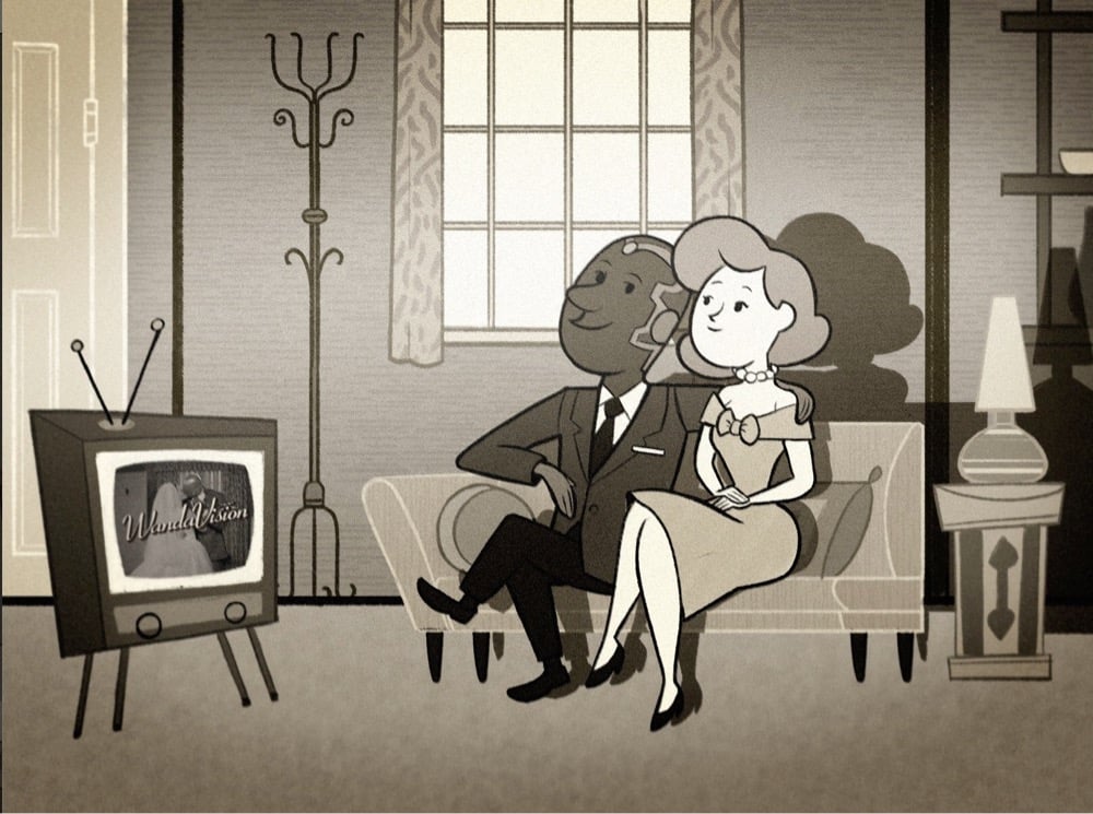
I don’t know enough about 50s cartoons to do more than guess at the inspiration of that one (Hanna Barbera? Looney Tunes?) but her 60s scene is obviously inspired by The Jetsons and The Flintstones:
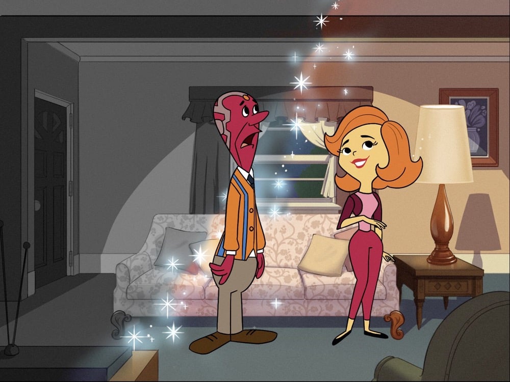
My kids and I are obsessed with Wandavision — it’s a big ol’ love letter to television — and this project is the perfect complement to the show.
This. This is the stuff. Lapping water, wind through the tall grass, patient trains, birds, rolling countryside, mountains, sleeping, castles in motion, and more calm scenes compiled from Studio Ghibli movies.
See also hundreds of Studio Ghibli backgrounds for your Zoom calls and 10 Hours of Extremely Relaxing Ocean Scenes & 40 Hours of Relaxing Planet Earth II Sounds, both from BBC Earth. (via laura olin)
I have been on this internet for a long damn time and somehow this has escaped my attention until just this morning: Disney reuses bits of animation in their movies and TV shows *all the time*. And blatantly so — just check out this comparison of sequences from The Jungle Book (made in 1967) and The Many Adventures of Winnie the Pooh (made in 1977):
There are many other instances of this reuse throughout Disney’s catalog of animation — The Fox and the Hound, 101 Dalmatians, Alice in Wonderland, Beauty and the Beast, Robin Hood etc.:
For animators under time constraints and on a budget, recycling footage was a sensible thing to do and probably wasn’t widely known among the viewing public until extensive at-home viewing, digital editing, and collecting sleuthing via the internet became available.
This is a treat: a 30-minute video that celebrates the animations & animators that changed cinema, e.g. Yuri Norstein, Miyazaki, Fantasia, The Iron Giant, Persepolis, etc. — a full list of the filmography is available in the description. Absolutely stunning visuals on some of these. See also The 100 Sequences That Shaped Animation. (via open culture)
3:45 PM is CalArts student Alisha Liu’s second-year film about a lovely day in the park interrupted by an existential case of the Sunday scaries. The animation in this is lovely, particularly in the overhead sequences when things get abstract. I think this is my favorite shot:
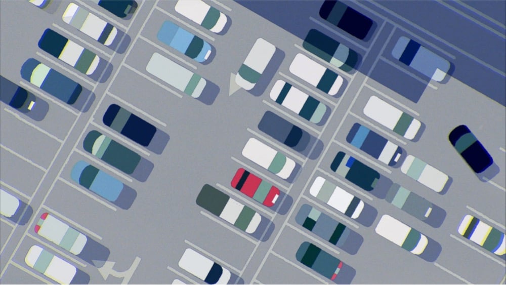
There’s just enough information here to convey to the viewer that these are cars in a parking lot — plus a little bit more, so that individual types of cars are perceptible. This is a really good implementation by Liu of the type of abstraction discussed by Scott McCloud in Understanding Comics. (via colossal)
I cannot improve upon the succinct description of this video from Natalie Smillie: “A new Ghibli film?! No — this is an advert for the state of Oregon.” It’s a great ad and certainly takes both content and stylistic cues from Studio Ghibli’s films. The video, along with a previous one, was created for Travel Oregon by creative agency Psyop and animation studio Sun Creature.
Animator Pinot Ichwandardi, designer/illustrator Dita Ichwandardi, and their three young children decided to remake some of the iconic scenes from the Spider-Man: Into the Spider-Verse trailer using traditional animation techniques. You can see some of the process and the impressive results in the video above. They drew the scenes by hand, built their own multiplane camera setup (a la Disney), and constructed a camera rig using Lego. You can read more about their process in these two Twitter threads: one, two.
After they were done, Sony Animation invited the family to visit their California campus to meet some of the team that worked on the movie, including producers Phil Lord and Chris Miller.
See also How Animators Created Spider-Verse.
In this short multi award-winning film, Sam Gainsborough uses “a hybrid of claymation, pixelation and live action to paint a visceral portrait of internal struggle.” Beautiful and yet haunting. If you’ve struggled with these kinds of bouts with anxiety, this might ring some uncomfortable bells but worth a viewing for sure.
Sam says he wanted to create a film that resonated with people who struggle with anxiety, or often feel isolated from others. “[It’s] about a character who struggles to interact with other people,” he tells It’s Nice That. “The main character is someone who has learned to repress his emotions. If he feels sad or angry, his skin physically restricts him from showing these emotions. This means his skin is constantly swirling and transforming, meaning he can never be truly comfortable in his own skin.”
This is a 45-second clip from Pinocchio, an animated film made by Disney in 1940.
The scene itself isn’t that exciting…until you actually start to wonder, wait, how was this made? The way the camera effortlessly swoops past buildings and through archways like one of Pixar’s infinitely pliable virtual cameras, the depth of field changing as we pan and zoom toward Pinocchio’s door — how did they do that 80 years ago, animating by hand? The film’s animators achieved this effect using a relatively recent invention, the multiplane camera.
The basic idea is that instead of animating characters against a single static background, you can animate several layers of independently moving scenes painted on glass. In a 1957 film, Walt Disney himself explained how the camera worked:
And here’s how Disney used the technique in dozens of scenes from Snow White to Bambi to 101 Dalmatians:
Because we’re seeing the output of an actual camera zooming and panning, many of these scenes feel more grounded in reality than even some of today’s best digital output. Even 80 years later, the effect is impressive, a real testament to the collaborative talent of Disney’s animators & technicians.
In the latest in a series of videos on film innovations that came from outside Hollywood, Phil Edwards highlights rotoscoping, a process of filming live action and transferring the motion to produce realistic animated movement invented by Max Fleischer.
As the above video shows, it started with Max’s brother Dave dancing on a roof in a clown costume. Footage of that was then used to model the classic Koko the Clown cartoons, which formed the basis for many Fleischer Studios films. Today, animators still use techniques like rotoscoping to turn real movement into animation.
A number of the studio’s most memorable cartoons used footage of legendary jazz singer Cab Calloway to create fluid animated sequences, like this dancing walrus from Betty Boop.
As Edwards notes, Fleischer’s studio also invented an early multiplane animation device, which allowed for the independent movement of different parts of the background to create the illusion of depth, resulting in yet more realism. Here’s Steven Johnson describing Disney’s more sophisticated multiplane camera in his book Wonderland: How Play Made the Modern World:
All of these technical and procedural breakthroughs summed up to an artistic one: Snow White was the first animated film to feature both visual and emotional depth. It pulled at the heartstrings in a way that even live-action films had failed to do. This, more than anything, is why Snow White marks a milestone in the history of illusion. “No animated cartoon had ever looked like Snow White,” Disney’s biographer Neil Gabler writes, “and certainly none had packed its emotional wallop.” Before the film was shown to an audience, Disney and his team debated whether it might just be powerful enough to provoke tears — an implausible proposition given the shallow physical comedy that had governed every animated film to date. But when Snow White debuted at the Carthay Circle Theatre, near L.A.’s Hancock Park, on December 21, 1937, the celebrity audience was heard audibly sobbing during the final sequences where the dwarfs discover their poisoned princess and lay garlands of flowers on her.
Andy Bailey is a stop-motion animator at Laika who worked on Kubo and The Boxtrolls. In this video, he shares his process while making a 658-page flipbook called The Return of Grumpy Cloud that took him 35 work-days over three months to complete. The end result (skip ahead to ~14:25) is pretty impressive given the lo-fi medium. Bailey sells kits for making your own flipbooks, but the store was down for maintenance when I checked.
Older posts




Socials & More