Pencil Typography
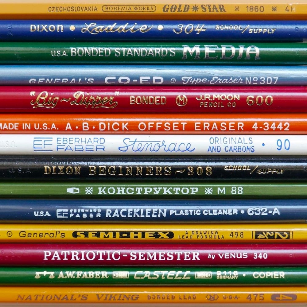
Even just looking at photos of pencils, I can still smell the sheets of mimeograph paper hot off the ditto machine.
This site is made possible by member support. 💞
Big thanks to Arcustech for hosting the site and offering amazing tech support.
When you buy through links on kottke.org, I may earn an affiliate commission. Thanks for supporting the site!
kottke.org. home of fine hypertext products since 1998.
Beloved by 86.47% of the web.
Even just looking at photos of pencils, I can still smell the sheets of mimeograph paper hot off the ditto machine.
The Type Directors Club has announced the winners of their two design competitions: TDC67 Communication Design and 24TDC Typeface Design. (via print)
Urine color is an indicator of how hydrated you are and Pantone are the color experts, so of course they’ve teamed up with a Scottish bottled water company to produce a chart with 5 color gradations that help you determine your hydration level. But 10 glasses of water a day?! I’m not sure the science supports that, particularly since we get a lot of our recommended intake from regular food & beverage consumption.
It remains unclear where the “8 x 8” water intake recommendation comes from. Perhaps, this two-liter intake threshold is derived from a misinterpretation of original recommendations offered by the U.S. Food and Nutrition Board in 1945 as well as the 2017 European Food Safety Authority, which states the daily recommended amount of water includes all beverages plus the moisture contained in foods.
This means that the moisture contained in foods, especially fresh fruits, sodas, juices, soups, milk, coffee and, yes, even beer, contributes to this daily recommended water requirement. These guidelines go on to suggest that most of the recommended water content can be accomplished without drinking additional cups of plain water.
(via print)
Tomer Hanuka asked his third-year illustration students at SVA to “come up with a post-pandemic New Yorker magazine cover” and posted some of their wonderful & thoughtful work to Twitter. Here are a few that caught my eye:
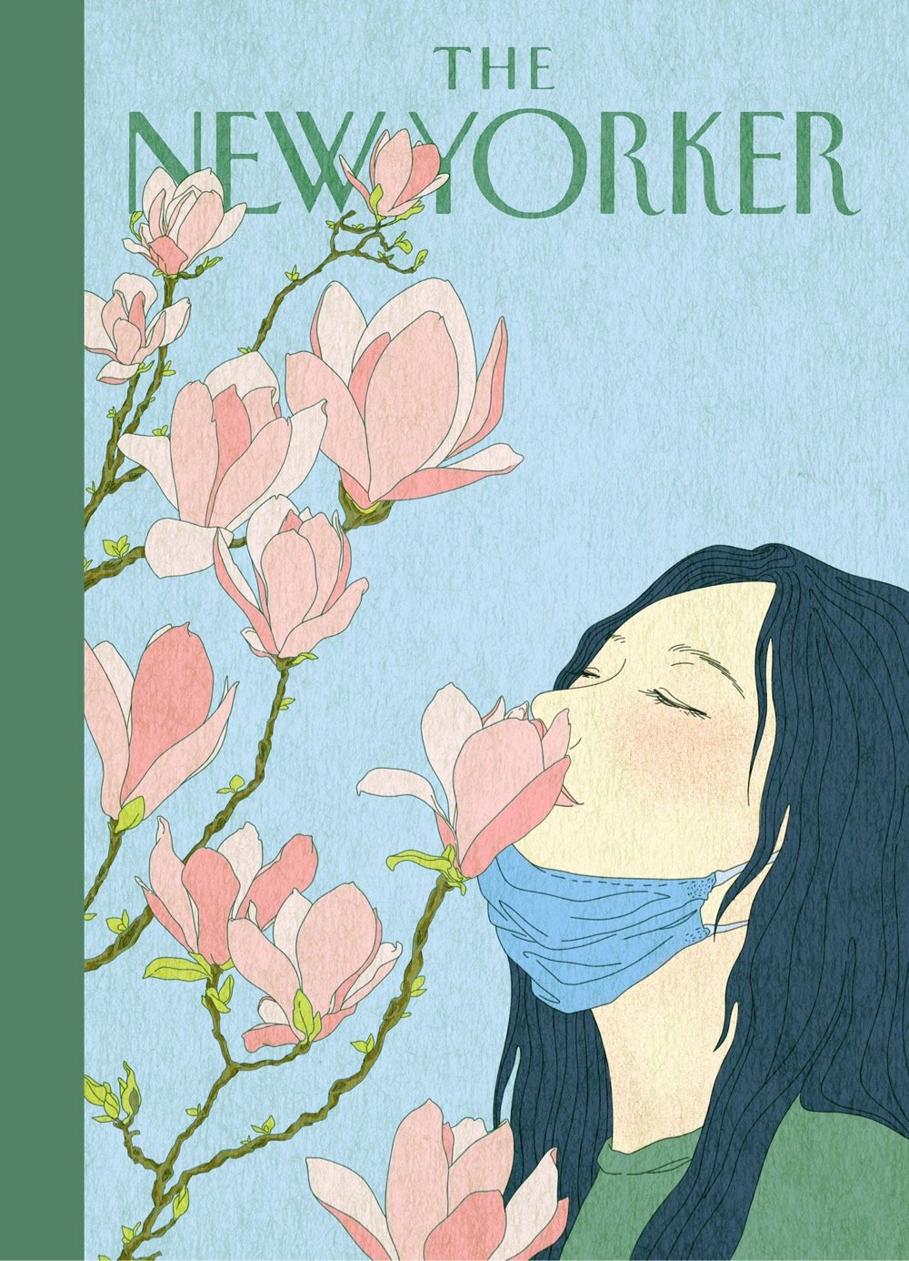
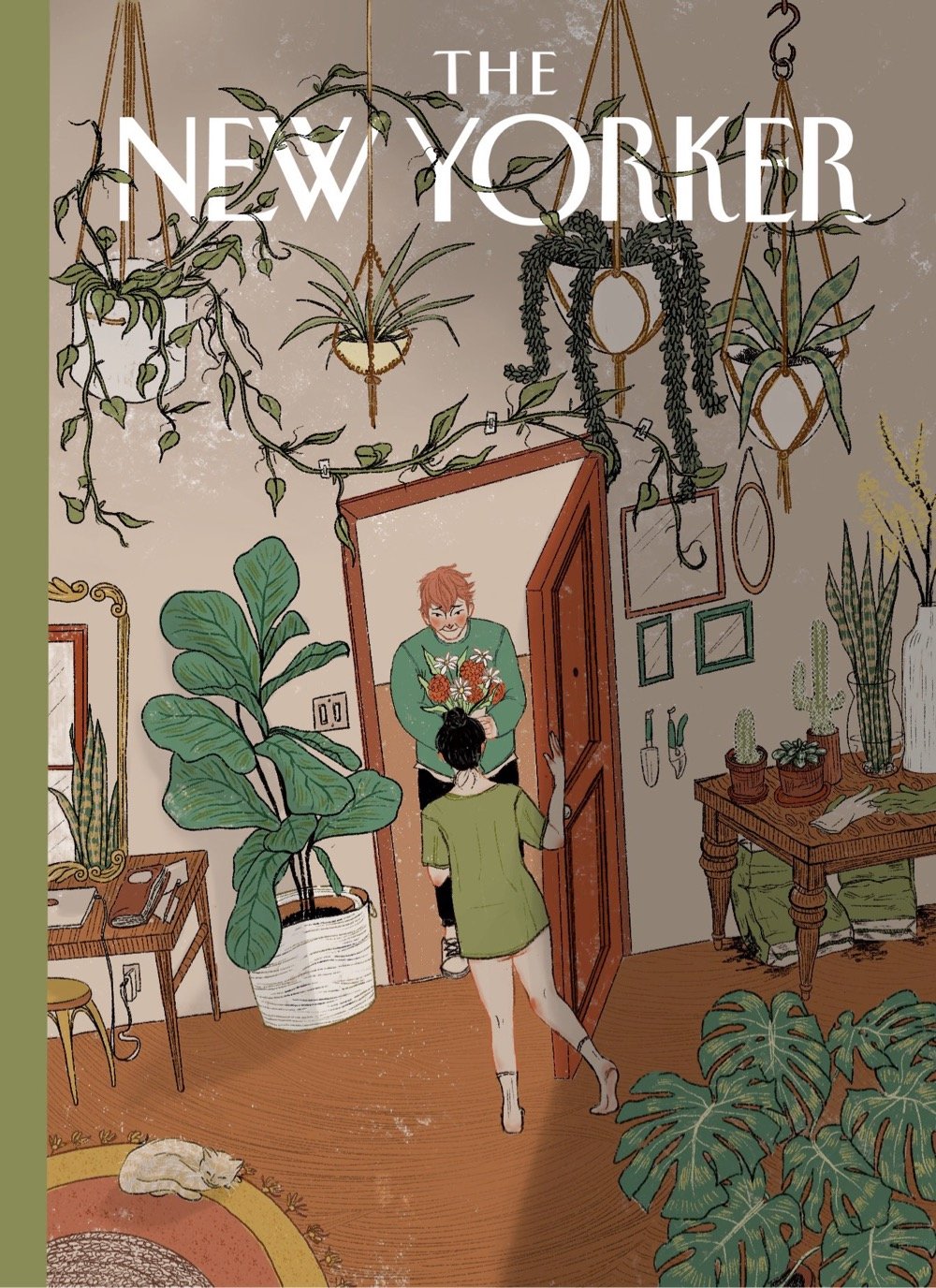
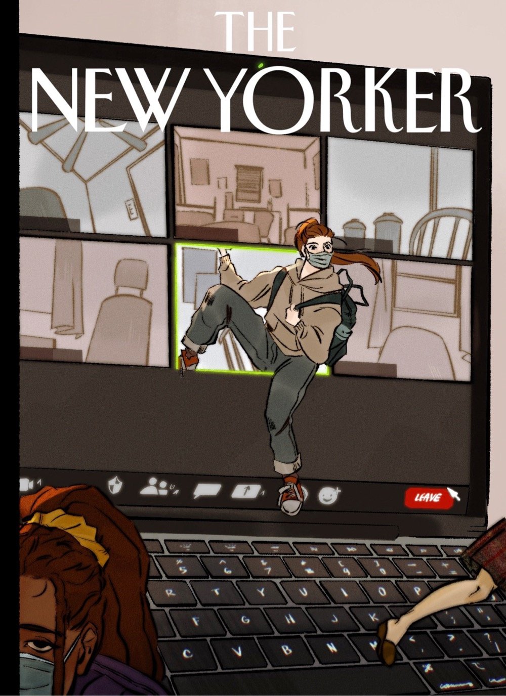
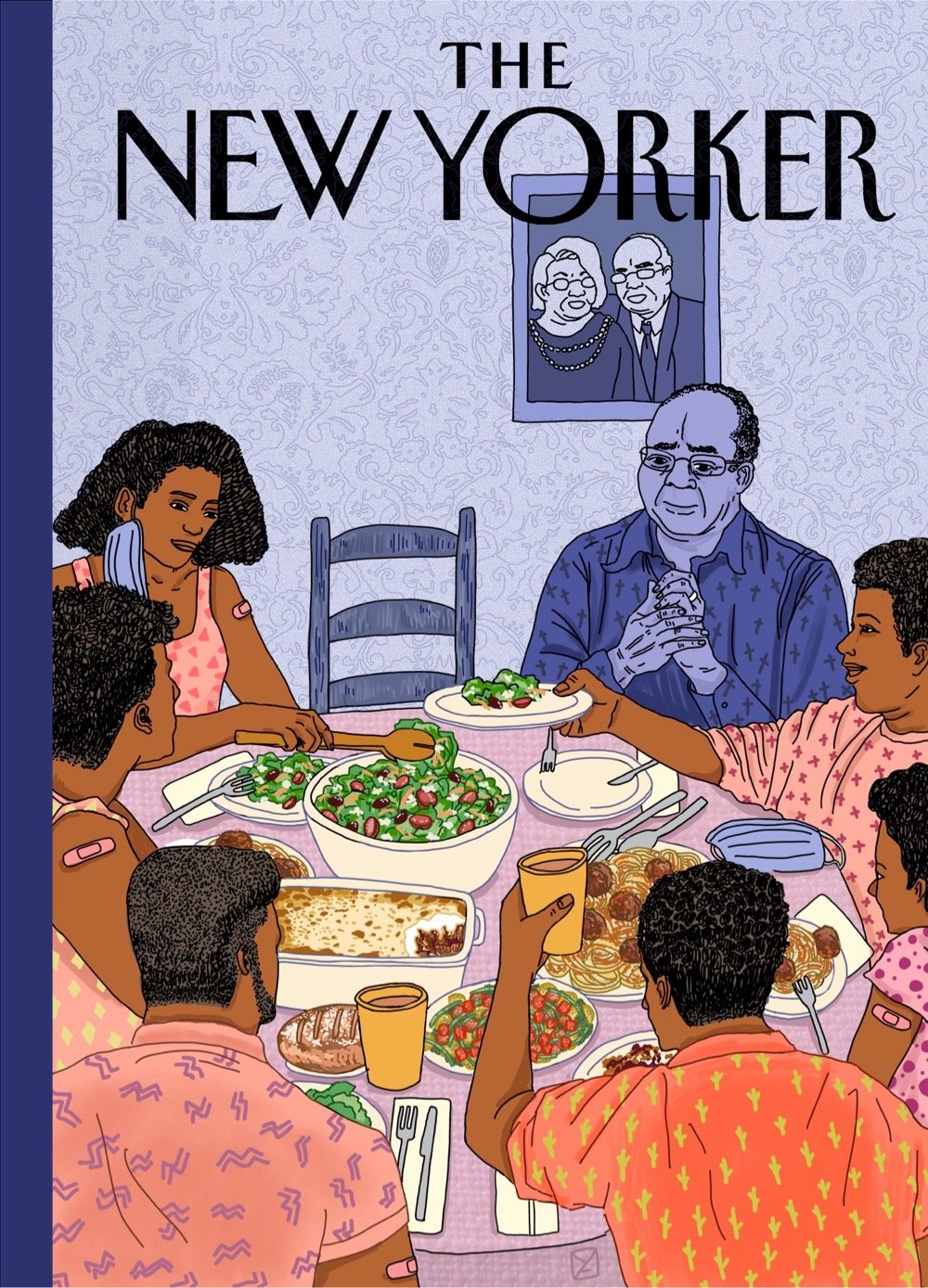
The second cover down, by Katrina Catacutan, is probably my favorite (the body language of the woman answering the door is just perfect) but the last image by Amy Young hit me like a ton of bricks. The New Yorker should run all of these covers for an issue of the magazine in a few weeks — collect them all!
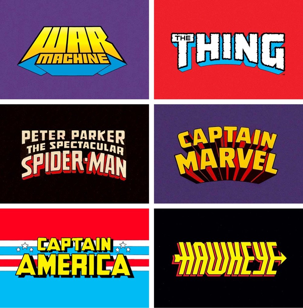
Reagan Ray has compiled a collection of hand-lettered Marvel superhero logos from before the computer animation era. (via print)
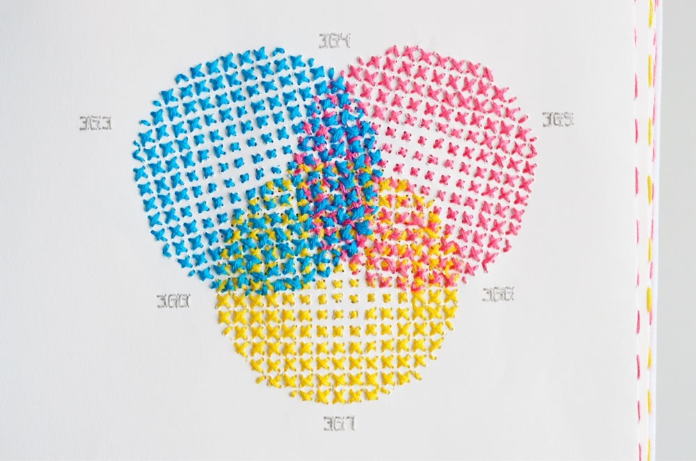
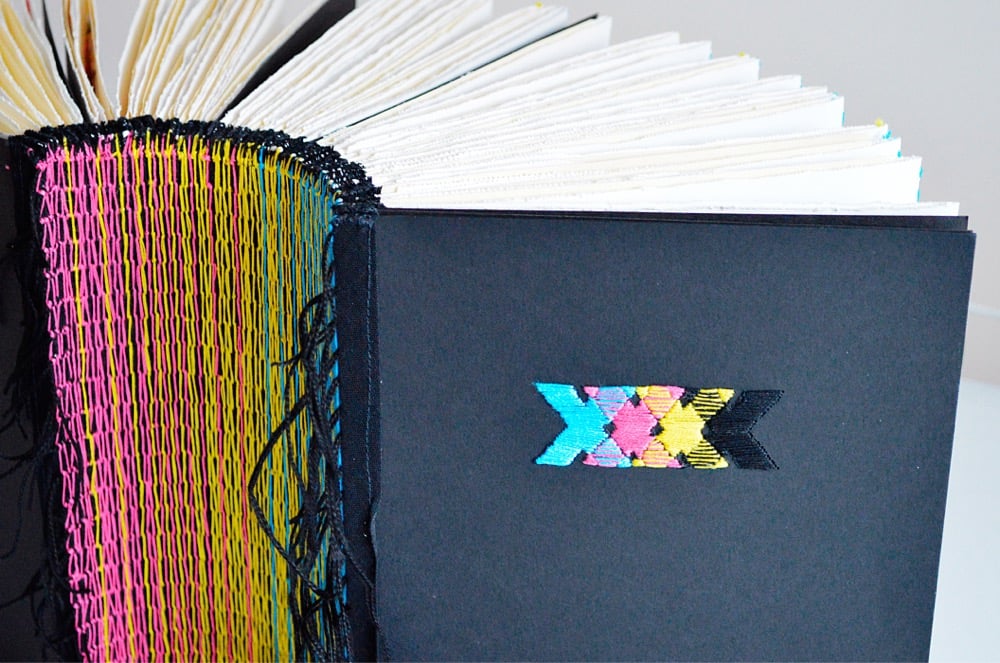
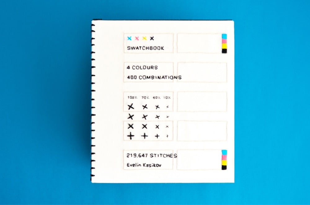
Back in January, Clive Thompson asked his Twitter followers for links to books of unusual dimensions. In the resulting thread, people shared images and links to books of all different shapes and sizes, from Irma Boom’s miniature books to the Codex Gigas to a book of Kraft American Singles (my contribution). Designer Evelin Kasikov’s XXXX Swatchbook, a handmade book about CMYK printing constructed entirely of embroidery thread and paper, would fit nicely into that collection.
XXXX Swatchbook shows the range of colours that can be achieved in handmade printing technique. But it also twists the idea of print by turning quick reproduction process into slow handmade process. It’s a book about a process, and with no less than six years in the making, the book itself is a process. It’s a catalogue of colour, a unique art book and an object of book art. The book documents 400 hand-stitched colour swatches in CMYK embroidery. The line screen in my book is incredibly low and ranges between 4 to 7 lines per inch (as opposed to 300 lpi in standard printing).
See also Embroidery that Breaks the Fourth Wall and The Embroidered Computer. (via colossal)
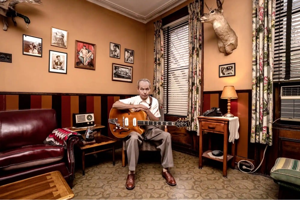
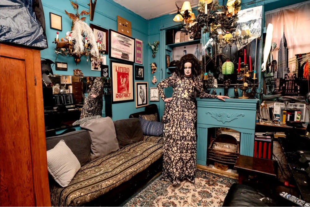
For her forthcoming book New Yorkers, photographer Sally Davies (Instagram) captured portraits of people inside their NYC apartments. I love the creativity of these living spaces, many in styles you just do not see in contemporary design magazines. You can preorder New Yorkers at Bookshop.org — it comes out April 1.
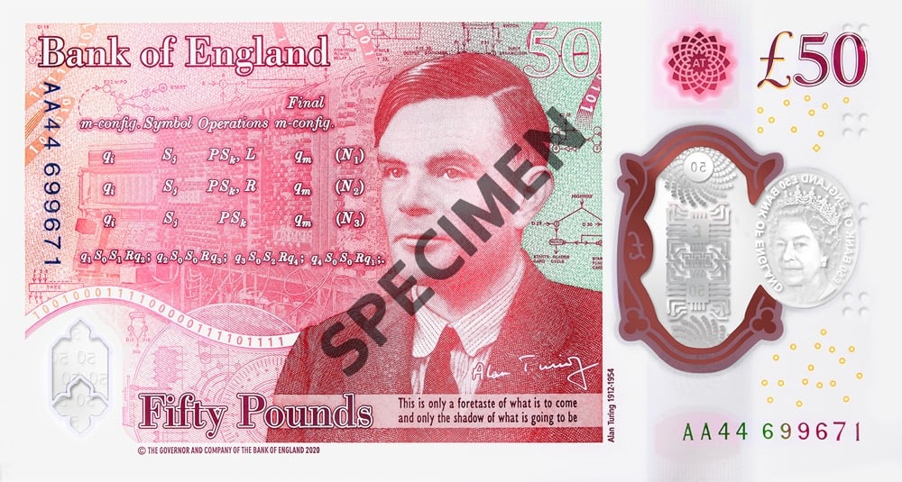
The Bank of England unveiled the final design of the new £50 banknote honoring mathematician and computer scientist Alan Turing.
Commenting on the new note, Governor Andrew Bailey said: “There’s something of the character of a nation in its money, and we are right to consider and celebrate the people on our banknotes. So I’m delighted that our new £50 features one of Britain’s most important scientists, Alan Turing. Turing is best known for his codebreaking work at Bletchley Park, which helped end the Second World War. However in addition he was a leading mathematician, developmental biologist, and a pioneer in the field of computer science. He was also gay, and was treated appallingly as a result. By placing him on our new polymer £50 banknote, we are celebrating his achievements, and the values he symbolises”.
The note will be placed into circulation beginning June 23, 2021. As part of the introduction of the note, GCHQ (the successor agency to the one Turing worked for) has created a series of 12 puzzles for folks to decipher. Good luck!
For the past three years, Dan Pashman of The Sporkful podcast has been on something of a mission: to invent a new pasta shape. All of Pashman’s hard work has paid off with the debut of cascatelli pasta, available for sale from Sfoglini.
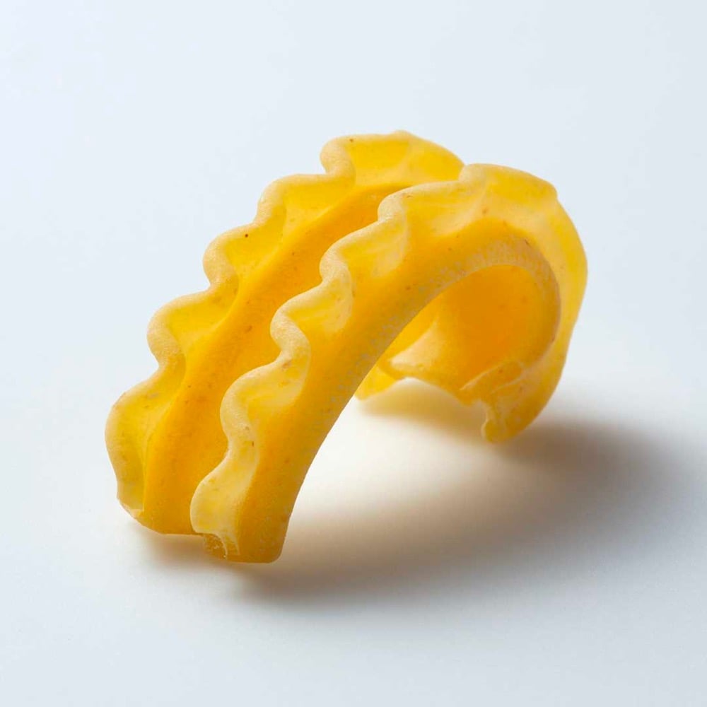
Pashman and Sfoglini engineered the new shape to maximize the amount of sauce that sticks to it, make it easier to get your fork on it, and have it feel good when you bite into it.
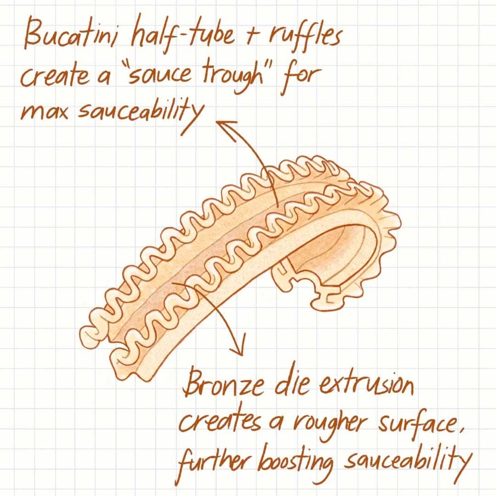
Cascatelli is designed to maximize the three qualities by which Dan believes all pasta shapes should be judged:
Sauceability: How readily sauce adheres to the shape
Forkability: How easy it is to get the shape on your fork and keep it there
Toothsinkability: How satisfying it is to sink your teeth into it
Pashman documented the invention of cascatelli in a 5-part series on The Sporkful podcast — you can listen to the first episode here — and on Instagram. You can order some cascatelli to try it out at home, but it looks like they are currently sold out of everything aside from 5-lb bulk bags.
See also How to Make 29 Different Shapes of Pasta by Hand and 150 Different Pasta Shapes.
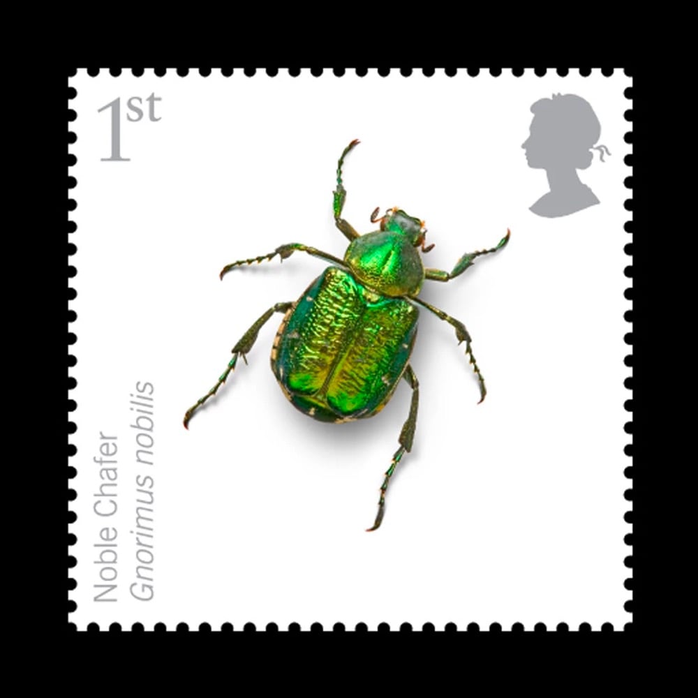
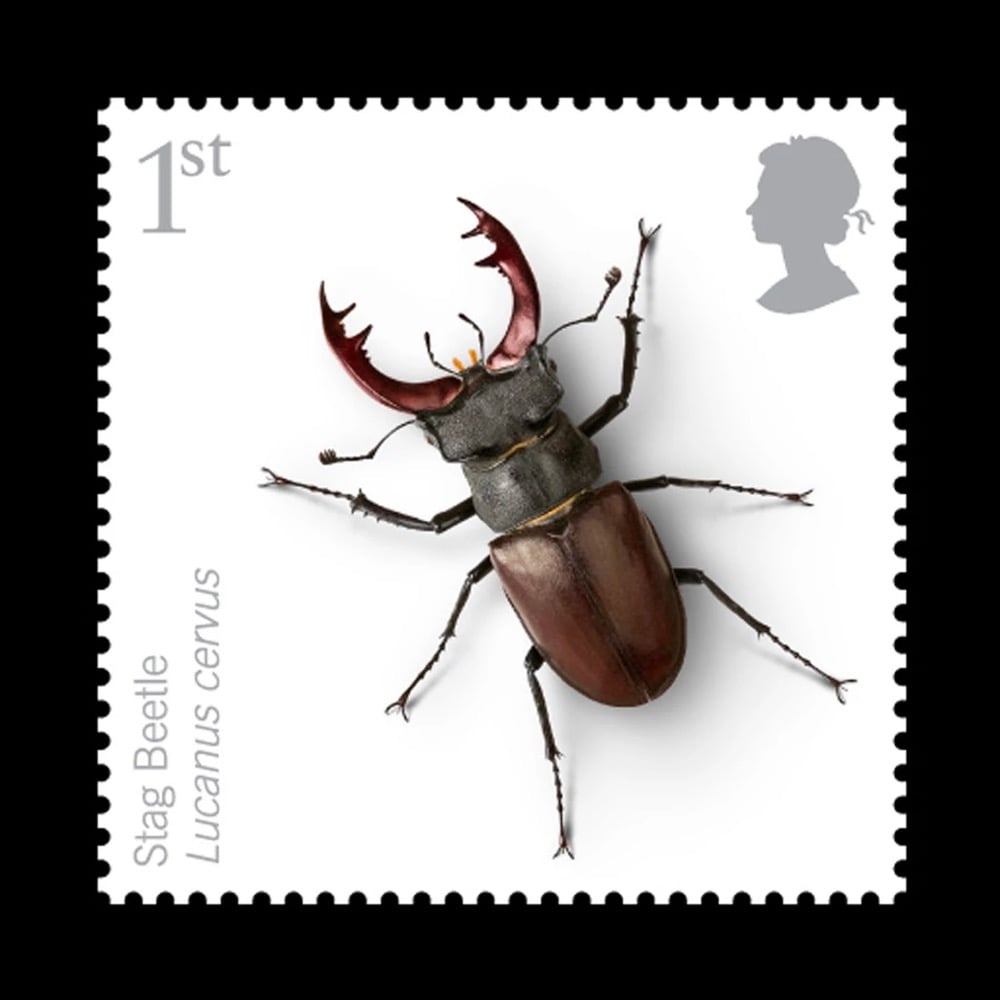
Via Steven Heller at Print, I ran across these lovely insect stamps designed by Osborne Ross for the Royal Mail.
And check out this other stamp project of theirs, featuring these irregularly shaped stamps that playfully wrap around the edges of the letters:
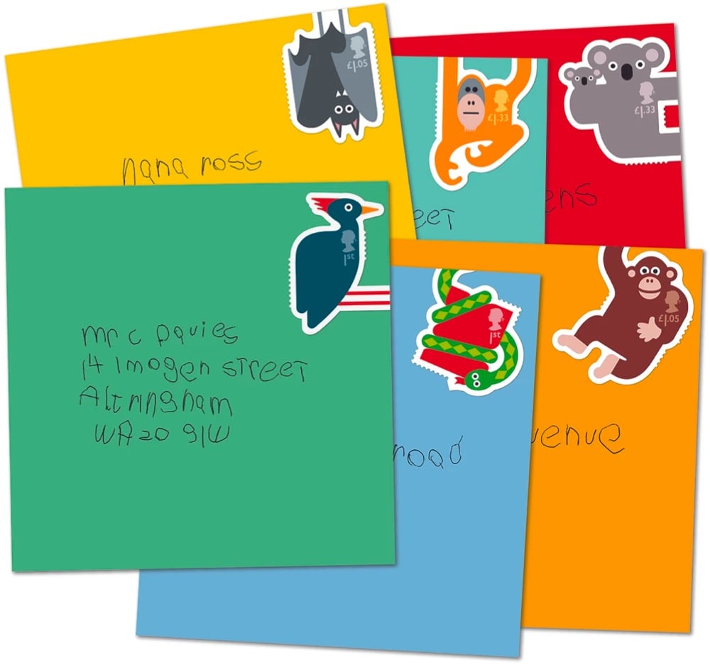
So good!
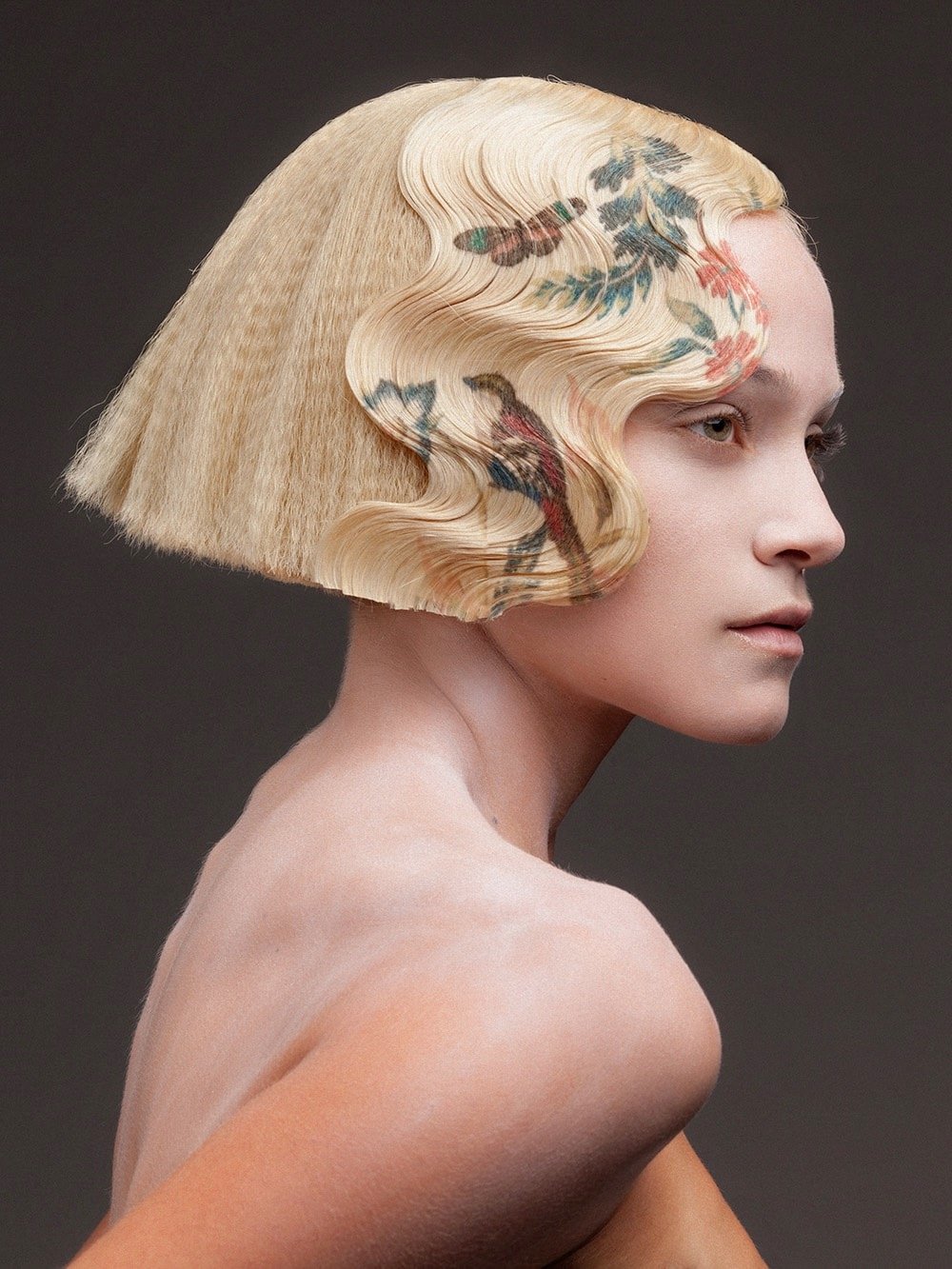
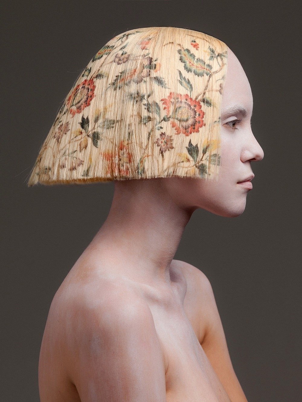
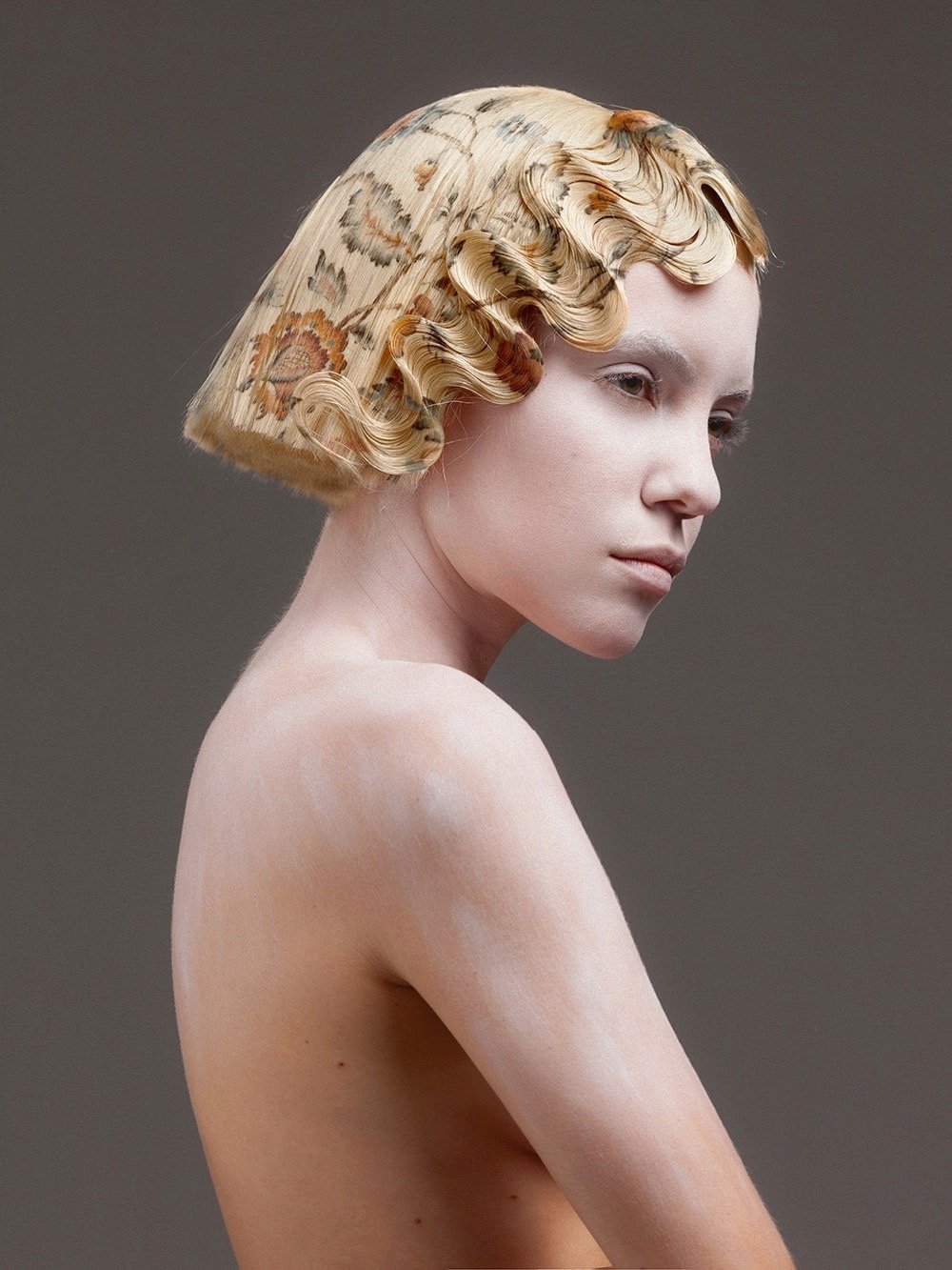
After many years of experimentation, Spanish hairdresser Alexis Ferrer has developed a process for vibrant, full-color printing onto hair extensions, culminating in his recent collection, La Favorite (photographed by Rafael Andreu on model Emma Fuhrmann).1
Sidebar: why is it always so difficult to find out who the models are in fashion shoots like this? The articles and Instagram posts list the photographer, the stylist, the makeup artist, the assistant, and even the clothing brands but almost never the person actually being photographed (unless they are famous). Is Fuhrmann not an equal participant in the process of getting these photos just right? Seems retrograde.↩
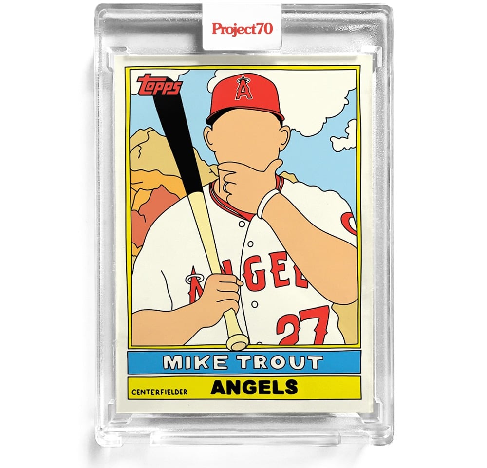
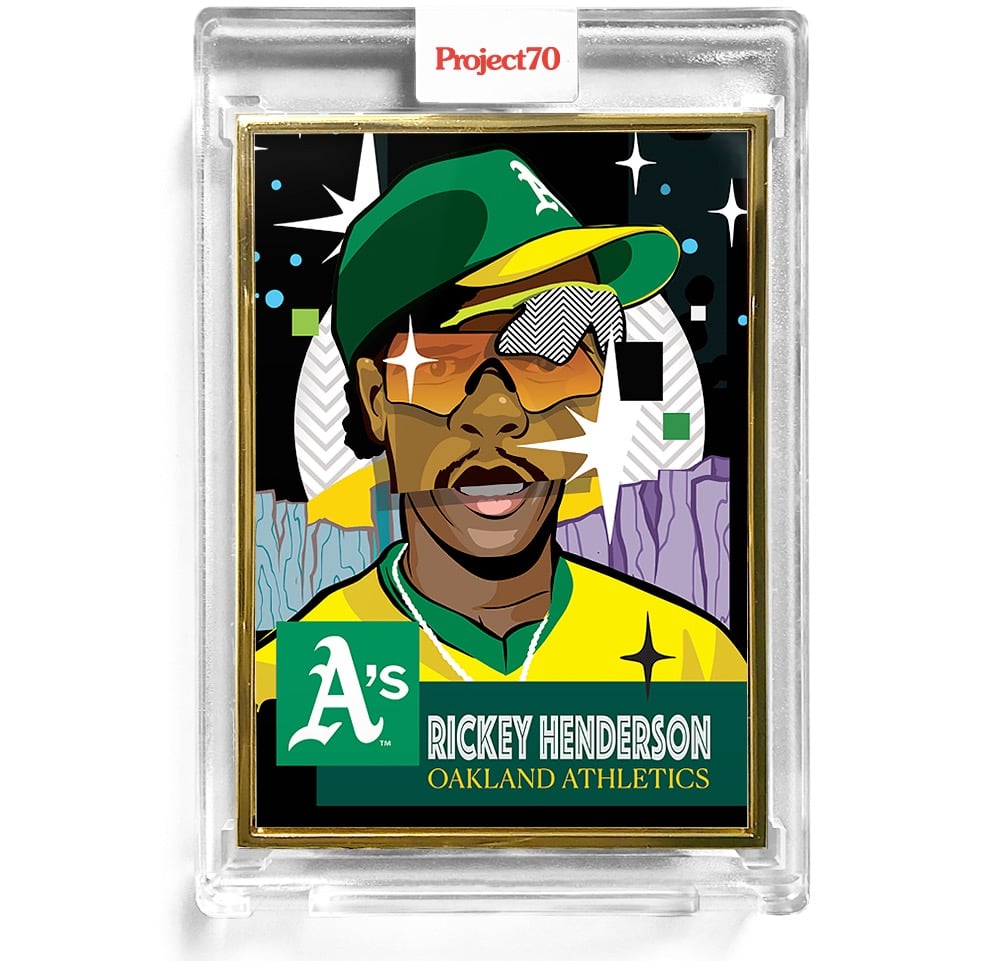
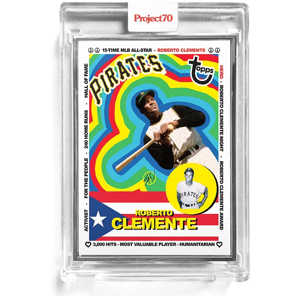
In 1951, Topps released their first set of baseball cards, hoping to entice people into buying their chewing gum. Instead, they created a sports collectable industry that’s still going strong 70 years later. To celebrate the anniversary, “artists and creatives around the globe are revisiting and reimagining 70 years of iconic baseball card designs” as part of Project70.
They’re releasing a few cards at a time for a limited time — you can find the current selection in the Topps online store. I’ve included three of my favorites above: 1976 Mike Trout by Fucci, 1953 Rickey Henderson by Pose, and 1983 Roberto Clemente by Sean Wotherspoon.
Question: Since the case is now part of the collectable being sold, do you have to put the whole thing in a bigger case to preserve its overall mint condition? Where does this end? (via print)
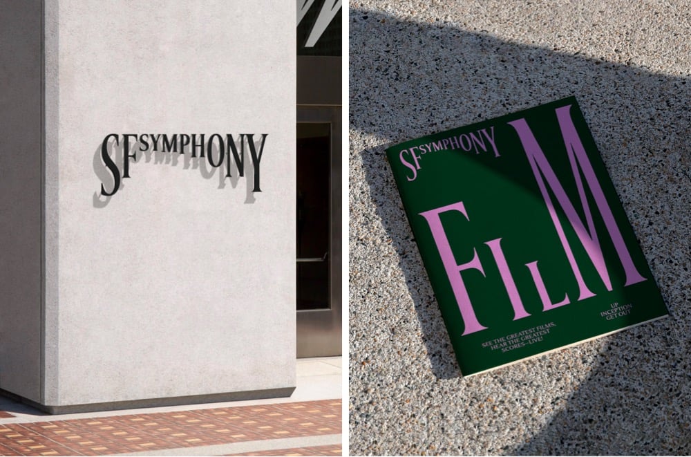
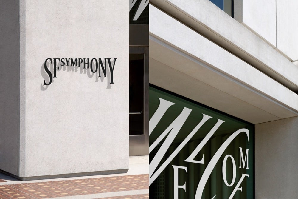
Design studio Collins has created a new brand identity for the San Francisco Symphony that uses type in a playful, almost musical way. This brief video demonstration is worth 1000 words:
Even better, you can experiment with your own type and music with the Symphosizer web toy. I made this (to the beat of Daft Punk):
(via @dkhamsing)
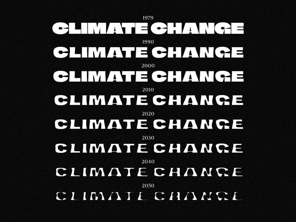
Finnish newspaper Helsingin Sanomat has released a free typeface called Climate Crisis that can help designers and the media visualize the urgency of the climate crisis.
The font is intended to be used by anyone who wishes to visualize the urgency of climate change. Especially the media can use it to enhance its climate-related storytelling through illustrations and dramatizations. Newspaper Helsingin Sanomat is at the moment using the font to draw attention to its climate-related stories.
The typeface has seven weights corresponding to data & projections of the minimum extent of the Arctic sea ice from 1979 to 2050. As you can see in the graphic above, the type gets thinner and thinner as the years pass. (via print)
The iconic album cover for The Beatles’ Sgt. Pepper’s Lonely Hearts Club Band is a collage of images of dozens of people — mostly famous, mostly men — arranged as though they’re standing in a group behind the band. A list of the people depicted on the cover (including Marilyn Monroe, Edgar Allan Poe, Karl Marx, Shirley Temple, and Fred Astaire) can be found on Wikipedia but Chris Shaw went a step further and tracked down the exact source images for each one of people & objects shown.
The collage was designed by Peter Blake and his wife Jann Haworth, and the cut-outs were assembled in Michael Cooper’s London photographic studio. Michael and his team toiled hard to construct the ‘cast of extras’, using a mix of photos sourced from the BBC Hulton Picture Library, images from private collections, waxworks and personal artifacts, including a gnome owned by Ringo Starr.
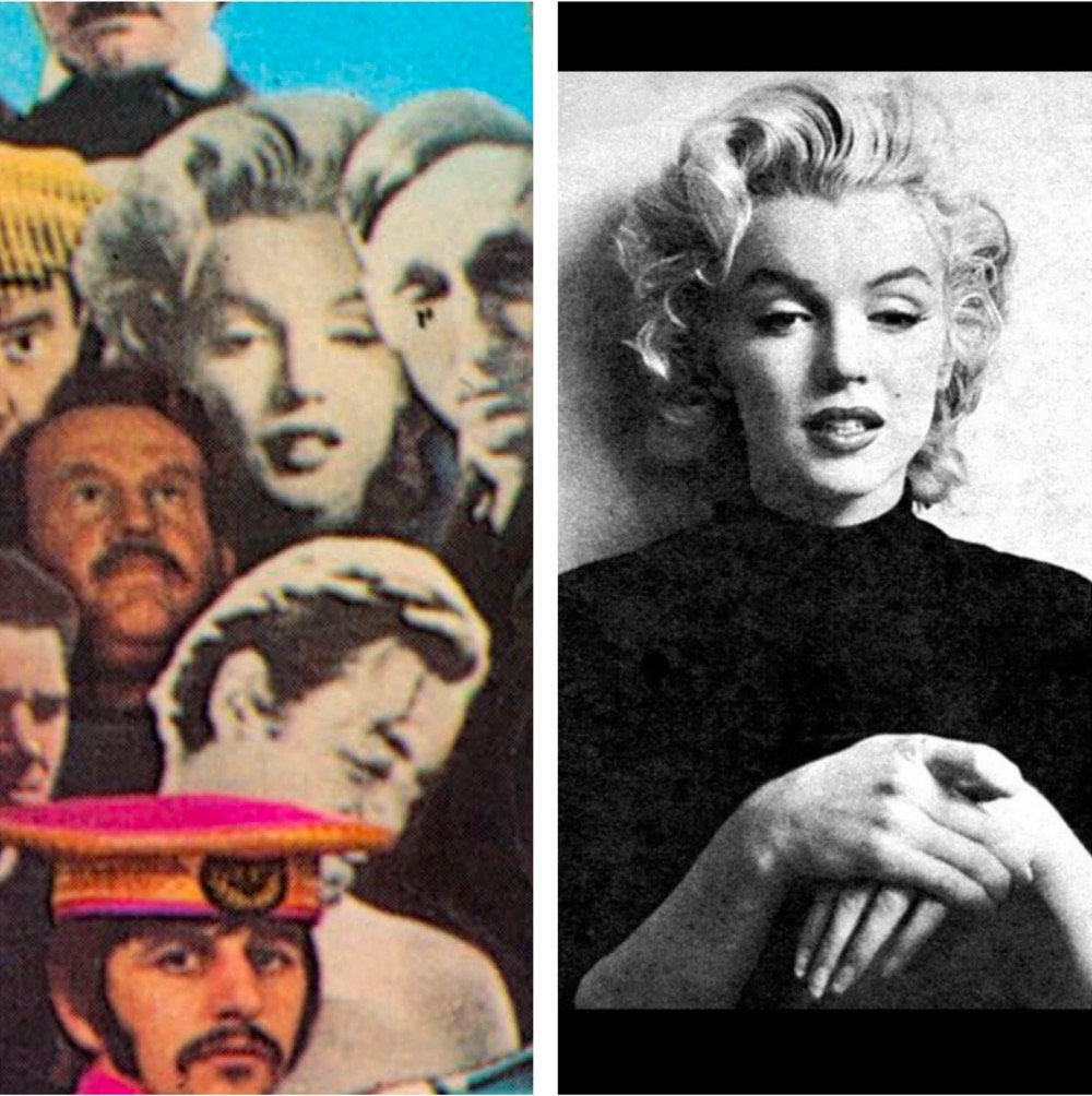
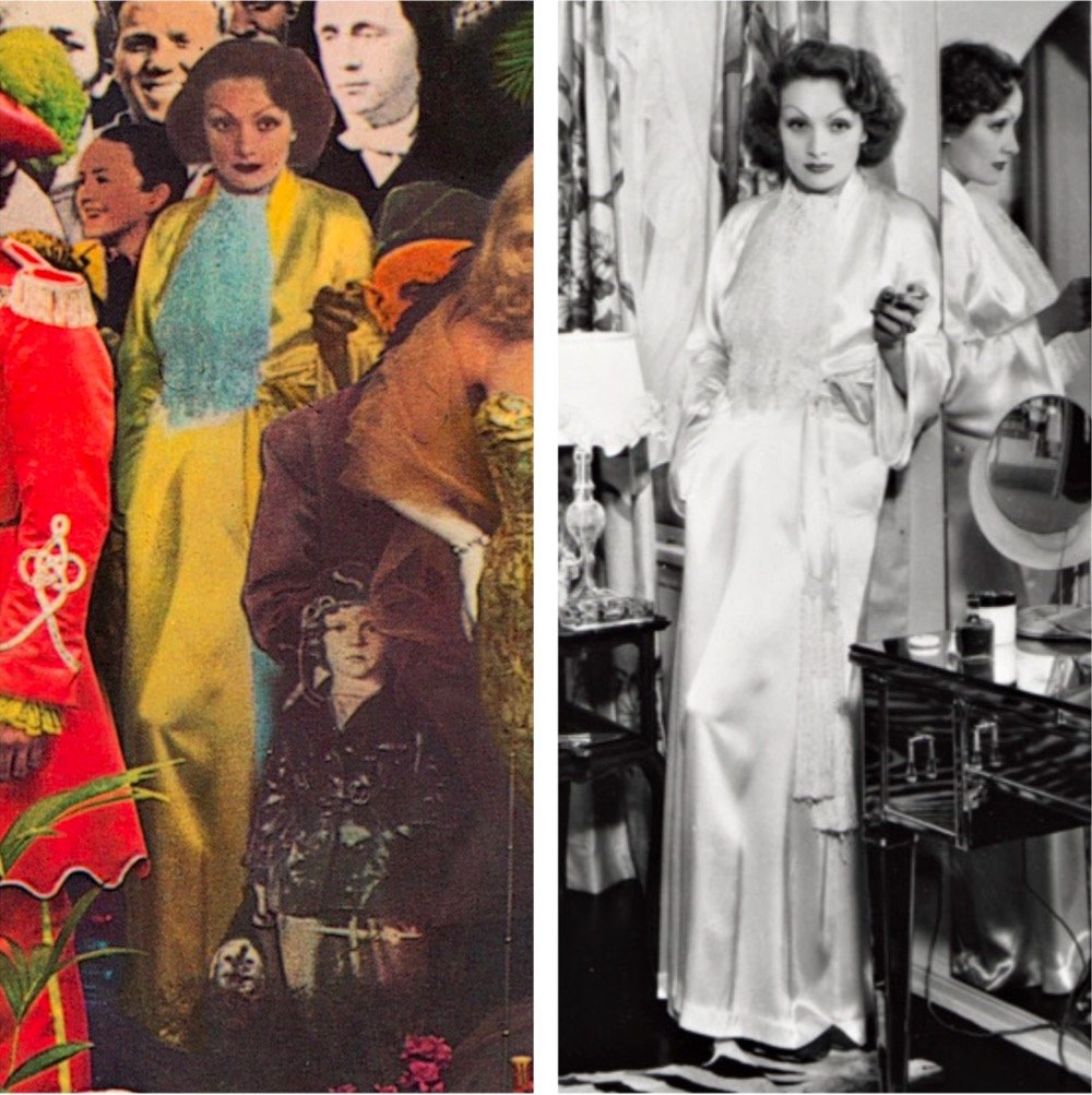
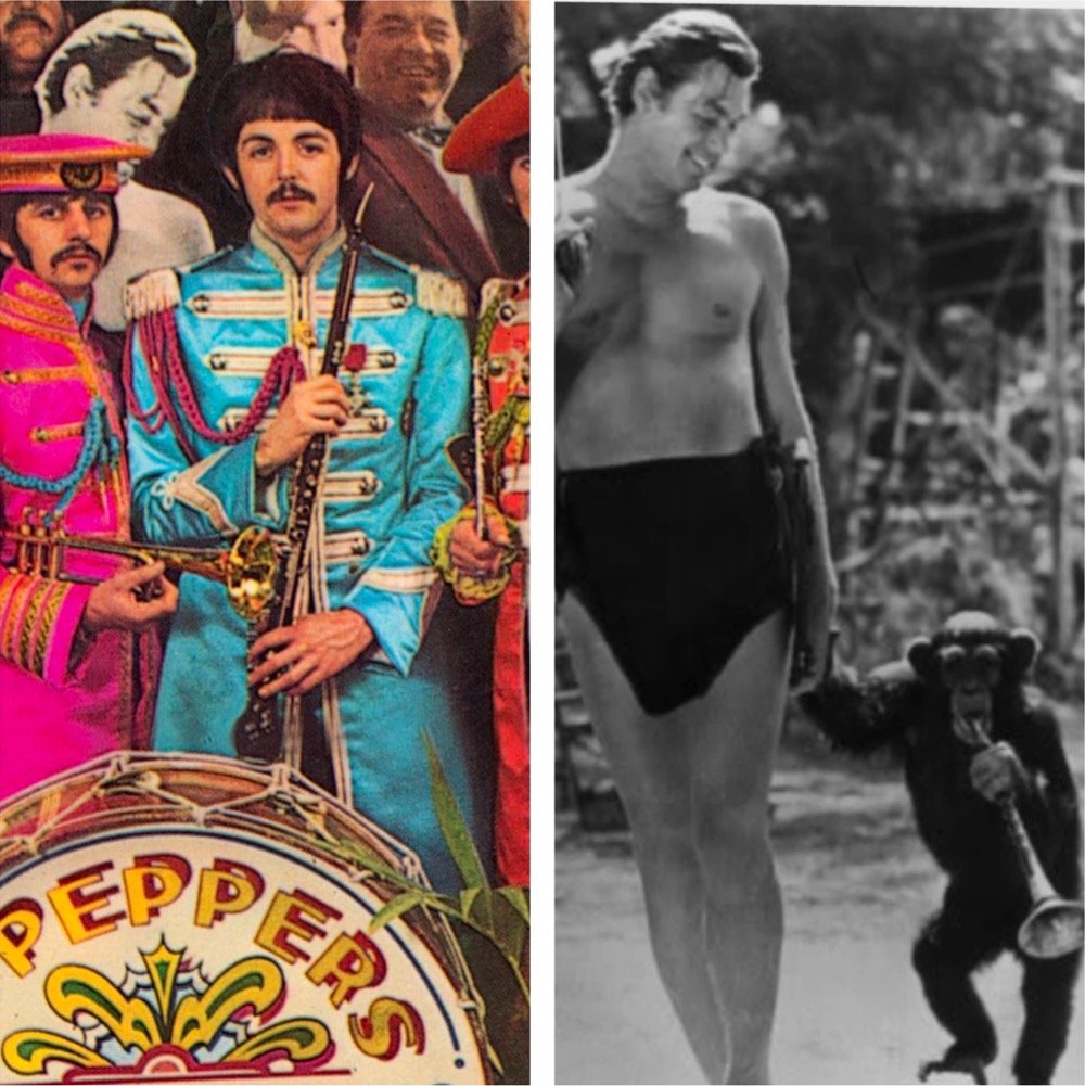
You so rarely get to see the raw materials used for design objects, so this is a real treat. (via waxy)
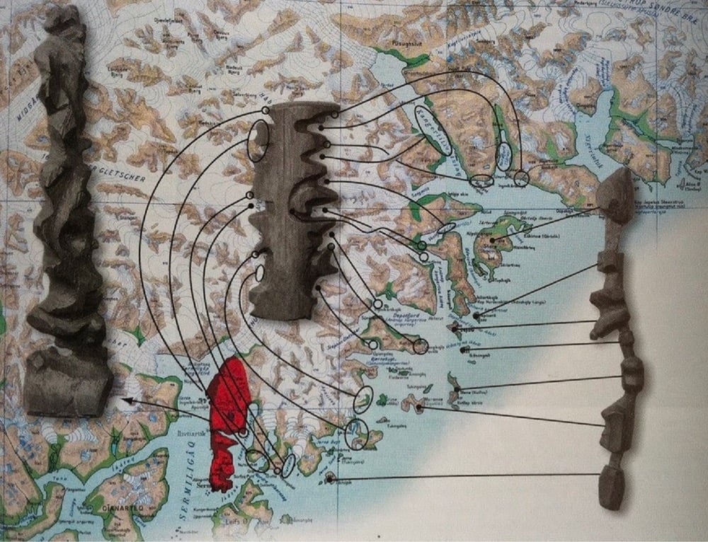
I love these coastline contour maps made by the Inuit people of Greenland. So simple and functional.
In Kalaallit Nunaat (Greenland), the Inuit people are known for carving portable maps out of driftwood to be used while navigating coastal waters. These pieces, which are small enough to be carried in a mitten, represent coastlines in a continuous line, up one side of the wood and down the other. The maps are compact, buoyant, and can be read in the dark.
See also the Marshall Islands Navigation Charts. (thx, kate)
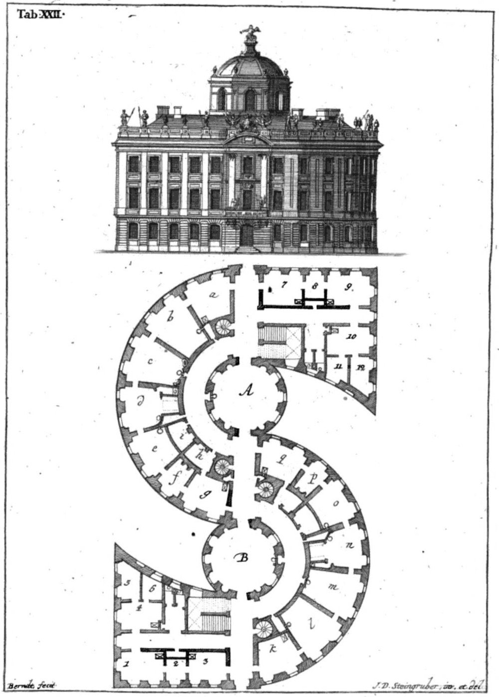
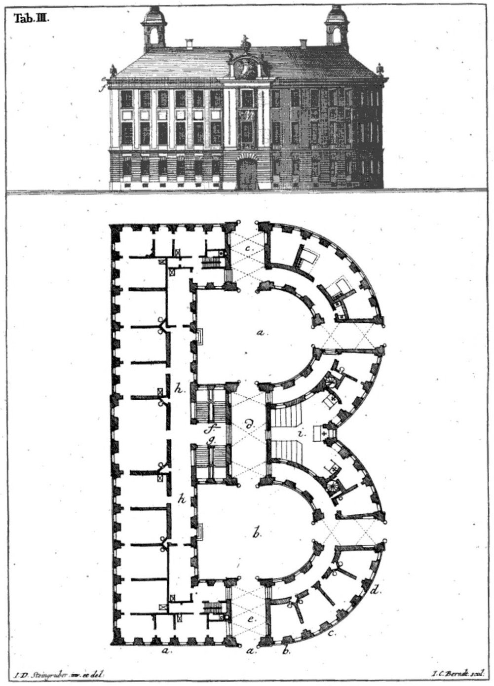
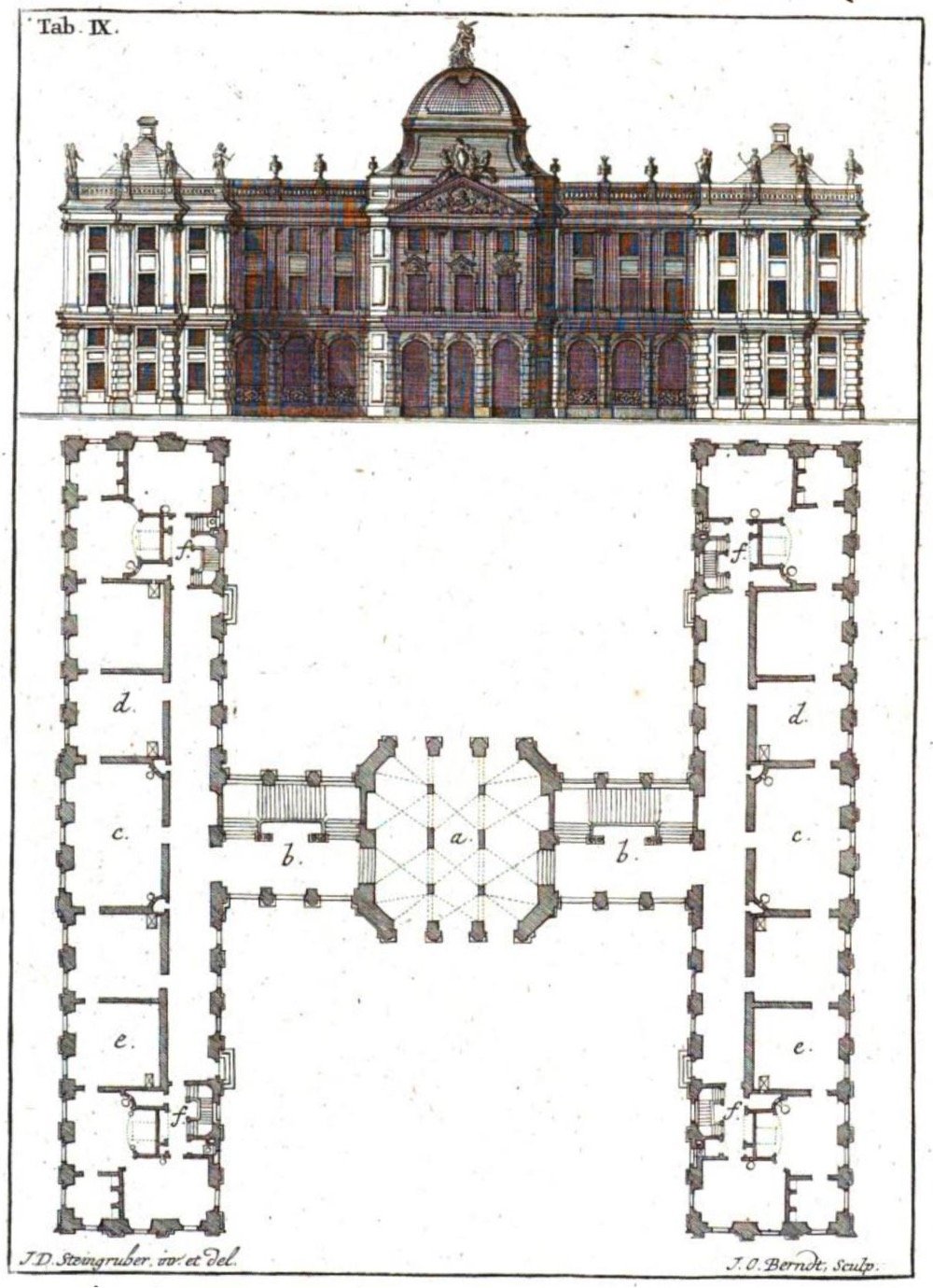
As someone who lives in an A-frame house, I love this architectural alphabet designed by Johann Steingruber in 1773. A typically great find by Present & Correct (see also).
I’d like to take a brief moment at the end of this weird and difficult week to appreciate this monogram that’s part of Burger King’s new brand identity.
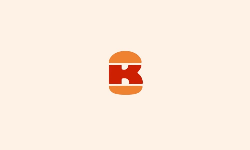
B + K + burger = perfect. I hereby dub this new tiny logo “The Slider”. It was designed by Stephen Kelleher Studio; you can see some of their other “explorations” as they worked on refining the finished monogram. Reminds me of Sandwich’s excellent logo.
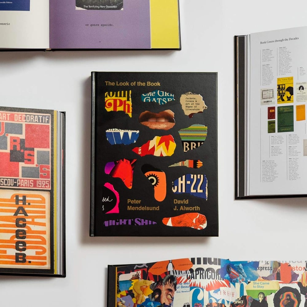
A book? (I love books.) About book cover design? (I love book cover design.) By book cover designer Peter Mendelsund? (I love Peter Mendelsund. Platonically. More as a concept, really — we’ve never met.) And co-written by David Alworth? (I don’t know David Alworth but he seems like a solid chap.) The Look of the Book checks a lot of my boxes and might do so for you as well.
As the outward face of the text, the book cover makes an all-important first impression. The Look of the Book examines art at the edges of literature through notable covers and the stories behind them, galleries of the many different jackets of bestselling books, an overview of book cover trends throughout history, and insights from dozens of literary and design luminaries.
See also The Best Book Cover Designs of 2020.
I somehow1 missed this a few months ago: Roman Mars’ venerable podcast 99% Invisible has resulted in a book that seems right up my alley: The 99% Invisible City: A Field Guide to the Hidden World of Everyday Design.
In The 99% Invisible City: A Field Guide to Hidden World of Everyday Design, host Roman Mars and coauthor Kurt Kohlstedt zoom in on the various elements that make our cities work, exploring the origins and other fascinating stories behind everything from power grids and fire escapes to drinking fountains and street signs.
Urban historian Kenneth T. Jackson gave the book a good review in the NY Times.
A brief review cannot do justice to such a diverse and enlightening book. The authors have sections on oil derricks, cell towers, the Postal Service, water fountains, the transcontinental telegraph, cisterns, telephone poles, emergency exits, cycling lanes, archaeological sites in Britain, national roads, zero markers, the Oklahoma land rush, cemeteries, public lighting, pigeons, raccoons and half a hundred other eccentric topics.
I suspect that with Mars’ podcast pedigree, the audiobook version of this (Amazon, Libro.fm) is pretty good too.
Lol, “somehow”. How anyone manages to keep up to speed on anything but their job and family (and maybe a couple of shows) during this pandemic is a wonder.↩
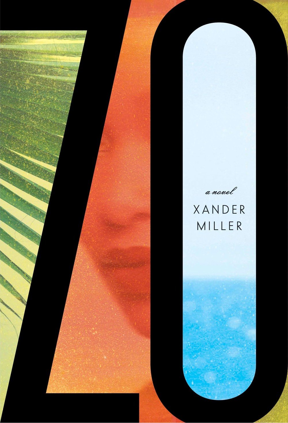
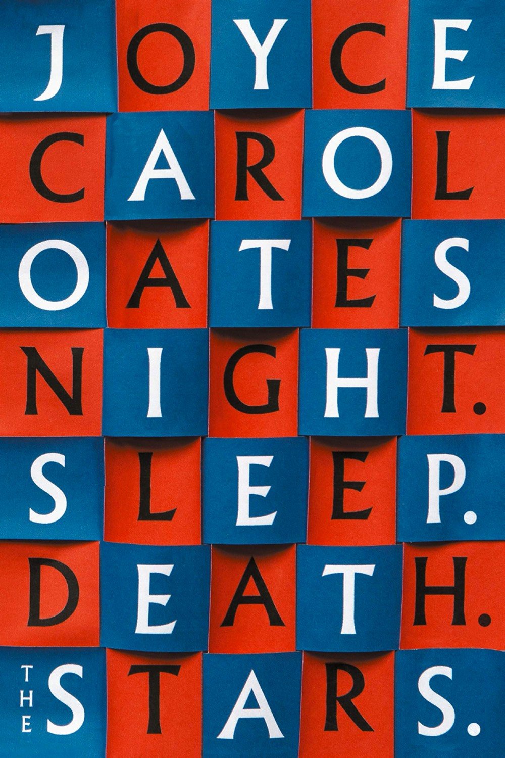
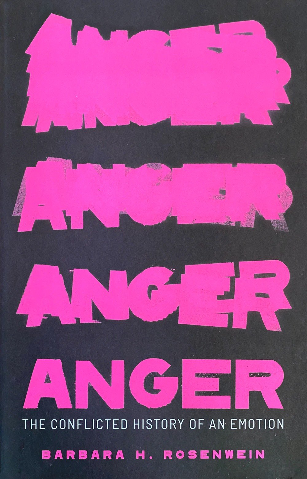
Well, what an unprecedented year that was! *sigh* 2020 is not a great year for ledes, so let’s skip right to the chase: many books were published this year and some of them had great covers. Lit Hub has the best roundup, with a selection of 89 covers chosen by book cover designers. Mark Sinclair’s ten selections for Creative Review are excellent as well. Electric Lit and Book Riot shared their cover picks as well.
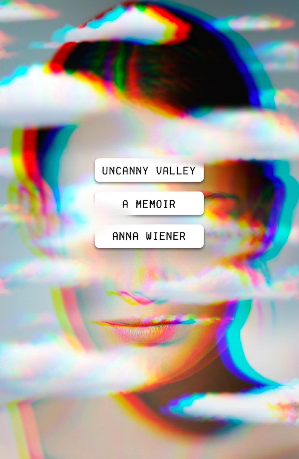
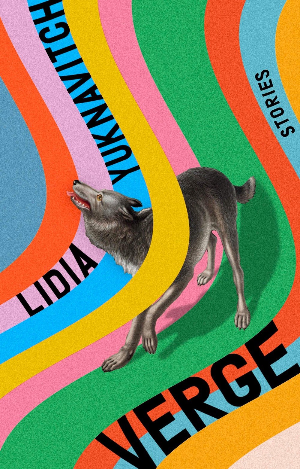
I chose a few of my favorites and shared them above. From top to bottom: Zo by Xander Miller designed by Janet Hansen, the UK cover for Night. Sleep. Death. The Stars. by Joyce Carol Oates designed by Jamie Keenan (the US cover for comparison), Anger by Barbara H. Rosenwein designed by Alex Kirby, Uncanny Valley by Anna Wiener designed by Rodrigo Corral, and Verge by Lidia Yuknavitch designed by Rachel Willey. Looking at great work like this always gets my “maybe I should have been a book cover designer” juices flowing…
See also The Best Books of 2020.
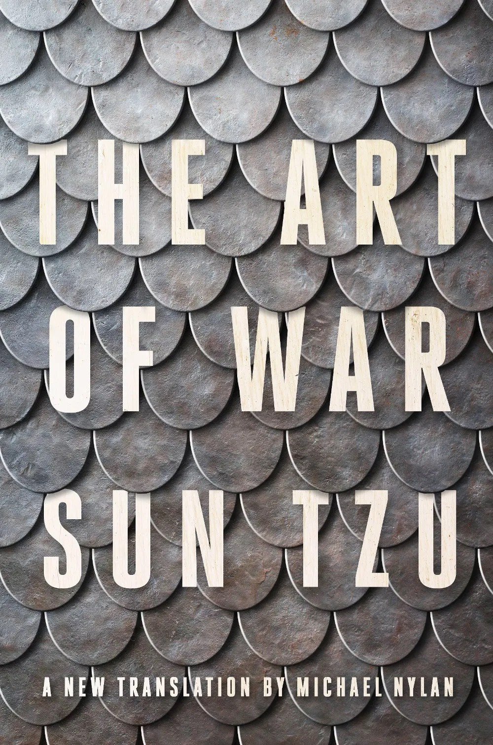
Update: Oh good, the annual list from The Casual Optimist is here: Notable Book Covers of 2020. A cover that he highlighted that I particularly liked is from Michael Nylan’s translation of The Art of War by Sun Tzu designed by Jaya Miceli.
The NY Times list of The Best Book Covers of 2020 is out as well.
For Design Ah by Daihei Shibata, Unendurable Line is a short film about sudden changes due to “thresholds hidden in everyday life”. The choral accompaniment to this is delightful.
See also Shibata’s Unexpected Outcome. If you’re in the US, you can watch 60 full episodes of Design Ah on THIRTEEN.
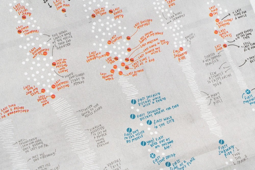
For the print version of the NY Times from this past Sunday, information designer Giorgia Lupi created a hand-drawn visualization that “tracks the last time [she] did something before the pandemic hit, and the first time she did something new with social distancing”.
Our lives have been transformed during the Covid-19 pandemic as the activities we used to do every day have been put on hold and new, socially distanced routines have taken their place. Pentagram partner Giorgia Lupi documents these changes in her own life in a data visualization commissioned by The New York Times for the cover of its “At Home” section, which runs as part of the newspaper’s Sunday edition. The hand-drawn visualization is a personal timeline that tracks the “last” time Giorgia did something before the pandemic hit, and the “first” time she did something new as she started to emerge from lockdown.
Not hand-drawn, but I remember pretty clearly what my lasts were:
I don’t remember my firsts as well, although one that sticks out is eating french fries (take-out) in July. On a normal day, french fries are delicious but when you haven’t had them in months, they are otherworldly.
This video is a lovely little rumination by Iancu Barbarasa “about collecting, cycling caps, art and design, personal connections and why it’s worth doing something for a long time, even if the benefits are not clear at first.”
Many think some people are special but usually those people just put a lot more time in it than others. This applies to sports, arts, almost everything. It’s worth doing something for a long time, even if the benefits are not always clear. Good surprising things come out of it. You also learn about yourself in the process.
His inspiration in doing the film was to “inform, delight, and inspire”:
I mentioned above Milton Glaser’s “inform and delight” definition of art. It’s brilliant, but I always felt something was still missing from it. So I’d say that art — and any creative’s work — should aim to “inform, delight and inspire”. Hopefully my film will inspire people to start something of their own, or share what they’re already doing with other people. That would bring joy to everyone, and there’s never too much of it.
You can check out Barbarasa’s cycling cap collection on Instagram. I have never been much of a collector, but my 22+ years of efforts on this site (collecting knowledge/links?) and my sharing of photos on Flickr/Instagram over the years definitely have resulted in some of the same benefits.
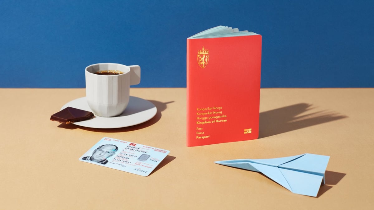
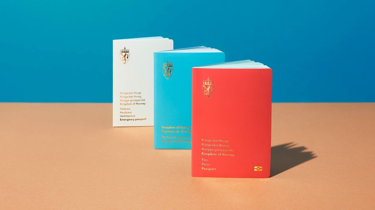
Last year, I shared the concept designs for Norway’s new passports by creative agency Neue. Last month, the first documents using the new design were released. You can see them here.
Aside from a design that makes the passport safer, the passport also has details from Norwegian nature used both as a background illustration and a security element.
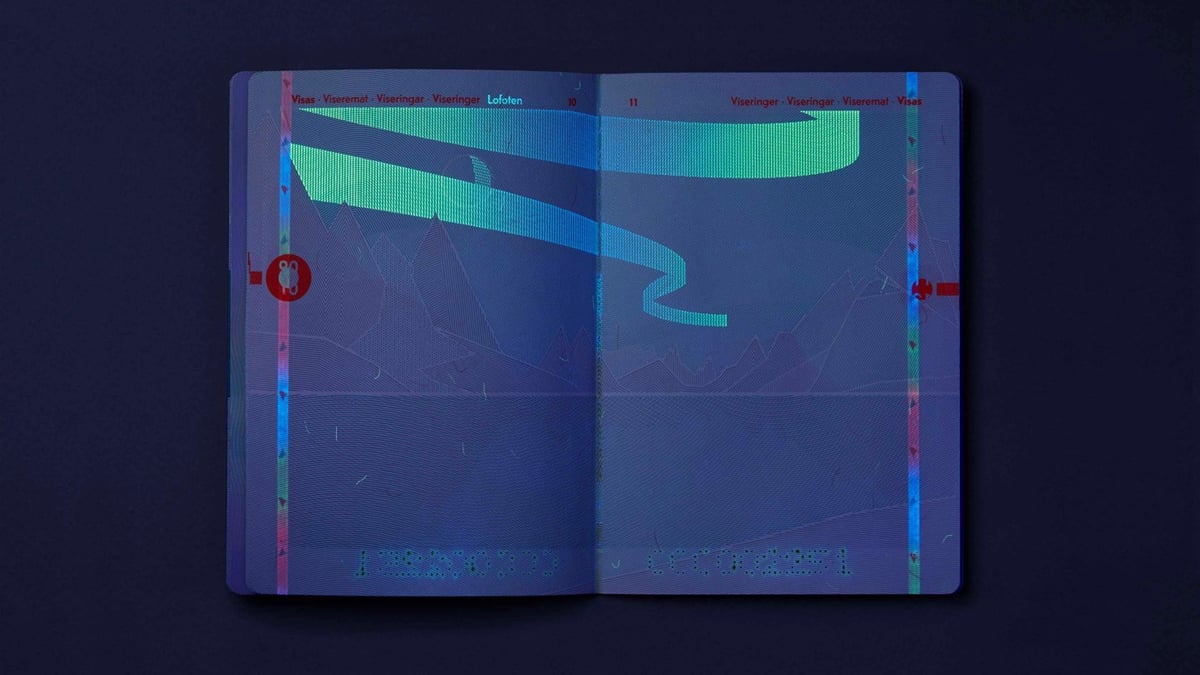
When the pages of the passports are placed under UV light, the reproduction of the Norwegian landscape will change from day to night, with, among other things, beautiful northern lights and clouds.
You can see the appearance of the northern lights under UV in the third image above — what a great detail! And I liked this explanation regarding the shared ownership of the passport:
The documents need to ensure identification for its holder and for controlling authorities — domestically as well as abroad. This implies that the ID documents are both a private and a public matter. The document’s holder should feel proud ownership, thus treating the documents carefully and with respect.
When we can all travel again, I will be on the lookout for these sharp-looking documents. And how does one get Norwegian citizenship…? (thx, bård)
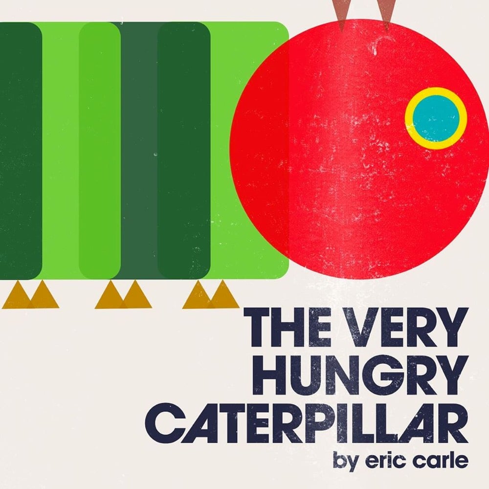
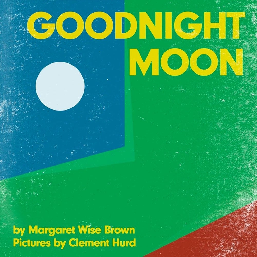
Over on his Instagram, Raj Haldar is making modernist versions of book covers for children’s books. So far there’s Goodnight Moon, The Snowy Day, The Very Hungry Caterpillar, Haldar’s own P Is For Pterodactyl, and a few others. Here’s what he says about Goodnight Moon:
Today, I’ve reduced ‘Goodnight Moon’ to nothing more than a few circles, rectangles, and triangles. What’s amazing, and a testament to how deeply this classic picture book is embedded in our collective consciousness is that even as a collection of the most simple forms, the cover is thoroughly recognizable.
(via print)
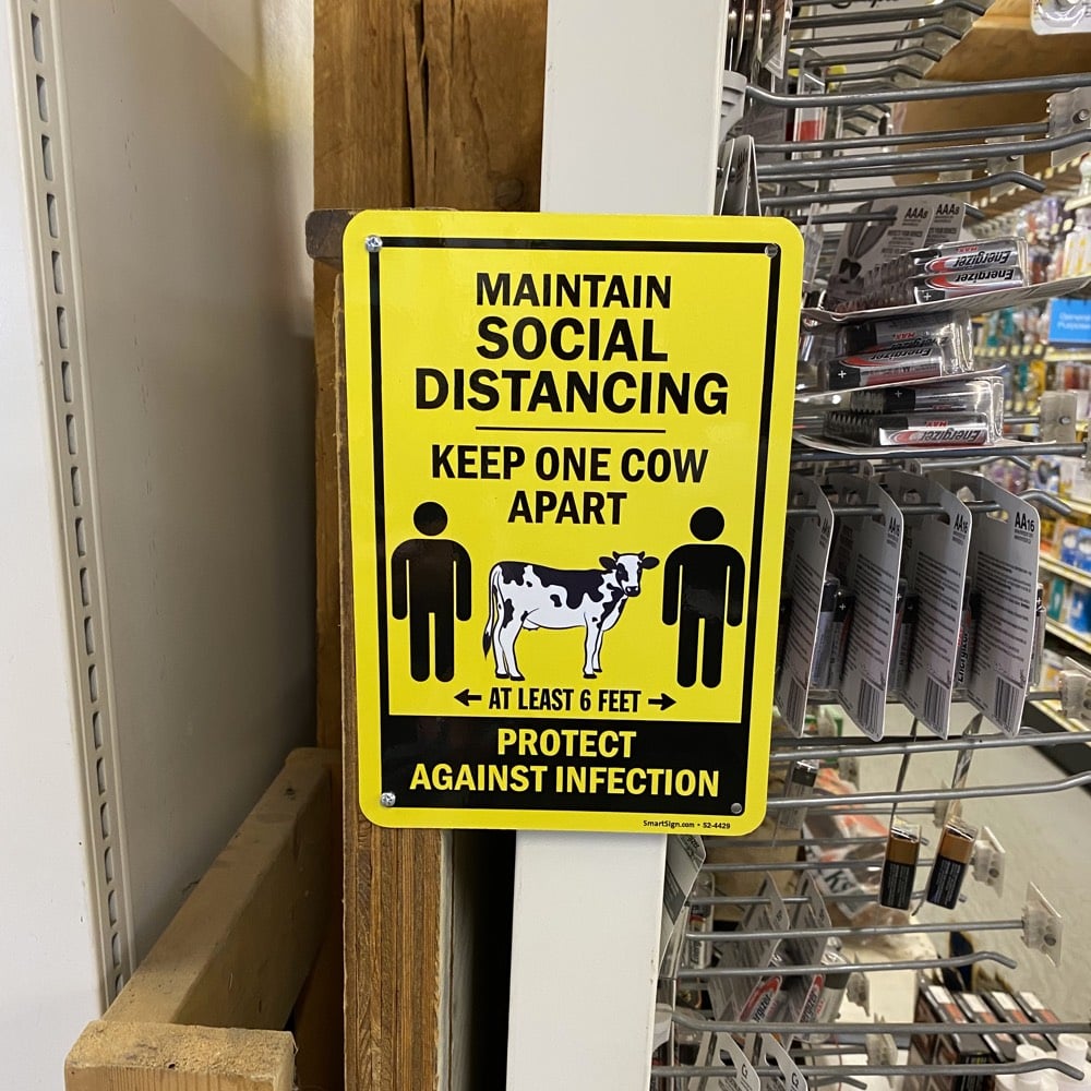
Public health safety measures don’t have to be bureaucratic, dour, and oppressive. They can even be fun. This is a sign from my local hardware store here in Vermont reminding shoppers to social distance:
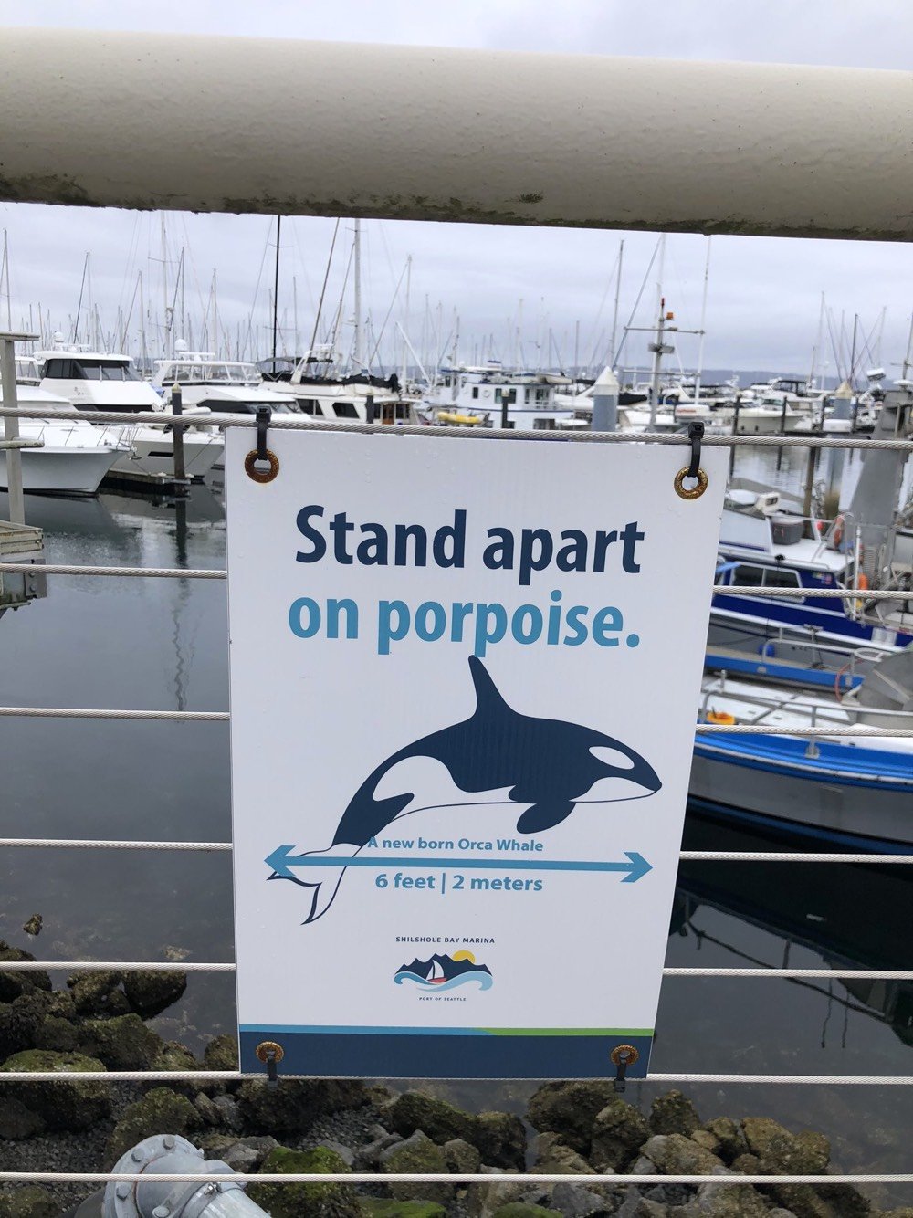
Journalist Rebecca Boyle recently asked her followers to share their local Covid-19 signage and they responded with some great examples.
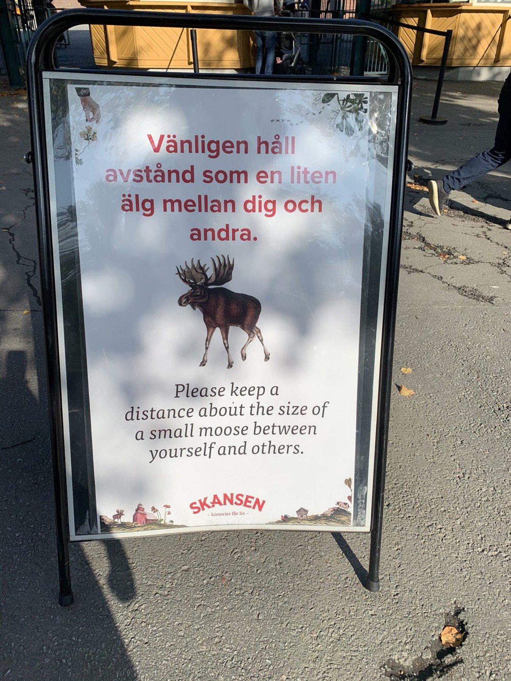
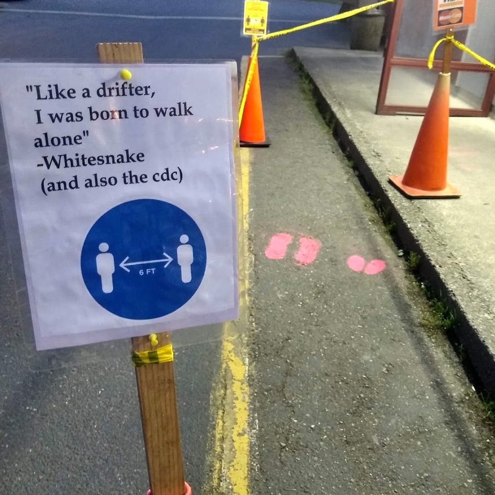
This homage to the Ministry of Silly Walks might be my favorite:
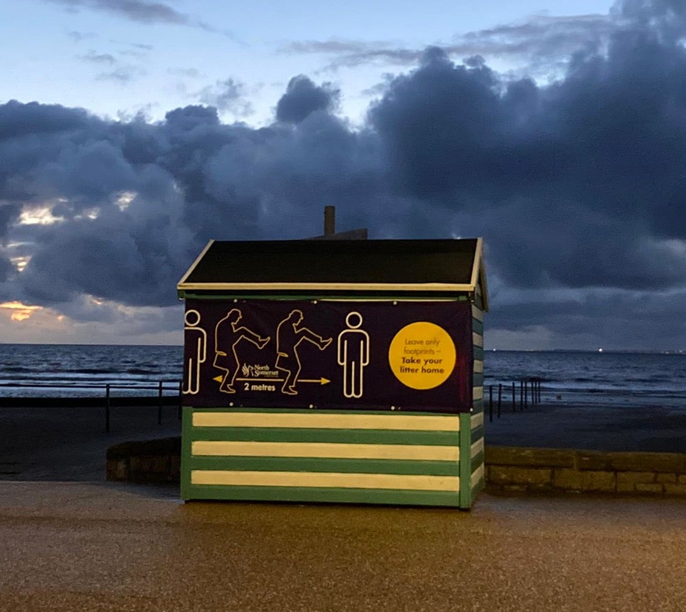
You can scroll through the whole thread for many more.
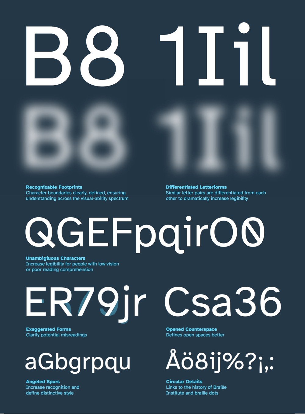
Atkinson Hyperlegible is a free typeface developed by the Braille Institute and Applied Design Works that makes text more readable for people with low vision.
“People may be surprised that the vast majority of the students who come to Braille Institute have some degree of vision,” says Sandy Shin, the institute’s vice president for marketing and communications. “They’re not 100% blind.”
Thus, most of the Braille Institute’s 37,000 clients across Southern California don’t depend on the dot-based Braille language. Instead, they rely on spoken-word tools and accessibility standards that encourage text publishers to think more carefully about the legibility of words on pages.
As you can see in the graphic above (taken from their summary PDF), Atkinson Hyperlegible’s letterforms are constructed so that each letter is as distinctive as possible so that it’s recognizable even when blurry or distorted by low vision. You can download Atkinson Hyperlegible on the Braille Institute site. (via print)
Data visualization pioneer Edward Tufte has published four books on the art and science of displaying information, including the seminal The Visual Display of Quantitative Information in 1983. To that set, he now adds a fifth book: Seeing with Fresh Eyes: Meaning, Space, Data, Truth. I couldn’t find a description of the book, but the website lists the table of contents and shows a few of the page layouts.
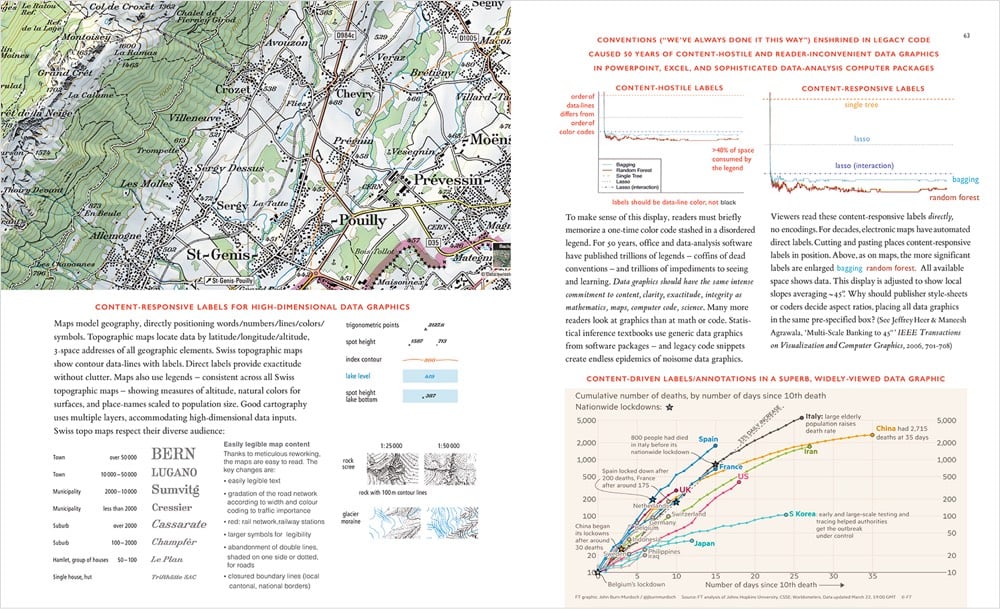
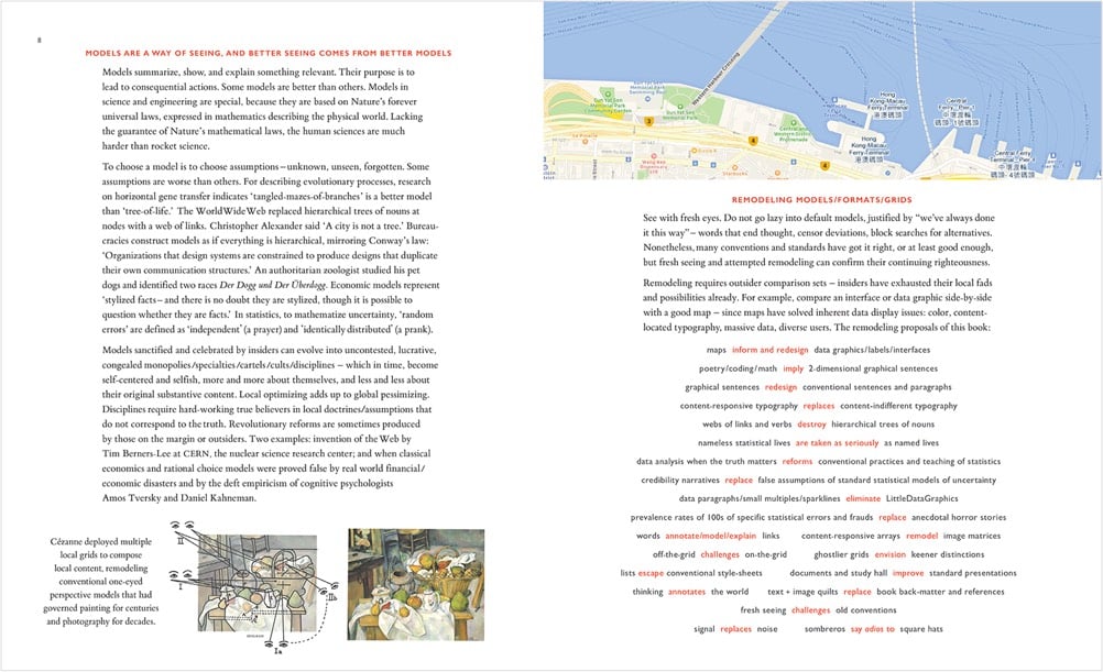
His previous four books are some of my favorites about design. You can only order Seeing with Fresh Eyes direct from his site, which says the book is shipping in mid-October. (thx, dewayne)
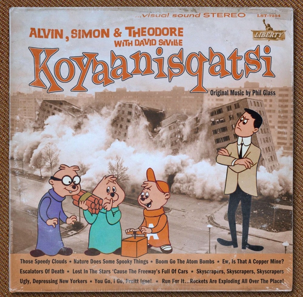
This album cover was tweeted out the other day by Philip Glass’s official account with no additional comment. What really makes it IMO is the song titles listed at the bottom of the cover: Those Speedy Clouds, Escalators of Death, Run For It…Rockets Are Exploding All Over the Place!
I tried to track down who made this, but the only other instance I could find online was on Philip Glass’s Instagram exactly one year ago. Koyaanisqatsi is a serious work of art — it’s refreshing to see how playful Glass is about its representation. You could imagine other artists/musicians not being so chill about it.
Update: Aha, designer Cris Shapan made this. (via @jdpbbank)
Update: Here’s a short snippet of what this album might sound like.
Socials & More