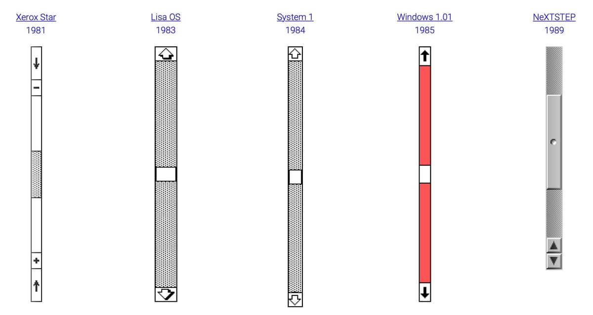
This is the kind of thing fin to look through while at the same time wondering “you did what now??” Sébastien Matos researched and recreated the scrollbars of various operating systems of the last thirty years. Grayson Blackmon at The Verge goes through all of them and gives his “very serious review of scroll bars through history.”
It’s part of the Information mesh projects by the The ECAL study group, part of the swissnex Salon.
Information Mesh is a web platform celebrating the 30th anniversary of the World Wide Web that explores social, technical, cultural and legal facts throughout different interactive timelines. … The timelines present an overview of Web history, starting with the proposal for hypertext by Tim Berners-Lee at CERN in 1989, initially under the name “Information Mesh.” From this start date, users can then explore 30 years of evolution.
I really enjoyed Amber Case’s essay “The Hidden Cost of Touchscreens.” It’s a quick but surprisingly thorough look at where touchscreen interfaces are inappropriate or just plain go wrong.
For instance, touchscreens in cars are problematic for anything that’s going to be used during driving, because well, touchscreens require looking at a thing. For muscle memory and mission-critical tasks, physical buttons are better.
But I also appreciated her nuanced, experience-driven take on ways to improve touchscreen design, where too often clean aesthetics have pushed out strict usability.
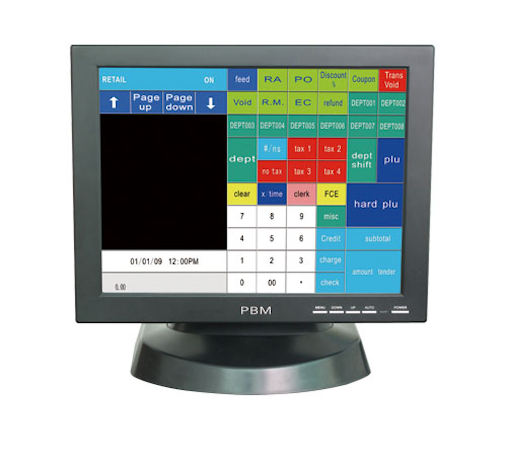
Touchscreen design could benefit from some basic design principles. Color-based interfaces take less time to parse when they are glanced at. Image-based interfaces take longer for the brain to process, and the lack of contrast can be confusing, because each item must be distinguished from adjacent items. When so many images look alike, service workers must rely on position and muscle memory for speedy use.
When I worked in food service and in the mailroom, the uglier touchscreens were always easier to work with. They were color coded with bright, contrasting colors, making the boundaries between numbers or items very obvious. I found that the colors reduced mistakes. I’d usually tap the right items after barely even glancing at the interface. After a while, I’d only check the screen for mistakes at the end of the process, before submitting an order or printing a receipt.
I think touchscreens in general are more usable now than they used to be, simply because of learning effects: more of us are used to dealing with touch interfaces in lots of different contexts, and we translate that familiarity wherever we go. At a certain point, though, we bump up against some hard limits of the human brain, eyes, and hands. Trying to fight against those hardly ever turns out well.
Report from Etech on Jeff Han’s demo of a “multi-touch user interface”. Be sure to watch the videos linked to at the end…it’s the interface from Minority Report in action.
The iTunes 5 Announcement From the Perspective of an Anthropomorphized Brushed Metal User Interface Theme. If you’re a Mac nerd, you’ll love this because it’s pretty damn funny and if you’re not, you probably won’t get it.
Socials & More