kottke.org posts about National Geographic
Over a period of 8 years, explorer and photographer Bradford Washburn worked with a small team and National Geographic to produce a map called The Heart of the Grand Canyon. Published in 1978, it is “still considered by many to be the most beautiful map of the area ever created”.
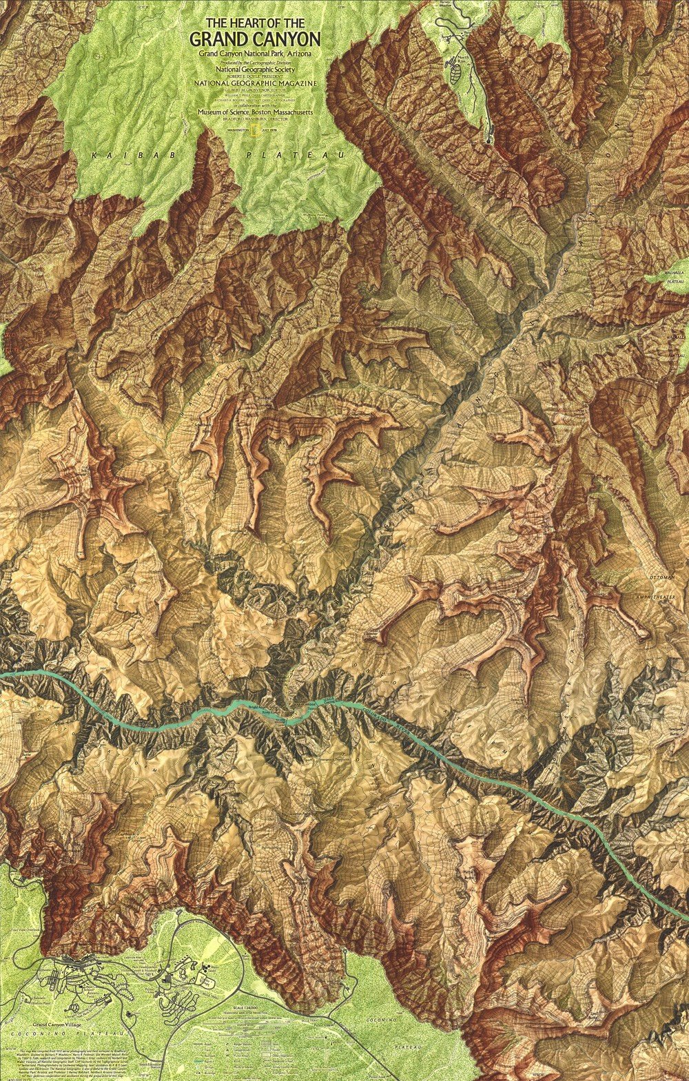
Here’s a closeup view of part of the map, which shows just how much detail is there:
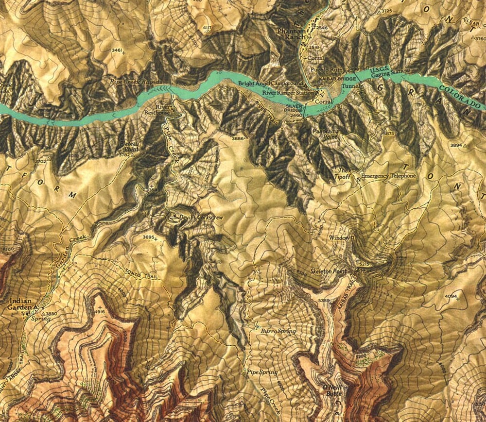
Often Washburn was dropped off on top of a pinnacle or small butte along with surveying equipment, such as a state-of-the-art laser range-finder device still under development, on loan from the company that made it. Using a built-in telescope, Washburn would aim the helium-neon laser at a reflecting prism positioned on another point miles away. The laser beam would be reflected back to the range finder, which measured how long the beam’s round-trip took and translated that into distances that were accurate to within 6/100 of an inch per mile. Washburn used a 40-pound surveying instrument called a theodolite to measure the angles between each of the control points, providing him with the relative position and height of each set of points.
After a few weeks in the canyon, Washburn was convinced of the potential for “a map of really superlative beauty as well as topographic quality.” Knowing exactly where to find the expertise, and the funds, needed to realize that potential, he asked the National Geographic Society to join the project.
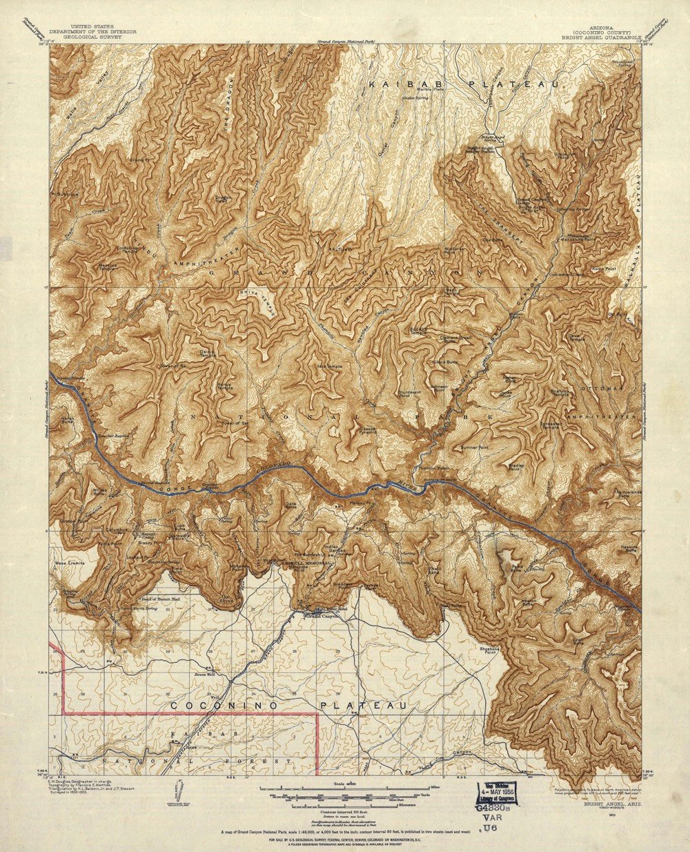
The surveying took years and then came the data analysis & production phases…it took over 1000 hours just to paint the relief shading onto the map. If you want to compare Washburn’s map to earlier efforts, check out this post at Codex 99. This 1903 USGS map was the best map into the 1960s:
Even in the age of crisp satellite views in Google Maps, The Heart of the Grand Canyon is a beautiful and useful map. You can purchase a copy of the 1978 map (and a refreshed 1999 version) from the National Geographic store.
With the 50th anniversary of the Moon landing coming up this summer, the media is about to go into Apollo overdrive. (And I am fully here for it!) So far, there’s been First Man and this Apollo 11 documentary featuring a recently discovered trove of 65mm footage. Add to that Apollo: Missions to the Moon, a documentary series by Tom Jennings for National Geographic. Here’s the trailer:
Engadget has some info on the content of the film:
Director Tom Jennings (who previously documented the Challenger explosion and Princess Diana) is relying on a few uncommon technological tricks to enrich the experience. He’s melding NASA footage with Apollo black box recordings, for example, and is syncing 30-track audio from Mission Control. The aim is to create an “Apollo-era time machine,” Jennings said.
Add an original Hans Zimmer soundtrack into the mix and this could really be something special.
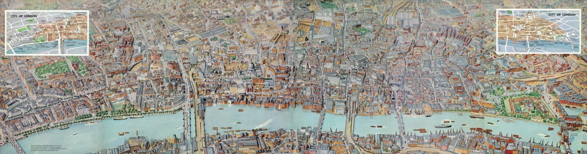
National Geographic is making digital copies of its century-plus archive of maps available to the public… with a twist. Immediate access to the full archive is subscriber-only. The rest of us get a new map a day, on Twitter, Instagram, or Facebook.
So you might get this gorgeous 1961 panorama of London, with individual hand-painted buildings…
… or you might get this 1894 sketch of Antarctica.
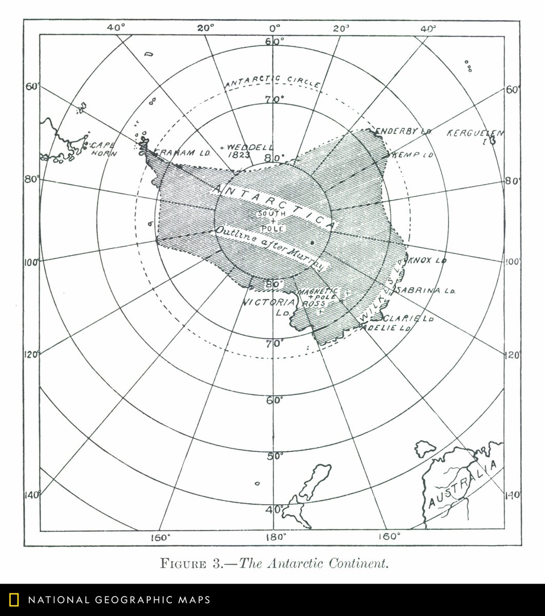
Which is not uninteresting, but it’s interesting for different reasons.
As a longtime advocate of digging in the crates, I have to applaud Nat Geo making creative use of its own archives. Even if the greedy part of me wants all the goodies at once.

Speaking of great magazine covers, for their issue on plastic, National Geographic put artist Jorge Gamboa’s arresting plastic bag iceberg image on the cover. A simple yet powerful concept, perfectly executed.
Update: The iceberg plastic bag is not an original concept. Prior art includes a 2015 ad campaign for Tesco and a pair of stock images on Getty (date not listed). It’s unclear whether Gamboa created his image after seeing these images or if multiple people had this same idea. (via @krjohn01/status/997198395189223424)
As part of their issue on race, National Geographic asked historian John Edwin Mason to dive into their archives to examine the magazine’s past coverage of people of color, both in the US and abroad. What he found was not pretty.
What Mason found in short was that until the 1970s National Geographic all but ignored people of color who lived in the United States, rarely acknowledging them beyond laborers or domestic workers. Meanwhile it pictured “natives” elsewhere as exotics, famously and frequently unclothed, happy hunters, noble savages — every type of cliché.
Unlike magazines such as Life, Mason said, National Geographic did little to push its readers beyond the stereotypes ingrained in white American culture.
“Americans got ideas about the world from Tarzan movies and crude racist caricatures,” he said. “Segregation was the way it was. National Geographic wasn’t teaching as much as reinforcing messages they already received and doing so in a magazine that had tremendous authority. National Geographic comes into existence at the height of colonialism, and the world was divided into the colonizers and the colonized. That was a color line, and National Geographic was reflecting that view of the world.”
Some of what you find in our archives leaves you speechless, like a 1916 story about Australia. Underneath photos of two Aboriginal people, the caption reads: “South Australian Blackfellows: These savages rank lowest in intelligence of all human beings.”
A laudable move, particularly for a publication owned by Rupert Murdoch.
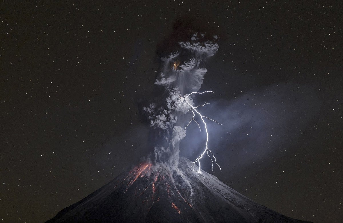
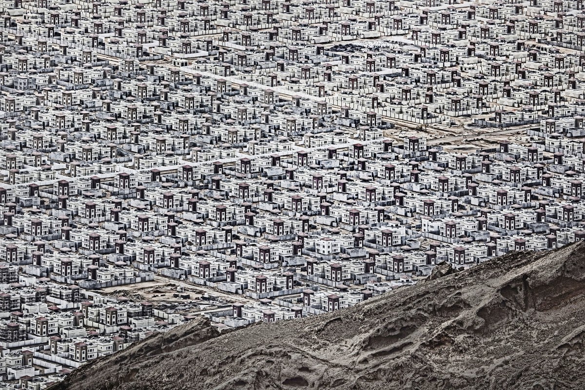

In Focus is sharing some of the photographs taken by the winners of the 2017 National Geographic Travel Photographer of the Year contest. The winning photo, of Mt. Doom the Colima volcano in Mexico, was taken by Sergio Tapiro Velasco, who will receive a 10-day trip for 2 to the Galapagos islands for his efforts. The second photo above was taken by Andrzej Bochenski and the third by Julius Y.
National Geographic Infographics is an anthology published by Taschen of some of the best infographics featured by National Geographic in the past 128 years.
Through seven sections — History, The Planet, Being Human, Animal World, World of Plants, Science and Technology, and Space — we encounter the rise and fall of the Roman Empire, the mysterious origins of the Easter Island statues, Cleopatra’s Alexandria and a history of Hawaiian surfboarding, all distilled in expert, accessible graphic form. We discover how our genetic patterns have been pieced together over the years or how hip-hop emerged as a cultural heavyweight; we get to grips with global warming, and explore our ever-expanding study of an ever-expanding universe.

Bravo to National Geographic for putting a transgender girl on the cover of the magazine. Editor-in-chief Susan Goldberg explains why:
Today that and other beliefs about gender are shifting rapidly and radically. That’s why we’re exploring the subject this month, looking at it through the lens of science, social systems, and civilizations throughout history.
In a story from our issue, Robin Marantz Henig writes that we are surrounded by “evolving notions about what it means to be a woman or a man and the meanings of transgender, cisgender, gender nonconforming, genderqueer, agender, or any of the more than 50 terms Facebook offers users for their profiles. At the same time, scientists are uncovering new complexities in the biological understanding of sex. Many of us learned in high school biology that sex chromosomes determine a baby’s sex, full stop: XX means it’s a girl; XY means it’s a boy. But on occasion, XX and XY don’t tell the whole story.”
As part of their coverage, the magazine went out, asked kids from around the world their thoughts about being boys and girls, and came back with this video.
National Geographic’s cartographic department celebrates its 100th birthday today. Here’s a look back at their work and some of NG’s most memorable maps.
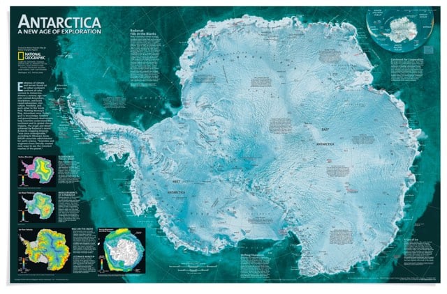
Our family subscribed to National Geographic for awhile when I was a kid. The maps and photos contained within brought this country bumpkin in closer contact with the world at large than even the TV news (which was admittedly all of 13-inches and in B&W to boot).
National Geographic has launched a new Tumblr site that features the less-celebrated-but-still-awesome parts of its vast photographic archive. I want this car:
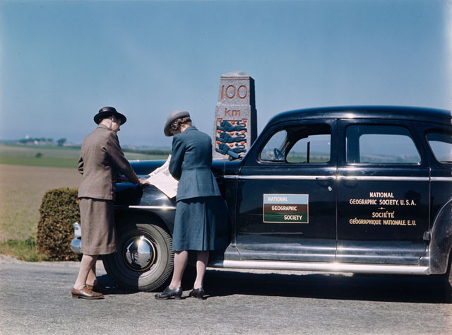
(via the verge)
The Big Picture has a selection of photos from this year’s National Geographic photography contest. It was difficult to pick a favorite, but I’ll go with this one:
A look at how little the essential design of National Geographic magazine has changed since its introduction in 1888.
National Geographic’s front cover is a great example of how well simple branding can be tied to a product or message. In this case, the slightly warm yellow has become a symbol of wonderful photography, intriguing articles and serves as a doorway into places worlds away.
I have fond memories of Fleer’s otherwise forgettable 1991 set of baseball cards because of the yellow border…probably NatGeo spill-over.
Socials & More