Norway’s new pixelated banknotes are gorgeous
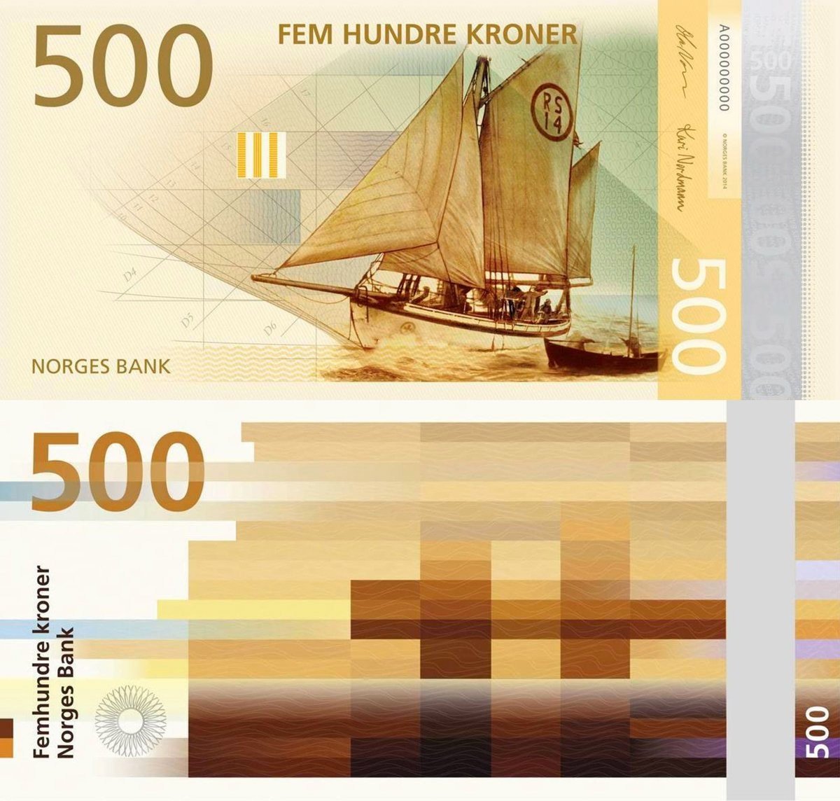
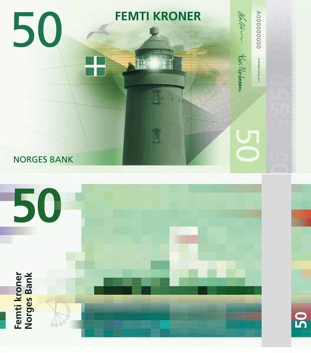
Back in 2014, I posted that Norway would start using new banknotes in 2017 featuring an abstract pixelated design on the reverse of each note. Time did the only thing it knows how to do so here we are in 2017 and the bills will begin circulating later this year. The overall theme for the notes is “The Sea”:
Norway’s long, gnarled coastline has shaped the identity of Norwegians individually and as a nation. The use of marine resources, combined with the use of the sea as a transport artery, has been crucial to the development of Norwegian society.
And each particular note has its own subtheme:
The 50-krone banknote: The sea that binds us together
The 100-krone banknote: The sea that takes us out into the world
The 200-krone banknote: The sea that feeds us
The 500-krone banknote: The sea that gives us prosperity
The 1000-krone banknote: The sea that carries us forward
The final design concept by Terje Tønnessen was chosen from among several finalists. I love the final design but also really like the concept by Aslak Gurholt with a children’s drawing on the back of each note echoing the illustration on the front.
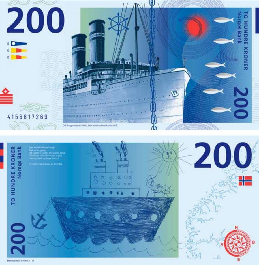
Also of note (ha!): Norges Bank crowdsourced several aspects of the design process but managed to do it in such a way as to avoid the Boaty McBoatface problem.




Socials & More