Bad design in action: the false Hawaiian ballistic missile alert
Note: The image at the top of this post does not show the actual interface. See the update below.
The Honolulu Civil Beat has tweeted a screenshot of the interface that was used to send an real alert for a nonexistent incoming ballistic missile on Saturday morning.
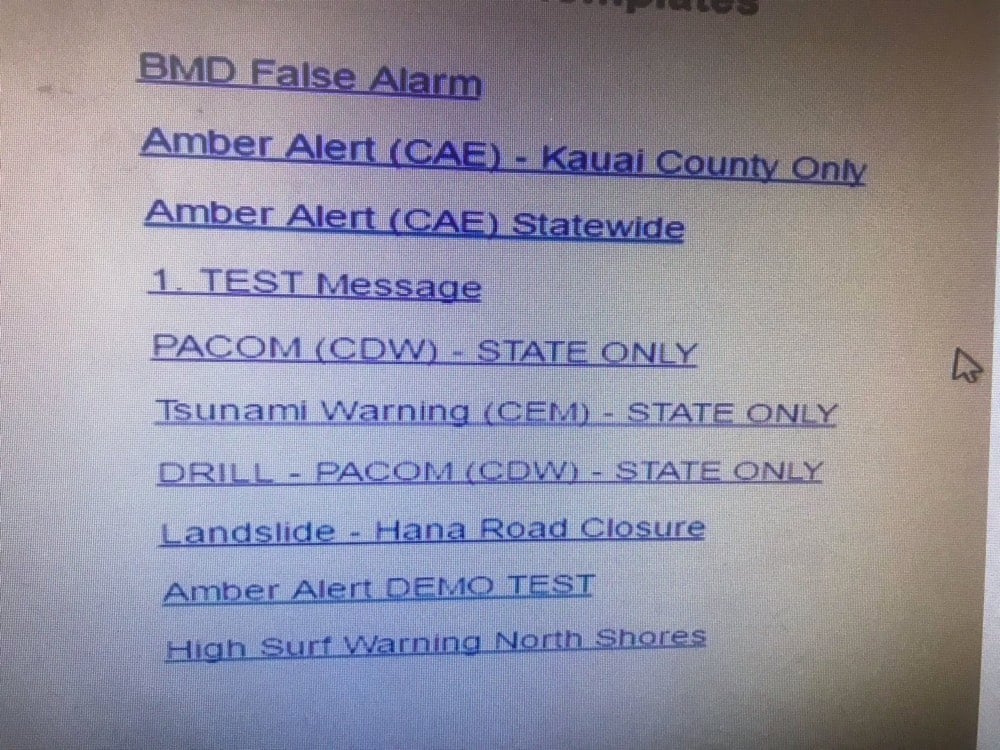
Instead of selecting “DRILL - PACOM (CDW) - STATE ONLY” from what looks more like a list of headlines on The Drudge Report than a warnings & alerts menu, the operator chose “PACOM (CDW) - STATE ONLY” and sent out a real alert.
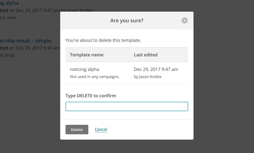
The design for this is obviously terrible. As others have noted, there are better interfaces for confirming much more trivial actions on our phones. In Mailchimp, the service that powers the Noticing newsletter, you are asked to manually type in the word “DELETE” as a confirmation for deleting a template (an action a tiny bit less consequential than sending out a ballistic missile launch alert):
But the response to the false alarm has been worse. The employee who triggered the erroneous alert has been “reassigned” and, as the news cycle continues to wind itself up, it wouldn’t surprise me if he were soon fired. And the fix for this, again per the Honolulu Civil Beat, is the addition of the “BMD False Alarm” link at the top of the menu, presumably so that if a real alert is sent out again in the future, it can be followed by a message saying, “actually, that was a drill”.
Hopefully this, uh, “redesign” is temporary and a full overhaul is in the works. That menu is a really dangerous bit of interface design and adding an “oopsie, we didn’t mean it” button doesn’t help. The employee made a mistake but it’s not his fault and he shouldn’t be fired for it. The interface is the problem and whoever caused that to happen — the designer, the software vendor, the heads of the agency, the lawmakers who haven’t made sufficient funds available for a proper design process to occur — should face the consequences. More importantly, the necessary changes should be made to fix the problem in a way that’s holistic, resilient, long-lasting, and helps operators make good decisions rather than encouraging mistakes.
Update: John Allspaw, who worked at both Etsy and Flickr at a time when they thought deeply about design and engineering process, says that a wider view is needed to truly understand what happened and fix it.
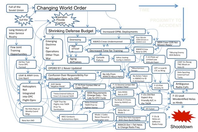
Focusing solely and narrowly on the “bad UI’ design in the Hawaii alert accident would be like focusing solely and narrowly on the F-15 misidentification in @scottsnook’s causal map in “Friendly Fire”.
Here’s the map he’s referring to, along with a link to a discussion of the F-15 incident described by Snook in the context of causal landscapes.
To compound this challenge, people want definitive 1-2 word answers, as if life was a series of mechanical operations and it was possible to affix blame and diagnose faults. If a copying machine jams, there is usually a mechanical reason — a sheet of paper may have gotten stuck in the assembly and once it is removed, the problem is solved. Mechanical problems like this are determinate; there is a cause and it can be identified. Yet most of our problems are not mechanical. They are not determinate. There is not a single cause. There are multiple, intersecting causes and we may never uncover some of the most important causes. We live in a multi-cause, indeterminate world and our attempts to understand why events occurred will usually be frustrating. We cannot expect specific single-cause 1-2 word answers.
It’s easy to say that the menu is wrong and it should be redesigned. But how did that menu come to be? What’s the context? What does the casual landscape look like here? Back to Allspaw (emphasis mine):
How are operators of the alert system involved in the design of their tools? How have those tools changed over time, across staff changes and feedback rounds? How do ‘near-misses’ happen with this system? How many operators are familiar with these tools and how many are new?
What does this system look like (not just UI) contrasted with other states with similar systems? How have accidental false-alarms been caught before? What data is collected about the type of work (difficulty, frequency, procedure-updating, etc.) including upward mgmt?
In other words: we focus on the UI because unhelpful UI is endemic to software, and easily identified and cartoonishly convicted. But there’s always much more to the narrative of an accident.
As it says on the front page of the site for Allspaw’s new consulting firm (which works with groups facing problems just like the Hawaii alert snafu): “Incidents are encoded messages your system is sending you about how it really works.” I hope that message is being received by the Hawaii Emergency Management Agency in the right way.
Update: Honolulu Civil Beat is now reporting that the image above is not what the actual interface looks like.
However, state officials now say that image was merely an example that showed more options than the employee had on the actual screen.
“We asked (Hawaii Emergency Management Agency) for a screenshot and that’s what they gave us,” Ige spokeswoman Jodi Leong told Civil Beat on Tuesday. “At no time did anybody tell me it wasn’t a screenshot.”
HEMA won’t share what the interface actually looks like because of security concerns (which is understandable) but they did provide a new image that “better represents what an employee would have seen on Saturday”:
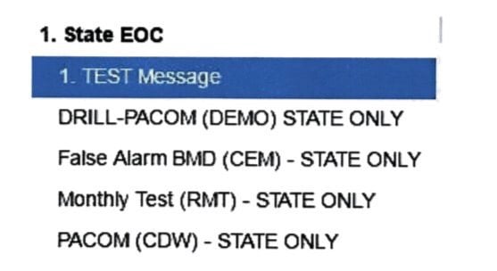
While this doesn’t look so much like a homepage from 1995, I would argue that fundamentally, the design (how it works, not how it looks) is unchanged. There are fewer options but the problematic similarity between options hiding vastly difference consequences remains. (via @andrewlong166)
Update: According to a federal investigation, the employee who sent out the alarm misheard a message played during a drill and thought it was the real thing. They have been fired.
This report, made public on Tuesday, said that the employee “has been a source of concern” to other staffers “for over 10 years.” The employee, who has been fired, has confused real world events and drills “on at least two separate occasions,” according to the report.
In addition to this person being fired last week, the head of the Hawaii Emergency Management Agency resigned Tuesday morning.
Regardless of the “cause”, the process for distinguishing between drills and real-world situations still seems problematic. And that UI is still bad.
Socials & More