kottke.org posts about maps
This is a map showing the real-time location of Scotland’s fleet of snow plows (which they call “road gritters”). As Jackie Sojico discovered, Scotland names their plows and some of them are hilarious.
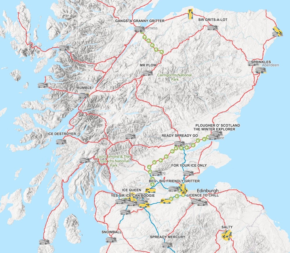
Some of the plows are named things like Sprinkles or Salty but there are also Gangsta Granny Gritter, Mr Plow, Spready Mercury, License to Chill, Ready Spready Go, and Gritney Spears. A possibly out-of-date list of plow names shared on Twitter includes Darth Spreader, Gritty Gritty Bang Bang, and Snowbegone Kenobi.
Plows elsewhere in the UK are also given interesting names: Basil Salty, David Plowie, Freezy Rider, and Roger Spreaderer. (thx, meg)
For BBC Future, Sam Arbesman writes about “maps that plot alternative worlds to our own”.
These are the “what if” stories that ask us to imagine our world on a different path: what if a battle, election or assassination had gone the other way, or a pivotal person had never been born? Some of these stories involve time travel to make the change, but many alternate histories are simply imagined differences. What if the Nazis had not been beaten, as in the novel The Man in the High Castle, or what if the Soviets had landed a man on the Moon first, like in For All Mankind?
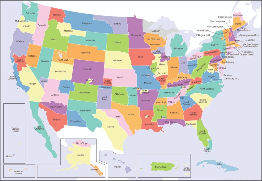
The map above was created by Andrew Shears and shows what the United States could have looked like if various state partition plans had come to fruition.
One of my favorite alternative history maps not covered by Arbesman is Melissa Gould’s Neu-York, a map of Manhattan after a hypothetical conquest of the United States by the Nazis in World War II (which I blogged about way back in 2003, when kottke.org had comments!)
See also Alternate Map of the Americas Features “Long Chile”.
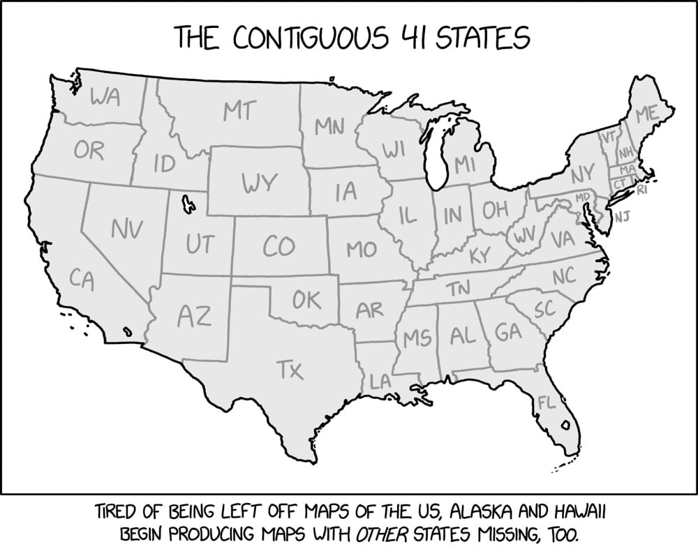
This map of the lower 48 US states hand-drawn by XKCD’s Randall Munroe is super clever: 7 of the states are actually missing. Maybe the pandemic is starting continuing to rot my brain, but I stared at this for an embarrassingly long time before finding any of the absent states. Even now that I know which ones are gone, the map doesn’t look out of place at all. *claps*
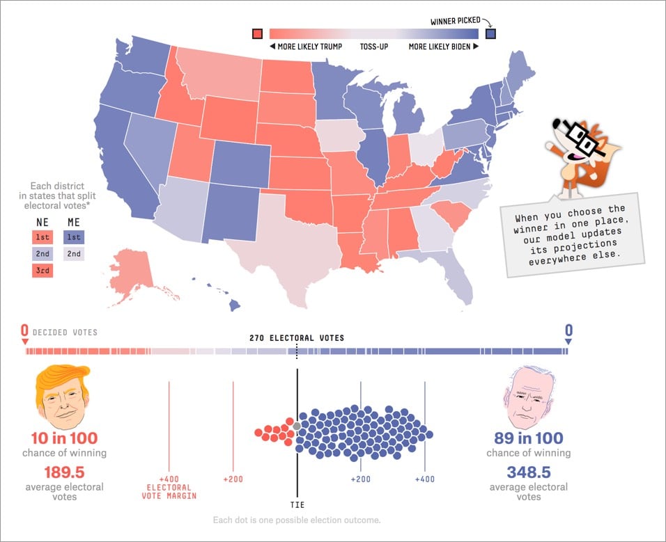
From Stamen’s lead cartographer Alan McConchie, an excellent review of the charts and maps that best communicated vital information about the 2020 election.
After the first night of election results was over, and most of the state races had been called, we settled in for several more days of vote counting in a few key states. Dynamic “choose your own adventure” maps and scenario modeling tools became much less useful, and the landscape of the remaining Electoral College outcomes could be explained better without a map or a chart at all. Simple infographics like this one from the BBC did an excellent job of telling the reader all they needed to know.
You should dig into the article for the commentary and analysis, but I did want to share a couple of my favorite maps/charts:
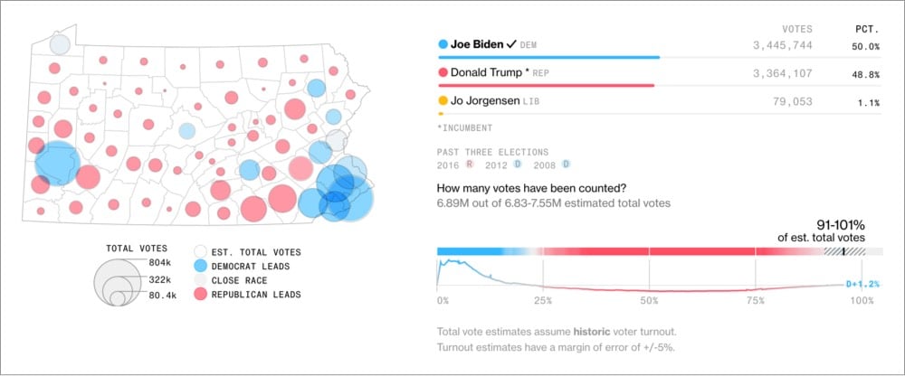
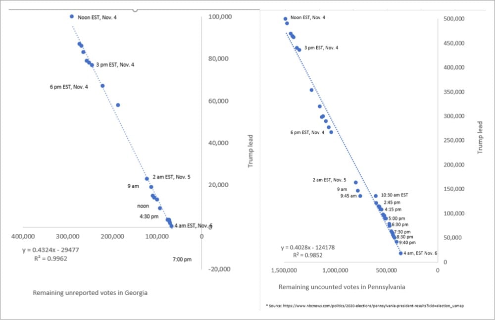
The graphs by John Harurum in that last image were especially useful for me in seeing how the counting trends were going.
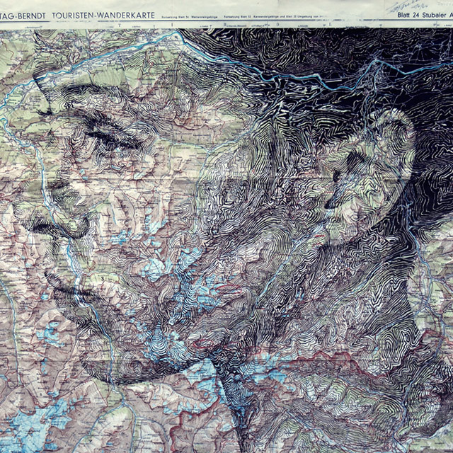
Artist Ed Fairburn draws portraits of people and objects on top of maps and, well, it is just my exact cup of tea. His newest stuff is available on Instagram. I’ve featured his work twice before and it won’t be the last. (via colossal)
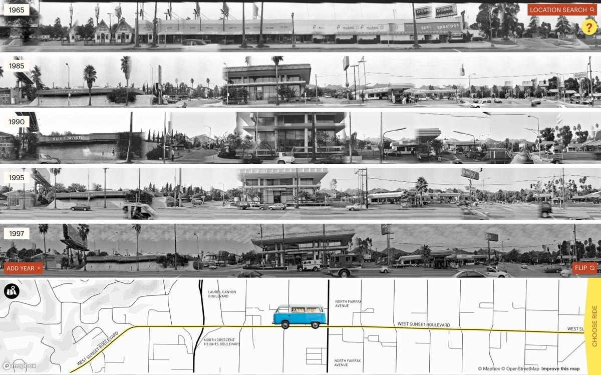
Since 1965, American artist Ed Ruscha has been taking photos all along the length of Sunset Boulevard in LA. The Getty has made those photos available on the Getty Research Institute website and Stamen Design built this fantastic interface called 12 Sunsets for virtually cruising up and down the street.
This is so much fun to play with! You can use the mouse or arrow keys to drive, the spacebar to flip to the other side of the street, and you can change or add years to the display. It’s really interesting to add a bunch of different years to the display and then motor up and down the street to see what’s changed over the decades. It’s the perfect interface for this art.
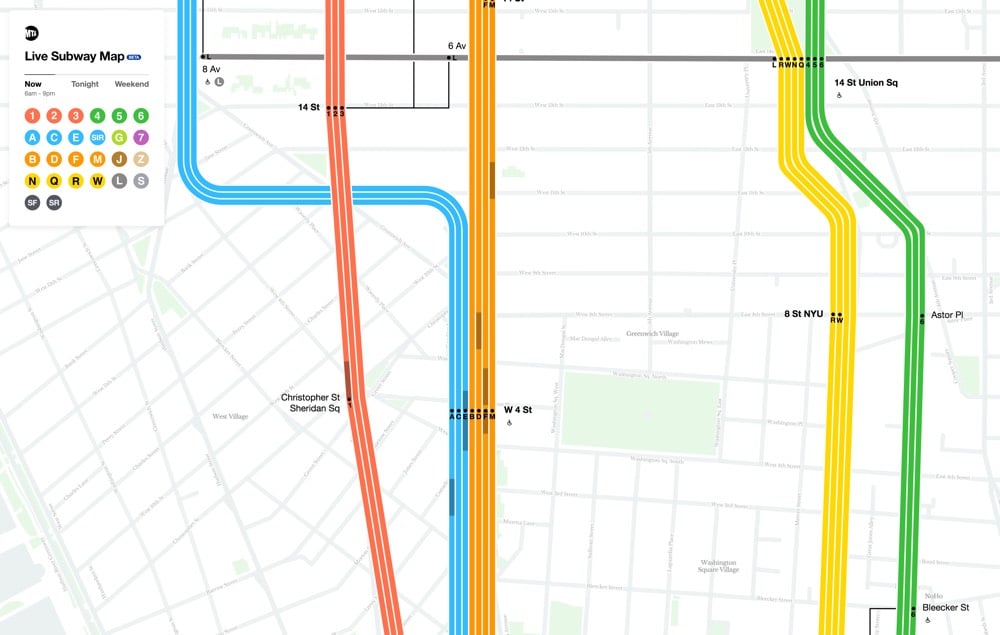
New York City has a new digital subway map that reflects the current status of the subway lines. And you can even see the trains moving, right on the map. (Finally!!) Visually, the new map combines the styles of two past maps, each beloved in their own way.1 Fast Company explains:
The first map is that by Massimo Vignelli, who simplified the snaking subway system into a clean diagram which traded geographic literality for graphical clarity. This elegant simplification turns the confounding subway into a logical system. But the main Vignelli map was scorned by New Yorkers because it wasn’t an actual map, and it was quickly replaced (though a permutation actually lives on as the MTA’s Weekender diagram, which signals weekend services). Meanwhile, the primary map the MTA uses today was created by Unimark International and Michael Hertz Associates. It’s more geographically accurate, but it actually condenses information that was in the Vignelli map. For example, it combines individual train lines such as the C, D, and E lines into singular trunks.
Here’s a video from filmmaker Gary Huswit that shows how the team came up with the new map:
Zooming the map in and out, you see different levels of detail, just like with Google or Apple Maps. I like it — a good combination of form and function.2
Update: A reader reminded me of designer Eddie Jabbour’s Kick Map of the NYC subway, which effectively melded the styles of the Vignelli and Hertz maps together more than 15 years ago.
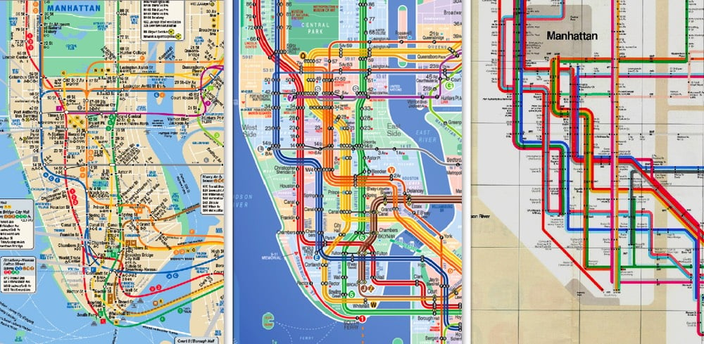
What’s interesting is that the MTA explicitly rejected and criticized the Kick Map but ended up doing something quite similar with the new digital map. I think Jabbour’s effort deserves to be acknowledged here. (thx, nicolas)
You may remember Anton Thomas from the huge hand-drawn map of North America that took him about 5 years to finish. His next effort, already well underway, is Wild World, a geographic map of the Earth.
Commenced in mid-2020, this is a brand new map of the world. Rather than the endless skylines and cultural features of North America: Portrait of a Continent, I wanted the wild character of Earth to shine.
While you won’t find cities or borders on this map, you will find geographic labels. This is important. From mountain ranges to deserts, rivers to rainforests, the labels here offer a detailed, accurate outline of Earth’s natural geography.
He’s aiming to complete the map by mid-2021.
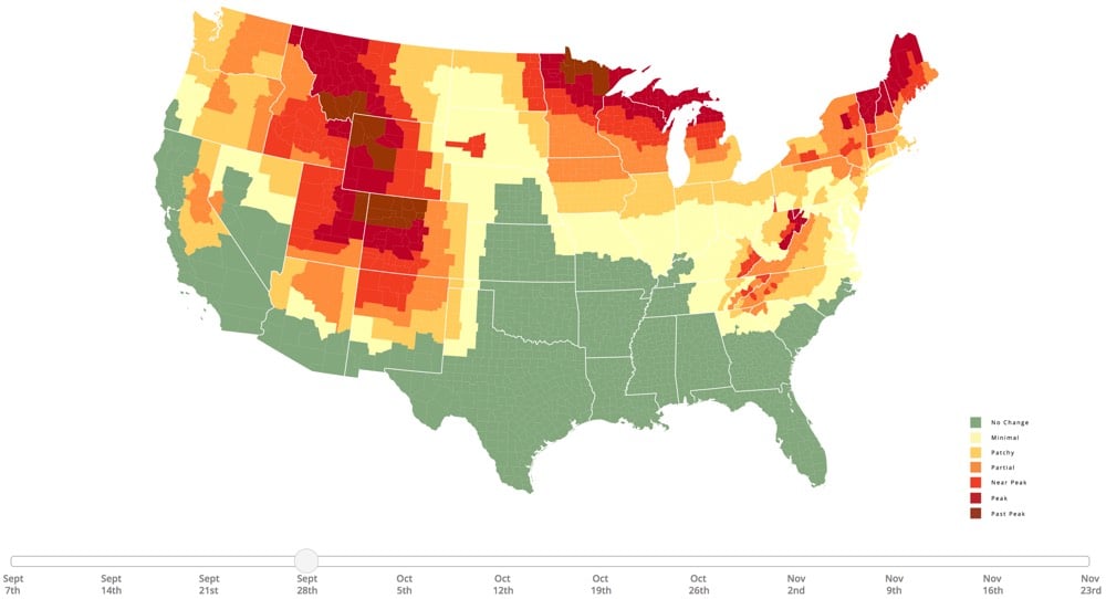
Once again this year, SmokyMountains.com has the best online foliage prediction map. And once again again, summer was far too short and trees here in VT have already been changing colors for weeks (although most have not really started yet). The onset of fall carries an extra wallop in this pandemic year: in many parts of the country, summer made it possible for people to comfortably meet up with family and friends in the lower-risk out-of-doors, an option that will be increasingly less comfy once the leaves fall and the weather crisps up. (via @legalnomads)
A site called Sounds of the Forest is collecting sounds from forests and woodland areas around the world and presenting them on a world map.
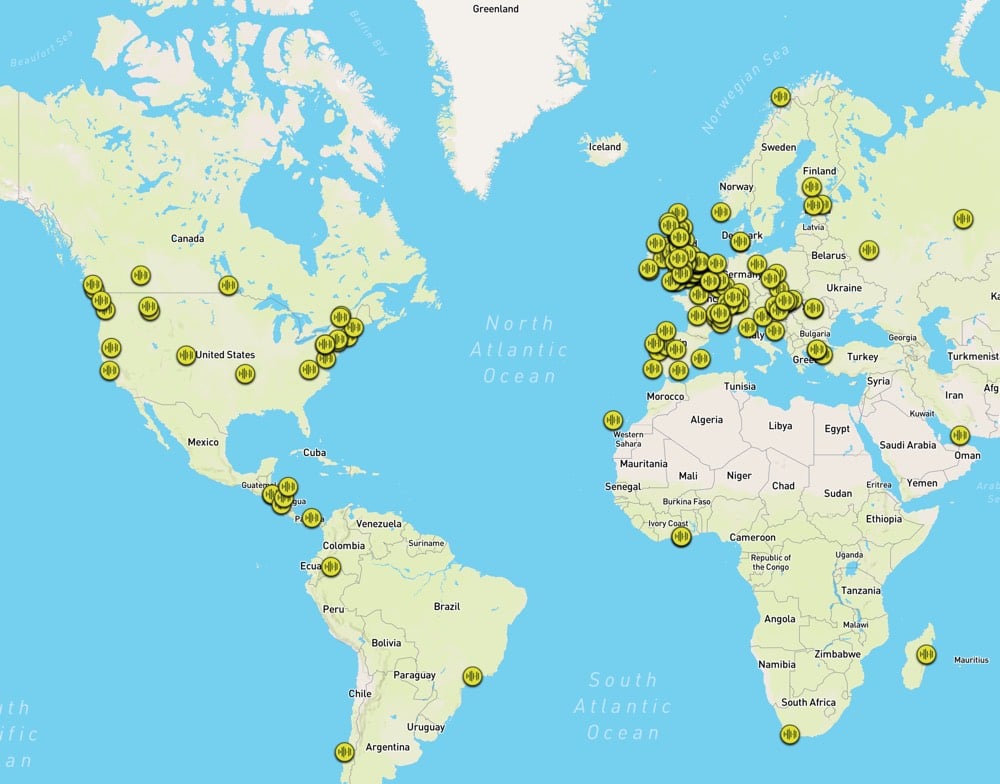
We are collecting the sounds of woodlands and forests from all around the world, creating a growing soundmap bringing together aural tones and textures from the world’s woodlands.
The sounds form an open source library, to be used by anyone to listen to and create from.
Here are a few of the sounds that they’ve collected.
See also the work of Gordon Hempton, who is trying to capture the sounds of the very few places left in the world without human noise. (via moss & fog)
From January to the end of June, over 500,000 people died of confirmed cases of Covid-19. In order to demonstrate the magnitude of the pandemic, James Beckwith made a time lapse map of each Covid-19 death.
Each country is represented by a tone and an expanding blip on the map when a death from Covid-19 is recorded. Each day is 4 seconds long, and at the top of the screen is the date and a counter showing the total numbers of deaths. Every country that has had a fatality is included.
As was the case with the pandemic, the video starts slow but soon enough the individual sounds and blips build to a crescendo, a cacophony of death. The only way this could be made more ominous & upsetting is by including the first song off of Cliff Martinez’s Contagion soundtrack as a backing track. As Beckwith notes in the description: “It is likely a sequel will need to be made.” (via open culture)
In 1854, Dr. John Snow produced a map of a London cholera outbreak which showed deaths from the disease concentrated around a water pump on Broad Street. The prevailing view at the time was that cholera spread through dirty air, but Snow hypothesized that it was actually spread through water and constructed this early medical data visualization to help prove it.
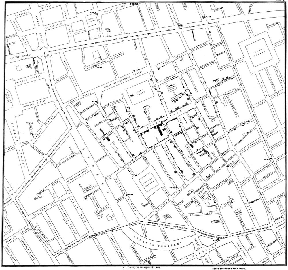
Through a mix of personal interviews, clever detective work, and data analysis that included tables and a famous map, Snow managed to stop the outbreak and convince local public health officials, eventually, that cholera could be transmitted through water, not a miasma. Since his breakthrough study, the map has become an iconic piece of epidemiological history, as an illustration of keen detective work, analysis, and visual representation with a map that, even today, tells a story.
Aside from the cluster of deaths around the pump (which could be argued were the result of a miasma cloud and not contaminated water), stories of nearby people who didn’t get sick (brewers who drank the beer they produced rather than well water, people in buildings with their own wells) and far away people who died because they had drunk water from the well were also essential in proving his theory:
I was informed by this lady’s son that she had not been in the neighbourhood of Broad Street for many months. A cart went from broad Street to West End every day and it was the custom to take out a large bottle of the water from the pump in Broad Street, as she preferred it. The water was taken on Thursday 31st August., and she drank of it in the evening, and also on Friday. She was seized with cholera on the evening of the latter day, and died on Saturday
You can read more about John Snow and how his map changed science and medicine in Steven Johnson’s excellent Ghost Map.
In this video for NPR, Gene Demby summarizes the history of housing segregation in America and how it’s a factor for current differences in health (poorer), wealth (much less), education (underfunded), and policing (much more aggressive) for Black communities in US cities.
If you look at the way housing segregation works in America, you can see how things ended up this way. Once you see it, you won’t be able to unsee it.
When you’re talking about housing policy in America, Kimberly Jones’ Monopoly analogy starts to sound a lot less metaphorical and more literal: if Black people cannot buy houses or can only buy houses on certain streets, they will not be able to build wealth like others can.
For more on housing segregation, check out historian Richard Rothstein’s The Color of Law: A Forgotten History of How Our Government Segregated America. From a 2017 interview with Rothstein:
The federal government pursued two important policies in the mid-20th century that segregated metropolitan areas. One was the first civilian public housing program which frequently demolished integrated neighborhoods in order to create segregated public housing.
The second program that the federal government pursued was to subsidize the development of suburbs on a condition that they be only sold to white families and that the homes in those suburbs had deeds that prohibited resale to African-Americans. These two policies worked together to segregate metropolitan areas in ways that they otherwise would never have been segregated.
Rothstein talked about the book with Ta-Nehisi Coates during a conversation at Politics and Prose Bookstore.
Update: This is excellent: you can explore the maps created by the federal government’s Home Owners’ Loan Corporation at Mapping Inequality by the University of Richmond’s Digital Scholarship Lab.
These grades were a tool for redlining: making it difficult or impossible for people in certain areas to access mortgage financing and thus become homeowners. Redlining directed both public and private capital to native-born white families and away from African American and immigrant families. As homeownership was arguably the most significant means of intergenerational wealth building in the United States in the twentieth century, these redlining practices from eight decades ago had long-term effects in creating wealth inequalities that we still see today.
(via @masonadams)
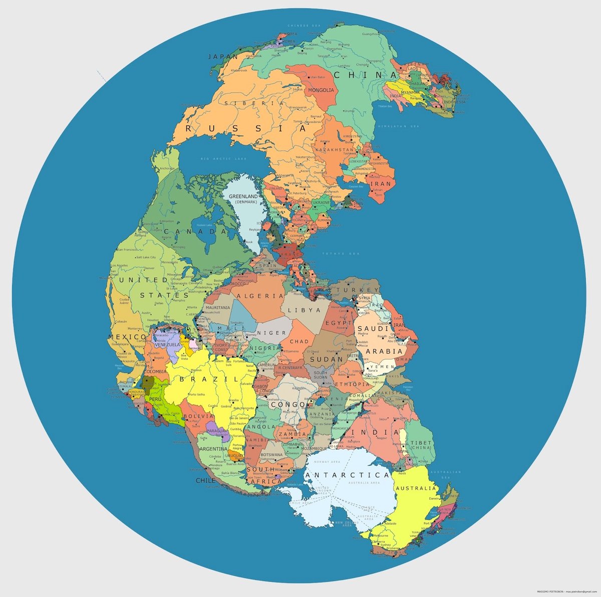
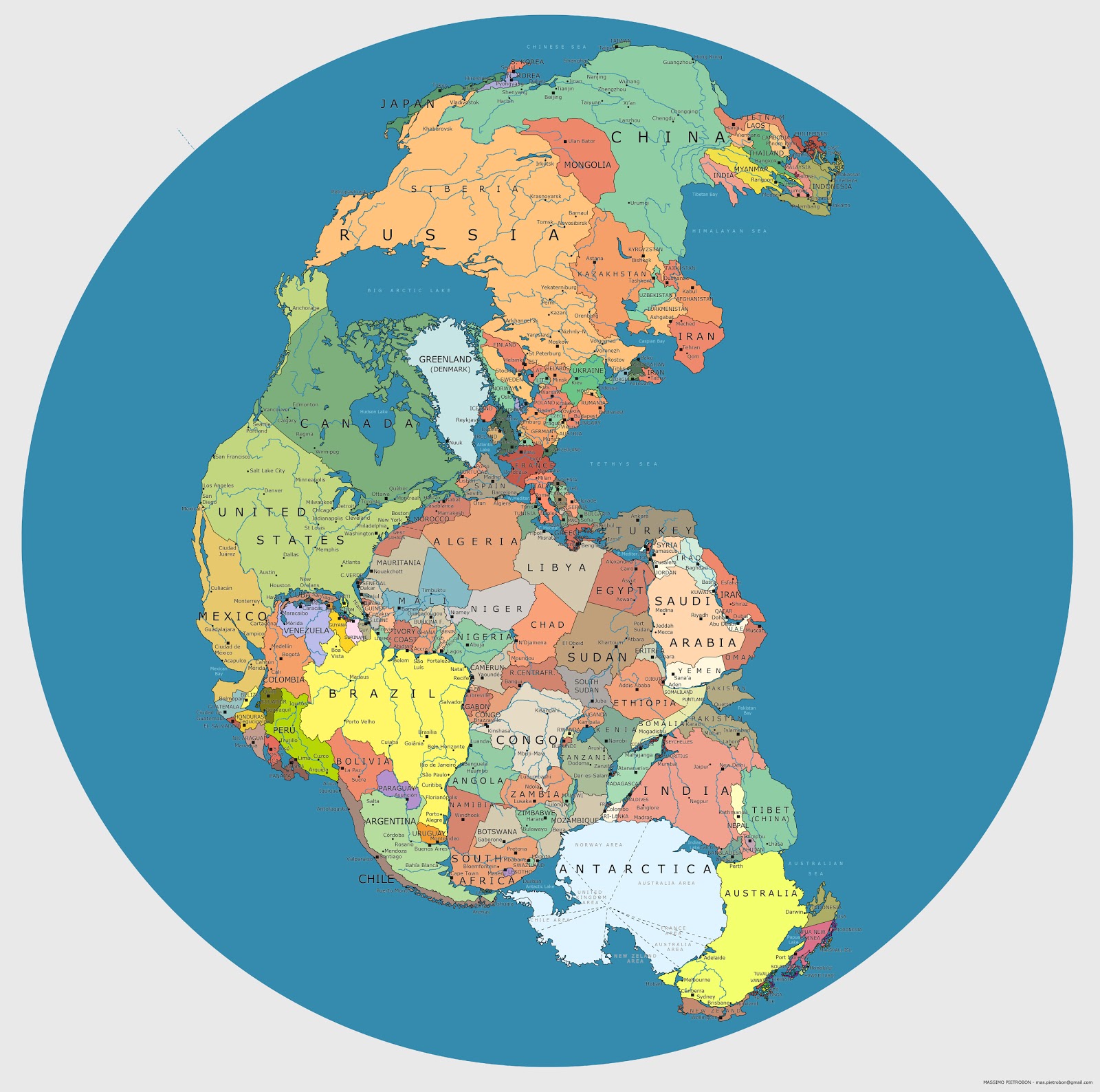
Pangaea is a supercontinent that formed on Earth about 335 million years ago and began to break up about 175 million years ago, eventually forming the familiar continents of today. Massimo Pietrobon made a map that shows where our modern country borders would appear on Pangaea. Check out the full-size version here.
See also Locate Modern Addresses on Earth 240 Million Years Ago. (via @owacle)
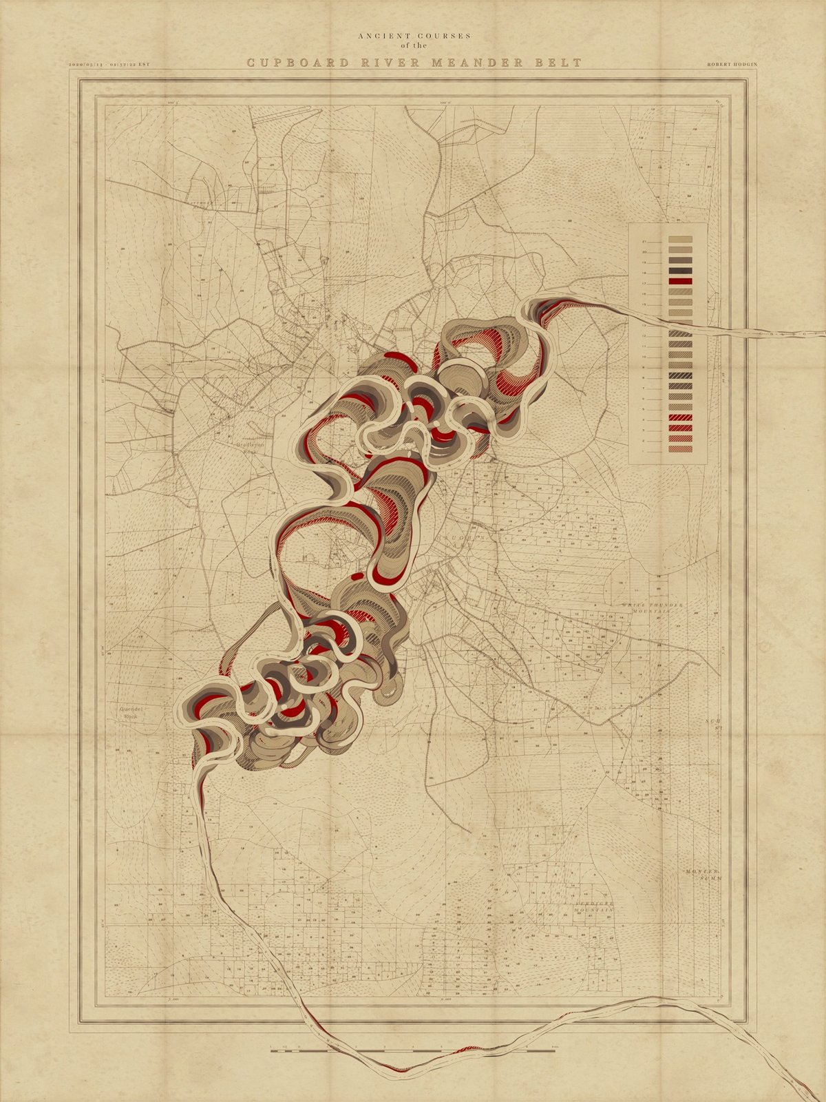
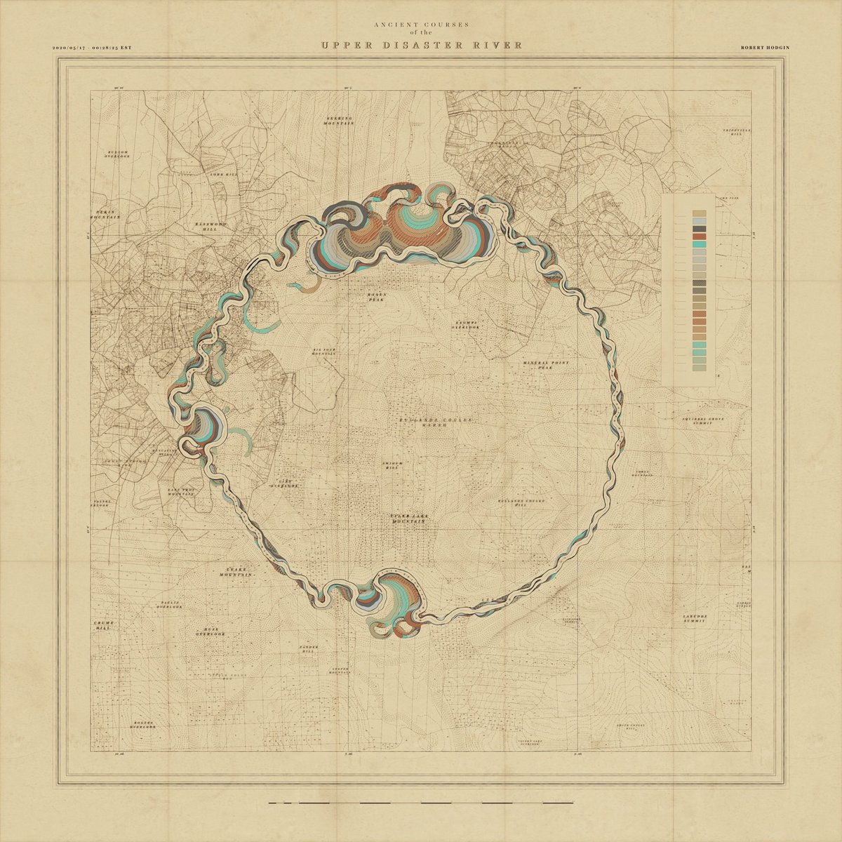
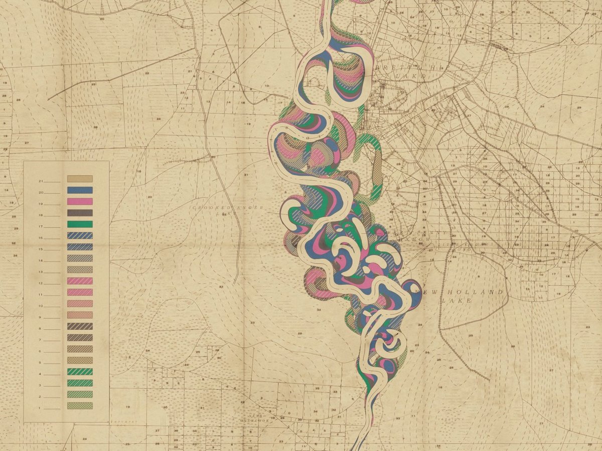
I have written previously about cartographer Harold Fisk’s wonderful meander maps of the Mississippi River produced for the Army Corps of Engineers. Borrowing the aesthetic of these maps, interactive artist & engineer Robert Hodgin wrote some software called Meander to generate meander maps for fictional rivers.
From an input curve, the terrain, land plots, side roads, highways, marsh land and mountain peaks are generated and prominent features are named. The map is then weathered and rendered in the style of old US Army Corp of Engineers maps from the 1930s and 40s.
You can check some of the generated maps out on Twitter or on Instagram, including some prototypes and animations (this one is my favorite). Hodgin has promised a full write-up of the project; I’ll link to it when he publishes it.
Coincidentally, while I was writing this post I got an email from a reader about an audiovisual installation called Meandering River that displayed “real-time visuals generated by an algorithm and music composed by an A.I.”
Synchronicity!
Update: Hodgin wrote about the Meander project on his website and included several more gorgeous examples of his output.
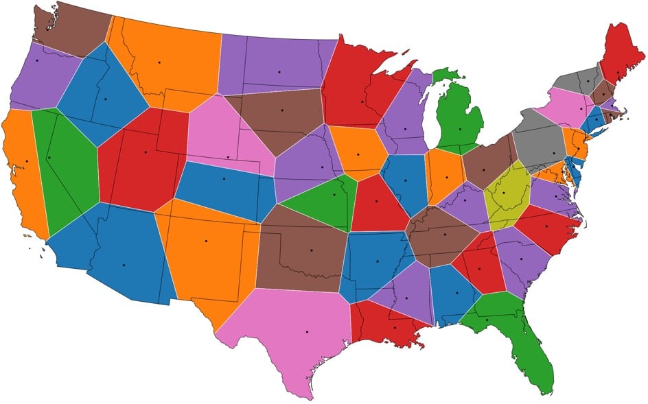
From Jason Davies, this is a US map where the state borders have been redrawn so that all points closest to a state capital than to any other form a state a la Voronoi diagrams. See also Voronoi maps of world airports and world capitals.
It’s interesting that many of the states’ new shapes are similar to their current ones, suggesting that the placement of the capitals relative to borders was somewhat naturally Voronoi-esque, like how people naturally space themselves in elevators or parks.
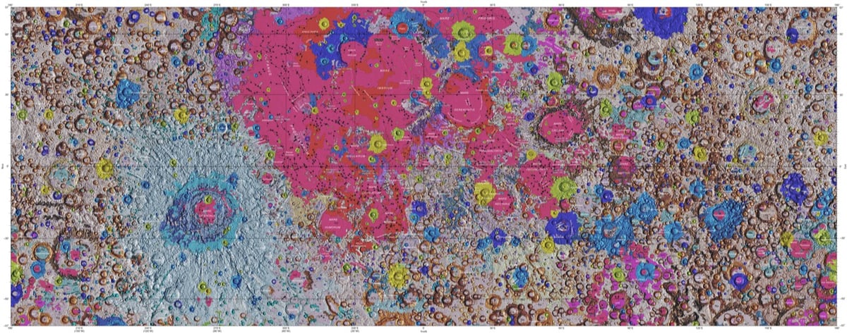
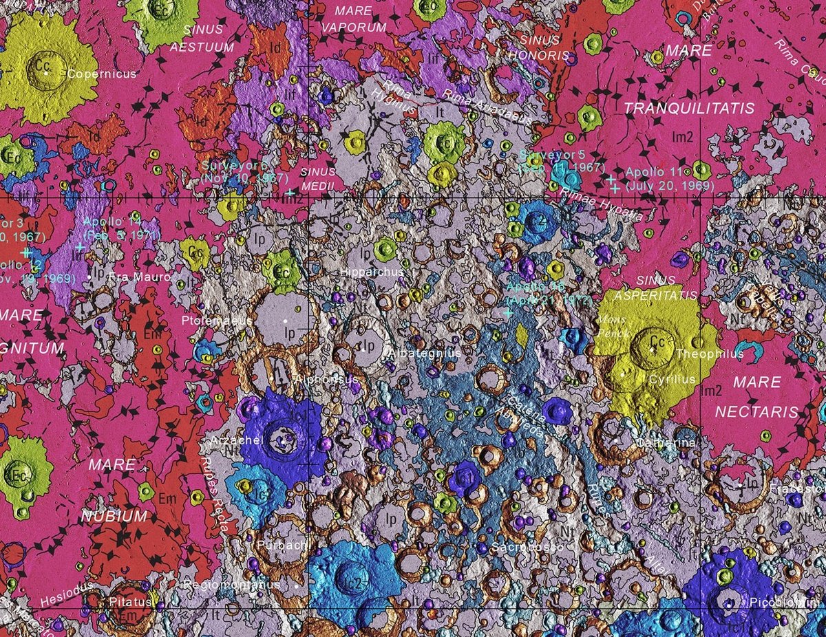
In collaboration with NASA and the Lunar and Planetary Institute, the USGS has released the first complete geological map of the Moon’s surface.
This new work represents a seamless, globally consistent, 1:5,000,000-scale geologic map derived from the six digitally renovated geologic maps (see Source Online Linkage below). The goal of this project was to create a digital resource for science research and analysis, future geologic mapping efforts, be it local-, regional-, or global-scale products, and as a resource for the educators and the public interested in lunar geology.
Strange Maps has more information on how the map came to be and what it shows.
The map was created by the U.S. Geological Service’s Astrogeology Science Center in Flagstaff, Arizona. In collaboration with NASA and the Lunar and Planetary Institute, it combined six ‘regional’ maps of the Moon made during the Apollo era (1961-1975) with input from more recent unmanned lunar missions.
This included data on the polar regions from NASA’s Lunar Orbiter Laser Altimeter (LOLA) and close-ups of the equatorial zone from the Japanese Space Agency’s recent SELENE mission.
The two images above show the entire map and a detailed view of a single area (which includes the landing sites of 3 Apollo missions) while the video shows a rotating globe version of the map.
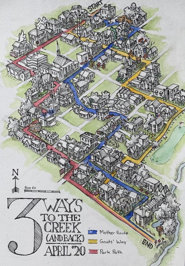
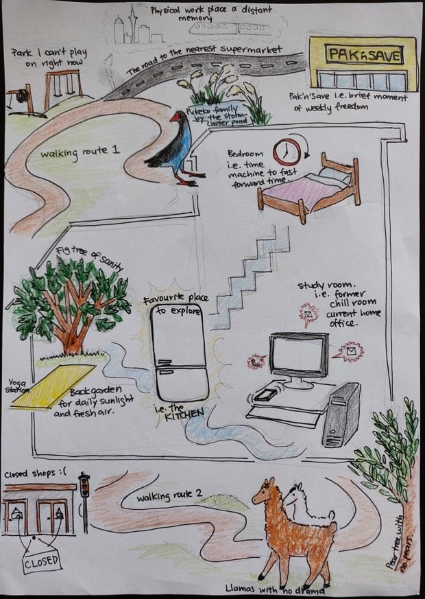
CityLab asked its readers to “draw maps of their worlds in the time of coronavirus”. They drew floor plans, neighborhood walking diagrams, and more abstract representations of their surroundings.
You charted how your homes, neighborhoods, cities and countries have transformed under social distancing and stay-at-home orders around the planet, from daily work routines and the routes of your “sanity walks,” to the people you miss and the places you fled.
While most used markers, pens, and computer-based drawing tools to sketch maps by hand, some used watercolors, clay, and photography. Some were humorous, others heart-wrenching - between them all, a full spectrum of quarantine-era emotion emerged.
(via @ctsinclair)
The British Library has digitized some of their 17th & 18th century globes into 3D models that you can explore and spin online (and in VR). These are seriously cool at fullscreen.
During the so-called ‘Age of Exploration’, expanding European geographical and astronomical knowledge fuelled the demand for maps and sea charts. It also inspired experimentation in the art of globe-making, and the first half of the 16th century saw the production of several models, both hand-painted and printed.
Printing made it possible to produce globes in greater numbers at lower cost so they could be more widely distributed. The printed globe, terrestrial and celestial, soon became established as the standard type of globe, sometimes called the ‘common’ globe, and the methods of manufacture changed surprisingly little from the mid-16th century until the 20th century.
The one at the top of this post is my favorite: Willem Janszoon Blaeu’s Celestial Globe from 1602. (via @john_overholt)
People on Spring Break in Florida for the past couple of weeks were famously unconcerned with social distancing measures implementing in other areas of the country to help stem the tide of COVID-19 infections and save lives. Using cellphone location data from just the phones of the people gathered on a single beach in Fort Lauderdale, Florida, this video shows just how far those people spread across the country when they went home, possibly taking SARS-CoV-2 with them. They go everywhere.
Show of hands: who feels uncomfortable being reminded of the extent to which 3rd party companies know the location of our cellphones? With tools like the one demonstrated in the video & other easily available info, it has to be trivial to identify individuals by name using even “randomized” data and so-called metadata. (via @stewartbrand)
For decades, mapmakers working for the Swiss Federal Office of Topography have defied their mandates to create the most accurate maps possible by covertly inserting drawings in official maps.
But on certain maps, in Switzerland’s more remote regions, there is also, curiously, a spider, a man’s face, a naked woman, a hiker, a fish, and a marmot. These barely-perceptible apparitions aren’t mistakes, but rather illustrations hidden by the official cartographers at Swisstopo in defiance of their mandate “to reconstitute reality.” Maps published by Swisstopo undergo a rigorous proofreading process, so to find an illicit drawing means that the cartographer has outsmarted his colleagues.
It also implies that the mapmaker has openly violated his commitment to accuracy, risking professional repercussions on account of an alpine rodent. No cartographer has been fired over these drawings, but then again, most were only discovered once their author had already left. (Many mapmakers timed the publication of their drawing to coincide with their retirement.)
Some of these blend remarkably well within the usual details of the maps — I never would have noticed the reclining nude in the second image above if it weren’t highlighted.
See also trap streets, errors deliberately introduced by mapmakers to catch others copying their work. (via @jschulenklopper)
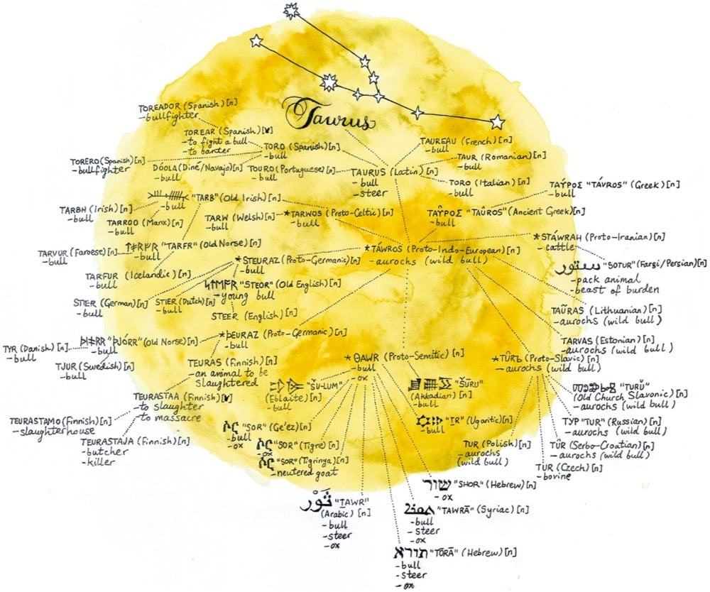
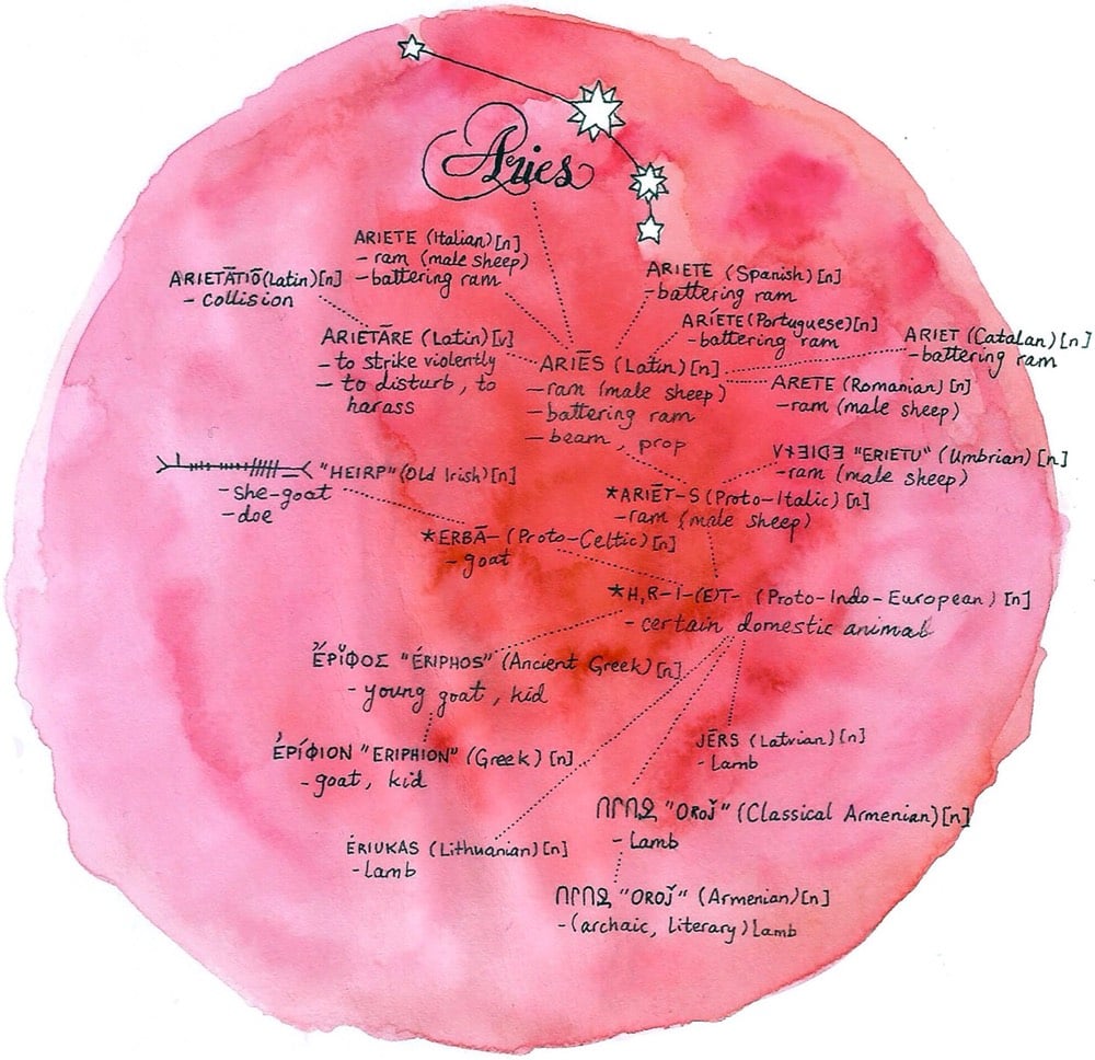
Illustrator Jerry M. Wilson has drawn a series of constellations that explore the etymology of the constellations’ names and related words in several languages. So for example, “Taurus” is Latin for “bull”, which is “toro” in Spanish & Italian and “tyr” in Danish. And then you also have associated words like “toreador” (“bullfighter” in Spanish) and “teurastamo” (Finnish for “slaughterhouse”)…a constellation of words related to “Taurus”.
Over a period of four years, Davis Vilums cycled every street in central London. A map and a time lapse of his journeys:
Including some irregular times off, overall it took me four years to visit every single road on the map. When I started this hobby, it took me 30 to 40 minutes to do the route. Later it expanded to 2 hours to get to the office when I tried to reach the furthest places on my map. One of the main goals was never to be late for work. From the beginning, I planned to visit not only the main roads but every single accessible mews, yard, park trail, and a path that was possible to go through. I used Endomondo app to have a proper record of my journeys and proof that I have been there. After every trip, I prepared my next route in Google maps where it was easy to adjust streets to the next ones and mark points to revisit if I missed something.
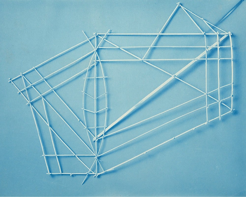
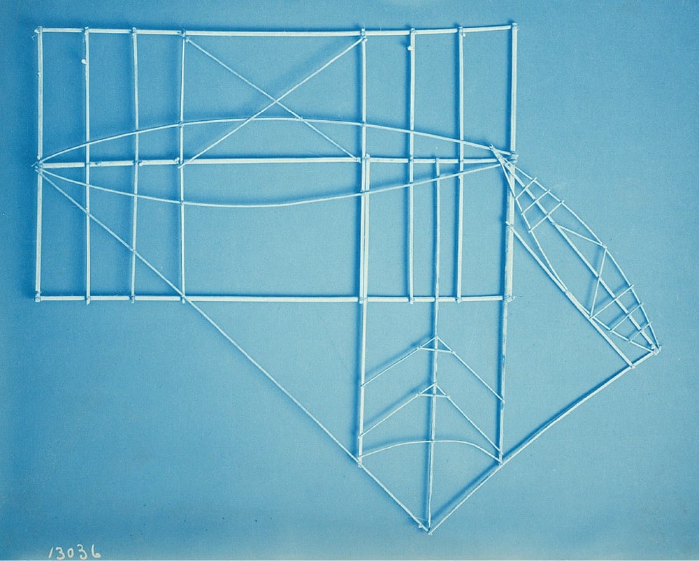
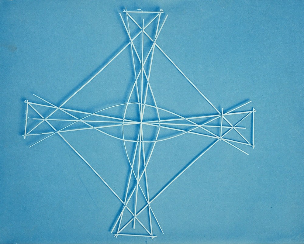
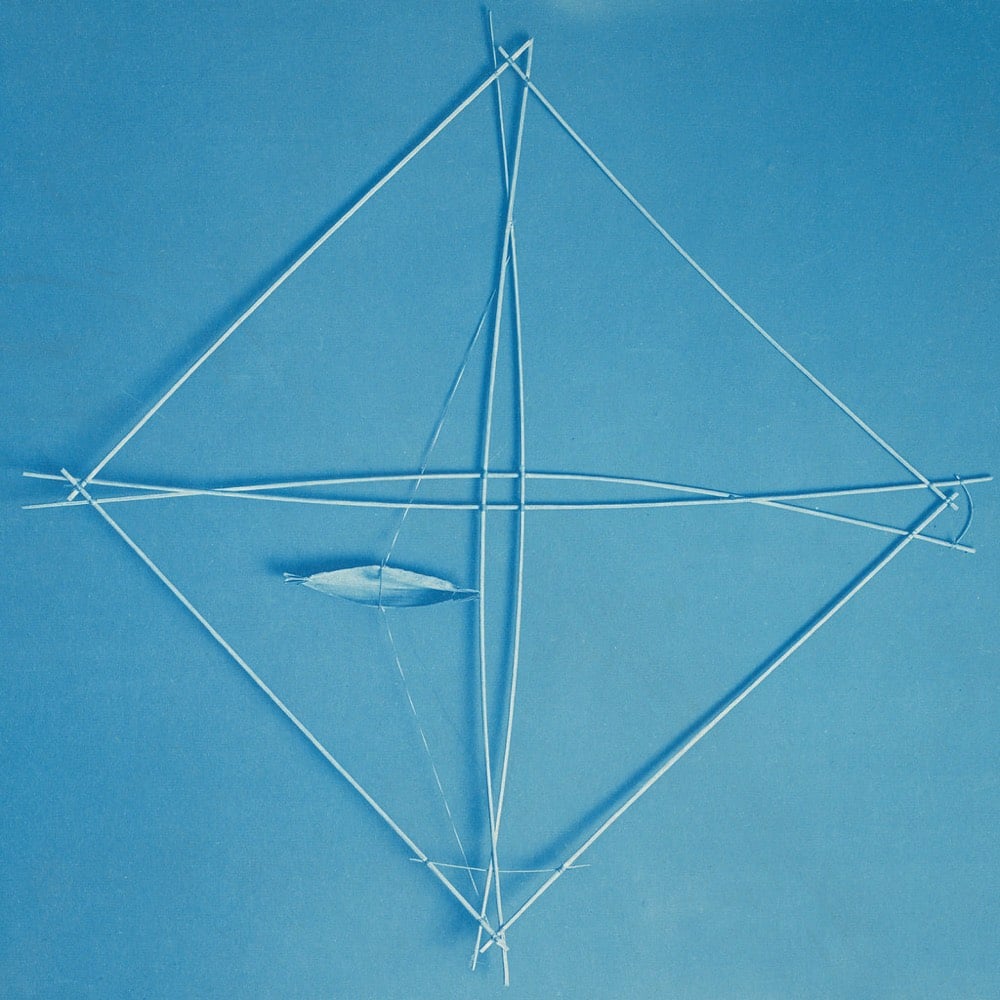
The arrangement of the sticks in these Marshall Islands navigational charts represents ocean swells & currents and how they interact with the land, useful information for navigating between islands via canoe. From a Smithsonian Magazine article about these charts:
The chart is less a literal representation of the sea, says museum curator and anthropologist Adrienne Kaeppler, and more an abstract illustration of the ways that ocean swells interact with land. Curved sticks, she explains, show where swells are deflected by an island; short, straight strips often indicate currents near islands; longer strips “may indicate the direction in which certain islands are to be found;” and small cowry shells represent the islands themselves.
The stick charts were preparatory & teaching tools — mariners would memorize the charts before heading out to sea rather than take them along on the boat.
The photos above are from the Smithsonian Institution, courtesy of Flickr.
See also Secrets of the Wave Pilots and other physical data visualizations. (via curationist)
With news of more than 70,000 confirmed cases and 1700 deaths from the COVID-19 virus, the importance of handwashing is once again front and center. Using data from a 1978 study on the hygiene of health professionals, this is a map of the most missed areas when washing hands.
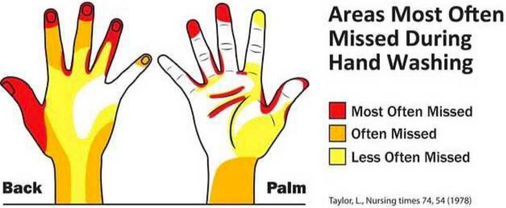
This more recent paper contains a short review of various studies of missed areas, most of which conclude that people often forget to wash their fingertips:
In 2008, the WHO designed a handwashing leaflet, making reference to Taylor, who indicated that the fingertips, interdigital areas, thumbs, and wrists are the most commonly missed areas in handwashing. Pan et al. also found that the tips of the nails and the fingertips had the largest amount of residual florescent stains left after handwashing among healthcare workers in Taiwan. The commonly missed areas among medical students in the study conducted by Vanyolos et al. was the first metacarpal, the proximal part of the palm (lateral), the distal phalanges, and the nail beds. In healthcare workers in Škodová et al.’s study, the thumbs and fingertips were the most commonly missed areas. In this study, the most frequently missed area was also the fingertips. However, the medial aspect and back of the hand were the second and third most missed areas, respectively. Moreover, the interdigital area and the front and back of the fingers were the least missed areas, which is in contrast to Taylor’s study.
So wash those fingertips! Here’s the CDC-recommended guide to washing your hands properly.
- Wet your hands with clean, running water (warm or cold), turn off the tap, and apply soap.
- Lather your hands by rubbing them together with the soap. Lather the backs of your hands, between your fingers, and under your nails.
- Scrub your hands for at least 20 seconds. Need a timer? Hum the “Happy Birthday” song from beginning to end twice.
- Rinse your hands well under clean, running water.
- Dry your hands using a clean towel or air dry them.
See also this TED Talk on how to properly dry your hands with a paper towel. (via a map a day)
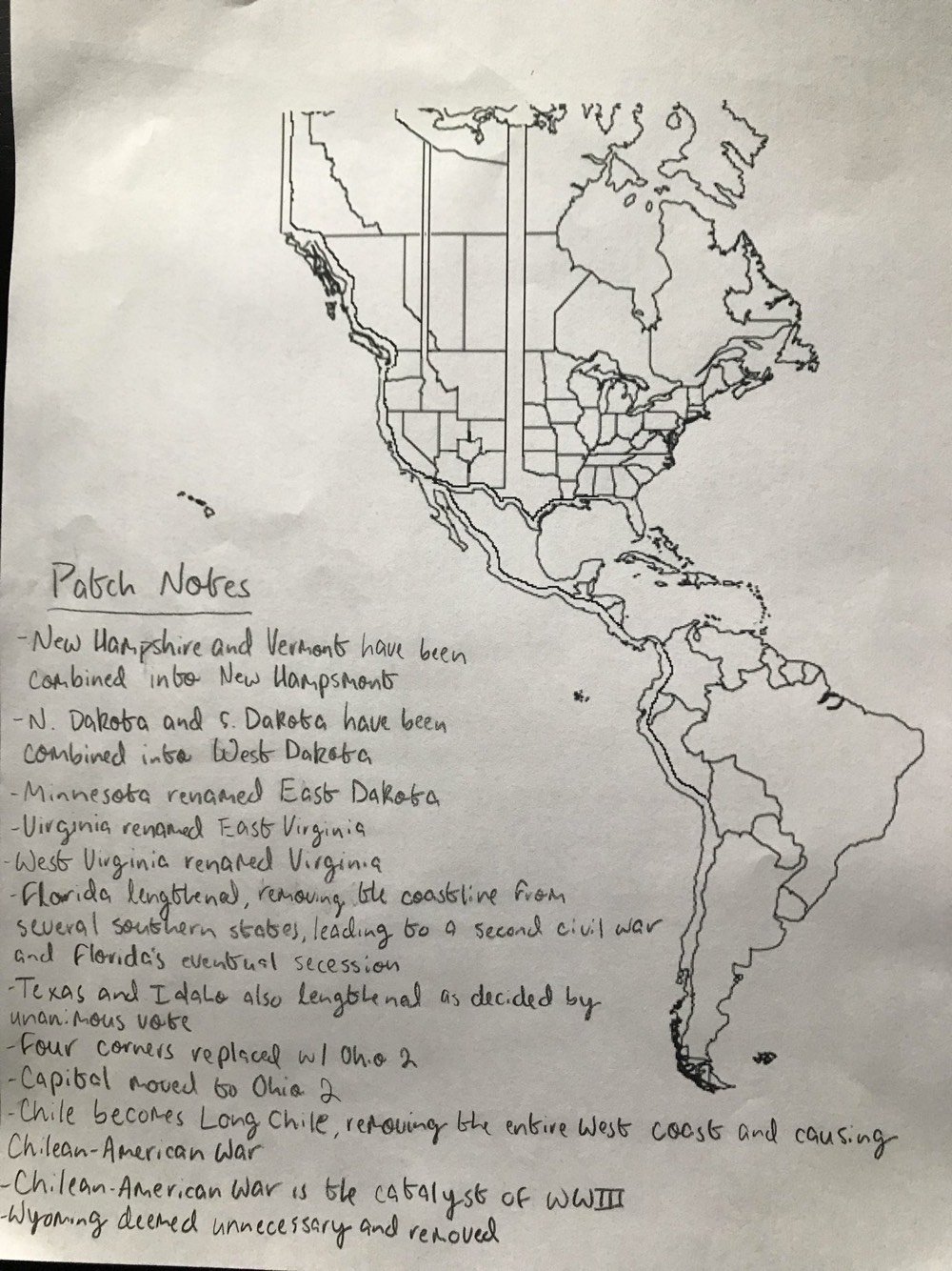
Long-time readers know that I like me some maps and in particular hand-drawn/homemade maps and maps of alternate realities. So I was charmed by Anna Calcaterra’s alternate map of the Americas, which features geographic entities like Long Chile, Ohio 2 (“Four Corners replaced w/ Ohio 2”), and East Dakota (RIP Minnesota). The kids are alright, y’all.
Some quite stunning work by Cream Electric Art created for an ad campaign for United Airlines in Australia. These are quite made-up by assembling two different landscapes in a dreamlike 90° angle but I’m posting them here to take us back to a favorite movie of mine, Inception, and the architect scene in Paris where Ellen Page’s character Ariadne bends the dream in a similar fashion. Less well known but even more interesting because it bent an actual map’s perspective was the dearly departed BERG’s Here & There project.
The projection works by presenting an image of the place in which the observer is standing. As the city recedes into the (geographic) distance it shifts from a natural, third person representation of the viewer’s immediate surroundings into a near plan view. The city appears folded up, as though a large crease runs through it. But it isn’t a halo or hoop though, and the city doesn’t loop over one’s head. The distance is potentially infinite, and it’s more like a giant ripple showing both the viewers surroundings and also the city in the distance.
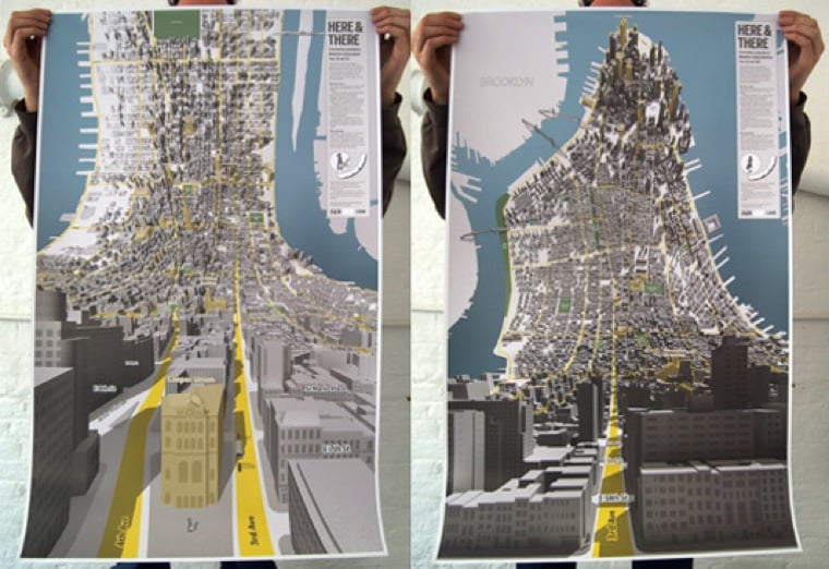
That whole piece is a great read for a tour of perspectives from Alfred Wainwright’s hand-drawn walking maps, to China, to GTA and SimCity.
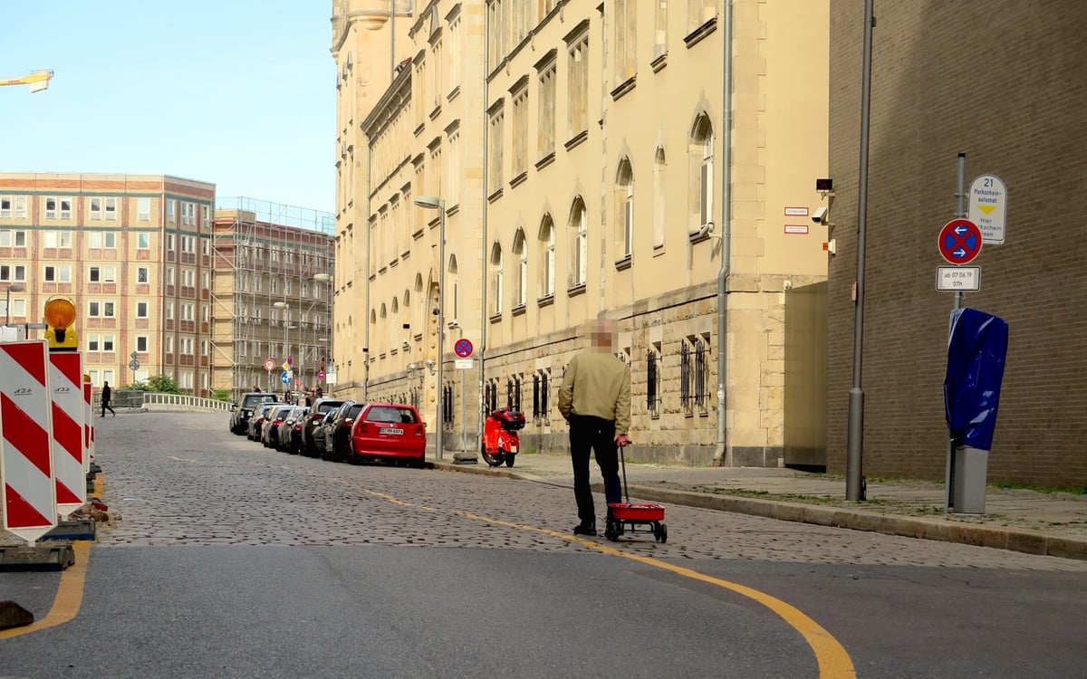
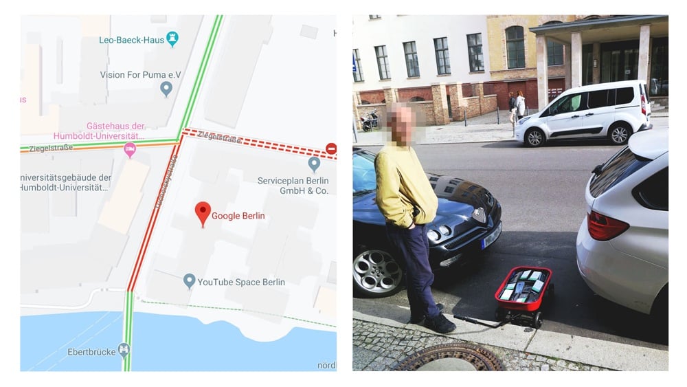
You’ve got to love little artistic hacks like this. Simon Weckert put 99 second-hand smartphones in a red handcart and walked around a few blocks in Berlin. Each phone was running Google Maps and being tracked for trafic measurements. Their presence and slow rolling around the streets caused Google to display a traffic jam.
The advent of Google’s Geo Tools began in 2005 with Maps and Earth, followed by Street View in 2007. They have since become enormously more technologically advanced. Google’s virtual maps have little in common with classical analogue maps. The most significant difference is that Google’s maps are interactive - scrollable, searchable and zoomable. Google’s map service has fundamentally changed our understanding of what a map is, how we interact with maps, their technological limitations, and how they look aesthetically.
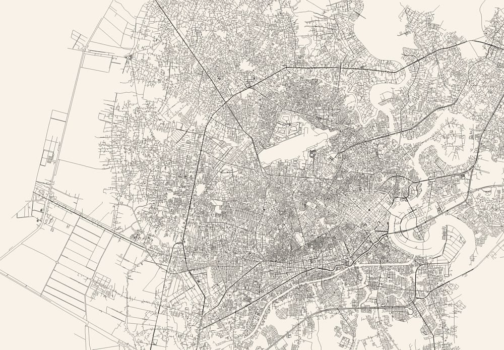
Andrei Kashcha’s City Roads tool will draw you a map of just the roads in any city around the world. I’m in Saigon right now, so I did that one first:
And this is Paris:
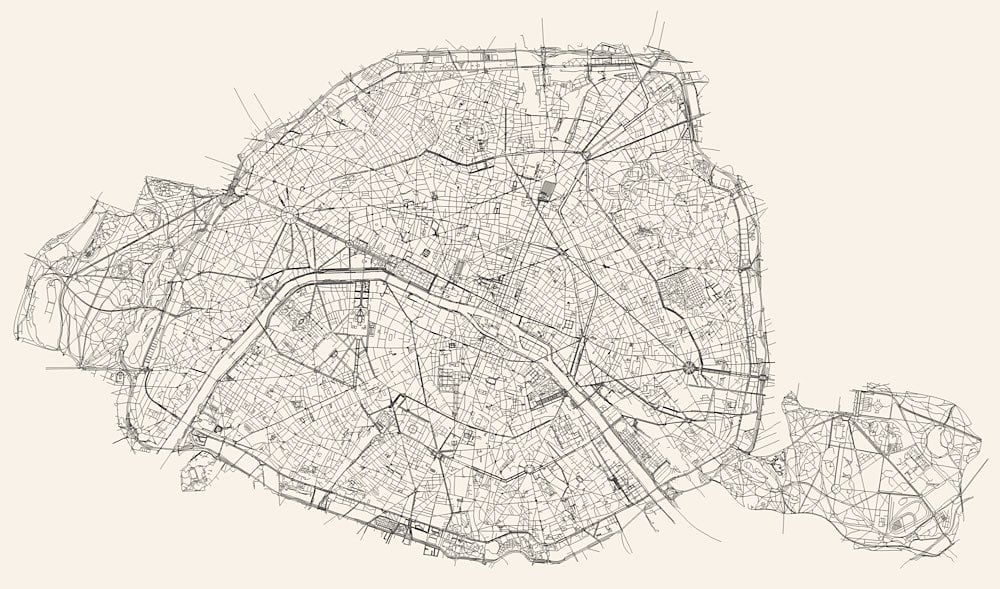
I love that the whitespace reveals more of a city than just roads — you can also see rivers, parks, train lines, stadiums, and airports.
See also Ben Fry’s All Streets project and Nelson Minar’s map of all the rivers in the US.
Update: Javier Pastor compiled a list of similar services that create artistic maps. The article is in Spanish but Google Translate works well on it.
Sometimes I load up the US map on Weather Underground just to watch storm systems tumbling and swirling across the country, so this 2-hour time lapse of the last 10 years of US weather radar is riiiiight up my alley. You don’t have to watch the whole thing — even dipping in here and there for a couple of minutes is really gratifying. Can you get ASMR from a weather map? (thx, benjamin)
Newer posts
Older posts
Socials & More