Advertise here with Carbon Ads

This site is made possible by member support. โค๏ธ

Big thanks to Arcustech for hosting the site and offering amazing tech support.

When you buy through links on kottke.org, I may earn an affiliate commission. Thanks for supporting the site!

kottke.org. home of fine hypertext products since 1998.

๐Ÿ”  ๐Ÿ’€  ๐Ÿ“ธ  ๐Ÿ˜ญ  ๐Ÿ•ณ๏ธ  ๐Ÿค   ๐ŸŽฌ  ๐Ÿฅ”

How the Mercator Projection Distorts the True Sizes of Countries on Maps

Data scientist Neil Kaye made this map to show how much the popular Mercator projection distorts the sizes of many countries, particularly those in the Northern Hemisphere.

Mercator Adjusted

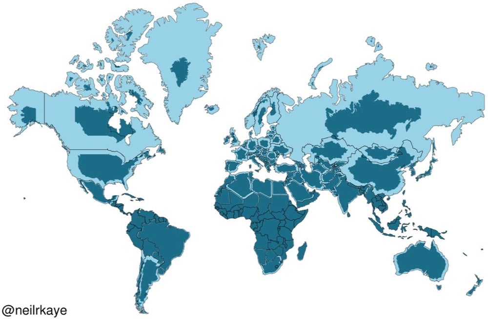
The distortion in the animated version is even clearer. Key takeaway: Africa is *enormous*.

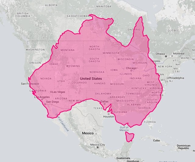
See also the true size of things on world maps.

True Size Map