The true size of things on world maps
One of the most popular map projections of the world is the Mercator projection:
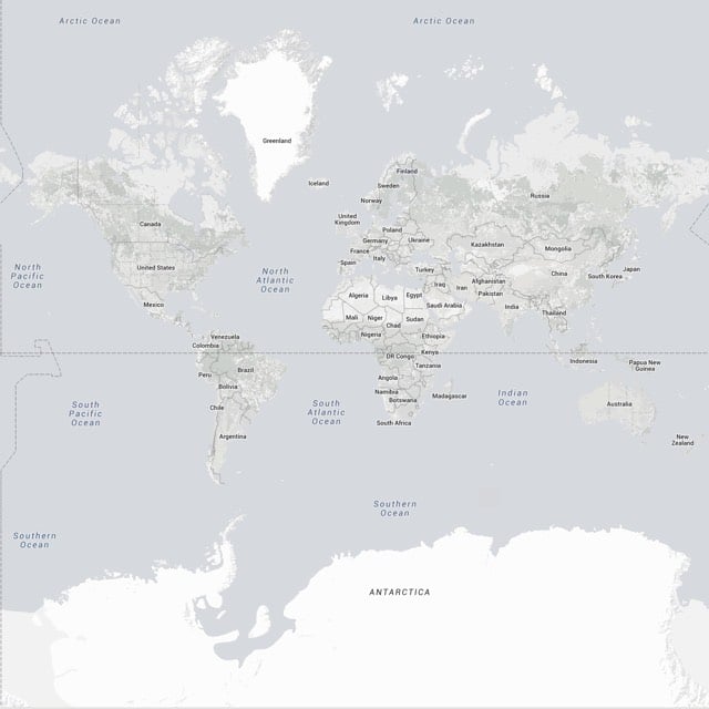
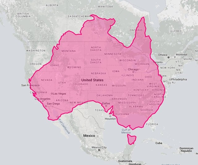
It’s useful but misleading in important ways. With the the True Size Map, you can drag countries and continents around a Mercator map to uncover their true sizes. For example, it may not be apparent on a Mercator map that Australia is about the same size as the lower 48 US states (see above). Or that Africa is much larger than it seems on the map:
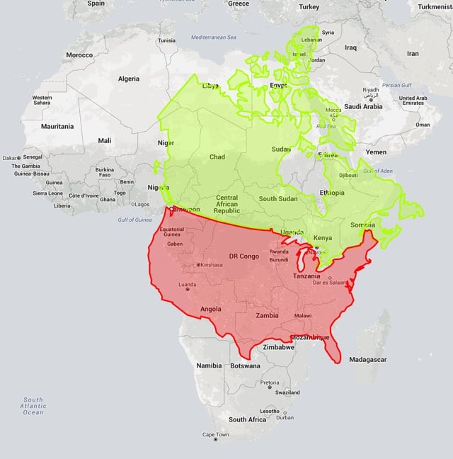
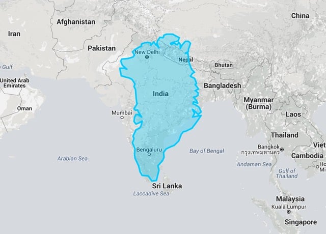
Or is it that North America is oversized on the map? Greenland certainly is. Its true size becomes more clear when you overlay it on India:
Mercator’s been around for hundreds of years, so luckily cartographers have invented dozens of other ways to visualize the world in 2D, each of which have their own strengths and disadvantages. You can view many of them here.
Update: I had somehow forgotten about this great scene from The West Wing discussing the geographic bias of the Mercator map:
(thx to the many who reminded me)


Socials & More