kottke.org posts about maps
I bet you never noticed that South America can kind of approximate most of the world’s other continents pretty well. XKCD’s Randall Munroe did and made a bad map projection of it.
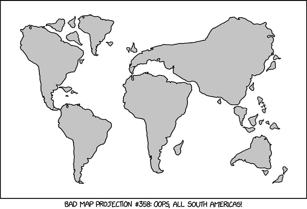
This is only slightly worse than the Mercator projection tbh.
Boston Rare Maps recently sold a nine-foot-high cloth map from 1899 that shows a geographic interpretation of the Book of Mormon.
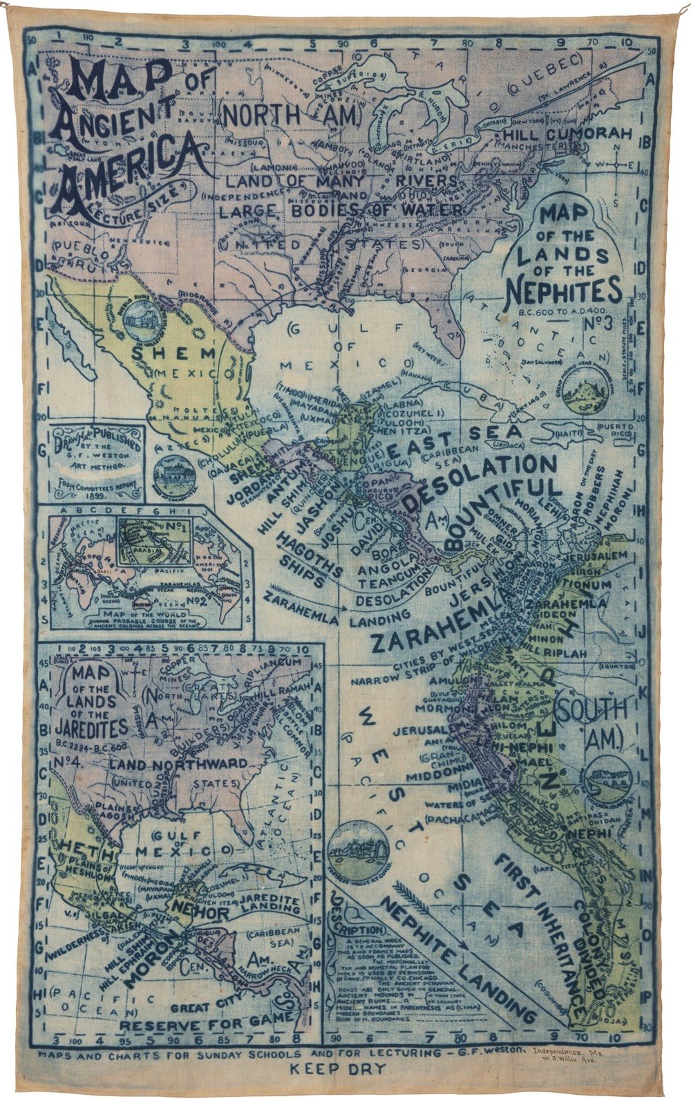
The map was an official production of the Reorganized Church of Jesus Christ of Latter Day Saints (RLDS) in Independence, Missouri. The RLDS (known since 2001 as the Community of Christ), is a reformist branch of the Church of Latter Day Saints, established in 1860.
You can read more about the proposed setting of the Book of Mormon on Wikipedia and its adherents’ belief that the indigenous peoples of the Americas are descended from Israelites.
The Book of Mormon is based on the premise that two families of Israelites escaped from Israel shortly before the sacking of Jerusalem by Nebuchadnezzar and that they constructed a ship, sailed across the ocean, and arrived in the New World as founders of Native American tribes and eventually the Polynesians. Adherents believe the two founding tribes were called Nephites and Lamanites, that the Nephites were white and practiced Christianity, and that the Lamanites were rebellious and received dark skin from God as a mark to separate the two tribes. Eventually the Lamanites wiped out the Nephites around 400 AD, leaving only dark skinned Native Americans. The descent of Native Americans from Israel is a key part of The Church of Jesus Christ of Latter-day Saints’s foundational beliefs.
(via @john_overholt)
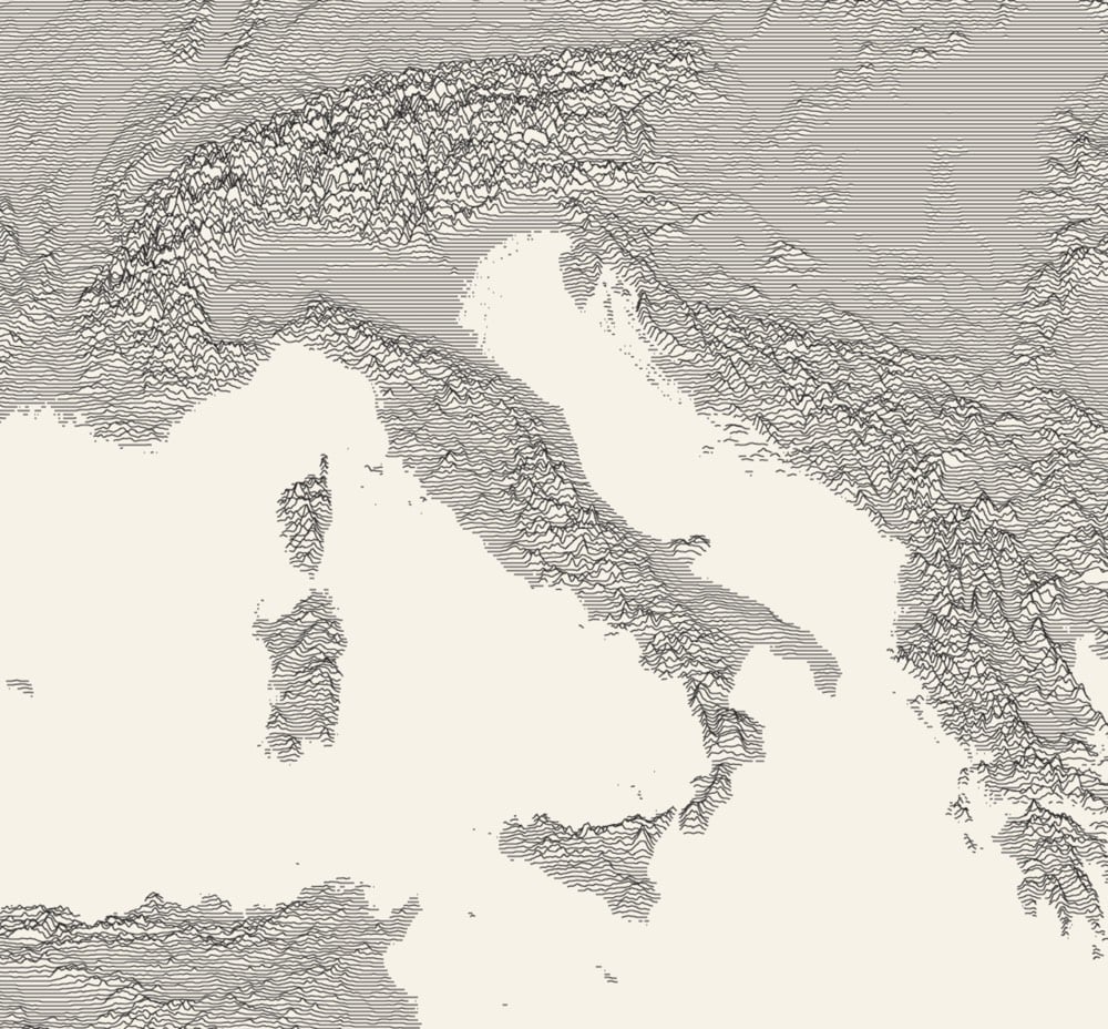
Using Andrei Kashcha’s Peak Map tool, you can create what’s called a ridgeline chart — picture the album cover for Joy Division’s Unknown Pleasures — of the elevation anywhere on the Earth. Try it out here. (via @eramirez)
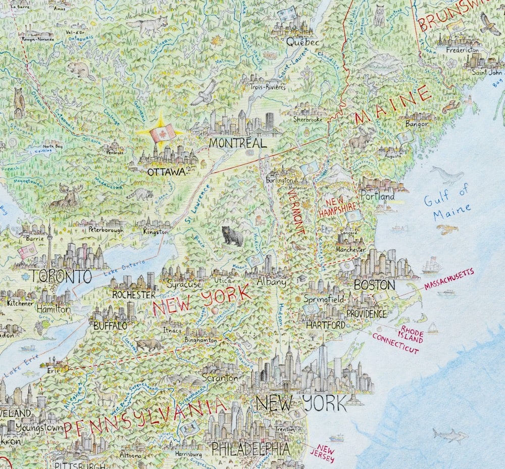
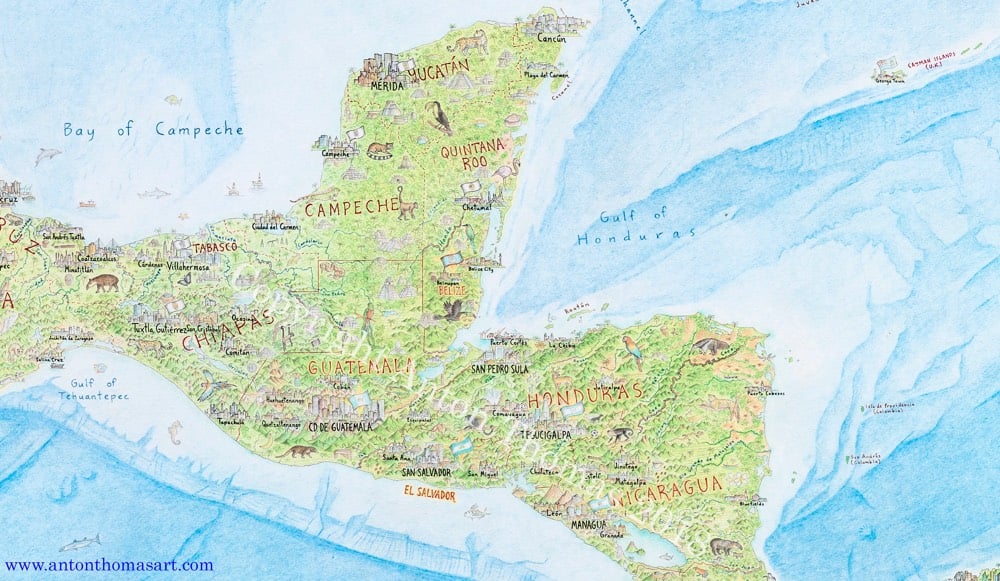
Anton Thomas has been working for the last five years on a huge hand-drawn map of North America.
North America: Portrait of a Continent is drawn completely by hand with colour pencil and pen. It is a 5 x 4 feet (150 x 120 cm) perspective projection of the entire region, spanning from Alaska to Panama; Greenland to the Caribbean. There are tens of thousands of features, including 600 individual cities and towns.
Looks fantastic. He finished it in February and is getting ready to open pre-orders for prints sometime this month.
Update: Prints of the map are available on Thomas’ store. He also made a video tour of the Mississippi River, in which he shares what all the little details on the map signify along the river’s meandering course.
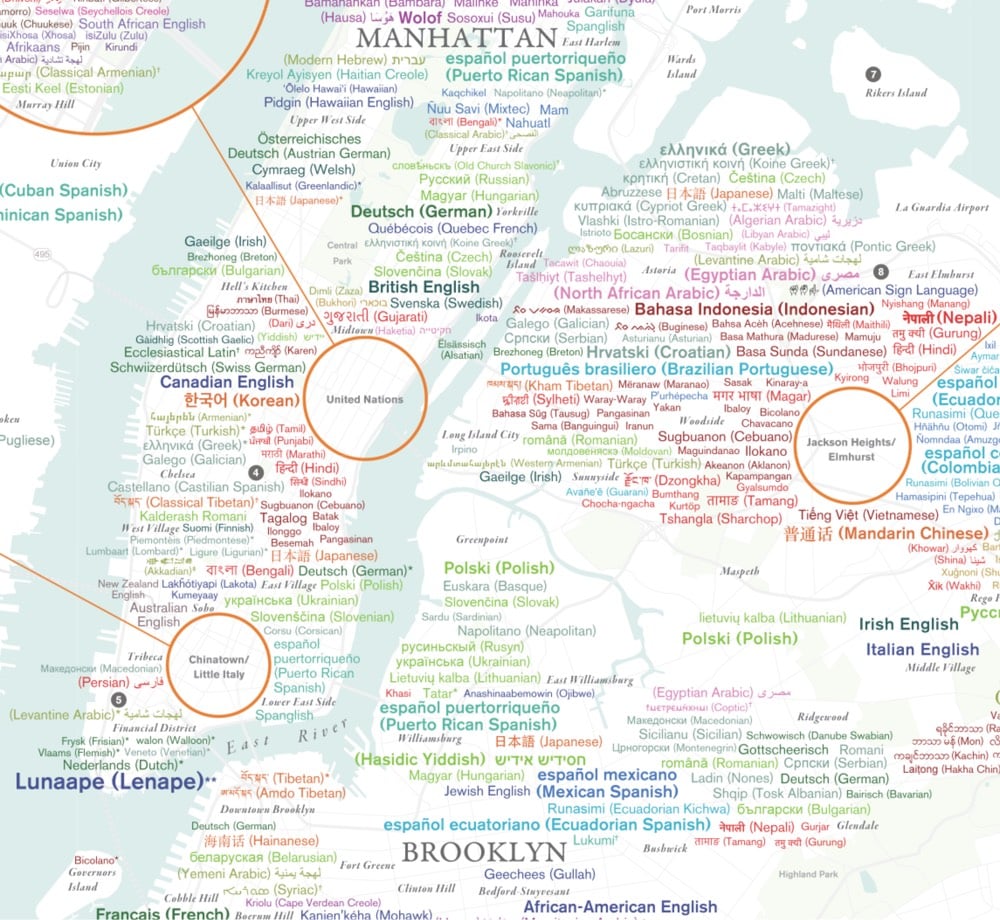
The Endangered Language Alliance has produced a map of the 637 languages and dialects spoken by the residents of NYC (past and present).
It represents ELA’s ongoing effort to draw on all available sources, including thousands of interviews and discussions, to tell the continuing story of the city’s many languages and cultures. The patterns it reveals — the clustering of West African languages in Harlem and the Bronx, a microcosm of the former Soviet Union in south Brooklyn, the multifaceted Asian-language diversity of Queens, to name a few — only hint at the linguistic complexity of a city where a single building or block can host speakers of dozens of languages from across the globe.
The online map embedded in the page works ok, but a $50 donation to the organization will get you a 24″ x 36″ print for your wall.
According to a Gothamist post about the map, the size and diversity of the city sometimes means that a significant chunk of a language’s worldwide speakers live in NYC:
Seke is a language spoken in just a handful of towns in Nepal-worldwide, there are fewer than 700 people who speak it. More than 100 of those people live in Brooklyn and Queens, according to the Endangered Language Alliance, a group that seeks to document and preserve smaller, minority, and Indigenous languages across New York City.
(via gothamist)
One Page Dungeon generates small dungeon layouts for RPG adventures (Dungeons & Dragons, etc.) You can just throw all that graph paper in the recycling.
See also Auto-Generated Maps of Fantasy Worlds, Fractal Terrain in Javascript, and the Medieval Town Generator. (via @pomeranian99)
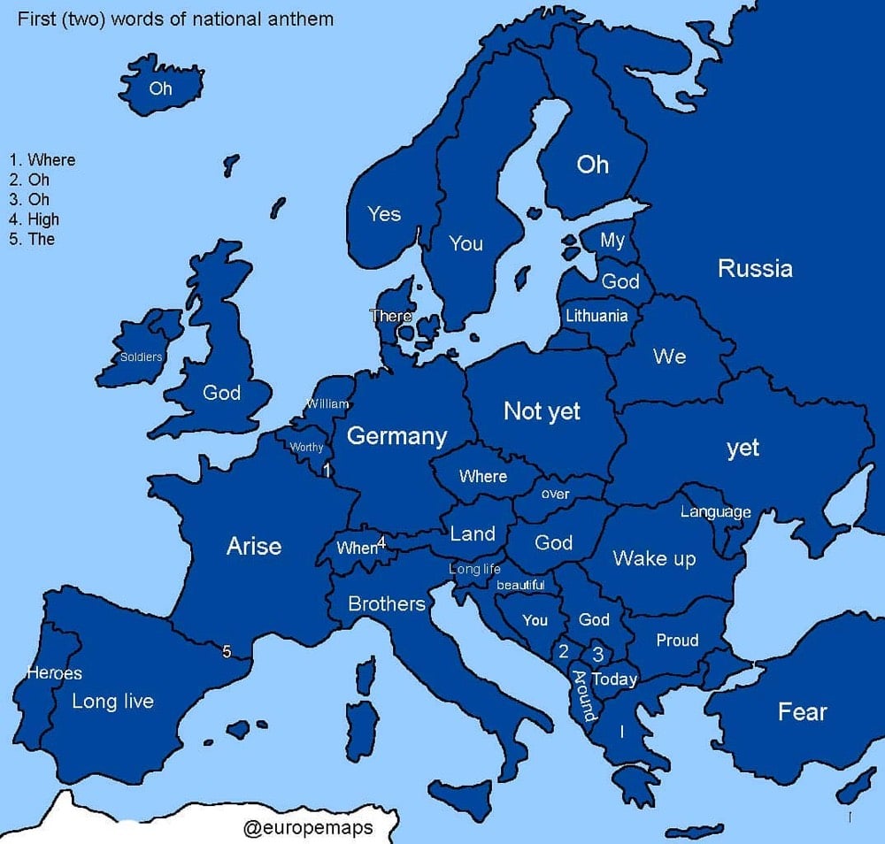
From the @europemaps Instagram account, a map of the first words of the national anthems of European countries. Collectively, it sounds like northern Europe is having some fun in the bedroom: oh… yes… you… there… oh… my… god… not yet…
Please also note that there are a lot of people in the comments with corrections, especially about Spain, Germany, and Turkey, so take it with a grain of salt.
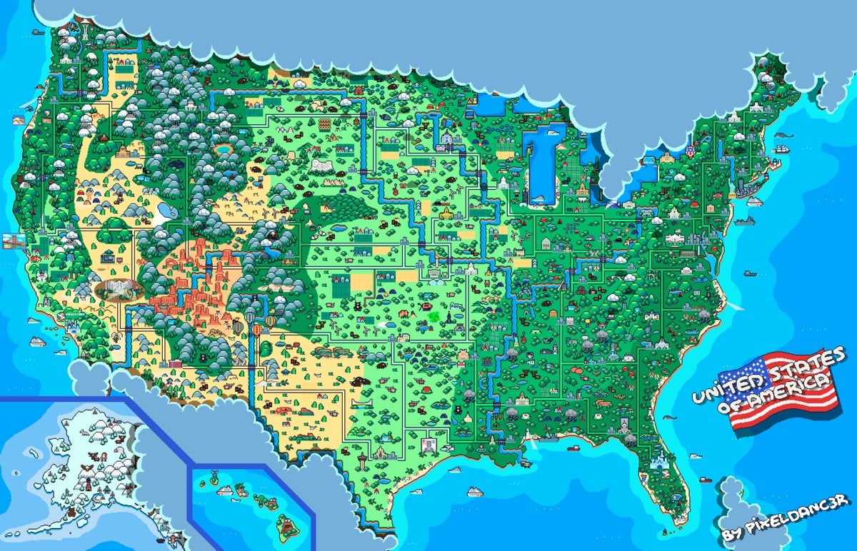
A fellow by the name of David who goes by PixelDanc3r made this animated map of the United States in the style of 16-bit video game graphics; it seems like the most direct inspiration is the overworld map in Super Mario World. He’s done similar maps of Brazil, Venezuela, and his home country of Argentina. You can check out more of his pixel creations on Instagram and DeviantArt. (via the morning news)
Using 2020 census estimates, a series of six maps and the accompanying article from William H. Frey at the Brookings Institution show how the racial makeup on the United States is expected to have changed since the last census in 2010.
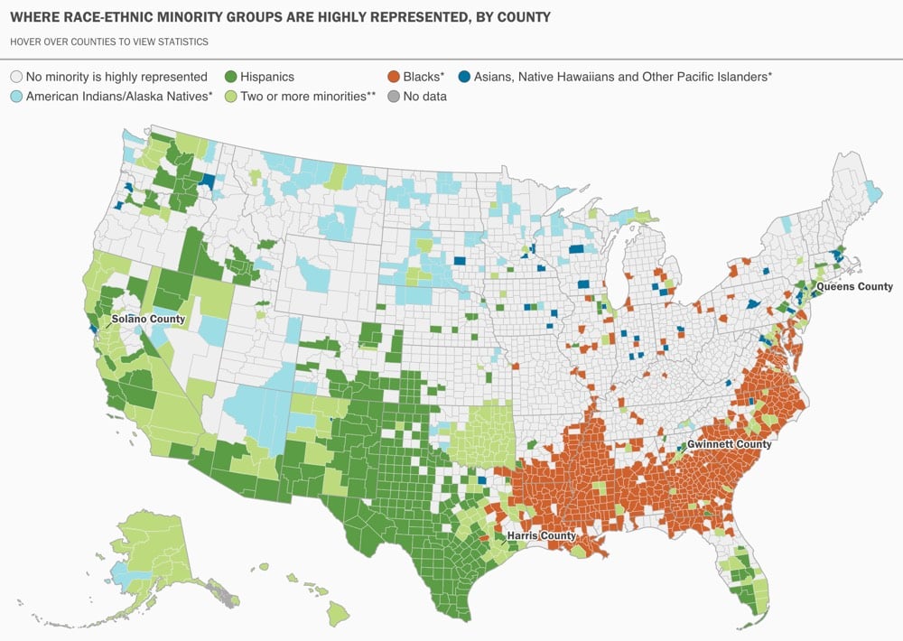
Hispanics and Asian Americans are the fastest-growing racial minority groups nationally, increasing by 18.6% and 27.4%, respectively, from 2010 to 2018. There is also a growing dispersion of both groups to new destinations, which tend to lie further afield than the familiar large metro areas.
In 1990, 39% of all U.S. Hispanics resided in just four metro areas: Los Angeles, New York, Miami, and Chicago. In 2018, 39% of U.S. Hispanics resided in seven metro areas, with Houston, Riverside, Calif., and Dallas added to the list (and each eclipsing Chicago in size). And beyond these, Hispanic growth is high in areas with smaller Hispanic settlements in all parts of the country.
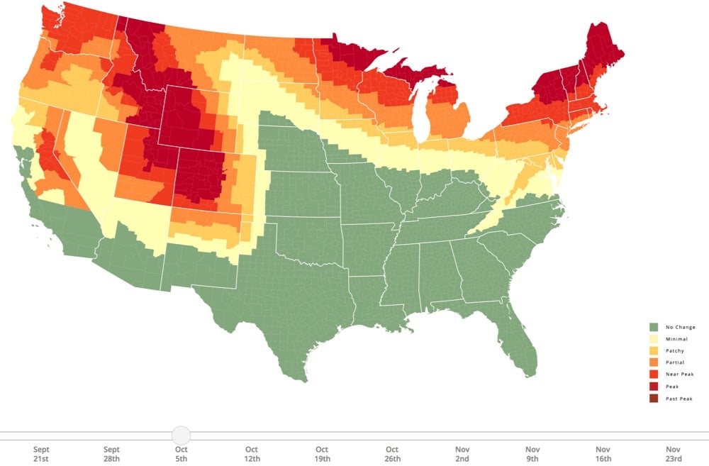
SmokyMountains.com is back this year with their best-of-web foliage prediction map. Here in Vermont, things are starting to look a little rusty out there, but it appears I have at least a few more days to pretend that it’s still summer. Right? RIGHT?!
This video is an animated history of the shifting borders of Europe from 400 BCE to the present. This is a very nation-centric view of European history (and I would mute the music and use your own soundtrack), but it’s still worth a look.
Because of the Electoral College and the way the primary system works in the US, presidential candidates end up spending a disproportionate amount of time is so-called “battleground states” like Pennsylvania, Ohio, and our dysfunctional friend Florida and primary states like Iowa and New Hampshire and less time where most of the US population actually lives (NY, CA, TX, IL, and in cities). The campaign for the National Popular Vote has produced a map that shows where the candidates did campaign events in 2016:
Because of these state winner-take-all statutes, presidential candidates have no reason to pay attention to the issues of concern to voters in states where the statewide outcome is a foregone conclusion. In 2012, as shown on the map, all of the 253 general-election campaign events were in just 12 states, and two-thirds were in just 4 states (Ohio, Florida, Virginia, and Iowa). Thirty-eight states were completely ignored.
And here’s the map for the 2012 election, which is even more extreme:
State winner-take-all statutes adversely affect governance. “Battleground” states receive 7% more federal grants than “spectator” states, twice as many presidential disaster declarations, more Superfund enforcement exemptions, and more No Child Left Behind law exemptions.
Also, because of state winner-take-all statutes, five of our 45 Presidents have come into office without having won the most popular votes nationwide. The 2000 and 2016 elections are the most recent examples of elections in which a second-place candidate won the White House. Near-misses are also common under the current state-by-state winner-take-all method of awarding electoral votes. A shift of 59,393 votes in Ohio in 2004 would have elected John Kerry despite President Bush’s nationwide lead of over 3,000,000 votes.
Today I learned that ZIP Codes do not strictly represent geographic areas but rather “address groups or delivery routes”.
Despite the geographic derivation of most ZIP Codes, the codes themselves do not represent geographic regions; in general, they correspond to address groups or delivery routes. As a consequence, ZIP Code “areas” can overlap, be subsets of each other, or be artificial constructs with no geographic area (such as 095 for mail to the Navy, which is not geographically fixed). In similar fashion, in areas without regular postal routes (rural route areas) or no mail delivery (undeveloped areas), ZIP Codes are not assigned or are based on sparse delivery routes, and hence the boundary between ZIP Code areas is undefined.
The White House has its own ZIP Code (20500), as does the shoe floor of Saks Fifth Avenue in NYC (10022-SHOE). US mail to Santa Claus gets sent to the town of North Pole, Alaska (99705) but in Canada, Santa gets his own postal code (H0H 0H0). And Smokey Bear has his own ZIP Code (20252) because he gets so much mail.
ZIP Codes are therefore not that reliable when doing geospatial analysis of data:
Even though there are different place associations that probably mean more to you as an individual, such as a neighborhood, street, or the block you live on, the zip code is, in many organizations, the geographic unit of choice. It is used to make major decisions for marketing, opening or closing stores, providing services, and making decisions that can have a massive financial impact.
The problem is that zip codes are not a good representation of real human behavior, and when used in data analysis, often mask real, underlying insights, and may ultimately lead to bad outcomes. To understand why this is, we first need to understand a little more about the zip code itself.
For instance, in Miami’s 33139 ZIP Code the difference between the highest median income (as measured in much more granular US Census Block Groups) and lowest median income is over $240,000. So you can imagine it would be difficult to know or even assume anything in general about those residents based on their ZIP Code alone.
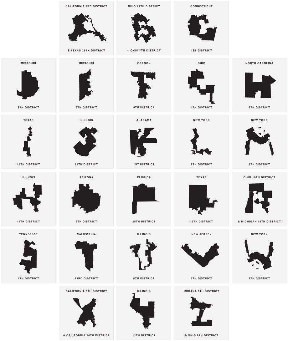
Gerry is a typeface where the letterforms are created from heavily gerrymandered Congressional districts. For example, the letter U is the 4th district in Illinois:
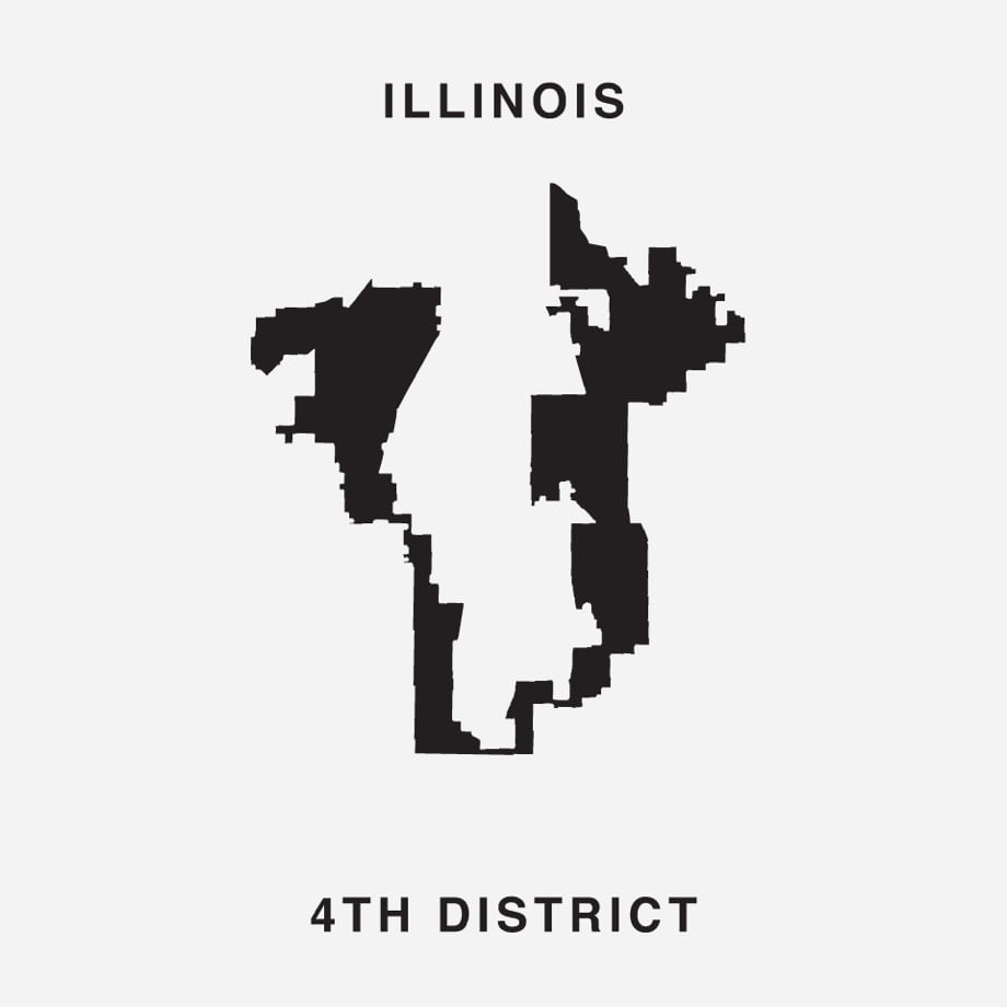
Click through to download the font for free and to tweet at your representative to stop gerrymandering.
This is a really cool visualization of how Planet’s 150+ imaging satellites take a complete satellite photo of the Earth every single day.
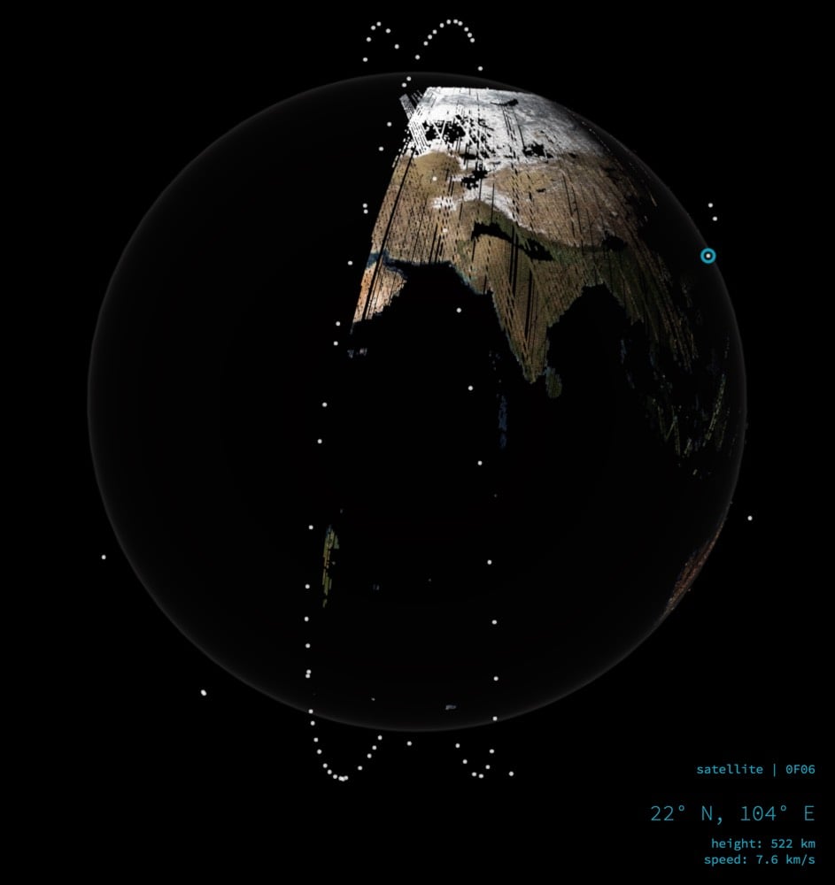
Every few seconds, the visualization picks a new satellite to track, allowing you to see the location, height, and speed. The satellites are 300 miles from the surface of the Earth moving at about 17,000 mph.
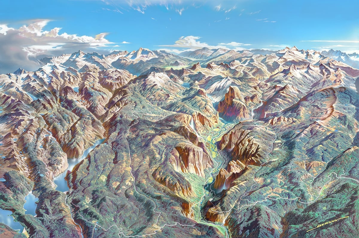
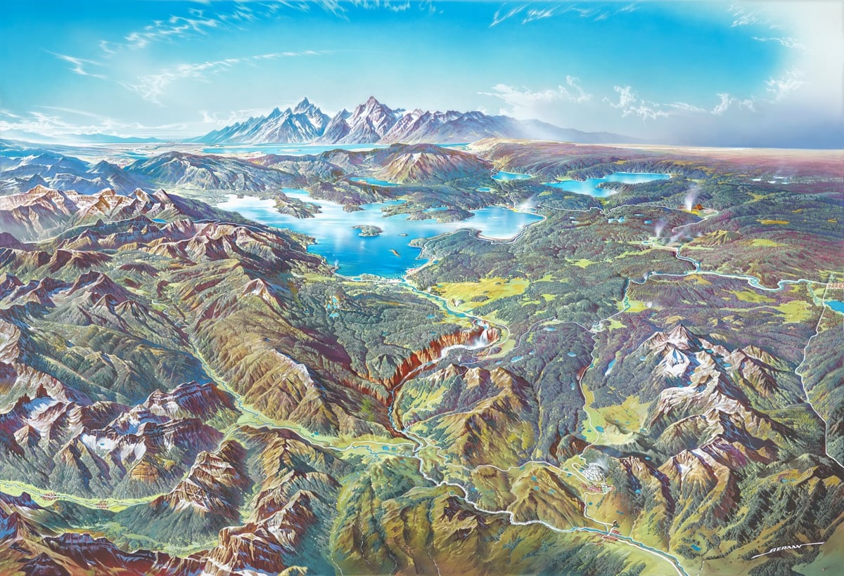
Heinrich C. Berann’s panoramic paintings of US National Parks aren’t just art and aren’t just maps but sit somewhere delightfully in the middle. The US National Park Park Service recently released ultra high-res scans of Berann’s parks panoramas for free download. You can read about the paintings at National Geographic.
Part of the appeal of Berann’s depictions of the national parks is that they look fairly realistic while at the same time greatly enhancing the landscapes in a number of ways. The end result is similar to what you might see from the window of a plane, and yet better than any possible real-world view, Patterson says.
Berann made sure all the important features of each park were visible in the scene. Sometimes this required some creative distortion. On the Yosemite National Park panorama below, for instance, Yosemite Valley is widened to allow all the rock formations, waterfalls, and man-made structures to be clearly seen. All of the valley’s iconic natural features are exaggerated, with Half Dome and El Capitan much taller than in real life, and the waterfalls significantly longer.
The NPS has many other high-resolution maps available for download here. Another good resource for downloadable maps is National Park Maps.
(As an aside, I got this link from Open Culture, who said they found it via Boing Boing. I clicked through to Boing Boing to see that they’d discovered the link from, uh, kottke.org? Perhaps from this link last year?)
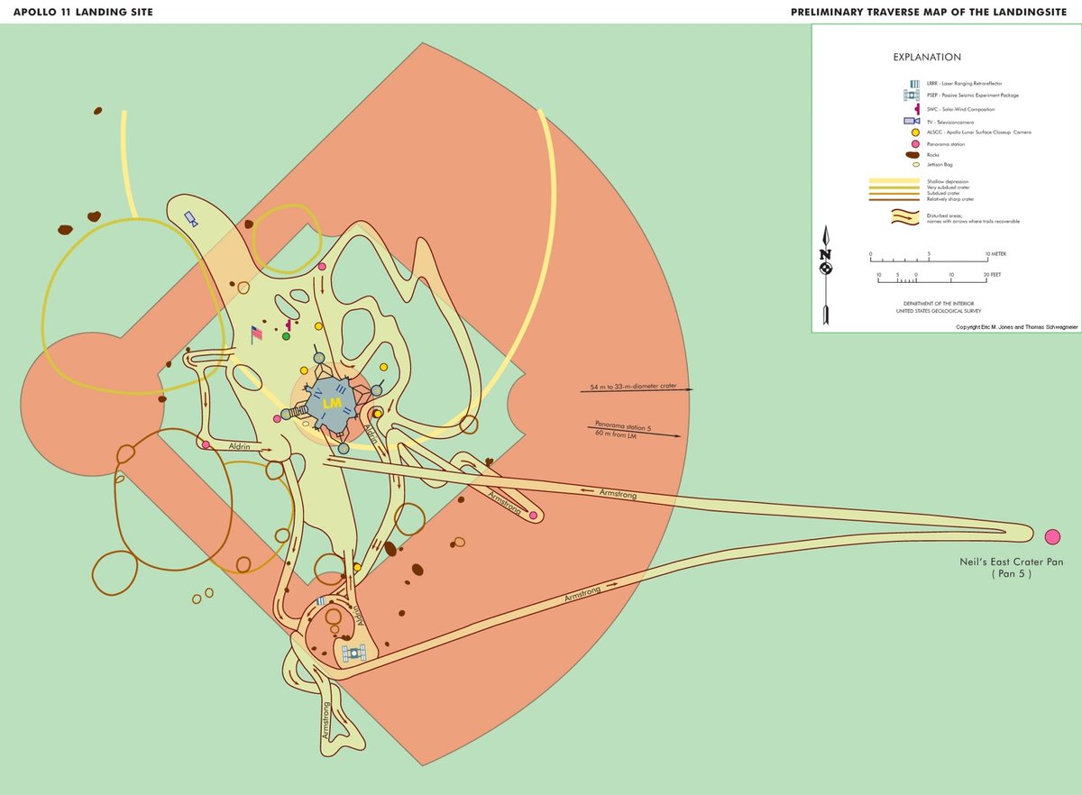
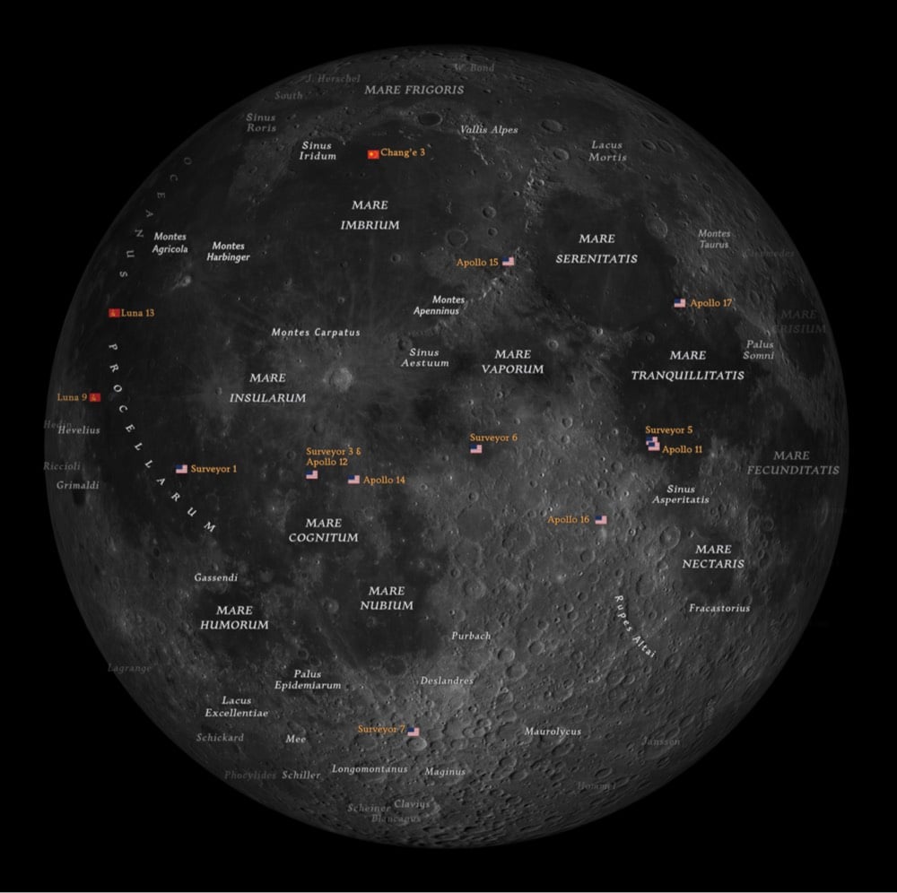
With the 50th anniversary of the first crewed landing on the Moon fast approaching, I thought I’d share one of my favorite views of the Moon walk, a map of where Neil Armstrong and Buzz Aldrin walked on the Moon, superimposed over a baseball field (bigger). The Lunar Module is parked on the pitcher’s mound and you can see where the two astronauts walked, set up cameras, collected samples, and did experiments.
This map easily illustrates something you don’t get from watching video of the Moon walk: just how close the astronauts stayed to the LM and how small an area they covered during their 2 and 1/2 hours on the surface. The crew had spent 75+ hours flying 234,000 miles to the Moon and when they finally got out onto the surface, they barely left the infield! On his longest walk, Armstrong ventured into center field about 200 feet from the mound, not even far enough to reach the warning track in most major league parks. In fact, the length of Armstrong’s walk fell far short of the 363-foot length of the Saturn V rocket that carried him to the Moon and all of their activity could fit neatly into a soccer pitch (bigger):
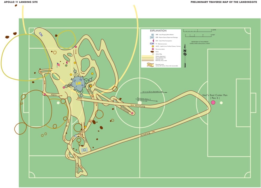
Astronauts on subsequent missions ventured much further. The Apollo 12 crew ventured 600 feet from the LM on their second walk of the mission. The Apollo 14 crew walked almost a mile. After the Lunar Rover entered the mix, excursions up to 7 miles during EVAs that lasted for more than 7 hours at a time became common.
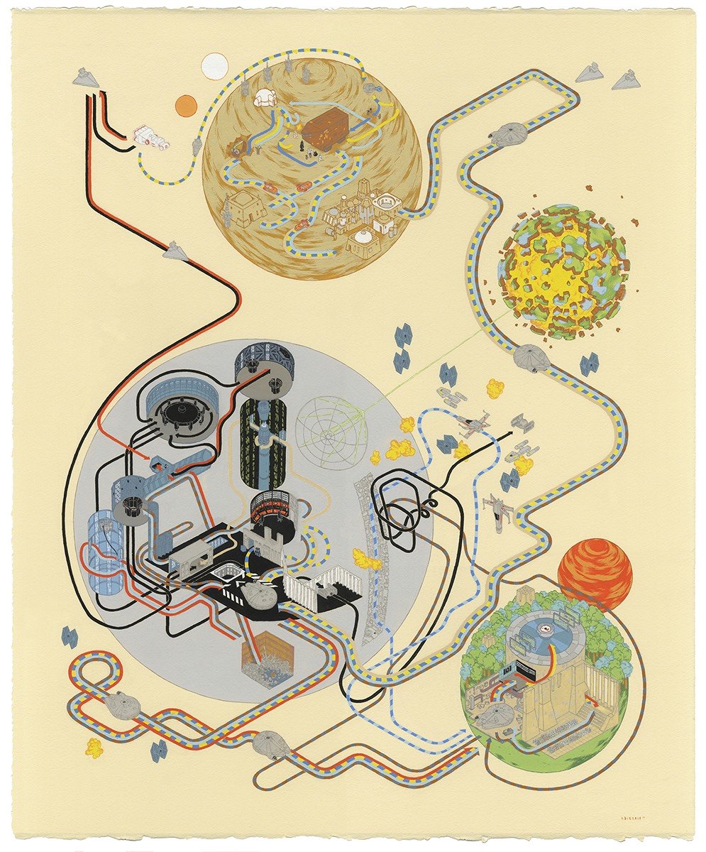
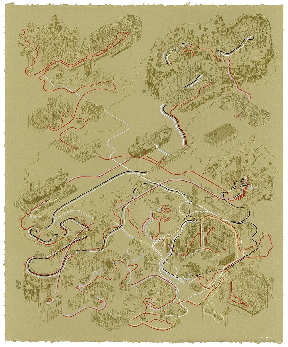
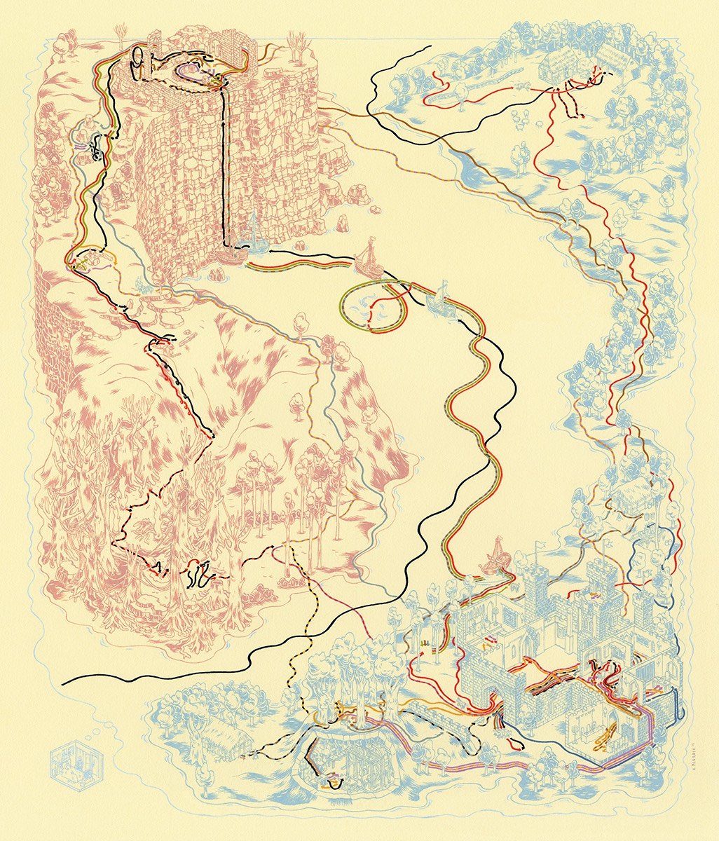
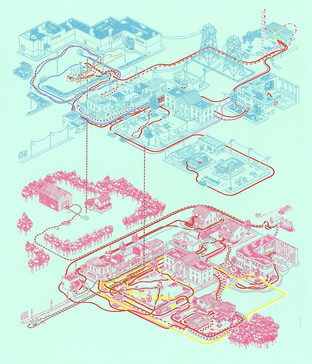
Illustrator Andrew DeGraff makes what he calls Cinemaps, maps of movies and their plots in the style of the dotted-line wanderings of The Family Circus comic strip or Harry Potter’s Marauder’s Map. He’s done maps for Star Wars, Indiana Jones, and The Princess Bride.
My favorite DeGraff drawing is probably Back to the Future, with Hill Valley represented twice on the same page: 1955 in pink underneath 1985 in blue.
DeGraff collected these maps (and several more) into a book called Cinemaps. (via fairly interesting)
From National Geographic comes The Atlas of Moons, an interactive reference to all of the major moons in our solar system, from the Earth’s own moon to the Galilean moons of Jupiter to Charon, which forms a binary system with Pluto.
For whatever reason, I wasn’t fully aware that some of Jupiter’s and Saturn’s major moons orbited their planets so quickly — Europa takes 3.6 days to complete an orbit, Io once every 1.8 days, and Mimas speeds around Saturn every 22.6 hours.
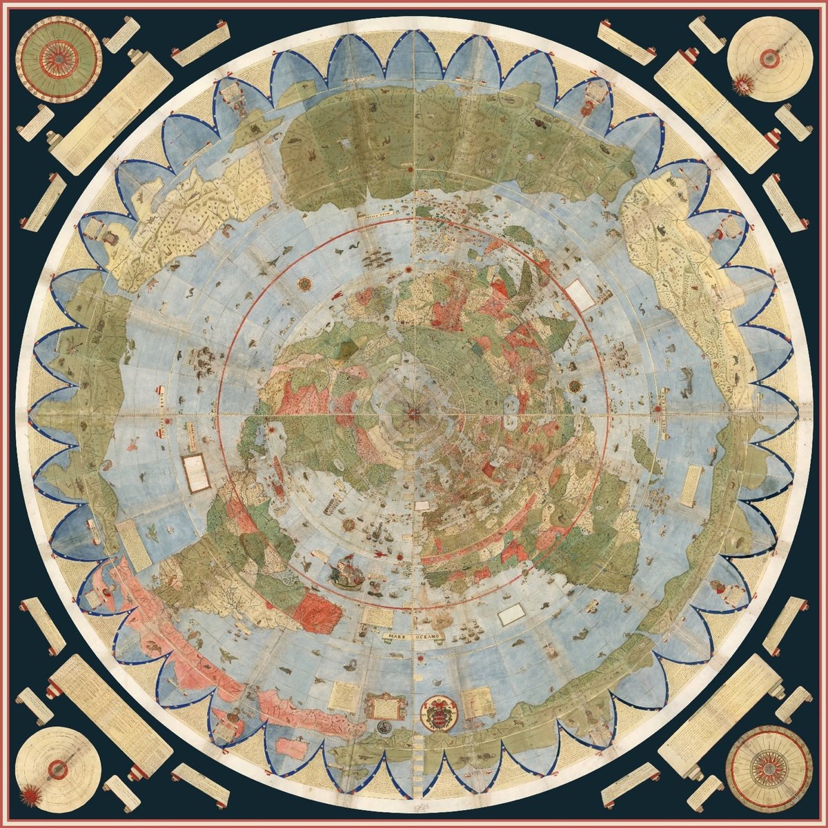
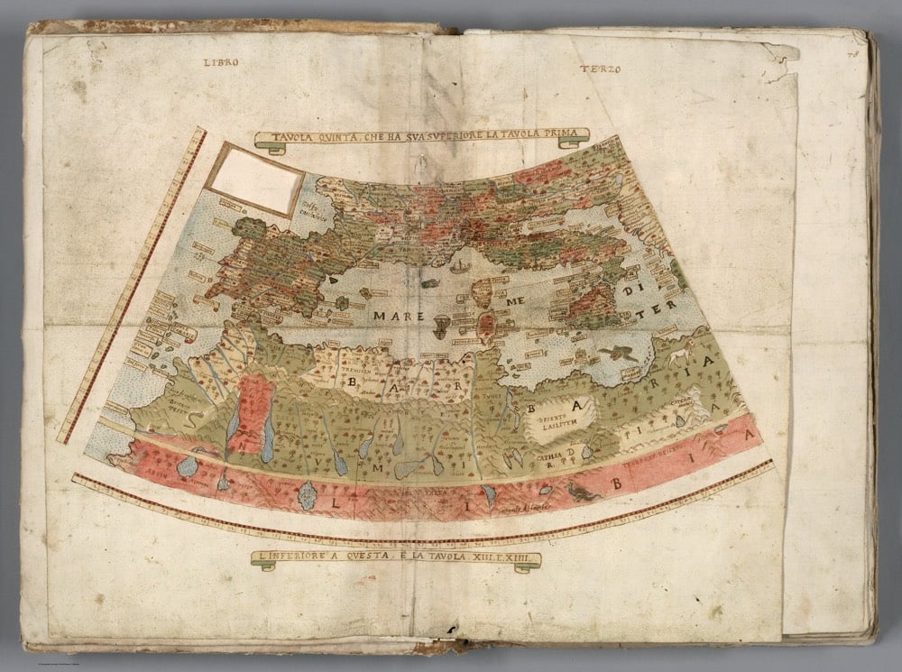
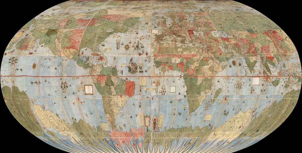
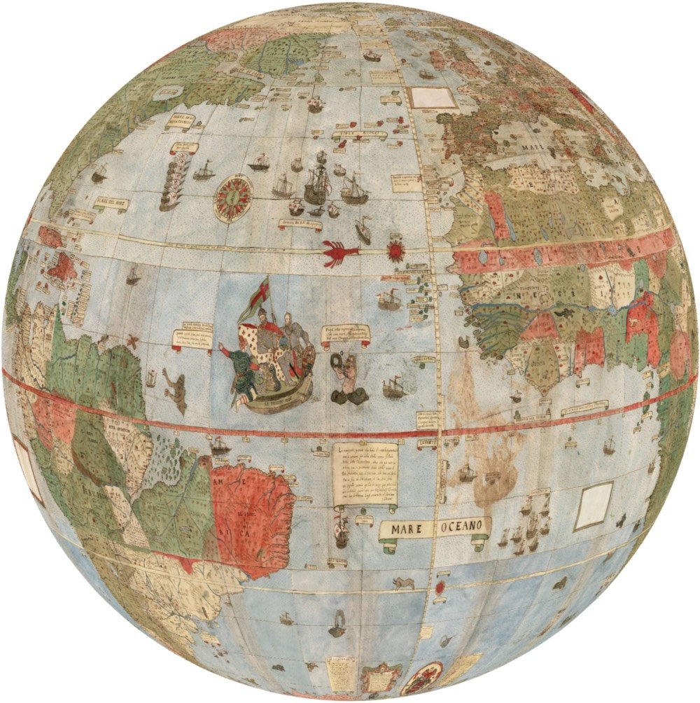
In 1587, Urbano Monte made the largest known early map of Earth. The map consists of 60 panels that were meant to be assembled into a planisphere (a circular map that rotates about a central axis) measuring 10 feet across. The David Rumsey Map Center recently acquired a manuscript of Monte’s map and digitally assembled all 60 pieces into the full map (inlined above but click through to zoom/pan).
Of great interest is the attempt Monte makes to make his map not just a geographical tool but to show climate, customs, length of day, distances within regions — in other words, to create a universal scientific planisphere. In his dedication on tavola XL he specifies how to arrange the sheets of the mappamondo and makes it explicit that the whole map was to be stuck on a wooden panel 5 and a half brachia square (3.25m) so that it could be revolved around a central pivot or pin through the north pole.
The individual map panels looked like this:
Of course, once the image is digital you can map it into all sorts of different projections like Mercator or Ortelius oval projection.
Jeremy Ashkenas even created a rotatable & zoomable globe of Monte’s map that is incredibly fun to play with.
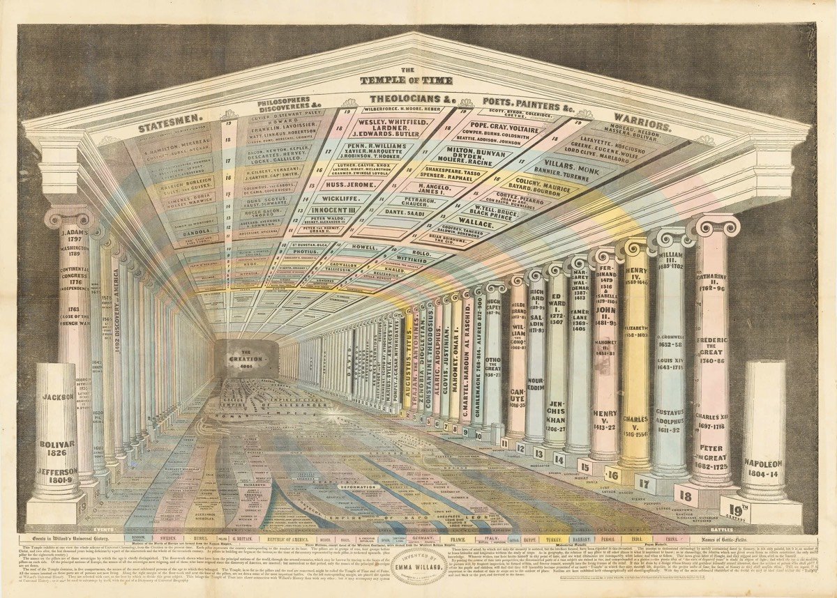
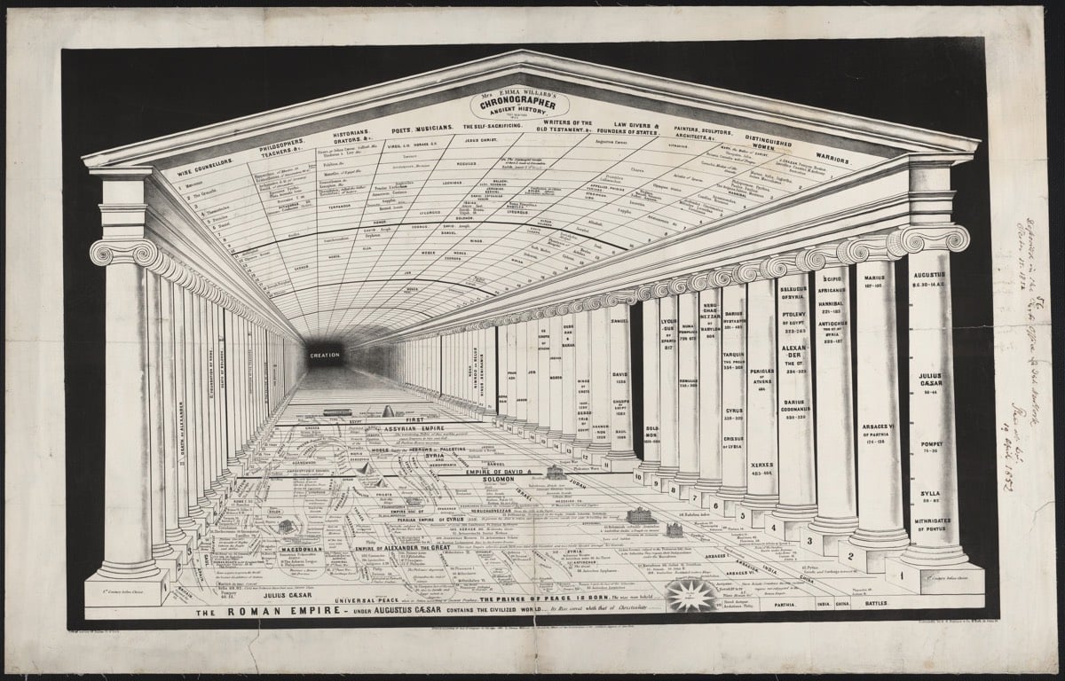

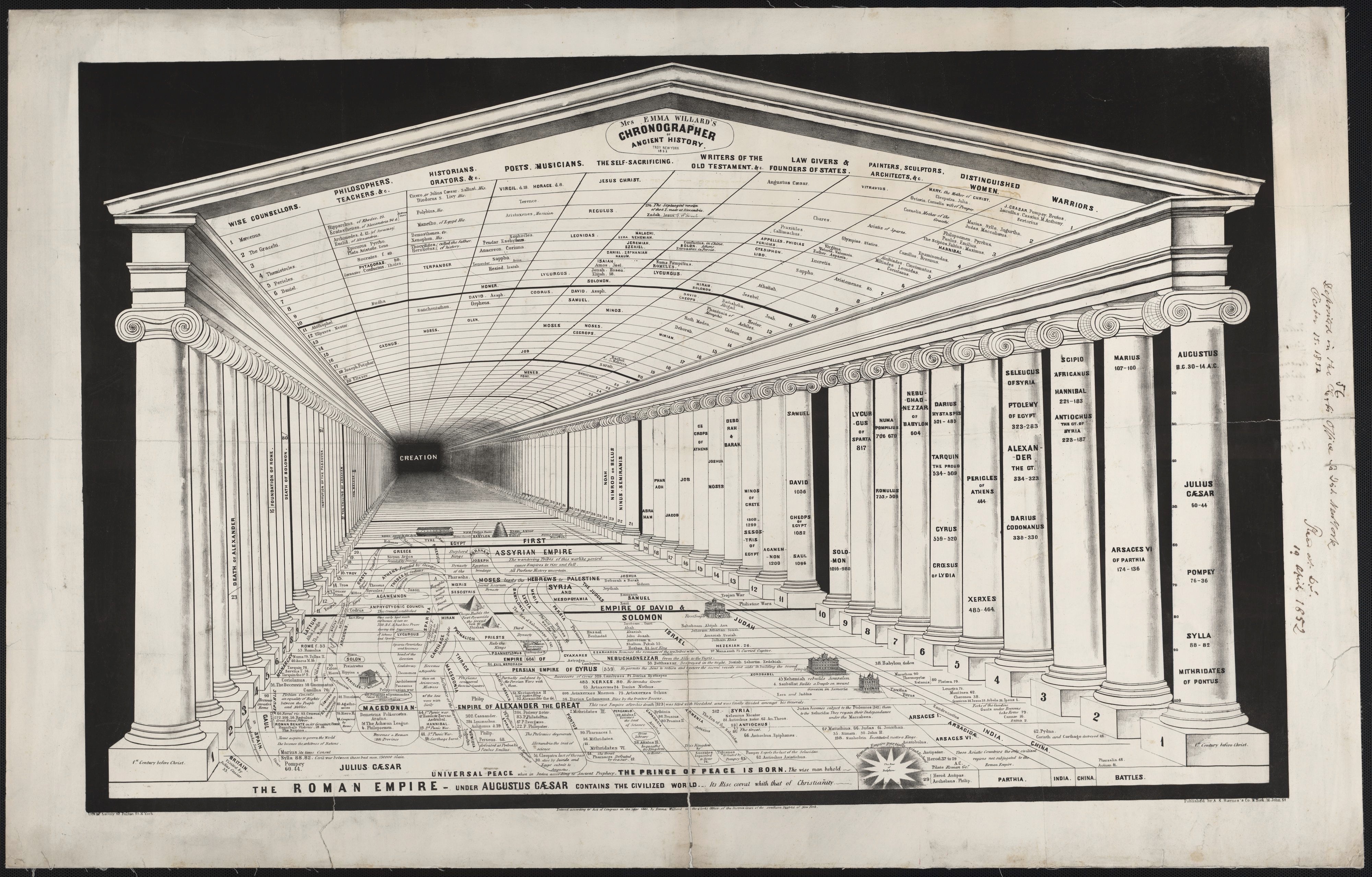
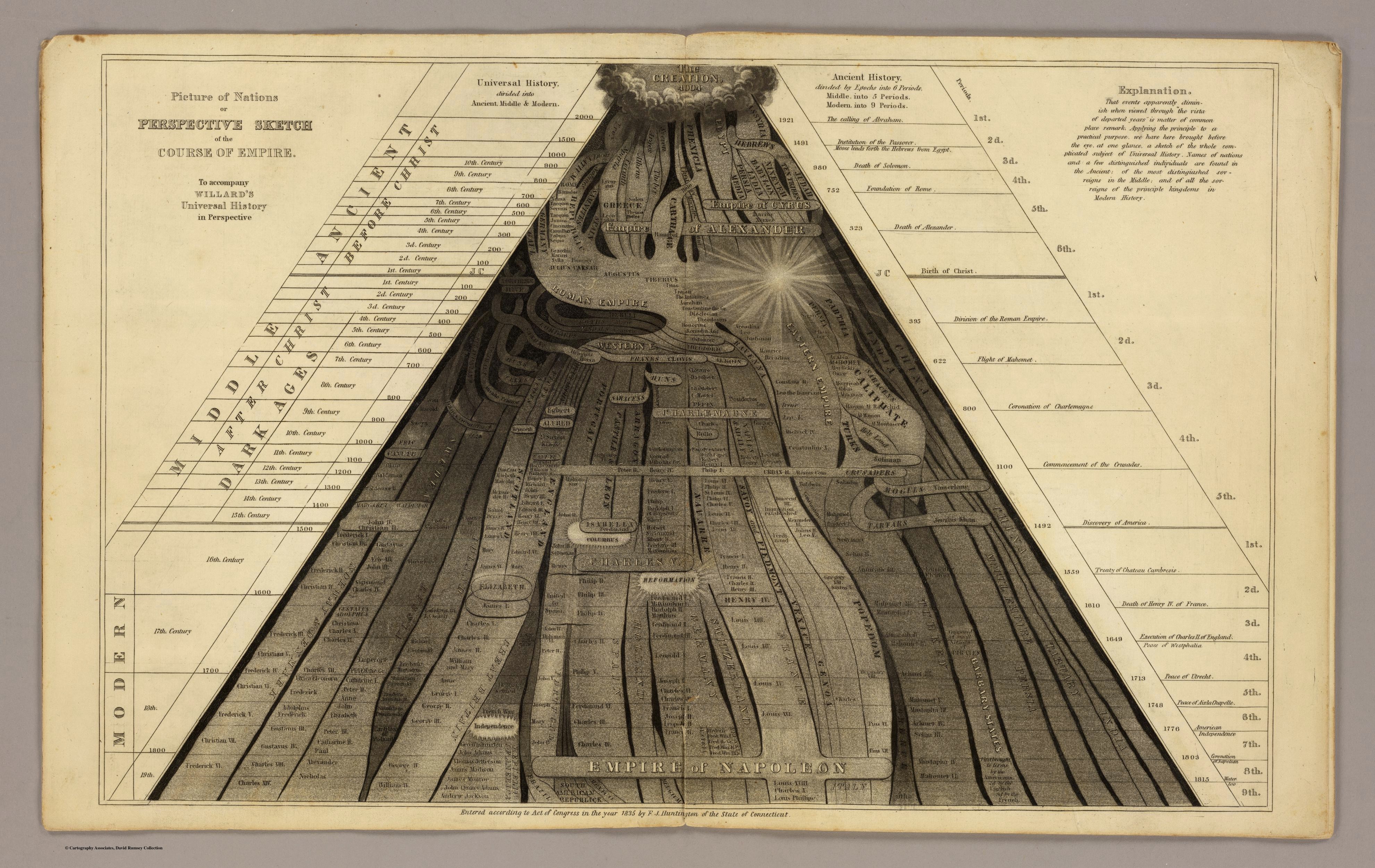
At The Paris Review, historian Ted Widmer highlights the work of Emma Willard, pioneering educator and America’s first female mapmaker. Willard began her mapmaking career in the 1820s.
She used every tool available to teach young readers (and especially young women) how to see history in creative new ways. If the available textbooks were tedious (and they were), she would write better ones. If they lacked illustrations, she would provide them. If maps would help, so be it: she would fill in that gap as well. She worked with engravers and printers to get it done. She was finding her way forward in a male-dominated world, with no map to guide her. So she made one herself.
The maps for sale show North America in twelve different snapshots. I say “snapshots” because Willard was such an inventive visual thinker. On the eve of photography, she was thinking hard about how to capture a big story inside a single striking image.
Her maps are good, but what really catches my eye are her information visualizations, included at the top of this post. They are worth looking at in detail: The Temple of Time, The Chronographer of Ancient History, and The Perspective Sketch of the Course of Nations. I mean… [emoji heart eyes]
You can read more about Willard at Slate and Open Culture.
Update: Willard’s Universal History in Perspective, which contains many of her maps and infographics, is available at the Internet Archive. (thx, del)
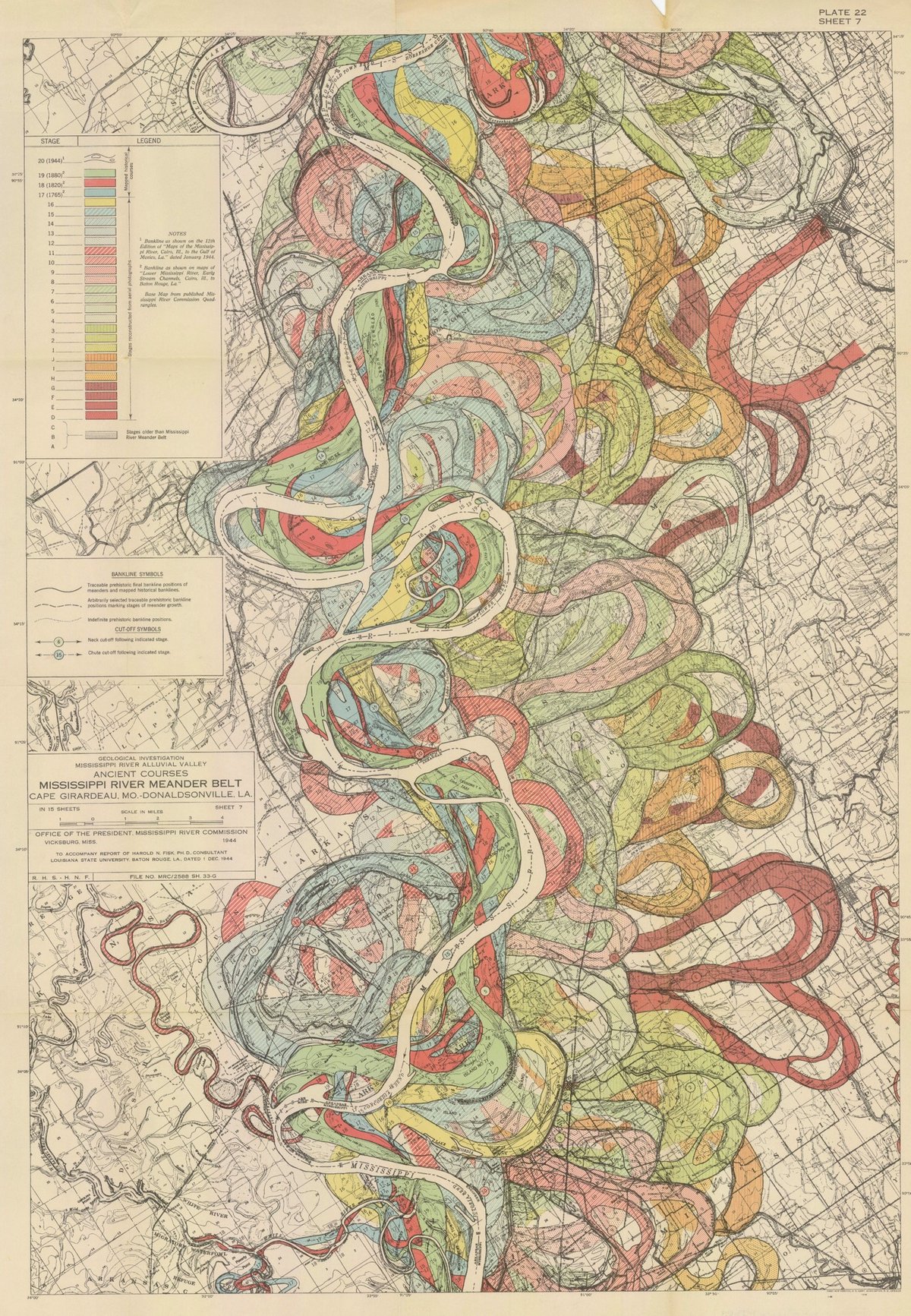
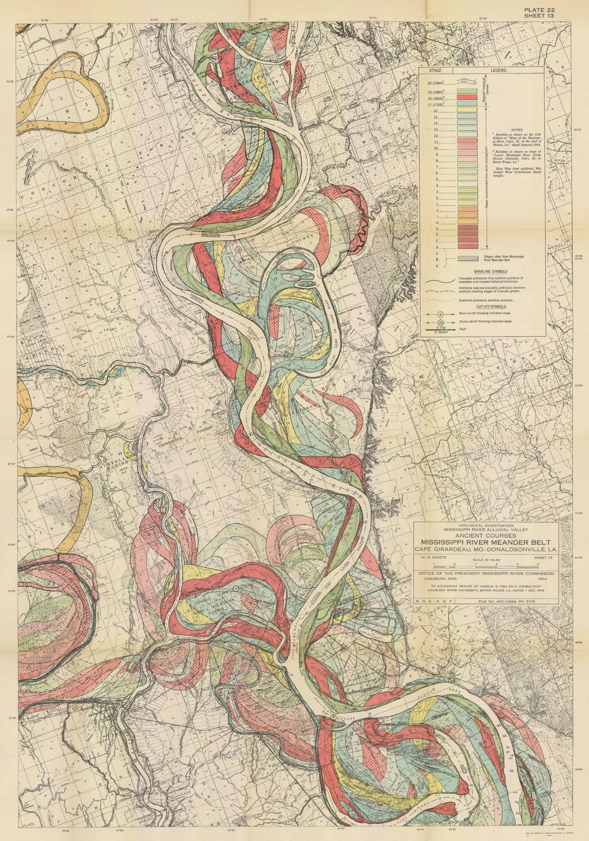
I have long admired the Mississippi River meander maps designed by Army Corps of Engineers cartographer Harold Fisk but have somehow never written a whole post about them. So when my pals at 20x200 reached out wanting me to write a blog post for them about their Fisk prints, I jumped at the chance. It gave me an excuse to write about art as time travel and, in particular, how Fisk’s clever map compresses thousands of years of a river’s activity into a single image.
It takes some imagination, but standing before a painting by Hilma af Klint, a sculpture by Bernini, or a cave painting in Chauvet, France draws you back in time in a powerful way: you know you’re standing precisely where those artists stood hundreds or even thousands of years ago, laying paint to surface or chisel to stone. Even experiencing art through prints or photographs leads the mind to consider all the cultural, political, technological, and economic things that were happening when the work was produced. Art is a doorway to past worlds.
Fisk’s maps represent the memory of a mighty river, with thousands of years of course changes compressed into a single image by a clever mapmaker with an artistic eye. Looking at them, you’re invited to imagine the Mississippi as it was during the European exploration of the Americas in the 1500s, during the Cahokia civilization in the 1200s (when this city’s population matched London’s), when the first humans came upon the river more than 12,000 years ago, and even back to before humans, when mammoths, camels, dire wolves, and giant beavers roamed the land and gazed upon the river.
You can buy prints of Fisk’s maps at 20x200…they have several available at all kinds of different sizes, framed and unframed.
Update: With LIDAR, the past meanderings of rivers can be seen more clearly (and no less artistically) than in Fisk’s maps. Here’s a LIDAR image of the Mississippi River along the border of Arkansas and Mississippi:
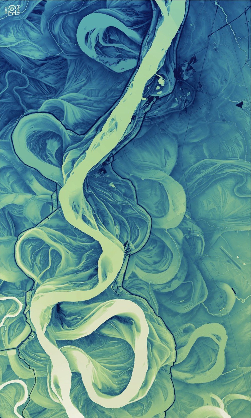
And don’t miss Daniel Coe’s morphing GIF of Fisk’s map to the LIDAR image. (via @macgbrown)
Update: Ahhh, look at this meander quilt from Timna Tarr:
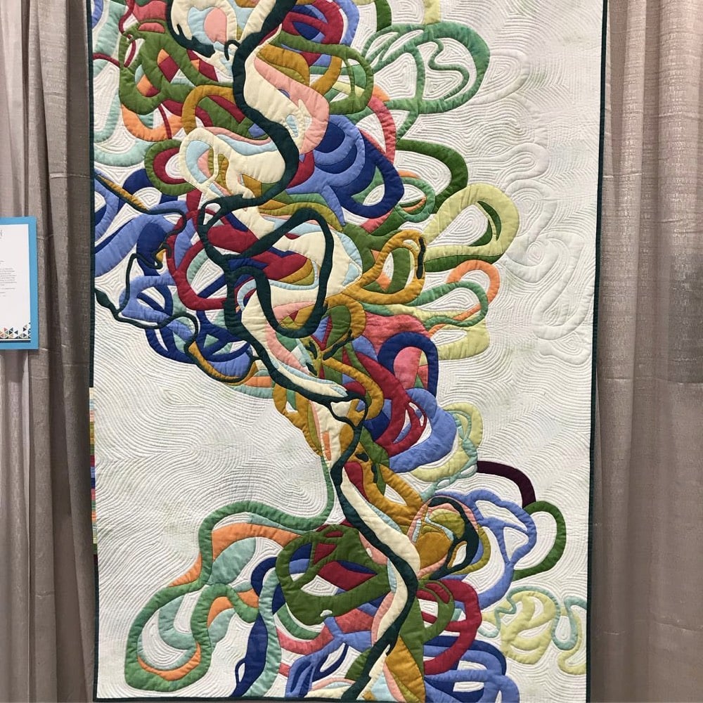
And check out some of the other quilts in her gallery…very cool. (thx, rachel)
Update: Cathy Fussell has also created quilts based on Fisk’s maps.
I don’t know if this needs a disclaimer or not, but 20x200 paid me a modest amount to write this blog post for their site but not the post you’re reading now. 20x200 didn’t pay me to write this here post; they didn’t even ask me if I would link to their post from my site. I once wrote a slightly longer (and progressively unhinged) disclaimer for a previous post about 20x200.
Remember how last week I told you about Eleanor Lutz’s An Atlas of Space?
Over the past year and a half I’ve been working on a collection of ten maps on planets, moons, and outer space. To name a few, I’ve made an animated map of the seasons on Earth, a map of Mars geology, and a map of everything in the solar system bigger than 10km.
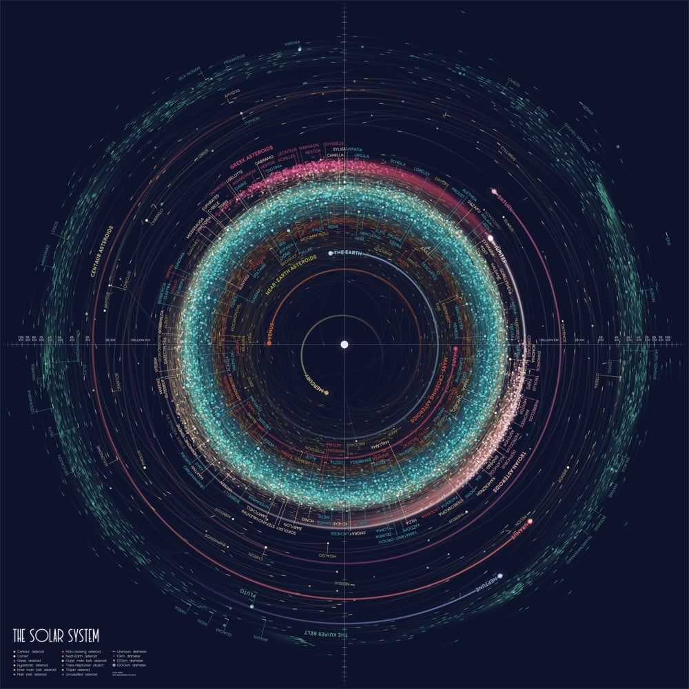
Well, she’s posted her first two projects: An Orbit Map of the Solar System (a map of more than 18,000 asteroid orbits in the solar system) and A Topographic Map of Mercury.

As promised, Lutz has posted the source code for each project to her GitHub account: Mercury topography, asteroid orbits. What a great resource for aspiring data visualization designers. Stay tuned to her site, Twitter, or Tumblr for upcoming installments of the atlas.
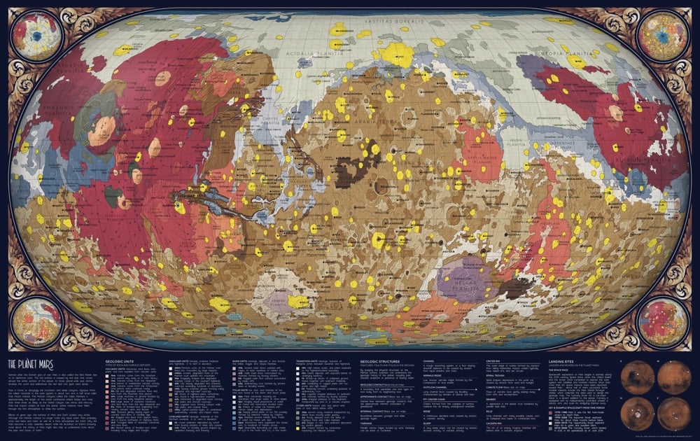
Update: Lutz’s third map in the series is out: The Geology of Mars. And here’s the link to the code and how-to on Github.
Update: Lutz’s fourth map has been released: an animated map of the Earth cycling through all four seasons. Link to the code on GitHub.
Also, she’s made high-res wallpapers available for download in a number of different aspect ratios…check out the links at the bottom of the post.
Update: Today’s installment of the atlas presents a view from our solar system: The Western Constellations (source code on Github).
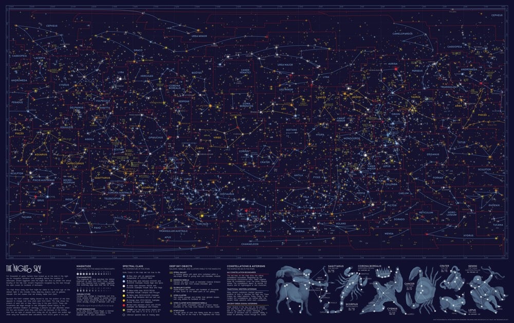
This week’s map shows every single star visible from Earth, on the darkest night with the clearest sky. The map also includes all of the brightest galaxies, nebulae, and star clusters from W.H. Finlay’s Concise Catalog of Deep-sky Objects. I illustrated the familiar Western star patterns — or asterisms — in blue and gold, as well as the scientific constellation boundaries in red.
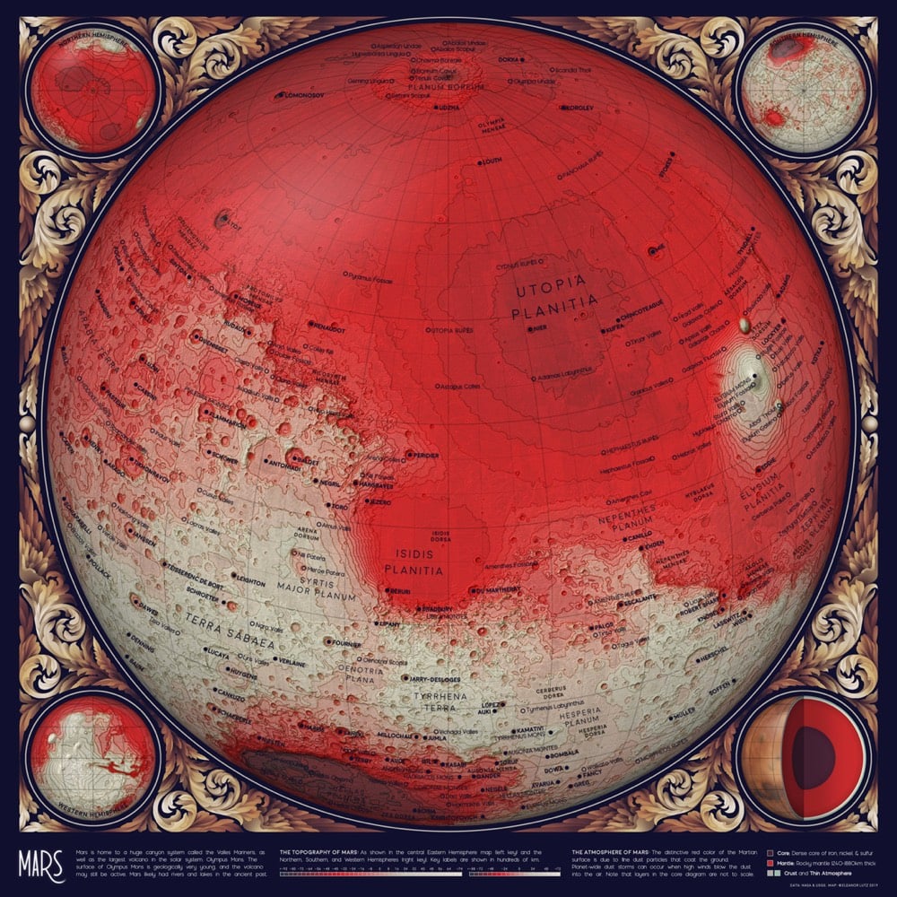
Update: Holy moly, I think Lutz’s Topographic Map of Mars might be her most beautiful one yet.
Update: I couldn’t keep up with all of Lutz’s additions to her atlas. You can check out all of the installments in the archive, including the last part (for now), The Geology of the Moon.
Emily Lakdawalla of the Planetary Society filed a report on humanity’s current roster of spacecraft currently exploring the solar system (and beyond).
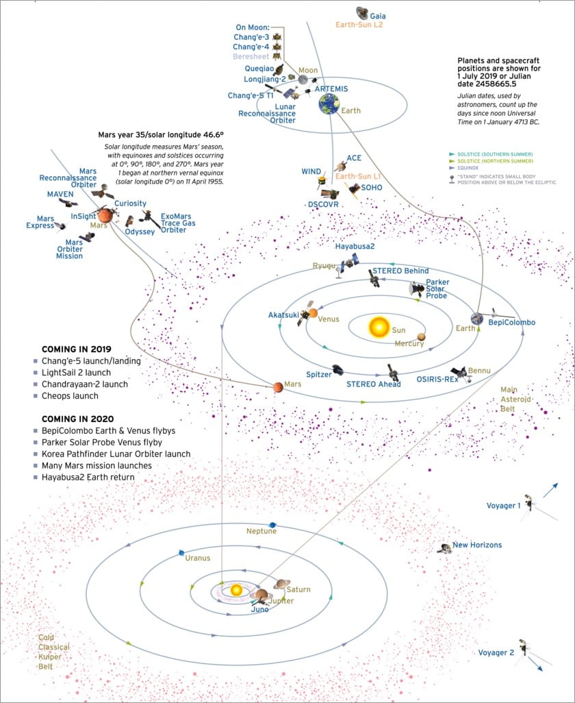
Chang’e-4 and Yutu-2 are now past their prime mission and are in their extended mission phases. Their companion SmallSat, Longjiang-2, will crash into the Moon on 31 July to bring its mission to an intentional end. Parker Solar Probe is near aphelion as of 1 July and will reach its third death-defying solar perihelion on 1 September. BepiColombo completed its near-Earth commissioning phase on 5 April and is now settling into its long-cruise phase. Earlier this year, the ESA-JAXA Mercury mission was racing ahead of Earth on an inside track, but its elliptical orbit has now taken it farther from the Sun than Earth, allowing Earth to catch up. It will return to Earth’s neighborhood in April 2020 for a flyby.
I counted roughly 30 different probes and rovers in operation, most of them gathered around the Moon and Mars. Sure, where’s my jetpack and flying car and all that, but the fact that humanity has more than two dozen robots currently exploring the solar system seems pretty futuristic to me.
Wikipedia also has a page listing currently active probes and of course there’s the lovely & informative spaceprob.es as well.
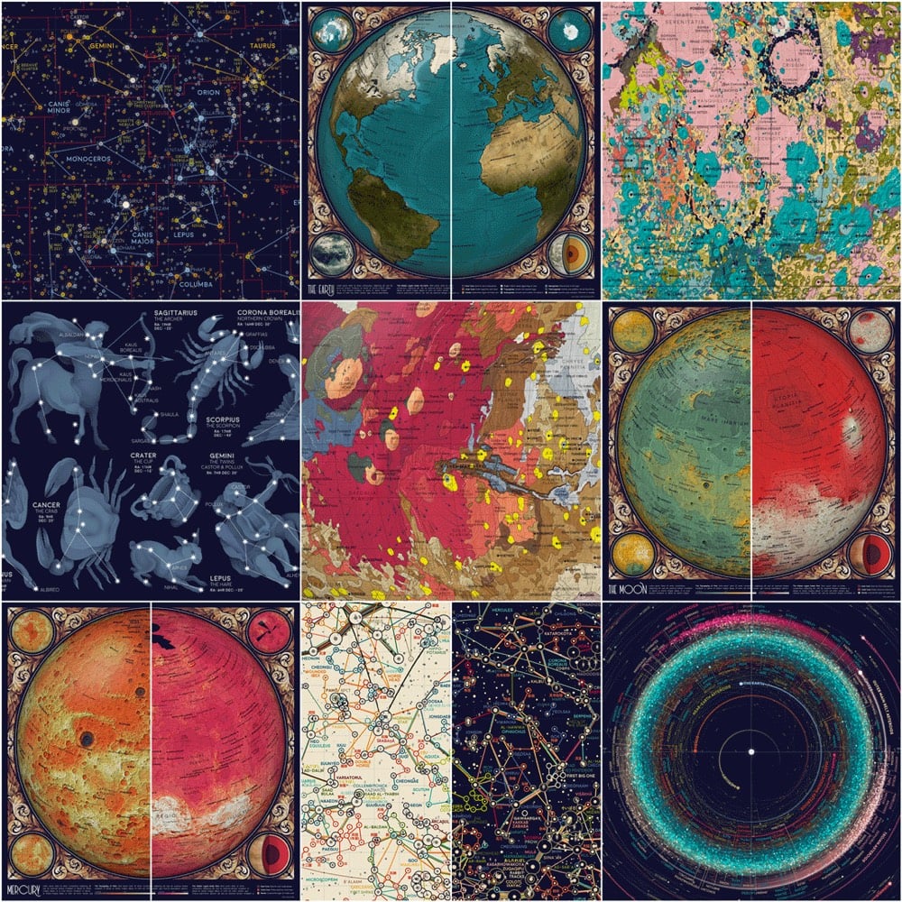
Eleanor Lutz is one of my favorite data visualizers (previously) and she’s about ready to drop her new project: An Atlas of Space.
I’m excited to finally share a new design project this week! Over the past year and a half I’ve been working on a collection of ten maps on planets, moons, and outer space. To name a few, I’ve made an animated map of the seasons on Earth, a map of Mars geology, and a map of everything in the solar system bigger than 10km.
Over the next few weeks I want to share each map alongside the open-source Python code and detailed tutorials for recreating the design. All of the astronomy data comes from publicly available sources like NASA and the USGS, so I thought this would be the perfect project for writing design tutorials (which I’ve been meaning to do for a while).
Ahhh, look at those colors! Lutz is going to be posting a new map from the project periodically over the next few weeks so follow her on Tabletop Whale, Twitter, or Tumblr to tune in.
Update: I’m keeping track of the projects that make up the atlas as they are released in updates to this post.
First You Make the Maps is a survey of mapping technology by Elizabeth Della Zazzera showing how, starting at the end of the Middle Ages, better maps facilitated the European discovery of the Americas, the explosion of global trade, the enslavement of Africans, and the colonization by Europeans of much of the world.
While geographically accurate maps had existed before, the Age of Exploration saw the emergence of a sustained tradition of topographic surveying. Maps were being made specifically to guide travelers. Technology progressed quickly through the centuries, helping explorers and traders find their way to new imperial outposts — at least sometimes. On other occasions, hiccups in cartographic reasoning led their users even farther astray.
(via @ktguru)
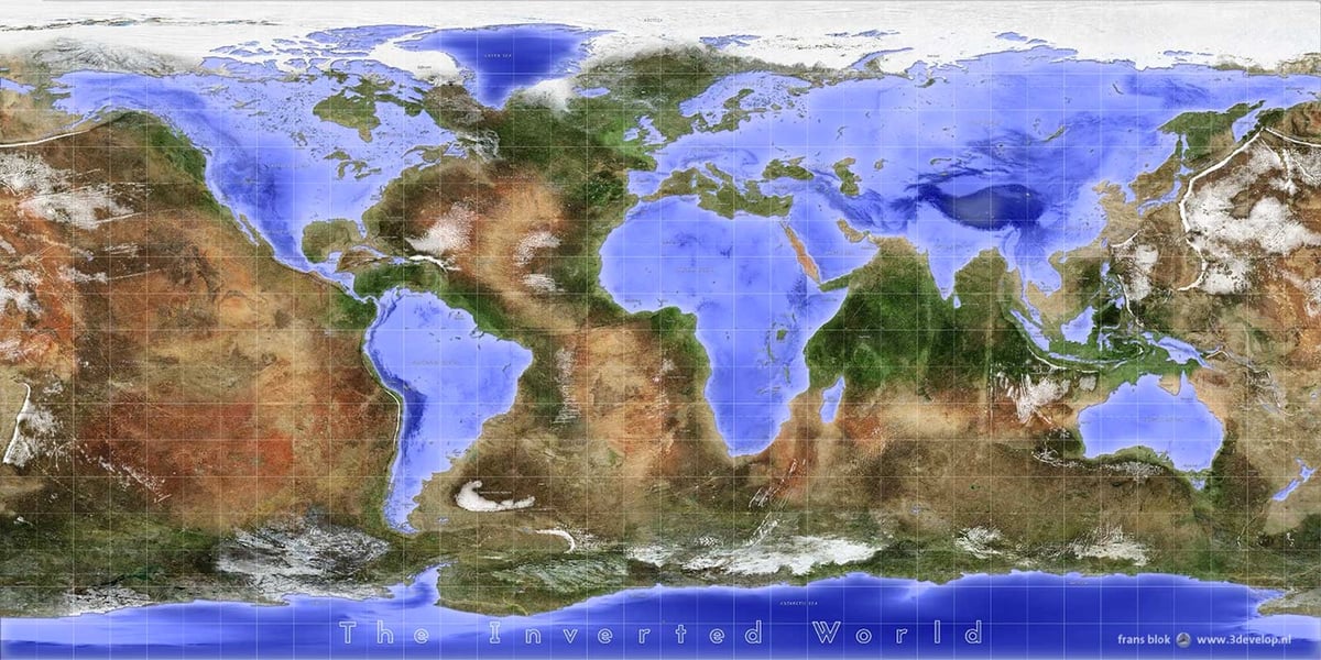
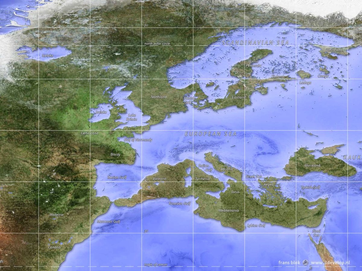
Frans Blok has created an incredibly detailed inverse map of the world, where all the current landmasses have been turned into water and oceans, lakes, and rivers converted into land.
Not only the coast lines are reversed in this world. Also, the relief is consistently the opposite of reality. So the deepest parts of the oceans are in the Tibetan and Himalayan troughs in the southern part of the Asian Ocean. And the highest peaks, around eleven kilometer, are found in the Mariana Mountains in the west of the continent Pacifica.
Prints of Blok’s map are available here.
See also Vladislav Gerasimov’s inverted world map.
Using geological surveys, geo-referenced road network data, and historic maps drawn the from the collections of the Library of Congress and New York Public Library, Miles Zhang made this time lapse video of the development of the street grid of NYC from 1609 (when Henry Hudson first explored the area for the Dutch) to the present day.
The resulting short film presents a series of “cartographic snapshots” of the built-up area at intervals of every 20-30 years in the city’s history. This process highlights the organic spurts of growth and movement that typify New York’s and most cities’ development through time. The result is an abstract representation of urbanism.
Zhang has written up his research methodology for the video as well as some observations and analysis of the data.
For almost the first half of Manhattan’s history, walking was the primary means of transport. This preference was manifested in the shorter distances between residential, industrial, shipping, and commercial areas — and more frequently their overlap. With street systems, the reliance on the foot is manifested in narrower streets widths not designed to accommodate greater width from carriages, trolleys, and later cars. In fact, the average width of secondary arterial streets increased from 30 feet for streets opened between 1624-1664, to 45 feet for streets opened 1664-1811, and then a uniform width of 60 feet for any cross street opened after 1811. Later widenings increased many of these smaller and pre-1811 streets to width between 100 and 130 feet. In other words, moving from the older networks in the south to newer networks in the north, the width of streets and size of blocks generally increases. These new widths might be influenced by growing population size from only 25,000 in the 1770s, to 64,000 by 1811, and 247,000 by 1834, thereby requiring wider streets for expanding population and higher buildings.
These gradual changes in planning reflected increasing reliance on carriages and horse-drawn trolleys instead of walking. Each mode of transport required a different minimum street width and was associated with different speeds.
(via @john_overholt)
Oh my, this medieval town generator tool is super fun to play around with. By adjusting parameters like size, color palette, building styles, and which features to include (rivers, coastline, temples), you can make a random ichnographic map of a medieval town or city.
Toy Town is a related tool by the same person that allows you to move through a 3D visualization of a medieval town, a la Minecraft. (Unfortunately, you can’t generate a map in the 2D tool and then fly through it in the 3D tool.)
See also Auto-Generated Maps of Fantasy Worlds. (thx, ann)
Update: See also the Fantasy Map Generator. (via @mattg)
Newer posts
Older posts
Socials & More