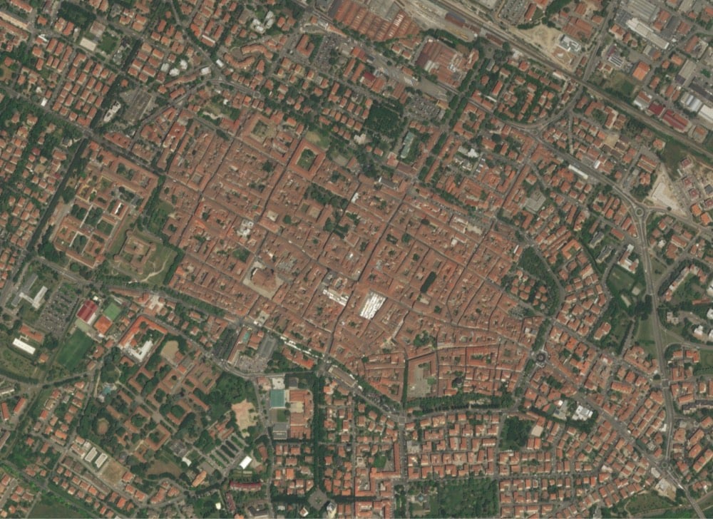
kottke.org posts about maps
In 2017, BuzzFeed’s Publisher Dao Nguyen did a TED Talk about how the company thinks about producing content.
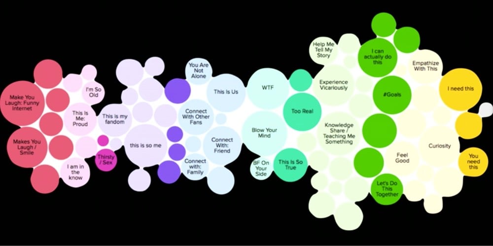
In it, she introduces a system BuzzFeed developed called cultural cartography.
The question I get most frequently is: How do you make something go viral? The question itself is misplaced; it’s not about the something. It’s about what the people doing the something, reading or watching — what are they thinking? Now, most media companies, when they think about metadata, they think about subjects or formats. It’s about goats, it’s about office pranks, it’s about food, it’s a list or a video or a quiz, it’s 2,000 words long, it’s 15 minutes long, it has 23 embedded tweets or 15 images. Now, that kind of metadata is mildly interesting, but it doesn’t actually get at what really matters. What if, instead of tagging what articles or videos are about, what if we asked: How is it helping our users do a real job in their lives?
Last year, we started a project to formally categorize our content in this way. We called it, “cultural cartography.” It formalized an informal practice that we’ve had for a really long time: don’t just think about the subject matter; think also about, and in fact, primarily about, the job that your content is doing for the reader or the viewer.
Here’s what BuzzFeed’s map of their users’ desires looks like:
But as former BuzzFeed employee Matthew Perpetua notes in a post about pop star Lizzo, content can start to feel formulaic if, you know, you use an actual formula to produce it.
I can’t hear Lizzo’s music without recognizing her cultural cartography savvy. A lot of music can achieve these goals without contrivance, often just as a natural side effect of an artist intuitively making resonant work, but Lizzo’s songs all sound very calculated to me. This is not such a bad thing — her skill in expressing herself in relatable ways is a major talent, and I’ve worked with many people who have this natural skill and hold them in very high regard. (I’m much better at telling people who they are rather than asking you to identify with who I am.) Lizzo has a good voice, and her songs range from “pretty good” to “undeniable banger” but I have mixed feelings about all of it because I know the game being played rather well, and because I’m uncomfortable with this self-consciously audience-pleasing approach to content creation becoming the primary mode of pop culture.
All artists who produce work for a large audience (or aspire to) have a method like cultural cartography, though most likely much less formal and more intuitive than BuzzFeed’s system. Some artists are better than others in disguising their methods.
For almost as long as we’ve had civilization, people have been making data visualizations.1 The availability of paper and screens has exploded their creation in the last few hundred years, but the earliest visualizations were made from physical objects. This list contains more than 300 examples of physical visualizations and related artifacts and is absolutely fascinating (the older artifacts in particular). Take these stick charts from the Marshall Islands for example:
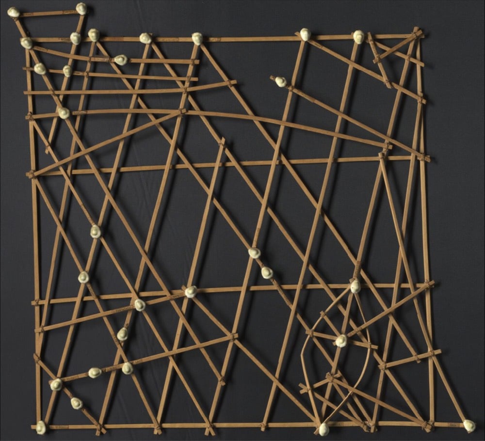
These physical visualizations show ocean swell patterns, and were built by native Micronesians from the Marshall Islands to facilitate canoe navigation. They were memorized before trips. The Western world remained unaware of the existence of these artifacts until 1862.
The photo above is a stick chart from 1974. Straight sticks represent regular currents and waves, curved sticks represent ocean swells, and seashells represent atolls and islands.
And Yakama time balls:
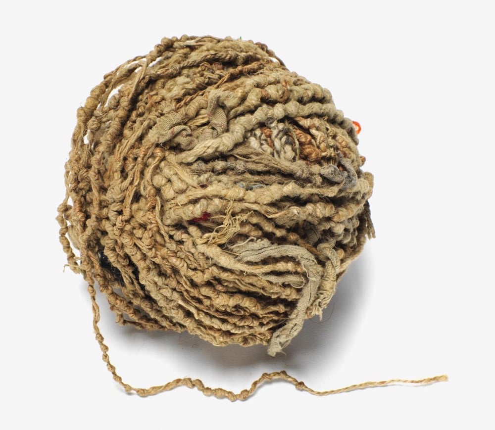
Women from the Yakama Native American tribe used strings of hemp as personal diaries. Each major event in their life was represented by a knot, a bead or a shell. This mnemonic device is called an Ititamat, or counting-the-days ball, or simply time ball.
A young woman would use a time ball to record her courtship, marriage, and other experiences using a system of knots and beads that only she could decipher. As she grew older, a woman might have several time balls with which to share her life story or keep those memories private. When she passed on, they were buried with her.
The ball of twine grew in size as time passed and as events occurred. The women would sometimes divide the twine into 25-year lengths to make it more manageable. When the women were very old, they could use the knots and beads of their time balls to recall not only what happened in their lives but when the events occurred. They could easily recount when their children were born, when they moved away, and other major experiences.
You can read more about stick maps in the Smithsonian magazine and more about time balls at the Realm of the Lone Grey Squirrel.
Have you ever wondered how mapmakers made bird’s-eye-view maps before the invention of satellites or even hot air balloons? I have and was glad to find Phil Edwards’ video on the subject:
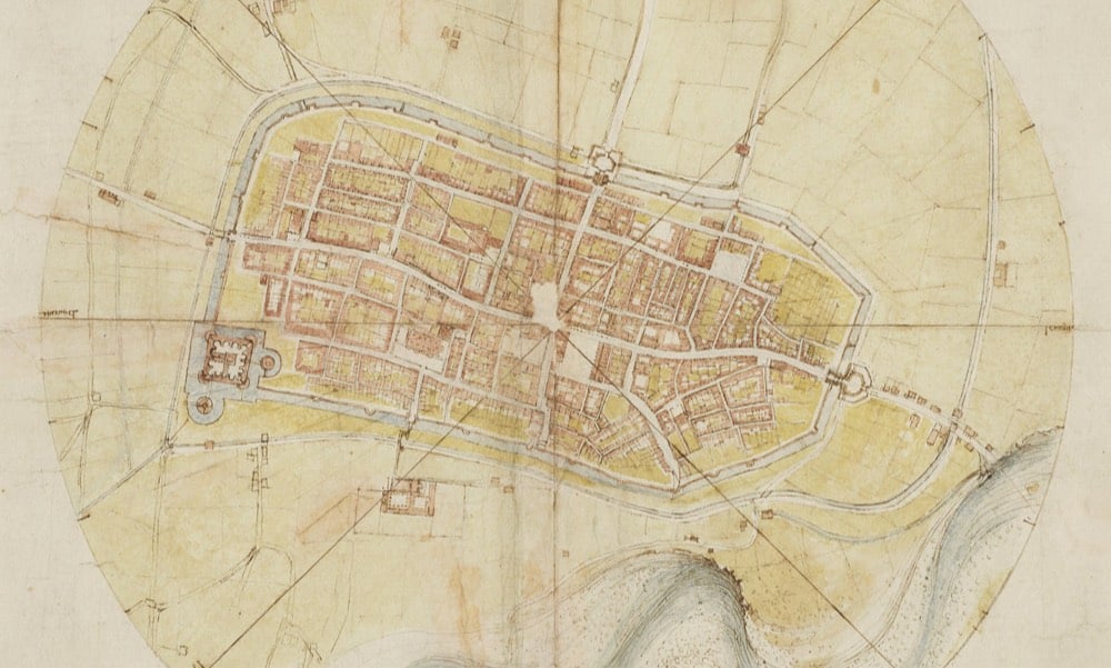
Leonardo da Vinci is justly famous for a lot of different things, but we’ve heard somewhat less about his mapmaking prowess than his painting or mechanical designs. His 1502 map of the Italian town of Imola is the oldest surviving example of an ichnographic (i.e. bird’s-eye-view) map of a place, a type of map that is ubiquitous today in the form of satellite imagery.
Most Renaissance maps are known for their fanciful inclusion of dragons, castles, and undulating mountainsides, and most of them show buildings in elevation, or the “oblique perspective.” But da Vinci’s sought to capture the proportions and relationships between land features more accurately, and he developed new technologies to do so. To make this map of Imola, he may have used the special hodometer and magnetic compass he’d already invented (he’d been fascinated by maps and optics for years). With careful measurements in hand, he drew every “street, plot of land, church, colonnade, gate and square, the whole encompassed by the moat,” writes the Renaissance historian Paul Strathern.
Here is Leonardo’s Imola map (cropped) compared with a contemporary satellite image:
As Edwards notes in the video, Leonardo’s map is not strictly an illustration or drawing of a place but more of an infographic. We take this type of map for granted now, but 500 years ago, that shift was a genuine innovation.
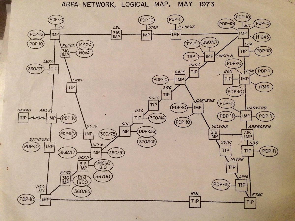
This is a map of ARPANET circa May 1973 via David Newbury, who found it among his father’s papers. The first part of ARPANET was built nearly 50 years ago and became the basis of the modern internet. The network was so small in the early days that those circles and squares on the 1973 map represent individual computers and routers, not universities or cities.
See also An Atlas of Cyberspaces.
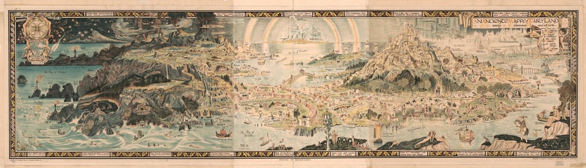
The Library of Congress has a remarkable digitized work in its collection titled “An anciente mappe of Fairyland : newly discovered and set forth,” by Bernard Sleigh, published in London around 1920. Here’s the high-resolution image so you can see some of the detail:
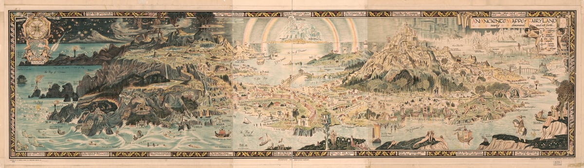
The map aims to be a nearly comprehensive atlas of the world of common English fairy tales, with a few of its own twists and turns. The accompanying guidebook lays out the map’s unique, ontological take on folktales and faerie stories, with the following introductory paragraph (with a quote from Keats’s “Ode to a Nightingale”):
Of the Land of Faerie and of the way thereto
In the Heart of every child, is hidden away a golden key which unlocks the door of a silent, clean-swept room full of changing lights and mystic shadows. There, every child that is born into the world enters at times to gaze eagerly upon the one great window, pictured with ancient legends, and glowing with many colours: amber and scarlet, lapis blues and strange greens. And it is written in many places with curious letters of silver upon black and black upon silver.
About these,
“Charmed magic casements, opening on the foam
Of perilous seas, in faery lands forlorn,”
there lingers a faint, plaintive music, as of far-away organ pipes, of whispering harps, and the sighing of wind amongst the reeds. You would think, at times, it was but the droning of bees in the clover field, or the fall of surf upon some long white beach. It is always there, rising, swelling, dying away in a long, pulsing, voiceless harmony, and through the jewelled panes the light changes continually from that of a pale, cold starshine to the white glory of unclouded moons; and again to the rich warmth of an Eastern sun. Always too, there is the fragrance of enchanted winds, a breathless scent that is like the fading memory of all the flowers that have raised their glad faces to the sun, and closed them softly beneath the Evening Star.
At one time or another of its life, every child that is born of woman sets trembling fingers to open wide the flashing casements — to stand gazing, awed and silent, upon a sea and sky of gold and crimson, full of winged forms grey against its summer radiance.
It goes on like this. I hope you find it charming. (I do.)
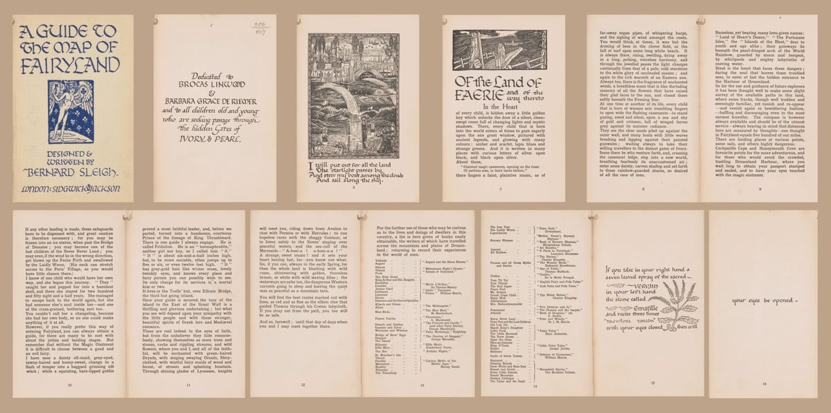
One of the many things this is useful for, besides its own right, is in understanding the cultural mentality in which works like The Lord of the Rings, CS Lewis’s writings, Walt Disney’s films, and the like were shaped. There was a real grappling with European folk stories, from the 19th century onwards, but the 20th century added a metaphysical dimension, a desire to make these stories real, to fix them in a place, to give them their own world. I find that desire fascinating, especially coming out of the horrors of World War I, and the destruction of so much of what had been the old Europe.
(Via Allen Tan.)
The Atlantic recently teamed up with polling and analytics company PredictWise to build a county-by-county map of political open-mindedness in America.
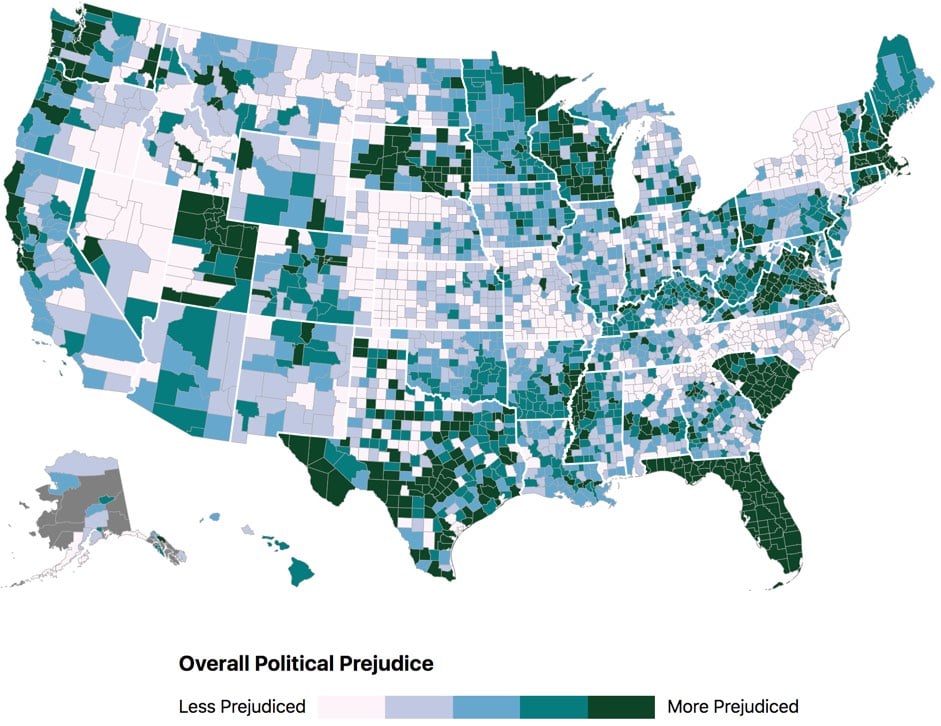
In general, the most politically intolerant Americans, according to the analysis, tend to be whiter, more highly educated, older, more urban, and more partisan themselves. This finding aligns in some ways with previous research by the University of Pennsylvania professor Diana Mutz, who has found that white, highly educated people are relatively isolated from political diversity. They don’t routinely talk with people who disagree with them; this isolation makes it easier for them to caricature their ideological opponents. (In fact, people who went to graduate school have the least amount of political disagreement in their lives, as Mutz describes in her book Hearing the Other Side.) By contrast, many nonwhite Americans routinely encounter political disagreement. They have more diverse social networks, politically speaking, and therefore tend to have more complicated views of the other side, whatever side that may be.
We see this dynamic in the heat map. In some parts of the country, including swaths of North Carolina and upstate New York, people still seem to give their fellow Americans the benefit of the doubt, even when they disagree. In other places, including much of Massachusetts and Florida, people appear to have far less tolerance for political difference. They may be quicker to assume the worst about their political counterparts, on average.
If you click through to the article, the interactive map will let you see how prejudiced your county is. There are also maps for Republican on Democratic prejudice and Democratic on Republican prejudice.
This map is a little bit bonkers…I can’t wrap my head around some of the results. Why are Florida and South Carolina so polarized while the states surrounding them are not? And look at New York…aside from NYC, there’s relatively little polarization right up against a very polarized New England and Pennsylvania. Utah sticks out among western states but you can probably chalk that up to Mormonism. Is this a methodology problem or is it due to something fundamentally different about the states and/or their governments?
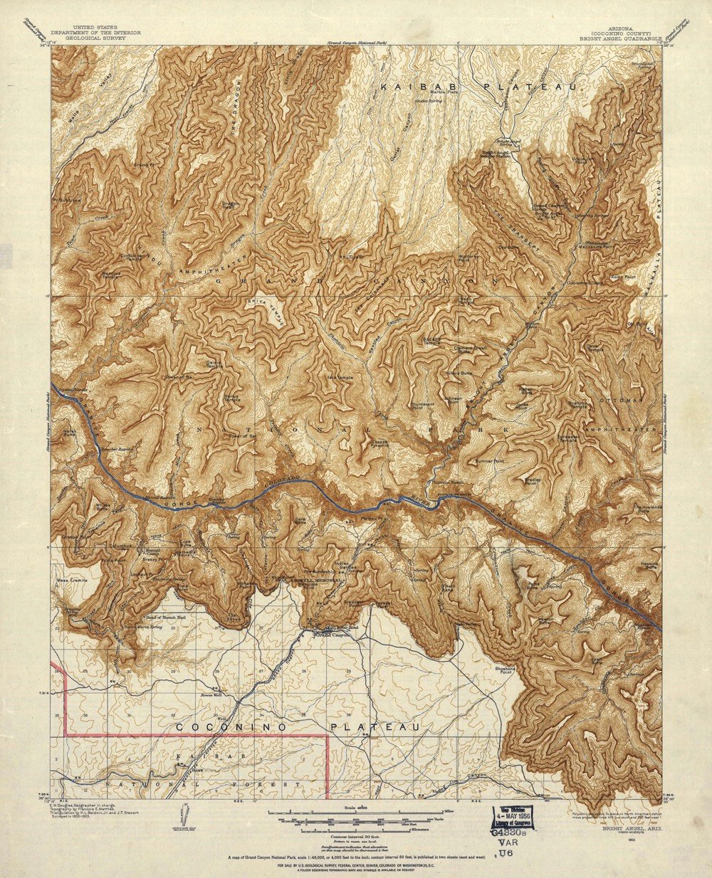
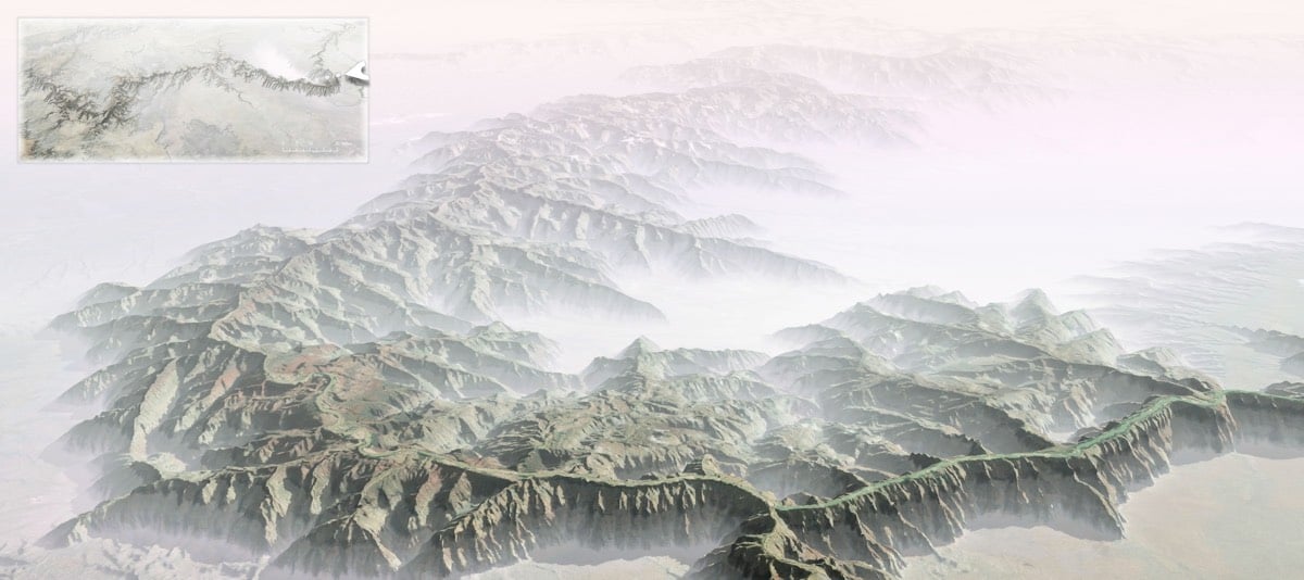
Over a period of 8 years, explorer and photographer Bradford Washburn worked with a small team and National Geographic to produce a map called The Heart of the Grand Canyon. Published in 1978, it is “still considered by many to be the most beautiful map of the area ever created”.
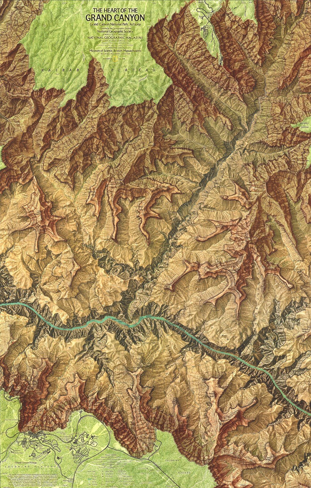
Here’s a closeup view of part of the map, which shows just how much detail is there:
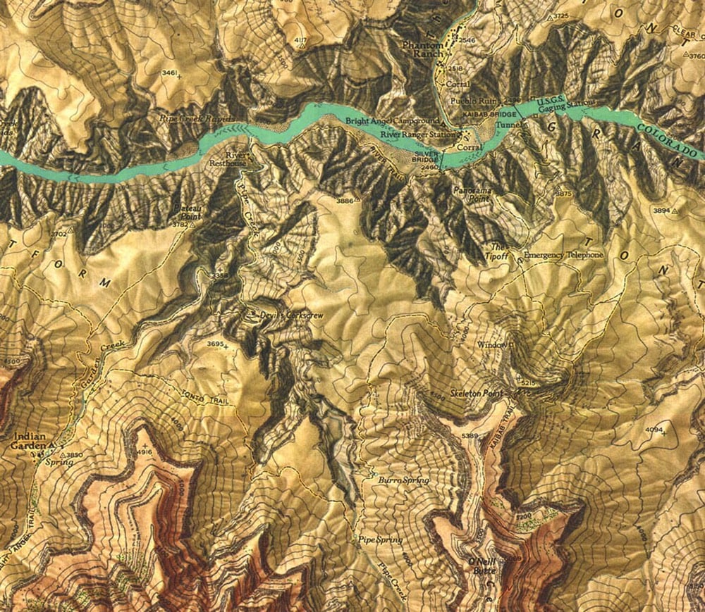
Often Washburn was dropped off on top of a pinnacle or small butte along with surveying equipment, such as a state-of-the-art laser range-finder device still under development, on loan from the company that made it. Using a built-in telescope, Washburn would aim the helium-neon laser at a reflecting prism positioned on another point miles away. The laser beam would be reflected back to the range finder, which measured how long the beam’s round-trip took and translated that into distances that were accurate to within 6/100 of an inch per mile. Washburn used a 40-pound surveying instrument called a theodolite to measure the angles between each of the control points, providing him with the relative position and height of each set of points.
After a few weeks in the canyon, Washburn was convinced of the potential for “a map of really superlative beauty as well as topographic quality.” Knowing exactly where to find the expertise, and the funds, needed to realize that potential, he asked the National Geographic Society to join the project.
The surveying took years and then came the data analysis & production phases…it took over 1000 hours just to paint the relief shading onto the map. If you want to compare Washburn’s map to earlier efforts, check out this post at Codex 99. This 1903 USGS map was the best map into the 1960s:
Even in the age of crisp satellite views in Google Maps, The Heart of the Grand Canyon is a beautiful and useful map. You can purchase a copy of the 1978 map (and a refreshed 1999 version) from the National Geographic store.
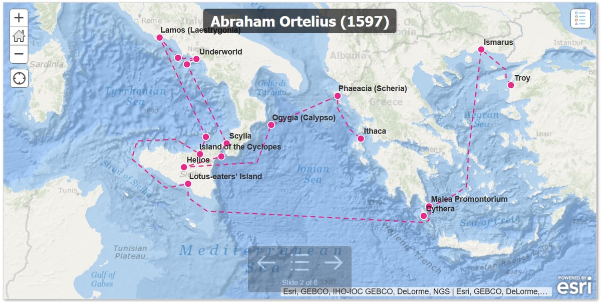
We’ve looked before at maps of Odysseus’s travels in The Odyssey (as Jason wrote in 2018, “that dude was LOST”). But it turns out — and maybe this shouldn’t be surprising — that it’s not easy to figure out exactly where Odysseus was in the Mediterranean Sea for all that time.
Scholars have pored over the text for clues for centuries, argued about their findings, and tried to interpret ambiguous language. We don’t even know for certain where Odysseus’s home island of Ithaca was.
Ithaca is one of a group of four islands, with smaller islands nearby, but it faces west while the others face east. (What does it mean for an island to face a direction?) It has forests and at least one mountain, and it is a good place for raising children. That isn’t much to go on.
Then there’s the whole question of what we gain from mapping The Odyssey in detail anyways. Some of it is plugging a gap in our imagination; we’ve gotten used to fantasy worlds supplying us with maps, and The Odyssey is a fantasy world that coexists with our own. But the level of detail is obsessive.
Attempts to map the Odyssey seem different from other attempts to locate the sites of famous myths and legends. Atlantis was the site of a wondrous civilization, Troy the landscape for an epic battle; finding them in the real world would mean discovering rich sources of evidence about past cultures. El Dorado’s location seems to have been coveted mainly for the lost city’s purported riches, Bimini for its rumored fountain of youth. But what do we gain by knowing where Helios kept his cows? Or which rocky, uninhabitable cave a kidnapping nymph called home?
Nevertheless, there’s a long history of scholars, artists, kings, and more attempting to write themselves into the myth of The Odyssey. The Aeneid, which simultaneously reimagines the founding of Rome as part of the story of the Iliad and Odyssey and elevates Virgil’s Latin poetry to the epic heights of Homer, is the most famous attempt to shore up a claim to legitimacy by appealing to the reality of the Odyssey’s ancient past.
But where exactly was Odysseus? Was he mostly in the Aegean and Italy, as Abraham Ortelius believed in 1597? Or was he scattered into the western Mediterranean, Spain, Corsica, North Africa, as Peter Struck thinks? We’ll probably never know. That dude was LOST.
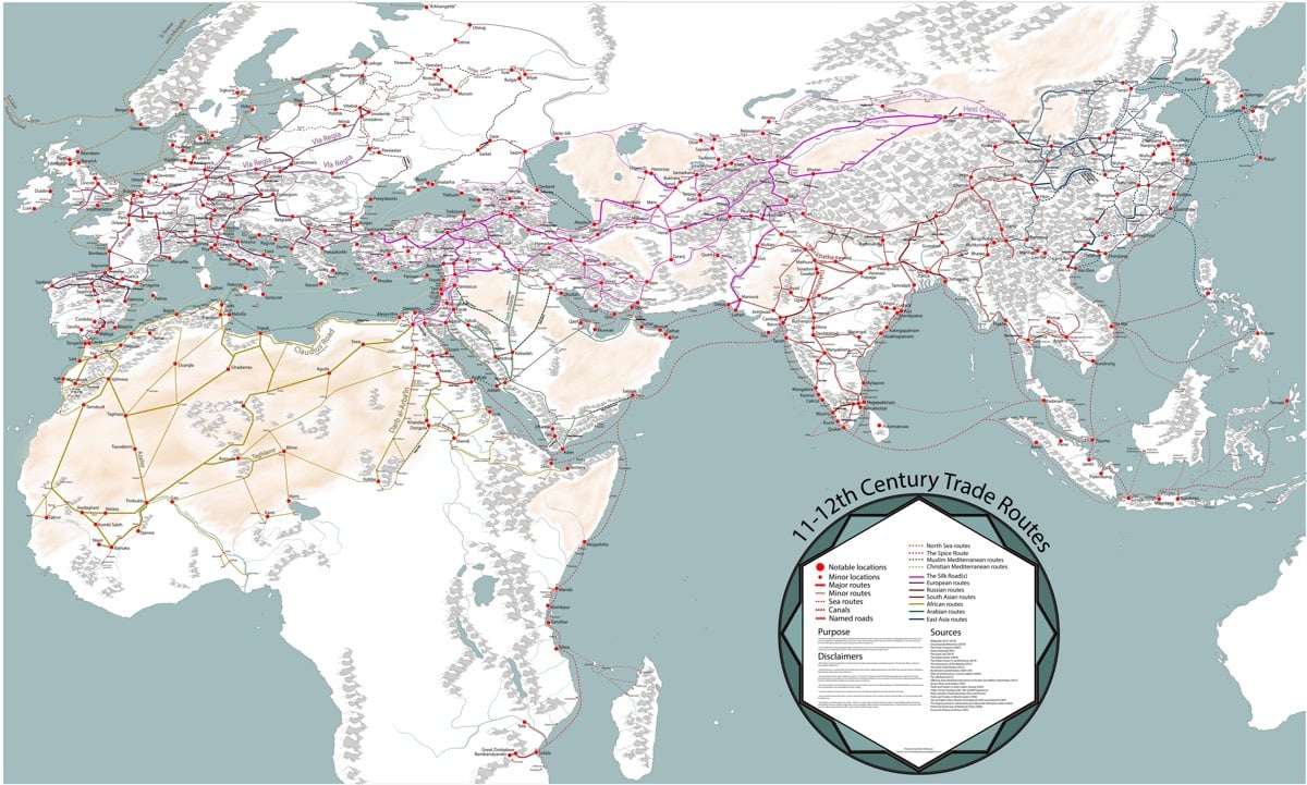
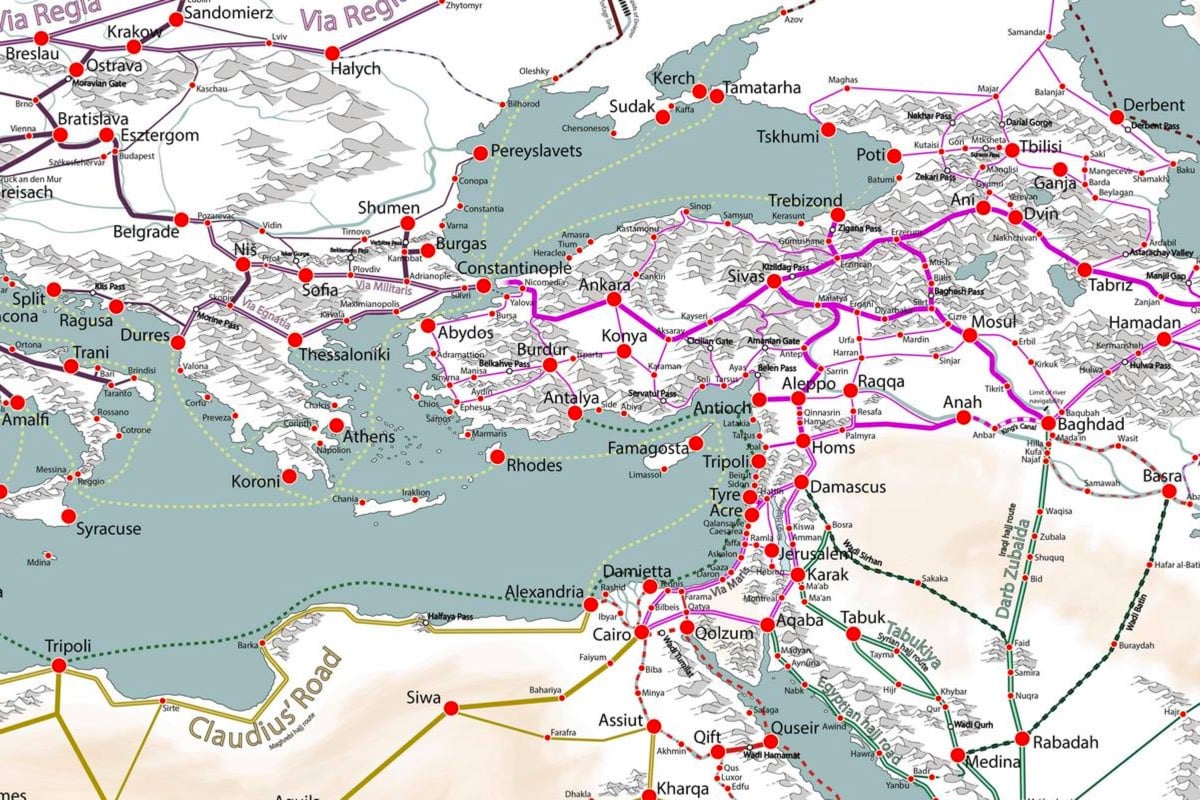
Grad student Martin Jan Månsson has created this incredibly detailed map of trade route networks in Europe, Asia, and Africa in the 11th and 12th centuries.
Even before modern times the Afro-Eurasian world was already well connected. This map depicts the main trading arteries of the high middle ages, just after the decline of the Vikings and before the rise of the Mongols, the Hansa and well before the Portuguese rounded the Cape of Good Hope.
The map also depicts the general topography, rivers, mountain passes and named routes. All of which contributed to why cities came to be, and still are, up until modern times.
The high middle ages were a time when the stars aligned in terms of commerce for many areas of the world. In central Europe many German and French cities initiated annual trade fairs, some of which are still active today — most notably in Frankfurt. The Europeans have redeveloped a demand for eastern goods as a result of the crusades in Iberia and the Levant. The Italian city states and some north eastern Iberian cities had shipped the crusaders back and forth in the Mediterranean sea, building up huge fleets and setting up networks of trade all around the Mediterranean shores. The Italians frequented ports such as Alexandria, which had separate trading ports for muslim and christian ships.
You can play with a zoomable version here.
The saying is that “all roads lead to Rome” but as this map shows, that assertion belongs to an earlier era. In the 12th century, it was more accurate to say that all roads lead to Constantinople or Cairo or Baghdad or Hanzhong…or perhaps even “all roads lead to everywhere”. It’s not quite globalization, but many of the world’s peoples were well on their way to connecting with everyone else.
P.S. I have heard many good things about Peter Frankopan’s The Silk Roads. It’s been sitting on my (virtual) bedside table for several months now…I think I might make it my next read. Has anyone read it?
There’s a little-known monument located at the site of the Hoover Dam that shows the progression of “North Stars” as the Earth moves through its 25,772-year change of rotational axis. Alexander Rose of the Long Now Foundation couldn’t find much public documentation related to this celestial map, so he did some research.
I now had some historical text and photos, but I was still missing a complete diagram of the plaza that would allow me to really understand it. I contacted the historian again, and she obtained permission from her superiors to release the actual building plans. I suspect that they generally don’t like to release technical plans of the dam for security reasons, but it seems they deemed my request a low security risk as the monument is not part of the structure of the dam. The historian sent me a tube full of large blueprints and a CD of the same prints already scanned. With this in hand I was finally able to re-construct the technical intent of the plaza and how it works.
In order to understand how the plaza marks the date of the dam’s construction in the nearly 26,000-year cycle of the earth’s precession, it is worth explaining what exactly axial precession is. In the simplest terms, it is the earth “wobbling” on its tilted axis like a gyroscope — but very, very slowly. This wobbling effectively moves what we see as the center point that stars appear to revolve around each evening.
Presently, this center point lies very close to the conveniently bright star Polaris. The reason we have historically paid so much attention to this celestial center, or North Star, is because it is the star that stays put all through the course of the night. Having this one fixed point in the sky is the foundation of all celestial navigation.
Here are some explanatory notes that Rose wrote over the blueprints of the monument showing how to read the map:
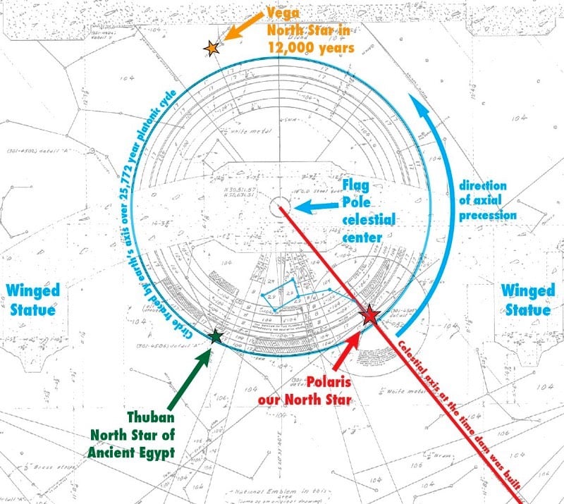
Update: Wally Motloch has also done some significant research on this monument.
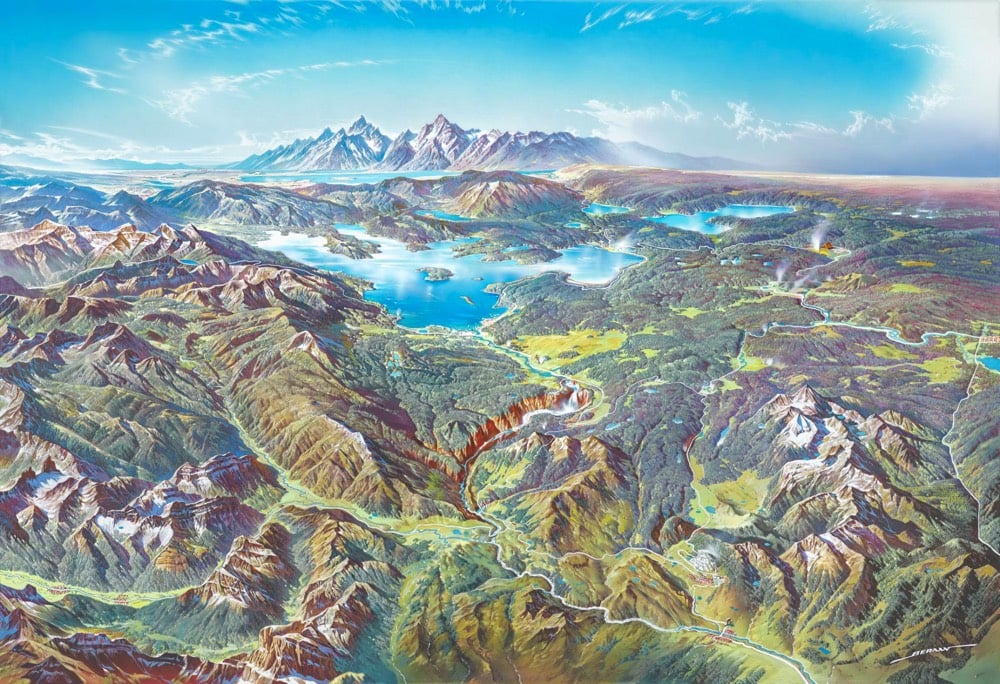
Designer Scott Reinhard takes old geological survey maps and combines them with elevation data to produce these wonderful hybrid topographic maps. From top to bottom, here are Reinhard’s 3D versions of a 1878 USGS Yellowstone map, a 1904 USGS map of Acadia National Park, and a 1899 USGS map of the Grand Tetons.
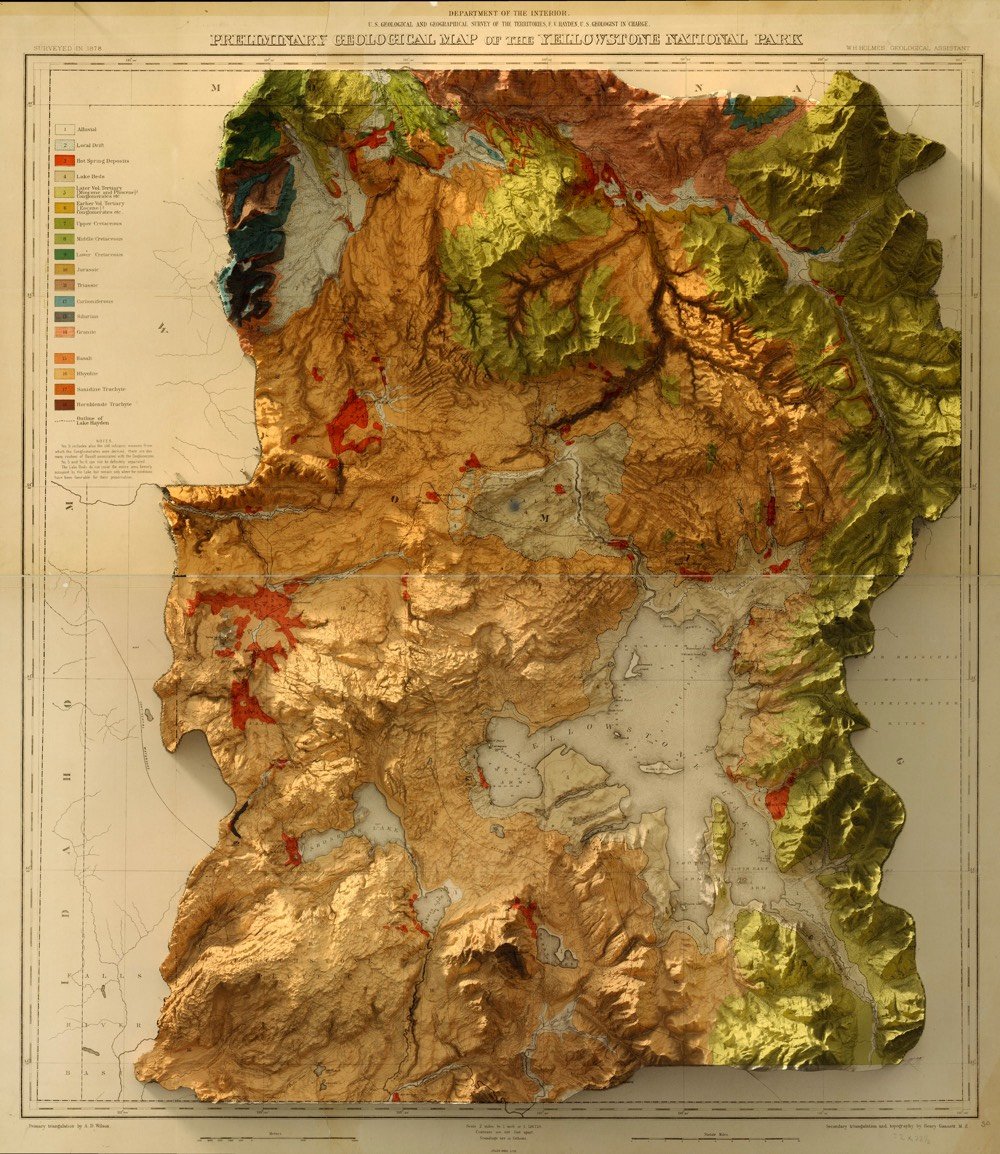
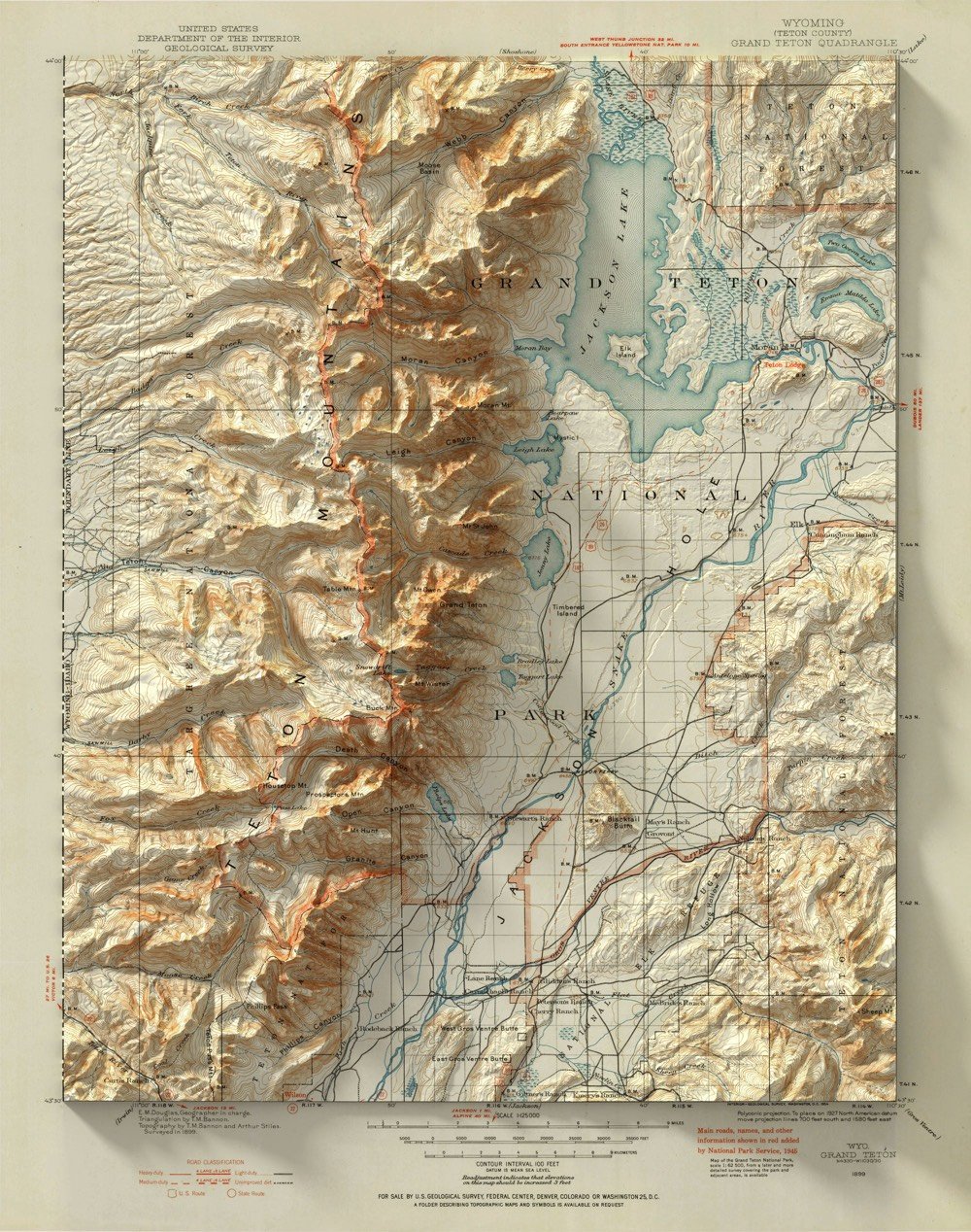
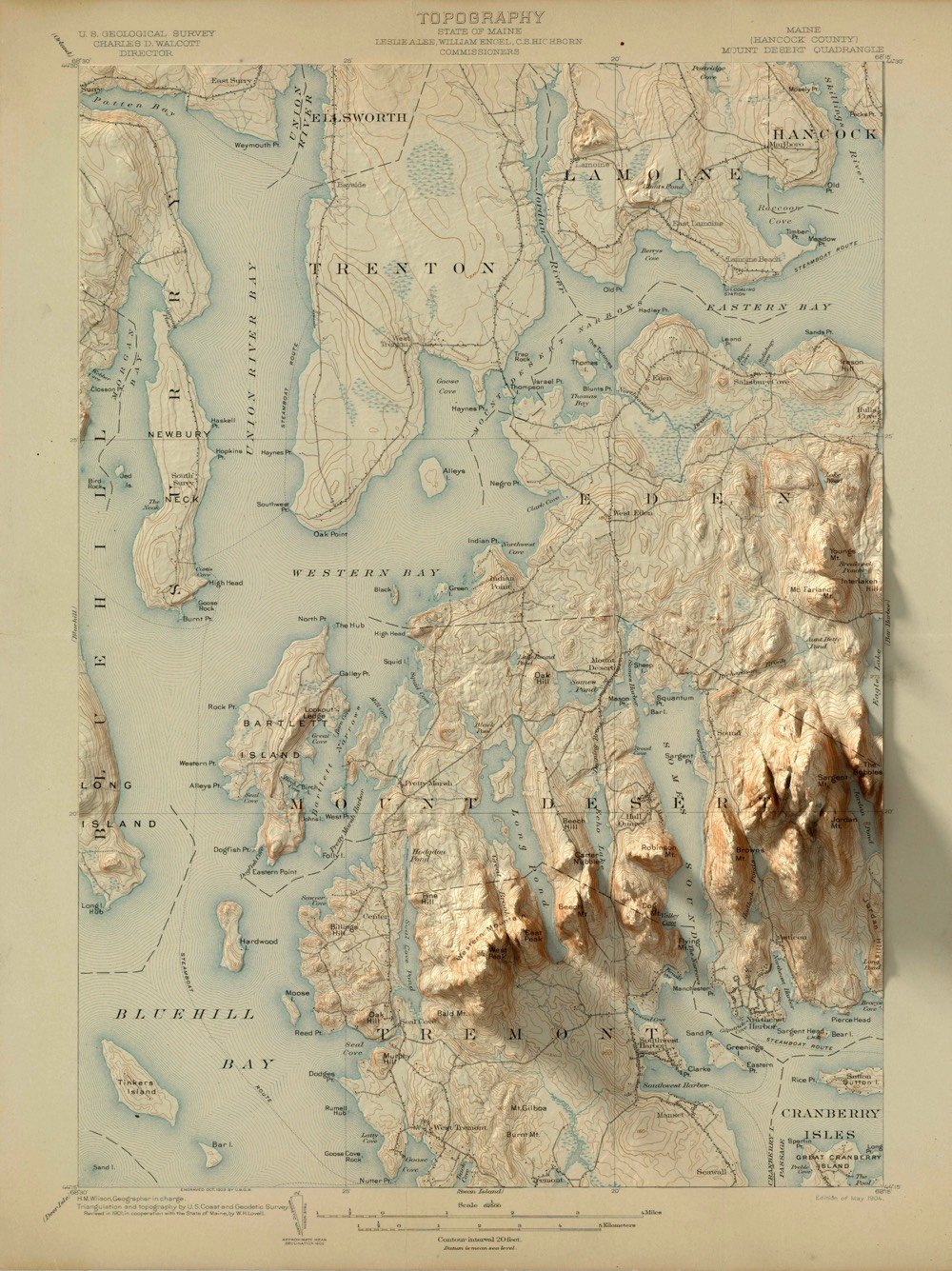
What really sells it is the shadows cast by the topological part of the map onto the borders; it’s particularly evident in the Teton and Acadia maps. I’d love to see an animated version of the mountains pushing up from the flatness of the map. (via the morning news and several emailers)
Update: FYI, if you want to buy prints of some of these maps, Reinhard has set up a shop selling prints.
This is mesmerizing to watch for a few minutes: a time lapse map of weather activity across the entire US in 2018. I was thinking it would be instructive to see this sped up a bit more, that perhaps different patterns might reveal themselves, and then I remembered that you can control the playback speed on YouTube videos…just click the gear icon. I think I like the 2X version better. (via @DesignObserver)
What would the Grand Canyon look like as a Grand Mountain, i.e. if its depth became its height? Not quite as Grand perhaps, but still pretty cool.
Some of my earliest memories of the place had to do with the trippy feeling of my eyes and mind trying to make sense of the scale. I had seen many mountain ranges and vistas, including some on the way, but the vast negative space played havoc with my perception of magnitude. I’ve felt it a few times since, but never like that first Grand Canyon overlook.
I wondered, then, if flipping the Grand Canyon into a Grand Mountain might in some way help me make sense of its scale. I’m much more accustomed to seeing the mass of something rather than the massive void of something. So, here’s what that looks like.
For reference, the depth at the deepest part of the canyon is ~6000 feet and the top of the canyon is between 6000 and 8000 feet above sea level, so the highest point of the Grand Mountains would be somewhere between 12,000 and 14,000 feet, in the ballpark of the Rocky Mountains. It would be fun to see what an inverted Kola Superdeep Borehole would look like: a 9-inch spire rising 40,000 feet into the air from a starting point very close to sea level, more that 10,000 feet higher than Everest.
If you want to dig into the details of how this visualization was made, check out this post on the ArcGIS blog. (thx, john)

Subscribers to Noticing, the Kottke.org newsletter, have already seen our two-part Best of 2018 series, published on Thursday the 20th and Friday the 21st. We decided to split the best-of into two parts, with the first letter, the A-Sides, focusing on the 50 most popular posts of the year, and the second, the B-Sides, collecting our personal favorites.
For the B-Sides, Jason and I each submitted lists of posts we wanted to include, and after discarding redundancies, it turned out that the number of “favorite” posts was an even 100. I’d expected to write up about fifty, which was the number of the first newsletter. But that century mark felt like a sign, and a challenge I wanted to meet. So, fuck it; we wrote up the full 100.
Here’s an excerpt from the first newsletter:
Mapping cities, the planet, the stars
A number of the year’s best posts, as always, featured maps. A literal world map stars countries with the literal translations of their names. A map of the world after four degrees of warming is sobering, if not outright depressing. (Spoiler: most of the places where lots of people live will become hostile to the point of unliveable.) A map of the world where the sizes of countries is determined by their population has a similar “whoa!” effect, making you rethink the distribution of the planet. But maybe nothing is more “whoa!” than a timeline map of the 200,000 year history of human civilization, starting with migrations out of sub-Saharan Africa and following human travel and development through to the present.
We’ve reached the point in our development where we don’t necessarily need cartography to map our surroundings; photography will do the job. Even in 1920, photographers were able to capture stunning aerial photographs like cities, like these snaps of Edinburgh. These days, you can take aerial panoramas from 20,000 feet using as something as ubiquitous as an iPhone. Or use a fractal lens to take pictures of Tokyo, bending yourself into the future from that great contemporary city.
We now know what high-resolution photos of the Earth taken from the surface of the moon look like. We know how our seemingly geometric road grids subtly correct themselves for the curvature of the Earth’s surface. And we can even photograph black holes — or rather, watch stars in orbit around black holes, using a twenty-year time lapse. (Twenty years? Huh.)
That “twenty years” bit is a callback, as Kottke.org turned 20 this year.
And here is an excerpt from the B-Sides issue, which is, let’s just say, more dense:
The Year In Inspiration

Consider the fable of the dragon-tyrant. Literally, it’s about the possibility of extending the human lifespan and human flourishing, instead of sacrificing the young and old alike to the tyranny of death. But allegorically, as Jason writes, “humanity has lots of dragons sitting on mountaintops, devouring people, waiting for a change in the world’s perspective or technology or culture to meet its doom.”
Consider, too, the calmness of airline pilots. In the midst of disaster, good pilots actually get calmer, and this helps them solve their problems.
Do you need to get yourself out of a funk? Or console or otherwise help a grieving friend? Think about what Augustine says about hope: hope stretches us out across time. It makes our hearts bigger in order to contain it. And all our secular hopes help to prepare us for the great hope to come, that all might be redeemed and made perfect, and we can find our true place in the cosmos. Think about Dean Allen, one of the kindest and most talented people in the tech universe, and whether or not he’s found the peace that eluded him — that eludes us all — on Earth.
We are, all of us, explorers and hermits, both searching for adventure and longing for routine. This is why, despite it all, it is some small comfort to know that humans right now are better at Tetris than they have ever been. And that if we decide to move to Los Angeles, we’ll have to solve a lot of problems with ourselves first: “How do you help care for the city that drew you in, rather than allow your presence to steamroll its culture?” And, to generalize: how can we care for 2019, as we’re drawn inexorably into its vortex, rather than allow it to steamroll us all?
It’s been a great year. I’ve loved writing this newsletter, and being able to chime in with my Friday posts and occasional guest weeks. (Guest editor Chrysanthe Tenentes put up some great posts this year as well.) Cheers to Jason for continuing to host the best blog in the universe. Here’s to more and better in 2019. Here’s to blogs making their inevitable comeback. Here’s to another twenty years.
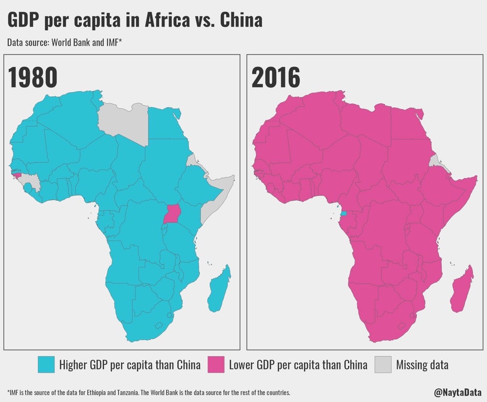
Using data from the IMF and World Bank, this map by Näytä Data shows how quickly the relative fortunes of China and African countries changed over the last few decades. For reference, in 1980, Africa had an estimated population of 480 million and China’s population was 994 million, while in 2016, Africa had 1.23 billion people and China had 1.4 billion people.
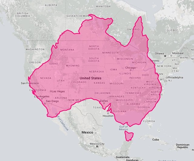
For the past few years, the @TerribleMaps Twitter account has been posting maps that aren’t useful or that don’t make a lot of sense. Here are some of my favorites.
(via laura olin)
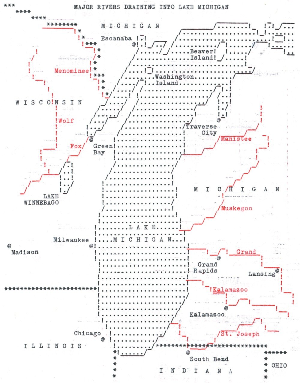
Daniel Huffman dug his dad’s old typewriter out of the basement and used it to type out a map of the major rivers draining into Lake Michigan.
The final product has various interesting smudges where the paper accidentally contacted the ribbon. In particular, I noticed that typing in red always produced a faint black “shadow” a couple of lines above. When the slug hit the red part of the ribbon, a small portion of it would lightly hit the black portion of the ribbon, too. Later on, I started holding scrap paper over my map in order to prevent this, so that the black shadow would go on the scrap.
In sum: my typewriter is not a precision instrument. This makes it a somewhat uncomfortable-feeling tool for a detail-oriented designer like me. I like being able to zoom in to 64,000% in Illustrator and correct errors that are small enough that no human eye could possibly ever see them. But, there’s something attractive about the organic messiness of the typewriter.
He experimented with a couple of other maps as well: a shaded relief map of Africa and a contour relief map of the Great Lakes.
See also An Atlas for the Blind.
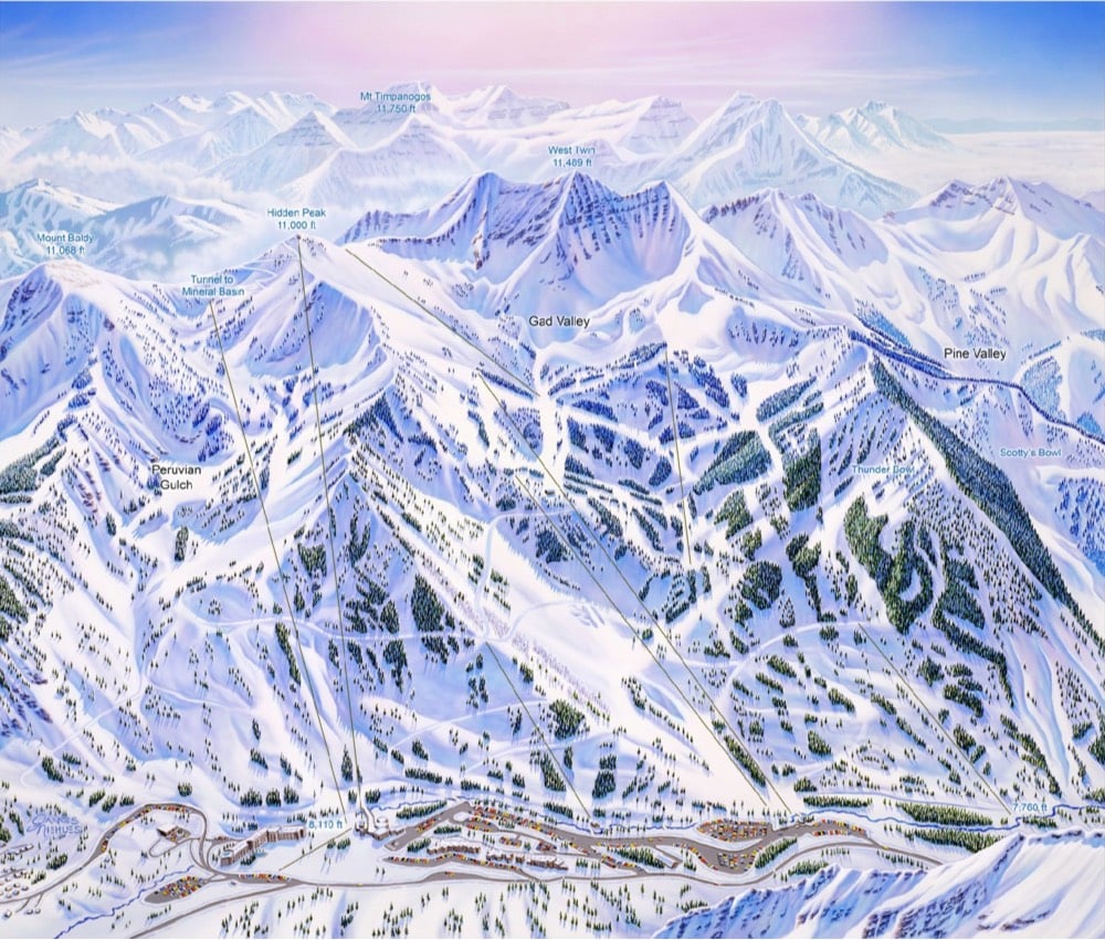
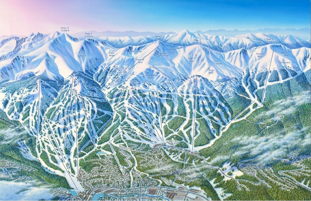
I’ve you’ve ever skied or snowboarded in the US, Canada, or many other spots around the world, chances are you’ve used a ski map painted by James Niehues. He’s hand-painted almost 200 trail maps for places like Alta, Vail, Big Sky, Okemo, and Mammoth.
Ski Magazine regularly ranks the Top 50 resorts in North America. Jim has hand painted 45 of them. His tools of choice are a camera, a notepad, a paintbrush and a canvas. Every painstaking detail — peaks, cliffs, trees and shadows — is painted by hand. Jim’s large and beautiful paintings have helped generations of skiers navigate and capture the unique character of each mountain. He has had more impact on the image and feel of skiing than almost anyone, yet few people know his name.
With the help of a small team, Niehues is publishing a hardcover coffee table book featuring all of his work along with a series of prints. Here are a couple of the maps that will be in the book:
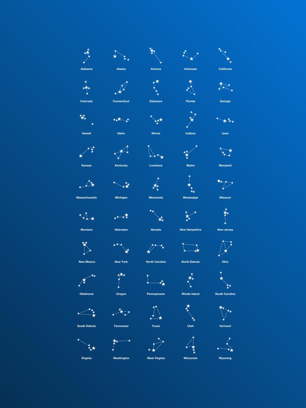
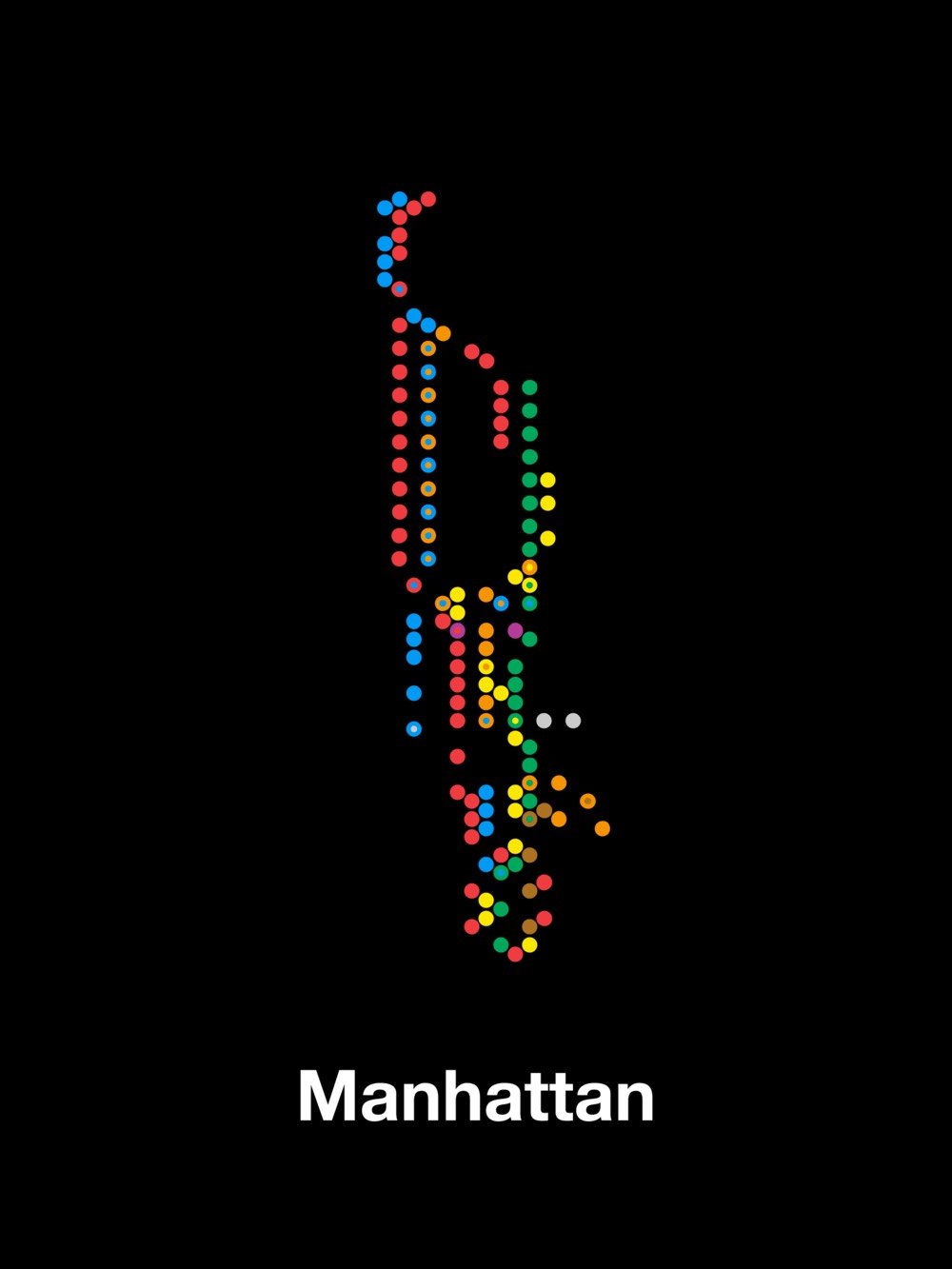
Peter Gorman is creating dozens of minimalist maps that he’s rolling up into a book that will be ready late next year (hopefully).
One of my favorites is this map that shows the 5 largest cities in each US state as constellations.
I also like how this map of Manhattan mostly keeps its shape only using subway stations.
You can follow Gorman’s progress on Instagram.
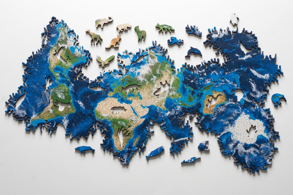
Nervous System designed this puzzle of Earth so that it can be put together in a variety of different ways.
This puzzle is based on an icosahedral map projection and has the topology of a sphere. This means it has no edges, no North and South, and no fixed shape. Try to get the landmasses together or see how the oceans are connected. Make your own maps of the earth!
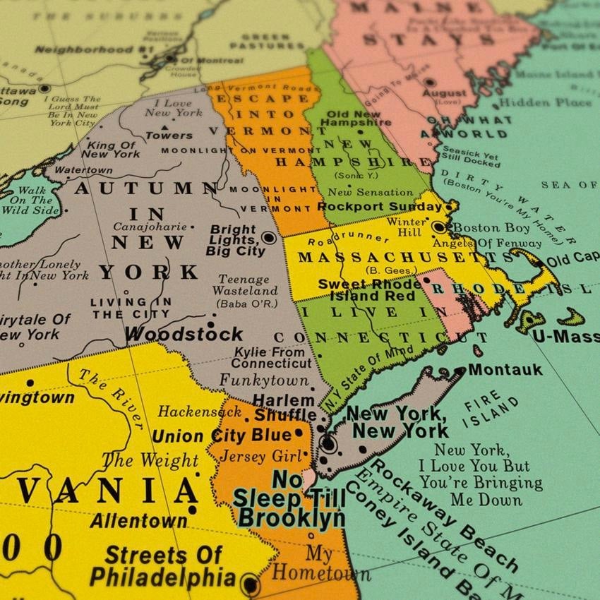
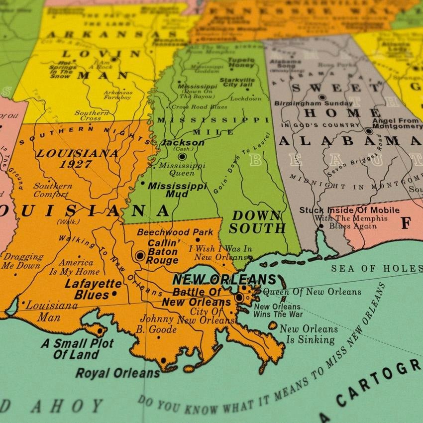
Design studio Dorothy has produced a poster of a map of the United States where all the place names are song titles.
Some of our favourite song choices are the ones which require you to think a little harder about connections, such as Space Oddity (David Bowie) which signposts Cape Canaveral, After the Gold Rush (Neil Young) which references Sutter’s Mill, and Homecoming (Kanye West) which is placed near the rapper’s home town of Chicago.
The map is accompanied by a Spotify playlist of most of the songs used…over 61 hours of music in total.
These two maps by Esri UK show the parts of the UK that voted to leave the EU and which parts voted to remain.
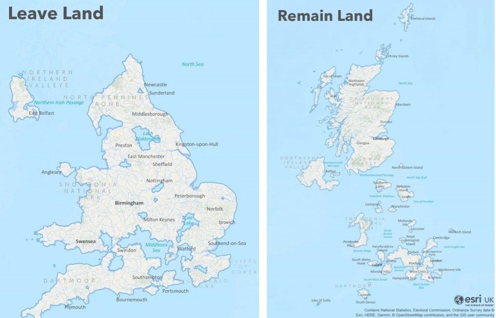
See also the NY Times’ maps of Trump’s & Clinton’s Americas from the 2016 election. (via @goodwinmj)
The folks behind the National Geographic cartography blog All Over the Map have come out with a book of the same name that is a “guided tour through the world’s most incredible maps”.
Just to give you a taste of the kind of stuff they feature, recent entries include maps of the most extreme places on Earth and Heinrich Berann’s panoramic paintings of national parks.
You can order a copy of All Over the Map here.
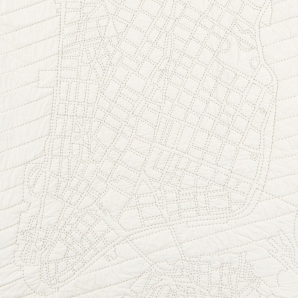
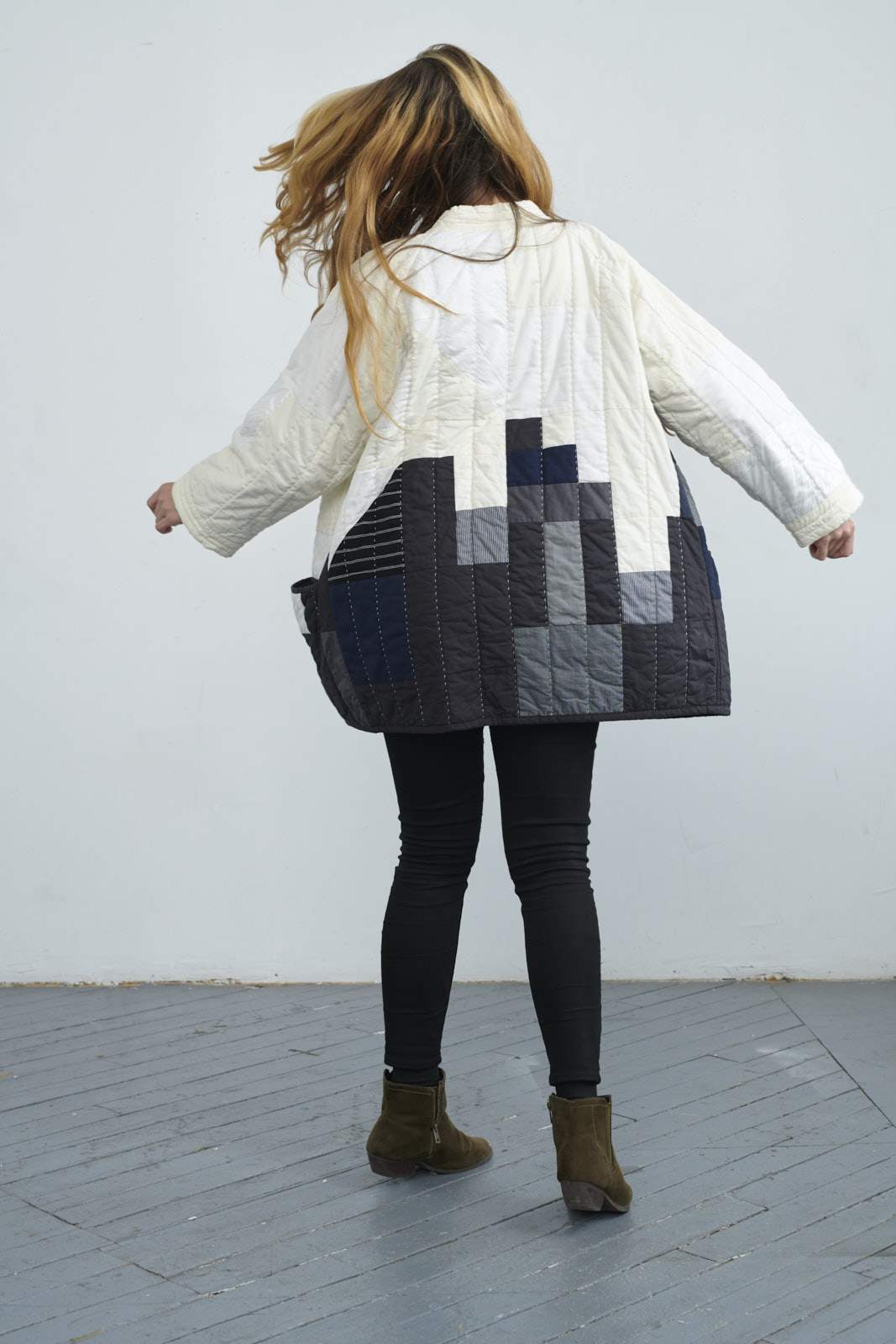
I’m a sucker for maps so I’ve been into Haptic Labs quilts since we found out about them nine years ago (thanks Kelsey!). Founder Emily Fischer is endlessly creative, but technical, and is one of the best layoff success stories I know. She originally programmed quilting machines to create to-scale neighborhood map quilts, though now they’re now all handmade.
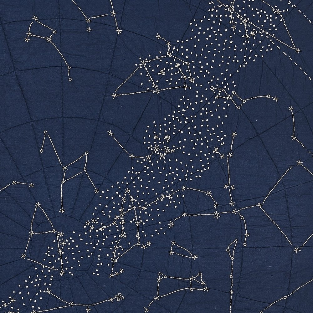
It’s hard to pick a favorite between the city maps, coastal maps, and constellation quilts. She even does baby quilts (a great gift) and has three lines of kites.
And now Haptic Lab makes quilted coats, which look great but also feel like draping yourself in bedding. Kind of genius considering the stressful times we live in, no need to get out of bed.
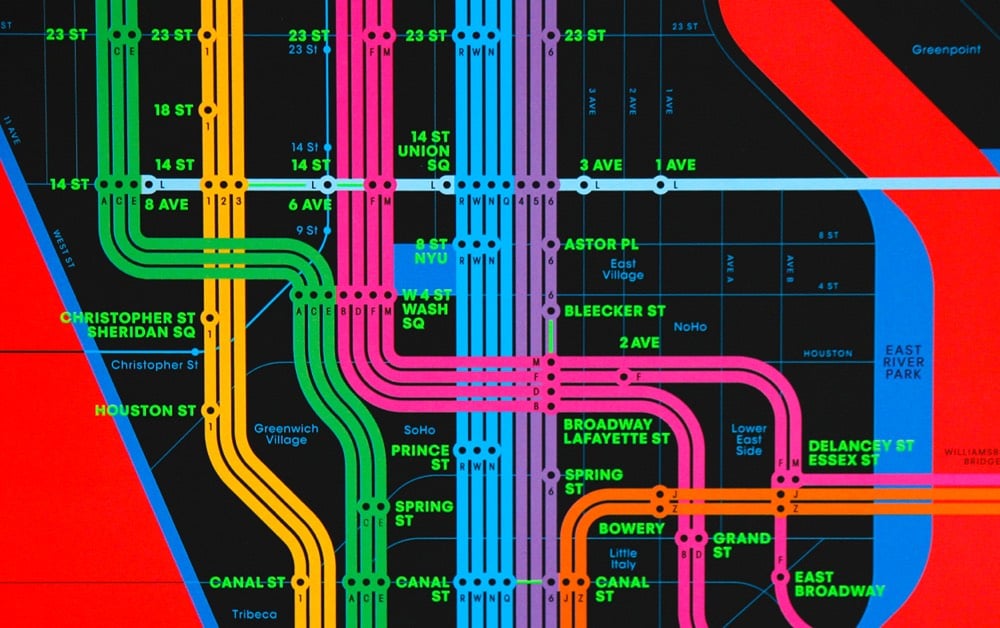
From the orange 123 line to the green ACE to the purple 456, the color designations on the NYC subway lines on the Wrong Color Subway Map will mess with your head. Get the print here. From the folks who brought us the One-Color Subway Map. (via @khoi)
Data scientist Neil Kaye made this map to show how much the popular Mercator projection distorts the sizes of many countries, particularly those in the Northern Hemisphere.
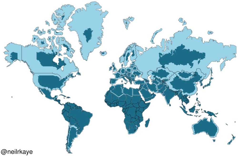
The distortion in the animated version is even clearer. Key takeaway: Africa is *enormous*.
See also the true size of things on world maps.
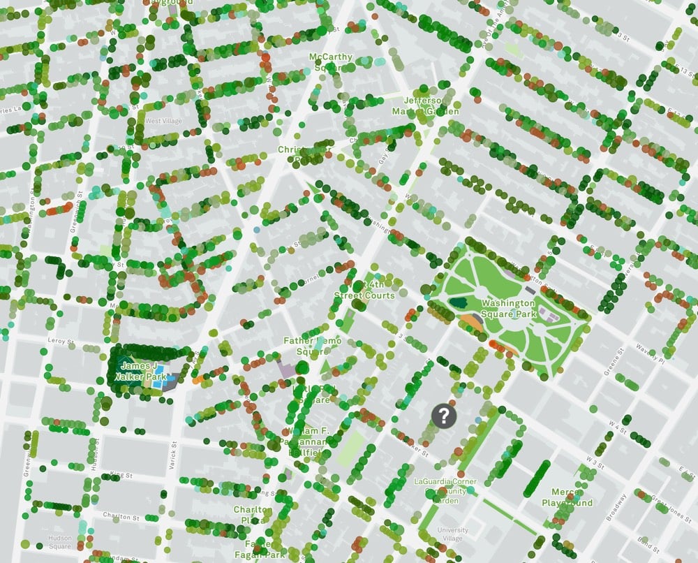
The NYC Parks department maintains an online map of the city’s street trees — currently 678,674 mapped trees from 422 different species.
Our tree map includes every street tree in New York City as mapped by our TreesCount! 2015 volunteers, and is updated daily by our Forestry team. On the map, trees are represented by circles. The size of the circle represents the diameter of the tree, and the color of the circle reflects its species. You are welcome to browse our entire inventory of trees, or to select an individual tree for more information.
The map only shows trees that grow on land under the jurisdiction of NYC Parks. This includes trees planted along sidewalks or other public rights-of-way. You might not see trees that are planted on rights-of-way maintained by the NYC Department of Transportation, or by the state or federal government. You will also not see trees planted on private property.
Each tree on the map is clickable; when you do so, you can see the tree’s species, diameter, and the ecological benefits. (For example, this large oak tree along Central Park West provides $540 of ecological benefits each year…from capturing storm runoff to removing air pollutants.) You can also keep track of your favorite trees, join a tree care group to help take care of the city’s trees, or record activities you’ve done to care for trees in your neighborhood.
It’s easy to become a tree steward! We host volunteers all year long. We can train you in basic activities such as watering trees, adding mulch and soil, and removing weeds and litter; as well as advanced activities such as installing a tree guard, expanding tree beds, and installing or removing stone or brick pavers.
When Melbourne, Australia assigned each of their trees an email address to report problems, people started writing love letters to their favorite trees.
“My dearest Ulmus,” the message began.
“As I was leaving St. Mary’s College today I was struck, not by a branch, but by your radiant beauty. You must get these messages all the time. You’re such an attractive tree.”
This is an excerpt of a letter someone wrote to a green-leaf elm, one of thousands of messages in an ongoing correspondence between the people of Melbourne, Australia, and the city’s trees.
Each of NYC’s trees has a ID number too…let’s give them email addresses! (via @halobrien_wa)
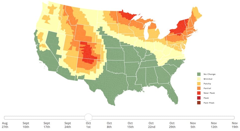
Well, I really can’t ignore it any longer. Here in Vermont, we’ve paid our last visit to the swim hole, the heat is on in my house, and the leaves on the trees have started changing. Autumn has arrived. If you’re into peeping some leaves in your neck of the woods, SmokyMountains.com has the best foliage prediction map on the web.
The 2018 Fall Foliage Map is the ultimate visual planning guide to the annual progressive changing of the leaves. While no tool can be 100% accurate, this tool is meant to help travelers better time their trips to have the best opportunity of catching peak color each year.
Compared to the past two years, it looks like the leaves are changing a little later this year.
In a book called Atlas of the World with Geophysical Boundaries, scientist Athelstan Spilhaus published a series of world maps that emphasized the Earth’s oceans over the continents. The maps turn our familiar continental view of the world inside out. Check out this rendering of one of Spilhaus’ maps by Le Cartographe:
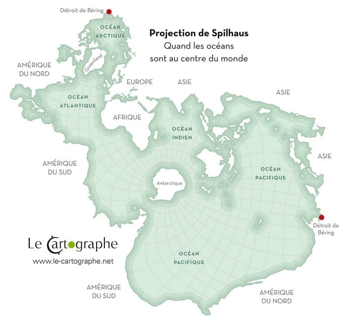
Takes a second to get your bearings on that, right? One big ocean with Antarctica in the middle, surrounded by the stretched-out landmasses of Asia and the Americas. Jason Davies recreated some of the other Spilhaus maps and so did Mike Bostock.
You can see a bunch of Spilhaus’ other shoreline maps by flipping through the pages of his book on Google Books.
I’ve often said that every two-dimensional map is a lie; a perfect map would be able to show a city in three dimensions. (Or four, to show how they’ve changed over time.)
Height tells you so much; the steepness of streets, where water tends to flood, even often class distinctions, at least traditional ones. Try walking around San Francisco sometime, or Gloucester, Massachusetts, following a map that tells you take a left turn, straight uphill. Better still, try this in a wheelchair.
Toby Eglesfield, a graphic designer working in New Zealand, took this challenge seriously. After some aborted attempts with arrows, he settled on a trimetric projection (it’s like isometric, but slightly different), with different colored wedges to indicate the relative steepness of a street. Here’s the basic idea:
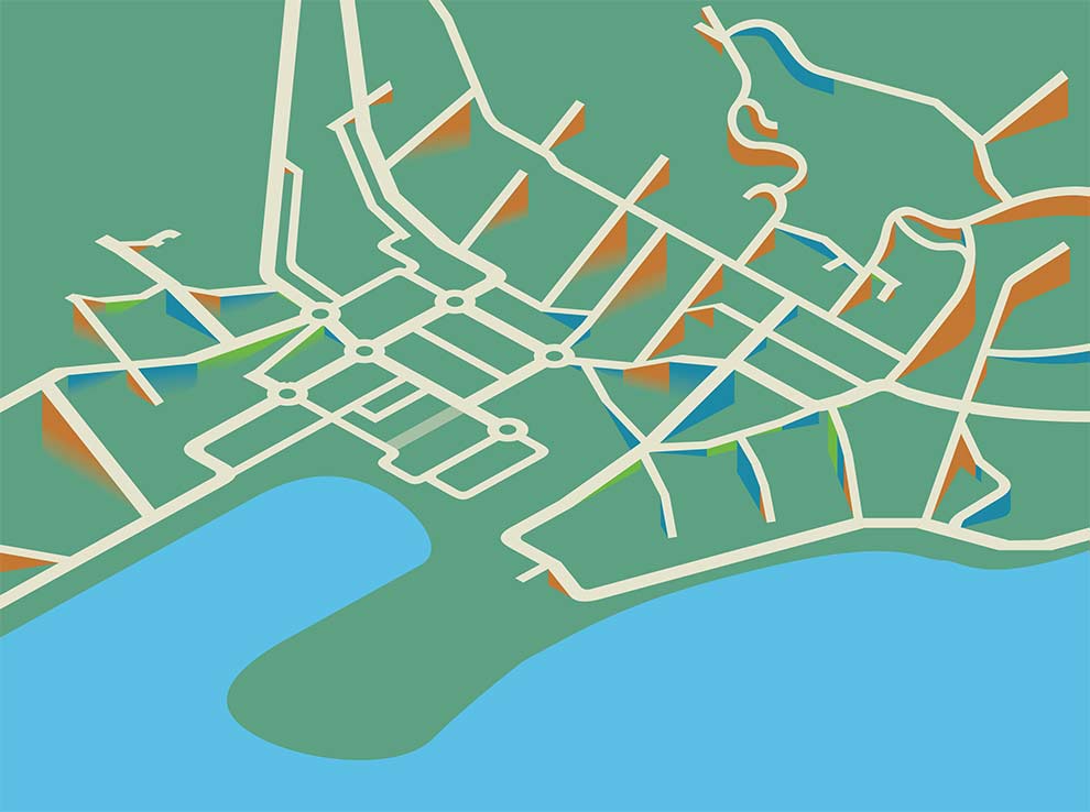
And here’s the completed product:
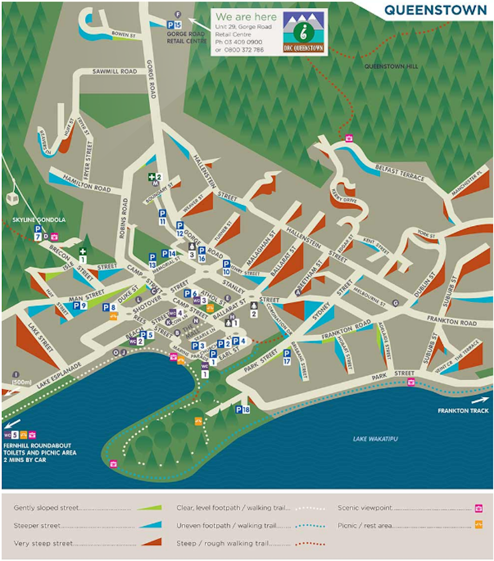
Created for the disAbilities Resource Centre in Queenstown, the map includes marks for accessible toilets, car parks, etc. I’d love to see a version for Manhattan, San Francisco — anywhere, really, but especially older cities with varied topography.
Newer posts
Older posts
Socials & More