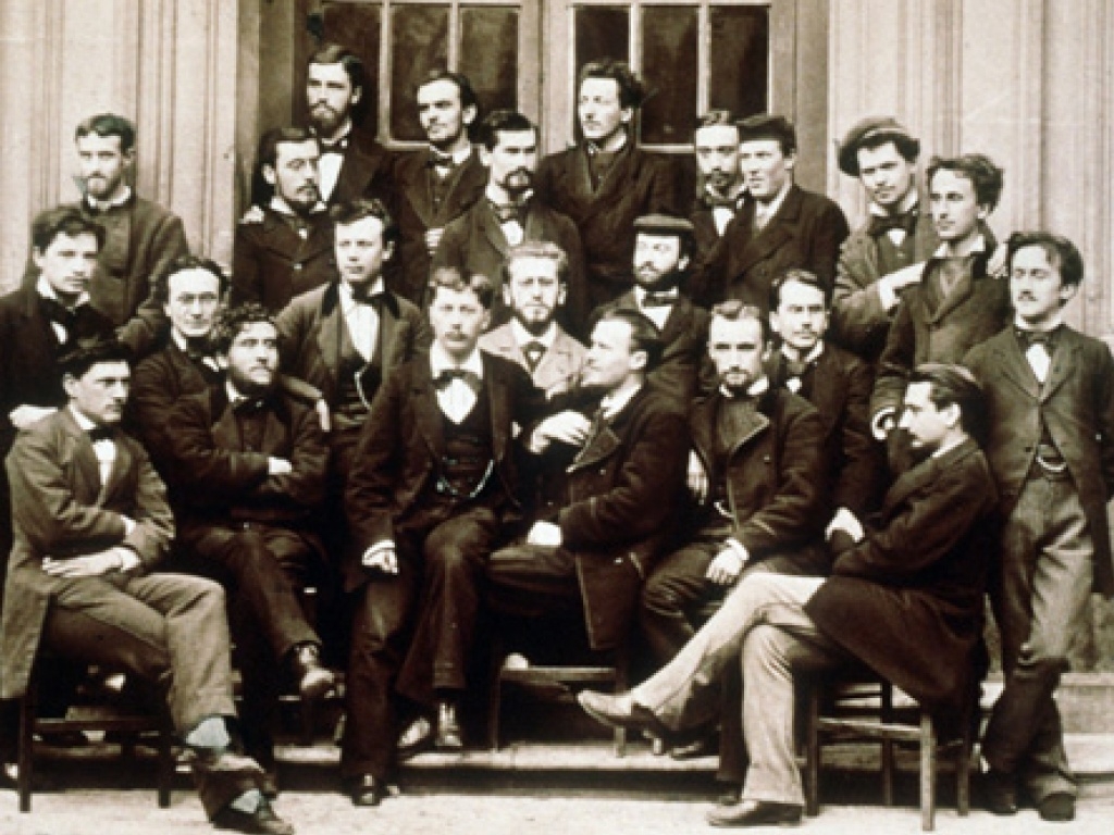
In the early twentieth century, Henri Bergson had a problem. His philosophy lectures were too popular:
On average, 700 people would attempt to squeeze into a room designed for 375. It was suggested that his classes be moved to the Grand Amphithéâtre of the Sorbonne or even to the Palais Garnier. Abroad too, Bergson drew huge crowds. The talks he delivered in London in 1911 filled venues to their 'utmost capacity', and he was greeted to the sound of 'loud cheers'. Two years later, a visit to New York caused the first ever traffic jam on Broadway.
Bergsonmania had another problem, too: many of its most devout adherents were women.
In France, Bergson's female followers were given derogatory nicknames such as caillettes, which designated a type of pâté, a kind of small bird, and in this context, a frivolous babbling woman, and snobinettes, which conveyed the common assumption that these women were ignorant socialites more interested in being seen at a fashionable event than in learning about philosophy. In 1912, Bergson was preparing to leave on an eagerly anticipated tour of the United States that would take place the following year. A writer for the magazine La vie Parisienne - known for its literary critiques, erotic illustrations, satirical takes on art, culture, politics and the indiscretions of the Parisian elite - scoffed: 'How will our snobinettes quench their thirst for metaphysics?' Which professor, the reporter wondered, would these 'anxious women' choose to replace Bergson? Surely, their decision would be based on the convenience of the time slot of the lectures rather than on their content.
The female audience was depicted as a crowd of posers, too frivolous to develop any profound interest in philosophical matters, and thus undeserving of the precious seats at the Collège de France. Many commentators thus dismissed the Bergsoniennes' enthusiasm for philosophy as nothing more than the bourgeois attempts of mondaines (socialites) to raise their social standing. Such ideas were embedded within a long tradition of French satire at the expense of learned women...
The presence of women in a traditionally exclusively masculine space was regarded at best as a source of ridicule, at worst as a nuisance (for instance, some worried that, by their mere presence, the Bergsoniennes were robbing male philosophy students of their rightfully earned seats). Others took this phenomenon to be the sign of something more serious. The fact that so many women were drawn to Bergson's philosophy perhaps said something about Bergson as a thinker. Indeed, traits traditionally associated with femininity, such as irrationality and sentimentality, clashed with the traditionally masculine qualities deemed necessary to be a good philosopher. Some of Bergson's most serious adversaries began arguing that Bergson's success among women was no accident. They believed that the reason the most irrational beings of all, women, were so enthusiastic about Bergson's ideas was that Bergson's philosophy was a philosophy of the irrational.
Bergson himself did not enjoy his celebrity status, but it is noteworthy that he inspired a generation of French feminist thinkers, including Simone De Beauvoir, who largely differed from his metaphysical positions but adopted parts of his popular, literary style (in both writing and public lectures) as a way to connect with audiences outside of the academy's cloisters.
Philosophy and public intellectual life changed tremendously during the years of Bergson's activity, not least because his own style and that of his admiring fans helped push matters along.
More about...

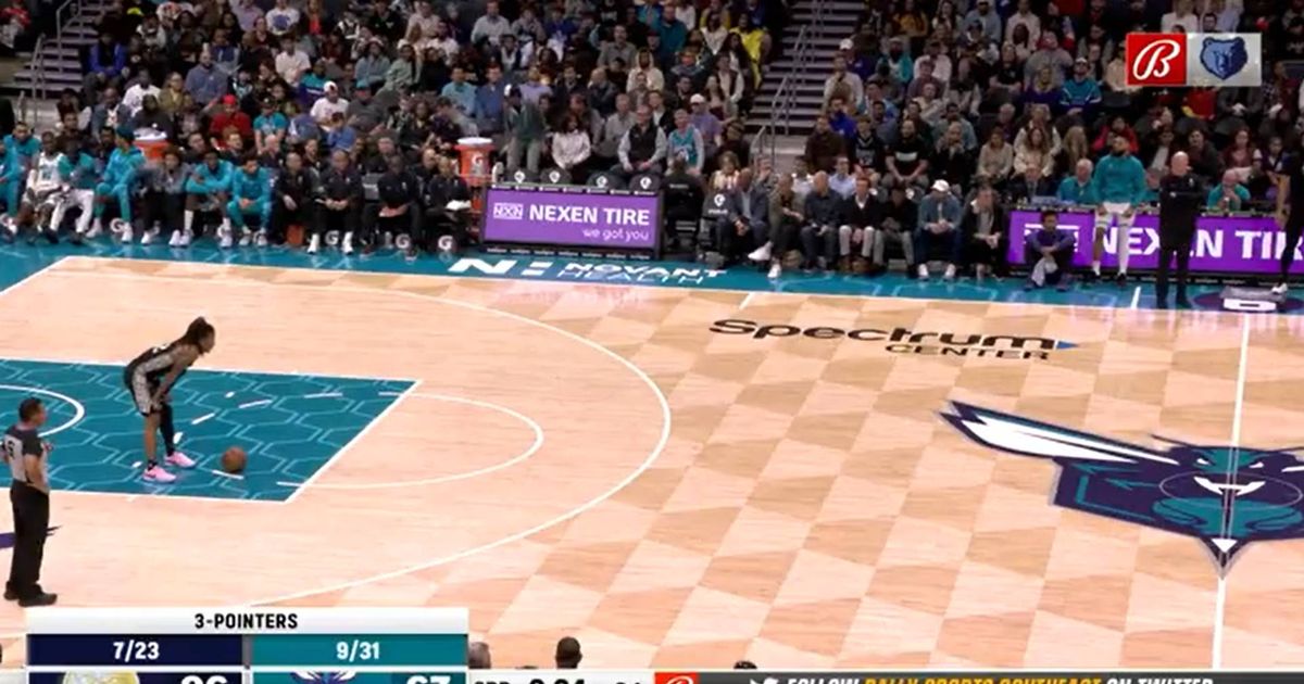
If you've watched a high-level basketball game in the last ten or so years (NBA, WNBA, NCAA), you've probably seen something a little strange. Instead of throwing the ball inbounds directly to a teammate, the inbounder will slowly roll the ball on the floor in their general direction... and then the ball handler will wait as long as possible before he picks it up and starts dribbling. Sometimes it's just a few seconds, and sometimes it feels like an eternity. What is this, and why do they do it?
It's called "walking the dog," and it exploits a rule that's as old as the shot clock itself. The shot clock (24 seconds long in the NBA) begins counting down as soon as a team takes possession of the ball after an inbounds pass. If you don't shoot and make contact with the rim within 24 seconds, the other team takes possession of the ball.
The shot clock is designed to speed up play. Walking the dog is a loophole designed to slow it down. You use it for two reasons: to delay starting the shot clock (giving you longer to get down court and set up a play) and to run time off the game clock (giving your opponent less time to control the ball and score).
Walking the dog is very old — the 60s Celtics used to use it after the other team scored to give them more time for their legendary center Bill Russell to get down court and set up the offense. And generally, that's been how it's used in the modern NBA, to get more time back on the shot clock. But in recent years, more ball handlers have been walking the dog to run time — sometimes, lots of time — off the game clock. So it's becoming more controversial.
One of the most notorious dogwalkers is Ja Morant, who usually makes highlight reels for his explosive dunks. But his slow roll strolls up the court are becoming just as much a signature move:
Two years ago, Morant became a regular dog walker in his sophomore season and quickly got his team to buy in. He's utilized the move 41 times across all quarters and has been the ball handler on 23 of those 34 plays in crunch time, wasting over three minutes of game clock. In just over half this season, Morant has wasted more time walking the dog than any team had in an entire year and holds three of the longest dog walks recorded in the NBA this season (his teammate Desmond Bane has one of the others)...
The Grizzlies don't discuss this in practice or plan these plays in advance. Morant often motions to his inbounder to roll the ball in slowly in these situations right as they materialize, especially when leading late in a game. The guy will do anything to shave a few seconds off. He'll leap out of the way instead of catching the ball if the inbounder throws it too hard in his direction. If Morant finds himself inbounding, he'll play dumb and misplace the ball as the game clock keeps running.
How has Morant become so good at walking the dog? He declined to speak with ESPN for this story, but his teammates think it boils down to his speed and athleticism. Opponents are hesitant to really press him 75-plus feet from their own hoop. If they make a mistake, he could have a huge runway with a numbers advantage. Others think it's more a combination of fatigue and a never-ending game of chicken.
How do you stop a player from walking the dog? It's so simple that it's stupid: send a defender to make them pick up the ball. There's some risk on either side here: an inattentive ball handler might allow an aggressive defender to steal a rolling ball. But an overaggressive defender might accidentally foul the ball handler in the back court while trying to steal the ball. That's exactly what happened to Ben Simmons in a recent game against Morant:
As the Grizzlies' star guard makes his way up the court, he lets the basketball roll alongside him, slowly, slowly, slowly, an inch at a time, untouched. Morant only needs to maintain a slow walk to keep up as he scans the court, uncontested by any Nets defender.
The ball rolls another inch, another inch, another inch. Morant is almost at half court. He keeps letting the ball roll alongside him, knowing the 24-second shot clock won't start until he touches it — burning precious game clock at the same time, almost 21 seconds now.
As he crosses half court, Morant finally picks up the ball and glances over to his bench. His defender, Ben Simmons, suddenly closes on him and lunges at the ball, looking for a steal — but he's too late. Morant sees it coming and protects the ball. Simmons hits him in the arm. Whistle. Foul. That's Simmons' sixth; he's out of the game.
Thanks in part to that play, Memphis wins by 10. Afterward, Morant explains that he was baiting Simmons, knowing he'd bite based on past experience. Clips of the play soon go viral.
Personally, I like it when clever players find ways to play games-within-a-game in sports, especially basketball. So I have no problem with walking the dog. Other people think it's boring, unfair, or it slows down the game too much. It definitely seems like if a lot of games come to a literal standstill, then the league office might step in and make a rules change. But until then, it's worth enjoying the players who play this game — and all of its wrinkles — the best.
More about...

Cistercian numerals were invented by the Cistercian order of monks in the 13th century. Giuseppe Frisella explains how the notation system works:
A vertical straight line acts as an axis dividing the plane into four quadrants, each one representing one of the four digits: the upper right quadrant for the units, the upper left quadrant for the tens, the lower right quadrant for the hundreds, and the lower left quadrant for the thousands.
What this does well, indeed better than the roman or Arabic numeral systems it's related to, is to represent both small and large numbers (1 up to 9999) in a single glyph. What it doesn't do well, compared to roman or Arabic systems, is allow you to reduce operations on large numbers to operations on smaller ones. There's no long division, in other words — and even addition and multiplication aren't very straightforward.
So you might think about this as a kind of mathematical compression system, optimizing for storage rather than operations. If you just need to record a number — say, a four-digit year — you can do it quickly and in a minimum amount of space in the Cistercian system. If you need to do bookkeeping, then the Arabic numerals are probably what you want.
But if you've read this far, you're probably thinking what I usually think anytime I encounter something a little strange in the world of mathematical notation — what about aliens? One can imagine an alien species that can easily do simple arithmetic operations on what they would call small numbers (less than 10,000) in their heads (or has offloaded such tasks to machine), and which would correspondingly value the storage and computational efficiency of a system of numbers like this. Maybe Cistercian numerals, rather than the clumsy digits of our intellectual infancy, will be the best way to make ourselves understood when first contact begins.
(Via Clive Thompson)
Update: Shelby Wilson has created an easy-to-use Cistercian numeral generator. (Via Alex Miller)
More about...

In film and television, a table read is an early part of the rehearsal process where, as the name suggests, all the performers read their scripts together around a table, out of costume.
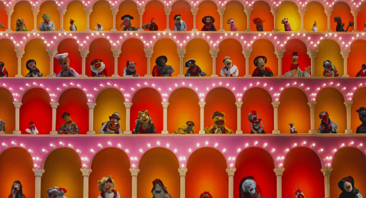
But what do you do when the performers are also operating puppets? The rehearsal process becomes more iterative; the table read is a kind of sketchboard, and the performance moves quickly from spoken dialogue to early filming in full costume. These two videos (less than six minutes long in total) follow the rehearsals of The Muppet Show (1976-1981) from a table read to filming.
One thing that might surprise you (I admit it surprised me) is how much the puppeteers use floor monitors to guide their performances. As Jim Henson says in the second of these two videos, "when we're working, our entire reality is on the screen. You are performing, and at the same time, you're seeing your performance the same as the audience does." On the one hand, this makes perfect sense: on the other, it's just another point of focus, another degree of difficulty in making an entire performance come together.
(Thanks to Ethan Marcotte)
Update: The full documentary (nearly an hour!) is on YouTube (again, thx Ethan)
More about...


Nicholas Rougeux designed a series of posters to visualize all 143 prime numbers with three digits based on simple rules.
Each print contains all 143 prime numbers with 3 digits. Each is represented by an image composed of simple geometric shapes based on its digital root and colors based on its digits. Arranging these images sequentially creates colorful collages of prime numbers based on simple rules.
For each poster, a unique shape was assigned to the digital root of each prime number which is calculated by iteratively summing its digits until one remains. (All known prime numbers greater than 3 have digital roots of 1, 2, 4, 5, 7, or 8.)
There are nine posters in all that use a few different styles of geometric shape.
More about...


For his project Illustrated People, Thomas Mailaender imprinted photographic images onto people's skin by shining a UV light through negatives. The visual effect created is not unlike that of a sunburn but it goes away as soon as the skin is exposed to light. I wonder...does it hurt like a sunburn?
More about...
This is a delightfully early-80s clip about how electronic music legend Suzanne Ciani created the soundtrack and sound effects for the Xenon pinball game. Xenon was the first talking Bally pinball game and the first pinball game voiced by a woman.
The idea of using the short grunts and groans came to me when I watched people playing the game — the way that people expressed their frustrations or their involvement with the game — and I wanted the game to do that back. I wanted it to talk back to the people playing.
Here are two other videos from the 80s of her explaining her work: on PBS's 3-2-1 Contact (I *loved* that show) and on The David Letterman Show. According to her Wikipedia page, Ciani created the Coca-Cola "Pop 'n Pour" sound logo as well as other sound logos for Energizer and ABC.
In 2013, Ciani was inducted into the Pinball Expo Hall of Fame for her pioneering work on the game. (thx, caroline)
More about...
This piece by Cory Doctorow on TikTok's enshittification (also available at Wired) contains some of the best and simplest descriptions of how online platforms like Amazon, Facebook, Uber, TikTok, Twitter, etc. evolve as they grow and then eventually die.
Here is how platforms die: First, they are good to their users; then they abuse their users to make things better for their business customers; finally, they abuse those business customers to claw back all the value for themselves. Then, they die.
...
This is enshittification: Surpluses are first directed to users; then, once they're locked in, surpluses go to suppliers; then once they're locked in, the surplus is handed to shareholders and the platform becomes a useless pile of shit. From mobile app stores to Steam, from Facebook to Twitter, this is the enshittification lifecycle.
The Amazon example he uses is really easy to follow. Early in the company's history, the site used to be a great place to shop; their customers loved Amazon. But then Amazon's sellers became their real customers and the user experience started to suffer. And now, much of the value generated by the users and customers goes to the shareholders (which, functionally speaking these days, means several dozen people who run hedge funds or large investment funds).
This strategy meant that it became progressively harder for shoppers to find things anywhere except Amazon, which meant that they only searched on Amazon, which meant that sellers had to sell on Amazon. That's when Amazon started to harvest the surplus from its business customers and send it to Amazon's shareholders. Today, Marketplace sellers are handing more than 45 percent of the sale price to Amazon in junk fees. The company's $31 billion "advertising" program is really a payola scheme that pits sellers against each other, forcing them to bid on the chance to be at the top of your search.
Over at Techdirt, Mike Masnick riffed on Doctorow's piece, arguing that enshittification, this playing of various parties against each other while siphoning off the value, is bad business because it focuses too much on short term gains.
Because maximizing revenue in the short term (i.e., in the 3 month window that Wall Street requires) often means sacrificing long term sustainability and long term profits. That's because if you're only looking at the next quarter (or, perhaps, the next two to four quarters if we're being generous) then you're going to be tempted to squeeze more of the value out of your customers, to "maximize revenue" or "maximize profits for shareholders."
He uses early Amazon as an example of long-term thinking:
Once you go public, and you have that quarterly drumbeat from Wall Street where pretty much all that matters is revenue and profit growth. Indeed, it's long forgotten now, but Jeff Bezos and Amazon actually were a rare company that kind of bucked that trend, and for a while at least, told Wall Street not to expect such things, as it was going to invest more and more deeply in serving its customers, and Wall Street punished Bezos for it. It's long forgotten now, but Wall Street absolutely hated Amazon Prime, which locked in customer loyalty, but which they thought was a huge waste of money. The same was true of Amazon Web Services, which has become a huge revenue driver for the company.
They created a tremendous amount of value for their shareholders by playing the long game, which for whatever reason they aren't willing to do anymore.
More about...

Artist Siren Elise Wilhelmsen designed a clock that knits while it tells time — the clock makes one two-meter long scarf every 365 days.
Time is manifested in physical objects; in things that grow, develop or extinguish. Time is an ever forward-moving force and I wanted to make a clock based on times true nature, more than the numbers we have attached to it.
(via clive thompson)
More about...
With soooo much TV these days, everyone has their own pick for The Best Show on TV Right Now and my pick, aside from the excellent & underrated My Brilliant Friend, is Succession. Since the middle of the first season, I have eagerly looked forward to each episode and I've been jonesing for season four since about 2 seconds after the final episode of season three aired. Plus, the opening credits are unskippable. Succession starts up again on HBO Max on March 26.
More about...
This is something I've heard over and over again, in many cities around the world: putting in bike lanes in place of car parking and/or car lanes results in an increase in humans patronizing local businesses and increased sales.
Five years ago, the city of Queens, New York, announced that it would be putting bike lanes onto a stretch of Skillman Ave-and removing 116 parking spots. Cyclists loved the plan, but local business owners went ballistic. Taking out those parking spots, as they argued at protests and in letters to the city council, would devastate stores and restaurants along Skillman. "Parking here is already a nightmare," one fumed at a protest rally.
But the bike lanes were a done deal, and soon they were in place. Early this year, Jesse Coburn — an investigative writer with Streetsblog New York — wondered whether those predictions of economic collapse came true. So he asked the city's Department of Finance to give him a few years' worth of sales figures for that stretch of Skillman Ave. How had the businesses on that street fared?
Quite well, it turns out. In the year after the bike lanes arrived, businesses on Skillman saw sales rise by 12 percent, compared to 3 percent for Queens in general. What's more, that section of road saw new businesses open, while Queens overall had a net loss.
The thing is, the actual merchants along Skillman? They didn't believe it. When Coburn spoke to them and described what he'd found, only a few store owners admitted the lanes had helped. Many still insisted the lanes were killing their part of the city. And emotions ran hot: Someone scattered tacks on the bike lane.
More about...


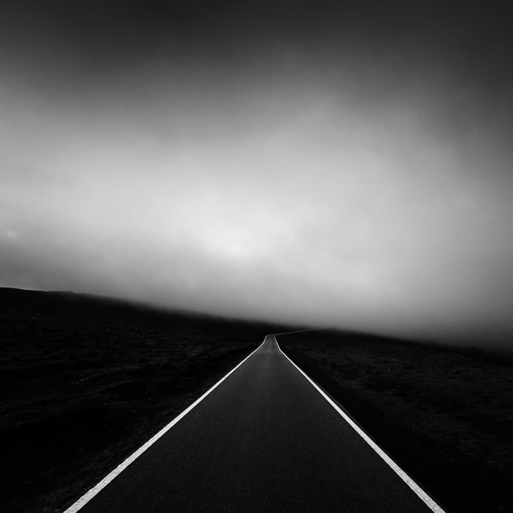
Some really nice work amongst the winners and runners up of the Minimalist Photography Awards for 2022. I've included a few favorites of mine above (from top to bottom: Daniel Dencescu, Gleici Rufatto, Julie Kenny, and Alexandre Caetano).
More about...
Haley Nahman on the contagious visual blandness of Netflix:
It's actually, specifically, about how movies these days look. That is, more flat, more fake, over-saturated, or else over-filtered, like an Instagram photo in 2012, but rendered in commercial-like high-def. This applies to prestige television, too. There are more green screens and sound stages, more CGI, more fixing-it-in-post. As these production tools have gotten slicker and cheaper and thus more widely abused, it's not that everything looks obviously shitty or too good to feel true, it's actually that most things look mid in the exact same way.
Yes, yes, 1000 times yes. This has been bugging me for years now — movies and TV shows are too blandly shiny these days (or is it shinily bland?) It's easy to make everything look just so — and so filmmakers do, without the visual zip of a Wes Anderson or David Fincher. This comment from Reddit captures the vibe:
I actually think it looks too "perfect". Everyone is lit perfectly and filmed digitally on raw and tweaked to perfection. It makes everything have a fake feeling to it. Commercials use the same cameras and color correction so everything looks the same. Every shot looks like it could be used in a stock photo and it looks completely soulless.
No film grain, no shadows on faces, and no wide shots. I have a theory that going from tungsten to led lightning added to this as well. Tungsten allows for more accurate color in camera but LEDs are cheaper, cooler, and more convenient. So the solution is to film on a nice digital camera and fix the color in post. However, this makes for less creativity on set and less use of shadows.
Green screens make it worse as they also require flatter lighting to work. Marvel films are very obviously mostly made in post and they all look very flat and not real. Even shitty low budget 90's comedies look better and I think this can be attributed to the lighting.
More about...

Catherine Scorsese appeared in many of her son Martin's films — Goodfellas, Taxi Driver, Mean Streets, Casino, etc. — and would often cook for the cast and crew.
Robert DeNiro said, "She made the best pizza I've ever eaten. I always wanted to serve it at TriBeCa Grill," while Harvey Keitel said, "In my memory, Catherine was the epitome of a warm, loving Italian mother. She enjoyed watching me eat as much as I enjoyed eating her cooking." And Pesci said, "Katie was one of the sweetest ladies I ever met. She was a true innocent. She never did anything bad; she never knew anything bad. In terms of her cooking, it's a toss-up as to who's a better cook, Katie or my mother."
In 1974, Martin made a documentary about his parents called Italianamerican:
Over dinner at their New York apartment on Elizabeth Street, Martin engages his parents in a lively and candid discussion about their lives, discussing such topics as their upbringing, family, religion, marriage, their Italian ancestors, post-war life in Italy, and the hardships of poor Sicilian immigrants striving to succeed in America.
During the film, Catherine cooks meatballs and sauce for dinner and a bare-bones recipe appears in the ending credits (which you can see here with the rest of the film):
The Sauce:
Singe an onion & a pinch of garlic in oil. Throw in a piece of veal, a piece of beef, some pork sausage, & a lamb neck bone. Add a basil leaf.
When the meat is brown, take it out & put it on a plate. Put in a can of tomato paste & some water. Pass a can of packed whole tomatoes through a blender and pour it in. Let it boil. Add salt, pepper & a pinch of sugar. Let it cook for awhile. Throw the meat back in. Cook for 1 hour.
Now make the meatballs. Put a slice of bread, without crust, 2 eggs, & a drop of milk, into a bowl of ground veal & beef. Add salt, pepper, some cheese & a few spoons of sauce. Mix it with your hands. Roll them up, throw them in. Let it cook for another hour.
As you can see, the recipe is pretty vague on measurements, but Catherine published a cookbook of her recipes shortly before she died, Italianamerican: The Scorsese Family Cookbook. The book has long been out of print and seems to be an expensive collector's item now, but some kind soul has republished the full meatballs and sauce recipe here.
See also burger recipes from Ernest Hemingway, Dean Martin, and Frank Sinatra and The Artists' and Writers' Cookbook.
More about...


It's been a bit since we've checked in on artist Reuben Wu, who uses drones to paint (sculpt?) with light in the sky over dark landscapes. Most of his recent stuff seems to be video on his Instagram account but I pulled a couple of photos of his that I haven't featured before. Always inspiring stuff worth exploring.
More about...

A comet called Comet C/2022 E3 (ZTF) is currently visible in northern skies with the naked eye and here's how you can catch a glimpse for yourself.
Comet C/2022 E3 (ZTF) is currently making its way through the northern skies and should reach its brightest magnitude in early February, according to In-The-Sky.org as it approaches perigee on Feb. 1. To see the comet for yourself, look to the north just after sunset and look for a faint greenish glow. Under the right dark sky conditions, the comet could be visible to the unaided eye, but binoculars will certainly make the job easier.
The comet last visited the Earth about 50,000 years ago and this may be its last visit before it leaves the solar system for good. The unusual green color results from a rare chemical reaction:
The comet itself isn't green, but its head does appear to glow green thanks to a somewhat rare chemical reaction. The glow likely comes from diatomic carbon (C2) — a simple molecule made of two carbon atoms bonded together. When ultraviolet light from the sun breaks this molecule down, it emits a greenish glow that can last for several days, according to a 2021 study in the journal Proceedings of the National Academy of Sciences.
This eerie light disappears before making its way to the comet's tail, or coma, which is made of gas. That gas is once again a result of solar radiation - in this case, sunlight causes part of the comet to sublimate, or transition from a solid into a gas without entering a liquid state. That gas streaks behind the comet, often glowing blue from the ultraviolet light.
The best, brightest views of the comet will be right around Feb 1, when it will be near the constellation Camelopardalis (almost due north, in the general vicinity of the Big and Little Dippers) right after sunset — use an app like Sky Guide to help find it. It's cloudy here in Vermont until Friday...I'm going to try to catch a glimpse of it then.
Amazing photo of Comet C/2022 E3 (ZTF) above by Dan Bartlett.
More about...

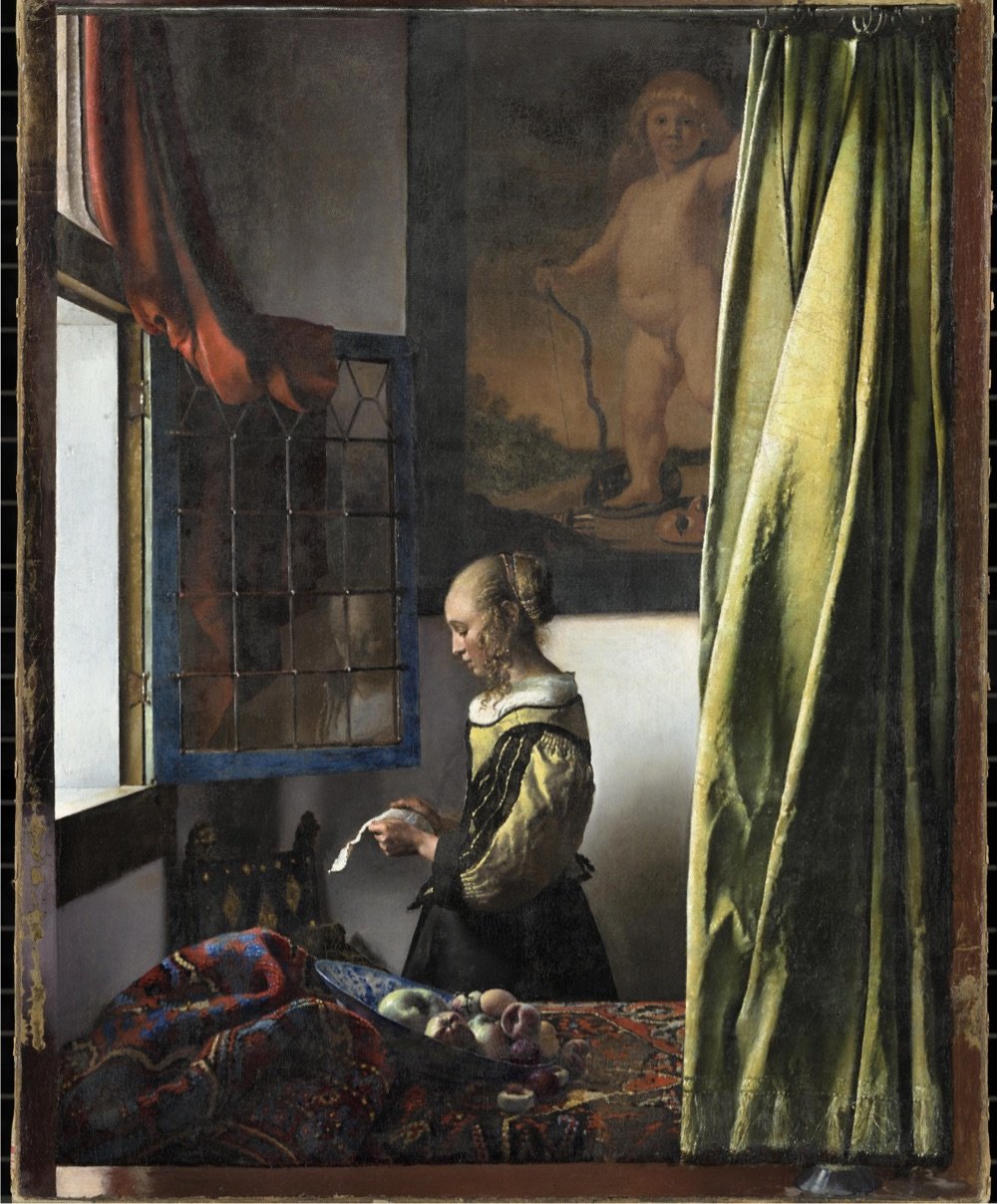
Wow! A forthcoming exhibition at Amsterdam's Rijksmuseum will bring together 28 of the 37 known paintings by Dutch master Johannes Vermeer, including The Girl with a Pearl Earring. As the museum's website says: "Never before have so many Vermeers been brought together".
The exhibition will include masterpieces such as The Girl with a Pearl Earring (Mauritshuis, The Hague), The Geographer (Städel Museum, Frankfurt am Main), Lady Writing a Letter with her Maid (The National Gallery of Ireland, Dublin) and Woman Holding a Balance (The National Gallery of Art, Washington DC).
Works never before shown to the public in the Netherlands will include the newly restored Girl Reading a Letter at the Open Window from the Gemäldegalerie Alte Meister in Dresden.
This page lists all of the works that will appear in the exhibition — you can click on the title of any of the artworks to see a zoomable high-resolution image of the painting, e.g. The Milkmaid or Girl Reading a Letter at an Open Window.

Accompanying the exhibition is an online guided tour of Vermeer's works, narrated in English by Stephen Fry. The History Blog raved about the tour:
This is one of the best virtual exhibitions I have ever seen, and I have seen a lot of them. It is written in a personable, light-hearted style that still manages to be incredibly information-rich. The way they zoom into the detail of the paintings to illustrate the commentary is flawlessly paced and takes full advantage of the ultra-high resolution photographs. Fry explains changes Vermeer made based on the most recent imaging and research into his process. There are also annotated areas of each painting which you can click on for a shot of additional information. The notes open in windows that have click-through images, so every note is really multiple notes. Then when you're done exploring the nooks and crannies, you click back to the main tour and the narration picks up where you left off. Whoever designed this is a content management genius, seriously.
The exhibition runs at the Rijksmuseum from February 10 to June 4, 2023 — but note that The Girl with a Pearl Earring will only be available for viewing until March 30, at which point the painting will return to Mauritshuis in The Hague. I....think I might have to get to Amsterdam to go see this?
More about...
XKCD's Randall Munroe recently shared some of the pages from his grandfather's collection of Disfrustrating Puzzles and Diversions for People Who Don't Have Time for the Hard Ones and....I cannot stop laughing at some of these.


Welp, it's no mystery where XKCD came from then.
More about...

Image by Cuban cartoonist Osvaldo Gutierrez Gomez. The cartoon is a few years old, but with the increased scrutiny of and legal repercussions feared by school librarians and the never-ending gun violence in our communities, it's more relevant than ever. (via @irwin)
More about...


Photoshop wizard Ingo Lindmeier makes these delightful mashups of animals and objects (fruits, vegetables, technology) which you can find on his Instagram account. Some of them are a little over-the-top, but the conceptually simpler ones are great. (via moss and fog)
More about...
Dialogue from movies and TV shows has become more difficult to hear in recent years, prompting many to switch on subtitles for much of what they watch. As this video from Vox details, the reasons for this shift come down to a desire for realism, choices that filmmakers have access to because of technology, and mediocre at-home sound systems on TVs, computers, and devices.
I dislike watching movies and shows with subtitles on (unless there's non-English dialogue) because if there are words on the screen, they capture 95% of my attention and I find it extremely difficult to pay attention to all of the other things going on — physical acting, cinematography, pacing, effects, etc. Movies and TV shows are much more than plot-delivery mechanisms and all of that other stuff is important! But with dialogue harder than ever to hear these days (and with my mild misophonia), it does mean more rewinding and not watching anything unless I'm in a quiet room or using noise-cancelling AirPods.
See also Why Everyone Is Watching TV with Closed Captioning On These Days, Why Gen Z Loves Closed Captioning, and It's not you - movies are getting darker.
David Shariatmadari, an editor at The Guardian, was asked by a colleague to "have a go" at inventing a new game, a new viral sensation like Wordle. The game he came up with is called Wordiply (it's fun!) and he wrote up the whole process of how he went about designing it. The idea behind the game is a simple one and the way in which Shariatmadari arrives at it is a familiar trope in discovery stories:
That's where my older brother, Daniel, comes in. While I'm racking my brains about how to come up with a better version of Boggle, he's with his partner Nic in a hospital waiting for their baby to be born. On the morning she is due for an induction, they arrive bright and early at 8am. I call at about 11am to see how things are going. "What about if you had a word," Daniel says, "of three letters — and the point of the game is to find the longest word that still has those three letters."
"You mean like an anagram, but you make it longer?" I ask, confused.
"No, you've got to keep them in order. So if you had 'bid', then maybe, er, 'forbidden' would be the longest word."
"Or 'ambidextrous'."
"Right."
This is typical. I've been thinking about this for weeks. Daniel is supposed to be having a baby today and instead he's come up with something that just might be the next Wordle.
"I think that's pretty good," I tell him.
"Yeah, OK — gotta go."
"What about the bab — "
It's worth reading the whole thing — stories of invention and discovery are always interesting and the familiarity that most people have with word puzzles makes this one easy to follow and even to place yourself in the creator's shoes. A key part of the design process is to look for the spark:
Next, I pitch the longest word game: "So if you have a word like 'pit', you could have 'spit', 'spittoon', 'hospitable'." "Amphitheatre!" Will exclaims, triumphantly. There's a beat before we realise it doesn't work. But I can hear an excitement in his voice — pride at having swung even if he missed. Maybe there is something to this. We do a paper prototype, and decide to play it against the clock — 15 seconds. I call out the word "cub" and everyone scribbles furiously. Time's up before we know it, and all I managed is "scuba". Someone gets "incubation". Will has "cubism". "You know what?" he says. "It's a good game!" Entrancement? Unlocked. Well, possibly.
I found this via Clive Thompson, who riffs on Shariatmadari's piece here.
Alas, there is no magic formula to finding the right mix of rules. You just have to tweak and tweak, and test and test.
Often the hardest part of finessing a design can be some incredibly weird thing you'd never predict.
For Shariatmadari, the hardest part was creating the list of allowable words. Since the goal of his game was - given a target word like "pop" (for example) - to find the longest possible word that contains the target, there are a ton of super-long medical and chemical words one could use, like "pseudopseudohypoparathyroidism". But allowing words like that could break the feeling of fairness, giving an advantage to people who rote-memorize really long medical words. (As an aside, this is why I find competitive Scrabble rather dreary: Success hinges upon memorizing endless marginal two-letter words that normal people rarely ever use in daily speech; this does not feel, to me, like a particularly interesting skill.)
I have a weird relationship with word puzzles. I don't like crossword puzzles but have been doing them recently with a friend over FaceTime, which has been enjoyable. Boggle is my jam and has been since childhood, but I dislike Scrabble with an intensity that is almost absurd. I've never played Wordle (I know!) but I do Spelling Bee every day. I'm not sure why I love some of these games and dislike others — all word games require pattern matching to some extent, which is something I enjoy and am good at, but for some reason Scrabble and Wordle don't interest me at all while I cannot get enough Spelling Bee.
More about...
In 1812, Japanese woodblock print artist Katsushika Hokusai, who would later become famous for his iconic Great Wave off Kanagawa prints, published a three-volume series called Quick Lessons in Simplified Drawing. All three volumes are available online: one, two, three. Even if you're not in the market for drawing lessons, the pages are wonderful to flip through.


(via open culture)
More about...
Here's Kurzgesagt on the deceptively simple way we can make changes in our life: build new routines and turn them into habits.
If you are like most people, there is a gap between the person you are and the person you wish to be. There are little things you think you should do and big things you ought to achieve — from working out regularly, eating healthy, learning a language, working on your novel, reading more or simply actually doing your hobby instead of browsing Reddit.
But it can seem that to achieve your goals, you have to become a different person. Someone who is consistent, puts in more effort, has discipline and willpower. Maybe you have tried your hardest to be like that. And it worked! For a while. Until you find yourself slipping back into your old ways. In the end, you always seem to fail. And with every failed attempt, you become more and more frustrated and annoyed with yourself.
If you believe "success and hustle" internet, it is all your own fault: if you don't succeed, you just didn't want it enough and the failure is all you. But change is actually hard. But as with most things in life, understanding why makes things easier.
More about...
Eric Huang is the chef/owner/operator of Brooklyn's lauded Pecking House fried chicken joint. In a recent Instagram post, Huang explains why tipping is a part of the experience at his restaurant.
We do NOT use a tip credit at Pecking House. If we do not take a tip credit that means we pay every employee at least $15/hour. We then pool the tips and divide them among the entire hourly staff, including all back-of-house employees. This helps to foster an equitable team culture where everyone feels they are participating in the restaurant's success.
So far, we've been able to pay every front-line employee an average of an extra $7 per hour on top of their hourly wages. We've been managing that while collecting a tip average of 18% on a check average of $26. So even an entry-level employee at Pecking House is making $22/hour if not more.
Almost no one in New York City does this. This is pretty damn unique. And while people have been generally enthusiastic about supporting restaurants as they weather a furious storm of inflation, this is an easy way for us to take better care of our restaurant workers. Because the pandemic revealed quite painfully that we are a sizable, important and vulnerable population. And this is all perhaps even more relevant given that certain Best Restaurants have been outed about certain abhorrent business practices. Their example should be motivating us to take a look at how we can change the restaurant industry for the better.
So when you add a tip at Pecking House, you're really helping to take care of the whole team and acknowledge their effort in creating your experience. I think we've all been guilty of having a great time and leaving a fat tip, but forgetting at that moment that the cook who made you that taglioni isn't seeing an extra penny. So for those of you who have been helping us out with 18% on $26, an extra $4, know that it's going to everyone. Except and rightfully so, the chef standing there pointing at stuff, not being terribly helpful, i.e. me.
From there, he goes on to explain why eliminating tipping doesn't work from the standpoint of the restaurant (customers spend less), its employees (they make less than they could elsewhere), or, surprisingly, its customers (they want the illusion of control/agency). And there's also a sort of tacit collusion that happens amongst restaurants — no one wants to eliminate this obviously unfair system because of the financial hit so none of them do. The whole thing is worth a read.
Back when I lived in NYC, a restaurant I frequented experimented for a few months with eliminating tipping. In practice, it meant that the bartenders and servers made less money and the chefs got paid more. As a regular customer who knew and liked everyone who worked there, I thought that was much more fair than front-of-the-house staff being paid more than the kitchen folks due to some antiquated racist bullshit. In the end, they had to revert to doing tips again because customers weren't spending as much money and it eliminated the restaurant's profit margin. Customers looked at the higher prices ($25 for the chicken instead of $21, $17 cocktails instead of $14) and ordered fewer and less-expensive items, even though they were paying exactly the same amount for them by tacking 20% onto the check at meal's end. It's just economic reality: lower posted prices with added fees will encourage people to spend more money because the posted price is what gets stuck in their heads.
It seems like the only way to get rid of tipping in the US is for every restaurant to do it simultaneously, either by mutual decision (ha!) or through some kind of legislation (double ha!). But because of the pandemic and the ubiquity of digital payment screens, tipping is more engrained in American commerce than ever so...??
See also The Failure of the Great Tip-Free Restaurant Experiment.
More about...


South Korea currently has a probe called Danuri orbiting the Moon at an altitude of about 62 miles above the surface. It's just begun its mission but has already sent back some black & white photos of the Moon and the Earth, including the two above. Over at EarthSky, Dave Adalian says these shots "rival the work of legendary nature photographer Ansel Adams" and it's difficult to disagree.
Also worth a look: Danuri's shot of the Earth and Moon from a distance, hanging in the blackness of space like a pair of pearls. (via petapixel)
More about...
Jonathan Mehring's short documentary Walls Cannot Keep Us From Flying follows two young Palestinians who have found freedom in skateboarding while surrounded by walls & barbed wire and facing harassment from Israeli authorities and their own families & communities.
What do I feel when I skate? What do I imagine? I imagine there's no occupation, there's no wall. I feel freedom.
With every new trick, it's like you become aware of a new life, new ideas. It's not something that I can describe, it's something you feel in your heart. It's like when something has been missing and you're looking for it and slowly you find it.
According to one of the young skaters in the film, when a new skatepark opened in the West Bank, the Israeli army came and fired tear gas. And no wonder — when oppressed people start doing things like skateboarding and begin to feel like they are free, authoritarian regimes can't have that — they've got to crack down.
More about...


Smithsonian Magazine is featuring some incredible photos from Angel Fitor's SeaDrops project: microphotography of tiny plankton-populated worlds contained in drops of seawater.
It took Fitor three years of surgically precise work to get the jewel-like images you see here. First, he would take a boat out on the Mediterranean Sea and dive in to collect water samples, usually 30 to 50 feet below the surface. He'd bring the samples straight back to his home studio in the coastal village of Alicante, south of Valencia on Spain's eastern coast. Then he'd get straight to work: When copepods die, they quickly lose their color and look like dull brown beetles. Fitor wanted to capture the vivid blues and golds of the living organisms, and he wanted to show them in action just as he does when he photographs any other marine animal.
You can check out more of Fitor's work on Instagram and his website.
More about...
In the course of making his Oscar-winning documentary about basketball star Lusia Harris, director Ben Proudfoot became interested in how Title IX, the federal civil rights law that prohibits sex-based discrimination in any educational program that receives federal funding, was passed. And that led him to former US Representative Patsy Mink, who was the first woman of color elected to Congress and a key advocate in the fight for Title IX.
As the first woman of color elected to Congress, Ms. Mink — and her path to office — was influenced by the discrimination she experienced in her personal and professional lives. Many doors were closed to her as a Japanese American woman, and she became an activist and later a politician to change the status quo.
As I learned more about the early history of Title IX in the 1970s, I found that lobbyists and legislators mounted a formidable campaign to dilute and erode the law. This effort would culminate in a dramatic moment on the House floor, where Ms. Mink was pulled away during a crucial vote on the future of the law.
More about...


Textile artist Alicja Kozlowska's Embroidered Ordinaries series recalls the the pop art of Warhol & Lichtenstein and Andreas Gursky's 99 Cent II Diptychon while also being firmly contemporary. There's maybe a Duchamp/readymade something something riff in there? I dunno, I'm not an art critic, just a fan. Anyway, I love how detailed these are — remarkably true-to-life for objects that are embroidered. (via colossal)
More about...
Magnets are cool. Full stop. The Magnetic Games channel has a ton of videos about all the neat stuff you can do with them.
I can't be the only person who, after watching this, wants to spend a significant amount of money on neodymium magnets and magnetic putty? Some people do puzzles, others do Lego — maybe I could be a magnet guy?
More about...
The Odyssey YouTube channel is a trove of documentaries about the ancient world, "from the dawn of Mesopotamia to the fall of Rome". Several of their videos about Rome are presented by classicist Mary Beard, perhaps the best-known Roman scholar in the world and the author of SPQR: A History of Ancient Rome, which you couldn't enter a bookstore in the late 2010s without seeing. I've embedded her videos on The Ancient Origins Of The Roman Empire and Why Did The Roman Empire Collapse above and you can head to YouTube to watch several more hours of Beard explaining Rome: Who Were The Citizens Of Ancient Rome?, How Did The Ancient Roman World Work?, The Meteoric Rise And Fall Of Julius Caesar, What Was Normal Life Like In Pompeii Before Its Destruction?, and Caligula And Corruption In Imperial Rome. (via 3 quarks daily)
More about...
Self-described "maker of things" Evie Bee has made a cool thing indeed: an e-bike with a frame constructed mostly from sustainably sourced poplar and birch plywood called the Electraply.


Here's a video of the bike in action:
The design of the bike was inspired by my love for the cafe racer and scrambler motorcycles of the past (the Great Escape anyone?) and the desire to honour and continue this iconic design through a modern interpretation.
Bee has released a pair of PDFs (one, two) to guide you through the entire process of building your own plywood e-bike. (via design milk)
More about...

For 10 years beginning in the late 90s, photographer Angela Cappetta captured the goings-on of a multi-generational Puerto Rican family living on NYC's Lower East Side, focusing particularly on the youngest daughter, Glendalis. From a recent piece in the New Yorker by Ana Karina Zatarain:
The neighborhood was different then. During those years, just before a fierce wave of gentrification hit the area, the photographer Angela Cappetta often rose at dawn to roam the streets, a Fuji 6x9 camera in hand. ("I still use it," she told me. "It looks fake, like a toy.") It was on one of those mornings that Cappetta encountered a clan that reminded her of her own upbringing, within a multigenerational family of Italian immigrants, in Connecticut. As a child, Cappetta was shepherded among various homes by aunts, uncles, and older cousins-a constant and frenetic flow of relatives. The family she met that day, Puerto Rican New Yorkers living on multiple floors of a tenement building on Stanton Street, had a similar dynamic. Instinctively, she began placing each member in their role. "I looked at this beatific, beautiful family, and I thought, Yeah, I relate to this," she recalled.
More about...
From steel scrap to testing the final product with a ton of water pressure, here's how Japanese manhole covers are made. The video is perhaps a little long in parts, so I would not blame you for skipping ahead to ~12:10 to see how some of the covers are hand-painted in brilliant color.
See also Japanese Manhole Covers Are Beautiful.
More about...
At the end of each year, art director Chris Barker collects celebrities who have died in the past 12 months into a Sgt. Pepper's album cover collage — here's 2022's edition.

There doesn't appear to be a complete listing of everyone pictured, but you can easily pick out Coolio, Gilbert Gottfried, Sidney Poitier, Angela Lansbury, Meatloaf, Nichelle Nichols, Pele, Mikhail Gorbachev, and Twitter.
Fueled by television, advertising, cable TV, and the internet, the post-war era saw an explosion of celebrity in America and the world. The average person today "knows of" so many more people than someone living in 1945 did, probably by a couple orders of magnitude. As Boomers and Gen X continue to age, annual displays like this of well-known people who have died will get larger and larger.
Update: An incomplete key to the image is available here. (via @matsimpsk)
More about...
The length of winter near the northern 45th parallel requires events to look forward to in order to feel like you're not forever adrift in cold and dark. Big things like vacations and reunions with friends & family as well as small things like getting outside in the afternoon, having something delicious planned for dinner, or just, like, getting to the end of the day having consumed enough water.
One of the things I am looking forward to in the early spring is March 1st because a) the sun will set at an almost respectable 5:38pm instead of the current 4:40pm, and b) season three of The Mandalorian starts. This is the way.
More about...
Based in Dubai, video artist André Larsen spends a lot of time shooting the Burj Khalifa which, at 2,722 feet and 163 floors, is the world's tallest building. In this video, a drone piloted by Larsen dives the entire height of the building...and it's kind of astounding just how much of it there is. Floors whiz past by the dozen and still there's so far to go.
More about...


The USGS Astrogeology Science Center recently released a series of detailed geological maps of Mars that detail features from the red planet's past like volcanos and flowing water. If you're thinking, "hey that looks a lot like a river in that second image", you're not far off.
One particularly interesting feature that hints at Mars' watery past is the sinuous ridge, which is a winding, narrow ridge that looks like an inverted river channel. These ridges are interpreted to be aqueous (formed by water), making them possible clues about the history of water on Mars.
The scale of the maps is useful for identifying geologic changes over time:
The new map of Aeolis Dorsa adds to the hypothesis that Mars was once wet and had abundant active river systems in the past before aqueous activity decreased over time. This change caused the primary depositional methods in the region to shift from rivers (fluvial) to sediment fans with intermittent deposition (alluvial) and eventually to a dry and wind-driven (aeolian) system. This local pattern mimics our current understanding of the global environmental history of Mars.
Lovely aesthetics as well. (via @geoffmanaugh)
More about...
The Art of the Title, Print magazine, Slashfilm, and Salon have each compiled their picks for the best film and TV opening title sequences for 2022. There's quite a bit of overlap, with the opening titles for Severance (which I added to the Unskippable Intros Hall of Fame earlier this year), The White Lotus, Peacemaker, and Pachinko making multiple lists. I haven't seen After Yang yet, but I love that title sequence. Always a fan of lots of creativity and expression packed into small times and spaces.
More about...


I am loving these vibrant fabric portraits by Bahamian artist Gio Swaby (Instagram). Here's a brief statement of work from her website (italics mine):
Gio Swaby is a Bahamian visual artist whose practice is an exploratory celebration of Blackness and womanhood. Her work centres on Black joy as a radical act of resistance. It works through the philosophy of love as liberation and explores pathways of healing and empowerment. It allows space for both the strong and soft to coexist.
(via colossal)
More about...
This video is a simulation of a rogue wave 58 feet tall recorded by a buoy off the coast of Vancouver Island in 2020.
For centuries, rogue waves were considered nothing but nautical folklore. It wasn't until 1995 that myth became fact. On the first day of the new year, a nearly 26-meter-high wave (85 feet) suddenly struck an oil-drilling platform roughly 160 kilometers (100 miles) off the coast of Norway.
At the time, the so-called Draupner wave defied all previous models scientists had put together.
Since then, dozens more rogue waves have been recorded (some even in lakes), and while the one that surfaced near Ucluelet, Vancouver Island was not the tallest, its relative size compared to the waves around it was unprecedented.
Scientists define a rogue wave as any wave more than twice the height of the waves surrounding it. The Draupner wave, for instance, was 25.6 meters tall, while its neighbors were only 12 meters tall.
In comparison, the Ucluelet wave was nearly three times the size of its peers.
Watching the video is surprising...the wave you think is the tall one isn't and when it comes, you're like, ok, WOW. (via damn interesting)
More about...
This is such a trip to see the familiar original version of Nintendo's The Legend of Zelda being played as a VR first-person shooter. You only get one screen at a time with the top-down 2D view, but in this version, you get as much of the map as you can see - it looks like it stretches off into the distance for miles.
I just went to Wikipedia to look at the release date for Zelda and it came out February 21, 1986. I remember getting Zelda for my birthday that year, which means I somehow waited seven whole months to play that game and, boy was it worth it. I have a Switch now and still fire up the original Zelda sometimes, just to make sure the ol' reflexes still work. (via digg)
More about...
Sure, the James Webb Space Telescope and ok, the Hubble, but the Solar Dynamics Observatory has to be right up there for producing some of the most jaw-dropping space photography around. This 4K video from NASA's Goddard Space Flight Center condenses 133 days of the SRO's observations of the Sun into a soothing hour-long time lapse.
See also The Highest Resolution Photo of the Sun Ever Taken, A Decade of Sun, Epic Time Lapse Videos of Mercury's Transit of the Sun, and Thermonuclear Art.
More about...


Written in Stone is a collection of photos of stamps and seals imprinted in sidewalks by the people and companies who made them. Great examples of vernacular design.
Update: See also Easy Bay Sidewalk Stamps. (via @presentcorrect)
More about...
Clive Thompson, himself a person with a number of "weird, offbeat obsessions", writes about the power of curiosity, including the story of how a trip to Yellowstone's burbling hot springs led to the PCR method that enables accurate Covid testing.
Back in 1964, the microbiologist Thomas Brock visited Yellowstone National Park to do some sightseeing. He was on a long car ride, and wanted to break up the monotony.
While peering into the hot springs, he noticed a curious blue-green tinge. When he asked a park ranger about it, he was told it was algae. That surprised Brock: Those pools are so hot that some of them reach a boiling temperature. At the time, scientists didn't know of many lifeforms that could readily thrive such scalding environments.
But Brock couldn't stop wondering about what exactly was going on in those boiling pools. He was dying to know: What was alive down there? How was it surviving?
More about...

For Beautiful Public Data, Jon Keegan takes a look at the Manual on Uniform Traffic Control Devices for Streets and Highways, the style guide published by the Federal Highway Administration that governs how America's roads are marked.
The MUTCD states that it "shall be recognized as the national standard for all traffic control devices installed on any street, highway, bikeway, or private road open to public travel". Exact specifications for the font, size, spacing of letters, background colors, reflectivity, mounting location and orientation help ensure that traffic signs are consistently readable at a glance while driving anywhere in the U.S..
The word "uniform" is key here, as you can only imagine the chaos if each state had its own version of stop signs, and safety warnings. But states do have some freedom in the signs that they use.
More about...
People running "unconventional miles" is a thing now (see the beer mile) and during the pandemic, when meets and other usual track activities were cancelled, running a mile while dribbling a basketball became part of the human competitive story.
What started out as a curiosity-driven gimmick on YouTube eventually transpired into a competitive record among plenty of athletes, to the point where very experienced milers are now the only candidates that can pull this off.
The record for the basketball mile is 4:28, which also happens to be the current record for the aforementioned beer mile. It's interesting that dribbling a basketball while running is equally as time-consuming as stopping to chug four beers and then running; I would have guessed the beer mile would take longer.
More about...


Bernie Kaminski makes everyday objects out of paper mâché and posts the results to his Instagram account. At a glance, you wouldn't be able to tell that some of these weren't real and then after a moment you're like, waaaait a minute... At any rate, the twee design aesthetic here is off the charts. (via @thoughtbrain)
More about...
I love me a good speedrunning video, so I'm interested in seeing Running with Speed, a new feature-length documentary about people who strive to finish video games as fast as they can. You can find the movie on Amazon, Apple TV, and other such places. (thx, rex)
More about...
At the height of the Roman empire, over 250,000 miles of roadway criss-crossed present-day Europe, western Asia, and northern Africa. These roads were built using a variety of techniques, but many of them were built as shown in these two short videos:
First, a wide area would be deforested in order to clear all vegetation. Then, in the strip where the track had been projected, the topsoil would be removed until a solid base was found. Then on this base, the curbs were placed appropriate to the chosen width for the road. Large stones were placed between the curbs to serve as foundations, and on top of them, smaller stone layers all mixed up with fine aggregates to fill the gaps. Finally, the surface layer: a mixture of gravel, sand, and clay was added.
Tipper carts moved along the already compacted layers to deposit the material for the next layer. After tipping out heaps of material, it had to be spread out with planks, watered from barrels, and, finally, compacted with rollers.
If you're like me and want to know just a little bit more about Roman roads in general after watching those, you can check this one out:
And if you want to know a lot more (and can read Spanish), check out this 245-page PDF.
See also How Did Roman Aqueducts Work? and A Subway-Style Map of Roman Roads Circa 125 A.D. (via open culture)
More about...
I know I've posted this before, but with the new Avatar movie out in theaters, it's a good time to revisit the SNL sketch where Ryan Gosling is driven mad by the typeface choice for the movie's logo.
I had forgotten about the title card at the end. Perfection.
Update: From Jake Kring-Schreifels at The Ringer last month: The Intertwining History of the 'Avatar' Papyrus Font and the 'SNL' Sketch That Spoofed It.
There actually is one single person responsible for Avatar's Papyrus-esque logo: Peter Stougaard. The former senior vice president of creative advertising for 20th Century Fox willingly takes credit for selecting and tweaking the movie's much-maligned font, but he doesn't mince words. "I didn't aimlessly pick Papyrus," he insists. "I chose it very strategically."
I can't believe they got it off of the cover of Cameron's copy of the script. (thx, matt)
More about...
It's here, it's here! David Erhlich's annual 25 best films of the year video for 2022 is here. Every year around this time, I get a little down about the movies. There's nothing to seeeeee... And then I watch Erhlich's 17-minute love letter to cinema and I want to see ever-ry-thing. The only complaint I have is that Everything Everywhere All at Once is not rated highly enough (a respectable #3 but not #1).
Erhlich has been doing these recaps since 2012 — you can find them all here or almost all of them at kottke.org with my commentary.
More about...
I am not entirely sure I liked Noah Baumbach's adaptation of Don DeLillo's White Noise (nor am I sure I disliked it), but I'm 100% positive that the grocery store dance scene that plays while the end credits roll was my favorite part of the film. The scene is set to a new LCD Soundsystem track called new body rhumba and Netflix has uploaded the whole thing to YouTube so you can enjoy it whenever you would like. Also, André 3000 with the cookie box!
More about...


The results of the 4th annual Close-Up Photographer of the Year competition have been announced and you can take a look at the top 100 images right here. I've included a few of my favorites above from photographers Minghui Yuan, Alex Pansier, Andy Sands, and Szűcs Boldizsár. (thx, jodi)
More about...

As part of the company's effort to get more adults building with bricks, LEGO has released an 1810-piece set based on Hokusai's The Great Wave Off Kanagawa. Here's the only problem: it's sold out online (and on Amazon as well). Perhaps you can find one at your local toy store?
If you were lucky enough to procure a set, Lego has produced an 85-minute audio piece about The Great Wave that you can listen to while you're putting it together. The piece includes interviews with woodblock printer David Bull, Alfred Haft, curator of Japanese Art at the British Museum, and anime & manga scholar Susan Napier. Very cool.
More about...
When Spider-Man: Into the Spider-Verse came out in 2018, it had a very different look than most other animated feature-length films. Since the release of Toy Story in the mid-90s, digitally animated films made by the large studios had taken their cues from Pixar. "The Pixar Look" was "extremely high quality, physically based, and in some cases almost photorealistic". Spider-Verse introduced a different style and since then, digital animation studios have been experimenting with non-photorealism. This video looks at how that shift is happening.
More about...


It feels weird to admit this, even to myself, but maybe I love movie poster design even more than I love book cover design. After running across Daniel Benneworth-Gray's list of his favorite movie posters of 2022 (via his newsletter), I found some more best-of lists — Mubi, Indiewire, Collider, The Playlist, First Showing, The Film Stage — and selected a few of my favorites to include here. I couldn't decide between the different versions of the posters for White Noise and Everything Everywhere All at Once, so I included both of each. *shrug*
More about...
Jon Lefkovitz has created a video montage of moments from movies and TV where characters "do or say the same thing at the same time". As you might imagine, it's a little bit mesmerizing.
This reminded me of Synchronized Basketball.
More about...
As a former mini-golf champion, I am completely charmed by Alphaputt, an mini golf iOS game where the courses are shaped like letters of the alphabet.


You can play through the alphabet or play a customized course by typing out a word (come on, that's pretty cool). (via colossal)
More about...
After her guide dog runs off after a thief who takes her bag, a girl navigates a world guided by her powerful senses of touch, hearing, and smell. Super charming and inventive. From the YouTube comments:
For those who don't know, blind people will clap their hands and listen for the echo to get a sense of how big a space they are in, if it's wide open or a tightly enclosed space.
(via peterme)
More about...
Back in August, David Zipper wrote an interesting piece for Slate arguing that urban areas should embrace smaller personal transportation options, like the golf cart.
Learnard said that most residents still commute by car, but that the carts have replaced automobiles for many short trips to a restaurant, school, or friend's house. "Golf carts are a quintessential part of the quality of life here," she said. "You put the family in a golf cart and go to the park or the splash pad. Or you go out for ice cream, or with your spouse to get a cocktail." The golf carts have proved popular with teenagers; many use them to get to and from high school. Residents frequently personalize their vehicles with souped-up radios and jerry-rigged storage. "It turns out you can do a lot with a couple milk crates and bungee cords," Learnard said.
With palpable enthusiasm, she reeled off a list of golf carts' advantages over cars: They provide accessibility for residents who aren't able to drive; they enable local shops to expand parking capacity (golf cart spots are significantly smaller than those for cars); the electric models are quiet and don't pollute. She is even convinced that they have made her town friendlier. "If you're on your golf cart and you see your neighbor doing yardwork, you're going to pull over and chat," she said. "You're never going to do that if you're in a car."
Bikes and ebikes share many of these advantages and infrastructure built for bikes can often be used for carts and vice versa. Zipper followed up with a recent thread on how he saw golf carts being used in The Villages, FL and Peachtree City, GA.
The weather was awful when I stopped by The Villages, a fast-growing 60+ community in central Florida, but I still saw a ton of golf carts.
Put up some plastic sheets, and you're protected from the rain.
The Villages was designed for golf carts; they can be life savers for those otherwise unable to drive.
Many roads have separated golf cart paths, and local streets are slow (with many roundabouts) so golf carts comfortably mix with car traffic.
More about...
This YouTube channel has been going for seven years and 150 episodes now but I just recently ran across it via Open Culture: You Suck at Cooking. The emphasis here is on being dryly funny while cooking but the actual techniques are solid as well. If you follow their advice — well some of it anyway — you will get a tasty loaded baked potato or smashburger:
Update: I no longer mix things, I wangjangle them together.
See also The Katering Show and Hilarious Recipe Videos in the Style of Famous Directors.
More about...


The annual BigPicture Natural World Photography Competition put on by the California Academy of Sciences has announced the winners of the 2022 competition. As usual, I have selected a few of my favorites and included them above; photos by Karine Aigner, Jens Cullmann, Jose Grandio, Sitaram Raul, and Sergio Tapia.
More about...
Hey folks. One of the things I realized coming back here after my time away is that I'm not super happy with how the site works & looks. It could be *waaay* better. The last time I fully redesigned the site was back in 2016 and it's showing its age. But redesigning the whole shebang just isn't feasible right now, so I'm starting to do what I can, here and there. First up is taking the Quick Links out of their front page box (the 10 latest links were collected below the first post) and inlining them into the main flow. (If you're reading this in RSS or clicked through from social media, you can head to the front page to see what I'm on about.) The Quick Links represent a lot of the site's present activity and I was worried they were a little lost down there in that box...like, were people actually reading them? Were they even aware of the existence of the Quick Links? Were they missing 40-60% of the site's total activity? That felt like something that needed to be addressed without delay.
It's not a perfect solution, I'm still not happy with how it works, and the whole thing is slightly inconsistent/janky in terms of design (e.g. multiple people have told me the inlined Quick Links look like ads), but I felt it was more important just to get something out there. There is a much better version of the kottke.org frontpage in my head, but as my art director (i.e. me) is currently 100% focused on editorial, it's going to have to wait. Feedback is welcome via email, Twitter, or Mastodon. Thanks!
More about...
This is delightful: a group of five friends who grew up on a predominantly Italian block of Union St. in Brooklyn reminisce about their childhood and the neighborhood in this animated video.
Imagine a whole block where 75-80% of the kids spoke Italian. We all lived there.
A lot of families were first generation Italians in America. Everybody was poor.
It was an open concept where, in the evening, the mothers and the grandmothers would take their chairs, sit outside, while we're playing in the street. People were out the window watching their kids from the fourth floor. It was tight-knit.
And whenever a stranger walked on the block, like the whole block knew that there was a stranger on the block. That's how tight-knit it was.
We've been together since, forget about it, since we were infants. Like brothers. Paisanos.
The names of the games they played in the street are amazing; I've only actually heard of a couple of these: stoopball, cracktop, red light green light one-two-three, ringolevio, buck buck, old mother witch, slapball, skelsies, boxball, stick ball, and hot peas & butter. The rules for hot peas & butter, which Eddie Murphy remembers playing as a kid:
It involved a long leather belt with a sharp edge. As kids gathered on the stoop or base, one person was selected from the group to hide the belt in our community's parking lot. The belt was usually tucked away in a car bumper or under a loose hubcap or something.
After hiding it, the child returned to base and said, "Hot peas and butter, come and get your supper!" With that call, dozens of eager children ventured out to find the belt. The person who hid it constantly screamed who's "hot" or near the belt and who's "cold" or far away from it. This could go on for 15 even 20 minutes, and then the climax! The person who located the belt got to whip and thrash every child until they ran hurriedly back to base.
When I was a kid, we played a game with a homophobic name where one kid would have the football and the rest of us would try to take it from them using any means necessary; it was a violent version of keep-away. Being a small bookish sort, I don't think I ever got the football and if I did, I threw it down the second anyone got close.
Anyway, back to the video...it's really charming; here's how it was produced.
The result is a vivid film that plays out on an intricately detailed model of a single block of brownstone Brooklyn. The childhood friends, now in late middle age, remember not just the games they played but also the prevalence of organized crime that shaped the neighborhood, and, to some degree, their own lives. And they talk, of course, about how the neighborhood has changed, laughing about the influx of "yuppies" who don't return hellos on the street.
More about...
Hulu and the NY Times are teaming up to bring Nikole Hannah-Jones' The 1619 Project to television.
In keeping with the original project, the series seeks to reframe the country's history by placing the consequences of slavery and the contributions of Black Americans at the very center of our national narrative. The episodes — "Democracy," "Race," "Music," "Capitalism," "Fear," and "Justice" — are adapted from essays from The New York Times No. 1 bestselling "The 1619 Project: A New Origin Story" and examine how the legacy of slavery shapes different aspects of contemporary American life.
The six-episode limited series will premiere January 26 on Hulu.
More about...
Last month, the US Postal Service revealed some stamps that are due to be released in 2023. Alongside a stamp honoring John Lewis and some cool microphotography stamps are a series of four stamps featuring the Art of the Skateboard.

Antonio Alcalá designed the stamps, which feature skateboard decks created by four different artists:
Di'Orr Greenwood is a member of the Najavo Nation who does pyrographic art, burning images into the wooden decks of some of the boards she designs. Greenwood also carves cedar wood flutes and teaches skateboarding. From her Instagram, one of decks she's designed recently:

William James Taylor Jr. is a prolific self-taught artist from Virginia. You can check out his work on Instagram and buy a bunch of decks with his designs — here are just a few of them:

Crystal Worl is "Tlingit Athabascan from Raven moiety, Sockeye Clan, from the Raven House" who currently lives and works in Juneau, Alaska. Her Instagram is here and here's a recent deck from her website:

Federico Frum is a street mural artist from Colombia who is based in Washington DC; he operates under the name MasPaz. From his Instagram, a recent desk design:

I'm excited to get some of these stamps when they come out later in the year. (via lizzie armanto)
More about...
Ted Gioia is one of the best music writers and critics around but has proved an astute cultural (and even business!) critic as well. In a piece for his excellent The Honest Broker newsletter, Gioia writes about the recent turnaround of Barnes & Noble, which he attributes to the company's new CEO and his love of books. James Daunt, who took the helm of B&N in late 2019, previously saved UK bookshop chain Waterstones, in part by refusing to take promotional money from publishers:
Daunt refused to play this game. He wanted to put the best books in the window. He wanted to display the most exciting books by the front door. Even more amazing, he let the people working in the stores make these decisions.
This is James Daunt's super power: He loves books.
"Staff are now in control of their own shops," he explained. "Hopefully they're enjoying their work more. They're creating something very different in each store."
This crazy strategy proved so successful at Waterstones, that returns fell almost to zero — 97% of the books placed on the shelves were purchased by customers. That's an amazing figure in the book business.
On the basis of this success, Daunt was put in charge of Barnes & Noble in August 2019. But could he really bring that dinosaur, on the brink of extinction, back to life?
The boldface above is mine and it matches up with the bold text from Gioia's conclusion:
Of course, there's a lesson here. And it's not just for books. You could also apply it to music, newspapers, films, and a host of other media.
But I almost hate to say it, because the lesson is so simple.
If you want to sell music, you must love those songs. If you want to succeed in journalism, you must love those newspapers. If you want to succeed in movies, you must love the cinema.
One of the reasons I decided to take a sabbatical last year is that I was not loving what I was doing here and it was starting to show. Oh, I've been doing this long enough that I know how to paper over the cracks. Also, I'm stubborn and will keep at something even if I'm not enjoying it, but the wheels were starting to come off of the wagon. Now that I'm back, I'm trying to figure out which bits of this weird job I'm really into and redirect my efforts there. Gioia's piece is a good reminder to follow the love and the rest will follow.
More about...
I woke up this morning and, for some reason, needed Sarah "Smac" McCreanor's hydraulic press interpretive dances to be the first thing you saw on this site in 2023. I've watched these on Instagram many times before (see the whole set here) but I think it's worth stopping to appreciate just how great these are: the wardrobe, the inventiveness in interpretation, the physicality, the comedic timing, and the precise choreography with the press. It's something completely ridiculous pulled off with unbelievable skill — more of that energy in 2023 please!
More about...
Archives • December 2022 » • November 2022 » • October 2022 »