The Style Guide for American Highways
For Beautiful Public Data, Jon Keegan takes a look at the Manual on Uniform Traffic Control Devices for Streets and Highways, the style guide published by the Federal Highway Administration that governs how America’s roads are marked.
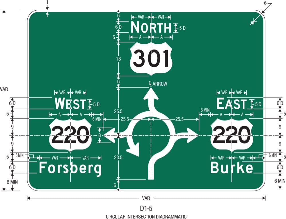
The MUTCD states that it “shall be recognized as the national standard for all traffic control devices installed on any street, highway, bikeway, or private road open to public travel”. Exact specifications for the font, size, spacing of letters, background colors, reflectivity, mounting location and orientation help ensure that traffic signs are consistently readable at a glance while driving anywhere in the U.S..
The word “uniform” is key here, as you can only imagine the chaos if each state had its own version of stop signs, and safety warnings. But states do have some freedom in the signs that they use.
Socials & More