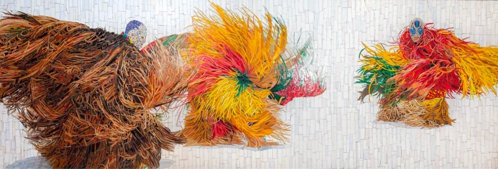
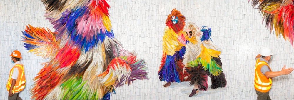
Oh, I really like this new NYC subway mosaic installed in the corridor between Times Square and Bryant Park designed by Nick Cave.1 It’s based on Cave’s Soundsuits project, full-body suits that “camouflage the shape of the wearer, enveloping and creating a second skin that hides gender, race, and class, thus compelling the audience to watch without judgment”. From a NY Times piece on the mosaic:
The Soundsuits have always been an amalgam of cultural references, Cave explained: the concepts of shamans and masquerade, obscuring the race, gender and class of the wearer and forging a new identity. They contain ties to Africa, the Caribbean and Haiti.
“It’s very important that you can make references, you can connect to something,” Cave said. “In one of the mosaics in the corridor, there’s a sneaker. So that brings it to this urban, right-now time.”
From beneath a pink-and-black cloak of raffia, carefully crafted out of glass shards, pokes a contemporary sneaker in shades of salmon, white and maroon. Cave likes the play that’s happening here: The form is sometimes figurative, sometimes abstract. “Sometimes it’s identifiable and sometimes it’s not,” he said. “But that’s the beauty of it all.”
In The Hidden Melodies of Subways Around the World, the NY Times takes a look at an often overlooked aspect of transit design: the door closing sounds on the subway. My favorite door jingle is from the Paris Metro — I never knew where it came from:
In Paris, a simple “A” note plays as the doors shut. This is also a throwback, a sound that mimics the vibrations of a mechanical part that is no longer in use on any of the system’s trains. “But for a half century Parisians and visitors alike became used to that sound, so we decided to keep it, and recorded a synthesized version,” said Song Phanekham, a communications manager for the Paris transit system. “It’s a tribute to the heritage of the Paris Metro.”
In Tokyo, each station has its own custom jingle to signal departures. In Rio de Janeiro, the subway’s door chime pays homage to bossa nova. In Vancouver, the doors still close to a three-note sound that was recorded in the 1980s on a Yamaha DX7. (“The hallmark of any mid-80s pop song,” said Ian Fisher, manager of operations planning at British Columbia Rapid Transit Company.)
You can listen to more sounds of subway doors closing in thesethreevideos recorded by Ted Green.
Update: Composer Minoru Mukaiya has made distinct door-closing jingles for each subway station in Tokyo.
BuzzFeed enlisted NYU track athlete Jon Diaz to help answer a burning question: Can a fast runner beat an NYC subway train from one station to the next? I don’t want to spoil the answer, but they probably wouldn’t have made the video if he’d failed, right? (via clive thompson)
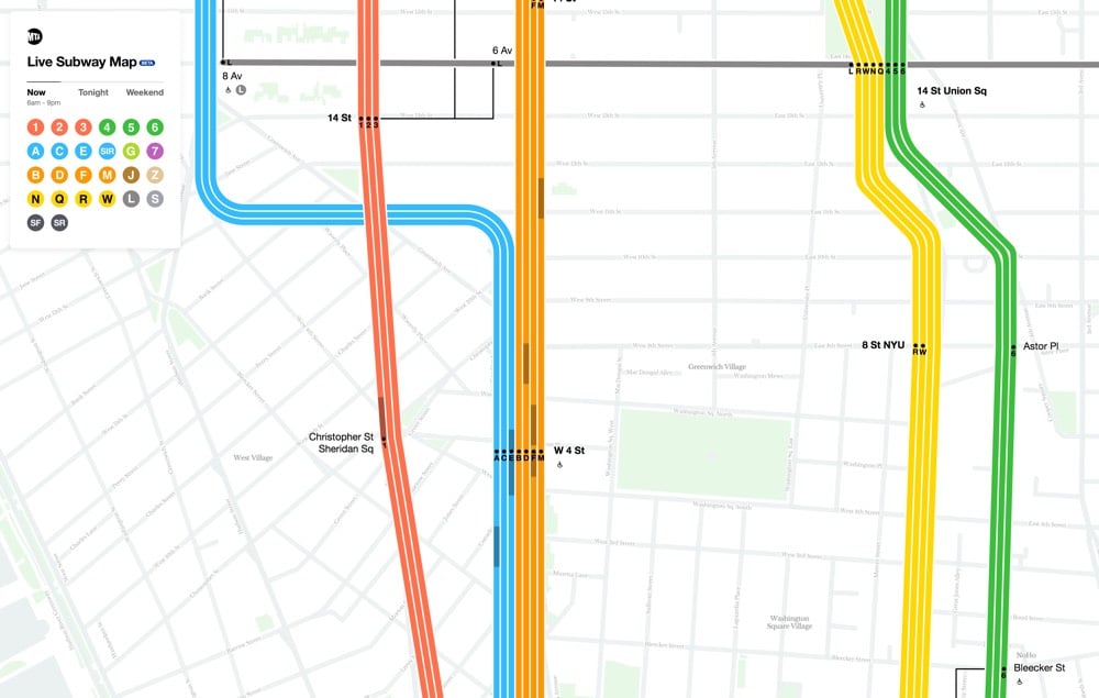
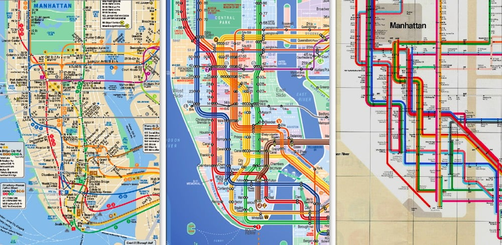
New York City has a new digital subway map that reflects the current status of the subway lines. And you can even see the trains moving, right on the map. (Finally!!) Visually, the new map combines the styles of two past maps, each beloved in their own way.1Fast Company explains:
The first map is that by Massimo Vignelli, who simplified the snaking subway system into a clean diagram which traded geographic literality for graphical clarity. This elegant simplification turns the confounding subway into a logical system. But the main Vignelli map was scorned by New Yorkers because it wasn’t an actual map, and it was quickly replaced (though a permutation actually lives on as the MTA’s Weekender diagram, which signals weekend services). Meanwhile, the primary map the MTA uses today was created by Unimark International and Michael Hertz Associates. It’s more geographically accurate, but it actually condenses information that was in the Vignelli map. For example, it combines individual train lines such as the C, D, and E lines into singular trunks.
Here’s a video from filmmaker Gary Huswit that shows how the team came up with the new map:
Zooming the map in and out, you see different levels of detail, just like with Google or Apple Maps. I like it — a good combination of form and function.2
What’s interesting is that the MTA explicitly rejected and criticized the Kick Map but ended up doing something quite similar with the new digital map. I think Jabbour’s effort deserves to be acknowledged here. (thx, nicolas)
I know as a lover of simplicity, beautiful design, and whatnot, I’m supposed to love the Vignelli map, but I never have. The Hertz map fits the utility of the NYC subway so much better.↩
Although I will say that the website in Chrome absolutely hammered the processor on my computer. It’s probably smoother on mobile?↩
File this under “I Love NYC”. On Sunday night, riders on a Brooklyn-bound L train were treated to a full Thanksgiving dinner, courtesy of some of their fellow straphangers. For more than 20 minutes, a group of riders dined and passed out plates of turkey, collards, stuffing, squash, and mashed potatoes to other folks in the car. Here’s a 21-minute chunk of the action:
They started the meal with a prayer and everything. An onlooker said of the event:
It was a 7 PM Sunday L from union square and was not crowded at all. They said it was an inclusive gesture to emphasize no one should go without food on Thanksgiving. They were loud but not rowdy or a nuisance. They even handed out plates to everyone in the car — I got one and the turkey was a solid 7/10 and collard 8.5/10. I’m glad I got to experience something like this. Makes a great story!
There were even MTA employees amongst us but no one objected.
Here’s a shorter video with some of the highlights:
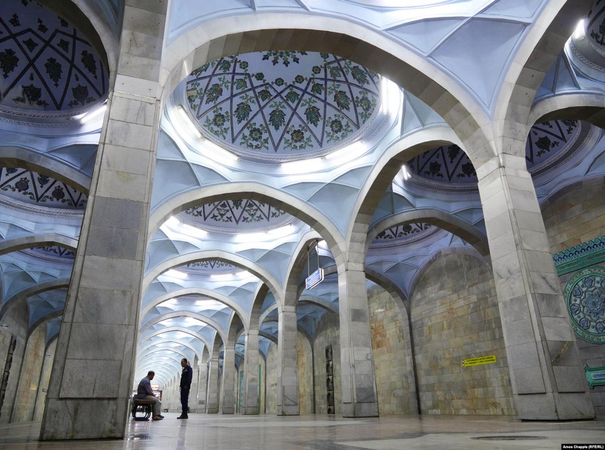
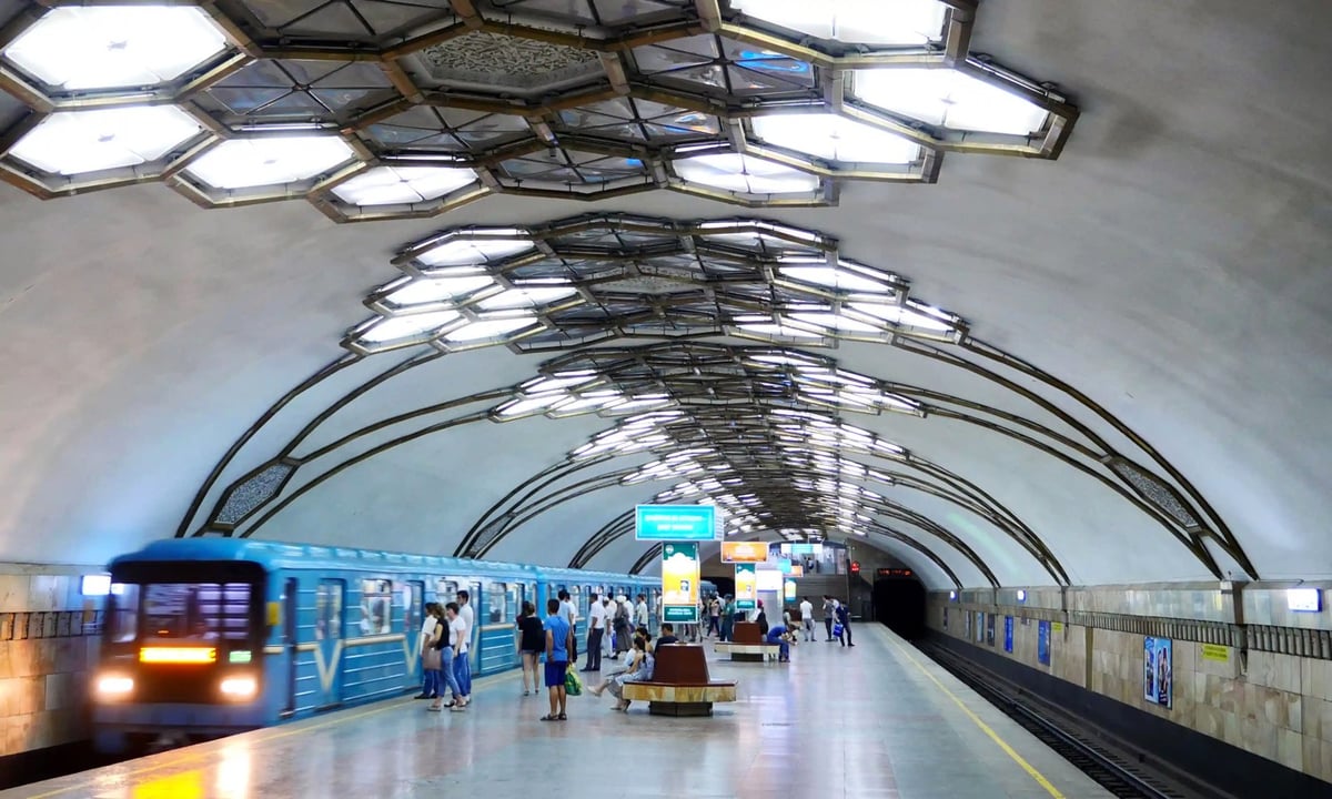
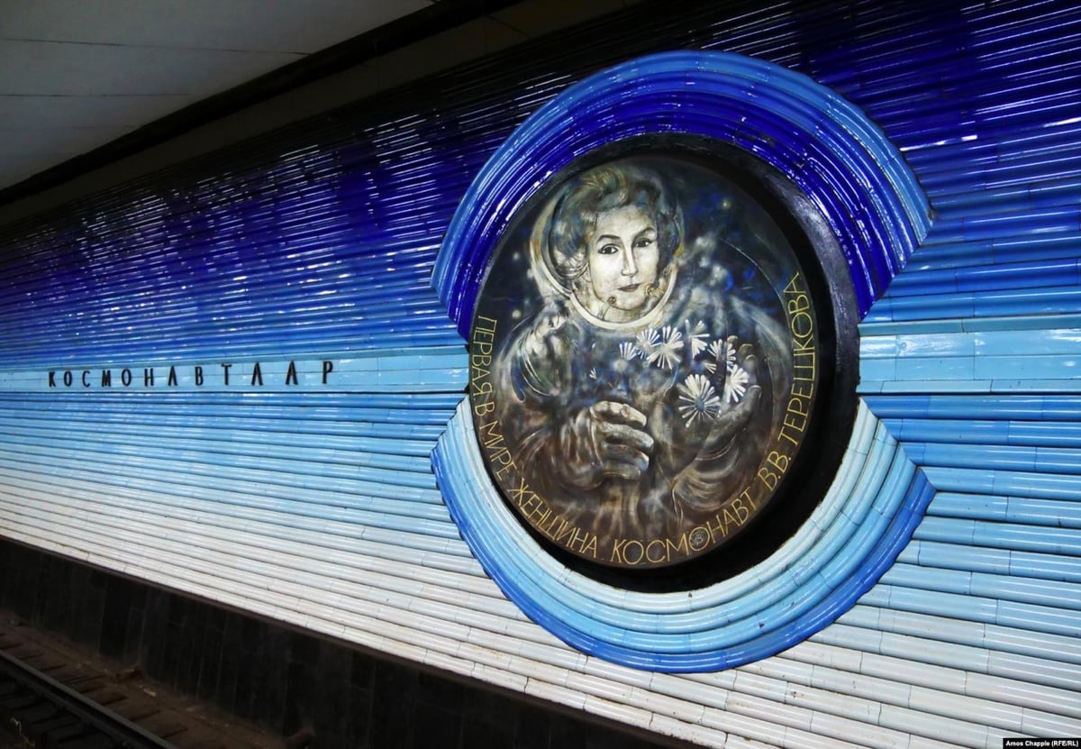
Once a stop along the Silk Roads from Europe to Asia, the city of Tashkent, Uzbekistan boasts many cultural treasures but perhaps the most unlikely is the city’s metro system and its colorful & artistic stations. In 2018, not long after a photography ban was lifted, Amos Chapple took a series of photos of Tashkent’s metro.
This is a short video of a set of subway stairs in Brooklyn where one of the steps is juuuust a bit taller than the rest, which makes most people trip on it.
We don’t often think about it but even the least graceful humans move in a finely calibrated way. When we’re climbing stairs, our feet don’t clear the treads by much, so that even the tiniest deviation in the height of a step can spell trouble.
I’d love to see a study of how quickly our bodies learn how high the steps are in a new flight of stairs. Like, maybe we clear the first couple of steps by an inch or two but then we’re locked in and subsequent clearances are much smaller.
Is there a word for the way people tend to speed up after they trip climbing stairs? The stumble hustle? It’s such a small & endearing little thing that most people do.
My least favorite flight of stairs in the entire NYC subway system are, I believe, at the SW corner of 14th St and 6th Ave in Manhattan. Each of the steps is a different height, making for a tricky ascent and a downright dangerous descent. I keep thinking they’re gonna get fixed, but I used them on my last visit to the city in June. At this point, they’re like an old friend who’s kind of a jerk but you’ve known him so long that whaddya gonna do? (via @fishtopher)
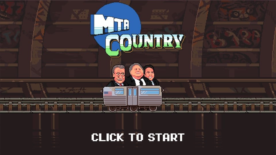
Everyday Arcade, which is responsible for The GOP Arcade (sample game titles include The Voter Suppression Trail and Thoughts & Prayers: The Game!), has designed a new game called MTA Country. Based on the SNES title Donkey Kong Country, the goal of MTA Country is to guide Andrew Cuomo, Bill de Blasio, and celebrity straphanger Gregg Turkin past hazards like track fires and stalled trains to their destination. That ending though… Hmm…
In the NY Times, architect and urban designer John Massengale discusses how four European cities (London, Amsterdam, Stockholm, Copenhagen) addressed their urban traffic problems and how NYC might apply those lessons to fix its own traffic issues. Massengale shared what the Dutch learned in reconfiguring their streets:
1. When drivers slow down to 20 m.p.h. or below, they are less likely to hit people and much less likely to seriously injure or kill people if they do hit them.
2. The best way to slow cars down is to throw away all the techniques that traffic engineers developed to make traffic flow quickly.
3. When you throw out all the detritus of traffic engineering, it becomes much easier to make beautiful places where people want to walk. Bike riding becomes more pleasant and safer as well.
His four-step plan to fix traffic in Manhattan is equally simple in principle:
The next step is to adopt congestion pricing below 96th Street in Manhattan and then:
1. Decrease the number of Manhattan streets that function as transportation corridors primarily devoted to moving machines through the city.
2. Design and build Slow Zones where people actually drive slowly.
3. Make the transportation corridors that remain better urban places, with a better balance between city life and moving cars.
Seems to me a vital part of this is fixing, expanding, and subsidizing the subway system…get everyone using the subway. Better, more reliable, and cheaper public transportation = less demand for taxis and Lyfts. As Bogota mayor Enrique Peñalosa said, “A developed country is not a place where the poor have cars. It’s where the rich use public transport.”
In 1990, China, Hong Kong, and Taiwan had only a handful of subway lines. In the early 2000s, growth in the number of cities with subways started to increase dramatically, as did the number of lines in the bigger cities like Beijing and Shanghai. As of 2020, more than 40 Chinese cities will have subway systems. Check out this time lapse map by “transit nerd” Peter Dovak (who also did these Mini Metros maps):
In this time, Beijing and Shanghai in particular have ballooned from nearly nothing into the world’s two largest, in both length and annual ridership. The timeline of their expansion alone is mesmerizing.
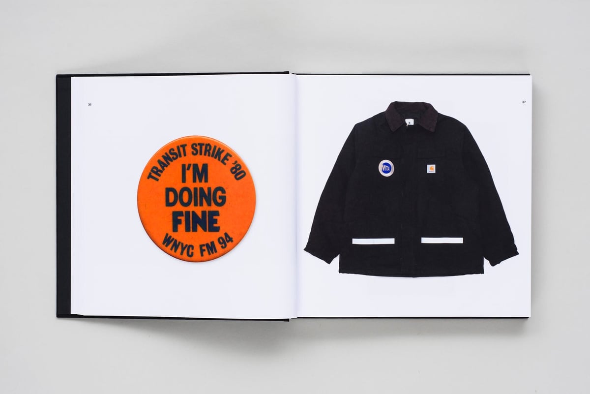
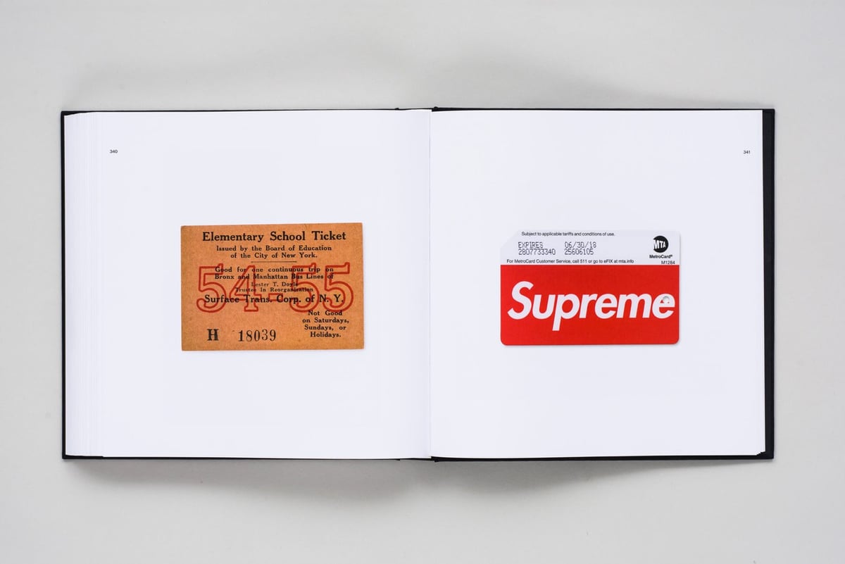
Kelley started collecting MTA MetroCards in 2011, and he quickly became fascinated by other Subway-related objects. This catalogue is the first of its kind — presenting a previously uncollated archive of subway ephemera that spans three centuries.
Kelley posts photos of many of the artifacts he’s found on Instagram.
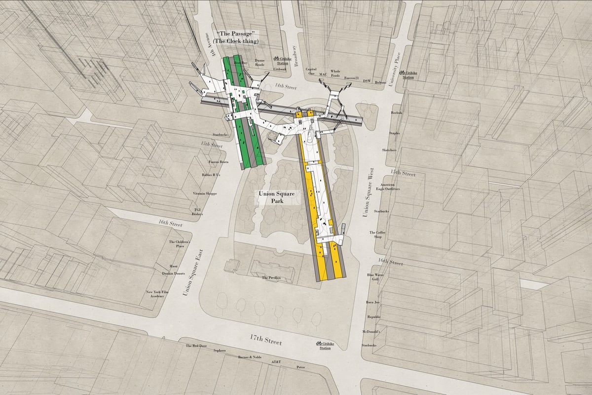
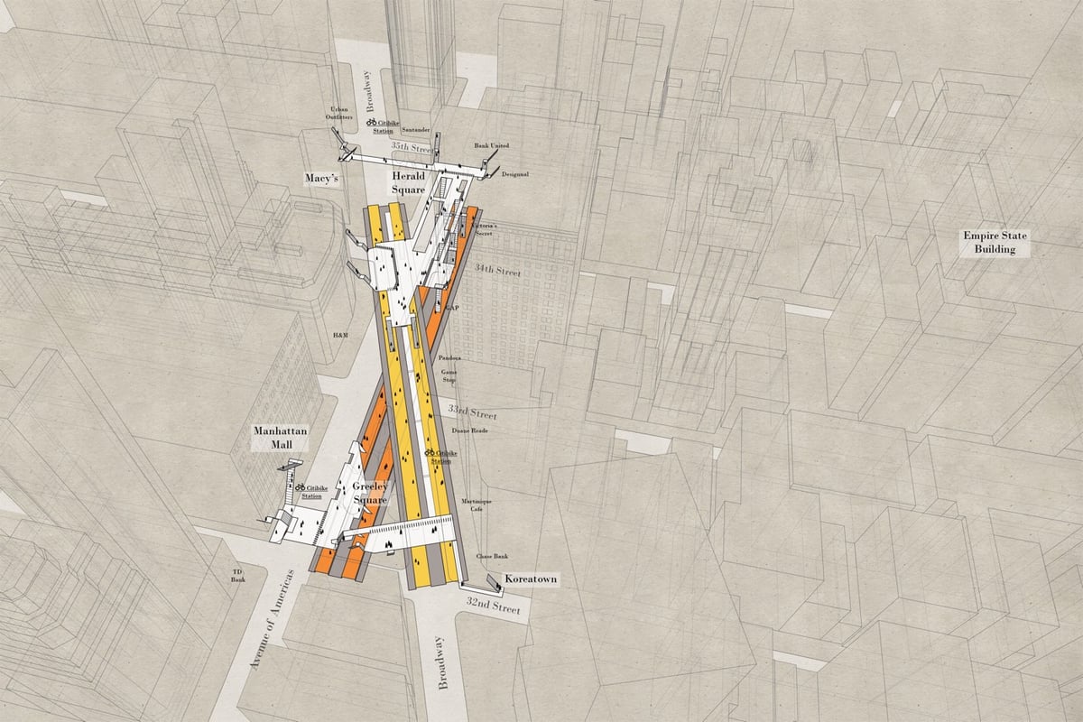
The subway and the street level of NYC are two very different worlds and even long-term residents have a difficult time understanding how they fit together. Architect Candy Chan has drawn a series of x-ray maps of NYC subway stations that show their layouts and orientation compared to the geography of the streets above. (Tip: you can zoom the maps for more detail.)
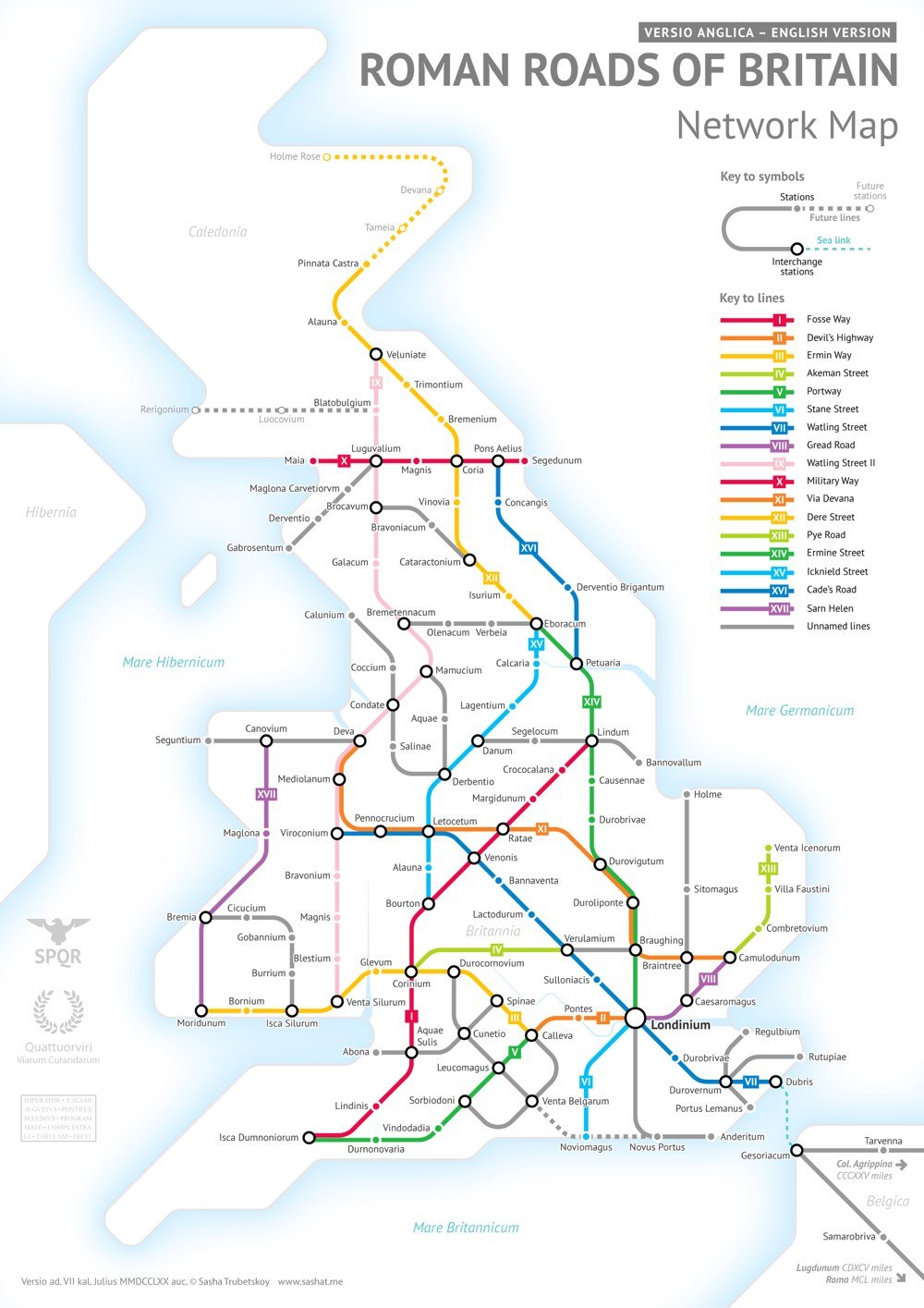
This was far more complicated than I had initially anticipated. Not only were there way more Roman Roads in Britain than I initially thought, but also their exact locations and extents are not very clear. In a few places I had to get rather creative with the historical evidence.
As Wikipedia notes, most of the roads were completed by 180 AD and many of them are still in use today.
After the Romans departed, systematic construction of paved highways in the UK did not resume until the early 18th century. The Roman road network remained the only nationally-managed highway system within Britain until the establishment of the Ministry of Transport in the early 20th century.
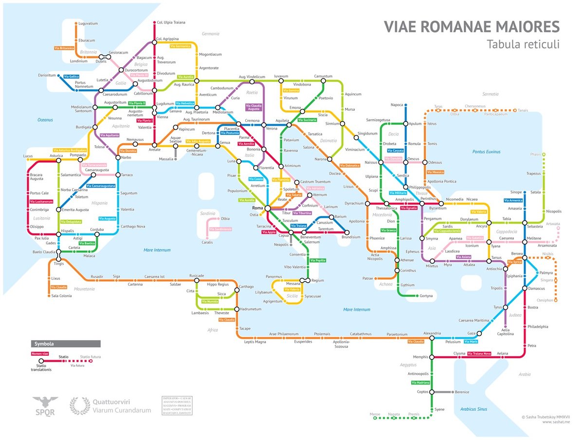
After much research, Sasha Trubetskoy has completed a subway-style map of the road system of the Roman Empire. From about 300 BC, the Romans built or improved over 250,000 miles of roads (50,000 miles were stone paved) that extended into the farthest reaches of the Empire: from Spain to modern-day Iraq to Britain to northern Africa.
Creating this required far more research than I had expected — there is not a single consistent source that was particularly good for this. Huge shoutout to: Stanford’s ORBIS model, The Pelagios Project, and the Antonine Itinerary (found a full PDF online but lost the url).
The lines are a combination of actual, named roads (like the Via Appia or Via Militaris) as well as roads that do not have a known historic name (in which case I creatively invented some names). Skip to the “Creative liberties taken” section for specifics.
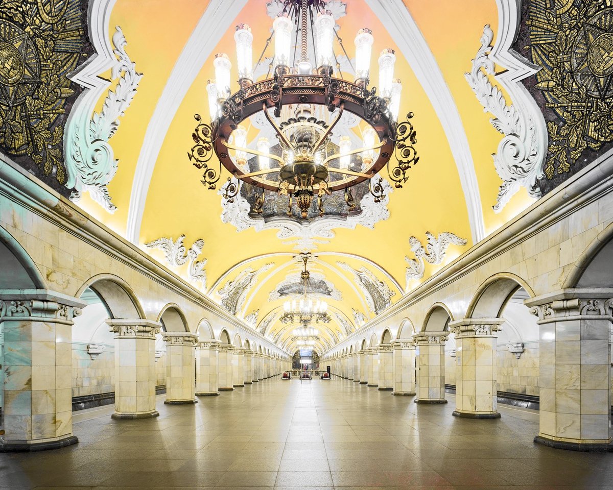
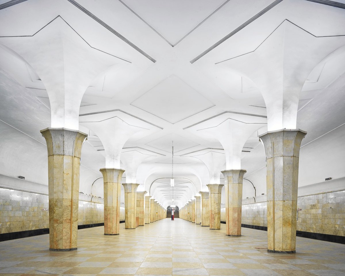
Back in the days before the US bankrupted the Soviet Union with the space race and the nuclear arms race, the Soviets spent lavishly on some public works…like these amazing metro stations built in the Stalin era. Photographer David Burdeny got special middle-of-the-night access to these stations in Moscow and St. Petersburg and came away with these great photographs. Could you imagine an NYC subway station with chandeliers? Or even moderately clean walls? (via petapixel)
In 2012, Francois De La Taille posted a video of himself racing a Paris Metro train from one station to the next, on foot. He exited the train, dashed out of the station, sprinted down the street (after pausing for a bus crossing the road), ran into the next station (after falling on the stairs), and hopped back onto the same train he’d just gotten off of.
Two years later, James Heptonstall did the same thing on the London Tube and, after a slow start, it went viral. Soon, people from all over the world were racing their hometown subway trains: Taiwan, Stockholm, Hong Kong, etc. If you’re wondering whether such a thing would be possible in NYC, the answer is yes, even if you pick the wrong door to start with:
A horde of dead men with live identities haunt New York City and almost every city in the Western world. Their names are on the streets, buildings, parks, squares, colleges, businesses, and banks, and their figures are on the monuments. For example, at Fifty-ninth and Grand Army Plaza, right by the Pulitzer Fountain (for the newspaper magnate Joseph Pulitzer), is a pair of golden figures: General William Tecumseh Sherman on horseback and a woman leading him, who appears to be Victory and also a nameless no one in par-ticular. She is someone else’s victory.
The biggest statue in the city is a woman, who welcomes everyone and is no one: the Statue of Liberty, with that poem by Emma Lazarus at her feet, the one that few remember calls her “Mother of Exiles.” Statues of women are not uncommon, but they’re allegories and nobodies, mothers and muses and props but not Presidents.
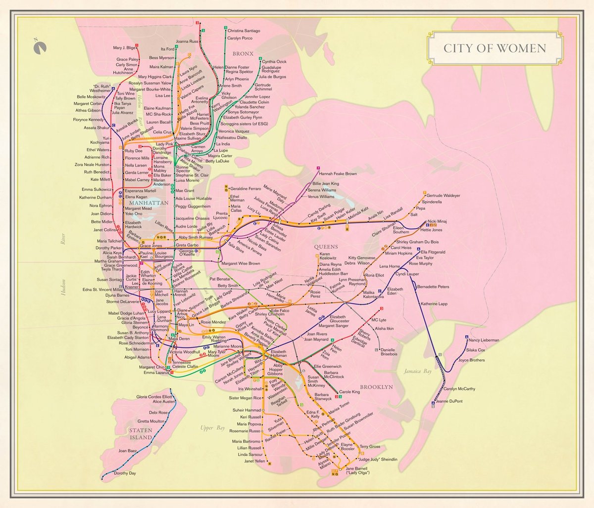
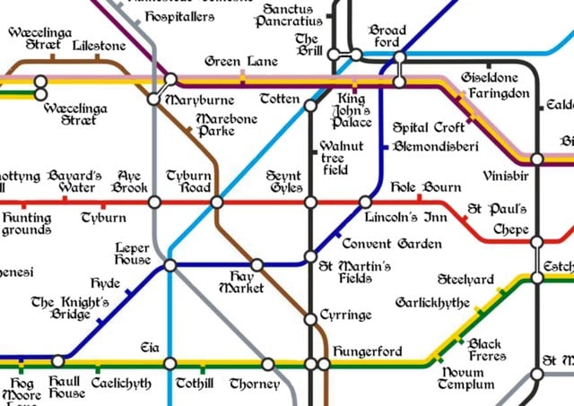
For her book Nonstop Metropolis: A New York City Atlas, Solnit and her co-author Joshua Jelly-Schapiro commissioned Molly Roy to make a subway map of NYC that uses only the names of the city’s prominent women for the station names.
It’s a map that reflects the remarkable history of charismatic women who have shaped New York City from the beginning, such as the seventeenth-century Quaker preacher Hannah Feake Bowne, who is routinely written out of history — even the home in Flushing where she held meetings is often called the John Bowne house. Three of the four female Supreme Court justices have come from the city, and quite a bit of the history of American feminism has unfolded here, from Victoria Woodhull to Shirley Chisholm to the Guerrilla Girls.
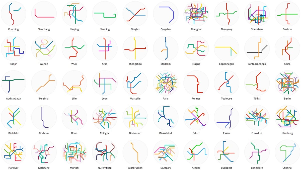
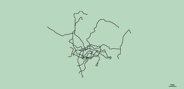
Mini Metros features small and simplified maps of over 200 metro and light rail systems from around the world. Many of the systems are small and simple themselves, just a single line or two, like in Edmonton, Mumbai, Seville, and Qingdao. Others, like in Munich, Shanghai, Tokyo, London, Seoul, and New York, are densely interconnected.
Whoa, this is the coolest! Jason Wright’s Brand New Subway allows players to alter the NYC subway system as they see fit. You can start with existing maps and the choices you make affect ridership and the price of a Metrocard.
Players can choose to start from scratch or one of several NYC subway maps (including present-day, maps dating back to the early 1900s, or maps from the future). They can build new stations and lines to expand the system to new areas, or tear it down and redesign the whole thing. The game intends to evoke an imaginative spirit, to empower people to envision transportation according to their needs and desires, and to arouse the fun of tinkering with maps.
Bottom-up vs. top-down design. Moses was infamous for his top-down approach to urban planning. He held “the public” as a concept in high regard while simultaneously showing contempt for the individuals who made up that public, in the form of arrogance, spitefulness, and an utter lack of concern for the millions displaced for his expressways and parks. Later on in his career, as the span of his projects increased, Moses would make monumentally important decisions about the fate of a neighborhood without once setting foot there. He was known for building 13 bridges and hundreds of miles of parkways despite never driving a car.
Although Brand New Subway might appeal to someone who enjoyed SimCity but who has never set foot in New York City, it’s targeted primarily at those who actually ride the subway and who might feel invested in what they design. In that regard, it inverts Moses’ paradigm by encouraging players to improve on transportation in their own neighborhoods and in ways to which they have a personal connection.
I reeeeeeally didn’t want to spend the rest of my day playing with this, but that super express train from Manhattan to JFK isn’t going to build itself! (via @byroncheng)
The medieval period spans something like 1,000 years, covering the centuries from the Roman withdrawal around 400 AD to the rise of the Tudors in the late 15th century. Place names, of course, changed greatly over this time and those on the map were not necessarily all in use at the same time. Where applicable, we’ve favoured spellings used in the Domesday survey of 1086. Elsewhere, we’ve taken the earliest recorded version of a place name.
YouTube user DJ Hammers has been uploading videos of start-to-finish trips on NYC subway lines from the perspective of the operator at the front of the train. The realtime videos are interesting to watch, but the 10x time lapses are probably a better use of your attention. Here’s the time lapse of the Queens-bound 7 train (realtime version):
The London Underground recently conducted an experiment on one of the escalators leading out of the busy Holborn station. Instead of letting people walk up the left side of the escalator, they asked them to stand on both sides.
The theory, if counterintuitive, is also pretty compelling. Think about it. It’s all very well keeping one side of the escalator clear for people in a rush, but in stations with long, steep walkways, only a small proportion are likely to be willing to climb. In lots of places, with short escalators or minimal congestion, this doesn’t much matter. But a 2002 study of escalator capacity on the Underground found that on machines such as those at Holborn, with a vertical height of 24 metres, only 40% would even contemplate it. By encouraging their preference, TfL effectively halves the capacity of the escalator in question, and creates significantly more crowding below, slowing everyone down. When you allow for the typical demands for a halo of personal space that persist in even the most disinhibited of commuters — a phenomenon described by crowd control guru Dr John J Fruin as “the human ellipse”, which means that they are largely unwilling to stand with someone directly adjacent to them or on the first step in front or behind — the theoretical capacity of the escalator halves again. Surely it was worth trying to haul back a bit of that wasted space.
Leaving aside “the human ellipse” for now,1 how did the theory work in the real life trial? The stand-only escalator moved more than 25% more people than usual:
But the preliminary evidence is clear: however much some people were annoyed, Lau’s hunch was right. It worked. Through their own observations and the data they gathered, Harrison and her team found strong evidence to back their case. An escalator that carried 12,745 customers between 8.30 and 9.30am in a normal week, for example, carried 16,220 when it was designated standing only. That didn’t match Stoneman’s theoretical numbers: it exceeded them.
But not everyone liked being asked to stand for the common good:
“This is a charter for the lame and lazy!” said one. “I know how to use a bloody escalator!” said another. The pilot was “terrible”, “loopy,” “crap”, “ridiculous”, and a “very bad idea”; in a one-hour session, 18 people called it “stupid”. A customer who was asked to stand still replied by giving the member of staff in question the finger. One man, determined to stride to the top come what may, pushed a child to one side. “Can’t you let us walk if we want to?” asked another. “This isn’t Russia!”
There’s a lesson in income inequality here somewhere…2
Update: The NY Times wades into the not walking on escalators debate: Why You Shouldn’t Walk on Escalators. Standing on the escalator, meet American self-interest.
It would be hard to persuade people that “everybody wins” if they all merely stood on the escalator, Curtis W. Reisinger, a psychologist at Zucker Hillside Hospital in Glen Oaks, N.Y., said.
“Overall I am not too optimistic that people’s sense of altruism can override their sense of urgency and immediacy in a major metro area where the demands for speed and expediency are high,” he wrote in an email.
Sam Schwartz, New York City’s former traffic commissioner and a fellow in transportation at Hunter College, said people’s competitive nature tends to trump logic and science.
“In the U.S., self-interest dominates our behavior on the road, on escalators and anywhere there is a capacity problem,” he wrote in an email. “I don’t believe Americans, any longer (if they ever did), have a rational button.”
Ok, explicitly: the people standing are poor, the people walking are rich, and speed is income. When the walkers redistribute some of their speed to the whole group, on average everyone gets to where they’re going faster. But the walkers are unwilling to give up walking because they believe their own individual speed will prevail. “This isn’t Russia!” indeed.↩
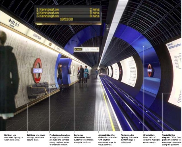
Transport for London recently released a document called the London Underground Station Design Idiom, a guide to the design aesthetic of Tube stations. After an introductory chapter called “A manifesto for good design”, the document offers nine main guidelines for how Underground stations should be designed:
1. Achieve balance across the network. Good design is achieved through balance. For us, this means balance between heritage and the future, between a station’s commercial activity and its customer information, and between the network as a whole and the station as a local place.
2. Look beyond the Bostwick gates. Stations are more than portals to the Underground; they are also places to meet, eat, shop and, most importantly, they are centres of community. Many people’s mental map of London is organised by Underground stations. A neighbourhood’s identity can be enriched by truly ‘embedding’ its station in the local area.
3. Consider wholeness. Good design starts by considering the whole: the whole station (from platform to pavement); the whole of the project from engineering to surface finishing; the whole team. It’s about making sure the right people are engaged from the outset. Considering ‘wholeness’ means creating entire spaces with clear forms, which are clutter-free and legible for all users and requirements.
4. Prioritise comfort for staff and customers. Well-designed stations support staff in their varied roles so they can provide world class customer service. It is this interaction between staff, customers and the built environment that makes London Underground stations so special and distinguishes us from other metros.
5. Delight and surprise. Every Underground station should include at least one moment of delight and surprise, to improve customers’ journeys and the working environment for staff. Such moments help put the network on the map, as a world-class leader of design.
6. Use materials to create atmosphere. The quality of materials has a huge impact on the way a station is perceived by both customers and staff. High quality materials that are robust and easy to maintain make better environments. Use materials to make atmospheric spaces that are dramatic and rich in texture. Make stations more memorable to customers and better places to travel to or through.
7. Create ambience with lighting. Lighting on the Underground is used to make safe and functional environments, with maintenance and costs often dictating the choice and application of fittings with no consideration on how this impacts overall perception of space. Although lighting must be functional to improve safety and increase feelings of comfort, it can also be transformational - improving spaces, drawing attention to heritage or special features and helping customers flow intuitively through a station.
8. Integrate products and services. Good design is not just about choosing the right materials and lighting, it also involves integrating the other products and services which make up the station. All network furniture, fixtures and equipment - such as customer information, safety equipment, ticketing, poster frames, advertising, CCTV and signage - must be fully integrated into the station so there is clarity and coherence from platform to pavement and across the network.
9. Prepare for the future. By embracing new technologies and understanding their benefits we can create better-designed stations that enhance the user experience. This also means considering the life cycle of existing and new materials and products. Designing in flexibility allows our stations to better respond to new challenges, opportunities and change programmes.
Aside from some of the specifics, that’s not a bad list of guidelines on how to think about designing anything. (via mefi)

Stay Connected